It's that time of the week. Think and work on anything except the markets or the economy. Until Monday ...


Question: when you say that the rail traffic suggests the double dip is right now, does that mean we are already on the way up out of it, given that traffic is turning back up after having been down?Answer: yes it may be so. The bottom line is, indicators seem to behave differently in deflation vs. inflation, in that lead times become much more compact. Rail traffic has suggested that the downturn foreseen in the LEI beginning in April has already been happening. Rail traffic may now be telling us that the downturn in the private vs. public sector may be abating.
 Total domestic investment is increasing at a solid rate.
 Equipment and software investment increased at a strong pace, as did


 Purchases of non-durable goods also increased, although at a lower rate than the previous quarter.
 Durable goods purchases increase at a healthy pace.
Real gross domestic product -- the output of goods and services produced by labor and property located in the United States -- increased at an annual rate of 1.6 percent in the second quarter of 2010, (that is, from the first quarter to the second quarter), according to the "second" estimate released by the Bureau of Economic Analysis. In the first quarter, real GDP increased 3.7 percent.
.....
The increase in real GDP in the second quarter primarily reflected positive contributions from nonresidential fixed investment, personal consumption expenditures, exports, federal government spending, private inventory investment, and residential fixed investment. Imports, which are a subtraction in the calculation of GDP, increased.
The deceleration in real GDP in the second quarter primarily reflected a sharp acceleration in imports and a sharp deceleration in private inventory investment that were partly offset by an upturn in residential fixed investment, an acceleration in nonresidential fixed investment, an upturn in state and local government spending, and an acceleration in federal government spending.


 Cattle is still in an uptrend (A), which has continued through important resistance levels (C) and consolidated gains along the way (B). After peaking, prices have fallen (d), but are still at elevated levels.
 Copper is clearly consolidating recent gains (A).
 Wheat is also consolidating gains (A).
Have you noticed that Valueline Arithmetic is currently correcting from a high it made earlier this year? That recent peak was an all time high, and therefore was higher than the peak before the 2008-2009 crash. The Drawdown from this recent peak is approximately 15%. What do you make of this situation? Especially given that the S&P 500 has only recovered about 50% relative to its pre-crash high,while Valueline Arithmetic recovered over 100% and is now correcting. Would be very interested in what you have to say about this situation.
On June 30, 1961, we introduced the Value Line Composite Index. This market benchmark assumes equally weighted positions in every stock covered in The Value Line Investment Survey. That is, it is assumed that an equal dollar amount is invested in each and every stock. The returns from doing so are averaged geometrically every day across all the stocks in The Survey and, consequently, this index is frequently referred to as the Value Line (Geometric) Average (VLG). The VLG was intended to provide a rough approximation of how the median stock in the Value Line universe performed.On February 1, 1988, Value Line began publishing the Value Line (Arithmetic) Average (VLA) to fill a need that had been conveyed to us by subscribers and investors. Like the VLG, the VLA is equally weighted. The difference is the mathematical technique used to calculate the daily change.
The VLA provides an estimate of how an equal-dollar weighted portfolio of stocks will perform. Or, put another way, it tracks the performance of the average, rather than the median, stock in our universe. It can be shown mathematically, for all practical purposes, that the daily percentage price change of the VLA will always be higher than the VLG. The systematic understatement of returns of VLG is a major reason that the VLA was developed. Moreover, although the differences between daily price changes may seem small, the magnitude of the annual differential between the two averages can be very large. The greater the market volatility, the larger the spread between the geometric and arithmetic averages becomes.
In 1965, when the current Timeliness Ranking System began, our only market average was the VLG, so we scored the ranks on a geometric basis. This allowed us to compare the performance of the ranks versus the market (as measured by the VLG). After we started the VLA, we began scoring the ranks both on a geometric and arithmetic basis.

Orders for durable goods, products such as autos and appliances designed to last three years or more, rose 0.3% in July from June, largely due to aircraft orders, the Commerce Department said Wednesday. Excluding the volatile transportation sector, orders tumbled 3.8%.We've been seeing this slowdown in the latest regional manufacturing numbers.The figures provided the latest evidence that the rebound in manufacturing, which propelled the early stages of the economic recovery, is unlikely to remain strong enough to offset weakness in consumer spending and waning support from federal stimulus.
A key gauge of future business investment—orders for nondefense capital goods excluding aircraft—fell 8% from a month earlier. That drop, the worst decline since January 2009, offset the gains seen in May and June.
While the durable-goods data can be volatile, they raised doubts about whether the underlying strength of businesses can keep the economy expanding in the second half of the year.
"The recovery has been relying so heavily on the industrial side of the economy for support, and it seems as though that support has now all but disappeared," said Ellen Beeson Zentner, an economist at Bank of Tokyo-Mitsubishi UFJ.
The Empire State Manufacturing Survey indicates that conditions improved modestly in August for New York manufacturers. The general business conditions index rose 2 points from its July level, to 7.1. The new orders and shipments indexes both dipped below zero for the first time in more than a year, indicating that orders and shipments declined on balance; the unfilled orders index was also negative. The indexes for both prices paid and prices received inched down, while employment indexes were positive and higher than last month. The six-month outlook weakened; though future indexes were generally still positive, many fell in August, with the notable exceptions of the future employment and capital expenditures indexes, which climbed after falling last month.


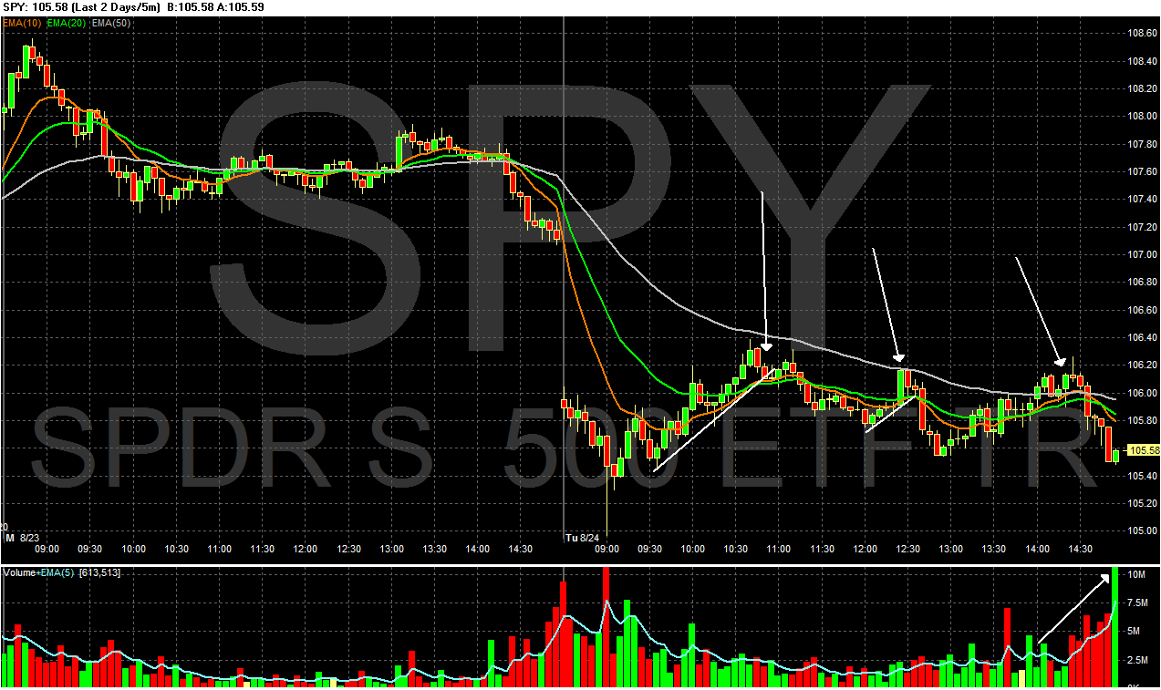
 The Russell 2000 hit support at previous levels (b) and rallied strongly yesterday (a). This is probably the result of program trading.

 Gold is still in a rally (a) and has consolidated gains by falling into the 10 and 20 day EMA (b). Also note the EMAs are in a very bullish posture (c) -- the shorter are above the longer and all are rising.
For a few months at the start of this year, things were looking up for stock market investing. Optimistic about growth, investors were again putting their money into stocks. In March and April, when the stock market rose 8 percent, $8.1 billion flowed into domestic stock mutual funds.Here is the accompanying graphic:
But then came a grim reassessment of America’s economic prospects as unemployment remained stubbornly high and private sector job growth refused to take off.Investors’ nerves were also frayed by the “flash crash” on May 6, when the Dow Jones industrial index fell 600 points in a matter of minutes. The authorities still do not know why.
Investors pulled $19.1 billion from domestic equity funds in May, the largest outflow since the height of the financial crisis in October 2008.
Over all, investors pulled $151.4 billion out of stock market mutual funds in 2008. But at that time the market was tanking in shocking fashion. The surprise this time around is that Americans are withdrawing money even when share prices are rallying.
The stock market rose 7 percent last month as corporate profits began rebounding, but even that increase was not enough to tempt ordinary investors. Instead, they withdrew $14.67 billion from domestic stock market mutual funds in July, according to the investment institute’s estimates, the third straight month of withdrawals.
A big beneficiary has been bond funds, which offer regular fixed interest payments.
As investors pulled billions out of stocks, they plowed $185.31 billion into bond mutual funds in the first seven months of this year, and total bond fund investments for the year are on track to approach the record set in 2009.

But in the Information Age, you can find out anything about anything on—where else?—Google. Google Trends tracks what people are searching as well as how many news stories mention the search term. And, observers Nicholas Colas, chief market strategist at BNY ConvergEx Group, "bubble" seems to have a hold on the imaginations of Google users for the better part of the past 18 months.Colas notes that it takes a while for a bubble to inflate fully and burst. The peak in Google searches for "housing bubble" was in 2005—years before the top in the market. It takes time, and usually leverage, to get the last, credulous buyers who ignore all the warnings to buy at the top tick.
But as for the terms "bond bubble" and "Treasury bubble," Google hasn't had enough searches to register a trend, Colas finds. That suggests bond investors "seem oblivious to bubble chatter," so he concludes that any backup in yields is apt to be met with more buying.
.....
As ISI Group points out in its Friday missive to clients, yields on government bonds have collapsed around the globe in the past two months. While the 10-year U.S. Treasury yield hit a 16-month low of 2.53%, the German 10-year bund fell to a record low 2.27% while the comparable U.K. gilt dipped below 3%, to 2.98%. And in Japan, the 10-year yield is under 1%, at 0.94%. So it's not just an American phenomenon.
.....
More importantly, Gluskin Sheff's David Rosenberg—who's been spot-on in his call on bonds and the economy slowing to stall speed—also takes issue with the two Jeremies' assertion that the $559 billion influx into bond mutual funds and $233 billion exodus from equity funds from January 2008 to June 2010 signals a bubble. If anything, it shows households' increased acumen, says Rosenberg, given that Treasury bonds returned 13% over that span while stocks lost 21%.
A similar bubble is expanding today that may have far more serious consequences for investors. It is in bonds, particularly U.S. Treasury bonds. Investors, disenchanted with the stock market, have been pouring money into bond funds, and Treasury bonds have been among their favorites. The Investment Company Institute reports that from January 2008 through June 2010, outflows from equity funds totaled $232 billion while bond funds have seen a massive $559 billion of inflows.We believe what is happening today is the flip side of what happened in 2000. Just as investors were too enthusiastic then about the growth prospects in the economy, many investors today are far too pessimistic.
.....
Today the purveyors of pessimism speak of the fierce headwinds against any economic recovery, particularly the slow deleveraging of the household sector. But the leveraging data they use is the face value of the debt, particularly the mortgage debt, while the market has already devalued much of that debt to pennies on the dollar.
This suggests that if the household sector owes what the market believes that debt is worth, then effective debt ratios are much lower. On the other hand, if households do repay most of that debt, then the financial sector will be able to write-up hundreds of billions of dollars in loans and mortgages that were marked down, resulting in extraordinary returns. In either scenario, we believe U.S. economic growth is likely to accelerate.
A few points/observations:
1.) Personally, from an investing perspective I'm a big fan of high quality, dividend paying equities and some fixed income. For example, I like portfolios that have companies like Exxon, MMM, coke, etc... The reason is with a dividend you always have a little bit of cash coming in. This puts a natural floor under the stock and provides an income stream for further investments. I'm hoping this style of investing is catching on; the pure growth play is a huge, double down bet at the investment table.
2.) As both NDD and I have pointed out, we've seen in increase in the personal savings rate over the last year or so. That money has to go somewhere. Savers see bank accounts paying next to nothing, so a bond mutual fund with liberal withdrawal privileges is the next best thing.
3.) In addition to the Treasury market, consider these charts of the mortgage backed bond market, investment grade corporate bond market and the junk bond market:

Money is clearly flowing into a variety of fixed-income funds, not just the Treasury Market.
4.) All of the fixed income markets have an inflection point that starts a rally right around the break-out of the Greek crisis this spring. This tells us that the Greek crisis was probably a catalyst event for the investment public, and a clear signal to put on the breaks and move money into more conservative venues. Since then, the US economy has printed weaker numbers, which has confirmed that asset shift to income yielding investments.
Months of supply increased to 8.9 months in June from 8.3 months in May. A normal market has under 6 months of supply, so this is already high - and probably excludes some substantial shadow inventory. And the months of supply will increase sharply next month when sales collapse.So July existing home sales were reported yesterday and, surprise surprise, they collapsed. This didn't prevent the usual Circle Jerks of Doom from taking place at the usual locations.