Saturday, March 19, 2022

Weekly Indicators for March 14 - 18 at Seeking Alpha


 - by New Deal democrat

My Weekly Indicators post is up at Seeking Alpha.

The economic indicators are coming under pressure from both ends. The long leading indicators are being buffetted by inflation and the Fed, as interest rates generally rise, and the yield curve gets very tight.

Meanwhile the coincident and short leading indicators have been hit by the exogenous event of the war in Ukraine, as the global economy severs ties with commodity supplier (oil and gas) Russia.

As usual, clicking over and reading will bring you up to the virtual moment, and bring me some lunch money for next week.

Friday, March 18, 2022

Coronavirus dashboard for March 18: the BA.2 variant behaves just like original Omicron


 - by New Deal democrat

In the last several days, the 7 day average of cases in the US has increased slightly from  30,700 to 32,700. The rate of decline w/w has decelerated to only 10%. Meanwhile, deaths have finally declined to slightly below 1000 at 995. The number of jurisdictions where cases increased week over week has increased to 7 or so in the past several days, compare with 2 or 3 a week ago:


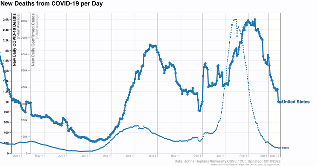
All of this suggests that the decline from the BA.1 Omicron wave may be ending, at least temporarily.

Like you, I have read in many places about the new BA.2 wave overtaking much of Europe, specifically including the UK, and warning that the same is in store for the US.

The truth appears to be more complicated.

I spent some time yesterday examining the work of Emma Hodcraft, Ph.D. of the Institute of Social and Preventive Medicine at the  University of Bern, Switzerland, on whose data of infection prevalence by variant for many countries and for all jurisdictions in the US is found at Covariant.org. I’m going to discuss it in two parts. The first part is today, below.

The data she has collected demonstrate that BA.2 is very much an Omicron, rolling in and out like a tsunami. Like BA.1, the BA.2 variant causes peak infections by or very shortly after it approaches 100% of all infections.

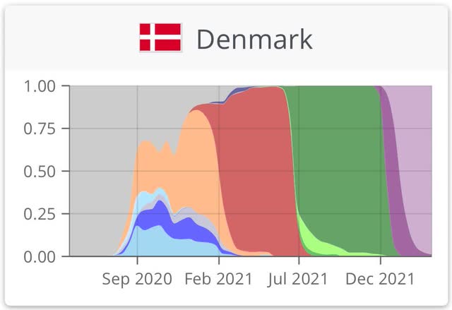
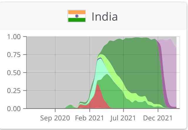
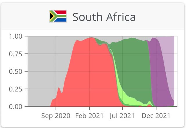
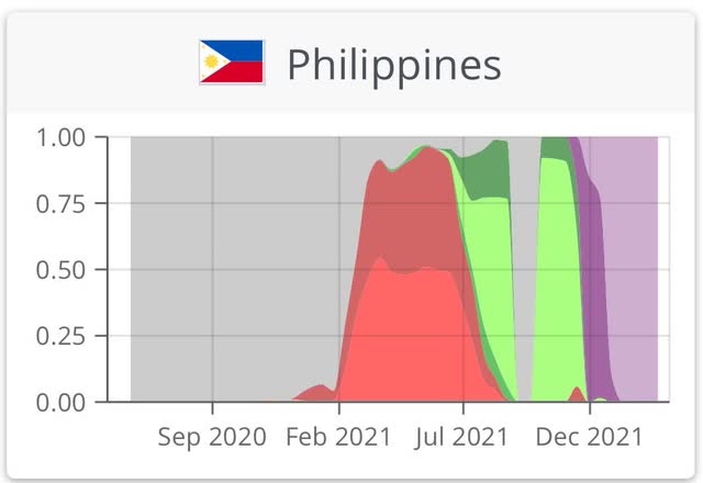
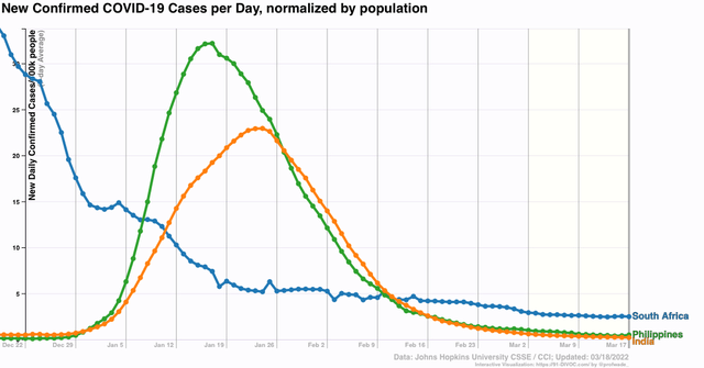
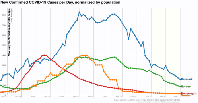
Here are graphs for South Africa, India, Denmark, and the Philippines, in all of which the BA.2 variant almost completely replaced BA.1 no later than the end of February (note: BA.1 is dark purple; BA.2 is light purple):


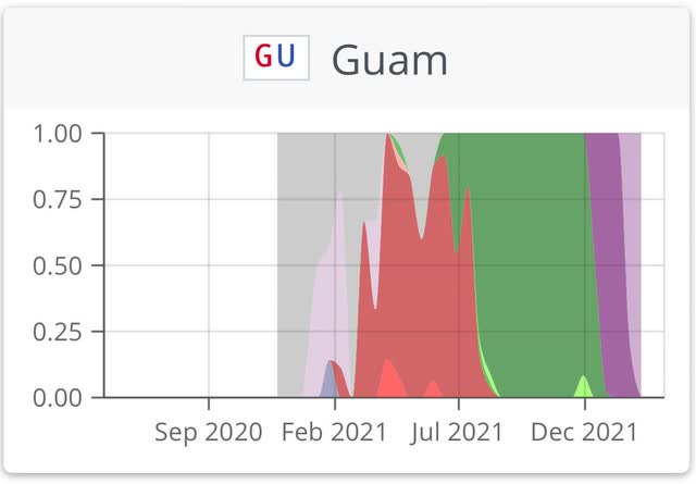
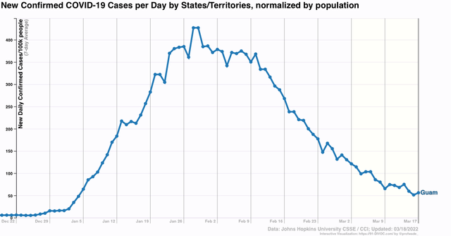
Similarly, here is her graph of the US territory of Guam in the Mariana Islands (the only US jurisdiction where BA.2 has completely supplanted BA.1):


In every single case, infections peaked shortly before or after BA.2 reached close to 100% of infections. In fact, I examined data from 12 other countries where the BA.2 timeline is similar: Sweden, Norway, Singapore, Bangladesh, Sri Lanka, Cambodia, Hong Kong (yes, even Hong Kong, where BA.2 hit 90% penetration in mid-February. Cases peaked on March 4, and have fallen by 60% since then), Pakistan, Nepal, the Maldives, Montenegro, and Serbia; and each and every one showed a peak of infections close in time, and almost all of them were down 75% or more from that peak, in some cases over 95% lower.

Here are several graphs showing infections from many of the countries discussed above:


And here is the same graph for Guam:


Now let’s turn to one of the present scary examples, the UK. According to the most recent UK government data I have seen, BA.2 accounts for 90% or more of all new COVID infections. It should be essentially 100% within about a week. Here is the relevant graph:


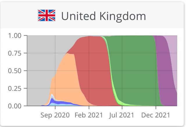
I found four other countries with similar trajectories: Switzerland, Vietnam, Jordan, and Monaco. In all of them, cases were rising just as in the UK, which is shown below:


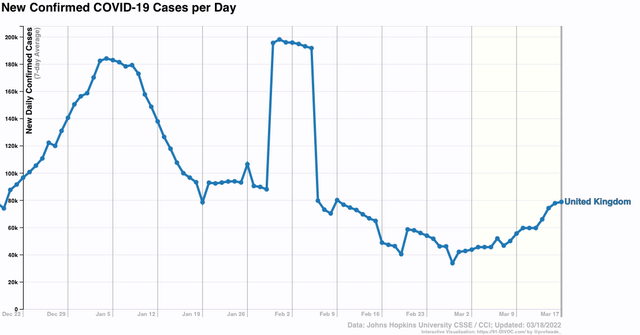
But in the past few days, the rate of increase in the UK week over week has declined from roughly 60% to 40%. If the UK follows the pattern of the close to 20 other countries I examined, then cases should peak in the UK within several weeks and, like original Omicron, decline sharply. 

Why have other countries in Europe experienced second Omicron waves, and what does it mean for the US? That is what I will take a look at in the second post on this topic.


Thursday, March 17, 2022

Housing permits and starts: still an economic positive - for the moment


 - by New Deal democrat

As you know, I consider housing, and in particular single family housing permits, one of the very best long leading indicators for the economy. In the past year, however, there has been a unique divergence between housing permits and housing starts, necessitating some adjustments. 

In the past year permits soared then sank, while starts held much more steady. The explanation for the divergence is the huge number of housing units for which permits have been taken out, but on which construction has not started. In February that metric increased again, to the highest such number since 1974:


There are simply a huge number of units that *could* be started, but haven’t, probably because of a shortage of some necessary materials.

With that in mind, let’s turn to total housing starts (blue), total permits (dark gray), and single family permits (red, right scale):


A close-up of the three series since just before the pandemic hit shows the pattern, discussed below, even better:


As you can see, there was a surge in permits one year ago, which then declined sharply. In January total permits rose again, to 1.895 million annualized, the highest number since  2006, before falling back slightly in February to 1.859 million. Single family permits also declined slightly to 1.207 million, vs. January 2021’s high of 1.268 million. Starts, by contrast, rose to 1.769 million, the highest monthly number, and highest 3 month average, since early 2006.

Since starts are the actual, hard economic activity, this indicates that housing is still a positive for the economy looking out ahead 12 months.

A big surge in housing permits in the face of rising mortgage rates, at least initially, is not really a surprise. The same thing happened several times in the past decade, notably in early 2014 and 2016, as potential buyers rush to close before rates climb even higher. Housing starts and single family permits (blue and red below, /10 for scale) does follow mortgage rates (inverted, gold), but with a 3 to 6 month lag as shown in the graph of the YoY% change in each for the past 10 years, which I have run many times in the past:


Last month I wrote that “after this surge, which may persist another month or so, I fully expect housing starts and permits to decline, and substantially, in accord with the big increase in mortgage rates to over 4%, about 1.3% above their 2021 lows.” The surge did persist, and I still expect a substantial decline in housing starts and permits in the months ahead. Some daily mortgage indexes already show rates around 4.5%. Much beyond that would likely put housing into a recessionary range later this year.

Industrial production nowcasts that the economy continues to perform well


 - by New Deal democrat


Industrial production increased in February by 0.5%, its highest reading ever with the exception of two months in 2014, and the second half of 2018. Manufacturing production  increased 1.2%, also its highest ever with the exception of 24 months from late 2006 through early 2008:


Of course, considering population and GDP growth in the past 15 years, this is hardly spectacular to say the least.

The YoY% comparison shows a big jump, but that is all because of the comparison with last February’s Big Texas Freeze:


If we take out last February, and instead compare with last March, the YoY gains are 4.5% and 4.2%, respectively, which is still solid and in line with the trend over most of the past year. 

The bottom line is that, Industrial production, the pre-eminent coincident indicator, is continuing to nowcast that the production side of the economy is performing well.

Yet another new 50+ year low in continuing jobless claims


 - by New Deal democrat

After 3 days of a data desert, today there is a cornucopia of data: not just initial claims, but housing starts and permits, and industrial production as well. On top of that, a large stretch of the yield curve in the bond market is close to inverting after yesterday’s Fed rate hike. I’ll report on housing and production later; below is the read on new and continuing jobless claims.

Initial claims (blue) declined 15,000 to 214,000 (vs. the pandemic low of 188,000 on December 4). The 4 week average (red) declined 8750 to 223,000 (vs. the pandemic low of 199,750 on December 25). Continuing claims (gold, right scale) declined 71,000 to  1,419,000, which is not only a new pandemic low, but also the the lowest number in over 50 years:

The temporary increase in claims due to Omicron has ended, but I still thin we have probably seen the lows in initial claims for this expansion. But with continuing claims continuing at 50 year+ lows, the record tightness in the jobs market isn’t going away. The number of jobs available relative to the number of applicants will remain tight, meaning there will be continuing upward pressure on wages.


Wednesday, March 16, 2022

Real retail sales for February: not recessionary, but not healthy either


 - by New Deal democrat

Let’s take a look at the February update for one of my favorite indicators, real retail sales. 

For the past few months, I have suspected that a sharp deceleration beginning with the consumer sector of the economy was more likely than not. At the moment, the verdict on that forecast is mixed.

In February, nominal retail sales rose +0.3%. Since consumer inflation rose 0.8%, real retail sales declined -0.5%. Further, they are down -1.8% from last April’s peak, although they are up 0.3% from last May (using that month because March and April were the stimulus months): 


On a YoY basis, real sales are up 9.0%, an increase since last month - but entirely due to the comparison with the decline during the Big Texas Freeze last February. Over the long term this is a very good number:


The big takeaway from the above is that, as shown in the first graph above, real retail sales have been esssentially flat beginning last May. That’s not recessionary, but it’s not good either. In other words, this report remains consistent with a slowdown in the consumer sector of the economy.

Next, let’s turn to employment, because real retail sales are also a good short leading indicator for jobs.

As I have written many times over the past 10+ years, real retail sales YoY/2 has a good record of leading jobs YoY with a lead time of about 3 to 6 months. That’s because demand for goods and services leads for the need to hire employees to fill that demand.  The exceptions have been right after the 2001 and 2008 recessions, when it took jobs longer to catch up, as shown in the graph below, which takes us up to February 2020:


Now here is the same graph since just before the pandemic hit:


In February the two returned to their recent near-perfect sync, at roughly +4.5% YoY. With real retail sales essentially flat for the last 9 months, and down compared with last March and April, I expect the string of monthly jobs reports averaging 500,000 or more will end in several more months. Whether we get a negative print at some point in spring or early summer will depend on whether sales continue to go sideways, improve, or deteriorate.

Finally, real retail sales per capita is one of my long leading indicators. Here’s what it looks like for the past 30 years:


These are down -2.6% since last April, and down -0.5% since last May, this remains a negative signal, and continues to reinforce the long leading forecast of a stall or near-stall in the economy by about the end of this year.


Tuesday, March 15, 2022

Today’s lesson: never simply project the current trend forward


 - by New Deal democrat

An important reason why I am so insistent on dividing data into long leading, short leading, and coincident indicators is in order to avoid the most common pitfall in any forecasting, which is that of projecting the current trend forward.


This morning PPI for February was reported. Frequently - but not always! - commodity prices lead producer prices, which in turn lead consumer prices.

The story in February for both commodity and producer prices is that of strong continuing demand that has neither strengthened nor weakened. Commodity prices increased 3.0% in the month, while final demand producer prices increased 0.8%. Both of these measures are essentially on trend from the past 6-12 months at +20.1% YoY and +10.1% YoY, respectively:


But when it comes to one commodity of some modest interest to consumers, the price of gas, those projecting the hyperbolic trajectory forward have gotten something of a rude awakening in the past day, as spot oil prices declined sharply, from over $130/barrel to $95.88/barrel as I type this:


Will prices continue on trend, or whipsaw again higher? Nobody really knows! But if you had simply projected the recent sharp increase forward, as of this morning you were really wrong.

Oil prices lead gas prices at the pump by several weeks, and in the past week the latter appear to have at least stabilized:


If oil prices don’t whipsaw higher again in the next few days, you can expect gas prices at the pump to go back down below $4/gallon in the next couple of weeks.

Never simply project the current trend forward.