Saturday, May 9, 2020

NY may have a much more severe problem than the infections data has shown


 - by New Deal democrat

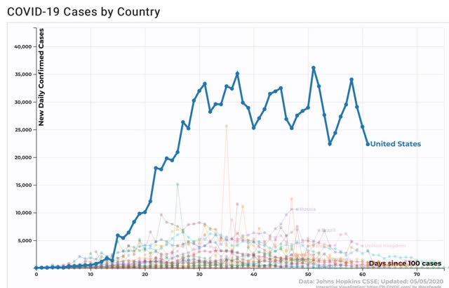
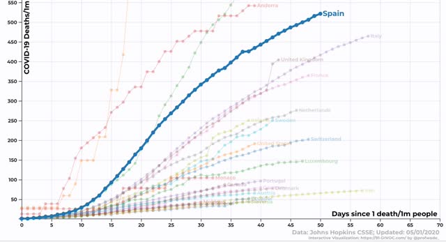
A few days ago I wrote in agreement with Nate Silver’s point that the increased number of coronavirus cases outside of the NYC metropolitan area might mainly be due to higher numbers of tests being conducted - and therefore finding more cases.

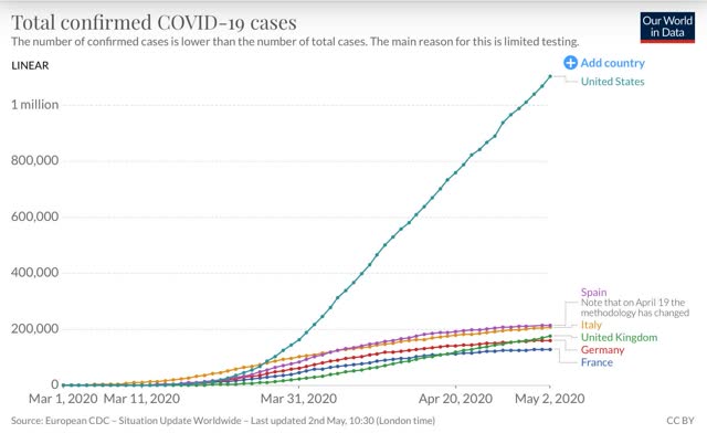
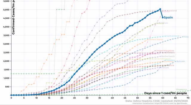
Here’s a graph that I used then to illustrate the underlying narrative: more cases outside of NY vs. fewer cases in the NY metro: 


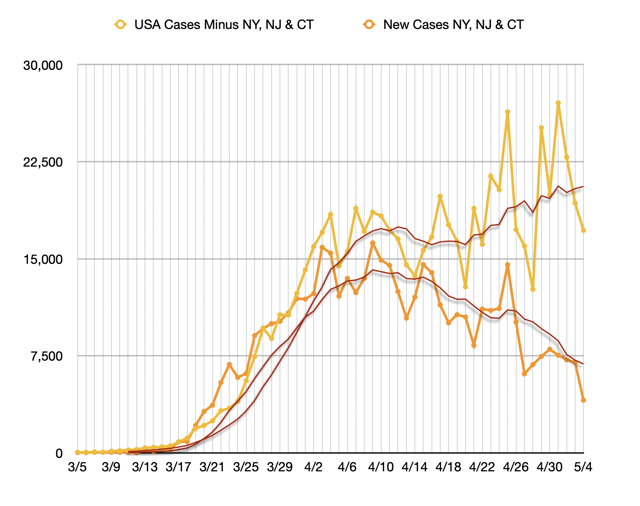
I still think Nate is correct. I also still want NY to “crush the curve” in order to serve as an example to other States, but a subsequent graph causes me to wonder if NY has been in even more dire straits than we previously imagined.

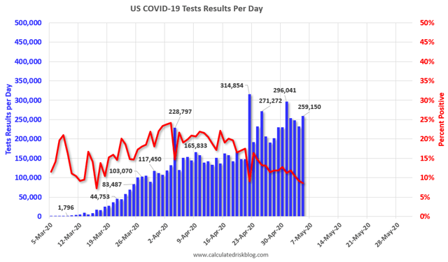
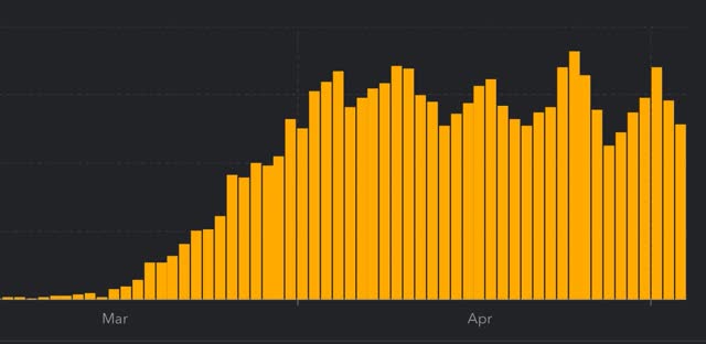
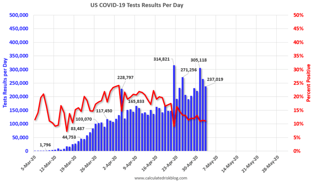
Let me start with the daily graph of total tests (bars) and the percent of positive tests compared with total tests (red line) that I have been running in all of my Coronavirus Dashboards:


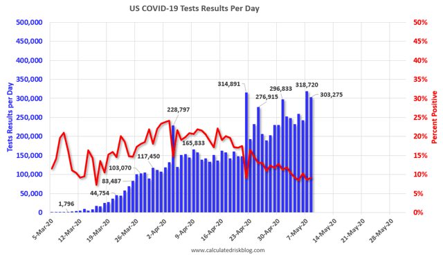
Recall that back in late March and the early part of April, when positive test results were about 20% of the total, we were concerned that we weren’t testing nearly enough, and as a result were missing a lot of cases.

Now here is a graph that shows the same above data by showing new positive test results as a percent of all tests conducted, but divided between NY,NJ&CT and all other States:


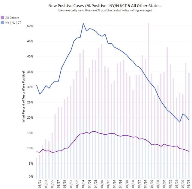
Outside of the NYC metro area, positive results have declined from about 16% to 9% from their peak to the most recent data. At this rate, while we are undoubtedly still missing some cases, the situation isn’t nearly so bad as before.

But now look again at the three NYC metro States: there, positive results have declined from just over 50% to just under 20% - the same percentage, 20%, at which we thought we were missing an awful lot of cases nationwide. Just imagine how many cases must have been missed when 50% of all tests administered in NY were coming back positive!

Further, if the rate of positives in the NYC metro area were 9%, just like the rest of the country, we’d see a lot more cases. Remember that in NY, testing has only increased a little over 20% in the past month, while in the rest of the country it has increased about 65%. If NY’s testing had also increased 65%, how many more cases in NY would we see. Probably (unfortunately) lots!

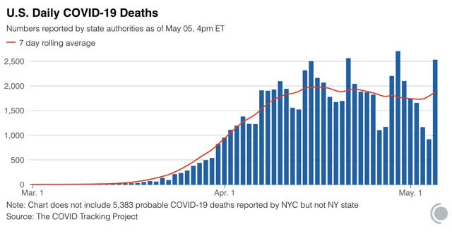
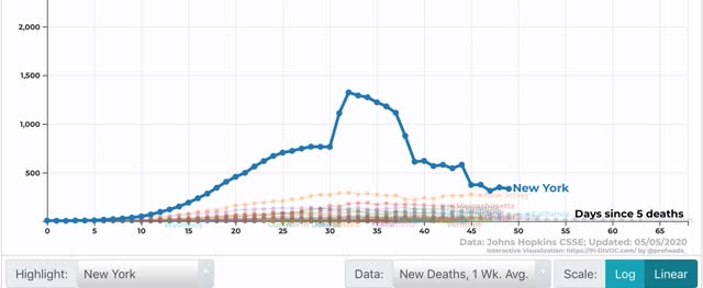
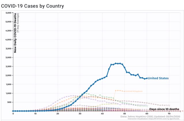
I suspect that the number of cases in NY did decline gigantically in the past month. The latest graph shows close to a 70% decline:

 
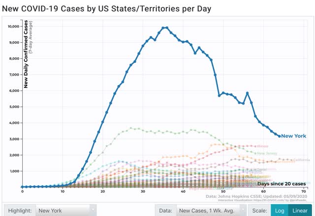
But I suspect that the true number of NY cases, now but even moreso a month ago, was relatively speaking much higher than what the first graph above shows - think maybe tripling the number a month ago, and doubling it now. NY would still be in decline relative to other States - but it would be from a much higher platform.

Weekly Indicators for May 4 - 8 at Seeking Alpha


 - by New Deal democrat

My Weekly Indicators post is up at Seeking Alpha.

I have added the calculations for the worst YoY readings since April 1.

We now have one full month of comparisons since then, to use as a baseline. Next week, when the actual May numbers come in, we will be in much better shape to do month over month and YoY comparisons. This will enable us to see if and when we have reached the bottom, or whether like ripples in a pond, the second order economic effects are continuing to spread out. I strongly suspect there will be a period of the latter before we get inklings of the former.

In any event, as usual clicking over and reading helps reward me a little bit for the efforts I put in to this reporting.

Friday, May 8, 2020

Infections in US States by population density


 - by New Deal democrat

Since COVID-19 is a communicable disease, it should hardly be a surprise that the most densely populated States have the most cases per capita, and conversely the least densely States have the least cases.  But since that basic point is lost in a lot of the analysis, let’s take a look.

Below are two charts consisting of the 12 most and least densely populated States, their respective population densities, and several measures of coronavirus infections.

The first column gives the rank of the State based on the total number of infections recorded since the start of the pandemic. The second column gives their rank per capita over time since the start of the pandemic. Finally, the third column gives their rank per capita based on infections just over the past week:

State Population
Density
(Per Sq. Mile)
Total #
Infections
(Rank) 
Infections
Per capita
(Rank)
1 week
Infections
Per capita
NJ1208222
RI10102141
MA867333
CT741956
MD61412108
DE4843389
NY419117
FL37682837
PA28661214
OH284142726
CA25153231
IL2314295


 On a per capita basis, the data closely fits these States ranks in population density, with three noteworthy outliers: Florida, Ohio, and California. Florida has been rumored to have been massaging their data, but those issues do not pertain to the other two.

State Population
Density
(Sq. Mile)
Total #
Infections
(Rank) 
Infections
Per capita
(Rank)
1 week
Infections
Per capita
OR42394745
UT36353029
KS36312211
NV26342635
NE2530134
ID20414144
NM17402319
SD11401623
ND11433125
MT7495050
WY6474341
AK1504848


Among the most sparsely populated States, only four are ranked in the top half of States in infections per capita since the outset of the pandemic (Kansas, Nebraska, New Mexico, and South Dakota). A fifth State joins those four among the States with the most infections in the past week (North Dakota). Nebraska in particular is a very poor outlier.

{By the way, the State ranked 49th in per capita number of infections, both over time and in the last week, is Hawaii, which is the 13th most densely populated State but has the obvious advantage of consisting of islands!}.

As I’ve already suggested, Alaska, Hawaii, Wyoming, Montana, and perhaps Idaho are States that could implement a regimen of testing, tracing, and isolating to maintain a containment of the virus. They are 4 of the 11 States that have had less than 10 deaths per day from the virus.  

By contrast, Nebraska, Kansas, and Iowa (#9 for per capita infections in the past week) are among the States that have lifted their “stay at home” orders, as shown on the map below:


The main takeaway is simply how hard it is to prevent this virus from spreading in a densely populated area without a strictly adhered to program of quarantining and mask-wearing (as, e.g., performed in Taiwan and Hong Kong). Even New York, which has made the most dramatic progress, has only fallen to #7 in new infections per capita in the last week.

April jobs report: disastrous, but not as cataclysmic as feared; lower paid part time workers take the biggest hit


 - by New Deal democrat

HEADLINES:
  • -20.5 million jobs lost. Between March and April this is a loss of 14.0% of all jobs since February.
  • U3 unemployment rate up 10.3% from 4.4% to 14.7%
  • U6 underemployment rate rose 14.1% from 8.7% to 22.8%
  • February and March were both revised downward, by -45,000 and -169,000 respectively, for a net decline of -214,000 jobs from previous reports.
Leading employment indicators of a slowdown or recession

I am still highlighting these because of their leading nature for the economy overall.  These were uniformly very negative: 
  • the average manufacturing workweek fell -2.1 hours from 40.4 to 38.3 hours. This is one of the 10 components of the LEI and will be a big negative.
  • Manufacturing jobs fell by 1.3 million. Manufacturing has lost 1.364 million  jobs in the past 2 months.
  • construction jobs fell by -975,000. In the past 2 months 1.08 million construction jobs have been lost.
  • Residential construction jobs, which are even more leading,  declined by -117,600. In the past two months together there have been -119,200 lost jobs.
  • temporary jobs declined by -842,000. 
  • the number of people unemployed for 5 weeks or less rose by 14.3 million.
  • Professional and business employment fell by -2.128 million, or -10.0% for the month.

Wages of non-managerial workers

Here are wages in the past year:
  • Average Hourly Earnings for Production and Nonsupervisory Personnel: ROSE $1.04 from $24.08 to $25.12 (up 4.3% in one month).

Aggregate hours and wages:
  • the index of aggregate hours worked for non-managerial workers fell by -16.9%. In the past 2 months combined this has fallen -18.4%.
  •  the index of aggregate payrolls for non-managerial workers fell by -13.3%. In the past 2 months combined this has fallen -14.4%.  

Other significant data:
  • Full time jobs were responsible for -15.0 million of the losses
  • Part time jobs were responsible for -7.4 million of the losses.
  • The number of job holders who were part time for economic reasons increased   By 5.122 million to 10.887 million. The total increase since February has been  6.564 million.
  • Temporary layoffs were 18.063 million
  • Permanent layoffs were -544,000

SUMMARY

This report was generated from data during the week of April 13, after a solid month of coronavirus impact. Note that since then layoffs have continued although not at the rate of early in April. But it nevertheless sets a baseline against which further impacts, both  temporary and more permanent, from the crisis can be measured.

The declines, while awful, were less than what was suggested by initial jobless claims. My suspicion is that the losses will be revised even more worse. The unemployment rate is the worst wince World War 2, but has not yet reached Great Depression levels.

The most marginal employees were the worst affected. A disproportionate number of part time employees (about 1/3rd vs. constituting  17% of all employees in February) were laid off. Another 5 million of full time employees were demoted to part time work. As a result, hours declined more than wages.

On that score, because I have seen many reports of wage cuts, I have been very curious what this report would show about wages. What this report showed is that is has been lower wage workers who have taken the brunt of layoffs so far. Professional and business employment, by contrast, also declined substantially, but not as much as non-office work.

Because, relatively speaking, higher paid employees suffered fewer layoffs, average hourly wages actually increased by 4.3% just in this past month, dwarfing any effect of wage cuts.

Because the last thing I expect is a V-shaped quick recovery in jobs, I anticipate that this will set a baseline. Whenever layoffs level off, I expect we will see that wages have indeed suffered. But we might have to wait for the Q2 Employment Cost Index (which measures wages per job category) to find that out.

Thursday, May 7, 2020

Initial jobless claims continue to be (less) horrible


 - by New Deal democrat

On a seasonally adjusted basis, initial jobless claims last week declined to 3.169 million. That brings the total number of new jobless claims over the past 7 weeks since the coronavirus crisis started to 33.5 million. Because seasonal adjustments are probably distorting the actual numbers substantially, I am including those in the below graph in red as well. They totaled 29.9 million in the past 7 weeks:


We know that many people had been unable to file due to State systems being overloaded or obtuse. It is not clear how many are still unable, or have given up trying, but it is likely that the total number is significantly higher.

Continuing claims, with a one week delay, rose to 22.647 million:


Now that we have a solid month of initial claims since the coronavirus crisis hit, we will have a basis on which to compare month/month levels to see if they are bottoming, rebounding, or continuing to worsen. 

In particular, it is likely that from here on out, new initial claims are likely to represent “second order effects” of the virus. In other words, the shutdowns in some sectors of the economy will likely lead to a collapse in demand for some products and services in other sectors not directly affected (e.g., layoffs in the media because advertising revenue has dried up).

In the meantime, tomorrow we will get an absolutely horrible jobs number.

Wednesday, May 6, 2020

Have the number of coronavirus cases outside of NY really been rising?


 - by New Deal democrat

Aside from a few sparsely populated rural States and the islands of Hawaii, it’s clear that New York State has by far the best record for a decline in the number of coronavirus cases and deaths, with roughly a 60% decline in new cases in the past 3 weeks.

But have the number of new cases outside of NY actually risen? A number of commentators over the past week or so say they have. Here’s a good graph of that metric I saw yesterday:


The above graph indicates that the number of new cases outside of the NY metro area has been rising by about 25% over the past 3 weeks.

Yesterday Nate Silver criticized this line of thought, arguing that it is “penalizing” all those other States for conducting more tests. His point is well taken.

Let me explain below.

Here is the graph of the number of new tests nationwide from the COVID Tracking Project:


There have been two broad plateaus in the number of tests daily during the past month: April 9 through April 19, at about 135,000/day,  and from April 24 to the present, at about 235,000/day. Below I break out, from data from the Tracking Project, tests and positives from NY, the US as a whole, and the US ex-NY for each of those two periods:

Tests:
Date              US.           NY.             US ex-NY
4/9-19     1,487,431     226,006.    1,261,425
4/24-5/4 2,359,197.    276,655.    2,082,542
%increase: +58.6%.     +22.4%.        +65.1%

Positive:
Date.             US.          NY.             US ex-NY
4/9-19.      293,337.    82,849.    210,488
4/24-5/4.  276,363.    47,363.    229,000
%in/decrease: -5.8%   -42.8%.    +8.8%

For both NY and the US as a whole, between the two periods testing has increased strongly, and the absolute number of new cases found by those tests has declined. [Note: Including NJ and CT with NY in the above calculations would not materially change the result. I put them with the rest of the US for ease of calculation.]

When we remove NY from the equation, we find that for the rest of the US, total cases have gone up 8.8%. But the testing that found those new cases went up by 65.1% !

Another way to look at this is that for the US ex-NY, during the period of April 9-19, positive tests were 16.7% of the total (i.e., 210,488/1,261,425). But the additional 821,117 tests only found an additional 19,488 cases, or a rate of 2.4% of the increased total.

This big drop-off, from a 16.7% positivity rate, to a 2.4% positivity rate of the increase, argues very strongly that the big increase in testing is only finding a few new cases. In other words, HAD WE BEEN TESTING AT THE SAME RATE FROM APRIL 9 TO 19, WE WOULD HAVE FOUND MANY MORE CASES THAN REPORTED.

How many? If we had been administering 2,082,542 tests back in mid-April instead of 1,261,425 and had 16.7% positives, we would have found 347,516 total cases, not 210,488, i.e., 66% more than what we actually found then. 

But let’s make a more reasonable assumption: that back in mid-April, we were testing only people who really seemed to fit the description of those who were infected, and not even all of them, whereas now we can cast the net wider - which means finding a higher proposition of negative results. Let’s say that, had we been able to test back in mid-April by the amount we are now, the positive rate would have declined by half, from 16.7% positives, to 8.35% positives among just the additional number of tests. 

That would give have given us a result of 279,002 positives during April 9-19, rather than the 210,488 we actually found. Comparing that with the 229,000 from April 24-May 4 gives us a decline of -17.9% in cases outside of NY during that time period.

The actual drop-off from 16.7% to 2.4% of positive results among the increased tests was a decline of 85% (i.e., 2.4/16.7). That seems extremely unlikely.

In short, it is very likely that, even leaving out NY, the rest of the US did see a real, and significant, decline in new coronavirus cases from peak in the past 2 weeks. That decline has simply been dwarfed by the much more significant decline of cases in NY.

Coronavirus dashboard for May 6: testing close to crucial threshold


 - by New Deal democrat

Here is the update through yesterday (May 5). 

As usual, significant developments are in italics. The bottom line is the same as several days ago: trends in new infections, deaths, and in testing have all turned positive - if not positive enough. But the good news remains primarily a NY story.

I have discontinued giving the % increases day/day in infections and deaths. They were included when important to determine if the US was “bending the curve.” The two. issues now are (1) whether any States (beyond the least populated rural or isolated States) can “crush the curve;” and, sadly, (2) whether those States that have “reopened” see a renewed increase in the growth of cases and deaths - and whether customers in those States largely stay away from the reopened businesses. 

Number of new and total reported Infections (from Johns Hopkins via arcgis.com and 91-divoc.com):
  • Number: 23,841, total 1,204,475 (vs. day/day high of +36,161 on April 24)

There has been a significant decrease in the number of new cases in the US. The US nevertheless has the worst record in the world, by far.
Number of deaths and infections and rate of increase of testing (from COVID Tracking Project)
  • ***Number of deaths: 2,527, total 65,307 (vs. day/day peak of +2,700 April 29)
  • Seven day average of deaths:1,826 (vs. 2,058 peak on April 21)
  •  
  • Number of tests: 259,150 (vs. 305,118 daily peak on May 1*)
  • Ratio of positive tests to total: 11.6:1 (new high - target is 15:1)

  • Below is a good graph comparing cumulative testing rates for the US vs. other European and Asian countries. Note that for Germany and Italy, cases started to decline once the rate hit 0.5% of the population per week. In the past week, the US has tested slightly over 0.5% of its population:

In the past three weeks, as shown in the graph above, the percentage of positive to total tests has declined from about 20% to 9%. At this rate, within 10 days we should be at 6%, which, based on the history of South Korea, lockdowns can begin to be judiciously lifted and a thoroughgoing regimen of “test, trace, and isolate” can be begun. 
 *ex.-Calif clearing its backlog

Summary for May 6
  • The number of daily new infections, adjusted for testing, appears to have peaked two to three weeks ago.
  • The number of daily new deaths also appears to have peaked about 2 weeks ago.
  • The trend number of daily tests has improved dramatically in the past 2 weeks from an average of about 150,000-160,000 to about 250,000. Better still, for the last 10 days, new infections have declined, even with higher testing - a very positive sign. 
  • My personal suspicion remains that the actual number of total infections in the US is about 5x the official number, or roughly 6 million at present. In NY, serological studies suggested that the actual number is about 10x larger than diagnosed infections, which would be about 12 million nationwide.
  • Comparing those States which remain in lockdown vs. those that are “reopening” is the main task going forward.

Tuesday, May 5, 2020

The humans always observe back: why I am rooting for NY to “crush the curve”


 - by New Deal democrat

So, in addition to a bunch of States in the Confederacy and a few in the high plains deciding that May 1 was the Day of Virus Jubilee, yesterday saw further discouraging news that not one but two epidemiological models drastically increased their estimates of deaths, while there was another revelation that Trump and the White House were relying on a “cubic” model devised by Kevin Hassett of “Dow 36,000” infamy, showing death abruptly declining to zero by about May 15.

First came the CDC model, that shows deaths beginning to increase exponentially again after May 14 (not coincidentally, two weeks after the Day of Virus Jubilee): 


Then, the IHME, whose model had only recently forecast 60,000 total deaths from the virus, and as recently as a week ago showed deaths declining to *0* by June 1, revised the model to show instead a gradual tapering off of deaths throughout the summer, with a total death toll of 135,000:


IHME director, Dr. Christopher Murray confirmed to Anderson Cooper last night that the change was indeed made because of the Day of Virus Jubilee.

Finally, Nate Silver and Matt Yglesias, among others, were quickly able to figure out that Hassett’s “cubic” model (and probably the IHME’s old model as well) were relying on a third order polynomial function that in Hassett’s case was probably designed to give the most sunny outcome desired by Trump. Here’s Silver’s work:


Silver said it took him “about 45 seconds” to figure this out.

Which brings me back to a point I have made before: when you publicly observe human behavior, the humans always observe back, and change their behavior based on the results of your observations. 

That appears to be what happened with the IHME’s original model. As Andy Slavitt observed, he discovered when he interviewed Dr. Murray four weeks ago, it made a bunch of optimistic assumptions, including that full social distancing would be observed through the end of May:


Trump, among others, immediately seized upon the IHME model to claim that the pandemic wasn’t nearly going to be as bad as people feared, and that the very social distancing steps taken to contain it were overreacting. This in turn led Trump, some Chamber of Commerce types, and some RW astroturfers to foment the “LIBERATE” demonstrations, which all together resulted in compliant Trumpist governors in the Confederacy to roll over.

Now the IHME and the CDC have taken into account this twist in the human behavior and seriously altered their models. We can expect, if the reality in the States which have “reopened” begins to match what the revised models show, that the humans will change their behavior again in response.

This is the dynamic I had in mind several weeks ago when I wrote that the US was on an actual trajectory of “flattening the curve” - almost all of the deaths happen, they just happen at a slower pace that doesn’t overwhelm medical resources - at least until next January (if a new President should be taking office).

Which brings me to New York.

By way of introduction, let me show you the trajectories in deaths of 3 big Western European countries all of which have endured pretty bad outbreaks.

First, Italy, which was one of the first countries hit hard back in early March:


Next, France:


Finally, Spain, which on a per capita basis has the worst record of any of the major counties in Western Europe:


All three are down more than 50% from their peaks: Italy, -63% 32 days after peak; France, -73% 26 days after peak; Spain, -69% 31 days after peak.

Now let me show you New York State:


New York is down -57% 21 days after peak - and I am not counting the 2 day surge in the middle of April that were the result of adding in some cases not previously entered.

Quite simply, New York State is on a downward trajectory better than that of Italy or Spain, and close to that of France.  New York is on track to “crush the curve” within the next 4 weeks.

I am rooting for New York to succeed, precisely because, when you observe a successful human behavior, the humans always observe back, and many of those who have not been successful will alter their behavior to emulate the success.

In other words, if New York, a State of 18 million people, succeeds where almost all the other States have failed, there is going to be a mad rush by many of the governors to ape NY’s methods - if not of their own accord, then to stay ahead of the torches and pitchforks of their citizenry. And that could lead to a better outcome than the alternative, a dispirited flattening of the curve for the next 8 months. 

Monday, May 4, 2020

A note about the weekly and monthly economic data


 - by New Deal democrat

For the past month or so, with the exception of the weekly catastrophe of new jobless claims it hasn’t been very important to keep track of the economic data. Now that it is May, that will start to change with the weekly data as of next week (reporting on this week). The monthly data fo May, of course, won’t be reported for until June starts.

That’s because the month of April was fully involved in the pandemic crisis. So with the month over month May data we will be able to see if the economy is beginning to stabilize at a lower level, sink even further as more second-order effects ripple out from the epicenter, or perhaps even rebound.

With the exception of finding out what happened to wages during April (because of all of the reports of wage cuts), even this Friday’s employment report, while surely catastrophic, won’t be that important looking forward. 

The only monthly data from April that has been reported recently of note is that comparing personal income and spending (which was released last Thursday).

The personal saving rate skyrocketed by over 60% compared with February:


That’s because, while personal income declined by -2.0%, personal spending declined even more, by -7.5%:


Part of that was simply that staying home, and the closure of dining and entertainment venues meant less opportunity to spend. But part was also the desire to hold onto savings in view of the dire short-term economic outlook.  This is Keynes’s “paradox of thrift” in action. Wanting to insulate oneself from economic harm makes sense. But when everyone does it at once, as frequently happens during recessions, it necessarily means a downturn in consumer demand. And it is consumer demand which drives most of the economy.

What we are going to find out this month in those States which have “reopened” their economies, is the answer to “if you open it, will they come?” I strongly suspect that the answer to that is “no,” but we will see.

Coronavirus dashboard for May 4: new infections, deaths continue slow decline


 - by New Deal democrat

Here is the update through yesterday (May 3).

As usual, significant developments are in italics. The bottom line is the same as several days ago: trends in new infections, deaths, and in testing have all turned positive - if not positive enough. But the good news remains primarily a NY story.

I have discontinued giving the % increases day/day in infections and deaths. They were included when important to determine if the US was “bending the curve.” The two issues now are (1) whether any States (beyond the least populated rural or isolated States) can “crush the curve;” and, sadly, (2) whether those States that have “reopened” see a renewed increase in the growth of cases and deaths - and whether customers in those States largely stay away from the reopened businesses. 

Number of new and total reported Infections (from Johns Hopkins via arcgis.com and 91-divoc.com):
  • Number: 25,272, total 1,158,341 (vs. day/day high of +36,161 on April 24)

There has been a slight decrease in the number of new cases in the US. The US has the worst record in the world, by far, with no sign of any big decrease.
Number of deaths and infections and rate of increase of testing (from COVID Tracking Project)
  • ***Number of deaths: 1,158, total 61,868 (vs. day/day peak of +2,700 April 29)
  •  
  • Seven day average of deaths:1,815 (vs. 2,058 peak on April 21)

  • Number of tests: 237,019 (vs. 305,118 daily peak on May 1*)
  • Ratio of positive tests to total: 9.0:1 (vs. 9.1:1 high on May 1)

In the past three weeks, as shown in the graph above, the percentage of positive to total tests has declined from about 20% to 11%. If this percentage were to fall to 6%, then based on the history of South Korea, lockdowns can begin to be judiciously lifted and a thoroughgoing regimen of “test, trace, and isolate” can be begun. Four small States are in that range now (but none have the tracing or isolation regimen in place).
 *ex.-Calif clearing its backlog

Summary for May 4
  • The number of daily new infections, adjusted for testing, appears to have peaked two to three weeks ago.
  • The number of daily new deaths also appears to have peaked about 10 days ago.
  • The trend number of daily tests has improved dramatically in the past 11 days from an average of about 150,000-160,000 to about 230,000. Better still, for the last 8 days, new infections have declined, even with higher testing - a very positive sign. 
  • My personal suspicion remains that the actual number of total infections in the US is about 5x the official number, or roughly 5.8 million at present. In NY, serological studies suggested that the actual number is about 10x larger than diagnosed infections. That would support at total number of infected in the US  of 11.6 million, or 3.5% of the population.
  • I am working on a separation of those States which remain in lockdown vs. those that are “reopening” so that I can track differential new infections and deaths for the two categories. 

Sunday, May 3, 2020

Comparing the US’s coronavirus response with its Western European peer group


 - by New Deal democrat

Western Europe is a reasonable peer group of countries against which to compare the US response to coronavirus. The 5 largest countries in Western Europe in particular - in order, Germany, the UK, France, Italy, and Spain - together have a population of about 324 million, vs. 332 million for the US. 

So let’s take a look at this peer group of European States vs. the United States in terms of cases, deaths, and testing.

One significant difference is that Italy was among the first countries struck in force by the pandemic. In early March it was common to note that the US was “two weeks behind Italy” in the number of cases. The other four all saw their pandemics start a few days to one week ahead of the US. To accomodate that, the below calculations compare each country 58 days after they reached 100 cases nationwide.

As of yesterday, according the Covid Tracking Project, the US had 1,104,161 cases, or 18.7% more than the 5 big Western European States, which had a combined total of 930,231:


When we look at cases per 1 million people, the US is closer to the middle of the pack. In the graph below, aside from city-States like Andorra and San Marino, the US had fewer cases per capita than Spain, and slightly fewer than Italy, but more than the UK, France, or Germany. It also had fewer than Iceland, Belgium and Switzerland, but is on track to overtake Switzerland and Italy within the next few days [NOTE:  the two graphs below highlight Spain, which has the worst record among the 5 Western European countries. The US is shown in tan]: 


When we look at deaths per million, the US fares better. Among the 5 major States of  Western Europe, only Germany has fewer deaths per million:


Germany has only 6,736 deaths, or less than 1 per 10,000 people, a stellar record. This is a tribute to the level of care rendered by the US medical system (note I said “level of care,” not the system itself).

Finally, turning to testing, the US had been languishing near the bottom of the pack, but with the big increase of the last 10 days, it is now closer to the middle of the pack, although it is still below the median:


Note that several places, in particular South Korea and Taiwan, which “crushed the curve” early, have recently had less need for testing.

In summary, compared with its peer group in Western Europe, the US does better than every major country except Germany in terms of care rendered to patients infected by coronavirus, but lags considerably against the better countries in terms of testing, and is among the worst countries for preventing the overall spread of the disease among the population.