Saturday, June 16, 2012
Weekly Indicators: on the cusp of contraction edition
- by New Deal democrat
The monthly data released this past week was almost all poor. Real retail sales were up slightly, but only because consumer prices decreased more than nominal sales. Producer prices declined sharply. Industrial production and capacity utilization were down. Consumer sentiment declined.
The high frequency weekly indicators this week generally are in agreement with the poor monthly reports, although there are significant areas that are positive. Let's start with those and progress to the most negative.
Housing reports are the best they have ever been for as long as I have been preparing this weekly summary:
The Mortgage Bankers' Association reported that the seasonally adjusted Purchase Index rose 12.8% from the prior week, and was up 4% YoY. The Refinance Index rose 19.2%. Refinancing is at a 3 year high, and purchase mortgages are at the top of their two year range.
The Federal Reserve Bank's weekly H8 report of real estate loans, which had been negative YoY for 4 years, turned positive over two months ago. This week, real estate loans held at commercial banks rose +0.2%, and their YoY comparison improved to +1.2%. On a seasonally adjusted basis, these bottomed in September and remain up +1.5%.
YoY weekly median asking house prices from 54 metropolitan areas at Housing Tracker were up + 2.1% from a year ago. YoY asking prices have been positive for over 6 months, are higher than at any point last year, and at their maximum seasonal point on a seasonally adjusted basis. Barring the appearance of the long-in-coming foreclosure tsunami (which, per Calculated Risk, may only occur in judicial states and be counterbalanced by the winding down of foreclosures in non-judicial states, which never had any delays), the bottom in prices is here.
Same Store Sales continue to be positive.
The ICSC reported that same store sales for the week ending June 2 fell -0.7% w/w, but were up +2.9% YoY. Johnson Redbook reported a 2.0% YoY gain. Shoppertrak did not report. The 14 day average of Gallup daily consumer spending at $71 was equal to last year's average on this date. I am struggling with how best to report Gallup's numbers, which tend to ebb and flow over 3 to 5 week periods. Average spending over 14 days peaked two weeks ago at $78, which is considerably above any number in spring 2011, while we are at a peak in last year's numbers. Unless there is a continuing poor comparison in these numbers, I am not concerned.
The energy choke collar continues to disengage:
Gasoline prices fell for the eighth straight week, down another .04 to $3.57. Oil prices per barrel finished flat at $84. Oil has only been less expensive for about 1 in the last 12 months. Oil prices are now well below the point where they can be expected to exert a constricting influence on the economy, and gasoline is following. The 4 week average of Gasoline usage, at 8836 M gallons vs. 9247 M a year ago, was off -4.4%. For the week, 9130 M gallons were used vs. 9370 M a year ago, for a decline of -2.6%. Although this week was off, generally gasoline usage is moving to parity with the reduced levels that began to be established one year ago.
Money supply was generally mixed to positive:
M1 increased +0.4% last week, and also rose +0.1% month over month. Its YoY growth fell to +15.4%, so Real M1 is up 13.7%. YoY. M2 fell -0.1% for the week, and was flat month over month. Its YoY growth eased to +9.3%, so Real M2 increased to +7.6%. Real money supply indicators continue to be strong positives on a YoY basis, and after slowing earlier this year, are increasing again.
Employment related indicators again were strongly contradictory:
While the Daily Treasury Statement was positive, showing $67.0B vs. $65.6B for the first 10 days of June, and for the last 20 reporting days, $124.4B was collected vs. $119.1B a year ago, an increase of $5.3B, or +4.3%...
Contrarily the Department of Labor reported that Initial jobless claims rose 6,000 to 386,000 last week. The four week average rose 4250 to 382,000. The rise in jobless claims is of concern, but there is still the question of whether there is a seasonal adjustment issue or whether something more ominous is going on.
Even worse, the American Staffing Association Index fell another point to 92. This is also a yellow flag. Any further renewed weakness must be viewed as a serious issue in the jobs market.
Rail traffic was also decidedly mixed:
The American Association of Railroads reported a +0.8% increase in total traffic YoY, or +4,100 cars. Non-intermodal traffic was negative again, down -5,000 cars, or -1.7% YoY. Excluding coal, this traffic was up +5,400 cars, but weakness has diffused into more types of loads, with 10 of 20 groups now negative YoY. Intermodal traffic, however, remained up 9,000 carloads, or +3.8%.
The worst domestic high frequency data was Bond prices and credit spreads:
Weekly BAA commercial bond rates increased by .02% to 5.03%. Yields on 10 year treasury bonds were flat at 1.61%. The credit spread between the two increased again to 3.42%, a 52 week high. The recent collapse in government bond yields screams of fear of deflation. An uptick in corporate yields begins to signal increasing fear of default. This pattern frequently occurs on the cusp of a recession.
The high frequency indicators for the global economy were also mixed to poor:
The TED spread fell 0.1 to 0.38, near the bottom of its recent 3 month range. This index remains slightly below its 2010 peak. The one month LIBOR rose 0.002 to 0.243. It is well below its 12 month peak set 3 months ago, remains below its 2010 peak, and has returned to its typical background reading of the last 3 years. It is interesting that neither of these two measures of fear have budged significantly with the annual May Europanic.
The Baltic Dry Index rose 47 from 877 to 924. It remains 254 points above its February 52 week low of 670. The Harpex Shipping Index fell slightly for the second straight week from 457 to 451, but is still up 76 from its February low of 375.
Finally, the JoC ECRI industrial commodities index continued to slide this week, down from 116.25 to 115.34. This is a 52 week low. This indicator appears to have more value as a measure of the global economy as a whole than the US economy.
The high frequency indicators were more negative last September than they are now, and of course that was the bottom. There are all sorts of signs that the world economy as a whole may be slipping into outright contraction. But the US is a continental sized economy that is still 20% or more of global GDP, and by no means is it a certainty that the US must follow vs. simply slowing down. Refinancing of debt at yet lower rates is soaring. Housing sales related data are all looking more positive. Consumers are still spending. Inflation has nearly fallen to the point where YoY real wages are at least holding steady. I suspect we are in the midst of a rough few months, and I continue to believe that watching consumer spending is the key.
---------
P.S. The summary final paragraph and the title are always the last two things I write. That is by design, to minimize my own cognitive bias while I report on the data, which is after all about 90% of the piece. It also means that if readers disagree about my conclusions, they are easy to strip out while keeping the up-to-the-week data useful to them. So I alternately have to laugh or sigh at some of the comments this piece gets when it is republished elsewhere (usually with a different title), by people who clearly can't see past their own ideological straightjackets long enough to simply read a piece that is by design about as exciting as watching paint dry.
From Bonddad: regarding credit spreads, note that the JNK and LQD corporate bond ETFs are starting to technically weaken, although they are by no means in or near a bear market.
Friday, June 15, 2012
Weekend Weimar, Beagle and Pitbull
It's that time of the week. NDD will be here tomorrow; I'll be back on Monday. Until then....


Why Are We Slowing Down?
In an article yesterday explaining why I switched from the WSJ to the Financial Times, I cited the FT's far more international orientation as a prime reason for the switch. With that in mind, consider this point from yesterday's statement from the Bank of Japan regarding interest rate policy:
1.) China is located at the center of Asian economic activity. Recently, they lowered their lending rate largely as result of weakening internal numbers. While these numbers still appear strong to a western observer (growth just over 8%), remember that China is trying to help over a billion people become middle class. To accomplish that goal, the economy needs to have a strong growth rate. Also consider that the news out of India has become darker over the last few months as well. A recent set of articles in the Economist highlighted the issues: a political system that is more or less unable to lead, thereby preventing the action on structural roadblocks to growth. The fact that two of the Asian tigers are slowing is rippling into other regions of the world, which leads to point number 2.
2.) The countries that supply the raw materials to these regions are now slowing. Australia recently lowered its interest rate by 25 BP in response to the slowing in Asia. A contributing factor to Brazil's slowdown is the decrease in exports to China. Other Asian economies that have a trade relationship with China are all experiencing a degree of slowdown, but not recession. Some of these countries (such as Brazil) were also experiencing strong price increases. The price increases are are starting to slow, but they are still above comfort levels.
3.) Russia has dropped off the news map of late. However, it emerged from the recession in far worse shape; it's annual growth rate for the duration of the recovery has been between 3.8% and 5%, which is a full 3% below its growth rate preceding the recession. This slower rate of growth makes Russia a far less impressive member of the BRIC list.
4.) The entire European continent is caught up in the debt story -- underneath which we're seeing some terrible economic numbers emerge. PMIs are now in recession territory, unemployment is increasing and interest rates for less than credit-worthy borrowers are rising. And, the overall credit situation is casting a pall over the continent, freezing expansion plans.
5.) The US economy has experienced 2-3 months of declining numbers. While we're not in recession territory yet, we are clearly in a slowdown with growth probably hovering around the 0% mark.
The EU situation is killing growth in that region. This is bleeding over to the US from a psychological perspective. China and India are bleeding over into the Asian region, along with having a negative impact on countries that export raw materials.
What's missing from the above points? There is no good news out there; it's all negative. Every region of the world is experiencing some type of slowdown. This has a tremendous impact on the overall psychology of market participants, and is a contributing factor to the overall slowing occurring over the globe.
Regarding risks to the economic outlook, there remains a high degree of uncertainty about the global economy, including the prospects for the European debt problem, the momentum toward recovery for the U.S. economy, and the likelihood of emerging and commodity-exporting economies simultaneously achieving price stability and economic growth. Regarding risks to the price outlook, careful attention should be paid to future developments in international commodity prices and in medium- to long-term inflation expectations.Put another way, there are no areas of the world economy that are demonstrating a pure growth environment; everybody is dealing with a fairly serious negative environment. Let's break the world down into geographic blocks:
1.) China is located at the center of Asian economic activity. Recently, they lowered their lending rate largely as result of weakening internal numbers. While these numbers still appear strong to a western observer (growth just over 8%), remember that China is trying to help over a billion people become middle class. To accomplish that goal, the economy needs to have a strong growth rate. Also consider that the news out of India has become darker over the last few months as well. A recent set of articles in the Economist highlighted the issues: a political system that is more or less unable to lead, thereby preventing the action on structural roadblocks to growth. The fact that two of the Asian tigers are slowing is rippling into other regions of the world, which leads to point number 2.
2.) The countries that supply the raw materials to these regions are now slowing. Australia recently lowered its interest rate by 25 BP in response to the slowing in Asia. A contributing factor to Brazil's slowdown is the decrease in exports to China. Other Asian economies that have a trade relationship with China are all experiencing a degree of slowdown, but not recession. Some of these countries (such as Brazil) were also experiencing strong price increases. The price increases are are starting to slow, but they are still above comfort levels.
3.) Russia has dropped off the news map of late. However, it emerged from the recession in far worse shape; it's annual growth rate for the duration of the recovery has been between 3.8% and 5%, which is a full 3% below its growth rate preceding the recession. This slower rate of growth makes Russia a far less impressive member of the BRIC list.
4.) The entire European continent is caught up in the debt story -- underneath which we're seeing some terrible economic numbers emerge. PMIs are now in recession territory, unemployment is increasing and interest rates for less than credit-worthy borrowers are rising. And, the overall credit situation is casting a pall over the continent, freezing expansion plans.
5.) The US economy has experienced 2-3 months of declining numbers. While we're not in recession territory yet, we are clearly in a slowdown with growth probably hovering around the 0% mark.
The EU situation is killing growth in that region. This is bleeding over to the US from a psychological perspective. China and India are bleeding over into the Asian region, along with having a negative impact on countries that export raw materials.
What's missing from the above points? There is no good news out there; it's all negative. Every region of the world is experiencing some type of slowdown. This has a tremendous impact on the overall psychology of market participants, and is a contributing factor to the overall slowing occurring over the globe.
The Weakness Worsens
- by New Deal democrat
The weakness that I foresaw happening during the first half of this year appears to be worsening, although I continue to believe it will be too short and too shallow to qualify as a recession.
First of all, here's an update of my scattergraph of initial jobless claims (left scale) and private monthly payroll numbers (bottom scale). The general idea is that hiring weakens first before a recession actually begins (i.e., similar jobless claims equate with slower hiring), and relative to layoffs new hiring strengthens after the worst downturn in the recession (i.e., similar jobless claims equate with more hiring). In the graph below, the pre-recession weakening in 2007 is in purple, the deepening losses in red, and the relatively better hiring for the same amount of new jobless claims beginning in April 2009 in blue. The March, April, and May 2012 disappointing jobs numbers are shown in orange:

April and May's poor payrolls numbers are what I would expect to see on the cusp of, but not yet in, a new economic contraction.
One of the other clear signs of weakness is shown by comparing YoY consumer prices (blue) vs. producer prices (green) vs. commodity prices (red). Usually before a recession there will be a rise in inflation, with the more upstream producer and commodity prices spiking higher than consumer prices. As the economy weakens into and through a recession, the more upstream prices fall more than consumer inflation, and their bottom marks the end of the recession. Here's a graph showing that pattern for both the 2001 and 2008-09 recessions, as well as the weakness in 2006 (in which one quarter of GDP was just barely positive, and we had one month of job losses plus two of tiny gains:

Another way to give you a better look is to subtract YoY consumer prices from producer prices (blue in the next two graphs). A negative result shows weakness, a positive result shows strength. Then we compare with monthly job gains or losses (red). First, here's 1998 through 2003:

Notice that we started to have job losses a few months before the YoY inflation metric turned negative.
Now here is the period of 2006 to the present:

In 2006 YoY price weakness did not result in actual job losses, except for one small loss in one month. In contrast notice the severe job losses in 2008 even before we went into YoY deflation. This year, as in 2006, job gains have remained positive even in the face of YoY price weakness.
I anticipate further declines in YoY inflation readings, as the June - August 2011 CPI numbers of +.1%, +.3%, and +.3% are replaced, and hence further economic weakness. After that the 2011 monthly readings were essentially 0, so I expect the relative weakness to end.
Right now YoY consumer prices are up +1.7%, producer prices are up +0.7% YoY, and commodiaty prices are actually negative YoY. At this point in the cycle in both 2001 and 2008 there were job losses. Like 2006, so far we have escaped actual job losses.
Additionally, although I won't show the graph, real retail sales were positive by +0.1% in May, but only because there was more price deflation than lower consumption. With April's downward revision, we are still below March's number. This, along with payrolls, is one of the four coincident markers of recession.
This morning, industrial production, the third of the four coincident markers of expansion vs. contraction, also showed a -0.1% contraction. This gives us pathetically positive payrolls and sales, with sales slightly under their recent peak, and a slight decline in production (albeit last month production grew a full 1.0%, so this is just one soft month). This is an economy in danger of a complete if temporary stall.
Despite that, with the long leading indicators showing more housing starts, more money supply, and more refinancing at lower interest rates, I do not expect the weakness to last into the autumn. But from now through summer, we may have several months of actual job losses until we reach the point where deflation bottoms out, and low gas prices fuel renewed growth. The continuing decline in inflation will also mean that real wage growth will resume weakly.
In summary, I expect this summer not to be quite so bad as 2001 in which we had two non-consecutive quarters of negative GDP and a 600,000 decline in non-manufacturing payrolls much exacerbated by the September 2001 terrorist attacks, but worse than 2006.
Morning Market Analysis

The dollar has been moving lower for the last two weeks. It is now below the 10 and 20 day EMA, with the 10 day EMA now turning lower. The MACD is dropping and the RSI is getting weaker. The next logical place for prices to test is the 22.5 area.


In general, the corporate curve is still in strong technical shape. However, there are a few chinks emerging. First, notice that in the short and medium term charts momentum is dropping. The MACD appears to have stalled in the longer (bottom) chart. The EMAs in the short term market are now getting tangled. Also, prices in the long term chart have broken trend. Finally, notice that the RSI isn't strong, nor weak, but in the middle for all three charts.

The junk bond market has moved lower to support over the last week or so. Prices found support at the 50 day EMA with the shorter EMAs starting to move lower. Also note the weakening RSI, MACD and CMF picture; this is a market that wants to move lower.
Thursday, June 14, 2012
What's Up With Small Business?
As I was reading the latest small business survey data this AM, I noted the following:

Notice that the percentage of respondents who reported increased earnings have been increasing for the last three years, and are now near levels associated with solid economic expansion; these are the same levels seen at the beginning of the 1990s expansion and the early 2000s expansion.
And while the sales volume number is currently lower (a reading of 16 versus 23 a year ago), sales are still positive.

Also note the current level of overall dourness is not due to the gap between expected and actual sales; that gap is always there.

And yet a clear majority state this is not a good time to expand because of economic conditions. While "political climate" is there at 15%, it is the overall economic environment that has small business worried.
The point of the above is that there is something "out there" that is really spooking small business. They have identified that "thing out there" as economic conditions. Politics is playing a role, but overall there is a tremendous amount of concern about the economy in general right now.

The top charts says that taxes are the most important problem facing small business, followed closely by poor sales (22 vs 20). We also see regulation coming in at 19%.
However, looking at the historical series for taxes and regulation, notice that taxes are almost always at this level (lower chart). When comparing the historical series to sales over the 26 years, sales have nearly always been below taxes. That means the variably of the sales response is still a more important issue.
The regulation line is interesting (top chart). It increased consistently from the mid-1980s to 1994, when it dropped down to about 10% of respondents, only to increase again from 2008-now. Also note that the sales question was not asked until 1993, so we can't compare the mid-1980s run-up in the regulation answer to sales for that period.
Both increases in the "regulation" occurred at a time of significant regulatory change (duh!). In the late 1980s and early 1990s, we had the S&L crisis, which led to the creation of the Resolution Trust Corporation, along with the passage of various pieces of legislation. Now, the big piece is the Affordable Care Act, along with its various components and sub-components. At this point, the importance of the line becomes political, or, more specifically, this question: was the legislation passed appropriate to deal with each respective problem? Put another way, should the law passed in response to the S&L crisis or health care crisis have been passed and were its components good law, such that, despite the reaction of small business, the law should stay on the books? The answer to that questions is incredibly subjective and personal. Perhaps most importantly, the percentage of business citing regulation as the reason is only 20%, telling us that for a clear majority (80%) regulation isn't the issue.
The fact sales spiked so high after the recession is very significant, as that would indicate lack of demand was clearly the reason for the concern. Now the sales response is closer to the peak of the previous two recessions. While the drop over the last few years is good, it's still high by historical standards and indicates that sales are still at best weak, especially when placed into historical perspective. This still makes them the most important issue facing small business.
Why I Dropped My WSJ Subscription for the Financial Times
A few months ago, I wrote a piece asking whether or not I should drop my WSJ subscription in favor of the Financial Times. Well, I did just that a few months ago and haven't missed the WSJ one bit. Here are the reasons for the switch:
1.) A far more international orientation: the Financial Times is truly an international paper; it covers most regions very well. Asian coverage is fabulous, BRIC/developing world coverage is top notch and (obviously) EU coverage is good as well. The only real shortcoming is Latin America. Basically, the world is now one giant inter-related system; you have to know what is happening in Europe, Australia and India and how that inter-relationship relates to the US. The WSJ falls down on this connection in a pretty big way. The paper is still very US centric.
2.) Much better blogs: Compare Alphaville and Money Supply to the WSJ's Market beat or Real Time economics. There is no comparison. The WSJ's blogs are like blogging 101; they lack a fair amount of depth. They report data, make some 30,000 view comments and then move one. Frankly, it's far more effective ro simply read the data yourself. Compare that to the FT blogs which provide some excellent in-depth research on meaty topics. The posts are longer and filled with far more nuance. The different is night and day.
3.) A great writing style. The FT has shorter stories, but there is no fluff; once the writers have said their peace, they stop writing. Considering the early hour when I usually read it, that helps.
4.) When was the last time the WSJ did a really good piece on anything? The high impact stories are getting fewer and farther between. The WSJ used to provide great well-researched economic articles on topics (in fact, it used to be a daily occurrence, running down the right or left side of the front page). They've just lost that edge. I think a big problem there is the attempt to make the WSJ a competitor with the NYT. The WSJ used to be the premier business paper; that's why you bought it. Now they're trying to stretch out into other areas, and unfortunately diluting the brand in a bad way.
5.) The lack of an "ick" factor. The ongoing investigations in the UK indicate there are serious management problems that have obviously filtered down throughout the Murdoch media group. Put another way, if the head is that corrupt, I don't see how that doesn't trickle down
6.) Whatever isn't covered in the FT is covered by Bloomberg.
It's sad that an icon of American journalism has started to lose its position. However, I do think its happened and don't see how it will not get worse going forward. I still think I'll read some stories from time to time, but nowhere like I used to.
Doomer underpants gnomes
- by New Deal democrat
You're probably familiar with the series South Park's "underpants gnomes," whose business plan is:
1. collect underpants.
2. ???
3. profit!
While this is meant to satirize ridiculous plans for success, the reverse also applies. The blogosphere and the media are full of recipies for failure that are light when it comes to the transmission mechanism.
The latest version of one such chronic recipe can be found in Dani Rodrik's hypothetical scenario in which Europanic ultimately leads to some version of World War III. His scenario moves from the - perfectly plausible - partial dissolution of the Eurozone to the following:
As the reality of the partial dissolution of the eurozone sinks in, the financial meltdown spreads from Europe to the United States and Asia.So the recipe is:
1. Eurozone split
2. ???
3. DOOM!
The truth is, nobody really knows what happens at step number 2, so there is no way to know what the outcome of that step would be. A Eurozone split could in very short order give rise to a dozen Icelands. I doubt many obversers at this point would consider Iceland's reaction to financial distress a failure, much less one that is having more negative than positive effects.
While anything is possible, in particular it isn't clear at all that there would be a financial meltdown in the US as a result of a Eurozone split. It might actually lead the world to a much quicker resolution of the financial debt debacle that began in 2007.
Morning Market Analysis

The daily IWM chart shows that prices have held support in from the 72-74 area, where we saw a price cluster established at the end of last year. Prices are still below the 200 day EMA, but the 10 and 20 day EMA are now moving sideways and volatility is dropping. While the MACD has given a buy signal, it's still negative and there is still a fair amount of risk off sentiment in the market.
You could make an argument (although I think a weak one) that prices have formed a reverse head and shoulders formation over the last three or so weeks.

The 60 minute chart shows that prices have held in the 75-77 area for the last three weeks -- a sign that sentiment is at least stabilizing.

\We see a similar situation developing with the QQQs, although here prices are stabilizing about the 200 day EMA.

Notice on the financials we also see a possible reverse head and shoulders formation. I'm a little more confident in that analysis with this chart.

The XLY's (consumer discretionary) has also leveled off are dropping from 46-41.5 -- about a 10% drop which is firmly in the correction but not bear market territory. The key here is a move above 44 or below the 200 day EMA.
Wednesday, June 13, 2012
A Closer Look Retail Sales

1.) Building materials and supplies have decreased two months in a row, and sharply. However, these only account for a little over 6% of the total adjusted retail sales figure.
2.) Gas sales dropped in both months. Remember that his data series is not adjusted for price, so this number reflects a drop in gas prices. Gas accounts for a little under 11.5% of the adjusted data series.
3.) Auto sales are still positive, up in both months and last monthly up strongly. These account for about 18% of the total data series.
4.) Furniture and home store sales are also up the last two months, which account for about 2% of the adjusted series.
5.) General merchandise sales have decreased for tow months. This accounts for about 13% of total sales. Something I forgot to add in the original. With gasoline prices dropping, you'd expect to see an increase in GM sales.
We see strength in two durable goods areas: autos and furniture sales, which is good.
But there is a concerning weakness in general merchandise sales.
The drop in gas prices is about the droop in prices as much as it is a drop in demand.
The next 2-3 months of data are now very important in this series. We need more data to determine if the gas story is the real story, or whether the general merchandise story continues. We really need to keep an eye on auto sales; a drop there would be very damaging.
For now retail sales are flashing yellow.
Inflation is Contained For Now
Inflation is caused by many things, one of which is the cost of raw materials. From a practical perspective, these are expressed in future's prices. As the charts below demonstrate, inflation is well contained at the present.


While both cattle and hog prices have been increasing in May, they are still below the 200 day EMA, as well as the highs established at the end of last year and the beginning part of this year.
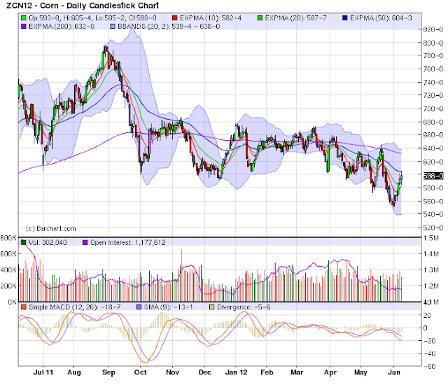
 Both corn and wheat have been trading in a low range since the end of 3Q11.

 Both cotton and sugar have dropped in price over the last few months, and are now near yearly lows.

Industrial metals are near multi-year lows, and are currently over 10% below the 200 week EMA.
The weekly oil chart shows that prices have been dropping fir the last month and a half and are now below the 200 week EMA. The shorter EMAs are dropping, as is momentum, and overall prices are weak.
 Soybeans are the one "stick in the mud," but their rally is very market specific. Weather conditions in South America led to concerns about the soybean crop.


While both cattle and hog prices have been increasing in May, they are still below the 200 day EMA, as well as the highs established at the end of last year and the beginning part of this year.


Industrial metals are near multi-year lows, and are currently over 10% below the 200 week EMA.

The weekly oil chart shows that prices have been dropping fir the last month and a half and are now below the 200 week EMA. The shorter EMAs are dropping, as is momentum, and overall prices are weak.

Morning Market Analysis
First, kudos to an anonymous reader for pointing out that what I thought was the chart of Spain's etf was in fact France's ETF. As the mistake indicates, life has been pretty hectic lately. All that being said, let's dive into the charts.


The entire treasury curve is still giving elevated readings. All are showing weaker momentum readings and prices at or above trading range highs. Put another way, the risk off trade is still wrong.

The Chinese market is trading at levels established at the end of last year. Prices are below the EMAs -- all of which are moving lower. Momentum is dropping and volume is flowing out of the market. Should prices move lower, the next logical target is near the 28 level.

The Brazilian market is also finding a bottom at lows established last year. Also note the declining MACD and CMF readings, along with the weak EMA picture.

And the Spanish market (with the correct chart this time) is also in terrible technical shape. Prices have dropped from just below the 42 level to the current reading of 24. The EMA profile is extremely bearish, momentum is dropping and volume is flowing out of the market.
Tuesday, June 12, 2012
Bonddad Linkfest
- China (Dr. Ed)
- Corrections v. Bear Markets (Dr. Ed)
- May Real Estate Market is Hot (Carpe Diem)
- Government is the Solution (WaPo)
- It's time for the Fed to step up (NYT)
- America's hidden austerity program (NYT)
- The Democracy Bottleneck (Free Exchange)
- Latvian unemployment is most due to emigration from the country (Krugman)
- Will QEIII involve MBS? (Sober Look)
A Week of Central Bank Action
Consider these central bank events of the last week in relation to the overall economic situation:
Although the bank of South Korea kept rates steady, they noted the following in their release:
First, like most countries, Korea imports a lot of oil, thereby making oil's price a very important number to keep track of. And while oil's prices are dropping, they're dropping largely because of concern about the EU situation, hence the reason for linking these two events in thier release.
Second, the bank notes the general drop in commodity prices, but has to balance those against internal price pressures. Here's a chart of South Korea's internal inflation rate:

The chart shows a YOY increase of about 4.5%-4.75%, indicating that the economy is a bit more sensitive to world commodity price fluctuations than other countries.
Interestingly enough, South Korea really didn't get hit that hard by the global slowdown; consider this chart of the real, year over year percentage change in GDP:

The worst reading was one just above 0%.
The Royal Bank of Australia lowered rates by 25 basis points:
Australia and China are inextricably linked; Australia has benefited greatly by supplying a large amount of raw materials to China. As a result, China's overall health is obviously very important to Australia. This decision was made before China's rate cut which would obviously be viewed positively by the Australians.
Note particularly the last paragraph. Even though the economy is doing well, the bank is beginning to see signs of concern on the part of businesses and individuals. Hence the reason for the rate cut. As noted by the Money Illustion Blog:

The above chart shows the percentage year over year percentage change in real GDP. Again -- like Korea -- notice Australia really didn't have a recession. However, this also shows how dependent the Asian rim is on China and, more specifically, Chinese growth.
China lowered their rates 25 BP:
Part of the reason is the slowing manufacturing situation. Consider this from HSBC:

The HSBC manufacturing index has been below 0 for some time, indicating contraction in this sector.
And China doesn't have as much pressure from inflationary pressures:

On one hand, a decreasing inflation picture is good because it indicates prices are easing. However, the question to ask is why. Part of the answer is the decrease we've seen in commodity prices on world markets. But that has occurred because traders perceive demand as dropping, which is not good.
The bank of England decided to keep rates low:
Although the bank of South Korea kept rates steady, they noted the following in their release:
In terms of the future growth path, the fall in international oil
prices will act as an upside risk, but the downside risks have
increased due to uncertainties resulting from the euro area fiscal
crisis.
.....
The downside risks to consumer prices, including those posed by
the declines in international commodity prices, are judged to be
generally in balance with their upside risks such as those due to
elevated inflation expectations and steeper than anticipated public
utility rate hikes.
First, like most countries, Korea imports a lot of oil, thereby making oil's price a very important number to keep track of. And while oil's prices are dropping, they're dropping largely because of concern about the EU situation, hence the reason for linking these two events in thier release.
Second, the bank notes the general drop in commodity prices, but has to balance those against internal price pressures. Here's a chart of South Korea's internal inflation rate:

The chart shows a YOY increase of about 4.5%-4.75%, indicating that the economy is a bit more sensitive to world commodity price fluctuations than other countries.
Interestingly enough, South Korea really didn't get hit that hard by the global slowdown; consider this chart of the real, year over year percentage change in GDP:

The worst reading was one just above 0%.
The Royal Bank of Australia lowered rates by 25 basis points:
At its meeting today, the Board decided to lower the cash rate by 25 basis points to 3.50 per cent, effective 6 June 2012.
Growth in the world economy picked up in the early months of 2012, having slowed in the second half of 2011. But more recent indicators suggest further
weakening in Europe and some further moderation in growth in China.
Conditions in other parts of Asia have largely recovered from the effects of last year's natural disasters, but the ongoing trend is unclear and could be dampened by slower Chinese growth. The United States continues to grow at a moderate pace. Commodity prices have declined lately, though they are mostly still high. Australia's terms of trade similarly peaked about six months ago, though they remain historically high.
Financial market sentiment has deteriorated over the past month. The Board has noted previously that Europe would remain a potential source of adverse shocks. Europe's economic and financial prospects have again been clouded by weakening growth, heightened political uncertainty and concerns about fiscal sustainability and the strength of some banks. Capital markets remain open to corporations and well-rated banks, but spreads have increased. Long-term interest rates faced by highly rated sovereigns, including Australia, have fallen to exceptionally low levels. Share markets have declined.
In Australia, available indicators suggest modest growth continued in the first part of 2012, with significant variation across sectors. Overall labour market conditions firmed a little, notwithstanding job shedding in some industries, and the rate of unemployment remains low. Nonetheless, both households and businesses continue to exhibit a degree of precautionary behaviour, which may continue in the near term.
Australia and China are inextricably linked; Australia has benefited greatly by supplying a large amount of raw materials to China. As a result, China's overall health is obviously very important to Australia. This decision was made before China's rate cut which would obviously be viewed positively by the Australians.
Note particularly the last paragraph. Even though the economy is doing well, the bank is beginning to see signs of concern on the part of businesses and individuals. Hence the reason for the rate cut. As noted by the Money Illustion Blog:
Forget about the implied 5.5% NGDP growth forecast. Australia has a 2-3% inflation target and faster trend RGDP growth than the US. That sort of nominal growth would be beyond my wildest dreams for the US. Rather think about how proactive they are. Unemployment is low and inflation is in the sweet spot. But they are easing monetary policy because they see the global slowdown, which for some reason the much more sophisticated Fed and ECB don’t quite comprehend. They aren’t cutting rates because 5.5% NGDP growth is too low, they are cutting rates to make sure that 5.5% NGDP growth happens.

The above chart shows the percentage year over year percentage change in real GDP. Again -- like Korea -- notice Australia really didn't have a recession. However, this also shows how dependent the Asian rim is on China and, more specifically, Chinese growth.
China lowered their rates 25 BP:
The PBC has decided to cut RMB benchmark deposit and loan interest rates for financial institutions as of June 8, 2012. The one-year RMB benchmark deposit and loan interest rates will be lowered both by 0.25 percentage points. Adjustments are made correspondingly to benchmark interest rates on deposits and loans of other maturities and to deposit and loan interest rates on personal housing provident fund.
Part of the reason is the slowing manufacturing situation. Consider this from HSBC:

The HSBC manufacturing index has been below 0 for some time, indicating contraction in this sector.
And China doesn't have as much pressure from inflationary pressures:

On one hand, a decreasing inflation picture is good because it indicates prices are easing. However, the question to ask is why. Part of the answer is the decrease we've seen in commodity prices on world markets. But that has occurred because traders perceive demand as dropping, which is not good.
The bank of England decided to keep rates low:
The Bank of England’s Monetary Policy Committee today voted to maintain the official Bank Rate paid on commercial bank reserves at 0.5%. The Committee also voted to maintain the stock of asset purchases financed by the issuance of central bank reserves at £325 billion.I highlighted the UK economy in this post; basically, it's a wreck.
Morning Market Analysis

Despite news of the Spanish bailout, the SPYs performed poorly yesterday. Prices gapped higher at the open, dropped to the 10 and 20 minute EMAs, but then sold off near the end of trading, closing just about the 38.2% Fibonacci line.

In general, the LQDs are still in a rally. But notice the weakening MACD position and the negative reading on the CMF for the duration of the latest rally. These are not bullish readings, not do they confirm the rally.

In addition, the MBBS have been trading right around the 108 area for a little more than a month. However, over that time momentum has dropped and volatility has decreased.
The above two charts are fixed-income markets that traders would reach for in a move to gain a little extra yield, rather than purchasing treasuries. There are two possible explanations for the weakness. First that traders are concerned about these area of the market and are starting to make a "risk off" play. The second is traders are looking to move money from fixed income into equities, thinking that the fixed income rally has run its course.

Emerging Europe has been in a decline for the last three months, dropping a little over 20%. Prices have rebounded over the last week, but until we see strong moves higher (a move of over 10%), it's just a technical rebound.

The Spanish market is in terrible technical shape. First, the longer EMAs are moving lower -- never a good sign. Momentum is in fairly negative territory and the CMF is showing a net outflow of cash. About the only good sign is the declining volatility, which may indicate that a bottom is close to being hit.
Monday, June 11, 2012
Bonddad Linkfest
- Push for fiscal cliff compromise gains speed (NYT)
- US homeowners shorten mortgages (FT)
- The IMF's assessment of Spain's banking System (IMF)
- Spain seeks EU assistance (Marketwatch)
- Chinese trade data shows a stronger than thought economy (FT)
- Farewell to Incredible India (Economist)
- Fourth bailout is the charm (FT)
- Gramm-Hubbard: so many misconceptions, so little time (Econospeak)
- Aggregate factors in the price of oil (EconBrowser)
- What constrains the Fed? (Next New Deal)
US Performing Far Better Than the Baltics
Last week there was a weblog uproar over comments made by Professor Krugman about Estonia. In a BBC broadcast debate, a promoter of Austerity measures used Estonia as an example of a country that had had a good experience with austerity -- a contention which was dismissed by Professor Krugman. Supposedly, the president of Estonia issued several tweets in response to professor Krugman's statements.
So, let's look at the real, seasonally adjusted GDPs of the Baltic states, starting with Estonia:

Several points jump out. Simply eyeballing the chart, Estonia's GDP dropped about 18% -- which is a pretty serious hit. And while it has been growing, growth is softening over the last few quarters.

Latvia's GDP contraction was more severe -- their GDP dropped nearly 24%. However, they have been growing since mid 2009. But they are only about 1/3 of the way to achieving their' GDP from before the contraction.

And Lithuania's GDP contacted about 13%, but has also regained momentum. However, they are still about halfway below their pre-austerity GDP.
Finally, there is this chart of real US GDP:

Total US real GDP is now higher than at the height of the last expansion.
So, the US -- which engaged in stimulus spending -- had a less severe contraction than then Baltics. In addition, our GDP is now higher than pre-recession levels. In short the US' GDP picture is far better than the Baltics.
Let's look at unemployment:
 Latvian unemployment spiked to 20%, but has now dropped to 15%.

Lithuanian unemployment spiked to 18%, but has now dropped to 14%.
I could find no data for Estonian unemployment. Please provide a link in the comments section if you find it.
Compare that to the US' chart:

US' unemployment spiked to 10% and is now at 8%.
So on a GDP and unemployment comparison we see the following:
1.) The US' contraction was shallower than the Baltics and our post recession performance is better.
2.) The US' unemployment rate increased less than the Baltics and is currently lower than the Baltics.
Promoters of austerity will look at the charts of the Baltics and say, "let's do that in the U.S." However, is that a good policy for the largest economy in the world to engineer? The Baltic states are tiny in comparison to other economies; not to downplay their importance, but they really are not major players on the world economic stage.
Compare that to the US, which is still the largest consumer market by far and the world's largest exporter. Out yield curve is a building block of world interest rates; our equity markets are some of the most liquid and most important in the world. Remember how the shock of last year's debt negotiations gave the world markets a cold? Increase the magnitude 5x and you'll get an idea for what a would happen if the US engineered that type of move.
And finally, when looking at the Baltics, consider this observation:
So, let's look at the real, seasonally adjusted GDPs of the Baltic states, starting with Estonia:

Several points jump out. Simply eyeballing the chart, Estonia's GDP dropped about 18% -- which is a pretty serious hit. And while it has been growing, growth is softening over the last few quarters.

Latvia's GDP contraction was more severe -- their GDP dropped nearly 24%. However, they have been growing since mid 2009. But they are only about 1/3 of the way to achieving their' GDP from before the contraction.

And Lithuania's GDP contacted about 13%, but has also regained momentum. However, they are still about halfway below their pre-austerity GDP.
Finally, there is this chart of real US GDP:

Total US real GDP is now higher than at the height of the last expansion.
So, the US -- which engaged in stimulus spending -- had a less severe contraction than then Baltics. In addition, our GDP is now higher than pre-recession levels. In short the US' GDP picture is far better than the Baltics.
Let's look at unemployment:


Lithuanian unemployment spiked to 18%, but has now dropped to 14%.
I could find no data for Estonian unemployment. Please provide a link in the comments section if you find it.
Compare that to the US' chart:

US' unemployment spiked to 10% and is now at 8%.
So on a GDP and unemployment comparison we see the following:
1.) The US' contraction was shallower than the Baltics and our post recession performance is better.
2.) The US' unemployment rate increased less than the Baltics and is currently lower than the Baltics.
Promoters of austerity will look at the charts of the Baltics and say, "let's do that in the U.S." However, is that a good policy for the largest economy in the world to engineer? The Baltic states are tiny in comparison to other economies; not to downplay their importance, but they really are not major players on the world economic stage.
Compare that to the US, which is still the largest consumer market by far and the world's largest exporter. Out yield curve is a building block of world interest rates; our equity markets are some of the most liquid and most important in the world. Remember how the shock of last year's debt negotiations gave the world markets a cold? Increase the magnitude 5x and you'll get an idea for what a would happen if the US engineered that type of move.
And finally, when looking at the Baltics, consider this observation:
One thing we can say for sure, however, is that the kind of drastic fiscal austerity that proved feasible in Latvia would not be possible in many other countries. Rimševičs and others stress that Latvian policy was successful because they took it on the chin and implemented the fiscal measures with speed and determination. Perhaps. But it is also true that they got away with vastly underestimating the costs of their measures. Latvian policy makers had expected a 10% fall in GDP in 2009; instead they got one that was nearly twice as large. The real secret of their success is that they did not have a revolution on their hands.Several economic contractions create civil unrest. And not just a few hundred people in the street, but massive outpourings of people who have the propensity to get violent.
Subscribe to:
Posts (Atom)