Saturday, August 11, 2018
Weekly Indicators for August 6 - 10 at Seeking Alpha
- by New Deal democrat
My Weekly Indicators post is up at Seeking Alpha.
Two long leading indicators are within 1% of turning negative. And two short leading indicators are also weakening considerably.
A friendly reminder that not only is the post informative, but I get compensated the more people read it, so by all means please read it!
Friday, August 10, 2018
Real wages decline YoY, while real aggregate payrolls grow
- by New Deal democrat
With the consumer price report this morning, let's conclude this weeklong focus on jobs and wages by updating real average and aggregate wages.
Through July 2018, consumer prices are up 2.9% YoY, while wages for non-managerial workers are up 2.7%. Thus real wages have actually declined YoY:

In the longer view, real wages have actually been flat for nearly 2 1/2 years:

Because employment and hours have increased, however, real *aggregate* wage growth has continued to increase:

Real aggregate wages -- the total earned by the American working and middle class -- are now up 25.8% from their October 2009 bottom.
Finally, because consumer spending tends to slightly lead employment, let's compare YoY growth in real retail sales, measured quarterly (red), with that in real aggregate payrolls (blue):

Here's the monthly close-up on the last 10 years:

Since late last year real retail sales growth has accelerated YoY, so we should expect the recent string of good employment reports to continue for at least a few more months.
Thursday, August 9, 2018
Four measures of wages all show renewed stagnation
- by New Deal democrat
This is something I haven't looked at in awhile. Since 2013, I have documented the stagnation vs. growth in average and median wages, for example here and here. I last did this in 2017. So let's take an updated look.
We have a variety of economic data series to track both average and median wages:
- The most commonly known measure is that of average hourly pay for nonsupervisory workers, which is part of the monthly jobs report.
- The Bureau of Labor Statistics, which conducts the household employment survey, also reports "usual weekly earnings" for full time workers each quarter.
- The BLS also measures the Employment Cost Index quarterly.
- The BLS also measures "business sector compensation per hour" quarterly.
Let's start with nominal wages. The first graph below shows the YoY% growth in each of the four measures:

While each is noisy, the overall trends are clear:
- First, in this cycle as in the last, wage growth declined coming out of recessions, then rose as the expansion continued.
- Second, by most measures nominal growth has picked up somewhat in the last year.
- Third, secularly there has been an undeniable slowdown in wage growth, which (while not shown) was 4-6% in the late 1990s peak and 3-4% at the 2000s peak. So far in this expansion it is no better than 2.5%-3%. I believe this is in part due to how weak the employment situation was for so long into this expansion, but also secularly due to shifts in bargaining power, as employers learn over time that employees can be retained with lower and lower annual increases in compensation.
Now let's turn to the real, inflation-adjusted measures. Our first graph starts out normed to 100 for each measure in the fourth quarter of 2007.

After a spike during the Great Recession due entirely to the collapse of gas prices at that time, real wage growth declined through 2013 time frame, then rose significantly from late 2014 through early 2016 mainly due to the decline in gas prices. Since that time, 3 of the 4 measures (all except the ECI) have turned flat if not worse. Further, note the divergence between the mean measure of the average hourly earnings (blue) and median measures in usual weekly earnings (red) and the employment cost index (green), strongly suggesting that gains have been skewed towards the upper end of the income distribution.
Finally, let's look at the YoY% real growth in the four measures:

Here the picture continues to be not good at all. After growing 2-3% in real terms during 2014-15, in 2016 real wage growth decelerated to only 0.5%-1.5% across the spectrum of measures, and as of the most recent readings is between -0.5% to +0.5% .
In my last look at this data over a year ago, I concluded that the prospects for further meaningful wage growth for the broad mass of American workers during this cycle was dim. Nothing that has happened since that time has changed this poor result. What little nominal acceleration in gains there has been in any of the four series has been entirely negated by inflation. What gains in income have been made at the household level appear to be due exclusively to declines in the unemployment and underemployment rates.
Wednesday, August 8, 2018
June 2018 JOLTS report evidence of both excellent jobs market and taboo against raising wages
- by New Deal democrat
Yesterday's JOLTS report remained excellent, suffering only in comparison to last month:
- Hires were just below their all-time high of one month ago
- Quits were just below their all-time high of one month ago
- Total separations made a new 17-year high
- Openings were just below their all-time high of two months ago
- Layoffs and discharges rose to their average level over the past two years
In short, the JOLTS report for June confirmed the excellent employment report of one month ago.
So let's update where the report might tell us we are in the cycle, remaining mindful of the fact that we only have 18 years of data.
So let's update where the report might tell us we are in the cycle, remaining mindful of the fact that we only have 18 years of data.
Let's start with the simple metric of "hiring leads firing." Here's the long term relationship since 2000, quarterly:

Here is the monthly update for the past two years measured YoY:

In the 2000s business cycle, hiring and then firing both turned down well in advance of the recession. Both are still advancing through the end of the second Quarter this year, and their YoY strength has rebounded.
In the 2000s business cycle, hiring and then firing both turned down well in advance of the recession. Both are still advancing through the end of the second Quarter this year, and their YoY strength has rebounded.
In the previous cycle, after hires stagnated, shortly thereafter involuntary separations began to rise, even as quits continued to rise for a short period of time as well. Here's what that looks like quarterly through midyear 2018 (note: involuntary separations are inverted, and quits are multipiled *2 for scale):

Unlike the 2000s cycle, it looks like involuntary separations may have already made their low for this cycle, while both hires and quits are still increasing. This in no way looks like a late-cycle report.
Finally, let's compare job openings with actual hires and quits. As you probably recall, I am not a fan of job openings as "hard data." They can reflect trolling for resumes, and presumably reflect a desire to hire at the wage the employer prefers. In the below graph, the *rate* of each activity is normed to zero at its June 2018 value:
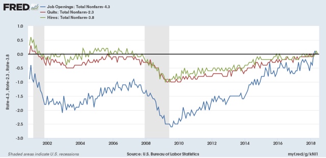
Looked at this way, the data is very telling. While the rate of job openings is at an all time high, the rate of actual hires isn't even at its normal rate during the several best years of the last, relatively anemic, expansion. Meanwhile quits are tied for their best level since 2001 (at the end of the tech boom).
In other words, in econospeak, "wages are sticky to the upside." In everyday language, there is an employer taboo against raising wages. In response, employees are reacting by quitting at high rates to seek better jobs elsewhere.
In short, the June JOLTS report confirms a thriving employment market, but a market that is not in wage equilibrium, as employers are failing to offer the wages that employees demand to fill openings.
Tuesday, August 7, 2018
Gimme credit for Q2 2018: conditions looser, demand improves, but acaution flag for housing
- by New Deal democrat
The Fed released its quarterly Senior Loan Officer Survey on credit yesterday. This is one of my long leading indicators. Let's take an updated look.
The first graph is of the percentage of banks tightening vs. loosening credit, for larger (blue) and smaller (red) firms. Thus a negative number, showing loosening, is a positive for the economy:

For large firms in particular, credit got very loose in the quarter just past.
Meanwhile, demand for those loans, which -- anomalously -- had been lackluster, picked up in the 2nd quarter:

For comparison purposes, here is credit provision for larger firms (blue below, as in the first graph above) vs. the weekly Chicago Fed National Financial Conditions Index (red):

You can see that the much more timely weekly measure is a good proxy.
Over the past 30 years, the provision of credit to firms has correlated well with corporate profits (both measured YoY in the graph below):

Finally, starting last quarter, I highlighted a few other measures in this survey which unfortunately have changed composition in the last decade. Since I've been watching housing closely, let me just republish the Fed's mashup of measures of tightening vs. loosening mortgage credit (first graph below), and demand for same (2nd graph):


This shows that mortgage conditions have been loosening for the last several years, and continued to do so last quarter. Meanwhile demand for mortgages has been declining in the last year, but if anything improved slightly.
An interesting comparison to watch in the future is how well this might correlate with consumer loan delinquency, which will be updated for the 2nd quarter next week by the NY Fed:

Delinquencies bottomed in Q1 2006 during the last expansion, a year or more after credit was tightened and demand decreased. They were improving as of the last report.
The bottom line is that the 2nd quarter Senior Loan Officer Survey continued to be a positive for the economy.
Monday, August 6, 2018
How close are we to "full employment"?
- by New Deal democrat
As I pointed out Friday, there was a lot of good news underneath the headline jobs gain -- primarily in labor force participation and underemployment. So, how close are we to "full employment," based on the last few expansions?
Let's start with the simple, straightforward unemployment rate of 3.9%. This is already considerably below the best reading of the 2000s expansion, and only 0.1% above the best reading of the 1990s expansion, which was tied two months ago in May:

But of course that isn't the end of it. Much attention has been paid to the U-6 underemployment rate, which reached a new expansion low of 7.5%.
To begin with, there are actually 6 "alternative measures of labor underutilization" in the jobs report, U-1 through U-6. U-6 consists of total unemployed (U-3, shown below in green) + "discouraged workers" (U-4) + "all persons marginally attached labor force" (U-5, blue) + those "employed part time for economic reasons" (red):

Even a cursory glance shows that U-3 and U-5 seem to move in tandem, with U-6 more variable. To show that better, the below graph takes the same three series and norms them to their readings at the peak of the 1990s tech boom:

You can see the U-5 is already right in line where it was then. It is only U-6 that remains elevated, i.e., only the percentage of those who are working part time involuntarily, which is about 0.8% higher than in 1999.
In addition to the higher percentage of involuntary part time workers, let's look at prime age labor force participation (first graph below, red is quarterly average) and the prime age employment population ratio (second graph, normed to zero at its current reading of 79.5%):


The prime age employment population ratio in particular is 0.8% below its level at the peaks of both the 1980s and 2000s expansion. It is 2.4% below that of the 1990s tech boom.
I doubt that we have to go all the way to the levels of the tech boom, which was after all only the second real boom of the last 60 years. Since the population of those age 16 through 64 is 206.5 million, increasing employment by 0.8% will take 1.65 million jobs over and above further population growth. If the prime age employment ratio continues to grow at the 0.9% rate it has in the last year, we should arrive at "full employment" participation levels in the next 10-12 months.
Further, if involuntary part time employment continues to shrink at the -1% YoY level it has in the last 12 months, or about 1.3 million growth in full time vs. part time jobs, we should arrive at "full, full-time employment" in about 9 to 10 months.
I don't know how much longer this expansion lasts before employment begins to fall at the outset of a recession, but based on my most recent long term forecast (slowdown but no recession in the next 12 months), it is a reasonable bet that, for at least some brief period, we will get to the above levels of "full employment."
Subscribe to:
Posts (Atom)