Saturday, November 4, 2017
Weekly Indicators for October 30 - November 3 at XE.com
- by New Deal democrat
My Weekly Indicators post is up at XE.com.
The near term forecast is getting even more strongly positive, while the longer term forecast gets a positive jolt.
Friday, November 3, 2017
October jobs report: great utilization, decent growth, poor wages
- by New Deal democrat
HEADLINES:
- +261,000 jobs added
- U3 unemployment rate down -0.1% from 4.2% to 4.1%
- U6 underemployment rate down -0.3 from 8.2% to7.9%
Here are the headlines on wages and the chronic heightened underemployment:
Wages and participation rates
- Not in Labor Force, but Want a Job Now: down -443,000 from 5.628 million to 5.135 million
- Part time for economic reasons: down -369,000 from 5.122 million to 4.753 million
- Employment/population ratio ages 25-54: down -0.1% from 78.9% to 78.8%
- Average Weekly Earnings for Production and Nonsupervisory Personnel: down -$.0.1 from $22.23 to $22.22, up +2.4% YoY. (Note: you may be reading different information about wages elsewhere. They are citing average wages for all private workers. I use wages for nonsupervisory personnel, to come closer to the situation for ordinary workers.)
Holding Trump accountable on manufacturing and mining jobs
Trump specifically campaigned on bringing back manufacturing and mining jobs. Is he keeping this promise?
Trump specifically campaigned on bringing back manufacturing and mining jobs. Is he keeping this promise?
- Manufacturing jobs rose by +24,000 for an average of +14,000 a month vs. the last seven years of Obama's presidency in which an average of 10,300 manufacturing jobs were added each month.
- Coal mining jobs were unchanged for an average of +250 a month vs. the last seven years of Obama's presidency in which an average of -300 jobs were lost each month
The more leading numbers in the report tell us about where the economy is likely to be a few months from now. These were mainly positive.
- the average manufacturing workweek rose +0.2 hours from 40.8 hours to 41.0. This is one of the 10 components of the LEI.
- construction jobs increased by +11,000. YoY construction jobs are up +187,000.
- temporary jobs increased by +18,300.
- the number of people unemployed for 5 weeks or less decreased by -97,000 from 2,226,000 to 2,129,000. The post-recession low was set al,ost two years ago at 2,095,000.
Other important coincident indicators help us paint a more complete picture of the present:
- Overtime rose +0.2 hours to 3.5 hours.
- Professional and business employment (generally higher- paying jobs) increased by +50,000 and is up +546,000 YoY.
- the index of aggregate hours worked in the economy rose by 0.2 from 107.4 to 107.6
- the index of aggregate payrolls rose by 0.8 from 176.5 to 177.3 .
Other news included:
- the alternate jobs number contained in the more volatile household survey decreased by -484,000 jobs. This represents an increase of 1,959,000 jobs YoY vs. 2,004,000 in the establishment survey.
- Government jobs rose by 900.
- the overall employment to population ratio for all ages 16 and up fell -0.2% from 60.4% to 60.2 m/m and is up +0.5% YoY.
- The labor force participation rate fell -0.4% m/m and is down -0.1% YoY from 63.1% to 62.7%.
SUMMARY
This was an excellent report in terms of labor utilization, decent in terms of jobs growth, and poor in terms of wages.
Bottom line: the late cycle deceleration in YoY employment gains is continuing, and outright wage deflation come the next recession looms ever larger.
-- From Bonddad
Here's my inflation-adjusted 2 cents.
First, the 3, 6 and 12 month moving average of establishment job growth is slightly above 150,000/month:


The big declines in unemployment, underemployment, involuntary part time employment, and persons who want a job now but haven't looked have nudged us very close to what has been "full employment" in the past two expansions. We may be as little as 1.5 million jobs away.
The total gain in employment in the last two months is 279,000, or an average of 140,000 per month for the hurricane-affected month and the recovery. This is no better than mediocre or average.
That hourly wages for nonsupervisory workers actually *fell* month over month, and are still only up 2.4% YoY quite simply is awful this late into an expansion.
-- From Bonddad
Here's my inflation-adjusted 2 cents.
First, the 3, 6 and 12 month moving average of establishment job growth is slightly above 150,000/month:

These numbers have been declining since the end of 2014. As we are now late-in-the-game of this recovery, I wouldn't expect more than 150,000 average month growth going forward.
We're seeing some weak Y/Y numbers.


Total service producing jobs (top chart), while still positive, are declining Y/Y. Both retail (middle chart) and information jobs (bottom chart) are declining.
Overall, the wage picture is weak:


The top two charts were released earlier this week in the BEA's personal income data. Real DPI and real DPI less transfer payments are barely getting about 1% on the Y/Y basis. Average hourly earnings (bottom chart), which are part of the employment report, are still weak on a historical basis.
Bonddad Economic Potpourri
The anecdotal comments from the latest ISM report are strong:


- "Raw material costs on the rise, but purchasing operation has navigated shortages caused by hurricanes." (Chemical Products)
- "Incoming orders are strong, mainly due to recovery efforts in the wake of Hurricanes Harvey and Irma. Backlogs are up due to operating inefficiencies." (Machinery)
- "Hurricanes have caused shortages in the resin market, resulting in price increases, inventory constraints and increased lead times." (Computer & Electronic Products)
- "Ongoing market growth. Minimal impact expected from hurricanes so far in this season." (Miscellaneous Manufacturing)
- "Business seems to be a bit depressed due to the storms last month, but is picking back up." (Fabricated Metal Products)
- "Business continues to be better than expected." (Transportation Equipment)
- "Business is good. Supplier deliveries have extended. Things are really picking up." (Food, Beverage & Tobacco Products)
- "Our plants are sold out for 2017 — we can’t take any new orders." (Nonmetallic Mineral Products)
- "In plastics processing, Hurricane Harvey is the reason for every price increase being announced — and virtually all suppliers are announcing price increases." (Plastics & Rubber Products)
The hurricanes are causing some shortages, lengthening delivery times, raising some prices and increasing demand from Texas and Florida. But all of these effects are temporary and should dissipate in the coming months.
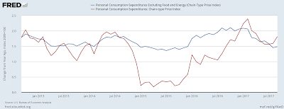
The Fed's preferred inflation measure is still weak:

Both measures of PCE inflation are below 2% -- the Fed's target.
Auto sales enjoyed a solid month of growth as consumers replaced cars destroyed in recent flooding:

Expect a few more months of this. But sales should return to their weaker position in by 1Q18.
Consumer staples, discretionary and now utilities are under-performing:

Thursday, November 2, 2017
The economy is firing on just about all cylinders
- by New Deal democrat
The "nowcast" over the last few months has been pretty darn good, and it is showing up in the data.
This post is up at XE.com.
Tuesday, October 31, 2017
AT&T is Worth a Look at These Levels
Income
streams are an essential component to my investment philosophy. They help to lower portfolio volatility,
provide returns in a stagnant or declining market, and continually provide
funds for reinvestment. I provide more
detail in my book, The Lifetime Income Security Solution.
I’m also a
big fan of companies that have a long history of raising their dividend, which
is one of the best ways management can reward shareholders. I maintain a list of stocks that have a 25-year
history of raising their dividends. When
these companies approach lows on a 6 or 12 months basis, it’s time to look at
adding them to a portfolio.
Recently,
AT&T (T) qualified by falling to a 52-week low:

Last week, the stock gapped lower on earnings news (more on
that in a minute). It looks like it’s
trying to form a short-term bottom at current levels.
Let’s take
a look at T’s financials (as reported by Morningstar.com).
Balance Sheet: their
balance sheet could be a lot cleaner.
Their current ratio has been below 1 for the last 5 years, which offends
my inner “Graham and Dodd.” But, large
companies also have the financial capabilities to maintain lower capital ratios
and get away with it in the marketplace.
At the same time, total equity has increased from $92.3 billion in 2012
to $123 billion at the end of last year – a nice increase for
shareholders. Long-term debt has also
increased substantially, climbing from $66.3 billion in 2012 to $113.6 billion
in 2016. However, according to the
company’s revenue statement, income expenses have dropped from 2.7% of income
to 2% in 2016 – which is largely due to declining interest rates.
Cash Flow: The
company – like other large companies – has the ability to self-fund plant,
property and equipment purchases from net income. This means that the primary “play” on their
case flow statement occurs in the financial section. Here, we see a lot debt refunding over the
last 5 years (which is to be expected) along with a share repurchase plan.
Income Statement:
this contains very positive information.
First, total revenue increased from $127 billion in 2012 to $167 billion
in 2016. While the cost of goods sold
increased over the same period (rising from 43.3% of revenue to 46.94%), operating
expenses declined from 46.47% to 38.19% and net income rose from 5.7% to
7.92%. Best of all, net income from
continuing operations was up from 5.92% to 8.14% over the same time period.
So – why is the stock low?
Two reasons.
Cord cutters: from the last earnings release: Importantly,
in the domestic market, net additions of its postpaid wireless subscribers
declined a massive 44.8% year over year.
AT&T lost 251,000 satellite TV customers and 134,000 U-verse TV
customers. However, it gained 296,000 DIRECTV NOW connections.
This is an important development, but not fatal. Entertainment revenue comprises 32% of all
income, according to the latest 10-Q. In
addition, it appears the company is working on new products to mitigate this
loss of revenue.
The Time Warner
Merger: AT&T and Time Warner are trying to merge. This looks eerily similar to the AOL/Time
Warner deal from years ago – which was a tremendous flop. But that deal simply came too early. Time Warner has content that AT&T could
bundle with its other services. While there
are calls from some groups to halt the merger, or at least give it very close
scrutiny, it’s difficult to see the current administration giving this deal the
thumbs down.
Finally, there is the dividend, which is 5.85% -- a more
than healthy reward for owning this stock.
The only drawback is the payout ratio is very high – 94%, indicating the
company needs to grow revenue to continue raising the dividend.
Overall, a stock with a 5.85% yield trading at a PE of 16 is
worth a look when it’s near a 52-week low.
This post is not an offer to buy or sell this security. It is also not specific investment advice for a recommendation for any specific person. Please see our disclaimer for additional information.
This post is not an offer to buy or sell this security. It is also not specific investment advice for a recommendation for any specific person. Please see our disclaimer for additional information.
Halloween potpouri
- by New Deal democrat
Some comments on the economic data from yesterday and this morning...
1. Personal income and spending.
Real, inflation adjusted income was flat, while real spending was up +0.6%. Which means the personal saving rate declined to a new expansion low:

We've had a steep decline in the savings rate in the past year. That is something that, as the above graph shows, tends to happen in mid- to late expansion. The upshot is that consumers have less room in their budgets to absorb a future negative shock.
2. The employment cost index.
2. The employment cost index.
This is some good news. The employment cost index is a median measure, and it tracks payment for the same job over time, and it improved 0.7% q/q, and the longer term trend is positive:

YoY growth of wages, at 2.5%, is just below the expansion peak of 2.6%. At least in terms of measuring payment for the same job, there actually is some improving wage growth.
3. Apartment rents.
The median asking rent for apartments rose by $2 to $912 in the third quarter

Rental price pressures are accelerating!
4. Regional manufacturing.
The Dallas Fed and the Chicago PMI both improved even more from September to October:

As a result, even taking into account that these have been outperforming industrial production this year, it is likely that manufacturing production when it is reported for October several weeks from now will be a positive, and most likely slightly better than last month's.
These releases are all consistent with an economy that is doing extremely well right now, while laying the groundwork for the ultimate downturn in the form of additional pressures on the consumer.
Dividend Yields Are Outperforming Inflation
This chart is from the Financial Times:


As I point out in my book The Lifetime Income Security Solution, dividends are a key component to investing. They lower overall volatility, steady performance and provide a constant stream of reinvestment income . The above chart partially explains why. Treasury yields started to drop in the early 1980s and have continued to plumb new lows since. While many people have correctly noted that yields have nowhere to go but up from their current position, it's doubtful we'll see a major advance with inflation so low. Add all this information together and you have a powerful argument for focusing on dividends.
You can read all about it in my book (shameless plug):

Monday, October 30, 2017
Gimme shelter: the real cost of renting vs. homeownership
- by New Deal democrat
What is the real cost of shelter?
Over the last decade there has been lots of discussion of housing prices in isolation. Sometimes that discussion includes an inflation adjustment -- which is problematic, since housing constitutes nearly 40% of the entire consumer price index, so in essence housing is being deflated largely by the cost of housing itself! From time to time there has also been a little -- but not much -- discussion of rental prices.
But I have never seen a discussion of the relationship between the relative cost of homeownership vs. renting, particularly as a function of the household budget.
That is a curious void. For the choice (or ability) to live in the residence one desires isn't a matter of its cost by itself, but also the relative cost of the type of residence. What is the cost of a house compared with the cost of an apartment? How expensive are each of them compared with a household's income? If both are too expensive, maybe the choice is made to live with mom and dad as an extended family.
The purpose of this post is to fill that void. Herein I compare the cost of home ownership -- in terms of the down payment, but also in terms of the monthly mortgage payment -- with the cost of renting, and further, compare each to the median household income (since by definition, the people renting the apartment or living in the house are a household!).
Let's start with the "real" cost of a down payment on a house. The first choice of most people is to reside in a single family house. Most people who follow economics are familiar with the housing bubble, bust, and recovery in the past 15 years. Here's what the median house price looks like measured in comparison with median household income:

In the above graph I've divided house prices by 10, to measure the share of annual household income needed for a 10% down payment. The graph would look exactly the same, just with different nominal values, assuming a different percentage of down payment.
What is surprising here is that house prices now are even higher than they were at the peak of the bubble in 2005 as compared with median household income. As we'll see below, there are good reasons to believe even these lofty prices do not mean we are in another bubble. But perhaps they are an important reason why, even more than eight years into the current economic expansion, home sales are barely above where they were at the bottom of previous recessions:

But if down payments are so dear, why have people chosen in increasing numbers to purchase houses? Perhaps that's because, when we compare monthly payments, and compare them with the alternatives, the picture looks entirely different.
Let's start with the most obvious comparison. Here is the median asking monthly rent for an apartment in the US since 1995 (note: the series goes back to 1988):
That is a curious void. For the choice (or ability) to live in the residence one desires isn't a matter of its cost by itself, but also the relative cost of the type of residence. What is the cost of a house compared with the cost of an apartment? How expensive are each of them compared with a household's income? If both are too expensive, maybe the choice is made to live with mom and dad as an extended family.
The purpose of this post is to fill that void. Herein I compare the cost of home ownership -- in terms of the down payment, but also in terms of the monthly mortgage payment -- with the cost of renting, and further, compare each to the median household income (since by definition, the people renting the apartment or living in the house are a household!).
Let's start with the "real" cost of a down payment on a house. The first choice of most people is to reside in a single family house. Most people who follow economics are familiar with the housing bubble, bust, and recovery in the past 15 years. Here's what the median house price looks like measured in comparison with median household income:
In the above graph I've divided house prices by 10, to measure the share of annual household income needed for a 10% down payment. The graph would look exactly the same, just with different nominal values, assuming a different percentage of down payment.
What is surprising here is that house prices now are even higher than they were at the peak of the bubble in 2005 as compared with median household income. As we'll see below, there are good reasons to believe even these lofty prices do not mean we are in another bubble. But perhaps they are an important reason why, even more than eight years into the current economic expansion, home sales are barely above where they were at the bottom of previous recessions:
But if down payments are so dear, why have people chosen in increasing numbers to purchase houses? Perhaps that's because, when we compare monthly payments, and compare them with the alternatives, the picture looks entirely different.
Let's start with the most obvious comparison. Here is the median asking monthly rent for an apartment in the US since 1995 (note: the series goes back to 1988):

In 1988 the median rent averged $343 per month. In the second quarter of this year it was $910.
Now, here is what it looks like in comparison with median household income:
Now, here is what it looks like in comparison with median household income:

If house prices have risen to new highs several times since the turn of the Millennium, so have apartment rents -- almost relentlessly.
In percentage terms, in 1988, the median rent for an apartment was 14.5% of median household income. That rose to slightly over 16% in the mid 1990s before falling to the series' low of 13.7% in 2000. Since then it has risen to a record 18.4% of median household income in the 2nd quarter of this year.
Now let's take a look at the monthly cost of living in a house. The below graph shows the median monthly mortgage payment for a house (blue) compared with median household income (red). Median monthly mortgage payment is calculated by using the median house price and the 30 year mortgage rate for each quarter, and consulting an amortization table using those values:

Notice that the monthly payment for the median house isn't extreme at all! In fact, currently it is very moderate in terms of the long term range. Let's break that down by showing the percentage of median monthly income (1/12 of the annual) that one month's mortgage payment consituted (note: I am assuming a 10% down payment, with 90% mortgaged to be consistent. Using a different down payment does not change the shape of the comparison at all, only the nominal values):
Now let's take a look at the monthly cost of living in a house. The below graph shows the median monthly mortgage payment for a house (blue) compared with median household income (red). Median monthly mortgage payment is calculated by using the median house price and the 30 year mortgage rate for each quarter, and consulting an amortization table using those values:
Notice that the monthly payment for the median house isn't extreme at all! In fact, currently it is very moderate in terms of the long term range. Let's break that down by showing the percentage of median monthly income (1/12 of the annual) that one month's mortgage payment consituted (note: I am assuming a 10% down payment, with 90% mortgaged to be consistent. Using a different down payment does not change the shape of the comparison at all, only the nominal values):
- Going back to 1988, the median mortgage payment was slightly over 40% of median monthly household income.
- This fell back under 28% at the end of 1998 before rising to 32% in 2000.
- After falling briefly, at the peak of the housing bubble in early 2006 it had reached a secondary peak just over 35% of median monthly income.
- At the bottom of the bust at the end of 2011 it made a new low of 23%.
- Even now, with the real cost of a house at all time highs, the median monthly mortgage payment is still less than 24% of median household income.
Monthly mortgage payments are moderate because, even as house prices have risen, mortgage rates fell to new lows not seen in over half a century several times during this expansion, most recently in the summer of 2016:

In our final comparative graph, let's see how median monthly rent compares with median monthly mortgage payment:

Most notably, the overall trend in the last 30 years has been that monthly mortgage payments have fallen from over 3 times median rent to about 1.5 time median rent now. Put another way, even at the peak of the housing bubble, the monthly carrying cost of a house was about 2.3 times the median cost of renting an apartment. At the bottom of the bust, that fell to 1.4 times the cost to rent. For the last five years, monthly mortgage payments have hovered near 1.5 times the median asking rent.
By comparing the "real" cost of housing to renting, both in terms of down payments and monthly mortgage payments, we can make sense of some of the biggest trends in the market for shelter.
In our final comparative graph, let's see how median monthly rent compares with median monthly mortgage payment:
Most notably, the overall trend in the last 30 years has been that monthly mortgage payments have fallen from over 3 times median rent to about 1.5 time median rent now. Put another way, even at the peak of the housing bubble, the monthly carrying cost of a house was about 2.3 times the median cost of renting an apartment. At the bottom of the bust, that fell to 1.4 times the cost to rent. For the last five years, monthly mortgage payments have hovered near 1.5 times the median asking rent.
By comparing the "real" cost of housing to renting, both in terms of down payments and monthly mortgage payments, we can make sense of some of the biggest trends in the market for shelter.
Record down payments are keeping an increasing number of prospective buyers, especially first time buyers, shut out of the market for buying a house. An enormous number are living in apartments instead. This explains both the multi-decade lows in the homeownership rate as well as the recent 30 year lows in the apartment vacancy rates, as a disproportionate number of adults are forced out of home ownership and into apartment dwelling.


With both real house prices and real apartment rents at new highs, perhaps it is no surprise that a record number of young adults are choosing, or maybe stuck with, continuing to live with mom and dad:

Note, by the way, that these adults are included as part of their parents' household for purposes of the homeownership rate above.
On the other hand, with monthly mortgage payments at such relative lows compared to both rental payments and median incomes, if one can get past the down payment, home ownership is clearly the better choice. Thus single family home construction continued to rise until at least the beginning of this year, and has declined only slightly with the roughly 1% increase in mortgage interest rates:

Finally, that being said, it is hard for me to imagine how home sales could continue to grow much further if house prices continue to outpace even their 2005 multiple of median household income. But if rental prices also continue to grow relative to median household income, then we can only expect to see even more involuntary extended family households.
[Special thanks to Mike KImel for preparing the customized comparative graphs used in this article.]
Subscribe to:
Posts (Atom)