Friday, December 1, 2023

Ex-housing, PCE inflation, like CPI inflation, is under th Fed’s 2% target


 - by New Deal democrat


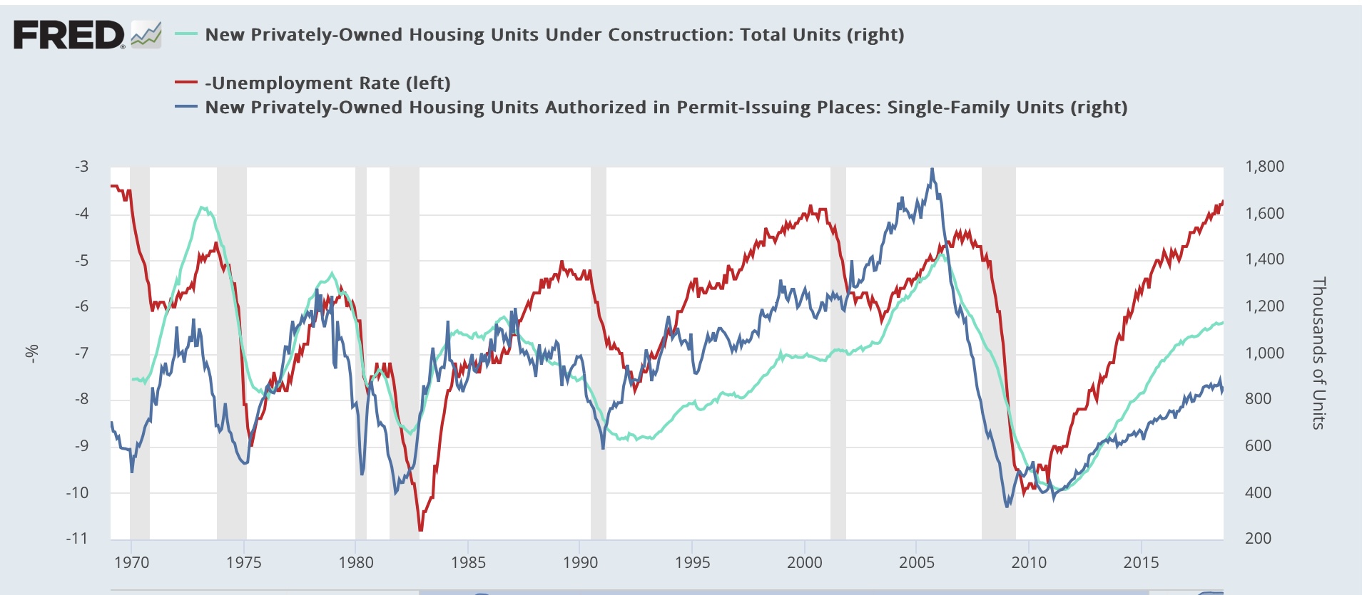
Note: I may not be around for the ISM manufacturing or construction spending reports this morning. If so, I’ll comment later (maybe over the weekend) about them. What I’ll be watching for: as to manufacturing, because the ISM is a diffusion index, it didn’t pick up the big increase in vehicle manufacturing earlier this year. How does that shake out for October (bearing in mind the UAW strilke)? As to construction spending, which typically trends in conjunction with building units under construction, does it hold up, or turn down (signaling a decline in housing construction)?


One thing I didn’t comment on with regard to yesterday’s personal income and spending report was inflation. So let’s take a look today. Spoiler alert: it generally mirrors the CPI report.

To begin with, PCE inflation for over a year has been all about services. Since June of last year, there has been *no* inflation in goods prices (red in the graph below). In the past 6 months, while total PCE inflation (gold) has been 1.2%, goods inflation has been a whopping 0.2%. Services inflation (light blue) has been 1.8% (or 3.7% annualized). Backing out housing and energy, services inflation (dark blue) is up 1.5% (or 3.0% annualized):


Another way to look at this is the month over month (light blue) or quarter over quarter (dark blue) changes in the PCE index excluding energy and housing, vs. the quarter over quarter changes in housing plus utilities (red):


In Q3, the former was up 0.8%, while the latter increased 1.3%. In October, the former increased less than 0.2%. 

As with CPI inflation, it’s clear that housing is the culprit. 

Harvard economist Jason Furman posted a couple of similar graphs yesterday, showing the monthly and 3 month average of the core PCE price index ex-housing:


And including housing, but substituting current rent increases for the official measure:


As he writes, core ex-housing is up only 1.7% YoY, and substituting current rents for the official measure of housing is up only 1.5%.

Just as a refresher, this is exactly what CPI ex-shelter looks like:


To be absolutely clear: the PCE inflation gauges, just like the CPI measures, show that excluding housing, inflation is already under the Fed’s 2% target. And if we include more current rent and house price measures, it is even a little lower than that. 

Please do note that in the past few months, both PCE ex-shelter and CPI ex-shelter have bottomed. They aren’t really increasing, but they’ve stopped decreasing. But - I know I’ve said this before - there really is no valid reason for the Fed to maintain a restrictive posture on interest rates. Indeed, if the Fed lowered rates a little, and mortgage rates declined to, say 5.5%, that might break the logjam in the existing home market, and via more inventory paradoxically help keep prices down.

Thursday, November 30, 2023

Despite a few soft spots, consumer income and spending continued to power ahead in October


 - by New Deal democrat


The monthly personal income and spending report is along with the jobs report, one of the two most important coincident metrics for the entire economy, because it is a fairly comprehensive look at the consumer sector.


In October both nominal and real personal income and spending increased 0.2%. Since the beginning of the pandemic, real income is up 5.8%, and real spending is up 9.7% (thank you, COVID stimulus payments!):


Both of these have consistently risen since the peak in gas prices in June 2022.

There are several slightly leading components in this report. The first is the personal savings rate, which tends to decrease as confident consumers spend during expansions, and increase just before recessions as consumers begin to pull in their horns. In October the savings rate increased 0.1% to 3.8%, but is down 1.5% from its level in May (the biggest part of the explanation for the blockbuster Q3 GDP report), and remains at low levels only seen in 2005-07 and in 2021 just after the stimulus payments (below graph subtracts -3.8% to show current level at the zero line):


There is no sign of consumers pulling in their horns here.

Secondly, while real spending on services has historically continued to rise even through recessions, real spending on goods, and especially durable goods, tends to decline beforehand. The below graph, again normed to 100 just before the pandemic, shows that both have continued to rise through October, up 0.1% and 0.2% respectively:


Real spending on goods has increased sharply earlier this year, but being up 2.1% on a 12 month basis is equivalent to YoY comparisons in past slowdowns as well as recessions (graph below subtracts 2.1% to show current level at the zero line):


We can break down goods spending further between durable and non-durable goods, since the former tend to turn first. Indeed, real durables spending did decline -0.3% for the month, while non-durables spending increased 0.3%:


This shows that the relative slowdown in the recent few months has been centered on durable goods, while non-durables spending has increased sharply. Again, current YoY spending on durable goods is equivalent to both slowdowns and recessions historically:


One important word of caution: spending on goods and durables in particular may have been influenced by the autoworkers’ strike, so take with a grain of salt this month.

There are two other coincident metrics that are paid particular attention to by the NBER.  The first is real personal income ex-government transfer payments. This also increased 0.3%, and is up 2.3% YoY:


The second is real manufacturing and trade sales. This increased a sharp 0.9% in September, and is up 3.4% YoY. This has a great deal to do with consumer disinflation and some outright producer prices deflation (note it has also generally increased since June 2022):


To sum up: although there were a few soft spots (spending on durables, a slight increase in savings), consumers generally continued to power ahead in October, fueled by continuing increases, even after inflation, in income.

Despite the continued elevation of continued claims, initial claims signal continued expansion


 - by New Deal democrat


I’ll comment on personal income and spending later this morning, but let’s start out with our weekly update on jobless claims.


Initial claims rose 7,000 to 218,000, while the 4 week average declined -500 to 220,000. With a one week delay, continuing claims rose 86,000 to 1.927 million, a nearly 2 year high:


On the more important (for forecasting purposes) YoY basis, initial claims were up 2.3%, the 4 week average up 3.5%, and continuing claims up 24.0%:


The YoY increase in continuing claims has gotten a fair amount of attention recently, because historically that big an increase has always meant a recession is already occurring. While it clearly shows that in at least several sectors of the economy people are not finding jobs very quickly, historically initial claims have led continuing claims. And also notice that the YoY increase in continuing claims has not gotten worse in over half a year - with no recession yet. So I am discounting that metric unless and until YoY initial claims agree. And with increases less than 5%, initial claims are in no way signaling any imminent recession.

Finally, since initial claims lead the unemployment rate, let’s update our look at the Sahm rule:


Initial claims are forecasting an unemployment rate of 4.0% or below in the next few months (3.5%*1.1), and likely lower than that a little afterward (3.5% or 3.6%*1.05). In short, initial claims are not indicating that the Sahm rule will be triggered in the months ahead.

Wednesday, November 29, 2023

Forecasting a further upturn in the unemployment rate: what works?


 - by New Deal democrat


Yesterday I read a post over at Seeking Alpha in which the author confidently predicted a recession in Q1 next year, based exclusively on the NAHB builder sentiment index. Here’s his accompanying graph, comparing builder sentiment with the unemployment rate 17 months later:


In case you didn’t already figure it out, the graph forecasts a 7% unemployment rate about 8 months from now. That’s one heckuva recession!

My first thought was that, while there clearly is a historical relationship, I hope the author wasn’t really just relying on one data point. The NAHB correlates very closely with mortgage rates, which are important, but hardly a single dispositive metric. In particular, note what happened back in 1994 and 1995 when Alan Greenspan raised interest rates sharply - and yet the unemployment rate continued to go down.

I wondered if other metrics from the housing sector had a closer relationship with the unemployment rate. In this regard, let me reiterate that while the unemployment rate is a lagging indicator coming out of recessions, it is a leading one going in. The unemployment rate has *always* risen off its lows before a recession begins. So we are asking, “is there a better leading indicator for the leading indicator (going in to recessions) of the unemployment rate?”

So, here is the historical data for housing permits (dark blue) and housing units under construction (light blue) compared with the unemployment rate (inverted, as in the author’s graph above):


And here is the post-pandemic record:


Historically, both permits and units under construction have turned down before the unemployment rate increased. And although they turn later, units under construction performed almost perfectly in 1994-95, continuing to increase throughout the period exactly as unemployment continued to decrease.

And in the present expansion, units under construction did peak in October 2022, three months before the nadir of the unemployment rate. As I’ve written in previous posts, units under construction with one exception have had to decline about 10% or more before signaling recession.

This also led me to wonder if any of the leading metrics in the employment report typically lead the unemployment rate. With two exceptions, the answer is “no.”

Below I show total goods producing employment (blue), manufacturing (green), construction (purple), and trucking (light blue) compared with the unemployment rate (red, inverted). First, historically:


Here is their post-pandemic record:


All of these generally have turned simultaneously with the increase in unemployment, although several times trucking or construction turned down first. At present, only trucking has turned down in any significant fashion.

But there are two employment metrics which have typically turned first before the unemployment rate: temporary employment and residential construction. Here’s what residential construction looks like historically:


And here is its recent performance:


Now, here is temporary employment:


Temporary employment did indeed turned down before unemployment increased, and is now down sharply. Residential construction turned down simultaneously with the bottom in unemployment, before anomalously turning back up in the past two months. I am curious if this will be revised away next Friday.

Finally, remember that initial jobless claims have an excellent 50+ year record forecasting changes in the unemployment rate. They forecast the recent upturn, and are suggesting that it will not proceed much further, and indeed will reverse downward, in the coming months.

The bottom line is that the typical historical pattern is being followed so far in our current environment. But until more of the coincident employment metrics turn down, and housing units under construction turn down, I think the forecast based on the NAHB sentiment indicator is not supported.

Tuesday, November 28, 2023

Driven by frozen inventory, repeat home prices continue to increase, but downward pressure on shelter inflation remains


 - by New Deal democrat


Our last piece of important housing information for the month was released this morning; namely repeat home sale prices as measured by the FHFA and Case Shiller. The former increased by 0.6%, and the latter by 0.3%, continuing their increases since the beginning of this year:


On a YoY basis, the FHFA Index is up 6.1%, while the Case Shiller Index is up 3.9%:


As repeat sales, by definition these are existing home sales, and the increases in these indexes are similar (on a non-seasonally adjusted basis) to the last year’s record in the NAR data:


The story continues to be that many existing homeowners are frozen in place by 3% mortgages. They are not selling and saddling themselves with new 7% or 8% mortgages. So inventory is way down, and buyers, especially entry level buyers, have to compete for that small inventory. This is completely different from the new home market, where homebuilders are using mortgage rebates and other incentives, such as smaller home sizes, to lower the cost to buyers, and so sales have not suffered nearly as much.

Finally, because sales prices lead the CPI measure for shelter via fictitious Owners’ Equivalent Rent, here is the YoY comparison of each:


The upturn in repeat sales prices will probably have some softening effect on the downward slope of OER in the months ahead, but the expected downward slope remains very much intact.

Monday, November 27, 2023

Two year low in new home prices and turndown in sales show renewed pressure caused by increased mortgage rates


 - by New Deal democrat


Once again, this morning’s report on new single family home sales shows that the compete bifurcation of the new vs. existing home markets continues. Unlike existing homeowners, many of whom are shackled in place by 3% mortgages, new home builders can offer price incentives and downsize floor plans to increase sales. This morning’s report also shows once again that this data is very volatile and heavily revised.


September new home sales (blue in the graph below, left scale), which had been reported at a 12 month high of 759,000 annualized, were revised downward by -40,000 to 719,000. And October sales were reported at 679,000, close to a 6 month low. Meanwhile prices (red, right scale) declined to a 2 year low of $409,300:


This also yet again demonstrates my mantra that prices follow sales, in this case with a 2 year delay from summer 2020 to summer 2022.

And since sales follow mortgage rates, here is an update of that relationship, comparing the YoY change in mortgage rates (red, inverted, *10 for scale) vs. the YoY% change in new home sales (blue) and single family permits (light blue):


As mortgage rates rose sharply in 2022, permits and sales sank. Mortgage rates moderated throughout early 2023, and both sales and permits responded positively. Indeed, on a YoY basis new home sales are up 17.7% (while prices, as shown in the first graph above are down -17.6%). But in the last 6 months, mortgage rates rose to new highs, and new home sales - usually the first metric to turn - have already responded negatively. Permits are likely to follow shortly.

Averaged together, new and existing home sales combined are down in the aggregate since one year ago, and so are prices. I expect further pressure on both sales and prices in the months to come.