Saturday, January 13, 2024

Weekly Indicators for January 8 - 12 at Seeking Alpha


 - by New Deal democrat


My Weekly Indicators post is up at Seeking Alpha.

There are almost always a few interesting ripples in the pond. In the past month, notably there has been the sudden collapse in YoY tax withholding payments. I’m not too concerned yet, but if it goes on much longer, it would portend some serious employment weakness.

Another such ripple, among the long leading indicators, is that the spike in corporate earnings in Q3 (remember the stellar GDP report?) has completely reversed in Q4, at least according to earnings estimates as they stand now. This could sharply reverse as actual earnings are reported; but usually by now the estimates are already being revised higher. Not happening so far this quarter.

As usual, clicking over and reading will bring you up to the virtual moment as to all the data, and reward me a little bit for my efforts.

Friday, January 12, 2024

Producer prices flat, commodities decline, confirming shelter as sole inflationary pressure


 - by New Deal democrat


Once again producer prices confirmed that the only significant problem in inflation is shelter.


In December commodity prices declined -1.3%. For finished goods they declined -1.2%. Even producer prices for services were unchanged:


On a YoY basis, commodity prices are down -3.2%, finished goods prices down -0.2%, and producer prices for services up 1.8%:


Needless to say, none of these suggest any producer inflation pressures in the pipeline at all. Here is what final goods producer prices (blue), headline consumer prices (red), and consumer prices excluding shelter (gold) look like since the energy inflection point of June 2022:


Producer prices are up only 1.4% since then, and CPI less shelter up 1.9%, vs. headline consumer prices up 4.8%.

The only real inflationary issue in the US economy is shelter as measured by the CPI. Paradoxically, high interest rates, which depress homebuilding, do not help this issue at all.

Thursday, January 11, 2024

Consumer inflation remains all about the lagged effect of house prices


 - by New Deal democrat


Consumer inflation in December continued to be a tale of the relative importance of gas prices vs. the lagged effect of home prices.


Headline inflation increased 0.3%, and was up 3.4% YoY. YoY headline inflation has bounced between 3.1%-3.7% for the past 6 months, i.e., ever since the gas price peak of June 2022 passed out of the YoY comparisons. “Core” inflation ex-food and energy also increased 0.3%, and was up 3.9% YoY, the lowest YoY increase since May 2021. Inflation ex-shelter rose 0.2%, and is only up 1.9% YoY (originally I wrote there was a monthly decline of -0.4%. That was in error. Not sure where that came from!):

Here are the YoY% comparisons for each:


And to demonstrate the importance of the peak in gas prices in June 2022, as well as the lagged effect of house prices, here is the % change in each since then:


Headline inflation is up 4.8% in the past 18 months, while core inflation, which does not include energy, is up 6.5%. But inflation ex-shelter is only up a total of 0.2% since then!

Once again, for all intents and purposes, consumer inflation for the past year and a half has been all about house and apartment prices (and the measurement thereof).

As to shelter, here is the update to my graph of the YoY% change in house prices, as measured by the FHFA, vs. Owners Equivalent Rent in the CPI:


The YoY% change in OER declined -0.2% to 6.5% in December, the lowest YoY change since August 2022. It will likely continue to decline at the same slow pace in the next few months. (As an aside, I shouldn’t have to say this, but I didn’t just start citing this when I expected OER to come down. I’ve been pounding on this theme since late 2021, when I expected the lagged effect of house prices to drag OER higher - indeed to 8% or more. Which it did.)

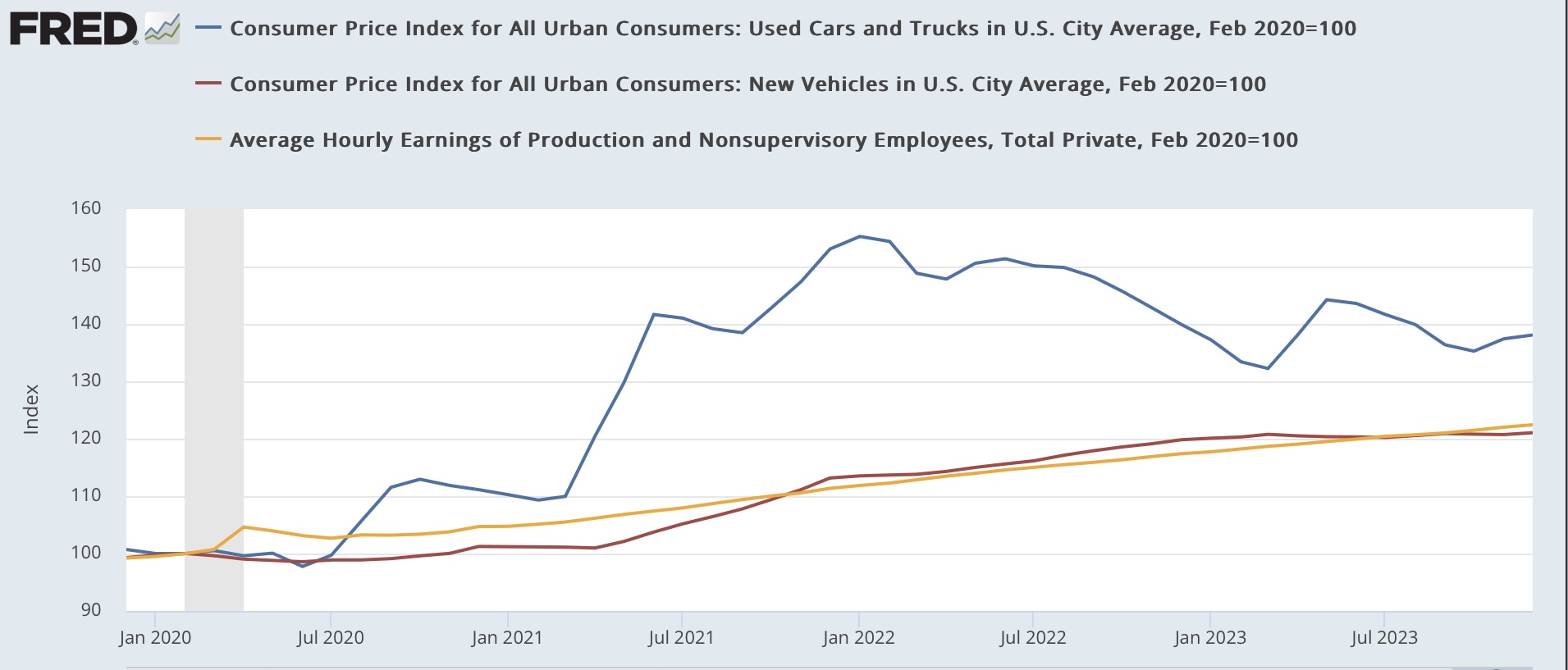
The former problem areas of new (red) and used (blue) car prices continue to cool, as the supply bottleneck for new cars and their components has eased. New car prices increased 0.3% in December, and are *down* -1.3% YoY. Used car prices increased 0.5%, reversing a declined from the previous month, and are up only 1.0% YoY. Below I show them normed to 100 as of just before the pandemic hit, and compare with average hourly wages for nonsupervisory workers (gold):


Wages have actually increased 1.3% higher than new car prices since February 2020, while used car prices, up 38.1% since then, are still about 16% higher than comparable wage growth. As a result I expect continued downward pressure on those.

The biggest current problem area is the related sector of transportation services, which includes car repairs and insurance. These only increased 0.1% in December, but remain higher by 9.5% YoY:


This has partly to do with a shortage of repair parts, and partly because vehicle owners responded to higher car prices by holding on to their older cars, which have required increasing repairs. I have also heard that there has been consolidation in the repair industry, leading to some oligopolistic price increases. Additionally, motor vehicle insurance has necessarily also increased in cost.

A second recent problem area has been food away from home, i.e., restaurants. These prices increased 0.3% in December and are higher by 5.2% YoY:


This also seems to be an issue where we can expect further downward pressure.

Finally, let’s update real aggregate nonsupervisory payrolls, an excellent indicator of the state of purchasing power. Since payrolls increased 0.2% in December, the net effect was a decline of -0.1% in this metric from its November all time high:


But it is still up 2.4% YoY. As you can appreciate, this is well within the range of noise and would only be of concern if no further progress is made.

So in summary, with the big decline in gas prices over for the moment, for all intents and purposes consumer inflation remains all about the lagged effect of house prices on the measure of shelter, which accounts for 33% of headline inflation and 40% of core inflation. We can expect that to continue to decline slowly in the months ahead, so the issue is going to be what happens with energy in particular over that time. The only negative I see is that YoY wage growth is likely to continue to decelerate, so if headline inflation remains reasonably constant, real aggregate payroll growth will probably continue to decelerate, and may stall out.

The good news on jobless claims continues


 - by New Deal democrat


The recent streak of very positive news on jobless claims continued this week.


Initial claims declined -1,000 to 201,000. The four week moving average declined -250 to 207,750. With the usual one week delay, continuing claims declined -34,000 to 1.834 million. The first two are close to their post-pandemic lows of one year ago, and continuing claims are the lowest since the end of October:


As usual, for forecasting purposes the YoY change is more important. YoY weekly initial claims are lower by -1.5%, and the four week average lower by -0.6%. While continuing claims are higher by 11.5%, this is the lowest level since last March:


This very much negatives recession in the immediate future, as is confirmed by comparing the monthly change in YoY initial claims through December, which leads the YoY change in the unemployment rate by several months:


Any triggering of the “Sahm rule” for recessions in the immediate future is off the table.

Wednesday, January 10, 2024

Sales lead employment: real aggregate payrolls update


 - by New Deal democrat


The drought in new data ends tomorrow with consumer inflation. In preparation, let’s take a look at real aggregate payrolls.


These increased 0.2% in December, one of the lower readings in the past 2 years:


On a YoY basis, aggregate nonsupervisory payrolls increased 5.8%, compared with consumer inflation in November, which increased 3.1%:


Recall that over the long term, real aggregate payrolls YoY have been an excellent coincident marker of recession:


They have typically made a rounded peak roughly 6 months before its onset. With real aggregate payrolls being up over 2.5% in November, and at a new record, the expansion has remained on solid footing.

Yesterday I posted another installment of “consumption leads jobs,” so I decided to take a look comparing real retail sales (blue in the graphs below) with real aggregate payrolls. I’ve split it up into three historical segments for better visibility.

Here is 1965 through 1993:


Here is 1994 through 2019:


And here is the post-pandemic record:


As usual, real retail sales are somewhat noisy, and the relationship is not perfect. But in general, real sales have tended to lead real aggregate payrolls by 1-2 months, especially as a smoothed average. Because of the noise, I don’t think we can use the former to forecast the latter, but because each measure independently has been generally reliable, watching them together will be particularly helpful.

I will update again tomorrow or Friday after the inflation report.

Tuesday, January 9, 2024

Scenes from the jobs report 2: the unemployment rate and consumption: weak, but not recessionary


 - by New Deal democrat


Yesterday I looked at some employment metrics from Friday’s jobs report. Today let’s look at un- (and under-)employment.


Every Thursday I repeat the mantra that jobless claims lead the unemployment rate. Here are both the U3 (blue) and U6 (red) rates from Friday’s report, compared YoY:


The unemployment rate is higher by 0.2% YoY; the underemployment rate by 0.6%.

This is actually pretty weak. Comparing historically, about 2 times out of 3, when the unemployment rate is higher YoY, you are close to or even beginning a recession.

Here’s the unemployment rate YoY from its inception in 1948 to 1994:


And here is 1994 through 2019, including the underemployment rate (which began being reported in 1994) YoY as well:


But as noted above, sometimes - e.g., 1967, 1984, 1996, 2003 - it just means weakness without a recession. Most notably, in 2003 both the U3 and U6 rates were significantly higher YoY than they are now, and while there was concern for a “double dip” at that time, there was no recession. Further, because as I’ve noted since early autumn, initial claims have been getting better, not worse, almost certainly now is one of those cases.

Another important consideration is that, just as consumption leads employment, it leads the unemployment rate as well.

Here are real retail sales YoY (blue, /4 for scale) compared with the YoY change in the unemployment rate (red, inverted so that negative means worse) from the onset of the metric in 1948 until 1994:


And here is the modern successor retail sales series through 2019:


Going back 75 years, while the data is noisy, and there are a few notable exceptions (1998-99), the YoY% change in consumption leads the YoY change in the unemployment rate by a few months.

Here is the post-pandemic trend:


YoY real retail sales turned flat in spring 2022. The YoY change in the unemployment rate got less positive starting that summer, and joined consumption as flat to slightly worse by about spring 2023. 

Real retails sales stopped deteriorating YoY last spring, and have been more or less flat YoY since summer. This tells us that the unemployment rate should stop deteriorating as well over the next few months.

Monday, January 8, 2024

Scenes from the leading sectors of the December jobs report: sectors of weakness and strength


 - by New Deal democrat


For nearly two decades, my focus on economic reporting online has been finding and examining leading indicators; those datapoints that tell us where the economy in general, and in particular jobs and income for ordinary Americans, are heading in the near future.

Usually that has meant batting away DOOOOMers; those people who always see terrible things dead ahead, usually based on an indicator they never mentioned before, and will never mention again once its forecast fails to come to fruition. 

But by the end of 2022, like for most forecasters, for me the stars appeared to be in alignment: something bad was indeed ahead. But then something akin to the reverse of THE GREAT FLAMING METEOR OF DOOM! happened: the unspooling of pandemic-related supply bottlenecks more than overcame the effects of the most stringent series of Fed rate hikes in 40+ years. For reference, here is the NY Fed’s Global Supply Chain Pressure Index for the past 25+ years:


Supply chain pressures were at their all-time highest in December 2021. They completely abated by February 2023, and were tied for their all-time loosest last May. In December they were very slightly tight, and in January reverted to very slightly loose - in other words, within their normal long term range.

So, what happens now? Does the improvement in interest rates recently mean better times ahead, or does the fact that they remains very elevated compared with two years ago mean that the tightening finally takes effect? We are in uncharted waters.

All of which is by way of introduction to the short leading indicators for employment constrained in the jobs report. One month ago I wrote that the leading internals of the report were much weaker than most commentators highlighted. 

Let’s see what happened with the December report. Last month I compared present data with long term trends. This time around I’ll use shorter term graphs, but here’s a link to the post one month ago in case you want to compare with longer term trends.

The leading data within the jobs report focuses on the manufacturing and construction sectors, the transportation bringing those goods to market, whether layoffs are increasing or not, and temporary help. That’s because service jobs generally are only affected substantially after jobs in the goods-producing, and transporting, sector are hit. 

The first metric to suffer - reliably enough that it is one of the 10 “official” leading indicators - is the manufacturing workweek. This declined to 40.4 hours in December, its first time below the modern 40.5 hour threshold that has meant contraction, and 1.2 hours below its post pandemic peak:


Only once in the past 75 years, in 1967, has a decline this much not occurred without a recession following shortly, if we were not already in one.

Manufacturing employment itself has almost always declined before the onset of a recession. For the past year, by contrast, it has been almost completely flat (blue). A significant positive has been the increase in motor vehicle production jobs, as the supply chain in that industry has unspooled (red, right scale). That segment might be peaking:


A somewhat similar dynamic has played out in construction, as residential construction employment (building houses) declined through most of 2023, before rising again to a new post-pandemic high in December; while total construction employment (led by the building of new on-shore manufacturing plants) has continued to increase throughout:


All of this has helped goods employment in total, which typically has rolled over or at least plateaued before a recession, continue to grow:


All goods produced, whether domestic or foreign in origin, must be hauled to market. Unsurprisingly, transportation employment (especially trucking) in the past has also typically turned down before a recession. Both of these peaked last May:


Like manufacturing - but unlike construction - transportation shows signs of rolling over.

Here’s what the monthly % change in goods-producing jobs + transportation jobs looks like for the 30 years before the pandemic:


And here it is for the past 2.5 years:


Not quite recessionary, but definitely weak.

Temporary help has probably also been distorted by the pandemic, as it surged well into record territory in late 2021, but has now sunk down below its immediate pre-pandemic level:


I think I would put more weight on its recent (as in, last 6 month or so) decline compared with the backing off from record levels in 2022.

Finally, whether or not layoffs have been increasing is shown by short duration (i.e., less than 5 weeks) new unemployment (blue). Typically (but not always!) these have increased for 6 months or more before a recession has begun. The series is noisier than initial jobless claims (red, right, averaged monthly) and thus it has largely been supplanted by them:


The 3 month average trend in short term unemployment has increased a little in the past 5 months, but is well within the range of noise.

In summary, we have a very weak manufacturing sector, as well as the transportation sector hauling those goods to market. This is counterbalanced by a still-strongly growing construction sector. There are further signs of weakness in the downturn in temporary hiring, and an equivocal, and noisy, slight uptick in short term unemployment. 

The more interest rates cooperate, the less likely this weakness will turn into an actual downturn, and the more likely we’ll see increasing strength.

Weekly Indicators for January 1 - 5 at Seeking Alpha


 - by New Deal democrat


I forgot to post this over the weekend, so here it is now: my Weekly Indicators post up at Seeking Alpha.


I’ll put a post up later taking a detailed look at some aspects of Friday’s employment report.