Saturday, April 10, 2021

Weekly Indicators for April 5 - 9 at Seeking Alpha


 - by New Deal democrat

My Weekly Indicators post is up at Seeking Alpha.

The big news continues to be bifurcation between the currently unfolding Boom, fueled by the fire hose of monetary and fiscal stimulus, and the fallout in the long leading forecast based on the increase in interest rates as a result.

As usual, clicking over an reading will bring you up to the virtual moment on the economic data, and reward me with a penny or two for my efforts.

Friday, April 9, 2021

With a Booming economy comes at least transitory inflation: March producer prices


 - by New Deal democrat

One of the economic subjects you are going to hear a lot about this year is inflation. We are recovering from a sharp if brief recession, and with the dual firehoses of fiscal and monetary stimulus, entering a Boom such as we have probably not seen in over 50 years.


Unsurprisingly supplies of commodities and goods that had been cut back during the recession are going to be stretched thin and much competed for now, generating at least a brief burst of inflation.

With that background noted, this morning producer prices for March were reported up 1.3% for that month alone. YoY producer prices are up 6.0% (blue in the graphs below):


Much of the increase has been due to gasoline. Take out energy costs and producer prices were up a more modest 3.3% (red in the graph above).

Typically producer and consumer prices move in sync, with no more than one month’s variation in YoY peaks and troughs. But consumer prices are much less volatile (gold in the graph below):


Because producer prices frequently actually decline during a recession, as they did in March and April of last year, it is not a surprise that some of their biggest YoY increases occur right thereafter, as recessionary price declines are replaced by strong gains due to increased demand:


And that’s what is happening now. 

I am expecting inflation to abate next year after a great deal of caterwauling from Doomers this year. One negative this year, however, will likely be that average wages will not keep up, resulting in an actual decline in purchasing power for many ordinary workers.

Thursday, April 8, 2021

Jobless claims: progress pauses, as a new surge in COVID in Michigan and the Northeast causes concern


 - by New Deal democrat

New jobless claims are likely to the most important weekly economic data for the next 3 to 6 months. As the number of those vaccinated continues to increase, I expect a big increase in renewed consumer and social activities, with a concomitant gain in monthly employment gains - as we saw in the March jobs report last week.

Three weeks ago I set a few objective targets: I am looking for new claims to be under 500,000 by Memorial Day, and below 400,000 by Labor Day. This week didn’t help us, although it is more of a pause than a significant increase.

On a unadjusted basis, new jobless claims rose by 18,172 to 740,787. Seasonally adjusted claims rose by 16,000 to 744,000. The 4 week average of claims also rose by 2,000 from last week’s pandemic low of 721,250 to 723,250. 

Here is the close up since last August (recall that these numbers were in the range of 5 to 7 million at their worst in early April): 


Focusing just on the less volatile 4 week average since September shows that the last several weeks have been more of a pause at the recent low rather than a notable reversal:


Note that I have discontinued the YoY comparisons, since we would be comparing agains the very worst weeks of the initial lockdowns last year.

Continuing claims, which historically lag initial claims by a few weeks to several months, continued to make new pandemic lows yet again this week. Seasonally adjusted continuing claims declined by 16,000 to 3,734,000, while the unadjusted number declined by 67,666 to 4,031,531:


Seasonally adjusted continued claims have now slowly declined to levels last seen in the summer of 2011, when weekly jobless claims were just over 400,000 and the unemployment rate was 8.2%.

I remain bullish that the ever-increasing pool of fully vaccinated adults - 64,300,000 as of yesterday, or almost 25% of the entire adult population - together with the ongoing seasonal shift from indoor to outdoor activities, is going to continue to result in a dramatic fall in jobless claims over the next few months.

I have to acknowledge, however, that I am growing more concerned at the big spike in new coronavirus cases from the now-dominant UK variant in Michigan and the Northeast, which is now showing up in increased deaths as well. It is at least reasonably possible that this will entirely counterbalance progress on the vaccine front for the next 2 to 3 months.

Wednesday, April 7, 2021

February JOLTS report showed a pandemic still in control


 - by New Deal democrat

Yesterday morning’s JOLTS report for February showed that the pandemic was still in control of the numbers.


This report has only a 20 year history, and so includes only two prior recoveries. In those recoveries: 
  • first, layoffs declined
  • second, hiring rose
  • third, job openings rose and voluntary quits increased, close to simultaneously
The recovery from the worst of the pandemic almost one year ago at first followed this script, but the winter surge, which led to a few month of flat, or worse, jobs reports, disrupted that trend.

Layoffs have followed the above script, reverting to normal levels back in last May, and continuing at those levels since:


But the situation is different with hirings, openings, and quits. Here is the long-term record of the entire series:


But now, let’s zoom in on the past several years:


This shows up in the YoY view as well, where only openings are positive compared with February 2020 (in contrast with the past two recoveries, where hires turned positive first):


While hires did bounce back most strongly at first, as in the past two recoveries, they have faded relatively speaking since.

Further, job openings have continued to increase strongly, and are back to close to their all time peaks in late 2018 and early 2019. Meanwhile, quits, like hires, are slightly subdued.

Because the YoY comparisons will be with the worst of the pandemic in the next several months, those comparisons will generally be useless. We will see if hires reassert themselves, as in the past two recoveries, or whether openings without actual hiring continue to soar as they did starting in 2015.

Tuesday, April 6, 2021

American plutocracy in two simple graphs; plus, when will wage growth bottom?


 - by New Deal democrat

The JOLTS report for February comes out later this morning; I may post on it later or tomorrow.


In the meantime, here are updates on several graphs I used to run during the last expansion in order to examine how shared out (or not) economic growth was.

First, here is a graph comparing corporate profits adjusted for inflation, and total nonsupervisory wages, also adjusted for inflation. Both are also adjusted for population growth, so that we can see how much each has grown (or not) per person:


During the era of strong unions, ordinary workers got an increasing share of the pie. That reversed after the 1970s, took off in the 1990s, and really exploded after 2000. By 2020, real corporate profits per capita had grown by 75% more than total wages per capita:


All of which supports President Biden’s plan to raise corporate taxes to pay for infrastructure, as well as Treasury Secretary Yellen’s proposal for a global minimum corporate tax rate.

Next, let’s turn to underemployment and wage growth. One graph I used to regularly update was the U6 underemployment rate vs. YoY wage growth, which is a “long lagging” metric. In other words, typically an expansion has to be well underway before wage growth starts to accelerate. Based on the history of the broad measure of U6, which only goes back to 1994, it appears that it takes an underemployment rate of less than 10% for wage growth to finally tick up.

In the below graph, I subtract the U6 rate from 10 (blue), so that, e.g., an underemployment rate of 8% shows as +2%. In other words, the more the underemployment rate is under 10%, the more positive it shows. Meanwhile to account for the long term average inflation rate, I subtract 2% from YoY wage growth (red), and multiple *2 for scale:


The U6 rate as of March was 10.7%, and has declined by about 1% in the past 6 months. There are still about 8.4 million fewer workers, mainly from low-paying service jobs, than there were in February 2020. It will probably require the majority of them to be rehired before wage growth bottoms out.

Monday, April 5, 2021

Coronavirus dashboard for April 5: the problematic cases of Chile . . . and Michigan


 - by New Deal democrat

As you probably already know, the news on the vaccination front continues to be good, as the US is now administering on average over 3 million doses a day - and still climbing. At this rate of improvement, every adult in the US could be vaccinated by Memorial Day at the end of next month.


One bit of not so good news is that the percentage of seniors who have received at least one dose has almost stalled out at roughly 75%. For example, yesterday that percentage improved by exactly 0.1%. If 1/4 of even the most vulnerable population simply refuses to be vaccinated, we are not going to achieve herd immunity.

Further, while in the past few weeks I have been highlighting the success stories in vaccination, particularly in Israel and the UK, there are a number of counter-examples that I want to examine today.

First of all, Chile. Chile has administered even more doses per capita than the US, equivalent to about 55% of its population vs. 50% for the US. And yet both cases, and with about a 4 week delay, deaths, have both risen about 50% from the date that vaccinations started to be administered:


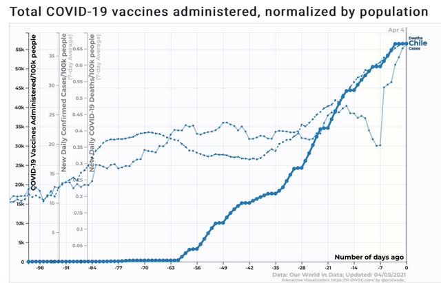
It’s possible that Chile’s trend is being affected by the fact that it is in the Southern Hemisphere and has entered autumn.

But there are several other countries, in the Northern Hemisphere, that are among the top 10 per capita for administering vaccines among more populous countries, who are undergoing similar surges - Turkey, France, Belgium, and Poland:


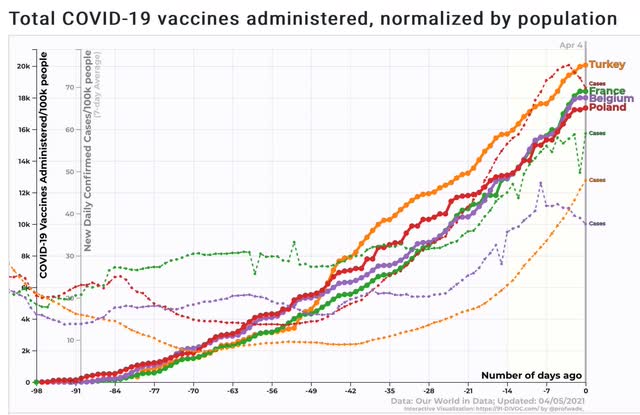
Cases are up 50% to 100%, in the case of Turkey, since the vaccination programs began.

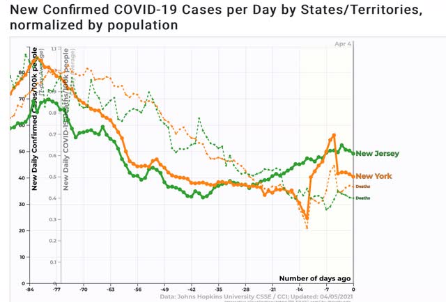
The situation, alas, is similar in some US States, particularly Michigan, NJ and NY, where despite doses equivalent to about 1/2 of their populations having been administered, cases have risen by about 10% in NY, 20% in NJ, and 500% (not a typo!) in Michigan:


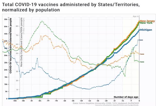
Deaths in NY and NJ have not risen, at least not yet, but they have plateaued:


And in the case of Michigan, deaths have followed cases by 28 days both on the way down, and now on the way back up:


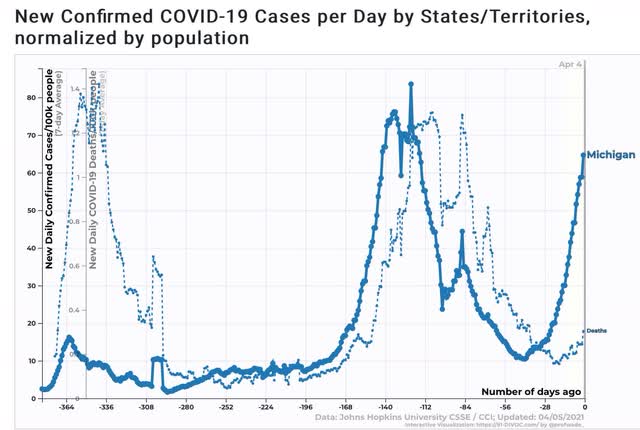
This week is going to be the acid test for Michigan, because it was 4 weeks ago that cases started to really increase exponentially. If deaths follow this week, then by the end of this month Michigan could be back to its worst levels of the entire pandemic.

What this means, I think, is that relaxing too early - even with a large percentage of the population having received at least one dose of the vaccine - can lead to renewed severe outbreaks. We really, really, really need to get close to herd immunity levels in the next month or two.

Sunday, April 4, 2021

I bookmarked a prediction about the coronavirus by supply-sider Scott Grannis one year ago ...


 - by New Deal democrat

 As I mention from time to time, I read a number of economic observers with whose opinions I usually strongly disagree, partly because it is good to consider other points of view, and partly because some compile excellent and interesting data, even if I disagree with their conclusions about what the data means.


The “Calafia Beach Pundit,” Scott Grannis, is one of those writers. His chart work is frequently compelling and often challenging. But, when it comes to the ideologically-inspired response to COVID-19, he has been out of his mind.

So almost exactly one year ago, on March 27, 2020, I bookmarked one of his observations and forecasts, because I expected that the truth would be very different than he thought: 
Since the normal flu season began last October, the CDC estimates that as many as 45 million Americans have come down with one form or another of the flu, and roughly 45,000 have died from complications of the flu. That works out to about 250 deaths per day. In all of the US, and for the year to date, covid-19 has been tied to only 1700 deaths. Simply put, this is not a pandemic, and is very likely not going to become one, especially given the draconian measures that have been imposed across the country to date. 
.... What we really need right now is to recognize that this virus is not a pandemic or a mass killer. It’s probably more like an unusually nasty flu. We need to lift the economic shutdown as aoon as possible and get back to work. Trump is right.

Now that we’re one year later, let’s see how it panned out.

There have been over 30 million *confirmed* cases of the coronavirus. The 550,000 who have died is over 10x the number who typically “have died from complications of the flu,” and over 300x the “only 1700 deaths” from coronavirus he touted.

But not only has Grannis never acknowleged his gargantuan error, the one thing he has remained constant about is that there should be no restrictions on economic behavior which might curb the spread or the deadly toll of the virus. There is literally no set of facts which would cause him to change his mind. Just like his supply-side mania. There is simply no set of facts which would ever cause him to deviate from his mantra that tax cuts for the wealthy and for corporations are the cure for everything.