Friday, August 6, 2010

Weekly Indicators: the 'Digby put' pays 10% edition

- by New Deal democrat

On July 7, with the DJIA at 9600, in Market Sentiment: a Big, Fat, Hanging Fastball I noted that investor and pundit sentiment was terribly bearish, but that insiders were buying at a ratio similar to the bottoms in 2008 and 2009, and said "the icing on the cake" was that :
I read about the CNBC prediction of a Great Depression like head and shoulders formation [a]t Digby's Hullabaloo, an exclusively political left-wing blog.... If bearishness is so pervasive, and expectations of a market move based on a technical indicator so universally known, that investment novices who are political writers warn you about what to expect in the market ....
In the past, indicators like this have been good for at least 30 days. Well, 30 days expires over the weekend, so unless we crash today, the 'Digby put' has paid off a handsome 10%, accurately forecasting the strongest rally all year. In other words, you're reading the right blog.

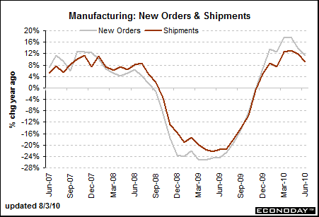
In addition to the monthly jobs report, (which to me highlighted the absolute idiocy of not helping out the states and local governments, where the lion's share of losses have been in the last couple of months), we learned that manufacturing and services were expanding, but manufacturing was doing so at a slightly slower (but still good) rate. Income and spending stalled in June, and more importantly, households ramped up their savings again in May and June to over 6%. Short term this hurts the recovery, but long term it is necessary.

Turning to our weekly numbers, the Mortgage Bankers' purchase mortgage index rose for the third week in a row, now three steps up out of the sub-sub-basement. It definitely looks like we've hit the post $8000 credit termination bottom. Now we need to see if we get a significant bounce (good) or not (bad).

The ICSC reported same store sales for the week ending July 30 rose 3.9% vs. a year earlier, and declined a slight 0.1% from the prior week. Shoppertrak reported the opposite, that sales fell 0.6% for the week ending July 31 YoY. A very mixed result!

Gas prices reamined steady at $2.74 a gallon. At a rate of 9.477 million barrels a day, last week was again one of the highest usages in the last 3 years, a good sign (except for conservation and energy independence).

The BLS reported 479,000 new jobless claims, the highest since April. While auto worker anomalies have ended, I continue to regard this data series as distorted due to filings by laid off census workers, which will probably continue through September. It is possible that almost the entire "stagnation" in this index since the beginning of June has been due to filings by up 25,000 or more census workers in some weeks.

Railfax continues to signal decline. Cyclical traffic is still slightly declining towards last year's level, and baseline traffic is already there. Only intermodal traffic, signalling imports and exports, is showing a very slight improvement. Waste and scrap materials aren't just declining, they are worse than a year ago. Rail traffic continues to argue that the slowdown or double-dip isn't in the future, it is occurring right now.

The American Staffing Association reported that for the week ending 25, "temporary and contract employment grew by 1.51%, pushing the index up one point to a value of 92." This index has grown almost every week this year, and temporary/contract jobs are responsible for almost 1/3 of all non-census job growth since the bottom at the end of last year. I suspect that we will have to wait for the temp workforce to be back to pre-recession levels before we see large numbers of permanent hiring to take place. At present rates, that is still 3-6 months away.

M1 was up 1.2% this week, so is up 4% on a YoY basis. For the month of July, “real M1” is up about 4% YoY). M2 held even this week, or about 2% YoY for July so far (meaning “real M2” is up about 0.9%). A reminder that to be "out of the woods" in terms of a double dip I would want to see continued positive real M1 and real M2 up more than 2.5%.

Last week I started to track weekly BAA commercial bonds. I selected this series because in deflation these spreads may be better indicators (albeit more coincident than leading) than the yield curve, and because this series has been reported since the 1920s. If anyone knows of a free source of short term commercial paper rates going back that far, please leave it in the comments. Weekly BAA commercial bond rates dropped slightly again last week to 5.94%, showing no sign of distress as might be found if another deflationary bust had started.

As usual, there continues to be good news in the Daily Treasury Statement. August has started out at $31.8 B vs. $29.7 B a year ago. More importantly, for the last 20 reporting days, we are also up over 9%, $130.1 B vs. $119.1 B. I'm sure some site somewhere will report the shocking news that July 2010 withholding ended slightly below July 2009, $131.2 B vs. $131.4 B (the last week of July 2010 was dead). As i noted last week, however, there was one more reporting day last year -- which is exactly why I use the 20 day period. This series continues to show a lot of strength for over two months now, even with about 400,000 census layoffs having taken place during that time.

In the real world, most of the reasons for the April-June slowdown have ended. The price of Oil, wage stagnation, and the insanity of Herbert Hoover-ism in Washington continue to be major causes for concern going forward. In the meantime, enjoy the weekend!

By Way of Comparison

Here are charts of the unemployment rates for the last two "jobless" recoveries.


Compare that to the current situation:


we're in about the same boat.

Employment -131,000 With Census, Up +71,000 For Private Payrolls


From the BLS:

Total nonfarm payroll employment declined by 131,000 in July, and the unemployment rate was unchanged at 9.5 percent, the U.S. Bureau of Labor Statistics reported today. Federal government employment fell, as 143,000 temporary workers hired for the decennial census completed their work. Private-sector payroll employment edged up by 71,000.

Here are charts of the relevant data:


The unemployment rate has stalled in the 9.5%-10% range for a little over a year. Remember that is the last two recoveries we had similar problems after the recession ended. While the unemployment rate was lower coming out of both recession, the unemployment rate rose for about a year after both.


The pace of job growth would have been positive for the last two months without the census firings. That being said, the pace of job growth -- while positive -- has been tepid for the last two months after a period of acceleration.

The labor force participation rate -- the percentage of people actually part of the labor force was unchanged at 64.6%, but this number has decreased .6% since April.

The household survey showed a decline of 159,000 jobs.

Goods producing was up 33,000.

Private sector growth was up 38,000.

On a scale of 1-10, I'd give this report a 3.5. While positive, it's clear the pace of hiring is slowing and needs to accelerate for the recovery to gain steam.

Yesterday's Market


For the last four days, prices have been trading in a tight range, indicating the importance of tomorrow's jobs report.


Prices have stalled just below important resistance levels.


The Russell 2000 has also been trading in a tight range, and is still below important resistance levels.

Both daily charts have strong technical developments -- the shorter EMAs are moving higher and prices are above the EMAs. However, the fundamental developments are incrediblyh important to the market right now.


After Friday's early morning move higher (a), oil has been moving sideways (b).


Copper is also consolidating (d) after moving through important resistance (a, b and c). Note the EMAs are very bullish (e) as is the MACD.


While gold have broken through resistance (a), prices are still in an upward sloping, bear market consolidation channel (b). Also note that prices have run into upside resistance at the EMAs for the last three attempted rallies (c).

Thursday, August 5, 2010

No, Virginia, The ECRI Drop Does Not Mean A Double Dip is Coming

When the ECRI index of leading indicators moved lower over the last few months the economic blogsphere jumped on the news, proclaiming that a double dip recession was coming down the pike. The Big Picture Blog posted a statement/explanation from the ECRI group themselves which denied this argument, only to be ignored by, well, everybody. Yesterday, the ECRI group printed another statement on the Big Picture site, again noting the drop in their index does not mean a double dip recession is coming down the pike.

However, the attention to the WLI has been accompanied by a deluge of misinformation which we tried to address in an article titled, Weekly Leading Indicators Widely Misunderstood. We’re concerned that, since then, further unenlightened commentary is still creating such confusion about this very useful tool that it will undermine confidence in its efficacy. We therefore address the main lines of criticism.

....

Some prominent voices representing this group of analysts, who had hurled scorn on the WLI on its way up last year, seem to have decided that the WLI is their new best friend. One widely-quoted commentator famously declared that the WLI has always been correct in calling a recession whenever its growth rate fell below a specific threshold. Many who read this concluded, in essence, that the WLI was infallible as a recession predictor. All we can say is that we’re flattered, but if there’s anyone who thinks that an infallible economic indicator actually exists, he should get in touch with us right away, as there’s a wonderful bridge we’d like to sell him.

It’s true enough, based on the four decades of publicly available data, that WLI growth has never dropped this far without a recession. What most don’t know – apart from the fact that the WLI growth rate shouldn’t be used to predict recessions in the first place – is that, based on two additional decades of data not available to the general public, there are a couple of occasions (in 1951 and 1966) when WLI growth fell well below current readings, but no recessions resulted.

.....

In our book, we’ve described in detail how we look for pronounced, pervasive and persistent cyclical swings in multiple leading indexes in order to make a recession or recovery call. This is a disciplined, objective process we’ve always followed, allowing the chips to fall where they may. Our forecasting approach hasn’t changed, regardless of the torrent of criticism directed at ECRI or the WLI by interested parties.

The U.S. economy is now firmly in the grip of the economic slowdown that we’ve been predicting at least since January. The reality is that, historically, a little more than half of such slowdowns have culminated in recession. Thus, we already knew back in January that, once this slowdown began, there would be a significant risk of recession.

However, a recession is hardly baked in the cake, which is why we aren’t making a recession call at this time. Simply put, we don’t predict the predictors. If we see our collection of leading indexes (including the USLLI, which turns ahead of stock prices) swing decisively toward the recession track, we’ll make a clear recession call. Until then, we’ll keep monitoring our leading indexes, as we’ve done for decades.

For me, these graphs that I printed last week put the issue in perspective.


This graph shows the GDP growth rate for the first four quarters after the end of the recession for the last three recessions. The 1991 recovery moved lower for the first three quarters only to bounce higher in the fourth quarter after the recession ended. The 2001 recovery continued to move lower for the four quarters after the recession ended. This recovery has printed some strong numbers in the second and third quarter coming out of the recovery, only to move lower in the fourth.


And the median growth rate for this recovery is nearly a percentage point higher than the previous recoveries.

Over the last month or so we have seen a slowdown in the manufacturing sector. However, None of those indicators have moved into contraction; they are all showing a slower expansion in that part of the economy. And the dollar's recent drop should lead to higher export totals in the coming months. Yesterday's ISM number for the service sector showed an increase. PCEs have slowed as well, but they are not crashing either. In short, things are slowing; they are not dying.

ISM Shows Continued Expansion; Factory Orders Drop


From the ISM:
"The NMI (Non-Manufacturing Index) registered 54.3 percent in July, 0.5 percentage point higher than the 53.8 percent registered in June, indicating continued growth in the non-manufacturing sector at a slightly faster rate. The Non-Manufacturing Business Activity Index decreased 0.7 percentage point to 57.4 percent, reflecting growth for the eighth consecutive month. The New Orders Index increased 2.3 percentage points to 56.7 percent, and the Employment Index increased 1.2 percentage points to 50.9 percent, reflecting growth after one month of contraction. The Prices Index decreased 1.1 percentage points to 52.7 percent in July, indicating that prices are still increasing but at a slower rate than in June. According to the NMI, 13 non-manufacturing industries reported growth in July. Respondents' comments are mixed. They vary by industry and company, with a tilt toward cautious optimism about business conditions."
INDUSTRY PERFORMANCE (Based on the NMI)

The 13 industries reporting growth in July based on the NMI composite index — listed in order — are: Real Estate, Rental & Leasing; Arts, Entertainment & Recreation; Management of Companies & Support Services; Agriculture, Forestry, Fishing & Hunting; Retail Trade; Information; Other Services; Transportation & Warehousing; Public Administration; Mining; Health Care & Social Assistance; Educational Services; and Wholesale Trade. The four industries reporting contraction in July are: Construction; Utilities; Accommodation & Food Services; and Finance & Insurance.

WHAT RESPONDENTS ARE SAYING ...
Note a few points.

1.) New orders and employment were higher.

2.) 13 industries were showing expansion while 4 were contracting.

3.) The anecdotal information was mostly positive.

From the AP:

Factory orders fell in June for the second straight month due to lower demand for steel, construction machinery and aircraft.

The Commerce Department said Tuesday that factory orders dropped by 1.2 percent to a seasonally adjusted $406.4 billion. Analysts expected a much smaller drop.

May's decline was revised to a steeper decrease of 1.8 percent. It was initially reported as a 1.4 percent drop.

The two months of declines follow nine straight month of increases, as manufacturers ramped up production last fall and helped the U.S. economy grow after four quarters of contraction.

But the sector has since shown signs of stumbling, raising concerns that the economy will slow in the second half of this year. On Monday, a trade group said U.S. manufacturing grew for the 12th straight month in July, but at a slower pace.

The factory orders report "suggests that the manufacturing sector has lost some of its growth momentum," John Ryding, an economist at RDQ Economics, wrote in a note to clients.

Here is a chart of the data:


Notice the orders appear to have peaked. Manufacturing led the way out of the recession. Now we need to see if it slows but doesn't die.

Yesterday's Market


According to lumber futures, the housing market isn't coming back to life anytime soon. Prices took a big dive (a) and are now consolidating at very low levels (b). Also note the EMAs are moving sideways.


Soy beans are rising in sympathy with wheat (see below). Prices are in a strong uptrend (a) and have consolidated are important technical levels (b and c). The EMAs are moving higher with the shorter above the longer (d). Prices currently are consolidating after a strong move higher (e).


Above is a 60 minute chart of the wheat market. Notice the strength of the trend (a) and that prices have made nice, standard consolidations along the way up (b). Yesterday prices made a strong move higher printing some incredibly strong upward bars (c).


The SPYs are right at important resistance levels (a) but they have momentum (d) and money flowing in (b and c). Also note the 10, 20 and 50 day EMAs are over the 200 day EMA.


However, the DIAs are now over important resistance levels.


The 7-10 year part of the treasury curve is again at important support levels (d), although the EMAs are in a very bullish posture (all rising and shorter about longer). However, money is flowing out of the market (a and b) and momentum is declining.

Wednesday, August 4, 2010

Real PCEs Up Modestly


From the Financial Times:

In June, spending adjusted for inflation rose 0.1 per cent after gaining 0.2 per cent in May. Real spending on services edged up 0.1 per cent, while spending on goods rose 0.2 per cent, the commerce department said.

Personal income was flat after increasing 0.3 per cent in May. It was the first time since September that incomes had not risen. Markets had expected income to rise 0.2 per cent in June from a previously reported 0.4 per cent rise in May.

Let's take a look at the data:


Real PCEs arfe still moving higher, although the pace of increase has slowed over the last two months.

Service expenditures -- which comprise about 65% of expenditures -- have moved higher over the last two months after remaining near the same level for the preceding 9 months.
Non-durable goods purchases have stalled, as have

Durable Goods purchases.


Labor Force Realignment? A differing view

- by New Deal democrat

During the last week my co-blogger Bonddad has made an argument (if I understand it correctly) that this is a "jobless recovery" which is in fact a re-alignment of the labor force, based on productivity enhancements in manufacturing. I have to disagree.

As an initial matter, I disagree that this qualifies as a "jobless" recovery. Beginning six months ago, the economy has added 600,000 or 1.3 million non-census jobs, depending on which survey you use. On its face that is simply not "jobless" as the term was used after the last two recessions, when it described an extended period where GDP grew but jobs actually continued to be lost.

But let's go to the heart of the matter. If this were actually a "realignment", we should expect to see a change in movement between the various types of work, and in particular, a move away from manufacturing into other types of work. One sort of job, having risen, would start to decline. Another, having declined, would start to rise. But - aside from one obvious type of job - that is simply not the case.

The following graph shows manufacturing jobs (blue) and service jobs (red) as a percent of total employment since World War 2:
As you can see, as a percent of total employment, service jobs have been rising, and manufacturing jobs have been declining throughout the entire 70 year period. The recent recession and recovery barely even creates a blip in the trends.

Now let's look at a close-up of the same graph, focusing on the last 10 years (note I have moved the measure of service jobs to the right axis to better show the contrast):


At most, there was a 1 year, 1% deviation. Simply put, the recent recession and recovery haven't made a dent in the long term trend. As a percent of the total workforce, service jobs have continued to rise, and manufacturing jobs have continued to fall -- just as they did for the last two recessions and following "jobless recoveries."

The situation is completely different when one looks at a graph of construction jobs as a percent of total employment:


The above graph clearly shows that this ratio has collapsed as a result of the bursting of the housing bubble. About a third of all construction workers have been laid off, and the percentage of workers in that area has fallen to a near post WW2 low. So in the sense that this recession caused construction employment to crater, yes there has been a job realignment. But we already knew that.

Now let's put all of the above information together. The following graph shows the decline from peak of manufacturing jobs (blue), service jobs (red), and construction jobs (green) in the 2001 recession and also in the "Great Recession":


In fact, the "Great Recession" did not hit manufacturing employment significantly harder than did the minor recession of 2001. To the contrary, it has been construction jobs and service jobs that have been hit very hard in the recent recession compared with the 2001 recession. So I must respectfully disagree with my co-blogger. At least as far as the "realignment" thesis regards manufacturing employment, I believe it must be rejected.

In his follow-up post yesterday, Bonddad does note that construction jobs in particular, as well as some service sectors, have taken a big hit, so in that sense we agree. But for that loss to qualify as a "realignment" of the labor force, I would want to see evidence that it has been productivity gains in construction or services that have led to the continuing decline. I do not believe there is such evidence. To the contrary, residential construction in particular has fallen 75% from peak, and at the trough last summer, real retail sales were 10% off peak. As neither construction nor service jobs have fallen as much in percentage terms, I do not think those losses can be called realignments -- again, with the exception that nothing like last decade's construction bubble is likely to be seen any time soon.

But Bonddad's theory does raise another very critical issue: to what extent have manufacturing job losses over the longer term been caused by productivity vs. outsourcing? This seems impossible to quantify exactly with publicly available data, but I do believe we can put one outside limit on it. I will address that in another post.

Yesterday's Market


Yesterday, prices centered around highs established last Tuesday.


Yesterday prices consolidated for the entire day, but moved lower at the end of trading.


Prices are still in an uptrend (a). The gap higher is still in play (b). Notice the 10 day EMA is now through the 50 and 200 day EMA and the 20 is about to move through the 200 as well.


The IEFs are still above their long-term trend line. Also note the EMAs are very bullish. However,


Notice the MACD is (a) is showing declining momentum, and the CMF and A/D line are showing declining participation.


The long-end of the curve is still below its trend line (a). Also note the 10 day EMA is starting to move below the 20 day EMA.


The dollar continues to move lower. The large number of downside gaps (a) is partially caused by trying to make an ETF adjust to a 24 hour market. However, the severity of the drop lower indicates the dollar has quickly lost its safe have appeal that it attained during the Greek crisis.


Oil continued to move above the $80/bbl level yesterday (a). Also note the EMA picture is turning more bullish -- the 10 and 20 day EMA have moved through the 50 and the shorter EMAs are both moving higher.

Tuesday, August 3, 2010

Labor Market Realignment, Redux

I wanted to finish with my thoughts on the labor market. First, this started with an analysis of the other two jobless recoveries. I started the analysis because this is not the first "jobless recovery" we've seen; it is, in fact, our third. The analysis revealed that a drop durable goods employment was the primary reason for the unemployment rate remaining at high levels for at least a year after each of the last two recessions ended. Let's take a look at the current labor market.


Like the last two recoveries, initial unemployment claims have remained elevated moving into the recovery. As a result,


The unemployment rate has remained elevated.


Above is a chart of total establishment jobs for the last five years. Simply estimating the total jobs lost from peak to the current level we get about 7.6 million (roughly 138 million to 130.4 million).


Total durable goods jobs lost are equal to about 1.8 million. So while these jobs were a primary driver for the long-term employment issues in the last two recoveries, they are only part of the reason for the problems in the current recovery. These account for about 23% of all lost jobs.


Construction jobs (obviously related to the problems in the housing market) are down about 2 million, accounting for about 26% of the lost jobs.


Non-durable goods manufacturing has lost about 775,000,, or about 10 % of all jobs lost.

Before we move forward, remember the pattern from the previous expansions with durable goods employment. Output increased thanks to an increase in productivity. If that trend still holds (and it probably will) there is no reason to think that trend won't continue. That trend will also extend into non-durable goods employment. In addition, considering how overbuilt the housing and commercial real estate market is right now, it's doubtful construction employment will return to previous highs either. In other words, at least 60% to the jobs lost will take a long time to come back.

Something I don't know the answer to but would be very curious to find out is 1.) how many of the jobs lost are moving into early retirement and 2.) the average age of the manufacturing population for both durable and non-durable goods manufacturing. My thought here is we've seen manufacturing employment drop for nearly two decades. That kind of drop will lead to fewer and fewer newer hires as the trend to lower employment continues. So, are the job losses we're seeing really a case of accelerated attrition (companies simply getting rid of jobs they intended to get rid of at a faster pace) or is there another trend in place?


Professional and business services have lost about 1.7 million from peak to their current level, but this area of the economy has been adding jobs since the end of the third quarter/beginning of the fourth quarter of 2009. These jobs account for about 22% of all jobs lost.


Financial activities are still losing jobs, and have lost about 700,000 or 9% if jobs lost.

The biggest problem we face is the job losses in "blue collar" industries, which account for about 60% of all job losses. With the exception of financial activities, the other service sectors have either bottomed or are rebounding somewhat. However, it's the blue collar area that will cause the most trouble.

Two Optimistic Graphs

- by New Deal democrat

Since the end of April, the lion's share of the economic data has been bad. But here are two graphs which suggest a short term turning point may have been reached.

You may recall that several weeks ago I looked for data series which turned before April, and were warnings of the deflationary downdraft. Among those were the behavior of bonds vs. stocks, and the Shanghai stock market.

Here is a one year graph of the 10 year treasury vs. stocks. Focus on the last month:

For the first time in 6 months, bonds and stocks are moving in opposite directions. Bond yields have generally continued to decline, while stocks have gone up over 10%. This means that the markets are no longer primarily concerned with deflation, but rather expansion. Note that this pattern mirrors that of a year ago, when the economy started to expand.

Now look at the Shanghai stock index:

Remember that Shanghai for the last few years has tended to lead Wall Street. This index confirms that the upturn in US stocks is not a fluke.

The other indicators that turned before April included the purchase mortgage index, which may have bottomed several weeks ago. BAA commercial bond yields are now declining again. Oil closed over $80 again yesterday, which is bad news in terms of increased impact on the consumer, but good news in that a drop in demand is not the predominate issue. So far, this is all short term, but the turns in trend are welcome news if they are sustained.

This correlates with what has happened in the real world, in which the April downdraft marked the confluence of the Euro crisis (which has abated), the BP oil catastrophe (which has been capped), the expiration of aid to the states (which may be reinstated this week), the expiration of the $8000 housing credit (the negative reaction to which may have bottomed), and near $90 Oil (which did fall but is now back at $80 again).

Russian Wheat Issues May Also Impact Next Year's Harvest

From Agrimoney.com:

The impact of Russia's drought on farmers look set to extend into next year, threatening a "significant decrease" in winter sowings in the core Volga Valley farming region, SovEcon has said.

Farmers in the region, one of the areas worst affected by Russia's worst drought in 130 years, have only a fortnight left until starting plantings, which are undertaken early so as to allow crops to enter well-developed into what are often harsh winter conditions.

Yet the fields there "have had no rain", said Andrey Sizov, managing director of SovEcon, the analysis group whose warnings at the end of June first drew global attention to the threat posed to Russia by drought.

While Volga farmers – responsible for nearly one-third of Russia's winter sowings last year - had some leeway for altering sowing strategy, they faced having "to sow in dry soil, which does not make a lot of sense", Mr Sizov told Agrimoney.com.

"It's too early to say what the planting area in the Volga region will be. But there is the risk of a significant decrease in [winter] planting area."

This is the big issue hitting the wheat market right now. I expect it will continue for some time. For all the talk of deflation, this might actually help out with prices in a, well, ironic way.

Yesterday's Market


The big news yesterday was oil moving through the $80/bbl level (a and b). Also note the increasingly bullish EMA picture -- the 10 and 20 EMAs are now moving over the 50 day EMA.


Yesterday's moves all happened in the opening time period. Prices moved higher quickly (a),, consolidated along the way (b) and then spent the rest of the day consolidating.


I've mentioned the wheat market over the last week. Notice that soy beans are now also moving into 6 month highs -- prices (d) have moved through key resistance (a and b) and the EMA picture is turning bullish -- all the EMAs are moving higher and the shorter EMAs are above the longer EMAs. Also note the strength of the rally over the last week -- prices are printing very strong bars.


Prices moved through important resistance early yesterday (a and b).

Prices gapped higher at the open (a), ran into previously established resistance which provided both support (b) and resistance (c) and then consolidated for most of the day, ending with a small rally (d).


The Russell 2000 had a large sell-off yesterday, which probably kept things from moving higher for the lat morning and early afternoon.


Prices gapped higher yesterday (a) and the uptrend is still intact (a).