Saturday, April 30, 2016
Weekly Indicators for April 25 - 29 at XE.com
- by New Deal democrat
My Weekly Indicators piece is up at XE.com.
There are continuing signs of a bottoming of the industrial recession. But I am concerned about poor consumer spending. I am increasingly coming to the conclusion that consumers' gas savings have been vacuumed up by increasing rents and house prices.
Friday, April 29, 2016
Rents are going through the roof!
Rent increases appear to be out of control. Median asking rent rose from $850 to $870 in the first quarter of 2016, and is up $71 from $799 YoY, an increase of 9%! This sets yet another record for rents.
Here is the graph of nominal median asking rents by the Census Bureau:

Here is an updated look at real. inflation adjusted median asking rents, which also set a new record:
Vacancies remain extremely tight:
| Year | Median Asking Rent | Usual weekly earnings | Rent as % of earnings | |
|---|---|---|---|---|
| 1988 | 330 | 382 | 86 | |
| 1992 | 401 | 437 | 92 | |
| 1993 | 422 | 450 | 88 | |
| 2000 | 478 | 568 | 84 | |
| 2002 | 545 | 607 | 90 | |
| 2004 | 599 | 629 | 95 | |
| 2009 | 680 | 739 | 92 | |
| 2012 | 717 | 768 | 93 | |
| 2013 | 734 | 778 | 94 | |
| 2014 | 762 | 791 | 96 | |
| 2015 | 813 | 809 | 100 | |
| 2016 Q1 | 870 | 823 | 106 |

Despite the ongoing stratospheric increase in rents, not enough multi-unit housing is being built. When the large Boomer generation hit adulthood 50 years ago, note how multi-unit construction quickly shot up to 1,000,000 a year, and remained above 400,000 almost continuously for 20 years thereafter, until the last Boomer hit adulthood:

Now here is the comparable look for the similarly large Millennial generation:

The increase has only been to the 400,000 level, and has been stuck in that neighborhood for 2years.
Renters are typically from the lowest 2 quintiles of the income distribution. The second lowest quintile has had the poorest record of income changes since the recession{
Renters are typically from the lowest 2 quintiles of the income distribution. The second lowest quintile has had the poorest record of income changes since the recession{

and that hasn't changed as of the latest update from the Consumer Expenditure Survey released two weeks ago:

It has increasingly occurred to me that one reason we haven't had a bigger kick of consumer spending from lower gas prices, is that it is all getting sucked up by rent increases.
That rents have been going through the roof is one of the most underreported important stories in the economy.

ADDENDUM: Bill McBride says "there are serious questions about the accuracy of this survey. .... The Census Bureau is investigating the differences between the HVS, ACS and decennial Census, and analysts probably shouldn't use the HVS to estimate the excess vacant supply or household formation, or rely on the homeownership rate, except as a guide to the trend."
Of course, the rate of increase in rents is exactly the trend. But for completeness' sake, let's compare Median Asking Rent with other similar measures.
The only other contemporaneous measure is "rent of primary residence" from the CPI report. It is a mean, not a median:
It has been rising at over 3% a year for the last 2 years -- and MEMO TO THE FED! Housing is the only important sector that is showing any actual inflation. If there is a shortage of multi-unit housing, exactly how is raising rates going to help???
There are two other median measures in addition to median asking rent from the HVS : the American Community Survey (as noted by McBride) and the Consumer Expenditure Survey. Unfortunately the former has only been reported through 2014, and the latter through mid-2015. The below table shows their YoY increases, compared with median asking rent:
SURVEY: ACS CES HVS
SURVEY: ACS CES HVS
2009 -------- (817) ------- ------ (708)
2010 +2.9% (841) +1.4% +2.6% (698)
2011 +3.6% (871) +4.4% -0.6% (694)
2012 +2.1% (889) +5.2% +3.3% (717)
2013. +1.7% (904) +4.3% +2.4% (734)
2014 +1.8% (920) +9.2% +3.8% (762)
2010 +2.9% (841) +1.4% +2.6% (698)
2011 +3.6% (871) +4.4% -0.6% (694)
2012 +2.1% (889) +5.2% +3.3% (717)
2013. +1.7% (904) +4.3% +2.4% (734)
2014 +1.8% (920) +9.2% +3.8% (762)
2015 ---- ----- +4.3%* +6.7% (813)
*June 2014-June 2015 all shelter
The CES through mid-2015 actually shows a bigger post-recession surge in rents than the measure of median asking rents. The ACS is more tame, but ends in 2014. When you also consider rents as measured by the CPI, it is pretty clear that rents are increasing faster than wages.
The Dollar Is Approaching Key Support Levels

While technical analysts may differ about the exact level of short-term technical support, most numbers will be around the 93 level. Commodities (most importantly, oil) will get a boost if that happens.
Yesterday's weak GDP print all but kept the Fed on the sidelines for the next few meetings. With no rate hike on the horizon, the shorts may take over.
Bonddad Friday Linkfest
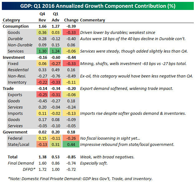
Today, it's all about yesterday's GDP report
BEA Table Showing the Q/Q % Change


The main takeaways in today’s preliminary GDP estimate: consumers are inclined to pare spending on personal items but are ramping up expenditures in the residential sphere. Businesses, meanwhile, are increasingly cautious on capital investment these days.
Housing investment was one bright point. Another was growth in government spending at the state

Thursday, April 28, 2016
In which I was cheerleading the Q1 economy
- by New Deal democrat
Back in 2009 and 2010, when I still wrote at the Great Orange Satan, I used to take flak for the crime of allegedly "cheerleading" the economy. You know, saying that the recession had bottomed and that the numbers were improving, when all of the Doomer kewl kidz just knew that conditions were always and everywhere getting worse and worse for everybody.
Well, Q1 2016 GDP just got reported preliminarily at +0.5%. So let me give you a few samples of my cheerleading.
Back in December, citing the negative Index of Leading Indicators from last summer:
The US$ would not meaningfully have changed the value of the strong LEI values during the first half of 2014, but would have subtracted -.1 or -.2 in the last half of 2014 into 2015, and again during the 3rd quarter of 2015. This would correlate well with the relative weakness of the economy in the early part of 2015, and strongly suggests rough patch this winter into next spring.In January, quoting Prof. Tim Duy:
we might get a negative GDP print, the weakness in the economy is very concentrated. The broader economy is holding up pretty well. That's not a recession.In my forecast for the first half of 2016:
The third quarter of 2015 featured no positive readings whatsoever. On top of that, I have recently suggested that the trade weighted US$ should be included as a short leading indicator, with a weight given of +/- .1 for each +/-1% change in the value of the dollar. Since the US$ has been slowly trending higher over the last 6 months, this suggests to me that this winter we can expect a definite rough patch, that probably has already started. With the readings for the final 3 months of 2015 firmly positive so far, by late spring we should be seeing a rebound.So as you can see, I am clearly nothing but a pom-pom-waving cheerleader.
And as for that potential rebound during this quarter, here are the new orders results from the 5 regional Fed manufacturing indexes for April:
- Empire State up +1 to +11
- Philly down -16 to 0
- Richmond down -6 to +18
- Kansas City unchanged at -2
- Dallas up +11 to +6
The average of the five is +6, down from +9 ib March. This suggest that we will get the 4th month in a row of positive ISM manufacturing new orders rreadings, traditioinally a harbinger of a turnaround in manufacturing activity.
The housing market: a detailed look for April 2016
- by New Deal democrat
I have a detailed look at the housing market, from interest rates through sales to prices to inventory, up at XE.com
Japan's In Serious Trouble
Recent Japanese economic releases are extremely concerning.


Industrial production (top chart) increased a paltry .1% and contracted in 7 of the last 12 months. One of Abenomics goals was to devalue the yen to make Japanese industry competitive. This would then lead to increased production. This obviously hasn't happened.
The BOJ hoped to spur inflation through a variety of measures. Yet, the Y/Y CPI rate is currently fluctuating around 0%. The latest reading was -.3% Y/Y.
The BOJ has continually suggested they are counting on a "virtuous cycle:" low unemployment leading to increased wages followed by increased consumer activity. Yet the Y/Y percentage change in retails sales (bottom chart) shows consumer activity is slowing, not increasing.
This is no good news in today's releases. In fact, there is a tremendous amount of very bad news, because the data implies Abenomics is either failing or has failed.
Bonddad Thursday Linkfest
We'll be doing our regular monthly economic review on Thursday, April 28th at 3PM CST. You can sign up at this link.


Let’s dig into the data a little. The post-crisis slump in international trade was initially concentrated among advanced economies, particularly in Europe. More recently, the trade slowdown has been centred in the emerging markets of Asia, including China. This has led many investors to link weak trade to the slowdown in China, and therefore in the global economy.
Recent work at the Bank of Canada and elsewhere shows that about half of the slowdown in trade growth among advanced economies in the post-crisis period can be explained by weak economic activity, especially sluggish business investment. Throughout this period, companies have been dealing with high levels of uncertainty about the prospects for the global economy, in some cases because of aggressive deleveraging. This has held back investment and, in turn, contributed to soft trade. Investment spending involves capital equipment, with inputs from many countries, and therefore is very trade-intensive. So when economic growth slows because of weak investment, trade slows disproportionately.
While advanced economies were dealing with the worst of the crisis, China’s economy continued to expand. This supported demand for commodities, thereby keeping a portion of international trade flows moving. Higher prices for commodities also prompted commodity producers to make big investments and ramp up supply.
Ultimately, though, growth in China began to moderate to a more sustainable pace. More importantly, the Chinese economy has begun to shift away from investment-driven growth toward consumption, especially of services. Quite simply, this has meant less international trade. Even so, China’s imports of many commodities continue to grow at double-digit rates.
So, we have reason to expect global trade to grow more slowly than in the past: first, because global investment spending is in a lull, and second, because China’s economy is restructuring toward more domestic consumption and less trade. We can certainly expect global trade to pick up when the world economy gets back onto a self-sustaining growth track, with stronger business investment. Still, as I just noted, cyclical factors can explain only about half of the trade slowdown, so we have more explaining to do.
Indeed, I think we need to step back and consider the possibility that the rapid pace of trade growth that prevailed for the two decades before the crisis was the exception, and not the rule. Why would I say that? What we saw during the 1990s and 2000s was the result of the natural incentive to use trade to increase specialization, in reaction to reduced trade barriers and major advances in communication and transportation technology.
During those years, countries formed regional trading blocs through arrangements such as the North American Free Trade Agreement and the European Union. Previously closed economies, such as China, became more engaged by joining the World Trade Organization (WTO).
This combination of elements gave the natural incentive to trade a great deal more room to grow. It paved the way for companies to build global supply chains—the “integrative trade model.” A factory that made a product no longer needed to be next door to the product’s designers. Firms could now exploit their comparative advantage by specializing, not just in one particular good or service, but in one part of a good or service. The result was an explosion of specialization as markets became global and companies became more efficient.
As the Peterson Institute for International Economics put it in its recent persuasive report Reality Check for the Global Economy, “trade boomed during the 1990s and early 2000s in part because intermediate goods began globetrotting.”
However, any trend that goes on for 15 or 20 years becomes ingrained in our expectations. We should have realized all along that this process of integration simply could not continue at the same pace forever. At some point, trade would reach a new balance point in the global economy where firms had built optimal supply chains that crossed international borders, slowing the integration process, at least for the present.
Yes, there are other structural reasons you can point to for the deceleration in global trade. A troubling number of protectionist measures have been put in place since the crisis, for example. But I believe that the most important structural factor behind the slowdown in trade growth is that the big opportunities for increased international integration have been largely exploited. China can join the WTO only once. That’s not to say that further integration waves won’t happen—I certainly hope they will. But if global trade has reached a new balance point, we should not fret that global export growth hasn’t recovered to pre-crisis levels.
Change in gross domestic product (GDP) is the main indicator of economic growth. GDP is estimated to have increased by 0.4% in Quarter 1 (Jan to Mar) 2016 compared with growth of 0.6% in Quarter 4 (Oct to Dec) 2015.
Output increased in services by 0.6% in Quarter 1 (Jan to Mar) 2016. The other 3 main industrial groupings within the economy decreased, with production falling by 0.4%, construction output by 0.9% and agriculture by 0.1%.
GDP was 2.1% higher in Quarter 1 (Jan to Mar) 2016 compared with the same quarter a year ago.


Wednesday, April 27, 2016
Wednesday Bonddad Linkfest
We'll be doing our regular monthly economic review on Thursday, April 28th at 3PM CST. You can sign up at this link.


First, the better “new orders” data and rising industrial commodity prices are consistent with higher bond yields. “The oil price is up around 55 per cent from its low but US 10-year bond yields are down around 20 basis points since the low in the oil price”. A rise in the oil price of this magnitude has never historically been associated with a fall in bond yields, says CS.
Second: “There are some signs of stronger US inflation (with a slight uptick in core PCE inflation, and the Atlanta Fed wage tracker).
Third, CS calculates that bond yields are 1.4 standard deviation below the bank’s estimate of fair value.
Finally, as the European Central Bank and Bank of Japan remain in easing mode, CS notes that “often yields rise in the 3-6 weeks following a commencement or acceleration of QE”.
30-2 Year Yield Spread

Daily Chart of Oil

Daily Chart of Industrial Metals ETF

Now that we’ve fulfilled our duty of relaying the seasonally adjusted annualized rate headline numbers, we can get to the task of discussing the data in our preferred manner. Not seasonally adjusted (or annualized) sales rose to 48,000 units in March, matching April 2015 as the strongest month for new home sales since May 2008. We had forecast unadjusted sales of 46,000 units in March but were off to a larger degree on our forecast for headline sales (488,000) since the decline in the seasonal adjustment factor was smaller than we had anticipated. Be that as it may, the 12-month moving sum of not seasonally adjusted sales, which we consider to be the most relevant gauge of underlying trends in sales, stands at 503,000 units as of March. This can be seen in one of two ways – it is the highest 12-month total for new home sales since November 2008, but at the same time the 12-month total has been pretty much stuck over the past four months, never below 501,000 or above 503,000, implying the underlying trend rate of sales is flattening out.

Tuesday, April 26, 2016
Would the real "real median household income" please stand up?
- by New Deal democrat
Real median household income is among the most important measures of economic well-being. So why do three surveys compiled from 3 different sources give 3 very different results?
Let me point out initially what real median household income is NOT. It is NOT real wages. Real median household income is compiled by the Census Bureau for all households headed by a person age 16 or older. NOT just wage/salary earners. Households consisting of two retirees are included. Households headed by somebody in college are included. Households headed by one or two unemployed person are included. So, real median household income does not tell you what is happening with salaries and wages. It is in no way "proof" that real wages and salaries have been declining. In fact, real wages and salaries have been essentially stagnant since the turn of the Millennium. Rather, calulated from the monthly housheold jobs survey (more on that below) it tracks pretty closely with real median weekly wages adjusted for the employment to population ratio, as shown in the graph below that was created for me by Doug Short (I am using several more of his graphs later on in this post as well):

First off, here ere is median annual real household income as calculated by the Census Bureau, based on the data series Income and Poverty in the United States. It was last updated in August 2015 for 2014:

The data in this report are from the 2015 Current Population Survey (CPS) Annual Social and Economic Supplement (ASEC). It shows median income declining through 2012, and then either an anomalous big increase in 2013 or an anomalous decrease in 2014.
One problem with this series is that it does not adjust for demographics, in particular the burgeoning increase in households of retired people. A clearer picture emerges when we divide households by age groups. The graph below, by Doug Short, superbly shows this breakout, and note especially the approximately 50% decline in income for the retired age cohort:

While median income for all households, and for prime working age households between ages 25 and 54, peaked in 1999, income for households between ages 55 and 64 has gone essentially sideways, and income for households 65 and over has continued to increase! While the typical internet explanation - people can't afford to retire - has some merit, the fact is that the older cohort is rising more than the relatively younger 55-64 cohort, and the increase is in long standing. The primary reason turns out to be the major increase in healthy longevity that caused the labor force participation rate for older people to start to increase in the mid-1980s, and to continue to increase even during the excellent economy of the late 1990s.
Which brings us to the second measure of real median household income. This comes from the study released by the Pew Foundation a month ago. The Pew measure is confined to the age group 20 to 60 years old, and is drawn from the Bureau of Labor Statistics’ Consumer Expenditure Survey:

According to this graph, as the recovery began, median household expenditures returned to pre-crisis levels, but median household income continued to contract. By 2014, median income had fallen by 13 percent from 2004 levels, while expenditures had increased by nearly 14 percent. Unlike the Census Bureaus's report on income and poverty shown in the first graph, there is no increase in either 2013 or 2014.
I am sure that the Pew Foundation accurately represented the data from the CES, but it is nevertheless troubling: despite the fact that employment was increasing, unemployment decreasing, and the labor force participation rate basically stable from 2012-14, the graph showed a continued decline in median household income among prime age workers.
Finally, here is median household income as calculated monthly trhough February by Sentier Research, making use of microdata from the monthly Household jobs report, from the Current Population survey:

Unlike either of the two ofther measures, the CPS microdata used by Sentier shows that real median household income bottomed in 2011 and 2012, and has increased every year since - and almost completely recovered its Great Recession loss by the end of 2015.
The sad fact is, one or more of these metrics, all supposedly showing the same thing, is simply not correct. Have real median household incomes relentlessly fallen since the Great Recession, or did they start to rise in 2013, before having a relapse in 2014? Or did they continue to rise since 2012, making back almost all of their ground by the end of 2015? I think there is persuasive evidence that one of the three metrics is giving a better picture, and I will explore this further in a subsequent post,
One thing that seems very clear is that the CES data is simply telling a different story about the exact same statistic as the CPS data. Even though the Pew study is limited to working age households, it simply does not accord with the demographic breakout by Doug Short of the annual Income and Poverty study, nor is it consistent with the Sentier data from the CPS. And although the Income and Poverty study deflates by PCS rather than CPI, should it really give that different a result? And then there are the odd, anomalous results of 2013 and 2014 in both the Pew and Income and Poverty reports.
The bottom line is, this is too important a statistic to leave to very delayed and problematic annual measures. An even more complete measure, average per capita adjusted gross income - which is generated from the complete tally of all tax returns filed in any given year, is only available through 2013! Resources should be devoted to producing more accurate and timely measures on a Quarterly basis at least.
Bonddad Tuesday Linkfest
We'll be doing our regular monthly economic review on Thursday, April 28th at 3PM CST. You can sign up at this link.


If you want a glimpse of America’s future, turn to California. In 2014, when Mr Trump was pondering his White House run, the state crossed a Rubicon. The number of Hispanics surpassed the number of whites. Two years earlier, California passed a related political milestone. For the first time it failed to elect a single Republican to statewide office. Not only is the state’s governor, Jerry Brown, a Democrat but roughly two-thirds of each legislative chamber are too. If a Republican were elected governor, the assembly could override his veto. The state that produced Ronald Reagan and Richard Nixon has relegated the party to a veto-proof minority, which is where it is likely to stay.
Mr Trump is doing his best to chart a similar course for the national party. In the last presidential election in 2012, Mitt Romney received just 27 per cent of the Hispanic vote — a sharp drop from what George W Bush had attracted. It was a key factor in Mr Romney’s defeat. He had urged Hispanics to “self-deport”. At the time his words seemed hardline. Mr Trump has taken it up several notches by referring to illegal Mexican immigrants as “rapists” and “murderers” and vowing to deport them forcibly. Unsurprisingly, he is polling at barely double digits among Hispanics. A generation ago, Latino Americans were concentrated in California, Texas, and Chicago. They are now spread nationally. In states such as Colorado, North Carolina, Florida and Virginia, non-Cuban Hispanic voters could tip a race. All the signs are that Hispanic groups are determined to make that a reality in 2016.
Their hurdle is pretty low. Univision, the dominant Spanish-language television network, is leading a drive to register 3m new Hispanic voters led by its celebrity journalist, Jorge Ramos — a man whom Mr Trump last year had physically removed from a press conference. Every time a Hispanic turns on their TV, or goes on to their Facebook page, they are urged to register. The only comparable drive is what Barack Obama’s campaign did with African-American voters in 2008, which was a blowout success. Univision is even more ubiquitous than his campaign. Its ratings often exceed the English-language networks. If Univision achieves its voter drive targets, it is hard to see how Mr Trump could win the White House.
China’s total debt to a record 237 per cent of gross domestic product in the first quarter, far above emerging-market counterparts, raising the risk of a financial crisis or a prolonged slowdown in growth, economists warn.
Beijing has turned to massive lending to boost economic growth, bringing total net debt to Rmb163tn ($25tn) at the end of March, including both domestic and foreign borrowing, according to Financial Times calculations.
Such levels of debt are much higher as a proportion of national income than in other developing economies, although they are comparable to levels in the US and the eurozone.
While the absolute size of China’s debt load is a concern, more worrying is the speed at which it has accumulated — Chinese debt was only 148 per cent of GDP at the end of 2007.
“Every major country with a rapid increase in debt has experienced either a financial crisis or a prolonged slowdown in GDP growth,” Ha Jiming, Goldman Sachs chief investment strategist, wrote in a report this year.
Rates of non-payment on emerging-market high-yield bonds have fallen every month this year to a four-month low of 3 percent in March, according to data compiled by Bank of America Merrill Lynch. That compares with defaults on U.S. high-yield bonds rising to 4.6 percent. Energy companies account for much of the disparity, with those in emerging markets mostly propped up with public money while U.S. issuers bear the full brunt of weak oil prices decimating revenues, Bank of America said.
Weekly Chart of the Emerginig Market Bond ETF

While the Bank of Japan’s name is nowhere to be found in regulatory filings on major stock investors, the monetary authority’s exchange-traded fund purchases have made it a top 10 shareholder in about 90 percent of the Nikkei 225 Stock Average, according to estimates compiled by Bloomberg from public data. It’s now a major owner of more Japanese blue-chips than both BlackRock Inc., the world’s largest money manager, and Vanguard Group, which oversees more than $3 trillion.

Monday, April 25, 2016
Bonddad Monday Linkfest
We'll be doing our regular monthly economic review on Thursday, April 28th at 3PM CST. You can sign up at this link.
Sixty-two percent of employers said they expected to raise prices of goods and services to accommodate the higher wages brought by the law. Ten percent of the employers believed incorrectly that the ordinance would force their business to move to a $15 wage immediately upon implementation.
But in an analysis of area prices over time, done through a combination of “web scraping” and in-person visits to grocery stores, restaurants and other retail locations, such price increases were not in evidence.
“Our preliminary analysis of grocery, retail and rent prices has found little or no evidence of price increases in Seattle relative to the surrounding area,” the team concluded.
The Great Normalization (Pragmatic Capitalism)
While many other people have referred to this period as the “new normal” or “secular stagnation”, I’ve referred to it as the “Great Normalization”. What I mean by this is that growth does indeed appear to be moderating. But it’s moderating back to a more stable and steady rate. In other words, we’d been in a secular boom for 50+ years and what we’re seeing now is a lower, but more stable form of growth.


“I think we still see the overall economy progressing in that 2% to 2.5% range, kind of uninspiring growth.” — CSX (CSX) EVP Fredrik Eliasson (Railroad)
“I think we still feel we’re. . . in the same low-growth . . . environment that we’ve been operating in for a couple of years — not enough to make it feel like rates are going to move as a result of it but not enough to feel like we’re stalling either.” — Wells Fargo (WFC) EVP and CFO John Shrewsberry (Bank)
“To me the outlook is less about any sort of explosive growth. The word I would use is ‘potential for stabilization.’ So things have been at a low level.” — MSC Industrial Direct (MSM) co-president and CEO Erik Gershwind (Industrial Distributor)
The Dollar is Still Right Above Key Long-Term Support


Sunday, April 24, 2016
U.S. Equity, U.S. Bond Market and International Week in Review Are At XE.com
We'll be doing our regular monthly economic review on Thursday, April 28th at 3PM CST. You can sign up at this link.
Subscribe to:
Posts (Atom)