NDD is traveling this week, and I'm beat. So, we'll see you on Monday. Have a safe weekend.
Friday, October 14, 2011
The "My God We're Overtaxed" and "My God the Tax Code is Too Complicated" Canard
I usually bite my tongue when it comes to the political debate because I have an extreme amount of contempt for both parties. The Republicans are literally off the rails on a variety of topics -- economics, global warming, family planning etc... I mean, these people now live in a hermetically sealed world where data free points of view are espoused as if backed by noble laureates, lack of evidenced be damned. On the other hand, the Democrats can't lead. Even with a super-majority, they stumbled and bumbled their way for two years. When you're running a country, that lack of leadership capability is stunningly bad.
All that being said, I have yet to see a Republican candidate put out anything beyond standard Republican dogma. To listen to them, you'd think we were the most overtaxed country on the planet earth. Let's cut through their two lines of argument as quickly as possible.
Taxes are in fact near historic lows:
Amid complaints about high taxes and calls for a smaller government, Americans paid their lowest level of taxes last year since Harry Truman's presidency, a USA TODAY analysis of federal data found.Then there is this chart from Reuters:
Some conservative political movements such as the "Tea Party" have criticized federal spending as being out of control. While spending is up, taxes have fallen to exceptionally low levels.Federal, state and local income taxes consumed 9.2% of all personal income in 2009, the lowest rate since 1950, the Bureau of Economic Analysis reports. That rate is far below the historic average of 12% for the last half-century. The overall tax burden hit bottom in December at 8.8.% of income before rising slightly in the first three months of 2010.

Regarding the tax code and its"complexity," let me add my professional .02 cents (inflation adjusted). First, I have a masters in domestic and international taxation from the Thomas Jefferson School of Law where I graduated Magna Cum Laude and am currently a doctoral candidate. I am author of the leading book in the area of Captive Insurance Law. Tax law is the area of law in which I practice every day, so let me offer some evidence from someone who actually does this for a living:
1.) The tax code is not that complicated for the vast majority of Americans. It's just not. If you make below, say, $100,000 and you use a standard tax preparation software, you're not missing any deductions. Really -- you're not. I realize the time involved with putting together your taxes is a pain, but, frankly, the do-it-yourself software is actually pretty good.
2.) If you're a high net worth individual, you can afford the services of a professional. That's part of the joy of being a high net worth individual -- discretionary income.
I'm actually one of the few individuals who has read the vast majority of the tax code and the accompanying regulations. While it took me several years to do so (that's what graduate school is for), that's also the case with vast swaths of the law. Have you ever looked at the property code in a North East state that also has 300+ years of legal precedent to research? Length of legal code is one of the side effects of a common law legal system. Deal with it.
That being said, the tax code is long for two primary reasons. First, is special interest giveaways. There are entire chunks of the code that are sops to special interests. For example -- anything related to natural resources was written by and for the oil and timber industry. Second, there are anti-avoidance statutes. These are laws that were put in place because someone tried to find their way around a nice, plainly worded statute. For example, about 2/3 of the corporate tax code (Subchapter C) is anti-avoidance in nature. The vast majority of the estate code falls under this guise as does the CFC (controlled foreign corporations) act. In short, people getting cute is a primary reason for the code being complicated. Also note -- the sections I've just cited probably won't have an impact on the vast majority of US taxpayers. In short, about 50%-60% of the code deals with special interest giveaways and anti-deferral rules that were written to plug holes in the code.
In short, the "we're being taxed to death" and "the tax code is too complicated" arguments just don't stack up. First, taxes are near historic lows. That means we're not being taxed to death. Second, for most individuals, the tax code's complexity has absolutely no effect on their tax computations: that which was a deduction last year is a deduction this year. Now, if you're terrible at keeping records and scramble every year near tax time, maybe you need to change your financial organization habits. Finally, if you're a high net worth individual, you can afford a professional help. And finally, the basic tax code -- gross income, deductions, taxable income etc... -- are pretty standard. You run into complexity issues on special interest giveaways and plugging of loop-holes -- and, again, this is an area that most taxpayers (as in 95%+) won't even see.
Morning Market


Over the last three days, notice the volume on the IWMs and SPYs has stalled a bit and that the respective candles have gotten smaller. The IWMs have gotten caught at the 50 day EMA. However, the shorter EMAs are now moving higher and the 10 say EMA has crossed above the 20. The lack of volume is still concerning to me, as it indicates there is declining enthusiasm for the rally.

The 7-10 year Treasury market is still below the 50 day EMA. But the price pattern is one of bottoming -- there are four separate candles with very small bodies and two days of somewhat weaker volume.
If the fundamental economic picture were different, I'd be more bullish on this week's developments, as they would fall into the category of turnaround. However, with the fundamentals as confused as they are right now, this looks more like a one week event rather than the beginning of anew trend.
Thursday, October 13, 2011
Ezra Klein Hits One Out of the Park
I seldom remember journalists by name; I use an RSS feed and look for headlines that catch my eye, read the story and move on. Bur Ezra Klein is quickly becoming one of the few writers I actually remember and look for because he writes incredibly well -- especially about economics.
Over the weekend he posted an article on the issues related to the stimulus and the recovery. It is one of the best pieces I've read on the players and politics involved. I simply wanted to focus on two points from the story that really highlight the central problem with the stimulus:
I would encourage you to read the entire article as it's really well done.
Over the weekend he posted an article on the issues related to the stimulus and the recovery. It is one of the best pieces I've read on the players and politics involved. I simply wanted to focus on two points from the story that really highlight the central problem with the stimulus:
The Bureau of Economic Analysis, the agency charged with measuring the size and growth of the U.S. economy, initially projected that the economy shrank at an annual rate of 3.8 percent in the last quarter of 2008. Months later, the bureau almost doubled that estimate, saying the number was 6.2 percent. Then it was revised to 6.3 percent. But it wasn’t until this year that the actual number was revealed: 8.9 percent. That makes it one of the worst quarters in American history. Bernstein and Romer knew in 2008 that the economy had sustained a tough blow; t hey didn’t know that it had been run over by a truck.In other words, a central reason why the stimulus didn't work as advertised is it was based on data that grossly underestimated the overall contraction. Initial estimates showed a contract that was half as small as the actual contraction that occurred. That is a huge understatement.
Some partisans offer a simple explanation for the depth and severity of the recession: It’s the stimulus’s fault. If we had done nothing, they say, unemployment would never have reached 10 percent.The argument that the stimulus didn't do anything is simply wrong. Government spending is a variable in the GDP equation; when you increase it, there will be an effect. There is no way to get around that basic mathematical truth.
That notion doesn’t find much support even among Republican economists. Doug Holtz-Eakin is president of the right-leaning American Action Forum and served as Sen. John McCain’s top economic adviser during the 2008 presidential campaign. He’s no fan of the stimulus, but he has no patience with the idea that it made matters worse.
“The argument that the stimulus had zero impact and we shouldn’t have done it is intellectually dishonest or wrong,” he says. “If you throw a trillion dollars at the economy, it has an impact. I would have preferred to do it differently, but they needed to do something.”
A fairer assessment of the stimulus is that it did much more than its detractors admit, but much less than its advocates promised.
I would encourage you to read the entire article as it's really well done.
Random Establishment Employment Thoughts

First, consider the above chart of total establishment jobs for the last five years. There is an enormous gap of jobs that have still not come back. In other words, there is a tremendous amount of labor market slack. However, let's consider the reverse -- where have the jobs been created? First, the lowest point of this cycle occurred in February 2010 when there were 129,246,000 jobs in the economy. Since then -- and including the latest jobs report -- the economy has added a little over 2 million jobs. But, when looking at the high point in jobs versus the low point in jobs over the last 5 years, the economy has lost 8.7 million. So, most people will look at the above chart and notice we're in fact 6.7 million jobs behind.
Morning Market

Let's start by looking at the 5-minute, SPY chart of the last 7 days. This is a good looking rally. Prices are clearly in an uptrend. Along the way, we've seen advances and some pullbacks. But, overall, there's been a very nice overall rhythm to the advance.

The daily chart shows some strong bars which have advanced through all the shorter EMAs. Also note the 10 and 20 day EMA are now moving higher, with the 10 day crossing over the 20. But since moving through the 50 day EMA, the rally has stalled on increasingly diminishing volume. And yesterday's bar printed a very long upper shadow indicating prices had advanced but couldn't hold the gains. My guess is we're seeing a consolidation at these levels, as traders take some profits and rethink the advance. While they probably moved into the market thinking it was oversold, now there are questions about how far it can realistically advance given the underlying fundamentals.

However, treasury prices are now below the 50 day EMA, and have been there for three trading days. The shorter EMAs have both turned lower and the 50 day EMA is now moving sideways. In short -- there is increasing evidence the Treasury rally is ending, as evidenced by the following TLT chart which shows prices at the long end of the curve have also broken trends:


The dollar has dropped from its recent rally, and has hit the 200 day EMA price area. The shorter EMAs have also moved lower and the 50 day EMA has decreased its rate of ascent. My guess is dollar traders are going to wait and see how the EU agreement plays out before continuing to bid the dollar higher at this point.
Wednesday, October 12, 2011
Bonddad Linkfest
- Port volume indicates weaker Christmas season
- Jobs bill fails
- IEA lowers global oil demand estimates
- Five things we learned in the GOP economic debate
- UK unemployment increases to 8.1%
- Greek budget deficit widens 15%
- EU industrial output increases for second month
- What is the jobs impact of free trade pacts?
- Anecdotal info: real estate market is abuzz
- Wait for a pullback
No AEI, WSJ, Virginia and Anybody Else Who Is Interested in Factual Data and Analysis -- The CRA Did not Cause the Housing Bubble
In the name of God and all that is holy, the "government regulation and CRA caused the housing crash" meme popped up AGAIN today, thanks to some utterly clueless idiotic yahoo at the AEI. Thanks to the truth challenged morons at the editorial page of the WSJ, we get this gem:
I realize that getting paid to spread this type of complete tripe is what "think tanks" are about. But, could you at least come up with something new?
And shame on Marc Perry for linking to this crap. He should know better.
Fannie and Freddie were not the only government-backed or government-controlled organizations that were enlisted in this process. The Federal Housing Administration was competing with Fannie and Freddie for the same mortgages. And thanks to rules adopted in 1995 under the Community Reinvestment Act, regulated banks as well as savings and loan associations had to make a certain number of loans to borrowers who were at or below 80% of the median income in the areas they served.Let me respond with someone who knows something about this: Federal Reserve governor Randall S. Kroszner:
Our findings are important because neighborhoods and communities affected by the economic downturn will require the active participation of financial institutions. Considering the situation today, many neighborhoods that are not currently the focus of the CRA are also experiencing great difficulties. Our recent review of foreclosure data suggested that many middle-income areas currently have elevated rates of foreclosure filings and could face the prospect of falling into low-to-moderate income status. In fact, 13 percent of the middle-income Zip codes have had foreclosure-rate filings that are above the overall rate for lower-income areas.Barry Ritholtz over at the Big Picture Blog has a far more devastating take down of this intellectual bile. See the numerous links at the bottom of this link.
Helping to stabilize such areas not only benefits families in these areas but also provides spillover benefits to adjacent lower-income areas that are the traditional target of the CRA. Recognizing this, the Congress recently underscored the need for states and localities to undertake a comprehensive approach to stabilizing neighborhoods hard-hit by foreclosures through the enactment of the new Neighborhood Stabilization Program (NSP). The NSP permits targeting of federal funds to benefit families up to 120 percent of area median income in those areas experiencing rising foreclosures and falling home values.
In conclusion, I believe the CRA is an important model for designing incentives that motivate private-sector involvement to help meet community needs. The CRA has, in fact, been helpful in alleviating the financial isolation of many areas of concentrated poverty, but as our report illustrates, there is much more that could be done in these communities. Contrary to the assertions of critics, the evidence does not support the view that the CRA contributed in any substantial way to the crisis in the subprime mortgage market. Today's discussion is an important first step in the process of identifying other initiatives and areas of cooperation between government and the private sector that will effectively address the continuing challenge of poverty in the United States.
I realize that getting paid to spread this type of complete tripe is what "think tanks" are about. But, could you at least come up with something new?
And shame on Marc Perry for linking to this crap. He should know better.
Where Are We Creating Jobs? Pt. III
Let's continue our look at where the jobs are being created by looking at additional areas of the service sector.

The long-term retail services chart in Log scale shows that employment in this area of the economy began topping out at the end of the 1990s. While the early 2000s expansion saw some increases, they were at a far slower rate. And the job cuts at the end of the recession have not been "filled in."

Above is a chart of retail employment, which comprises 16% of service sector jobs. From peak to trough, this area of the economy lost 1.2 million jobs, but since the trough has added 243,000 jobs. That means this part of the economy still has a hole of 1 million jobs to fill, assuming the previous peak is "full employment" in the retail area.

The long-term chart of leisure and hospitality employment is generally up, with the exception of the latest expansion. Notice that the total number of jobs has dropped from its peak and has yet to retain that level.

From peak to trough, leisure lost 609,000 jobs, but has since gained 292,000. So, about half of the jobs lost have come back.

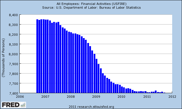
Financial jobs saw continued gains until this expansion, where there has been no employment growth.

Above is a chart for total financial services, which shows an overall net loss with no gain. In fact, the peak to trough includes a trough established in the last employment report. The net result is this sector of the economy has lost 748,000 jobs in the last five years.
The above sectors of the job market account for 39% of the service sector jobs market.

The long-term retail services chart in Log scale shows that employment in this area of the economy began topping out at the end of the 1990s. While the early 2000s expansion saw some increases, they were at a far slower rate. And the job cuts at the end of the recession have not been "filled in."

Above is a chart of retail employment, which comprises 16% of service sector jobs. From peak to trough, this area of the economy lost 1.2 million jobs, but since the trough has added 243,000 jobs. That means this part of the economy still has a hole of 1 million jobs to fill, assuming the previous peak is "full employment" in the retail area.

The long-term chart of leisure and hospitality employment is generally up, with the exception of the latest expansion. Notice that the total number of jobs has dropped from its peak and has yet to retain that level.

From peak to trough, leisure lost 609,000 jobs, but has since gained 292,000. So, about half of the jobs lost have come back.

Financial jobs saw continued gains until this expansion, where there has been no employment growth.
Above is a chart for total financial services, which shows an overall net loss with no gain. In fact, the peak to trough includes a trough established in the last employment report. The net result is this sector of the economy has lost 748,000 jobs in the last five years.
The above sectors of the job market account for 39% of the service sector jobs market.
Morning Market


The averages are still in a strong rally. The IWMs are right below the 50 day EMA, and the SPYs and IYFs are right at the 50 day EMA. Given the strength of the rally, I'd like to see prices drop to one of the shorter EMAs, thereby allowing some traders to take profits and others to get into the market. The continual decline in volume is still a concern however, because it indicates a growing lack of interest as prices rise.

The IEFs remain below the 50 day EMA with the 10 day EMA crossing below the 20. This is important, as it is occurring on a day when the Treasury market is open.
The above charts could provide an argument for an overall reversal of trend and sentiment.
Tuesday, October 11, 2011
Bonddad Linkfest
- Incomes drop more in recovery than recession
- Employment Chart Roundup
- Invictus at BP v
- Cafe Hayek
- Beijing intervenes to stabilize banks
- Bond bears stalk treasury ETFs
- Could US growth pick-up in the second half?
- New bankruptcies may emerge in tough economy
- Small business confidence improves
- OPEC cuts demand projections
ROR on Infrastructure Investment?
I'm putting this question out to BB readers.
Right now, the 10-year Treasury is trading right around 2.2%. Has anyone ever seen a report that shows the long-term rate of return on infrastructure spending? By long-term, I mean 10+ years?
Please let me know in the comment section below.
Right now, the 10-year Treasury is trading right around 2.2%. Has anyone ever seen a report that shows the long-term rate of return on infrastructure spending? By long-term, I mean 10+ years?
Please let me know in the comment section below.
UN Projects Increased Food Price Volatility
From Reuters:
Food prices are likely to become more volatile in coming years, increasing the risk that more poor people in import-dependent countries will go hungry, the United Nations said in an annual report on food insecurity published on Monday.
Global food price indices hit record highs in February and were a factor in the Arab Spring of unrest in north Africa and the Middle East.
Prices have since eased but the U.N. report said economic uncertainty, low cereal reserves, closer links between energy and agriculture markets and rising risks of weather shocks were likely to cause more dramatic price swings in the future.
"Food price volatility featuring high prices is likely to continue and possibly increase," the Food and Agriculture Organization, the World Food Program and the International Fund for Agricultural Development said in the joint report.
"Demand from consumers in rapidly growing economies will increase, population continues to grow, and further growth in biofuels (displacing food crops) will place additional demands on the food system."
The report said that poor farmers and consumers in small importer countries, particularly in Africa, would be more vulnerable to shortages as a result.
Where Are We Creating Jobs, Pt. II
Let's continue on the theme of looking at where the economy is creating jobs. Under the service sector, the BLS has several sub-parts. For our purposes, we'll look at the following areas, which represent the respective percentage amount of total service jobs.
Educational and health care jobs: 22%
Professional and business services: 19%
Retail trade: 16%
Leisure and hospitality: 14%
Financial: 8%
Let's start with educational and health care, by looking at the long-term trend:

Notice that the long term chart in log scale is very impressive and shows a strong, continued uptrend over a multi-decade time period. While the pace has decreased somewhat over the last 10 or so years, we're still seeing a strong uptrend.

Over the last five years, we see a continued uptrend that wasn't even dented by the recession. Over the last five years, this area of the economy has created 2.156 million jobs -- a very impressive feat.
Let's move to professional and business services.

On the long-term chart, we see a strong multi-decade uptrend until the last recession. While we saw job growth during the last expansion, it occurred at a slower pace.

On the five year chart, we see fairly strong job growth. From peak to trough, the economy lost 1.669 million professional business service jobs. But since the trough, the economy has added 897,000 jobs in this area of the economy. Put another way, a little more than half of the jobs in this area of the economy have come back.
These two areas of job growth represent 41% of all service sector jobs.
Morning Market

Oil is in the middle of a nice turn-around. Prices have moved though the upper downward sloping channel line and a key price level. They've also moved through the 10 and 20 day EMA and have hit the 50 day EMA. The MACD has also given a buy signal. Marketwatched noted the following regarding the oil market:
Overall, “there is a favorable set of fundamentals giving support to crude oil right now, including strong job retention in the U.S., more evidence that [third-quarter] industrial and cyclical earnings will come in strong, and a firming up of the demand story especially in the U.S.,” he said. “This process is taking dollars out of the money markets and putting them back to work in stocks and commodities.”If prices move through the 50 day EMA, the next stop will be the 200.

Helping oil's rally was a massive sell-off in the dollar, which hit the 200 day EMA after moving through the 10 and 20 day EMAs. The dollar sold-off on the EU pledge to provide liquidity to the banking system. Obviously a weak dollar benefits commodities.

Stock are the in the middle of a strong rally. From their low a little above 108 stocks have now rallied about 10.5%. Notice that with the exception of Friday, prices have printed a series of very strong candles. Prices have now moved through the 10, 20 and 50 day EMA. The only drawback is the declining volume on the rally.

The 7-10 year Treasury ETF is in the middle of a very strong downtrend that has lasted 5 days.

The daily chart shows that prices have dropped sharply through the EMAs and trend lines. Also note the 10 day EMA has now crossed below the 20 day EMA. This is a pretty strong reversal in comparison to just a few weeks ago. This could be an indication that sentiment is turning more aggressive.
Monday, October 10, 2011
Bonddad Linkfest
- Hedge funds have worst quarter since 2008
- Australian and New Zealand crops benefit from better weather conditions
- Is corn near a low?
- Libyan oil output up faster than expected
- Saudi sees no need to increase oil production
- Steel prices are moving lower
- OECD indicators paint darkening picture
- Soybeans go more to biodiesel than food
- Iowa farmland going at big prices
- DC dysfunction scaring old pros
Why Debt Debate Was So Incredibly Stupid
From the Financial Times:
Many foreign investors are not reassured by the increasingly explicit US government guarantee, and are wary of the debt that the two housing agencies issue. The political fallout over the US debt ceiling this summer and the consequent Standard & Poor’s downgrade of US sovereign debt intensified fears that politics might derail the US government promise to guarantee the debt.
“We have become hostage to the irresponsible behaviour of politicians,” said Bader al-Saad, head of the KIA, in a New York speech last month. “What happened during the debt negotiations will make many countries think twice about the investment environment of the US.”
Where Are We Creating Jobs? Pt. I
From the low point in job creation during this cycle, the economy has created about 2 million jobs. The question becomes -- where are these jobs being created? Let's take a look.

Above is a chart of total service employees. From the highest to lowest point, we've lost about 4.6 million jobs. However, we've also gained about 2.1 million from the low point in October 2010 to the latest employment report.

The above chart shows total manufacturing jobs for the last five years. From the high to the low point, we've lost about 2.6 million manufacturing jobs. From the low point to the high, we've added 285,000 manufacturing jobs. What's interesting about this number is manufacturing has been a primary driver of the last two years. This tells us that automation is having a tremendous impact on manufacturing employment.

Finally, we have total government jobs, where we see a slow, continual bleed. Eliminating the two spikes in the chart, we've lost 597,000 jobs in the government sector over the last five years.
In other words, the service sector is a prime driver of the current jobs market. Next, we'll break the service numbers down into their subparts.
Morning Market

I wanted to start by looking at the dollar chart, because it belies the underlying fundamentals. In an ideal trading world, a currency's value should rise when interest rates increase (because traders will park their trades in the home country's interest bearing accounts to some degree) and/or the economy is growing (because a strong economy attracts investment dollars). The US has neither, which means it is benefiting from being the only relatively safe haven currency in the storm. Remember that Europe is experiencing the Greek problem, making the euro a less than attractive investment and the Swiss National Bank has stated it would intervene in the currency markets franc's rise. That basically leaves the dollar by default.
The good news is this is a strong, bullish chart. We see money flowing into the dollar as the rally starts; prices are now over the 200 day EMA, all the shorter EMAs are rising and the 10 and 20 day EMAs are above the 200 day EMA.

The volume indicators show that money is moving into the market, but the MACD has given a sell-signal. However, in looking at this chart, remember that I place the most emphasis on the candles, the second amount of the EMAs and the third amount on the lower indicators.
Finally, note the above that is overall commodity negative but inflation positive.


In the charts above, notice that prices have either advanced through key resistance or are about to. Also of importance is that prices have moved through at least the 10 and 20 day EMA and in some cases have hit the 50 day day EMA for resistance. The significance of these developments is that prices now have a bit of breathing room, especially considering the technically precarious position in which they started last week. However, remember the averages are below their respective 200 day EMAs and in two cases (the SPYs and IWMs), the longer EMAs are both moving lower. In short, last week was a respite; there are still deep concerns about the macro economy which will probably prevent a strong rally.


Although still in a rally, the 7-10 year part of the Treasure curve has moved below important support, although it is still about the 50 day EMA, which it is using for support. The TLTs are right at crucial support. Both markets are still in a bull market, but the trend break by the IEFs could be an important development, as it might signal that the inflation bite might finally be taking its toll.
Subscribe to:
Posts (Atom)