Saturday, August 20, 2022

Weekly Indicators for August 15 - 19 at Seeking Alpha


 - by New Deal democrat

My Weekly Indicators post is up at Seeking Alpha.

The continued decline in gas prices has been doing some nice things to other indicators as well. Meanwhile, manufacturing as measured by the regional Feds is getting worse.

As usual, clicking over and reading will bring you fully up to date, and reward me just a little bit for my efforts.

Thursday, August 18, 2022

Prices of existing homes have probably peaked


 - by New Deal democrat

By now you may already know that existing home sales declined further in July, to an 8 year low (excluding the pandemic lockdown months:


This is roughly a 30% decline from their peak, and is certainly a recessionary level.

But perhaps more importantly at the moment, it appears that the prices of existing homes have now peaked.  Here is the one year graph from FRED:


Since there is no seasonal adjustment for prices, YoY is the only real way to measure, and YoY prices are up 10.7%.

Here is a longer term look at the YoY% change in prices (excluding this month), via Mortgage News Daily:


My rule of thumb is that when a metric that can’t be seasonally adjusted declines by more than 1/2 of its YoY peak in the past 12 months, it has probably peaked. One year ago, prices increased over 23% YoY. Since 10.7% is less than half of that, prices have probably passed their peak.

I have frequently pointed out that the sequence in the housing market is that sales peak first, and prices peak afterward. Since new home prices declined on a seasonally adjusted basis beginning last month, if existing home prices have now joined them, that means that the pattern has now been fulfilled. We should expect inventory to continue to increase from here, adding to the pressure of price declines.


New jobless claims decline for a (recent) change


 - by New Deal democrat

For the last several months, there has has been nearly a relentless slow increase in new jobless claims. That trend broke, at least for this week. 


Initial jobless claims declined by 2,000 to 250,000. More importantly, the 4 week average also declined by 2,750 to 246,750.  Continuing claims rose 7,000 to 1,437,000, the highest since April:


Claims have been on track to turn higher YoY in November, which would signal an imminent recession; but with this week’s report that trend *may* be breaking - to the good side.

Wednesday, August 17, 2022

July real retail sales show more stagnation, but slightly positive YoY


 - by New Deal democrat

Consumption leads employment. Increasing demand for goods and services leads employers to hire more people to fulfill that demand. That, in a nutshell, is the biggest reason why real retail sales is one of my favorite economic indicators.


In July, nominal retail sales increased by less than 0.1%, rounding to 0. Consumer prices declined by less than -0.1%, also rounding to 0. But the combination was just enough to push real retail sales to round to +0.1%:


Still, real retail sales remain -1.1% below their April peak:


Interestingly, while as noted above nominal total retail sales were unchanged, retail sales excluding motor vehicles increased 0.4%, and retail sales excluding both vehicles and gas increased 0.7%. Since March 2021, total nominal retail sales are up 9.6%, and ex-vehicles and gas up 9.4%, but excluding vehicles only up 13.4%:


[Note: retail ex gas and vehicles has not updated yet on FRED, so June and July of that series are not shown]

This indicates that consumers are avoiding the purchase of motor vehicles, given their big price increases as shown in this graph which I ran when CPI was updated earlier:


And it further suggests that a big reason for the dampened consumer spending this year is the big increase in car and SUV prices. In other words, the chip shortage is a Big Economic Deal.

That being said, YoY real retail sales, which were negative for the past several months, are now up 1.7%:


This is a good sign, since negative YoY real retail sales typically have been a recession marker, but positive YoY real retail sales have historically only happened either in expansions or late in recessions (i.e., a short leading indicator of an incipient recovery). In other words, yet another sign that the US economy is not currently in a recession.

Finally, as noted above, real retail sales is a good short leading indicator for employment. Here’s the long term view from 1993-2019:


And here is the last year:


Even with the blowout July employment gains, on a YoY basis job growth has continued to decelerate, and I expect it to decelerate further, perhaps sharply.


Tuesday, August 16, 2022

Industrial production heats up in July


 - by New Deal democrat

If the news in the housing sector this morning was bad, the news from the King of Coincident Indicators, industrial production, was quite good.


Total production rose 0.6% to a new all-time high. Manufacturing production rose 0.7%, and is below its April peak by only -0.1%:


Barring downward revisions, this, together with the latest blockbuster employment report, makes it *very* unlikely that the US was in recession as of July.

This is further shown by the YoY% changes in each. Currently total production is up 3.9%, and manufacturing production up 3.2%. Typically recessions have started from much weaker comparisons, although 1973 (oil embargo) and 2008 (housing collapse) did start from similar YoY comparisons:


With oil and gas prices having continued to decline in the past few weeks, I do not see any such sudden downdraft in the immediate present.

Housing permits, starts, and units under construction telegraph a deeper economic decline ahead


 - by New Deal democrat

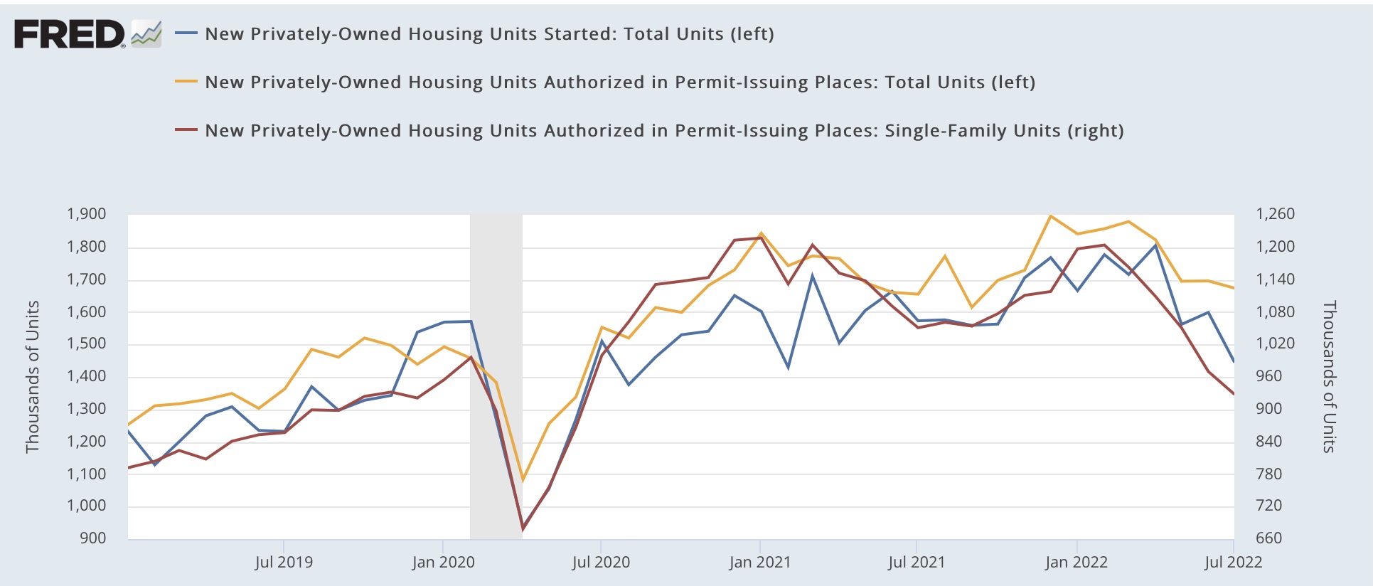
Housing had another negative month in July. Permits (gold in the graph below) declined -1.3% to 1.674 units annualized, an 8 month low. Single family permits (red, right scale) declined -4.3% to 928,000 units annualized, the lowest since January 2020 except for the pandemic lockdown months. And the three month average of starts (blue) declined to 1.536 units annualized, the lowest since the September-November 2020 period:


Total permits are still slightly higher YoY, +1.1%, but single family permits are down -11.7%:


Earlier this year, I highlighted the record number of housing units that had permits, but had not yet been started, pointing out that it distorts the economic signal, noting that “The conundrum is whether the 50 year high backlog in units not yet started will delay the downturn until it clears …. Since starts are the actual economic activity, until I see an unequivocal downturn there, the massive negative signal from permits, mortgage rates, and mortgage applications remains open to question.”

Last month permits continued to fall, and starts fell as well, verifying that signal. This month the signal became even clearer, and has also clearly spread to housing permitted but not started (gold in the graph below), and housing under construction (blue):


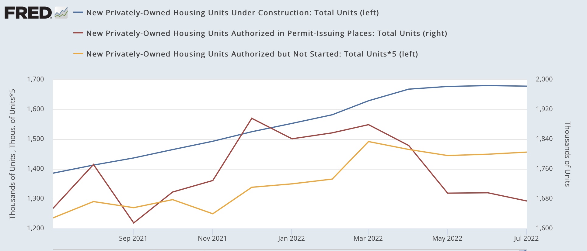
Here is the long term perspective going back 50 years:


At peaks, housing not yet started follows permits with only a short delay, with a longer delay until housing under construction peaks. Although we aren’t concerned about this at the present, note that at troughs, housing not yet started bottoms with a much greater delay compared with permits, almost as long as housing under construction.

Last month I wrote: “ Housing under construction is the ultimate coincident marker of housing economic activity. Once that begins going down, housing’s contribution to the economy is negative in real time. We are probably only a month or two from that point. In other words, the leading indicators will be joined by the coincident indicator.”

As shown above, housing under construction has been flat at its peak for the last 3 months. While housing’s contribution to the economy is not significantly negative yet, it is on the cusp of becoming so.

In the past declines of this magnitude have either corresponded with recessions, or else with near-recessions in 1966-67, 1984-85, and 1994-95. The more housing declines, and as I repeated yesterday, I am expecting further declines, the more certain a recession becomes and the deeper the trough of that recession.


Monday, August 15, 2022

Housing affordability: at or near the worst this Millennium


 - by New Deal democrat

The NAR calculates a monthly “housing affordability index,” which estimates the median mortgage payment for the median priced existing home based on an estimate of median household income. For June that came in at 98.5:


Not only has affordability deteriorated sharply this year, but the June reading was the lowest in over 20 years, i.e., even worse than at the peak of the housing bubble:


[note above graph stops in May].

From time to time I have looked at other measures of housing affordability, by calculating separately for down payments and monthly mortgage payments, for different housing indexes, and making use of the more timely data on average hourly wages. I last did this in April and May. Given the NAR’s new 20 year record low in June, let’s take another updated look.

The first graph below compares 4 measures of house prices: the FHFA purchase index (blue), the Case Shiller national index (red), the Census Bureau’s measure of median prices for new houses (gold), and the NAR’s measure of median prices for existing homes (for the last year only)(purple). The best way to get to the “real” inflation adjusted cost of housing would be to divide by median household income, but since that is only officially calculated once a year, a good monthly proxy is average hourly wages, which is what I use below. All 4 measures are normed to 100 as of January 2006, at or close to the peak of the housing bubble for all of them:


Although the data is compressed, all 4 exceeded their bubble peaks as of May (the last data for FHFA (up 8.9% compared with January 2006) and Case Shiller (up 1.7%)). For existing homes that continued in June (up 6.5%), while for new homes there was a slight decline (down -1.7% compared with an increase of 9.1% in May).

The Census Bureau also publishes quarterly updates on all home prices, and in Q2 of this year house prices deflated by average hourly wages were up 7.2% compared with their bubble peak:


The story remains a little different with mortgage rates. In 2006, they got as high as 6.8% in July. By contrast, the most recent weekly update pegs a 30 year fixed rate mortgage at 5.22% (the highest since 2009); at their recent peak in late June the rate was 5.81%:


Since on average “real” house prices are about 5% higher than they were at their peak in 2006, let’s compare a $250,000 mortgage then and a $262,500 mortgage now at the prevailing mortgage rates. Here’s the monthly payment for each:

April 2006: $1865.
July 2006: $1913.
June 2022: $1840
Aug 2022 $1742.

The bottom line is that the average monthly mortgage payment at its June peak was a little over 95% in real, wage-adjusted terms, of what it was at the peak of the bubble. As of last week, it was still over 90%.

When I last examined this in April, I wrote that: “I do not expect prices and mortgage rate to continue to rise together, as they did up until the peak of the bubble [because lending was completely reckless then]…. So if mortgage rates increase, I expect sales to tumble, followed in pretty quick succession by prices.”

We have seen prices of new homes decline. We haven’t seen that for existing homes yet, because while *new* inventory has been increasing to levels only a little below that of 2019 (red, right scale), *total* inventory (blue, left scale) remains well below its 2019 and 2020 levels:


But I still expect the turn to come very shortly.

Let me close by updating one of my favorite housing graphs, comparing the YoY change in mortgage rates, (inverted, *10 for scale) with the YoY% change in housing permits and starts:


The YoY change in mortgage interest rates this year was only matched by the 1994 change. In response, in 1995 housing permits were down -10% YoY, and 15% from peak to trough. But as of June of this year, permits were still slightly *higher* on a YoY basis.

In an update in May, I wrote as to a 10% decline in new housing that “The question, of course, is a 10% YoY decline from where. From the recent 1.9M high, the 1.6M low last summer, or somewhere in between? If the decline is 15%, as in 1994, that would take us back down to 1.7M permits…. I suspect it will be worse. And that would almost certainly have enough impact on the economy next year to put us close to if not in a recession, all by itself.”

And in the June and July reports for May and June, permits were indeed slightly below 1.7M both times. 

As the graph below shows, permits in the Third Quarter of last year averaged a little under 1.7M units annualized:


A 10% decline from that would be  about 1.5M units annualized.

Tomorrow July housing permits and starts will be reported. We will see then if there has been further deterioration.

Sunday, August 14, 2022

Weekly Indicators for August 8 - 12 at Seeking Alpha


 - by New Deal democrat

My Weekly Indicators post is up at Seeking Alpha.

Gas prices continue to be the dominant driver of changes in the current situation.

As usual, clicking over and reading will bring you fully up to date on the economic nowcast and forecast, and also reward me a little bit for my efforts.