Saturday, December 19, 2015
Weekly Indicators for December 14 - 18 at XE.com
- by New Deal democrat
My Weekly Indicator post is up at XE.com.
The resiliency of the US consumer continues in the face of the global economic hurricane to be amazing.
Thursday, December 17, 2015
November housing report: almost all great news
- by New Deal democrat
The November housing report overall was excellent, but there is still one nagging open question.
Let's do the good news first. Except for the June spike, this was the best report since early in the Great Recession:

This, along with November's post-recession record vehicle sales, is the simple but devastating rebuttal to those who claim we are already in a recession. We're not.
Even better, single family house permits did set a post-recession record:

This is pure good news.
Multi-family housing spiked in November as well:

Record rents should be creating demand for more multi-unit housing, and the flatness in this metric for the last 4 months has been puzzling.
Now for the nagging concern: like most analysts, I have been putting down the spike in June exclusively to expiration of a housing program in New York. It turns out that only half of the spike can be attributed to New York, as shown in the below graph of total permits (red) vs. pemits ex- NY (blue) [NOTE: graph only goes through October]:

So the decline in permits from July through October can't just be laid at New York's feet. And the state-by-state breakdown in permits won't be reported until next week.
In the meantime, we do have the regional breakdown through November, and here is what permits for all regions ex- the Northeast looks like:

So while I can't signal "all clear" on this most leading part of the US economy until housing permits ex-NY set a new high, we did set a decisive new high in all other regions in November. Most likely, next week we'll find that is true for everywhere except New York, and then I can declare this month's report unvarnished great news.
In the meantime, we do have the regional breakdown through November, and here is what permits for all regions ex- the Northeast looks like:
So while I can't signal "all clear" on this most leading part of the US economy until housing permits ex-NY set a new high, we did set a decisive new high in all other regions in November. Most likely, next week we'll find that is true for everywhere except New York, and then I can declare this month's report unvarnished great news.
Industrial production: the commodity collapse gets an assist frommother nature
- by New Deal democrat
I wanted to follow up on yesterday's industrial production numbers.
First of all, here is the series broken down into manufacturing (blue), mining (red), and utilities (green):

As you can see, manufacturing, while unchanged for the month, continued at its highest point since 2007. The downturn in mining (oil and metals) continues, while the unseasonably mild November weather in much of the nation caused utility production to cliff-dive.
Because 2001 was a business-led recession, where the consumer held up, let's take a look at the same 3 series through that time:

Manufacturing turned down a year before that recession.
Now let's see how overall industrial production fared at the time of the 2001 recession:

Let's compare that with the present downturn, including yesterday's number:

Our current shallow industrial recession is a little more than half of the depth of the downturn that became the 2001 recession, and at the moment the current downturn is much more concentrated in commodities, with an assist last month from global warming.
While the current shallow industrial recession is the biggest threat to the economy since 2009, it isn't yet at a point that makes me think that the economy as a whole is near a recession. For that, I would expect to see a significant decline in manufacturing, and declines in consumer purchases of houses and cars. right now, that's not happening.
Wednesday, December 16, 2015
Good news on housing, mixed on industrial production
- by New Deal democrat
I'm on the road right now, so this will be a brief note without graphs. I'll update later.
Housing can be summarized as follows:
- permits for single family homes made another post-recession record
- permits overall had their best motnh except for June
- the only fly in the ointment is that housing excluding New York (NY being responsible for most of the surge in May and June) is still short of those months, and flat since
- starts, which are more volatile, and slightly less leading, also had a strong month but have been flat for most of this year.
Industrial production, on par with the last few months, wasn't nearly as bad as the headline suggests:
- manufacturing was unchanged at a post-recession record
- mining continued to decline
- utilities went off a cliff (thank you, global warming!)
More later.
Tuesday, December 15, 2015
What November real retail sales tell us
- by New Deal democrat
I have a new post up at XE.com looking at this metric 4 different ways, including as a harbinger for employment, as a marker for early vs. late cycle expansioin, and as a long leading indicator of recession.
Monday, December 14, 2015
High yield junk bonds are imploding: We're DOOOOMED!!!
- by New Deal democrat
The market for junk bonds is imploding. Prices for CCC-rated corporate bonds are down 21% from their peak:

We're DOOOOMED!
Oh, wait. I'm sorry, that was 1998 Asian currency crisis. It was another 2 years and 9 months after that implosion before a US recession occurred:

This is the current graph of CCC-rated corporate bonds:

They are down 17% from their peak, less than the 1998 carnage.
There were some important differences between 2008 and 1998. In 2008:
- the derivates were centered on the lifeblood of the US economy: housing
- an oil price spike of 100% in 2 years had just occurred
- the underlying economy was already in contraction
In contrast, in 1998:
- the issue was centered on a particular corner of the market: foreign currencies
- oil was in the process of making a secular bottom
- the underlying economy was in expansion
While a bond implosion is never to be lightly dismissed, I think it is pretty obvious that our current situation, where the carnage is centered on the Oil patch and other commodities, and the service economy remains in a decent expansion, is more like 1998.
The bottom line is that, while low grade corporate bonds almost always blow out on the cusp of of early stages of a recession, the converse is not true. You can have a junk bond blowout without triggering or indicating a recession.
I suspect it won't be over until a dead whale - maybe a good-sized energy producer or utility - washes up on the beach, prompting Fed and/or Treasury action, just as the bankruptcy of Long Term Capital Management did in 1998. But so long as the consumer keeps buying more houses and cars, and generally spending as measured by real retail sales, I don't see any imminent general problem.
Sunday, December 13, 2015
Forecasting the 2016 election economy: the "Bread and Peace" model
- by New Deal democrat
This is the latest installment in my series, "Forecasting the 2016 election economy," a real-time experiment to see if I can forecast the outcome of the November 2016 Presidential election by making use of economic indicators up to a year in advance.
We have already seen that a number of economic indicators have a good track record of correlating with the election result, provided we know their values in the first 3 quarters of the election year. We have also seen that at least one long leading indicator, housing permits, has some validity in forecasting the election day status of changes in the unemployment rate, one of the best such economic indicators. We have seen that 80% of the time, just knowing whether or not the economy is in recession in Q3 of the election year has accurately forecast the popular vote winner in the election, going back over 150 years! Finally, we have seen that the long leading indicators through Q3 of 2015 suggest that it is more likely than not that this economic expansion will continue through Q3 of next year, and thus favor the election of the Democratic Party nominee.
There is one other well-known model, from economist Douglas Hibbs, called the "Bread and Peace" model. This model makes use of "real disposable personal income per capita" measured over the entirety of the last Presidential term, with weights for each period prior to the last measurement decreased by 20% (i.e., the last period before the election gets a weighting of 1, the period before that a weighting of 0.8, the period before that a weighting of 0.64, and so on). From this is subtracted the number of casualties in any wars of choice, with 1% being subtracted for each 100,000 casualties during the Presidential term. The result of this subtraction gives the percentage of the vote that can be expected to go to the incumbent party.
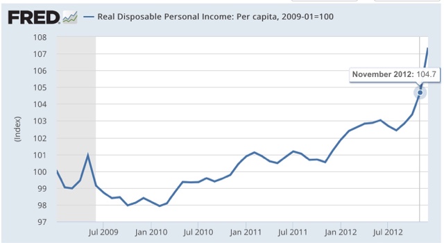
Here is a graph showing how the "Bread and Peace" model has performed since 1952, with its last projection before the 2012 election:
 As you can see, the model stumbled somewhat badly in 2012, forecasting that Obama would win only 47% of the vote, when in fact he received about 53%, as shown in this "post mortem" graph below:
We have already seen that a number of economic indicators have a good track record of correlating with the election result, provided we know their values in the first 3 quarters of the election year. We have also seen that at least one long leading indicator, housing permits, has some validity in forecasting the election day status of changes in the unemployment rate, one of the best such economic indicators. We have seen that 80% of the time, just knowing whether or not the economy is in recession in Q3 of the election year has accurately forecast the popular vote winner in the election, going back over 150 years! Finally, we have seen that the long leading indicators through Q3 of 2015 suggest that it is more likely than not that this economic expansion will continue through Q3 of next year, and thus favor the election of the Democratic Party nominee.
There is one other well-known model, from economist Douglas Hibbs, called the "Bread and Peace" model. This model makes use of "real disposable personal income per capita" measured over the entirety of the last Presidential term, with weights for each period prior to the last measurement decreased by 20% (i.e., the last period before the election gets a weighting of 1, the period before that a weighting of 0.8, the period before that a weighting of 0.64, and so on). From this is subtracted the number of casualties in any wars of choice, with 1% being subtracted for each 100,000 casualties during the Presidential term. The result of this subtraction gives the percentage of the vote that can be expected to go to the incumbent party.
Here is a graph showing how the "Bread and Peace" model has performed since 1952, with its last projection before the 2012 election:

This is because "real disposable personal income" was one of the poorest-performing consumer measures of Obama's first term, growing by only 3% through August, before increaseing another 1.7% in September and October, to be up 4.7% on election day, with much of that increase coming in just the last few months before the election:
This highlights an unusal feature of the model. the last 3 months before the election count for fully half the wight of the entire result. Each successive preceding quarter counts for about half of th subsequent one. thus if real disposable personal income per capita grew linearly by 10% in the first 3 1/2 year s of a presidency, but did not grow in the lsat 3 momonths before the election, the model projects only +5% for this metric.
Since real per capita disposable income almost always grows outside of recessions and their immediate vicinity, this is n accord with our previous discussioin: a flat - or declining measure right before the election usually means a recession - which is exactly what the simple model indicating that a 3rd quarter recession in election year predicts the popular vote winner 80% of the time.
So what does the model suggest now? Let's take a look at 3 Presidential elections for which the model predicted similar results, and did not have a war (such as in 1968) to detract from the numbers.
First, here is 1988:

Next, here is 1996:

Finally, here is 2004:

In all 3 cases, "real disposable personal income per capita" rose fairly linearly throughout the preceding 4 years, with results on election day of +9.5%, +6.1%, and +7.1%, respectively.
Now here is the 2 years and 10 months of Obama's 2nd term:

Currently "real dispoable personal income is up + 6.4%.
We don't know what it's values will be for the next year. What we can say is that, *IF* real disposable personal income per capita continues to grow at the average rate it has since the beginning of 2013, it will be approximately +8.6% on election day, and the "Bread and Peace" model will favor a Democratic victory with the nominee receiving somewhere on the order of 53%-54% of the vote.
First, here is 1988:
Next, here is 1996:
Finally, here is 2004:
In all 3 cases, "real disposable personal income per capita" rose fairly linearly throughout the preceding 4 years, with results on election day of +9.5%, +6.1%, and +7.1%, respectively.
Now here is the 2 years and 10 months of Obama's 2nd term:
Currently "real dispoable personal income is up + 6.4%.
We don't know what it's values will be for the next year. What we can say is that, *IF* real disposable personal income per capita continues to grow at the average rate it has since the beginning of 2013, it will be approximately +8.6% on election day, and the "Bread and Peace" model will favor a Democratic victory with the nominee receiving somewhere on the order of 53%-54% of the vote.
Of course, this isn't a real forecast, since we won't know the final equation until election day next year. So we need to see if our leading indicators can help us out. And it also suggests that we should not rely on one single metric, but rather an index of metrics, to improve outocmes. As it happens, a British team has done just that with the Index of leading Indicators. Those will be the subjects of my next posts..
Subscribe to:
Posts (Atom)