Friday, March 28, 2025

Real income, spending, saving, and sales continue to be expansionary


 - by New Deal democrat


Real income and spending are two of the most important indicators of the well-being of the consumer. With the general weakening of the economy, I have been looking to see if in particular real spending on goods would sputter. Signs were mixed in February.


Let’s start with the monthly look, followed by the overall look and real personal income and spending since the onset of the pandemic. In February, the PCE price index rose 0.3%. So while nominal income rose 0.8%, in real terms it rounded to up 0.5%. Nominally spending was up 0.4%, but in real terms only up 0.1%. Further, both income and spending were revised downward for January, by -0.2% and -0.1% respectively:


As you can see, in the past year real income has risen significantly, but spending has stalled in the past several months. Since the onset of the pandemic, real income is up 12.0%, while real spending is up 14.7%:


Somewhat concerning ly, real spending is down from December, and only up 0.1% since November. This is important, because as I always say, consumption leads employment.

Further, historically it is real consumption of goods (blue in the two graphs below) which declines before recessions. Real consumption of services (gold) not infrequently has continued to increase right through all but the worst downturns. And real consumption of goods in the last several months has turned down:


While real consumption of goods increased 0.7% in February, that only partially reversed the -2.1% decline in January, while real consumption of services declined -0.1% for the month. More importantly, real consumption of goods is down -0.3% since November (right scale), and even services (left scale) are unchanged since December:


But to put that in context, here is the 50 year historical YoY record in real spending on goods up until the Great Recession:


In each case, there was sharp deterioration YoY close to or even below 0 before the onset of recessions.

Now here is the post-pandemic record:


There is no YoY retrenchment whatsoever here, despite the stalling in the past several months.

Next let’s look at the personal savings rate. As expansions continue, consumers tend to get more and more extended, and then retrench just before or at the onset of recessions. Below is the historical record from 1983 into the Great Recession, showing both the savings rate (blue) and the YoY change in the rate (red):


You can see that the savings rate went down, and then increased as consumers retrenched, both during and partly causing the recessions, which is reflected in an increase in the YoY rate.

Here is the post-pandemic record through the present:


In the past several months, there has been a significant increase in the savings rate, but I have been concerned that it reflects unresolved seasonality around the Holiday season. And that seems to be confirmed by the fact that the YoY change continues to be slightly lower, indicating no significant consumer caution as of yet.

Finally, there are two important coincident indicators used by the NBER to help date recessions that get updated with this data.

First, here is real personal income less government transfer payments:


This increased another 0.1% in the month for another new record, up 9.1% since just before the pandemic.

Second, here are real manufacturing and trade sales, a more comprehensive measure of sales than just retail sales, as usual delayed by one month:


These decreased a sharp -1.2% for the month. They are now lower than any month since last August except for October. But because these are for January, they may reflect the unresolved seasonality we saw last month in real income and spending, a point reinforced by a similar drop one year ago in January. 

To reinforce that point, here is the historical 50 year record up until the Great Recession:


Real manufacturing and trade sales usually (but not always) decelerate sharply on a YoY basis in the months before a recession. 

Here is the YoY post-pandemic record:


There is no sign of a significant YoY deceleration at this point outside of the range of noise.

To sum up: real income and spending continue their expansionary trends. In particular, while several of the data points have stalled out in the last 3 months, this may mainly reflect unresolved Holiday seasonality. There has been no significant deterioration in real spending on goods that shows up in any YoY fashion. Real manufacturing and trade sales display a similar pattern. Despite the “soft” data on consumer confidence, when it comes to savings consumers appear to be confident enough to get a little further out over their skis.  In other words, real income, saving, spending, and sales continue to be expansionary.

Thursday, March 27, 2025

Long leading indicators update: corporate profits in Q4 2024


 - by New Deal democrat


Corporate profits are a long leading indicator, as they typically turn down at least one year before the onset of a recession.


Unfortunately, they are typically reported with a lag, and Q4 corporate profits aren’t reported officially until the final update of the relevant GDP report. Which means that they weren’t reported for Q4 last year until today. That’s why I use the proxy of proprietors’ income, which is almost as leading, 

With that caveat out of the way, Q4 corporate profits (dark blue in the graph below) increased 6.7% q/q on an unadjusted basis. Adjusted for unit labor costs (the “official” way to measure them as a leading indicator)(light blue), they increased 5.8%. This is in line with the increase in proprietors’ income (red), previously reported:


Note that, as usual, proprietors’ income also forecast an increase. This is also in line with what S&P 500 companies have been reporting to Wall Street, which I update weekly as part of that report:


The bottom line is that corporate profits have increased consistently since Q1 2023. Absent external factors (like the imposition of widespread tariffs!), they are forecasting no recession in 2025.

Jobless claims continue higher YoY, but not recessionary


 - by New Deal democrat


This week’s look at initial jobless claims includes seasonal revisions made to the data for the last five years. Fortunately, they appear to be very minor. So let’s take our typical look.


On a weekly basis, initial claims declined -1,000 to 224,000, and the four week moving average declined -4,750 to 224,000. Continuing claims, with the typical one week delay, declined -25,000 to 1.856 million:


As usual, the YoY% change is more important for forecasting purposes. So measured, initial claims increased 4.7%, and the four week moving average was up 5.2%. Continuing claims were also up 3.0%:


This is the trend we have seen since late last summer, with claims higher YoY, but not by enough to suggest and economic downturn, only some weakness.

Finally, anticipating next week’s jobs report, here is our weekly look at the YoY% change in initial, and initial plus continuing claims, averaged monthly, vs. the unemployment rate:


The YoY% increase in jobless claims suggests about a 5% increase in the unemployment rate. Since this is a percent of a percent measurement, the math is 3.8% * 1.05 = ~4.1%, which is exactly the unemployment rate last month. In other words, jobless claims are suggesting no upward or downward pressure on unemployment in the next few months.

Wednesday, March 26, 2025

Manufacturers continue to front-run tariffs, with no weakness in new orders


 - by New Deal democrat


Last week I explored how past episodes of sharp increases in politic uncertainty, and decreases in consumer confidence, had played out in the hard data as to both production and consumption.


The upshot was that consumers tended to react first, with about a one quarter delay, and producers tended to react afterward, once the decline in demand was significant, about 2 to 3 quarters after the downturn in confidence.

One of the two measures I looked at then, manufacturers’ new orders for durable goods, was released this morning for Feburary. Let’s take a look.

Normally I don’t pay much attention to this release, because it is very noisy, and although it is touted as a leading indicator, its record is not clear to say the least. And that was the case this morning as well.

Here is the modern record of durable goods orders (blue), core capital goods orders (red) which tend to be much less noisy, and manufacturing production (gold), all normed to 100 as of just before the pandemic:


While new goods orders were indeed leading in the late 1990s, that was emphatically not the case with regard to the Great Recession, where orders turned down coincident with its onset, and capital goods orders turned down four month *after* its start. Moreover, there is no evidence that they led industrial production in manufacturing, which is a classic coincident indicator. Much of this I suspect has to do with the widespread adoption of “just in time” inventory controls.

Here is the same data post-pandemic:


While there is some variation among the three measures, all essentially trended sideways beginning in 2022 or 2023. Notably, both the less volatile capital goods orders and manufacturing production broke out to new highs beginning in November of last year. That is almost certainly not a coincidence. The outcome of the Presidential election may have led to a surge in euphoria. But very quickly it certainly has led to a desire to front run tariff increases. I strongly suspect it is the latter which explains the sharp increase in January which was maintained in February.

(Anecdotally, one of the large car dealers in my area, who owns about seven different franchises, has been running ads for the last few weeks encouraging potential buyers to “beat the tariffs” and “buy now!”  Which is probably an excellent if inadvertent way to convey to customers that their budgets are about to take a hit.)

The below graph shows the same post-pandemic data in YoY% form. Since new orders are up 3.4% YoY, capital goods orders up 1.4%, and manufacturing production up 0.8%, the graph is normed to 0 for each series:


Now here is the same data historically up until the pandemic:


The current level of YoY change would be very weak at any point before the Great Recession, but if anything above average in the 2010s expansion.

The bottom line is that, in keeping with my examination last week, there is no evidence of weakness in new orders due to increased uncertainty in the monthly data at this point.

Finally, here is this week’s update in Redbook’s YoY measure of consumer spending:


The four week average is 5.8% higher YoY, which is right in line with typical readings over the last 12 months. So, also in keeping with my examination last week, consumer spending is not taking a hit yet either.

Tuesday, March 25, 2025

The housing market continues its slow rebalancing: new and existing home sales rangebound, price pressures including Case Shiller and FHFA steady


 - by New Deal democrat

Since new home sales as well as the repeat sales price indexes were both reported this morning, let’s update the entire housing market all at once, including existing home sales, which I didn’t report on last week.

NEW HOME SALES


As per usual, remember that while new home sales are the most leading of all housing metrics, they are very noisy and heavily revised. February showed a 1.8% increase from an upwardly revised (by 9,000 annualized) January, to 676,000. This is almost exactly in the middle of this metric’s two year range of 611,00 - 741,000. Also as per usual, the below graph compares with with single family permits, which lag slightly but are much less noisy:


Both demonstrate the recent rangebound behavior.

Turning to prices, the bugaboo of heavy revisions reared its ugly head, as last month’s reported $22,000 spike in median prices was almost entirely revised away, and this month declined further:


On a YoY basis, the median price of a new home is down -0.9%:


Finally, the inventory of new houses pulled back very slightly (-2,000) from January’s 15+ year high, but continued their 8% trend YoY gains. This is actually “good” news - for the moment - because as the below long term historical graph shows, recessions have in the past happened after not just sales decline, but the inventory of new homes for sale - which also consistently lag - also decline (as builders pull back):


I would need to see a more robust downturn in housing for sale that breaks the YoY trend before I would become concerned.

EXISTING HOME SALES

Existing home sales have been in a tight range for the past 2 years, of a piece with mortgage rates generally between 6% and 7%. That continued in February, as sales clocked in near the top end of that range, at 4.26 million annualized:


There was relief when it came to price appreciation, which is not seasonally adjusted and so can only be usefully compared YoY. After a jump to 6.0% in December, the median price gain declined YoY to 4.8% in January and now 3.6% in February, the lowest since Septebmer’s equal YoY% gain:


Meanwhile inventory continued its slow climb from its COVID lows, as total inventory in February was 1.24 million units, a 17% increase YoY, and the highest February total since 2019. Nevertheless, the longer term declining trend in inventory that predates COVID by over five years is still in place:


REPEAT SALES PRICES

The unwelcome news in repeat home sales that I noted last month continued this month.

On a seasonally adjusted basis, in the three month average through January, according to the Case-Shiller national index (light blue in the graphs below) on a seasonally adjusted basis prices rose 0.6%, and the somewhat more leading FHFA purchase only index (dark blue) rose 0.2%. Both of these continue the trend of re-acceleration we have seen in house prices in the second half of 2024 [Note: FRED hasn’t updated the FHFA data yet]:


Both indexes also continued to accelerate on a YoY basis, as the Case Shiller index by 0.2% to a 4.1% gain, and the FHFA index by +0.1% to a 4.8% YoY increase:


Because house prices lead the measure of shelter inflation in the CPI, specifically Owners Equivalent Rent by 12-18 months, the acceleration in sales prices is likely to lead to an even slower deceleration in the official CPI measure of shelter, although I continue to believe that OER will trend gradually towards roughly a 3.5% YoY increase in the months ahead, particularly as the most leading rental index, the Fed’s experimental all new rental index, indicated a median YoY *decrease* in new apartment rents of -2.4%, with all rents including existing rentals coming in at +3.2% as of Q4 of last year:


Here is the updated calculation of the house prices vs. the YoY% change in Owners Equivalent rent:


CONCLUSION

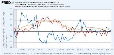
My theme from the past few months has been looking for a rebalancing of the new vs. existing homes market. For that to happen we need price increases to abate in existing homes, and prices to remain flat or still declining in new homes. Since sales lead prices, and are best viewed in a YoY% comparison, the below graph shows sales (/1.5 for scale) and median prices of new homes (red) in that format, together with the YoY% change in the FHFA repeat sales index (gold):


Last month I was concerned that there was renewed inflation rather than rebalancing. With this month’s new data as well as the revisions to last month’s new home prices, it appears that the rebalancing story is back on track, with continued slow price declines in new homes and abating price increases in existing homes. Meanwhile the increases in inventory in both should result in further release of pricing pressures. 

Nevertheless, we continue to have problems with mortgage rates that continue near levels last seen 15 years ago, and a longer term sharp decline in the number of existing homes for sale. This needs to be resolved to address the issue of housing unaffordability.


Monday, March 24, 2025

A “quick and dirty” update: the employment is historically very weak


 - by New Deal democrat


There’s no significant economic reports today, and even most of the high frequency indicators won’t start coming in for the week until tomorrow, so let me go a little more in depth in what the “quick and dirty” forecasting model suggests.

To repeat, this is a simple model consisting of the YoY% change in the stock market and the (negative) YoY% change in new jobless claims. Since the latter doesn’t signal recession until at very least it is 10% higher (worse) than the year before, I add 10 to the YoY% result.

Here’s the update through Friday:


Both signals are weak (+8.3% for the stock market and +2.8% for initial claims), but neither are signaling a recession.

For comparison, here is what they looked like for the five years before the pandemic:


At no point did it signal recession during those years.

To better show how it looked in comparison with the present situation, below I’ve subtracted -8.3% to stocks, and -2.8% to jobless claims, so that they show at the 0 line:


Stocks were much more volatile, and weaker than they are presently for much of that period, while jobless claims were only as weak as they are now for several weeks in September 2017 and December 2019.

FRED is no longer allowed to display stock prices from more than 10 years ago, but here is the long term historical record of the YoY% change in jobless claims normed to the current -7.2% level:


You can see that to be reliably recessionary, jobless claims must be worse than the are now. But on the other hand, there were only about a dozen occasions in the 50+ years before the pandemic where jobless claims were as weak as they are now without there being a recession. Again, this reinforces that the labor situation, while not recessionary, is weak.

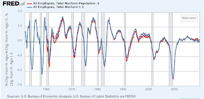
Although it isn’t part of the quick and dirty forecast, nonfarm payrolls are one of the quintessential coincident indicators. While I won’t bother with the graph, on a YoY% basis they have grown 1.3% as of February. Adjusted for the census estimate of population growth, they are up only 0.6%.

And here is the long term historical graph of nonfarm payrolls for the 70 years before the pandemic, subtracting -1.3% and -0.6% respectively from the YoY values so that they show at the 0 line:


Aside from four occasions: briefly during the Korean War, once in the early 1960s, once in the mid 1990s, and during 2019, employment has never been weaker outside of recessions or shortly before.

Here is a close up showing the situation in 2019:


Back then I was writing that it was touch and go whether we would tip into recession or not.

the bottom line is that the employment side of the equation is very weak, and it won’t take much - say, the actual widespread implementation of retaliatory tariff barriers - to tip it onto the recessionary side.