Saturday, June 13, 2020
Weekly Indicators for June 8 - 12 at Seeking Alpha
- by New Deal democrat
My Weekly Indicators post is up at Seeking Alpha.
The short leading indicators have continued to improve, from awful, to less awful, to merely really bad.
But that the NASDAQ briefly made a new high last week, while the S&P was only 5% from one, while the coronavirus pandemic rages on, was simply insane.
As usual, clicking over and reading should bring you up to the moment on the economy, and reward me a little bit for my efforts.
Friday, June 12, 2020
Coronavirus dashboard for June 12: the costs of recklessly reopening begin to come due
- by New Deal democrat
It is pretty clear now that in general those States (but not all) which left lockdowns the earliest and with the most lax continuing restrictions are suffering renewed outbreaks of the coronavirus, *possibly* in several cases verging on exponential spread.
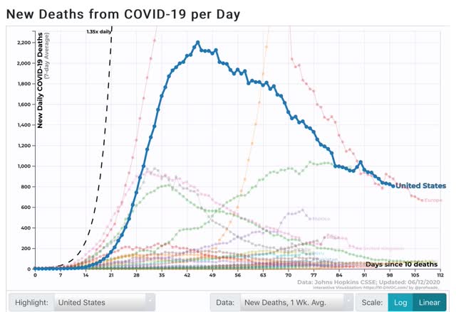
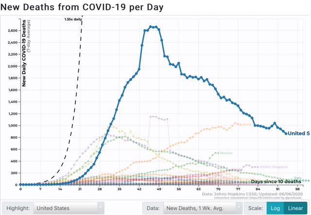
For the US in total, the 7 day average of deaths has continued to decline, now at 803 per day vs. 2,201 on the April 18 peak:
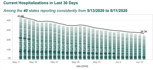
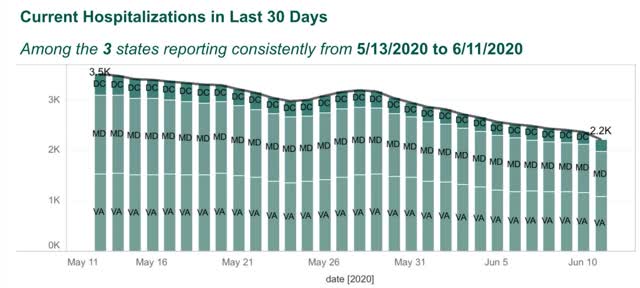
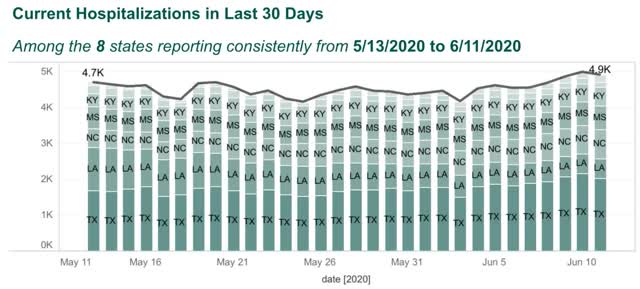
Among the 40 States that consistently report hospitalizations, the number has still also declined:
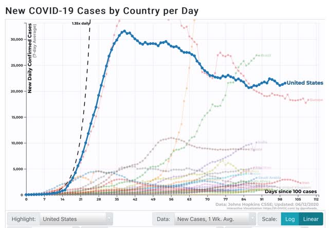
But new cases averaged over the past 7 days have started to rise again, now at 21,527 vs. the low of 20,658 on May 28:
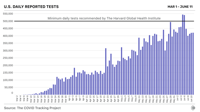
The increase cannot be put down to increased testing, as the 7 day average has leveled off in the past week:
Here is the breakdown of new infections by region:
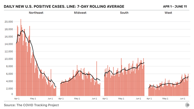
Note, however, that the above graphs are not per capita. The below chart of the last 7 days, however, is:
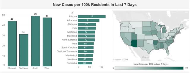
It is crystal clear that the new hot spots are in those States which recklessly relaxed restrictions.
The Washington DC area, including MD and VA, has been a hot spot, but that is abating somewhat:
But the other States of the Confederacy (plus OK and KY), are clearly seeing an increase in cases:
NY, which had the worst outbreak by far, is down to 42 new daily infections per million:
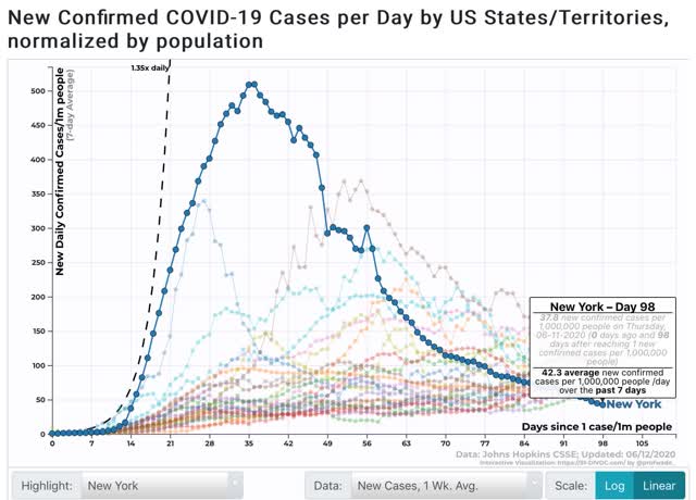
At its peak, NY had 509 infections per million per day. NJ peaked at 409, RI at 369, LA at 340, and CT at 309. No other State has exceeded 300 to date.
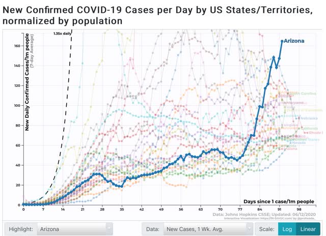
I call the above to your attention, because among States that are seeing new outbreaks, here in particular are Arizona, as of yesterday at 167 per million:
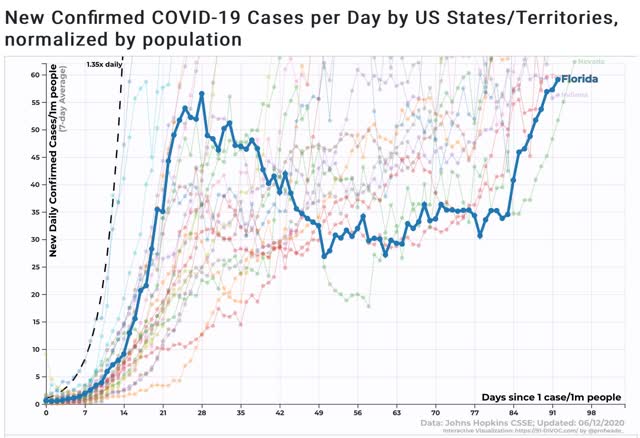
And here is Florida:
And Texas:
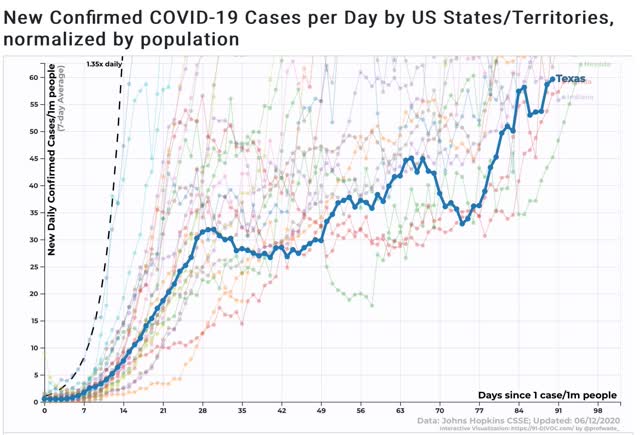
All three have new infection rates of over 50 per million population, above NY’s current number.
There is no certainty that the sudden increases in these three (and other) States will continue, but in the aggregate there is no doubt that the virus is spreading again. It remains to be seen if outbreaks approaching the prevalence formerly in the NYC area will lead to renewed lockdowns in any of the affected States.
Thursday, June 11, 2020
Initial jobless claims decline further, but continuing claims fail to make meaningful progress
- by New Deal democrat
Weekly initial and continuing jobless claims give us the most up-to-date snapshot of the continuing economic impacts of the coronavirus to the average worker. Twelve weeks after calamity first struck, the theme remains “less awful.”
First, here are initial jobless claims both seasonally adjusted (blue) and non- seasonally adjusted (red). The non-seasonally adjusted number is of added importance since seasonal adjustments should not have more than a trivial effect on the huge real numbers:
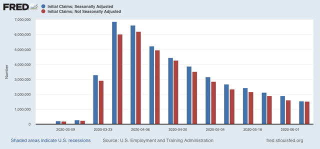
There were 1.542 million new claims , which after the seasonal adjustment became 1.537 million. This is a -355,000 decline from last week’s number, and the lowest so far since the virus struck - but still almost twice as bad as the worst week during the “Great Recession.”
Since we are more than a month after some States “reopened,” these new claims primarily represent spreading second-order impacts.
Unfortunately, the “less bad” trend has not continued in continuing claims, which lag one week behind. In the past three weeks, both the non-seasonally adjusted number (red), and the less important seasonally adjusted number (blue) have remained nearly stationary. This week the former declined by 339,000 to 20.929 million, but was 88,000 above the 20.841 reading of two weeks ago; while the latter declined by 179,000 to 18.920 million, 58,000 above its 18.861 reading two weeks ago:
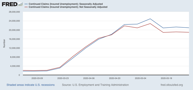
This tells us that the spreading new damage is about equal to the callbacks to work from various sectors “reopening.”
On a more long-term note, historically continuing claims have peaked at the end of or just after the end of recessions. Here’s the graph showing that from the beginning of the series through 2009:
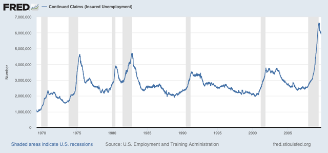
Depending on what happens with the King of Coincident Indicators, industrial production, when it is reported next week, it is possible that the NBER could call an end to a very short recession. But since the virus has not gone away, and indeed new cases are increasing again, I suspect we may see renewed restrictions implemented in many parts of the country in the next few months.
Wednesday, June 10, 2020
May inflation steadies: meanwhile, an artificial all time high in “real” wages
- by New Deal democrat
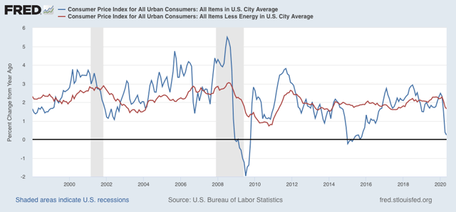
In May, overall consumer prices declined by -0.1% (blue in the graph below), while consumer prices excluding energy (gas) rose +0.1% (red):
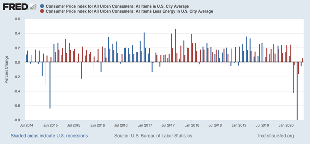
Note that in 2015 when gas prices collapsed, prices otherwise continued to increase, showing the underlying strength of the economy. But in March and April of this year, even prices outside of gas declined, showing underlying weakness. This is a typical recessionary scenario. May’s increase in prices ex-energy may be a good sign.
YoY inflation is now only +0.2%, while YoY inflation ex-energy is up +1.6%:
Last month I didn’t look at “real” inflation-adjusted wages. As it turns out, an important milestone was made - but was totally an artifact of the relative decimation of lower wage jobs.
“Real” inflation-adjusted wages for non-managerial employees rose to an all time high in April, finally surpassing the previous peak of January 1973:
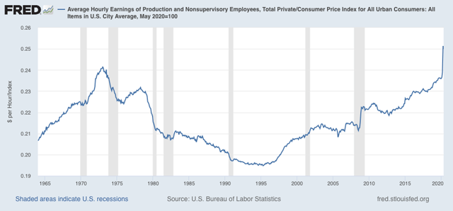
May declined -0.5% from the April peak. I suspect as more people are recalled to work, April will prove to have been a short-lived spike.
More importantly, here are “real” aggregate payrolls for all non-managerial employees YoY:
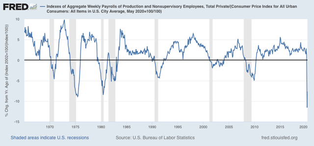
This is the worst drop in the entire history of this series.
That consumer prices steadied in May is a good sign. We will probably have to wait for the quarterly Employment Cost Index, which normalizes for the mix of jobs in the economy and won’t be released till the end of July, to find out what “really” has happened with wages during the pandemic.
Monday, June 8, 2020
Coronavirus update for June 8: declining trend in new infections has stopped
- by New Deal democrat
I haven’t updated the Coronavirus Dashboard in awhile. Last time I indicated I would do so if there was a significant change in trend.
Well, there has been. New infections are not declining anymore. In the last week, the 7 day average has increased slightly, and there has been only a 1% decline of the 7 day average in the past 2 weeks:
On Saturday, the 7 day average was 21.4k new infections, higher than the 21.0 cases of 10 days ago. Two weeks ago there were 21.7k new infections.
The 7 day moving average of deaths, which lags by 1 to 2 weeks, is still in decline, although I expect this to follow suit:
Because increased testing can be expected to find more cases, it might be argued that that is the cause of the recent reported increase in cases.
To check that, below I am comparing the 7 day average change in testing vs. the 7 day average change in new infections for each Wednesday and Saturday. In general between late April and late May we had a decline in reported new cases, even with a dramatic increase in testing. In the last two weeks the increase in new testing has abated somewhat, which we might expect to show an even steeper decline in new infections if the trend were continuing. But instead the level of new infections has turned around and increased:
To check that, below I am comparing the 7 day average change in testing vs. the 7 day average change in new infections for each Wednesday and Saturday. In general between late April and late May we had a decline in reported new cases, even with a dramatic increase in testing. In the last two weeks the increase in new testing has abated somewhat, which we might expect to show an even steeper decline in new infections if the trend were continuing. But instead the level of new infections has turned around and increased:
| Date | 1 week % Change Testing | 1 week % Change New infections | ||
|---|---|---|---|---|
| 4/18 | (-0.6) | (-5.2) | ||
| 4/22 | 20.6 | (-1.7) | ||
| 4/25 | 44.7 | 0.0 | ||
| 4/29 | 24.6 | (-2.0) | ||
| 5/2 | 9.4 | (-6.5) | ||
| 5/6 | 14.4 | (-5.3) | ||
| 5/9 | 15.9 | (-10.9) | ||
| 5/13 | 22.3 | (-14.4) | ||
| 5/16 | 25.0 | (-9.8) | ||
| 5/20 | 22.3 | 0.0 | ||
| 5/23 | 16.1 | (-2.2) | ||
| 5/27 | (-1.8) | (-8.7) | ||
| 5/30 | 0.7 | (-4.5) | ||
| 6/3 | 16.4 | 3.3 | ||
| 6/6 | 18.3 | 1.4 | ||
This suggests that the increase in new infections is signal and not noise, even if we can’t be sure that there’s been an “actual” increase vs. a leveling off.
The composition of States with the worst outbreaks has changed as well.
The Northeast Megalopolis from DC up through New Hampshire remained the hardest hit for deaths per capita:
| State | 1 week Deaths Per Million | |||
|---|---|---|---|---|
| MA | 10.7 | |||
| RI | 8.2 | |||
| NJ | 7.6 | |||
| IL | 6.0 | |||
| CT | 5.7 | |||
| MD | 5.5 | |||
| NH | 4.7 | |||
| PA | 4.4 | |||
| DE | 4.3 | |||
| DC | 4.3 | |||
| MS | 4.2 | |||
| NY | 4.2 | |||
Note that Mississippi had risen to #11.
When it comes new infections, however, the three States of the NYC metro area plus Pennsylvania have dropped out, while Southern, Great Plains, and Western States have all joined the list:
| State | 1 week Infections Per million | |||
|---|---|---|---|---|
| MA | 140.4 | |||
| MD | 129.2 | |||
| NE | 123.1 | |||
| AZ | 121.5 | |||
| DC | 111.7 | |||
| IA | 101.2 | |||
| UT | 100.9 | |||
| AR | 98.8 | |||
| VA | 96.8 | |||
| NC | 94.3 | |||
| IL | 89.9 | |||
| LA | 89.4 | |||
On a per capita basis, the MId-Atlantic from MD through NC is hard hit. But most noteworthy are the additions of NE, IA, AR, UT, and AZ.
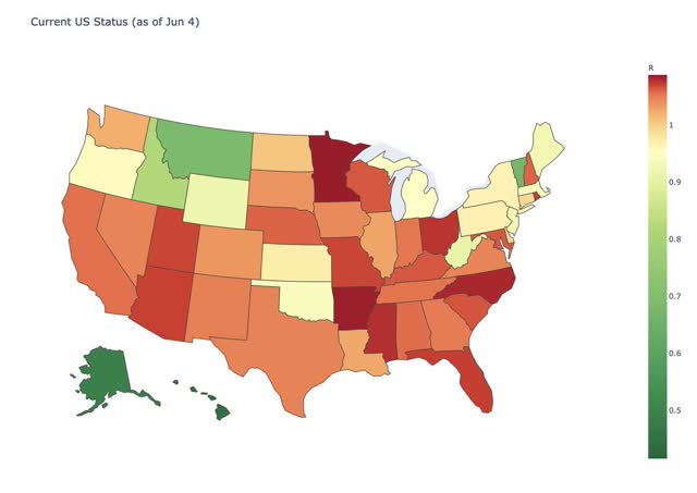
This is also shown in a graph of Reinfection status from several days ago (r less than 1 = good):
And this graph of the doubling rate of infections by county:
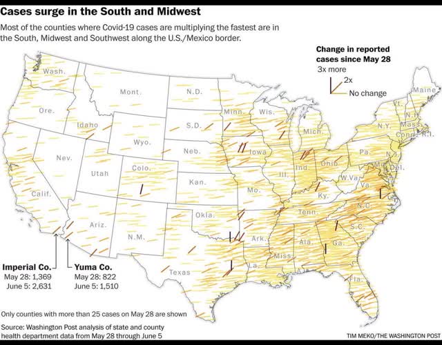
The interior South and some rural portions of the Midwest are now leading in outbreaks.
This, unfortunately, is in line with my forecast over the past month: that the population of the US as a whole lacks the political and social will to beat the coronavirus. As a result, the outbreak will continue to wax and wane as complacency alternates with fear generated by big new outbreaks. The massive protests we have seen over the past 10 days are only going to seed further outbreaks.
Subscribe to:
Posts (Atom)