Saturday, March 12, 2022

Weekly Indicators for March 7 - 11 at Seeking Alpha


 - by New Deal democrat

My Weekly Indicators post is up at Seeking Alpha.

The Russian invasion of Ukraine has created further pressure on the expansion via commodity and credit costs.

As usual, clicking over and reading will bring you right up to the moment, and bring me lunch money for the week.

Friday, March 11, 2022

Real wages for nonsupervisory employees make 19 month low, but no recession signaled


- by New Deal democrat

This is a follow up about “real” wages, in the wake of the February CPI.

Yesterday’s CPI report showed that prices increased 0.8% in February. Meanwhile, the jobs report indicated that average hourly wages for nonsupervisory workers increased 0.3%, so real hourly wages declined -0.5% for the month:


As shown in the above graph, real wages had been essentially flat since July 2020, varying from 0.8% above, to -0.3% below. Pending revisions, February marked a downward break in that trend.

Now let’s turn to real aggregate payrolls, which are an overall measure of consumer health. For nonsupervisory workers, these rose 0.2% for the month to a new high:


With the (understandable) exception of the pandemic, for the past 50+ years, only when aggregate real wages for have retreated from peak for 3 to 9 months, has recession typically followed:


 Here’s a YoY% change view of the same data:


As you can see, from just before to just after the onset of a recession, real aggregate wage growth turns negative YoY. With the exceptions of 1981 and the pandemic, where it hasn’t turned negative before the onset, it has been rapidly plummeting, by over 50% in the previous 6 months. 

Here’s a close-up of the last 3 years:


In the last 6 months, real aggregate income growth has decelerated from just over 5% to just under 4%. This is a gradual decline that is not consistent with the long-term pre-recession pattern.

 In other words, real wages indicate that a near term recession is off the table, although it certainly is consistent with a deceleration in the consumer sector of the economy, as indeed appears to have started in real retail sales, shown below:

Thursday, March 10, 2022

Another big increase in consumer prices in February, as the yield curve tightens


 - by New Deal democrat

Consumer prices increased 0.8% in February, the fourth time in five months that it has exceeded 0.5%. YoY inflation is now 7.9%, the highest rate since 1982. My favorite measure, CPI ex energy, is also up 6.6% YoY, the worst since the 1981-82 recession as well:


My rationale for tracking CPI ex-energy is that, unless energy costs filter through into the broader economy, there is no cause for alarm. But if the wider economy shows a sharp increase, then there is likely to be aggressive action by the Fed to bring the rate of inflation down, and that means slowing the economy, or even putting it into reverse.

Indeed, energy increased 3.5% for the month, which believe it or not is nevertheless within its normal monthly range for the past 25 years. YoY energy prices for consumers are up 26%, below their 33% peak from last November. This is just below their YoY peaks in 1974, 1979, 2005, and 2008 - not coincidentally 3 out of 4 of which coincided with deep recessions:


Prices of new and used vehicle prices were unchanged in January, but up 23.5% YoY, another all-time high:


As I have accurately forecast for months, house price increases (blue, /2 for scale) have continued to feed through into rents and “owners equivalent rent”(red), which constitutes 1/3rd of the entire inflation index, and in turn has also continued to increase, and is now up 4.3% YoY - a rate that now exceeds its YoY peak during the housing bubble, and is the higher at since 2002:


What happened in the case of both prior cases where owners equivalent rent surged after house prices did - 2000 and 2006 - the Fed stepped in and raised rates aggressively, in both cases resulting in recessions, which in turn caused the rate of overall inflation to decline:


That the Fed will raise interest rates at its meeting next week is all but certain, with the debate about whether it will be .25% or .5%. 

The big issue is whether the Fed can still achieve its desired result of a decline in inflation, without causing a recession. For that I along with everybody else look at the yield curve. While rates have been tightening across the board - for example, the heavily-followed 10 minus 2 year spread (blue) is currently 0.27%, and the 5 year minus 3 year spread, often the first to invert (red), is only 0.03%:


it is still consistent with an economy 2 or 3 years before a recession hits:


As I wrote one month ago, in hindsight it is pretty clear that the Fed fell behind the curve, failing to realize that big increases in house prices beginning in late 2020 were going to filter through into the broader measure, and begun to lay the groundwork for tightening to start slowly perhaps by the end of last summer. Since the Fed - like me and lots of other people - probably figured the US population would be fully or nearly fully vaccinated by last autumn, bringing the pandemic to an effective end, thus bringing labor and supply shortages to an end as well, its view was understandable. But here we are.
 
I’ll discuss the effect of this report on wages tomorrow.

Jobless claims continue low, but lows for this expansion likely already past


 - by New Deal democrat

Initial claims (blue) rose 11,000 to 227,000 (vs. the pandemic low of 188,000 on December 4). The 4 week average (red) rose 500 to 231,250 (vs. the pandemic low of 199,750 on December 25). Continuing claims (gold, right scale) increased 18,000 to  1,494,000, (vs. 1,474,000 two weeks ago, which was the lowest number in over 50 years):


We have probably seen the lows in initial claims for this expansion.

With continuing claims continuing close to a 50 year+ low, the record tightness in the jobs market isn’t going away, meaning there will be continuing upward pressure on wages.

I’ll take a look at this morning’s CPI report in a separate post. 

Wednesday, March 9, 2022

JOLTS report for January: the game of employment musical chairs continues


 - by New Deal democrat

The Census Bureau JOLTS report for January, released this morning, indicates that the jobs market continues to be nowhere near equilibrium - which continues to be a good thing for workers’ wages.  

Several months ago I introduced the idea of a game similar to musical chairs, where employers added or took away chairs, and employees tried to best allocate themselves among the chairs. Because of the pandemic, there are several million fewer players trying to sit in those chairs, leaving many empty. As a result, wages have continued to increase sharply, as employers attempt to attract potential employees to sit in the empty chairs.

This pattern has continued, easing only slightly. There were also some significant revisions in past months’ data, some positive, some negative.

Layoffs and discharges (violet, right scale in the graph below) increased 152,000 to 1.414 million from their record low in December. Total separations (blue) rose 16,000 to 6.058 million (graph starts in June 2020 for reasons of scale):


Layoffs continue to be extremely rare.

Meanwhile, job openings (blue in the graph below) decreased 185,000 to 11.263 million from their revised record peak of 11.448 million in December. Openings have been gradually increasing to repeated record highs in the past 6 months. Voluntary quits (the “great resignation,” gold, right scale) declined -151,000 to 4.252 million, 258,000 below November’s record high. Actual hires (red) increased only slightly, by 7,000, to 6.457 million, 248,000 below November’s record high of 6.705 million:


Quits have been increasing at an accelerated rate in the past year, while openings have also increased, but at a decelerating rate in the past 9 months. Hires have generally plateaued in the past 7 months.

In summary, we continue to have near-record high job openings, hires, and quits, together with near-record low layoffs,. Once again, little progress is being made towards establishing a new equilibrium.

Because of the continuing yawning gap in job-takers vs. job openings, wages have continued to soar. Below is a graph of job openings divided by actual hires (blue, right scale). This gives the rate at which openings are above or below hires, where 1.0 represents the level at which the number of openings and hires are equal. As you can see, this rate increases as expansions go on, and in the last 18 months has repeatedly made new all-time highs.

YoY wage gains for non-managerial workers (red, left scale) are a “long lagging” indicator, typically turning up well after an expansion is underway, and typically when the U-6 underemployment rate falls below about 9.0% (we’re at 7.2% now, the lowest except for the year 2000 at the end of the tech boom, the last 8 months before the pandemic, and one month ago):


In short, wage growth has responded to the favorable game of employment musical chairs by spiking to 6.7% YoY. I expect wages to continue to rise at this strong rate until potential employers can no longer make any profit from hiring potential employees.

My speculation has been that, in order for the situation to resolve, the first thing I want or expect to see is a further increase in monthly hiring. At the same time, or shortly thereafter, I would expect to see a significant decline in voluntary quits. *Possibly* that has begun to happen with quits, but I do not see any increasing trend in hires. The game of musical chairs continues for now.


Tuesday, March 8, 2022

Coronavirus dashboard for March 8: Omicron looks like it has burned through all of the “dry tinder,” leaving perhaps only 10% of the US population still fully vulnerable to infection


 - by New Deal democrat

Back in autumn when Delta was raging, I thought that, once it burned through all of the “dry tinder,” so many unvaccinated people would have been infected that cases would dwindle due to there being so few unvaccinated and uninflected people left.

Well, it appears that Omicron may have done what I thought Delta was going to do.

As of yesterday, cases in the US decreased to 42,000, a decline of over 33% in the last week, almost 95% from their Omicron peak, and the lowest since late last July. Deaths decreased to 1380, a decline of over 25% in the last week, and of almost 50% from their Omicron peak. Still, deaths are lagging cases by slightly over a month. If deaths were to decline 95% from peak as well, that would be only about 130 per day in a month, equivalent to their lows last June.

Here is what cases (dotted line) and deaths (solid line) look like for the past 6 months:

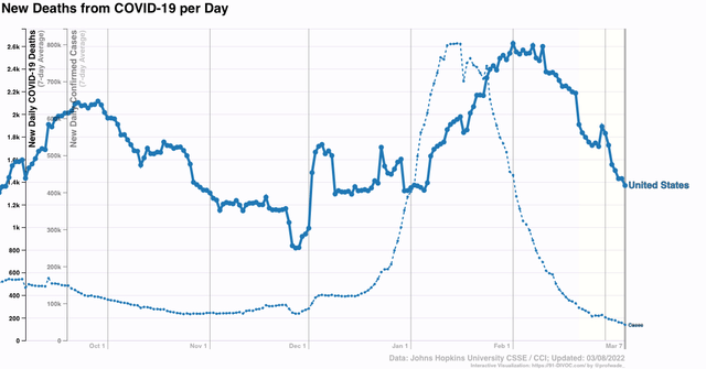
This shows just how dramatically the Omicron tsunami rolled in and has rolled out as well. 

But now, here is the same information about cases, with only values at or below the current number of cases shown, all the way back to the start of the pandemic:


While as stated above, cases are back to a level last seen 8 months ago, they remain higher than at almost all times during the first 7 months of the pandemic in 2020. Still, cases are probably going to continue to decline, because typically the reversal of trend will emerge in just a few States first and then gradually spread out. But as of now, only two States - Connecticut and Alabama - have more cases than one week ago, and in both of those States, the reason appears to be a data dump.

So if deaths continue to decline in line with cases, by 95% from their peak, that would take us down to only 130 deaths per day in a month or so - a level equivalent to the very best numbers last June.

A little over a week ago, the CDC reported that

“More than 140 million Americans have had the coronavirus, according to estimates from blood tests that reveal antibodies from infection – about double the rate regularly cited by national case counts.

“The blood tests count only antibodies from natural infection, including asymptomatic cases, not from vaccination. The study measures the presence of antibodies. It does not indicate whether there is strong protection against subsequent infection.

“Infection rates are much higher for children and younger adults, the study found. It estimated that 58 percent of children up to age 11 have antibodies from natural infection, along with the same share of children age 12 to 17.

“Just under half of adults up to 49 have been infected, the CDC estimates. The rate drops to 37 percent for people 50 to 64 and 23 percent of people 65 or older:

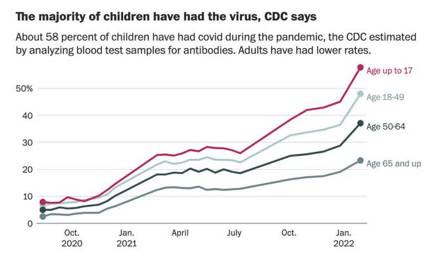
“As of late November, just before the omicron variant began spreading in the United States, the blood test study estimated that 103 million people had been infected. By that measure, 37 million new people caught the virus over two months ending in late January. [which is when the data was last collected].”

Late January was just as the Omicron tsunami was peaking. Since then, about another 10 million, or 3%, of the entire US population has had a *confirmed* case of Covid:


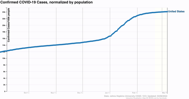
Note that only 21% of the US population had a confirmed case as of late January, vs. about 42% as estimated by the CDC as of that time; thus, it is likely that an additional 3% has had an *un*confirmed case since then, on top of the 3% confirmed new cases. This gives us a total of 48% (round it to 50%) of the entire US population at some point has been infected by COVID.

In the past, for simplicity sake I have estimated that infections were randomly split between those not vaccinated, or not yet vaccinated when infected, and those already vaccinated.

In view of the CDC study above, showing that infections have occurred considerably more often among those younger age groups who have had a lower vaccination rate, a more likely ratio is probably something like 2:1 infections having occurred among the unvaccinated vs. the vaccinated. In other words, not just 50% of the unvaccinated have been infected, but probably 2/3’s, or 67%, have been infected.

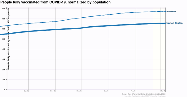
Now consider that, according to the CDC, 65.1% of the entire US population has had two doses of the vaccine, and 76.5% has had at least one shot:


What does this mean? A COVID virus particle, when inhaled in the US, has a 65% chance, or almost 2/3’s of it being a fully vaccinated person. 

Among the remaining 35%, at a ratio of 2:1 infections unvaccinated vs. vaccinated, that means there’s probably another 23% (2/3’s of 35%) chance (rounded to 25%) that it is being inhaled by someone who, while not vaccinated, has already had a COVID infection and has at least some resistance. And at least some percentage of those have had one shot of vaccine. 

In short, that COVID virus particle has only about a 10% chance of being inhaled by someone with no resistance at all due to vaccination or prior infection. That would show up in a severe decline in new cases to a very low level - which looks to be very likely what we are seeing right now.

It’s a near certain bet that there will be new variants of COVID in the future, and that resistance especially among the unvaccinated will wane over time. But I suspect that there will be a spring respite this year, and increasingly longer respites to come in between waves of gradually decreasing severity in the future.

Monday, March 7, 2022

The current spike in gas prices is not sufficient to bring about a recession (at least, not yet!)


 - by New Deal democrat

[Well, I never got around to a COVID update last week. Since most States don’t report over the weekend, I am going to wait until tomorrow. But the bullet point hint is: it increasingly looks like Omicron did what I expected Delta to do last fall. Stay tuned . . . ]


Gas prices in my neck of the woods hit $4 over the weekend, and seem to be center stage on the news this morning. So let’s take a little look and put this in perspective.

Gas prices have indeed spiked. Here’s GasBuddy’s chart of prices for the past 12 months, showing the nationwide average price at $4.09 this morning:


That’s a 50% increase in prices YoY, and a 25% increase - close to $1/gallon - just in the past two months. That is certainly going to get consumers’ attention, and for some people, it is going to really pinch their ability to buy some daily necessities.

But, this isn’t the first time a sudden spike has happened. There is no certainty that the spike will be durable over the next 3 or 6 months, and there have been a number of such spikes in the past that did not result in recessions.

Here’s a graph of gas prices from 2002 through their peak in 2008:


Before 2003, gas prices had never been higher than $1.75/gallon. Not only did they rise past that, but in 2005 there was a sudden spike to over $3/gallon after Hurricane Katrina knocked out some production and transport of gas in Louisiana and the Gulf of Mexico. That spike only lasted about 45 days. There were similar spikes in spring 2006 and 2007, and in neither case did a recession immediately ensue. Gas prices did help bring about a recession when they remained above $3/gallon during most of the rest of 2007, and certainly as they spiked to $4.25/gallon in 2008.

So - point 1: unless the current spike in gas prices is durable, it is not going to bring about a recession.

Now, let’s adjust gas prices by consumers’ ability to pay for it. The below graph divides gas prices by average hourly earnings for nonsupervisory workers:


Since this graph ends a month ago, and current wages are normed to “1,” the current price would be just over $4. But even so, the current price of gas is not equivalent to where it was in 2006 or 2007, or for most of 2011 through much of 2014 for that matter. 

In short, the current value is not enough on its own to bring about a recession. Keep in mind that in almost all previous cases of oil shocks bringing about a recession, the other long leading indicators kicked in as well, with vigorous Fed rate hikes inverting the yield curve, tightening of bank credit, a downturn in corporate profits, and consumers’ cutting back on purchases well beyond a $1 for $1 substitution for gas prices. None of that has happened yet.