Saturday, June 6, 2020
Weekly Indicators for June 1 - 5 at Seeking Alpha
- by New Deal democrat
My Weekly indicators post is up at Seeking Alpha.
The interest rate-sensitive long leading indicators largely turned positive as soon as the coronavirus crisis hit. As lockdowns have eased, several of the short leading indicators have also now turned - or at least are a lot less awful.
If the easing up and/or the huge protests result in a surge of new coronavirus cases, that could certainly reverse itself. But for now, “less awful” is the trend.
As usual, clicking over and reading rewards me with a penny or two for the effort I put into the endeavor.
Friday, June 5, 2020
May jobs report: a welcome positive shock
- by New Deal democrat
HEADLINES:
- 2,509,000 million jobs added. This makes up about 12% of the 22.1 million job losses in March and April.
- U3 unemployment rate improved 1.4% to 13.3%, compared with the January low of 3.5%.
- U6 underemployment rate improved 1.6% to 21.2%, compared with the January low of 6.9%.
- March and April were both revised further downward, by -492,000 and 150,000 respectively, for a net of -642,000 more jobs lost compared with previous reports.
Leading employment indicators of a slowdown or recession
I am still highlighting these because of their leading nature for the economy overall. These were uniformly very positive:
- the average manufacturing workweek rose 0.8 hours from 38.1 to 38.9 hours. This is one of the 10 components of the LEI and will be a positive.
- Manufacturing jobs rose by 225,000. Manufacturing has still lost 1.145 million jobs in the past 3 months, or close to 10% of the total.
- construction jobs rose by 464,000. Even so, in the past 3 months -596,000 construction jobs have been lost, or about 8% of the total.
- Residential construction jobs, which are even more leading, rose by 65,600. Even so, in the past 3 months there have still been -58,800 lost jobs, or about 7% of the total.
- temporary jobs rose by 41,300. Since February, there have still been -852,800 jobs lost, or over 1/4 of all temporary help jobs.
- the number of people unemployed for 5 weeks or less declined to 3.875 million, compared with April’s total of 14.283 million. This is similar to the “less awful” readings of the weekly initial jobless claims.
- Professional and business employment rose by 127,000, which is still 2.156 million, or about 10% below its February peak.
Wages of non-managerial workers
- Average Hourly Earnings for Production and Nonsupervisory Personnel: declined $0.14 from $25.14 to $25.00, which is still a gain of over 3% in 2 months. This reflects that job losses were primarily among lower wage earners.
Aggregate hours and wages:
- the index of aggregate hours worked for non-managerial workers rose by 4.9%. In the past 3 months combined this has nevertheless fallen by about 10%.
- the index of aggregate payrolls for non-managerial workers rose by 4.4%. In the past 3 months combined this has nevertheless fallen by about 11%.
Other significant data:
- Full time jobs were responsible for 2.2 million of the gains.
- Part time jobs were responsible for 1.6 million of the gains.
- The number of job holders who were part time for economic reasons declined by 254,000 million to 10.633 million. This is still an increase since February of 6.315 million.
SUMMARY
This report was a positive shock. Rehiring in May outweighed the continuing and spreading layoffs. At first blush it appears this was primarily among the retail and leisure and hospitality sectors which were more than decimated in March and April.
A few sectors have recovered more than half of the jobs that were lost, but most have only regained 10% or 20% of their losses. Further, because average hourly wages have maintained over 80% of the increase in April - because lower wage jobs were primarily lost - this strongly suggests that the job recalls were relatively speaking tilted towards higher paying jobs as well.
Most importantly, aggregate payrolls are still down more than 10% from their recent peak. Unless a miracle happens and a huge majority of the job losses are reversed in the next 45 days, when the enhanced unemployment insurance passed by Congress runs out in July, there is going to be a major knock-on shock to the economy.
Thursday, June 4, 2020
Jobless claims: “less awful” trend mainly continues - for now
- by New Deal democrat
First of all, I have a new post up at Seeking Alpha. The monthly May data has started to come in, giving us our first comparable data after the coronavirus recession struck. In housing, vehicle sales, and manufacturing, the theme is “less awful.” As usual, clicking over and reading is hopefully educational for you, as well as putting a penny or two in my pocket.
Meanwhile, weekly initial and continuing jobless claims give us the most up-to-date snapshot of the continuing economic impacts of the coronavirus to the average worker. Eleven weeks after calamity first struck, the theme is the same: “less awful.”
First, here are initial jobless claims both seasonally adjusted (blue) and non- seasonally adjusted (red). The non-seasonally adjusted number is of added importance since seasonal adjustments should not have more than a trivial effect on the huge real numbers:
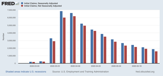
There were 1.603 million new claims, which after the seasonal adjustment became 1.877 million. This is a -249,000 decline from last week’s number, and the lowest so far since the virus struck.
Since we are a month after some States “reopened,” these new claims primarily represent spreading second-order impacts.
Unfortunately, the “less bad” trend did not occur in continuing claims, which lag one week behind. Both the non-seasonally adjusted number (red), and the less important seasonally adjusted number (blue) rose, by 437,000 and 649,000 respectively, although both remained substantially below their peaks of two weeks ago:
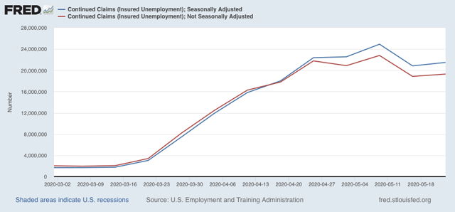
This tells us that, as of two weeks ago, the new damage outweighed callbacks to work.
Let’s be clear: all of these numbers are awful, Great Depression-scale readings. The “good” news is still that climbing back from recession bottoms always has to start with “less awful” news, and overall this is what we got in this week’s jobless claims report. By way of historical comparison, initial jobless claims peaked in late March 2009, a little over two months before that recession officially ended.
The big caveat: the virus does not care about States’ claiming that they are reopened. There is accumulating evidence that new infections have stopped declining on a nationwide basis, and both those and deaths have started to increase again slightly. So restrictions might need to be renewed. Also, given GOP opposition in the Senate, it appears that enhanced unemployment benefits are going to end next month. Since it is almost certain that the economy will still be very depressed at that point, a further huge wave of negative impacts seems increasingly likely.
Wednesday, June 3, 2020
Echoes and contrasts with 1968
- by New Deal democrat
As I mention from time to time, I am a fossil. I am old enough to remember 1968, when I was a politically precocious teenybopper. In the past week, I have read a number of commentaries wondering if this year is similar to that. In short: yes.
In 1968 it appeared that the world was spiraling out of control. The Vietnam war was at its height, with 300 soldiers killer every week. Protests against the war were also reaching a crescendo, one that reached its apex during the Democratic Convention in Chicago, which was later described as a “police riot” that, among other things, targeted journalists. That was just a few weeks after the Soviet Army rolled into Czechoslovakia to crush the “Prague Spring” of a progressive socialist government.
There were also race riots in medium and big US cities throughout the country. The police were called in to crack down on looting and vandalism, particularly following the assassinations of both Martin Luther King and Robert Kennedy.
While we don’t have a foreign war, we do have a pandemic that has uniquely been allowed to grow out of control in the US. We have China making moves in Hong Kong and the border with India. We have massive demonstrations, with some sporadic violence, following yet another death of a black man at the hands of heavy-handed police tactics. The President has called in the military against its own citizenry.
But there are also two important differences. The first is that the pervasive videoing of police tactics has caused what one writer is calling “The Great Awokening” among most white people, who have seen convincing evidence of racial profiling by police and worse, killings of African Americans by police for things as trivial as a boy having a toy gun in a park.
This “Great Awokening” is shown by two charts below. The first shows attitudes towards violence by vs. towards police:
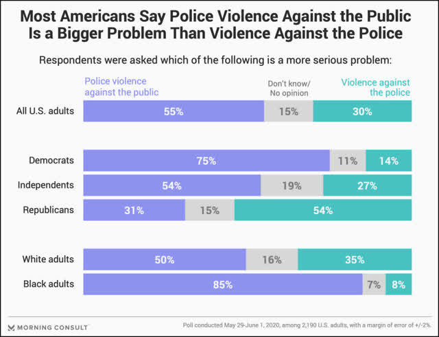
Even whites view violence *by* the police as a bigger problem than violence *towards* the police.
The second shows that the public does not approve of Trump’s handling of the protests in the past week (I’ve truncated the chart to take out views by employment and a few other items):
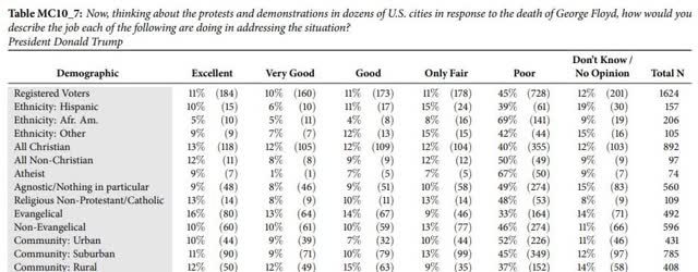
Only Evangelicals and rural areas show higher rates of approval (good, very good, and excellent) compared with disapproval (poor). Interesting, whites are not broken out separately.
The second contrast with 1968 is that the person calling for “law and order” is the incumbent. In 1968 the President, both Houses of Congress, most State governments and big cities were run by Democrats. Nixon, a Republican, was running against them. Now Trump and the GOP control the Presidency, Senate, and a majority of Statehouses. And when civil order breaks down, the public blames the incumbent party, not the insurgents.
I have no idea how everything will ultimately play out, but I do believe the images of the US military being called into action against peaceful demonstrators in Washington DC is going to leave a very sour taste. I do suspect that, like 1968, there will be a watershed passing of the political order of the old guard.
Tuesday, June 2, 2020
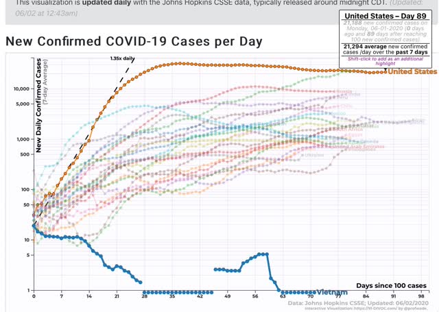
Coronavirus dashboard for June 2: the US has settled into a depressing status quo
- by New Deal democrat
The US seems to have settled into a status quo where it accepts 20,000 new coronavirus infections and 1,500 deaths each day. This is what I forecast about a month ago, as lockdown regimens were abandoned in much if not most of the country: periods of waxing and waning waves of infection because there simply isn’t the political or social willpower to “crush the curve.”
Meanwhile Vietnam, a developing country with a 90,000,000 population, which immediately went on a regimen of testing and tracing per the WHO recommendations, and has nearly universal wearing of masks, has not recorded a single coronavirus death. Below I show cases, because there are no deaths in Vietnam to show!:
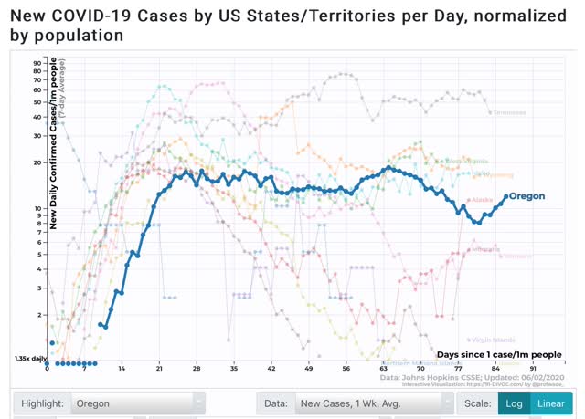
Domestically, it continues to be the case that only Oregon, with a population of about 4.5 million, in addition to several rural States and the island State of Hawaii, has “crushed the curve”:
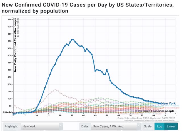
States that had early outbreaks, like NY, have seen dramatic reductions, but as the graph below shows, even with a -87% decline in new infections, NY still has more new infections even on a per capita basis than half of all the States, as shown in the below graph of new infections in the bottom 25 States plus NY:
Here is a map showing new cases and deaths per capita for all 50 States, from Conor Kelly, who continues to do great graphic work:
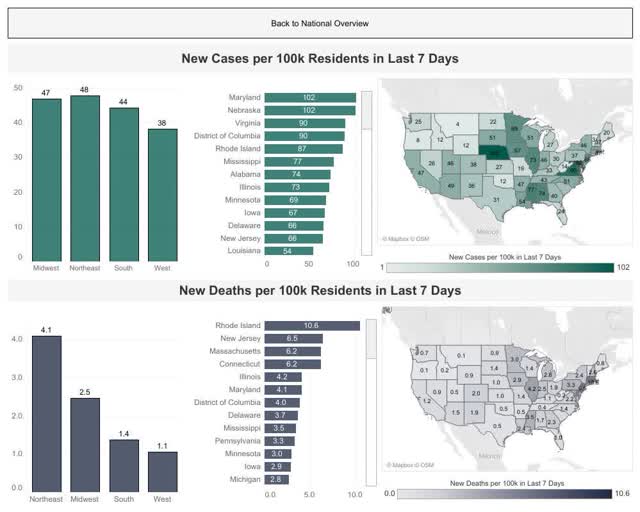
Here is his graphic overview of deaths, new cases, testing, and the % of positive tests:
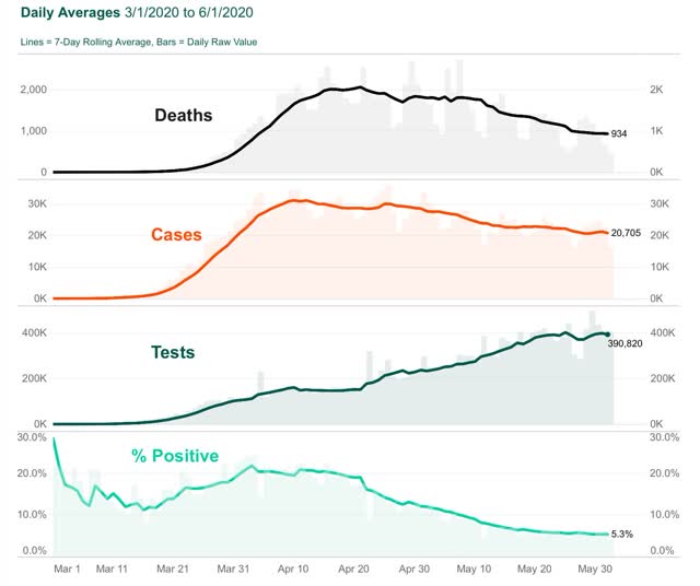
In the past 14 days, the 7 day average of new cases in the US has only declined by 1,624 cases, from 22,918/day to 21,294/day. Of that, 767 have been in NYS, in which they have declined from 2,045/day to 1,278/day.
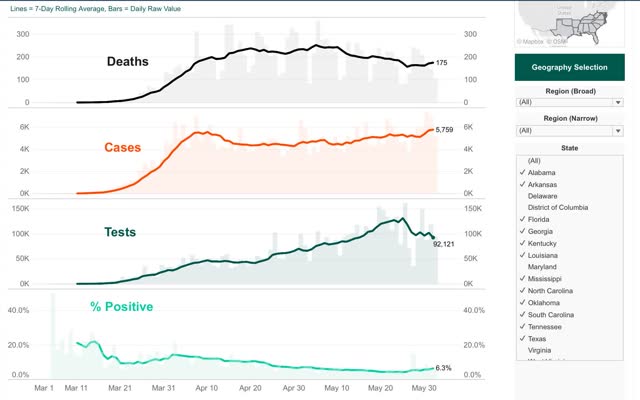
What about in States that have most egregiously ended restrictions? While the individual State data is noisy, and in some notorious cases (FL and GA) very unreliable, the below graph (again from Conor Kelly) for the Confederacy as a whole, shows that new cases started to increase as of April 28, while deaths have only increased after May 26, a 4 week lag:
Between some very bad social behavior over Memorial Day weekend and the civil unrest of the past week, I would expect new cases to increase in many areas in the next 14 days, and deaths to follow a week or two after that.
Unless a larger State like Washington, NJ or NY demonstrates by example that “crushing the curve” is possible in the US, I expect this waxing and waning around the status quo to continue until winter generally and specifically until at least next January 20.
Sunday, May 31, 2020
Coronavirus dashboard for May 31: comparing US States and regions with European countries
- by New Deal democrat
Among all countries in the world, Sweden has the worst death rate from coronavirus: 5.9 per million per day over the past week. But, even with massive declines from their peaks, most of the States in the US’s eastern megalopolis are worse.
To begin, here’s Kevin Drum’s dashboard of major European countries, plus Canada, as of May 27:
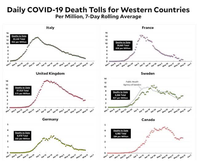
He doesn’t show it, but since Spain had the worst outbreak among major Western European countries, here it is:
And here, by comparison, is the US:
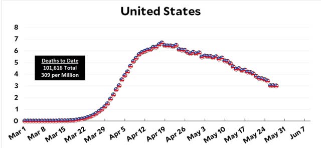
From worst to best, here are the death rates per million over the past week:
Sweden: 5.9
UK: 3.8
US: 3.0
Canada: 2.6
Italy: 1.5
Spain: 1.2
France: 1.1
Germany: 0.5
At its worst, the US as a whole had a death rate of 8.1 per million.
Now let’s see how US States fare compared with the above national averages. First, here is Conor Kelly’s breakdown of tests, infections, and deaths broken down by region. The West includes all of the mountain and Pacific West plus Alaska and Hawaii. The South includes all of the Confederate States plus WV, KY, and OK:
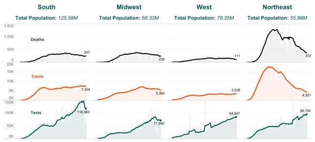
You can easily see that the Northeast had the worst outbreak, and has made the most progress. But even so, the Northeast’s death rate, at 6.6 per million, is the worst. The other three are, in order from worst to best:
Midwest: 3.5
South: 2.0
West: 1.4
The West is doing quite well, on par with Italy, France, and Spain. The South isn’t too far behind. The Midwest is problematic.
Now let’s use the same metric for the Northeastern States of the megalopolis as I used for countries above. The second number, in parentheses, represents their respective peak death rates. The declines have varied from 46% (MD) to 85% (NY):
MA: 10.1 (27.3)
CT: 9.3 (31.9)
NJ: 8.8 (33.0)
DC: 8.5 (17.2)
MD: 6.1 (11.3)
NY: 5.8 (68.0)
PA: 5.1 (12.6)
DE: 5.0 (10.6)
Only the last three States - NY, PA, and DE - have death rates lower than Sweden’s. And their death rates are worse than those of any other major country.
UPDATE: Here’s the list of the other US State with more than 3 deaths per million daily over the past seven days:
IL: 6.1
MS: 5.1
MN: 4.1
IA: 3.8
LA: 3.6
VA: 3.5
MI: 3.5
IN: 3.4
NM: 3.3
NH: 3.2
UPDATE: Here’s the list of the other US State with more than 3 deaths per million daily over the past seven days:
IL: 6.1
MS: 5.1
MN: 4.1
IA: 3.8
LA: 3.6
VA: 3.5
MI: 3.5
IN: 3.4
NM: 3.3
NH: 3.2
Subscribe to:
Posts (Atom)