Saturday, July 17, 2021

Weekly Indicators for July 12 - 16 at Seeking Alpha


 - by New Deal democrat

My “Weekly Indicators” post is up at Seeking Alpha.

All timeframes continue positive, but the renewed outbreak of COVID - indeed, its uncontrolled exponential spread - is the proverbial elephant in the room, and is quite likely to Bigfoot the entire forecast and nowcast. And with the many crosscurrents, is effect on the economy is fiendishly difficult to forecast.

As usual, clicking over and reading should be rewarding for you, and for me as well to the tune of a penny or two.

Friday, July 16, 2021

June retail sales decline after taking inflation into account, but overall pandemic gains “stick”


 - by New Deal democrat

As usual, retail sales is one of my favorite indicators, because it gives us so much information about the consumer economy. 

The news for June was mixed. Nominally retail sales were up +0.6% for the month. But after taking into account consumer inflation, real retail sales declined -0.3%. Still, nominal retail sales are up over 18% since just before the pandemic started, and up +12.9% taking into account inflation:


Here’s what the monthly changes in real retail sales look like compared with the other side of the consumer ledger, real personal consumption expenditures (which haven’t been reported for June yet):


The two have moved pretty much in tandem, so this gives me more confidence in the numbers.

But what is going to happen when the pandemic stimulus ends in a couple of months?  This is a legitimate concern, if spending is suddenly going to crash. The good news there is, even with recent drawdowns, consumers have increased their personal savings by 65%, or just over $900 Billion since the pandemic started:


This cash, which essentially is being held in reserve, should help cushion consumers, at least in the aggregate, when supplemental payments run out. And the enhanced Biden child tax credit, which is sending checks to millions of American families starting this month, is also going to help immensely.

Next let’s turn to employment, because as I have pointed out many times, real retail sales (blue) tend to lead employment (red) and aggregate hours (gold) by about 3-4 months. Here’s the long term YoY look from 1993 through the end of 2019:


The long lags after the 2001 and 2008 recessions reflected the “China shock” as manufacturing jobs in particular were re-sourced to China in large wages after both recessions.

Here is the monthly update since the beginning of 2020 (note the huge difference in scale!):


Since it is hardly surprising that there has been a big YoY jump in jobs in the past few months, given the 22 million loss in jobs in April 2020, the below graph compares the absolute data, normed to 100 as of February 2020 (with an adjustment for the increased volatility of retail sales compared with employment):


We had another big positive month for jobs (+850,000) in June, and the above graph argues that there is more to come. The biggest reasons that there hasn’t been even better numbers are (1) the supply bottlenecks in important industries like autos and home construction; and (2) continuing issues with things like arranging child care, and continued fear of the pandemic.


Thursday, July 15, 2021

Jobless claims make new pandemic lows; but the virus is back in control


 - by New Deal democrat

New jobless claims are the most important weekly economic datapoint with regard to the effects of vaccination progress. At this point, it is also a test of how much the “delta wave” of new cases is setting economic progress back. Two weeks I wrote that, because progress in vaccinations had largely stalled, “that implies at least a stall in the decline in new claims, and - I actually suspect - an increase, perhaps to about 450,000 per week or so.”

That certainly didn’t happen, at least this week. New jobless claims declined by 26,000 to 360,000, a new pandemic low. The 4 week average of claims set a new pandemic low, declining by 14,500 to 382,500. Here is the trend since last August:


After peaking last year at roughly 7 million, claims declined sharply into winter, then rose again during the winter wave of infections. This year, from late February into May, claims had trended down an average of roughly 100,000 per month. This has slowed sharply since then, to a decline of only about 20,000 in the past 5 weeks in the 4 week average.

Continuing claims, which are reported with a one week lag, and lag the trend of initial claims typically by a few weeks to several months, have declined gradually about 15% from roughly 3,800,000 over the past 4 months, and also set another new pandemic low today at 3,241,000:


Some of this decline *may* be due to many States’ termination of all extended jobless benefits due to the pandemic.

A long term perspective shows that this week’s level is similar to early during other recoveries from most previous recessions, versus at 2,000,000 or below later in strong expansions:


My ultimate target for economic success from vaccinations has been for claims to average 325,000 or below. 

But at this point nearly all States are showing an increase in new cases, and overall the average daily count of new COVID cases has more than doubled from 11,300 to 25,255 in the past 22 days. Deaths have also started to increase again. Thus the virus is back in control, especially in the relatively unvaccinated States. How employers and potential customers will behave in response to that is very much open to question, and so I am skeptical that there will be a full return to employment until the disease has run its course.

Industrial production slightly positive overall, but with negative revisions


 - by New Deal democrat

Industrial production is the King of Coincident Indicators. It is the single datum that most frequently coincides with the NBER determination of the beginning and end of recessions.


Production increased 0.4% in June, but May’s result was reduced by -0.2%. The manufacturing component declined less than -0.1%, and May’s result was also reduced, by -0.3%. As a result, overall manufacturing remains 1.2% below its pre-pandemic level, and the manufacturing component is -0.2% below that level:


While this wasn’t a poor report, it was only weakly positive overall. I don’t think the NBER will feel comfortable declaring the COVID recession over until at least the manufacturing component is all the way back to February 2020 levels.

Wednesday, July 14, 2021

Real wages decrease sharply - at least, if you include used vehicle prices


 - by New Deal democrat

As I pointed out yesterday, the big increase in inflation over the past few months has made the YoY change in real wages for nonsupervisory workers negative. Let’s take a little closer look.


Here is a graph of wages for nonsupervisory workers taking overall inflation into account, normed to 100 as of January 1973 (its peak previous to the pandemic):


Wages had been gradually increasing in real terms for several decades before the pandemic. The big surge in spring 2020 was due to the massive layoffs in the low wage sectors of the economy. Much of the decline since then has been attributable to their being rehired.

Here is a close-up over the past 2 years:


Average wages are still 2.4% higher than before the pandemic.

The same data YoY shows a decline of -3.9%:


But when we take used vehicles out of the inflation equation, YoY inflation is less explosive than the total number appears, at +3.9%:


So now here is the YoY% change in wages, leaving out used vehicles:


If you’re not in the market for a used vehicle, YoY real wages have risen ever so slightly (less than 0.1%).

I do expect the issue with vehicle prices to work itself out as microchips for vehicle manufacture become more available, but I have no insight as to how short or long a period of time that will be.

And of course, if you are looking to buy a house as well, you are really up the creek without a paddle.
 

Tuesday, July 13, 2021

Consumer inflation rises the most in over a decade; will it draw the Fed’s attention?


 - by New Deal democrat

Let me start my take on this month’s inflation report with my concluding remarks last month: “this is not a big deal if it only lasts another month or two. But if the trend continues longer than that, it will begin to impact consumer spending, and it will get the Fed’s attention.”

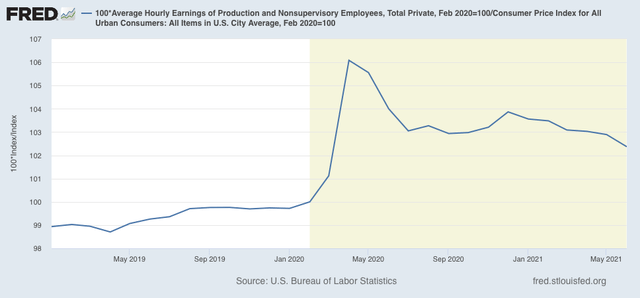
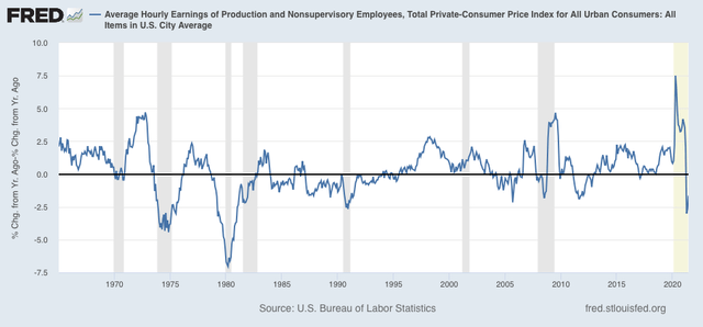
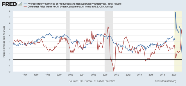
Well, it has definitely lasted another month. In spades.  The 0.9% increase in June was the highest since June 2008’s 1.0% increase (driven by $4+ gas).(red in the graph below) More importantly, the 5.3% YoY increase is also the highest since summer 2008, and well in excess of the YoY average wage increase for nonsupervisory workers of 3.7% (blue):

This is going to get the Fed’s attention. They may not even wait another month.

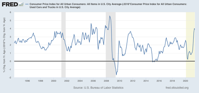
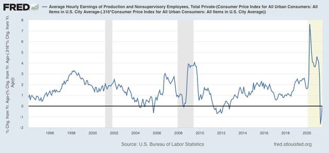
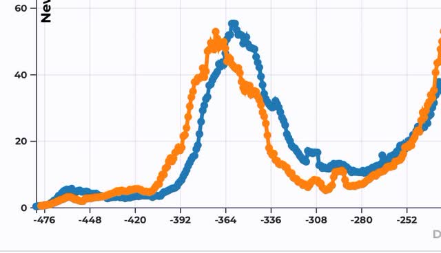
Be that as it may, the primary driver of this inflation is not wage increases, it is first and foremost a supply bottleneck in the production of new cars, which is driving insane demand for used cars (blue in the graph below), the prices of which are up 45.2% YoY. Secondarily it is the demand driven increase in gas usage, which has caused those prices to increase 44.8% YoY (red):

The spike in prices in used cars alone is responsible for about 1/3 of the total increase in prices last month. Used car prices, which are about 3.2% of the total weighting in the inflation index, rose 10.8% in just the past month! That nets out to over 0.3% of the total inflation number being just used cars.

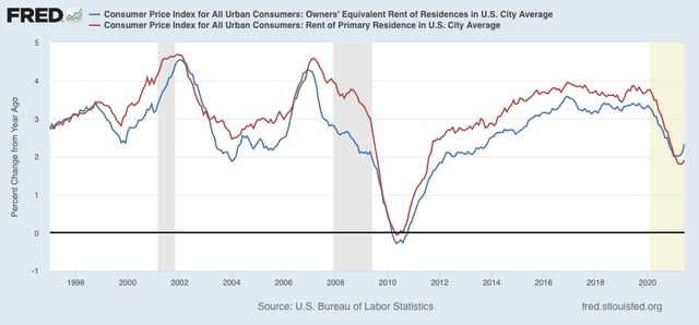
On the other hand, rent continues to be somnolent (as is “owners’ equivalent rent,” which is how the Census Bureau tries to measure house prices):

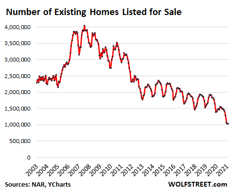
By the way, ultimately the house price spike has been driven by the fact that during the pandemic last year, existing homes placed on the market (which are about 90% of the typical housing market) declined precipitously compared with the typical year:

I expect both house prices and gas prices to work themselves out. Not only have home sales declined, but I expect most of the houses that were going to be placed on the market in 2020 to go to market over the next 12 to 24 months. This surge in existing home inventory is going to drive house prices down. Similarly, the travel bug from being cooped up at home during the pandemic is going to pass as well.

That leaves motor vehicles. As I wrote last month, I have no special insight into vehicle part supply chains, and in particular microchips, which have been fingered as a primary shortage.

But, hypothetically, would the Fed raising rates do anything about that shortage? The answer seems a pretty clear “NO,” so why deliberately slow down the rest of the economy to deal with a bottleneck that is beyond their control?

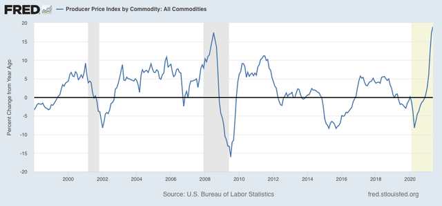
Beyond that, as I wrote last month, there have been a number of 10%+ spikes in commodity prices in the past several decades that were brief in nature and worked themselves out without causing a recession:


Ironically, the only way I can see the Fed “helping out” with inflation, is in the area of their “blind spot” - actual house prices. If they were to raise rates just enough to trigger an increase in mortgage rates of 0.5%-0.75%, which would serve to cool down the housing market in a very substantial way without necessarily causing the economy as a whole to stall.

Monday, July 12, 2021

Coronavirus dashboard for July 12: the completely preventable “delta wave” is here


 - by New Deal democrat

The completely unnecessary and preventable “delta wave” of COVID infections, hospitalizations, and deaths is now in force - all three metrics are now rising nationwide.


Here are the 7 day average of confirmed cases (thin line) and deaths (thick):


Cases have gone up roughly 50% from their 11,300 trough 3 weeks ago. Deaths likely bottomed 7 days ago.

Hospitalizations (graph from the CDC) have also started rising in the past week or so:


There are July 4 artifacts in almost all the new data, which won’t pass out of the 7 day averages for several more days. Also, about half of the States have apparently decided that COVID is so “over” that they no longer need to report on the weekends. 

With those caveats, here are a few graphs of the worst-affected States.

Here are Arkansas, Missouri, and Nevada:


And here they are for spring and summer 2020 for comparison:


Arkansas and Missouri have already matched their worst summer 2020 levels. Nevada is at less than half of its worst levels.

Next, here are Florida and Arizona, both of which had the worst summer outbreaks last year:


Here they are for comparison last year:


Florida is currently only at a little over 1/4 of its worst level from 2020, and Arizona is at about 1/6th of last year’s worst levels.

I expect the situation for all of the above States, except possibly Arizona, to change considerably for the worse before the end of this month.

All of which was completely preventable.