- by New Deal democrat
As I warned you on Saturday, there might be some hooky-playing this week; and as I also said, that was “Omicron permitting.”
Well, Omicron warrants an update today. Because exponential spread is underway especially in those parts of the country most exposed to international visitors.
But first, in the spirit of leading indicators, let’s take a look at South Africa, where Omicron was first reported, and which has an excellent reporting system.
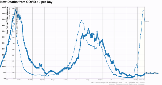
Here are deaths (solid line) vs. cases (dotted line) per capita for the whole country (note differences in scale) for the past year. In all previous waves of infection, including a previous wave during summer 2020 not shown, deaths followed cases by one month or less:

Cases began to rise almost exactly 5 weeks ago, from just under 300 to over 23,000 three days ago - and have already fallen back to 19,400. Meanwhile deaths have risen from 13 four weeks ago to 44. Undoubtedly deaths will continue to rise. The question is, how much?
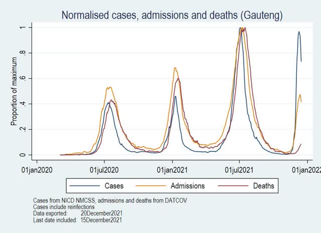
For some help, here is a look by Conor Kelly at cases, hospitalizations, and deaths in Gauteng, the first area of South Africa to be hit:

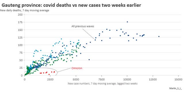
Note that hospitalizations and deaths rose comparably in the three previous waves. This time around, hospitalizations appear to have peaked at only half the level of cases, as normalized in the graph. This is really good news. Meanwhile deaths have clearly started to rise, but there is some indication that they have stayed low longer after the onset of this wave than for previous waves. This appears to be confirmed by the following graph comparing deaths in the first two weeks of the present Omicron wave, with previous waves:

In other words, our “leading indicator” example of South Africa lends credence to the idea that hospitalizations and deaths will not be so severe, on a per capita basis, as a result of Omicron than with Delta or other prior waves.
This is good news.
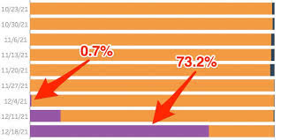
Turning to the US, the CDC made a splash yesterday by announcing that its model suggests that 73% of all cases in the US now are Omicron. Here’s their graph:

But take the CDC’s announcement with a shaker full of salt. In a footnote at its “Nowcast” site, it advises that the graph is bases on four weeks of data *ending November 27,* i.e., four weeks ago! It’s confidence interval includes about 2/3’s of all possible percentages. And it made very major revisions to last week’s estimate, increasing that from 2% to about 30%. In short, the CDC’s number is *very* unreliable.
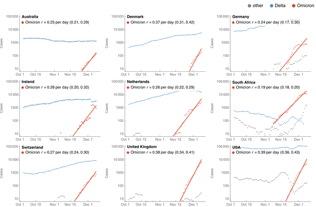
By contrast, here is Trevor Bedford’s log scale *actual* data, through 12 days ago, of cases in the US and 8 other countries:

Projecting Bedford’s trendline forward 12 days suggests that right now about 33% of all cases in the US are Omicron.
That’s a very major difference, not just because of the numbers, but because in the CDC’s version, Delta has been knocked back to about 35,000 cases, whereas in Bedford’s Delta’s number is about constant at 80-90,000 cases. In other words, the CDC has Omicron supplanting Delta, but Bedford does not, at least in the US - although his graph for South Africa does indeed suggest that Delta cases have declined by about 2/3’s since Omicron emerged at the beginning of November.
There is another intriguing trend in Bedford’s graphs, because most countries also provide a record for “other” variants in addition to Omicron and Delta. Looking at South Africa, “other” cases have risen even faster than Omicron since one month ago, and are responsible for about 10% of all cases there now. A similar trend appears to have started in Germany, the UK, and the US as well. I have not read of any explanation of this from any expert.
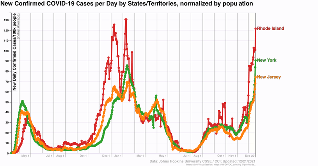
Finally, let’s look at where we have exponential spread in the US. Here are NY, NJ, and RI:

NY and NJ both set new records as of today. RI is not far behind.
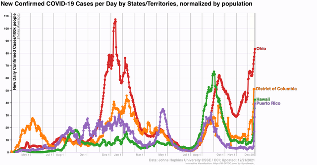
Next, here are OH, DC, HI, and PR:

HI and PR are two tropical island oases that had been doing extremely well. Both are 80% or more vaccinated, and PR in particular recently had as few as 2 cases per 100,000 daily. This week PR shot up to 40 cases per 100,000 in *four days!*
Of course, HI and PR are tourist destinations, and have heavy international travel as does the NYC area.
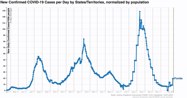
And of course we all know one other State that has a similar profile: FL. Here is FL’s official case count, which they are still only updating once a week:

Rising, but still very low.
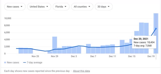
Except when you bypass the State, and get reports directly from counties and hospitals, here is what the daily total looks like (from the NYT):

As of yesterday, cases in FL were *triple* what they were just one week prior. Expect a huge increase in FL’s next weekly report this Friday.
I expect the exponential outbreak to grow both in terms of numbers and to spread throughout the entire country in the next week or two. We can hope that in the US, as in SA (and apparently in London in the UK as well), cases will peak about 30 to 40 days after the onset of the wave, and decline rapidly thereafter. And we can pray that, as appears increasingly likely in SA, the burden of hospitalizations and deaths does not grow at the same rate as cases.
