Saturday, August 22, 2020
Weekly Indicators for August 17 - 21 at Seeking Alpha
- by New Deal democrat
My Weekly Indicators post is up at Seeking Alpha.
Surprisingly, the underlying tone of slow improvement continues, especially among short leading and coincident indicators. In particular, the effects of the end of supplemental unemployment insurance due to the pandemic has not yet shown up in any big downdrafts in consumer spending.
As usual, clicking over and reading helps reward me a little bit for the efforts I put in.
Friday, August 21, 2020
The role of negative real bond yields in new record highs in stock prices: in which I reply to Paul Krugman
- by New Deal democrat
It sure seems like somebody sent Paul Krugman a link to my post the other day about Why, despite the worst economy since the Great Depression, the stock market has made a new all-time high. Because he wrote a series of tweets that look like a direct reply.
So here is my response.
To recapitulate, on Monday I suggested that the answer to the conundrum primarily consisted of 3 reasons:
1. Background longer term fundamental factors [particularly all-time low interest rates] for the economy are very positive.
2. All other industrialized countries beside the US have controlled the pandemic [so global companies’ earnings will reflect that].
3. Market gains are completely bifurcated, and are essentially limited to the 6 biggest players [FAANG+Microsoft] in the global economy and in home delivery [so companies whose footprint is either digital or based on home deliveries especially benefit].
As an aside, although I specifically declaimed that my explanation had no “actionable information” for stock investors, Seeking Alpha picked it up anyway, and so far it has about 70 comments there. But back to the main point.
On Wednesday, Paul Krugman weighed in with a series of tweets:
To rephrase his tweets in terms of my thesis:
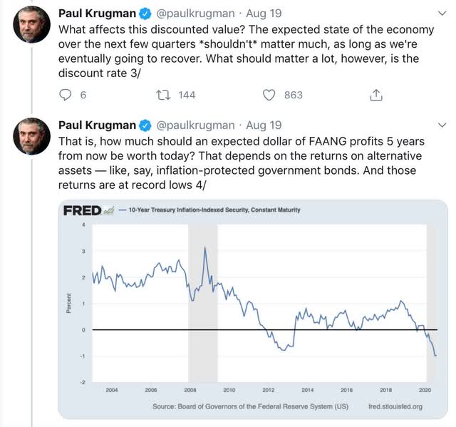
1. Yes, but short term profits over the next year of so shouldn’t matter [because Paul Krugman is a macroeconomist who can’t help but think in terms of rationally discounted value out to an ad infinitum future]
2. Zzzzzz.
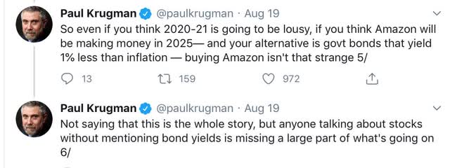
3. Yes, and beyond that, FAANG+Microsoft are able to charge monopoly rents for the foreseeable future.
4. BUT, since government bonds yield less than the foreseeable inflation rate, bidding up profitable companies is a rational investment decision. And further, “anyone talking about stocks without mentioning bond yields is missing a large part of what’s going on.”
Herewith, my response.
Corporate profits are a long leading indicator for the economy; stocks a shorter leading indicator. Unsurprisingly, over the long term corporate profits lead stock prices, not visa versa. Here’s a graph of that going back to 1987:
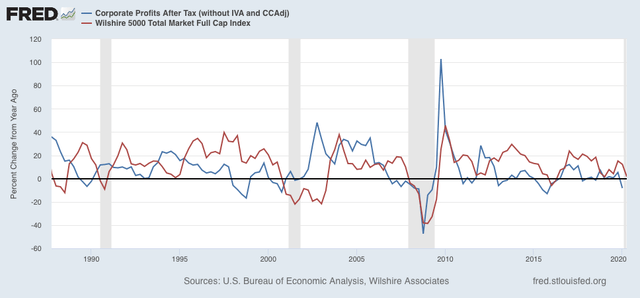
Note, importantly, that not only do stock prices, averaged quarterly, clearly follow corporate profits, but further that they do so with a 2-4 quarter lag —NOT 5 years! If the present situation holds true to form, second or at least third quarter corporate profits are going to bounce back smartly. In other words, actual, empirical history, going back decades, says that while “the expected state of the economy over the next few quarters shouldn’t matter much,” the expected state of corporate profits *should.*
But what about the negative “real” interest rate in Treasury bonds? There are two problems with Krugman’s formulation, one theoretical and one empirical.
The theoretical problem is his comparison of “Amazon making money in 2025” vs. “government bonds yielding less than inflation” now. See the problem? If we’re going to be consistent, it is the total government bond return over 5 years vs. Amazon’s total return over 5 years.
This wouldn’t be that much of an issue if the “super 6” paid dividends. If I could expect to earn 1% on a Treasury over 5 years, but 2% in dividends on my alternative basket of stocks, then stocks are clearly paying me more than bonds.
But among the Super 6, only Apple and Microsoft pay dividends. None of the other 4 - Facebook, Alphabet, Netflix, and Amazon - pay dividends at all! So any return is going to have to come in the form of capital appreciation. So, it *isn’t* simply a matter of whether, e.g., Amazon is going to still be profitable in 2025, but rather whether either (1) Amazon is going to continue to be *increasingly* profitable through 2025, thereby justifying an ever higher stock price, or (2) speculators will continue to bid up Amazon shares over the next 5 years even if its profits don’t increase (i.e., a bubble).
The second, empirical, problem with Krugman’s take is that, when we take a closer look, that isn’t how stocks have behaved.
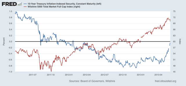
Let me start by taking Krugman’s same graph of inflation indexed Treasuries (blue), and compare it with in-adjusted 10 year Treasuries (green), and broad market gains, measured YoY for easier comparison (red):
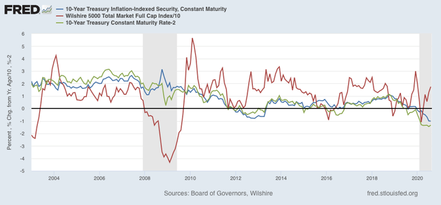
Note that, with the brief exception of November-December 2008, the two bond yields have moved pretty much in tandem, with less than a 1% variance. That’s because inflation ex-gas prices has averaged pretty close to 2% for the past 20 years, without a lot of variation.
Second, declining bond yields have indeed correlated with broadly rising stock prices - as I said in my first post, interest rates are the most important fundamental underlying the future economy. Krugman discounts this and instead focuses on an intermediate step, a variation on what is usually called the “Stock-bond yield gap,” I.e., how do stock dividends (in Krugman’s formulation, capital appreciation) compare with bond yields?
But now let’s look at the present episode of declining and negative real bond yields, below. First, here is the entire last 9 months since real bond yields made an intermediate high:
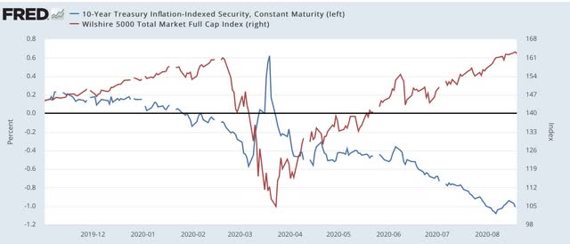
Note particularly in this context that the lion’s share of the stock market’s rebound - about 75% of it! — took place between the end of March and early June.
Next, here is the time period from November until the late March bottom:
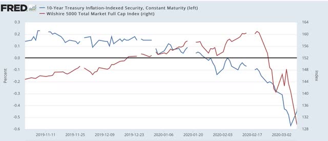
The first thing to note is that stocks *followed* bonds down in February and March. FAANG’s anticipated 5 year return didn’t seem to matter then, even though real bond yields went negative.
Now, here is the last 4+ months:
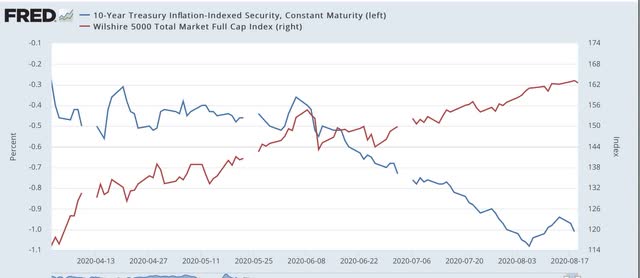
When we look on a micro, day-by-day basis, we see that stock prices and bond yields move generally in tandem. Increased bond yields, particularly the spike in early June, have correlated with positive moves in stock prices. Declining bond yields have correlated with lesser improvement in stock prices, or outright declines. This is the opposite of what we would expect if consistently profitable anticipated stock returns were being compared with bond yields by investors. Lower bond yields should lead to the most positive stock market days, and rising yields should correlated with market sell offs - but instead empirically the reverse has been true.
Further, going back to Krugman’s original graph, note that there was indeed a similar period of negative real interest rates in 2012-13. Let’s focus on that period, and again compare it with stock market returns, below:
Just as with the past year, initially stock prices followed real yields down. Then, just like the past year, stock prices made their biggest move as real returns turned mildly negative, to about -0.2%. Despite real bond yields continuing to decline to about -0.9%, stock prices increased in a much less pronounced fashion - just as has been the case in the past 2 months, as I pointed out above.
In short, in both the 2012-13 time frame, and over the past 9 months, the biggest stock price gains were when the real return was barely negative, and not when real bond yields declined substantially further. This is not what should have been happening if the primary driver were consistently improving future corporate profits being compared with worsening forward expectations of real bond returns.
In conclusion, while I am sure that investors’ comparisons of anticipated future stock vs. bond returns plays some role in asset reallocation in favor of stocks, I do not think it is a major contributor to the new stock market highs.
Thursday, August 20, 2020
Initial claims mixed, while continuing claims continue “less awful” pandemic recovery trend
- by New Deal democrat
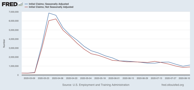
While this morning’s initial jobless claims increased from last week, they were better than any other readings since the pandemic started. Continuing claims had their “least worst” week yet.
On a non-seasonally adjusted basis, new jobless claims rose by 52,776 to 891,510, still only the second week under 1,000,000 since the beginning of the pandemic. After seasonal adjustment (which is far less important than usual at this time), claims rose by 135,000 to 1,106,000:
Continuing claims, on both an un-adjusted and seasonally adjusted basis, however, continued to decline, by 931,998 to 14,265,344, and by 636,000 to 14,840,000 respectively:
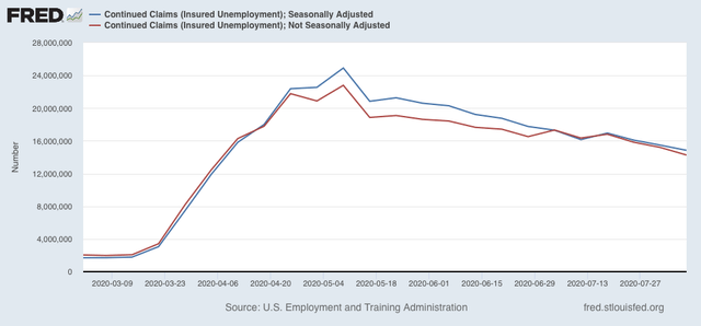
Continuing claims have fallen by roughly 40% from their peaks in early May.
So, within the context of the pandemic recession, this counts as “good” (or continuing “less awful”) news. Nevertheless, both initial and continuing claims remain at far worse levels than even at their worst during the Great Recession.
Wednesday, August 19, 2020
Coronavirus dashboard for August 19: a regional look at infections; the Deep South remains almost totally out of control
- by New Deal democrat
Total US cases: 5,457,824
Average last 7 days: 48,764
Total US deaths: 163,595
Average last 7 days: 1,048
Source: COVID Tracking Project
My overall thesis is that under the present leadership the US as a whole is politically and socially incapable of bringing the coronavirus under control, as almost every other industrialized country has been able to do. That is very likely to change beginning next January 20. Before then, I expect there to be a yin and yang in the course of the pandemic, as areas in the US veer between “the pain threshold” at one extreme and complacency on the other. Together with a vaccine hopefully being available by next spring, at that time I am hopeful that the US will finally have beaten the virus.
Today let’s focus on infections, which lead hospitalizations by a couple of weeks, and deaths by a couple of weeks more.
Here is the overall regional picture:
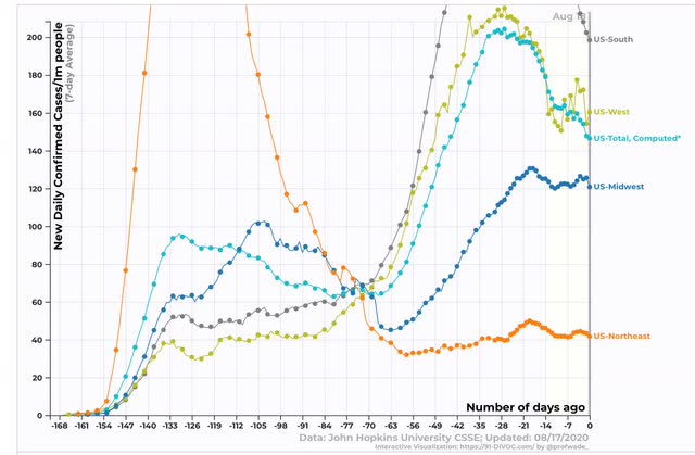
As has been the case for several months, the South and to a lesser extent the West are the epicenters of the pandemic, while the Northeast has come close to containing the virus.
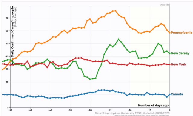
Breaking down each region by States, here is the South:
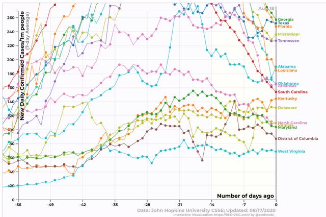
*Reported* cases in the Deep South, which were completely out of control a few weeks ago, have decreased substantially, while the Mid-Atlantic area centered on the DC metro area plus Kentucky has seen a significant increase after a period of relative complacency. (More on the significance of testing below).
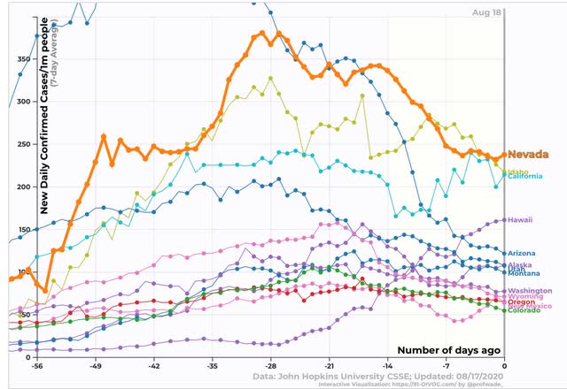
in the West, Nevada and Idaho have made progress, while California is on a high plateau. After beating the virus early, Hawaii has had a major setback, again likely due to complacency. Other States in the region are doing reasonably well:
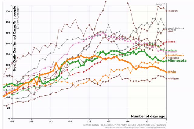
The Midwest is the area where complacency is currently leading to the most trouble, as all States have significantly higher levels of new infections than they did 8 weeks ago. Worse, only MInnesota and Ohio (highlighted) are currently trending downward:
Finally, we come to the one region which on average has done very well, the Northeast. With the significant exception of Rhode Island, infections rates are lower than virtually *every* other State in *every* region of the country:
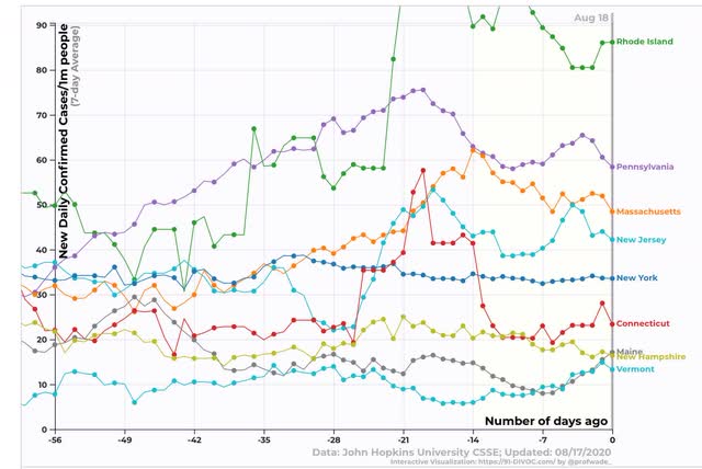
In the case of northern New England, Connecticut, and New York State, they have truly beaten the virus, although all the large States in the Northeast are not doing so well in comparison with neighboring Canada:
Only Maine, New Hampshire, and Vermont are comparable with our neighbor to the north.
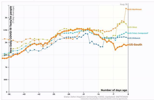
But the picture in the majority of States is not as good (or “more bad”) than appears above, because testing has decline substantially in the South, and until a week ago in the West as well:
And only the Northeast meets the WHO’s threshold of under 5% positivity at which relaxing restrictions is deemed acceptable. As you can see, the South is failing terribly:
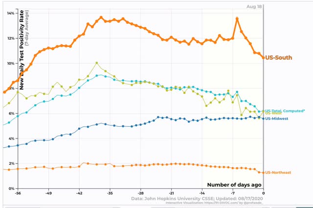
This means that in the West and Midwest, there are a significant number of missed cases, and in the South (especially the Deep South) the decline in new cases shown above may only be an artifact of fewer tests being done. In short, the situation there really remains virtually completely out of control.
Tuesday, August 18, 2020
Housing roars back
- by New Deal democrat
As I wrote yesterday, the background longer term fundamental factors for the economy, most importantly all-time low interest rates, are very positive. In particular I wrote, this “has already made an impact on the housing market ....Lower mortgage rates cause more people to buy houses. Housing permits have already made back about half of their pandemic losses as a result.”
Well, with this morning’s report on July housing permits and starts, I can amend that to read that housing permits [and starts] have now made back almost *all* of their pandemic losses.
To cut to the chase, here is a graph of the past 3 years of housing permits (blue), starts (green), and the least volatile of all the metrics, single family permits (red, right scale):
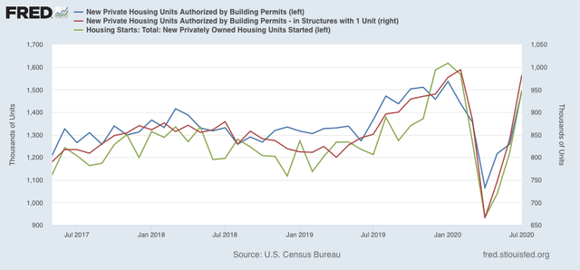
Permits are within 3% of their expansion highs from January, and are only exceeded by that month plus October and November of 2019. Starts, which tend to lag permits by a month or so, and are much more volatile, are within 8% of their January expansion high, and above every other expansion reading except for November and December 2019. Single family permits were only exceeded in one month - this past February - during the last expansion, and are only 1.1% below that peak.
Since housing tends to help power the economy for the next 12 to 18 months, this is a very positive sign over the longer term once we have competent political leadership in Washington, and especially if a workable vaccine is available as well.
Monday, August 17, 2020
Why, in the face of the worst US economy since the Great Depression, is the stock market near record highs?
- by New Deal democrat
As I type this, the S&P 500 is close to setting an all-time record. Last week it came within 0.2% of doing so:
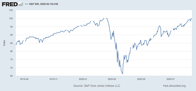
All of this in the face of the worst quarterly decline in GDP ever in Q2, and continuing unemployment over 10%. What’s going on?
Before I continue further, let me emphasize that I am not giving investment advice, and I do not believe there is any “actionable information” for investors in this post. But I do think there is a decent explanation for the huge bifurcation between the economy as a whole and the stock market.
There are 3 points to be made:
1. Background longer term fundamental factors for the economy are very positive.
2. All other industrialized countries beside the US have controlled the pandemic.
3. Market gains are completely bifurcated, and are essentially limited to the 6 biggest players in the global economy and in home delivery.
Let’s go in order.
1. Background longer term fundamental factors for the economy are very positive.
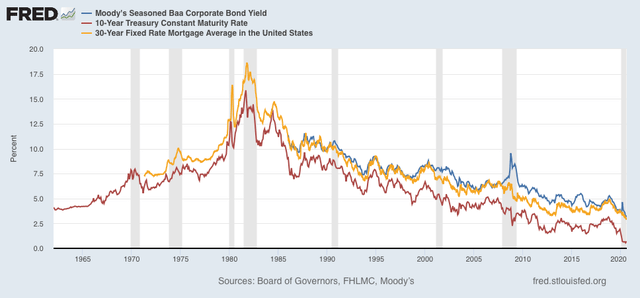
The most important longer term leading indicator for the economy is interest rates. Low interest rates and easy money power strong growth. Higher interest rates and limitations on credit strangle growth.
And on that score, interest rates are the lowest they have ever been, whether we measure in terms of corporate bonds (blue), US Treasury’s (red), or mortgage rates (gold):
We would expect this to power growth, and it has already made an impact on the housing market, as shown when we compare mortgage rates (gold, inverted) with housing permits (green):
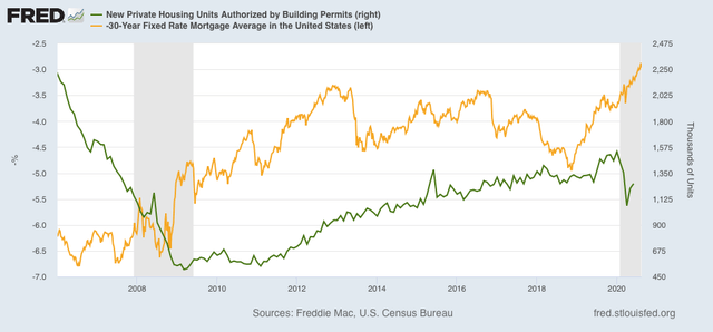
Lower mortgage rates cause more people to buy houses. Housing permits have already made back about half of their pandemic losses as a result.
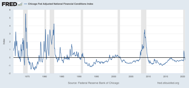
Add in easy credit, as shown by the Chicago Fed Adjusted Financial Index (below), and you’ve got the basis for a healthily growing economy as soon as the pandemic is contained (note: in this index a negative number is good):
As a result, Wall Street believes that the worst in corporate profits is behind us, and that over the next year, profits will gradually grow towards a new record:
2. All other industrialized countries beside the US have controlled the pandemic.
Here’s the graph of the 7 day average of deaths from the coronavirus for all the other major industrial powers (+NY, our best large State, for comparison):
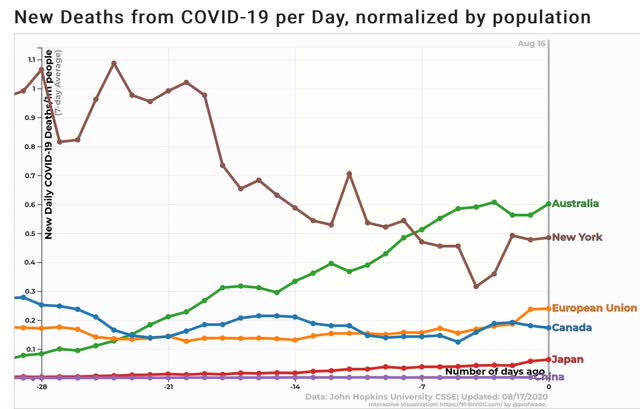
All except Australia have less than 0.2 deaths per million per day on average. Even Australia is only slightly worse than New York.
In other words, the lion’s share of the developed world’s economy has returned to normal or close to it, and every US company exposed to that economy is benefiting from it.
3. Market gains are completely bifurcated, and are essentially limited to the 6 biggest players in the global economy and in home delivery.
The 5 FAANG companies - Facebook, Apple, Amazon, Netflix, and Google - +Microsoft account for almost 1/4 of the entire S&P 500 by market capitalization:
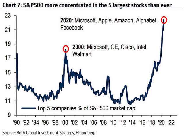
This is the most concentrated the market has been in generations.
What is most noteworthy is what happens when we break out their profits vs. the profits of the other 494 S&P 500 companies:
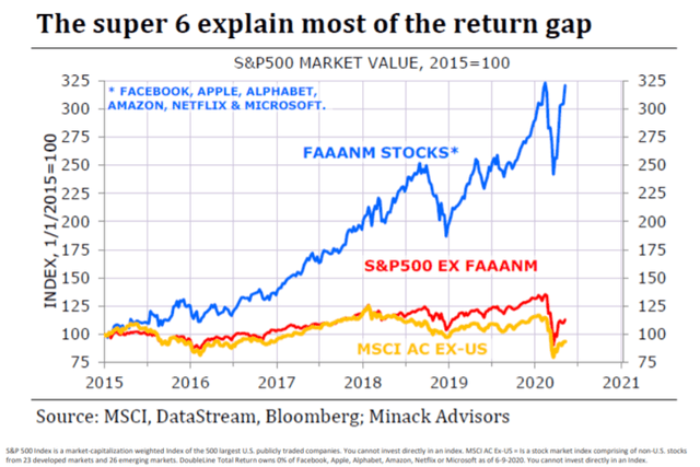
The above graph norms the categories as of the beginning of 2015. What is more important for our purposes is to compare vs. the beginning of 2018. Since then, FAANG+Microsoft stocks have increased over 40% in price, while the rest of the S&P 500 has gained virtually nothing. Even at its record in February it was only about 12% higher than its high in January 2018. In short, except for 6 stocks, the S&P has gone nowhere in over 2 1/2 years.
What do the 6 FAANG+Microsoft stocks have in common? They either exclusively have a digital hardware and software presence (Facebook, Apple, Netflix, Google, Microsoft), or couple that with a delivery service (Amazon).
In other words, those six have both a global footprint, so they benefit from the recovery in the rest of the world outside the US, and inside the US, they either are not affected by the closure of many businesses, or else actually benefit by delivering goods and/or online content to homes.
In short, the S&P 500 is close to a new record high because the market anticipates a solidly improving domestic economy over the next year, globally exposed companies experiencing robust international growth now, and the market’s biggest players are actually *benefitting* from so many people inside the US staying home.
Sunday, August 16, 2020
The 2020 Presidential and Senate nowcasts: Positions are getting entrenched, and spreading down-ticket
- by New Deal democrat
Here is my weekly update on the 2020 elections, based on State rather than national polling in the past 30 days, since that directly reflects what is likely to happen in the Electoral College. Remember that polls are really only nowcasts, not forecasts. There is nothing inherent in their current status which tells you they will remain in the same category in early November.
Which brings me to the matter of Nate Silver, who unveiled his “forecast” this past week.
Which brings me to the matter of Nate Silver, who unveiled his “forecast” this past week.
Here are the two problems: (1) it is not falsifiable; and (2) it’s *not* a forecast! At best it is a forecast of what he currently expects his nowcast to be on Election Day.
Here are a few of his tweets that demonstrate the problem:
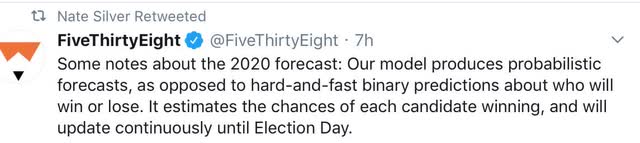

Ultimately, Nate says that his “forecast” *currently* gives Trump at 27% chance of winning, and Biden a 72% chance of winning.
Suppose Biden wins narrowly. Or solidly. Or has the biggest victory since 1932? In all of those cases, Silver will say his model was correct. But supppose to the contrary that Trump wins. In that event, Silver will *also* say his model was correct! About the only thing Silver appears to rule out is a Trump blowout. In every other scenario, he will say his model was correct.
It’s simply not falsifiable, and so ultimately not scientific.
Further, as Nate says above, his model is going to change with the news and the polling between now and Election Day. But a “forecast” that keeps on changing right up until Election Day is really only a nowcast.
By contrast, economic models based on leading indicators can give a forecast that is “locked in” well before Election Day. And with the exception of the model based on personal income, as to which I am waiting for July’s numbers in two weeks, they all forecast a Biden win, albeit by a percentage that is less than most of his polling advantage presently.
As an aside, note that in the three biggest blowouts of the past 100 years - 1932, 1964, and 1984 - the loser got 40%, 39%, and 41% of the vote, respectively. So even though Trump is polling in the low 40’s, with very few undecideds, by historical standards it is a very poor sign for him.
With that said, let’s turn to this week’s poll numbers.
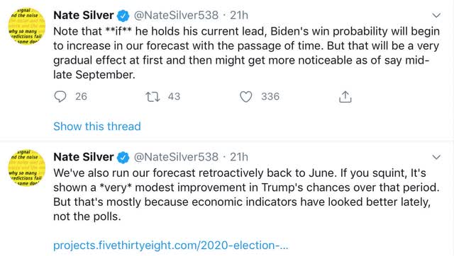
Last week I noted that Trump’s approval was reverting to the mean, as were the Presidential polls. The former trend has stalled; the latter has shifted slightly further in Biden’s favor.
Here is Nate Silver’s Trump approval vs. disapproval graph:
After languishing at 40%, equivalent to the worst levels of his Presidency, Trump’s partisans came back to supporting him again, as they always have for the past four years. Will his transparent trashing of the Postal Service in order to thwart voting by mail cause another temporary erosion of support? Too soon to tell.
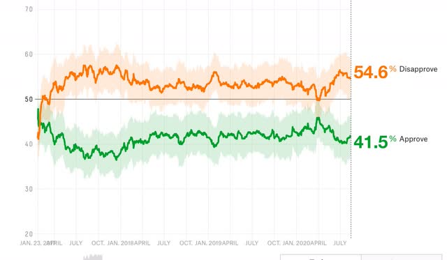
In any event, here below is the updated map through August 15. To refresh, here is how it works:
- States where the race is closer than 3% are shown as toss-ups.
- States where the range is between 3% to 5% are light colors.
- States where the range is between 5% and 10% are medium colors.
- States where the candidate is leading by 10% plus are dark colors.
There were very few changes this week. New polling moves Arizona from “lean” to “likely” Biden. North Carolina and the State of Nebraska at large both move back from “lean Trump” to “toss-up.” On the other hand, Minnesota moves from “solid” to “likely Biden.”
Last week I noted that Trump’s approval was reverting to the mean, as were the Presidential polls. The former trend has stalled; the latter has shifted slightly further in Biden’s favor.
Here is Nate Silver’s Trump approval vs. disapproval graph:
After languishing at 40%, equivalent to the worst levels of his Presidency, Trump’s partisans came back to supporting him again, as they always have for the past four years. Will his transparent trashing of the Postal Service in order to thwart voting by mail cause another temporary erosion of support? Too soon to tell.
In any event, here below is the updated map through August 15. To refresh, here is how it works:
- States where the race is closer than 3% are shown as toss-ups.
- States where the range is between 3% to 5% are light colors.
- States where the range is between 5% and 10% are medium colors.
- States where the candidate is leading by 10% plus are dark colors.
There were very few changes this week. New polling moves Arizona from “lean” to “likely” Biden. North Carolina and the State of Nebraska at large both move back from “lean Trump” to “toss-up.” On the other hand, Minnesota moves from “solid” to “likely Biden.”
Further, despite heavy polling, Georgia, North Carolina, Ohio, and even Texas remain in the toss-up category - and Florida remains firmly in the “likely Biden” category.
There are a few States where I have had to rely on older polling, and really need to be updated, notably Nevada, Arkansas, and West Virginia.
Once again, based on the current map Biden just has to win the “solid” and “likely” States, and need not win any of the “lean Biden” States, in order to win the election.
I continue to be of the opinion that Trump has 3 weeks left - until Labor Day - to work a miracle with the coronavirus pandemic. If it is about where it is now, then the economic fundamentals + the casualties from the pandemic indicate that Biden will win the popular vote in November, although the race seems likely to tighten somewhat, because the short leading economic indicators have been suggesting the economy will improve somewhat.
The solidifying of the Presidential election map is having a continued effect on polling for Senate races, as shown in the below map which uses the same % cutoffs as for the Presidential map:
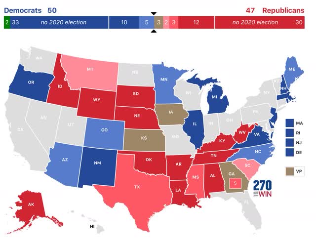
There have been a number important changes in the past two weeks. Four favor Democrats: Maine moves back from “toss-up” to “likely Democrat,” the Georgia Senate seat Ossoff is running for moves from “lean Republican” to “toss-up,” Texas moves from “solid” to “likely Republican”, and and South Carolina moves from “likely” to “leans Republican.” On the other hand, two changes favor Republicans: Alaska moves from “likely Republican” to “solid Republican,” and Montana moves from “toss-up” to “leans Republican.”
Based on this map, even if they do not win any of the “toss-up” States, but just win those rated “likely and solid,” Democrats will wind up with 50 Senate seats and so a technical majority. If they were to win the “toss-ups” and “lean Republican” races as well, they could wind up with as many as 55 Senate seats.
I do suspect that Senate races will closely mirror Presidential vote totals in the States this year, as voter preferences are deeply entrenched.
Subscribe to:
Posts (Atom)