Saturday, May 23, 2020
Weekly Indicators for May 18 - 22 at Seeking Alpha
- by New Deal democrat
My Weekly Indicators post is up at Seeking Alpha.
Many of the indicators are bouncing off their worst levels, especially those like mortgages that are affected by lower interest rates. On the other hand, employment losses continue to spread out.
As usual, clicking over and reading not only should be educational for you, but rewards me a little bit for my efforts.
Friday, May 22, 2020
Bad news and good news on coronavirus; plus, implications for Election Day
- by New Deal democrat
No economic news today as we head into the Memorial Day weekend, but there are a few coronavirus and economic/political developments of note.
First, the bad news: the declining trend in new diagnosed cases of coronavirus in the US has stopped in the past week. Instead new cases have leveled off. Here’s a graph from Conor Kelly’s excellent tableau coronavirus dashboard page:
Cases in the US outside of NY actually increased slightly (2%) in the past week.
Now, the good news: as also shown in the above dashboard, testing has continued to increase dramatically, up 18% again in the past week.
The jury is still out on whether the slight increase in new cases in the past 4 or 5 days is because some States recklessly “reopened” without justification, or whether it is just an artifact of increased testing. There was a similar small increase in new cases right after testing started to ramp up around April 20, but it lasted less than a week. It will take about another week to know which explanation for the end of the decline in new cases is the better one.
The jury is still out on whether the slight increase in new cases in the past 4 or 5 days is because some States recklessly “reopened” without justification, or whether it is just an artifact of increased testing. There was a similar small increase in new cases right after testing started to ramp up around April 20, but it lasted less than a week. It will take about another week to know which explanation for the end of the decline in new cases is the better one.
Even better good news about testing: the US is no longer lagging compared to other major developed countries. The below graph shows the 7 day average in US testing per capita compared with those countries in Western Europe that also had major outbreaks, plus South Korea:
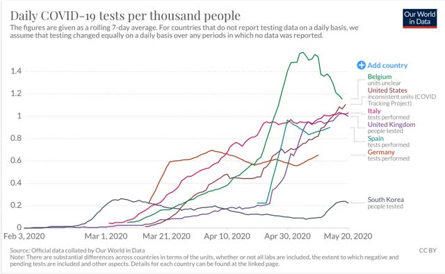
As you can see, South Koreas started large-scale testing immediately and was rewarded with “crushing the curve,” allowing the country to go back to nearly normal activity. The US did awful even compared with Europe until about April 20, when testing in the US ramped up significantly. In the past week, testing in the US finally surpassed all of the major countries in Western Europe except for Belgium (the worst hit on a per capita basis).
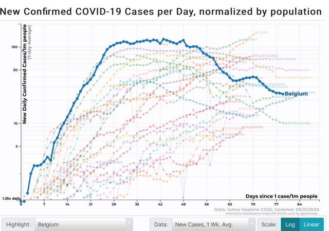
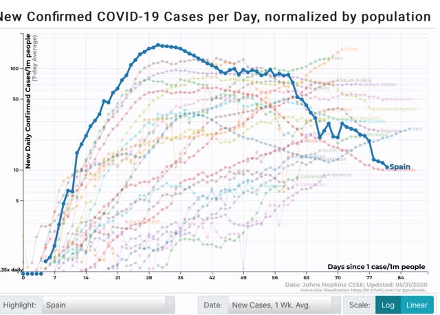
Of note, at their worst on a per capita basis both Belgium and Spain had worse outbreaks than the US does now:
This strongly suggests that, with proper staffing, much of the US could begin an aggressive tracing program to help tamp down new infections more.
In that regard, there is a new site called “Test and Trace” which is tracking exactly that. Here’s their map, as of May 20, of which US States are able to begin a successful test, trace, and isolate regimen:
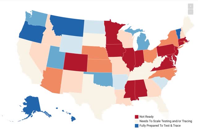
My one criticism is that the site measured “planned hires” for tracers in each State, as opposed to *actual* hires.
I continue to think that it will be crucial for at least one medium sized or major State to “crush the curve” to show other States that the plan can be successful - particularly if new outbreaks begin in States that have recklessly relaxed restrictions.
Finally, on a related political/economic note, the April index of Leading Indicators was reported yesterday, and as expected it was another bad month, down -4.4%:
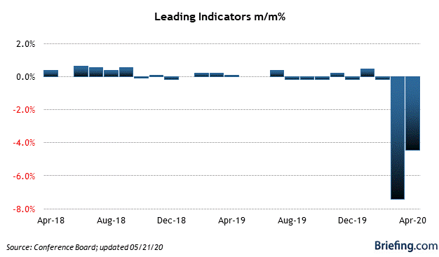
Since the LEI tells us where the economy is likely to be in the next 6 to 8 months, this tells us that conditions are still going to be poor on Election Day. And every econometric election model says that means the incumbent will be defeated.
Thursday, May 21, 2020
Initial jobless claims: employment damage continues to spread
- by New Deal democrat
Now that there is more than one month of data from initial and continuing jobless claims since the coronavirus lockdowns started, we can begin to trace whether the economic impacts of the virus are being contained, or are continuing to spread out into further damage.
Nine weeks in, it appears that, insofar as employment is concerned, the damage is continuing to spread.
First, let’s look at initial jobless claims both seasonally adjusted (blue) and non- seasonally adjusted (red). The non-seasonally adjusted number is of added importance since seasonal adjustments should not have more than a trivial effect on the huge real numbers:
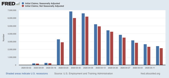
There were 2.174 million new claims, which after the seasonal adjustment became 2.438 million. This is a slight decline from last week’s number which was revised down to 2.687 million.
By now, virtually all of the people laid off due to the initial lockdowns in March and early April should have already applied for benefits. Further, last week was the second week after some States “reopened.” Thus these new claims are almost certainly primarily represent the spreading second-order impacts of the coronavirus shutdowns. In other words, this is evidence that new economic damage have continued to spread, and in a very large way.
Next, looking at continuing claims, which lag one week behind, both the non-seasonally adjusted number (red), and the less important seasonally adjusted number (blue) rose:
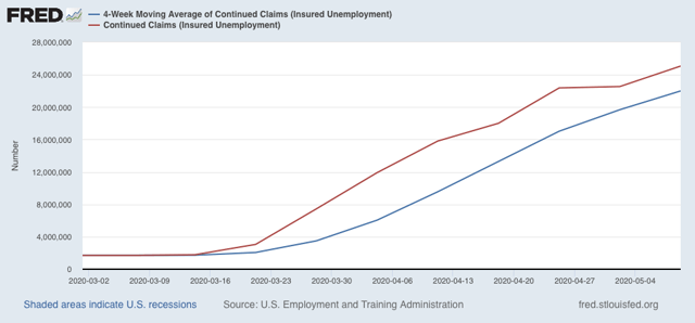
This tells us that, as of two weeks ago, there were not enough callbacks to work to offset the spreading new damage. If “reopening” leads to a significant new upturn in cases - something that may have begun in the past week - this will only get worse.
Bottom line: confining my comments strictly to the economy, while there have been significant or small rebounds in many of the series, the news on employment is not just bad, but it is still getting worse, albeit getting worse at a slower rate.
Wednesday, May 20, 2020
Housing permits and starts plummet in April, but mortgage applications suggest big rebound in May
- by New Deal democrat
At some point it is going to be safe for the economy to be completely reopened. When that point comes it would be nice if the leading sectors of the economy have already been priming the pump for a consumer rebound. As usual housing is the most important long leading sector in that analysis.
As expected, housing tanked in April. But it is likely setting the baseline for improvement in the coming months, as new record low mortgage rates have brought out new buyers, as shown by new mortgage applications which as of this morning are only -1.5% below where they were last year at this time.
This post is up at Seeking Alpha. As usual, clicking over and reading should be educational for you, and helps reward me a little bit for my efforts.
New coronavirus cases vs. testing in “reopened” States
- by New Deal democrat
Are new coronavirus infections increasing in States that “reopened” on or about May 1? The jury is still out. The number of infections is up in 4 of the 5 biggest States that have done so, but so are the number of tests. The likelihood that most or all of the increase is an artificial of an increase in testing depends on the date on which you start your comparison.
I haven’t been able to find graphs that nicely show both tests and positives together, so let me just show you 2 separate graphs of the 7 day average in number of new cases diagnosed vs. the 7 day average in testing for Texas, which is the state with the biggest number of new cases.
First, here are new coronavirus infections, which are up 42% from April 30:
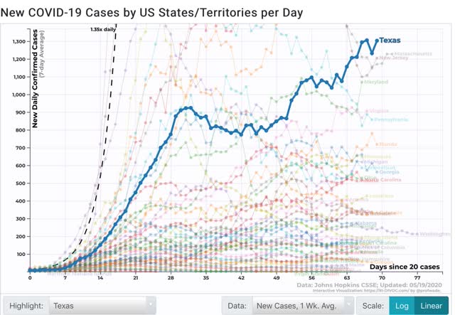
But here are new tests performed, which are up 120%:
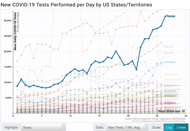
To save space, I won’t show them, but the trends are similar in the 4 other States, except in Georgia, where there has been an actual decline in new cases reported since April 30.
Instead I’ve prepared the below chart of both the increase in tests and increase in cases for the 5 target States. Additionally, as you can see in the graph of Texas above, there seems to have been a renewed pulse upward in new cases since May 10. Since there is a 5 to 10 day lag between exposure and the onset of symptoms, this may be what is showing up. A similar pattern seems to be occurring (but could be just noise!) in several of the other States, so the below graph also compares test increases to new infections dated from May 10 as well:
| State | Test increase From 4/30 | Case increase From 4/30 | Test increase From 5/10 | Case increase From 5/10 |
|---|---|---|---|---|
| AZ | 157% | 51% | -41% | 15% |
| FL | 35% | 12% | 4% | 21% |
| GA | 135% | -2% | 65% | -13% |
| TN | 41% | -1% | 12% | 36% |
| TX | 120% | 42% | 77% | 19% |
All 5 States show bigger increases in tests than in new infections when dated from April 30. Dated from May 10, 3 of the 5 States - AZ, FL, and TN - show a bigger increase in new cases than in testing. Georgia remains a complete outlier, but has been shown to have important data integrity issues.
It is certainly possible - indeed likely - that many people, especially seniors, are probably continuing to practice safe distancing and mask wearing habits, despite the local governments’ lifting of restrictions, and this is probably at least a partial explanation of the data. But the virus is impervious to ideology. To the extent people in the “reopened” States are engaging in unsafe behavior, we should expect new infections to increase. Nevertheless it is safe to say that nothing dramatic has happened in the first three weeks of May.
Tuesday, May 19, 2020
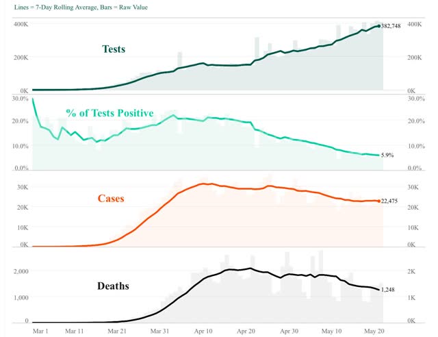
Abbreviated coronavirus dashboard for May 19: testing improvement continues
- by New Deal democrat
Here is the update through yesterday (May 18).
As usual, significant developments are in italics. The downward trend in new infections and deaths has continued. An important issue is whether we are beginning to see an increase in new infections in States which irresponsibly “reopened.” I will look at that separately from this post.
I will restart giving the daily increase in infections if States that have “reopened” start to increase significantly again. The preliminary evidence is that customers are largely staying away from reopened businesses in those States.
Number of new and total reported Infections (from Johns Hopkins via arcgis.com and 91-divoc.com):
- Number: 22,215, total 1,508,957 (vs. day/day high of +36,161 on April 24)
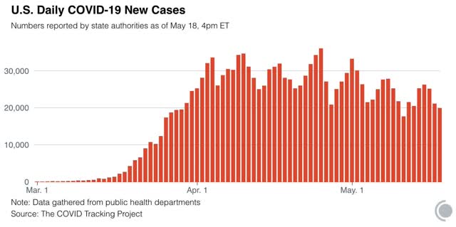
There has been over a 1/3 decrease in the number of new cases in the US from peak. The US nevertheless has the worst record for total cases in the world.
Number of deaths and rate of increase in testing (from COVID Tracking Project)
- ***Number of deaths: 786, total 84,640 (vs. day/day peak of +2,700 April 29)
-
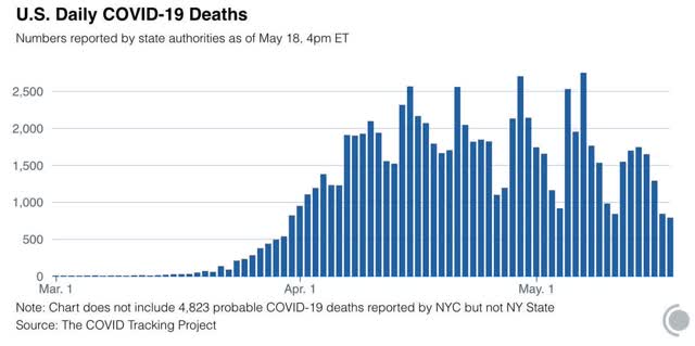
- Seven day average of deaths: 1,362 (vs. 2,058 peak on April 21)
- Number of tests: 346,094 ( vs. daily peak of 411,235 on May 17*)
- Ratio of positive tests to total: 17.4:1 (new high)
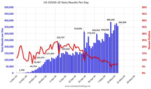
- 7 day average of tests: 355,000* (new high)
- 7 day average of positive tests to total: (15.6:1* vs. target of 15:1)
*These numbers exclude 113,489 past negative tests reported by NJ on May 11
South Korea decisively contained COVID-19 once its ratio of total vs. positive tests rose to 15:1, when there were only 900 new daily infections nationwide and 15,000 tests. The US has 6.5x as many people as South Korea, but 25x the number of new infections daily. So the US as a whole is far from being able to lift its lockdowns on a nationwide basis (although a few States and many rural areas probably could with proper tracing and isolation regimens).
Summary for May 15
- The number of daily new infections, adjusted for testing, appears to have peaked four weeks ago. There has been a decline of about 1/3 in new infections since then.
- The number of daily new deaths appears have peaked about 3 weeks ago.
- The trend number of daily tests has improved dramatically in the past 4 weeks to over 350,000. Better still, for the last 3 weeks, new infections have declined, even with higher testing - a very positive sign.
- The increase in infections in the rest of the US in late April and early May was mostly an artifact of the dramatic increase in testing in the rest of the country.
- My personal suspicion remains that the actual number of total infections in the US is a little under 5x the official number, or roughly 7 million, over 2% of the total population. Now that testing has improved, that rate will hopefully slowly improve over time as well.
- We are at the point where new infections might be expected to begin rising in States which have irresponsibly “reopened” their economy, but I will examine that separately.
Monday, May 18, 2020
Updating the Petri dishes of democracy: population density remains a primary determinant of intensity
- by New Deal democrat
Over the weekend I saw a map indicating that new coronavirus infections have been increasing on a relative basis in different and generally more rural parts of the country, especially in the Baltimore-Washington portion of the eastern megalopolis and the “black belt” in the South, the interior Midwest and Mountain West:
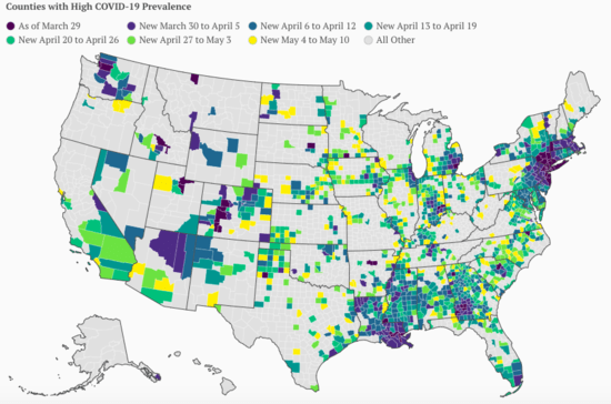
Ten days ago I took a look at the number of cases of coronavirus based on the population densities of the States. In view of the above map, I thought I’d take another look. Since COVID-19 is a communicable disease, generally one would expect that the most densely populated States have the most cases per capita, and conversely the least densely States have the least cases.
Below are two charts consisting of the 12 most and least densely populated States, their respective population densities, and several measures of coronavirus infections.
The first column gives the rank of the State based on the total number of infections recorded since the start of the pandemic. The second column gives their rank per capita over time since the start of the pandemic. Finally, the third column gives their rank per capita based on infections (in parentheses) in the week before my original look at this (May 1-8), compared with the past week:
| State | Population Density (Per Sq. Mile) | Total # Infections (Rank) | Infections Per capita (Rank) | 1 week Infections Per capita |
|---|---|---|---|---|
| NJ | 1208 | 2 | 2 | (2)8 |
| RI | 1010 | 23 | 4 | (1)1 |
| MA | 867 | 4 | 3 | (3)4 |
| CT | 741 | 12 | 5 | (6)7 |
| MD | 614 | 10 | 9 | (8)6 |
| DE | 484 | 33 | 6 | (9)2 |
| NY | 419 | 1 | 1 | (7)10 |
| FL | 376 | 9 | 32 | (37)37 |
| PA | 286 | 6 | 11 | (14)18 |
| OH | 284 | 15 | 28 | (26)31 |
| CA | 251 | 5 | 33 | (31)33 |
| IL | 231 | 3 | 7 | (5)3 |
On a per capita basis, the data closely fits these States ranks in population density, with three noteworthy outliers: Florida, Ohio, and California. Florida has been rumored to have been massaging their data, but those issues do not pertain to the other two. On the other hand, Louisiana, the 24th most densely populated Staes, has the 8th most infections per capita.
| State | Population Density (Sq. Mile) | Total # Infections (Rank) | Infections Per capita (Rank) | 1 week Infections Per capita |
|---|---|---|---|---|
| OR | 42 | 40 | 47 | (45)45 |
| UT | 36 | 34 | 30 | (29)34 |
| KS | 36 | 31 | 21 | (11)26 |
| NV | 26 | 35 | 29 | (35)36 |
| NE | 25 | 29 | 10 | (4)5 |
| ID | 20 | 42 | 42 | (44)44 |
| NM | 17 | 36 | 20 | (19)19 |
| SD | 11 | 39 | 12 | (23)13 |
| ND | 11 | 43 | 25 | (25)20 |
| MT | 7 | 49 | 50 | (50)49 |
| WY | 6 | 47 | 44 | (41)43 |
| AK | 1 | 50 | 48 | (48)48 |
Among the most sparsely populated States, five are ranked in the top half of States in infections per capita since the outset of the pandemic (Kansas, Nebraska, New Mexico, North and South Dakota). Nebraska and South Dakota in particular have very poor records.
Hawaii, the 13th most densely populated State, ranks 49th in per capita number of infections.
Alaska, Hawaii, Wyoming, Montana, and Oregon are prime candidates to implement a regimen of testing, tracing, and isolating to maintain a containment of the virus, if they had the proper tracing infrastructure. Testing is not much of a problem anymore (the US is approaching 400,000 tests per day). Idaho, West Virginia, and Vermont could likely do so as well (along with rural areas of other States).
While the virus spread may be intensifying in some more rural areas, it remains most of all a problem in the more densely populated areas of the country.
Sunday, May 17, 2020
Three virus-related thoughts for Sunday
- by New Deal democrat
There are a few posts I have been working on, but haven’t had the energy to complete. But since I wanted to make the point, let me use this opportunity to quickly set forth a few thoughts.
1. I suspect that the virus has been “burning through the dry tinder” in March and April. At least 1/3, and possibly 1/2, of all deaths from the disease have been at nursing homes. When you consider this disease thrives on indoor spaces, recirculated air, repeated dosing with the virus, compromised immune systems, and those who already have cardiovascular disease, that ought to be no surprise.
What I suspect, but don’t have good sourcing for yet, is that a huge percentage of all residents at such facilities have already been infected. Since the turnover at these facilities is on average about every 2.5 years, once the disease has “burned through” this population, that source of fatalities immediately vanishes. Which means that the number of infections and fatalities would presumably decrease.
How much of the decrease in infections and fatalities we have seen in the past month is due to coronavirus burning through this dry timber? I suspect it plays a significant role. Which would mean that the next phase would be determined by how much community spread can occur without these facilities being part of the outbreak.
2. I have read dozens of reports since March of wages being cut. This trend was overwhelmed in the April jobs report by the fact that low wage workers were those who took the brunt of the virus-related shutdowns. Professional workers and other higher-wage employees who could work from home were much less affected.
It appears that somewhere over 10% of all of these workers have had to deal with cuts in pay. In States that are “reopening,” are these wage cuts going to be reversed? Frankly, I doubt it.
Since the monthly mortgage, rent, and vehicle and other installment loan payments for these workers remain the same, many of them are going to be in deep trouble. That is a recipe for a wage/price deflationary spiral, just as was set off in 1929.
3. The appearance of armed “brownshirts” in this pandemic is alarming. At first they only appeared for gun-related issues, but things like business closures and mask-wearing are totally unrelated to that. This is the use of armed force for intimidation, plain and simple.
At some point it is going to have to be confronted. And there will probably be violence. The appearance of such brownshirts has been a flashing-red warning sign for republics going all the way back to Rome, and not coincidentally the Weimar Republic of Germany. Levitsky and Ziblatt pointed to this as one signpost in “How Democracies Die.” Joanne Freeman wrote about this as to the 1830s-50s as to the Congressional chambers themselves in “The Field of Blood.”
This is not a good sign for the health of the American Republic at all.
Subscribe to:
Posts (Atom)