Saturday, August 28, 2021

Forecast-palooza: Weekly Indicators, Short Term, and Long Leading Forecast all posted at Seeking Alpha


 - by New Deal democrat

My Weekly Indicators post is up at Seeking Alpha.


Despite the Delta wave raging, the consumer data continues to be very positive.

But wait, this week there’s more!!!

My biannual Short Term forecast for the next 6 months has also been posted.

As has my biannual Long Leading outlook through mid year 2022.

(Hint: the situation changes as we get into and past Q1 of next year).

As usual, clicking over and reading will not just bring you up to the virtual moment on the economy, and this week, it will give you a pretty good look at what is in the near and farther distance ahead. And it will pay my bar tab, which is a positive as well.

Friday, August 27, 2021

July personal income and spending: return to normalcy, and normalcy is good


 - by New Deal democrat

How well personal income and spending held up throughout the pandemic is one of the best things about the government response. That has continued to be the case as of this morning’s report for July.


Real personal income (blue) increased 0.7%, and is 4.2% above where it was in February 2020. Real personal spending (red) decreased -0.1%, but is still 2.7% above its immediate pre-pandemic level:


Further, the “cushion” in personal savings due to the emergency pandemic programs continues, as the savings rate remains significantly above where it was before the pandemic (the below graph subtracts 7.0%, which was the lowest level in the immediate few years before 2020, better to show this):


Real personal spending is basically the other side of the coin compared with real retail sales, since they cover the seller and buyer of consumer transactions, which is over 2/3’s of the entire economy:


Both of these have returned to basically normal levels m/m. While the stimulus has abated, spending hasn’t crashed, although sales have declined relatively modestly in the past few months. At this point in the pandemic, normalcy is good.

Thursday, August 26, 2021

Initial and continuing jobless claims: the good news continues


 - by New Deal democrat

The good news for both initial and continued claims continued this week.

Initial jobless claims rose 4,000 to 353,000 from last week’s pandemic low. The 4 week average of claims declined by 11,500 to 366,500, another new pandemic low:


Significant progress in the decline of initial claims had stalled for the last 2 months, but that has ended.

The story is the same for continuing claims, which declined 3,000 to another new pandemic low of 2,862,000 (with last week’s preliminary estimate of 2820,000 being revised substantially higher):


This continues this series’ recent declining trend that began on May 29. As I have noted before, this may reflect the termination of special pandemic benefits in many States, the impact of $15 minimum wages and signing bonuses being offered, or other items.

From the long term perspective, below is the current level of continuing claims  (blue), together with the 4 week average of initial claims* (red), and the unemployment rate from last week’s jobs report* (gold)(*adjusted for scale)(all current values = zero). The first two are consistent with early- to mid-expansions over the past 40 years, while the unemployment rate is consistent with mid-expansion or later:


Surprisingly, so far the awful outbreak under the Delta variant has had no apparent effect on either initial or continued claims at all. While they are by no means consistent with full employment, claims are in a good spot, relatively speaking.

Wednesday, August 25, 2021

Coronavirus dashboard for August 25: is the Delta wave close to peaking?


 - by New Deal democrat

I’ve been writing for about a month that, if the US outbreak followed the cycle of India and the UK, in which the Delta wave hit its peak about 6 to 8 weeks after onset, in the US the peak would be about Labor Day. As the graph below (which is in log scale better to show accelerating and decelerating trends) shows, it looks like that is about to happen:


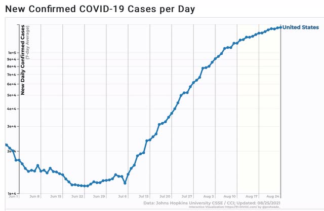
For the US as a whole, cases over the last 7 days increased by about 10%. 
One week prior, on August 17, it was about 20%. 
On August 10 it was 30%. 
On August 3 it was 50%. 
On July 27% it was almost 70%. 
So if the pattern continues, it looks like the Delta wave is about 1 week from peaking - I.e., right about and maybe a little before Labor Day.

That the Delta wave may be approaching its peak by noting in how many States it has already done so, or is very close to doing so. A couple of weeks ago I noted that was the case with the 4 or 5 earliest States to be hit. Now there are 8 States + DC which are down week over week, or at least clearly down from their prior peak:


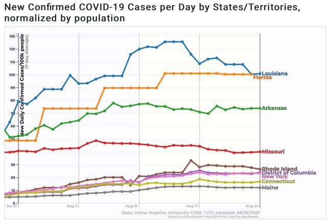
Additionally, there are 9 other States that appear very close to doing so:


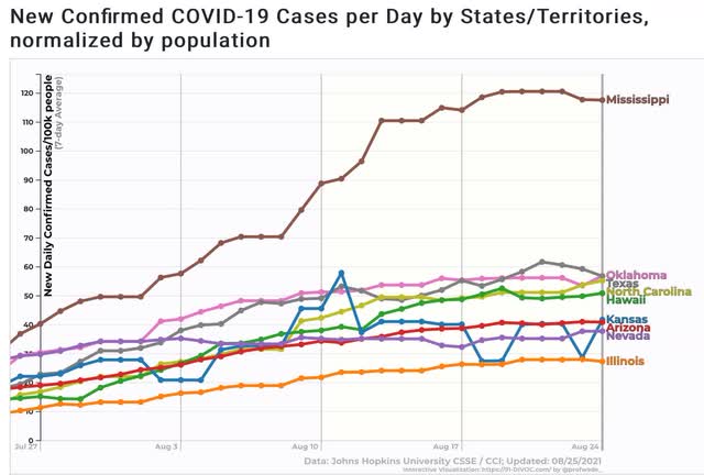
Note that 3 of the 4 biggest States - NY, TX, and FL - are on this list, plus IL. Among the largest States, only CA is still in an unabashed uptrend.

Deaths, which have been following cases by 3 to 4 weeks, are still in a pronounced uptrend:


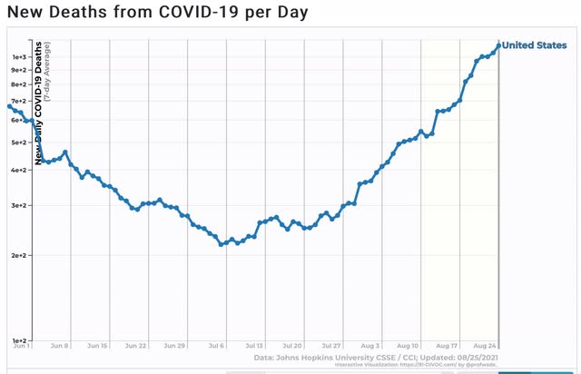
The likelihood is, we will be up to about 1750 to 2000 deaths a day in 3 to 4 weeks.

Finally, I have to comment on one item in the news the past few days in which I am clearly a dissenter; namely, the matter of cases in South Dakota in the wake of the Sturgis rally. You’ve probably seen the charts and graphs showing that over a 14 day period beginning on August 7, SD had the highest rate of increase in cases of any State.

There are two problems with the claim: (1) the starting date happened late in a week during the last week in which SD stopped reporting daily results; and (2) the % increases start from a very low number.

As to the second item, note that an increase from 1 to 4 cases is a 300% increase, while an increase from 1000 to 2500 cases is only a 150% increase. The amount of the % increase is strongly affected by how small the initial number is. For example, the purported huge increase of 225% in 2 SD counties’ hospitalization cases, came in counties with exactly 1 and 4 COVID hospital patients. 

As to the first item, here is a six month comparative graph of cases Per Capita in South Dakota vs. Vermont (which has one of the highest vaccination rates of any State):


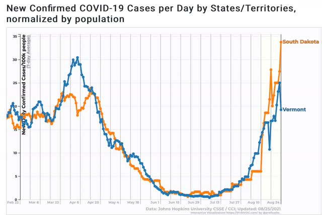
The trajectories of these two graphs over the six month period is nearly identical.

Now here is a look at South Dakota’s reported cases Per Capita on a daily basis (wide solid line), and the weekly average (narrow dotted line):


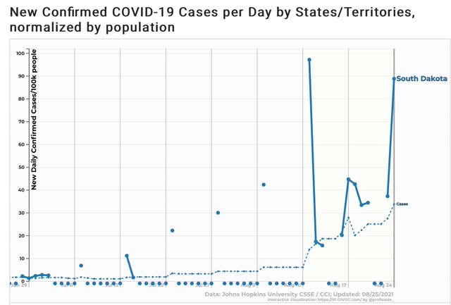
Note that until August 11, SD was only reporting once a week. The rest of the days were entered as zeroes. Which meant that the entire time from August 4 through 10 were entered as an average of 6 cases per 100,000; after which on August 11 it abruptly rose to 14 per 100,000. There is simply no way that the number of cases on August 7, the start date of The NY Times charts and graphs, had zero cases. In fact, had SD been updating daily, it probably would have been about 9 cases per day on the 7th, resulting in a 2 week increase of about 2.7x vs. Vermont’s 2.3x increase - higher, but not by much.

I don’t doubt that the Sturgis motorcycle rally has had some affect increasing SD’s numbers. But we’ll have a much better idea once the artifact goes out of the data starting tomorrow. If SD - with 48% fully vaccinated - and VT - with 67% fully vaccinated - continue to track fairly closely in the next few weeks, that will be significant evidence that there are a large %age of SD’s population with immunity or resistance to COVID due to previous infection.

Tuesday, August 24, 2021

July new home sales down nearly 30% from peak, as prices perhaps start to plateau

 Here

 - by New Deal democrat

Unlike yesterday’s existing home sales, today’s report on new home sales is much more economically significant. The reason I prefer single family housing permits as a measure is that the sales data is extremely volatile, and heavily revised over the next several months. But with those caveats, let’s take a look.


New home sales (blue in the graph below) increased 1% for the month, but are still down 28.7% since their January peak:


In the graph I also show single family permits (red) and deflated residential construction spending (gold). Not unusually, new home sales surged earlier than either of the other two metrics, peaking on a 3 month averaged basis last September. Permits and construction spending were far less noisier, but peaked a few months later.

The inventory of new homes for sale (red in the graph below), unsurprisingly, continues to rise, as has been its typical pattern of lagging actual sales by a number of months:


New home inventory will probably peak shortly.

Prices have traditionally lagged sales, as shown quarterly for the past 10 years:


A monthly close-up of the past year shows that sales are negative YoY, while price increases may have plateaued:


Finally, the NAR does provide public access to its existing home inventory data (but unfortunately not sales) for the past 5 years here.

Below I show the YoY% change in that data (gold, inverted) compared with permits and sales:


Note that in general, it tracks pretty closely with permits, just as existing home sales and new home sales have historically tracked similarly. In other words, existing home inventory is largely (not exactly!) a mirror image of existing home sales. In other words, it is more confirmatory evidence of a downturn in housing sales and construction, that has not yet resulted in a decline in prices (but I do expect it soon!), although those price increases may have started to decelerate, as the building of new inventory accelerates. 

Monday, August 23, 2021

A note on existing home sales


 - by New Deal democrat

Existing home sales are the least noteworthy of the housing data, because of the very limited economic activity moving into or out of an existing home provokes compared with the construction, furnishing, and landscaping of a new home. But it’s worth a brief look, so let’s note this month’s report.


Existing home sales (blue in the graph below) are only up 1.7% compared with one year ago, as opposed to new single family home sales (red), which are off over 30%! :


Prices for all existing homes (blue) and single family existing homes (violet) are up almost 20% - which is still less than the 23% YoY increase recorded one month ago. Note that the median price for new single family homes (red) is also higher, but much less so at 10%:


It is likely that the supply constraint of lumber for new homes has crimped some construction, driving some demand to existing homes, the median price of which tends to be less, and which in turn is driving up the prices for same, as well as driving down inventory. Here’s a look at the YoY% change in inventory of existing homes (blue) vs. new homes (red) for the past 4 years:


In general both move in tandem (and in the case of new homes, we know that inventory lags both sales and prices), but the decline in existing home inventory, which had been slow for the past decade, started to accelerate even before the pandemic hit as sales increased.

As more and more potential buyers grow gun-shy about the insane price increases, I expect prices to level off and then actually decline, with a concomitant increase in inventory that likely began in the spring.