Saturday, December 26, 2015
Weekly Indicators for December 21 - 25 at XE.com
- by New Deal democrat
My Weekly Indicator post is up at XE.com. This week was virtually identical to last week. The US consumer once again appears to have come through with increased Christmas spending.
Thursday, December 24, 2015
Oil, the US$, and corporate profits
- by New Deal democrat
Previously this week I have written that the effect of US$ strength has been the biggest economic story of 2015, and that for the last 15 years, the US$ has closely tracked the price of gas. Because of the increasing importance of international trade to the US economy, the US$ deserves some weighting as a short leading indicator. Let me conclude with two notes.
First, this is the first time that a big decline in the price of gas has coincided with a surge in the value of the US$. Let's compare with the two prior occasions.
In 1986, the price of oil precipitously fell by nearly 50% (red), but that was accompanied by a weakening US$ (blue):

These two tailwinds helped propel the economy to a second round of growth in the late 1980s.
In 2006, there was a smaller (and less lasting!) decline in gas, that again coincided with a weakening US$:

Now here is the last 6 years:

That the price of gas has fallen so much is a real boon to consumers. In fact both USC Prof. James Hamilton and oil analyst Steve Kopits have shown that whenever crude oil expenditures exceed 4% or more of US GDP, as recession has followed:

That a slow move to 4% would be self-correcting was the origin of my theory about the "Oil choke collar." But the US produces more oil than it used to, so industrial production in the Oil Patch has suffered. Still, the collapse in gas prices would still be a significant net positive if the US$ hadn't eaten into exports so much.
That a slow move to 4% would be self-correcting was the origin of my theory about the "Oil choke collar." But the US produces more oil than it used to, so industrial production in the Oil Patch has suffered. Still, the collapse in gas prices would still be a significant net positive if the US$ hadn't eaten into exports so much.
Here's a look at the US$ (blue) and exports (iinverted, red):

While it almost has to be that a hit to exports will take a toll on US domestic corporate profits, the relationship isn't very strong, as shown in the graphs below:


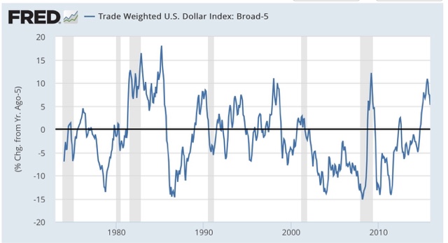
So there is no reason to think that US corporate profits will automatically continue to suffer so long as the US$ remains strong. And in another month, the YoY comparisons of the US$ may look much more tame:

Wednesday, December 23, 2015
Real disposable personal income growth: not too shabby
- by New Deal democrat
This morning's release of personal income and outlays for November pretty much puts the last nail in the coffin for those Doomers who have been claiming we would go into recession in 2015. Beyond that, "real personal disposable income per capita" is a good enough measure of general middle class well-being that it is the economic metric in Prof. Douglas HIbbs' "Bread and Peace" model of Presidential election outcomes. Let's take a long-term look.
First, here is real disposable personal income per capita from 1959 - present, in log scale best to show the actual trend:

You can see the big increase was in the 1960-73 boom. The trend moderated from 1974-2006, and appears much flatter since. Unsurprisingly, this shows that it has been harder and harder for Americans of each successive generation to make progress.
Now let's take a look at the same metric measured YoY. As of November 2015, the YoY% gain in real disposable personal income per capita was 2.72%, so the graph subtracts that so that equivalent YoY gains show at the "0" line [Note that the big reversal in 2012-13 was due to the temporary 2% decrease in Social Security withholding]:

While the present gains aren't fantastic, they aren't too shabby either. Outside of the 1960-73 era, the only times that there were sustained significantly better YoY gains were several boom years in the 1980s and late 1990s. I hasten to add that the gains in the last year have primarily been due to the big declines in gas prices, rather than a surge in nominal income.
P.S.: If current trends continue, Hibb's model forecasts a win for the Democratic Party nominee in next year's Presidential election.
Tuesday, December 22, 2015
Gas prices and the US$ as short leading indicators
- by New Deal democrat
Yesterday I wrote a post for XE.com pointing out that the more international trade increased as a share of the overall US economy, the more important the trade-weighted US$ has become. Specifically, industrial production peaked 5 months after the US$ began to appreciate strongly in July 2014. By March 2015 things like steel production and transportation had rolled over, and they rolled over further with a further pulse of US$ strengthening several months ago.
While rapid strengthening of the US$ has not always led to recession, it has correlated on a number of occasions, and particularly so where the US$ has appreciated by more than 5% annually, as shown in the graph below:
That makes me think that the US$ ought to have a place in the index of *short* leading indicators, with a weighting on the order of +/-0.1% in the LEI for every +/-1% change in the trade weighted value of the dollar. Here is the LEI for the last two years:

and here is the monthly change in the value of the US$, inverted, for the last 5 years:

The US$ would not meaningfully have changed the value of the strong LEI values during the first half of 2014, but would have subtracted -.1 or -.2 in the last half of 2014 into 2015, and again during the 3rd quarter of 2015. This would correlate well with the relative weakness of the economy in the early part of 2015, and strongly suggests rough patch this winter into next spring.
Another important correlation is that, for the last 25 years, the inverse of the value of the US$ (blue) has increasingly tightly correlated with gas prices (red):

In a sense, this just restates the truism that commodity prices are short leading indicators. But it highlights the difference in the manner in which those prices (and in particular gas prices) are transmitted into the US domestic economy. There is less domestic manufacturing, so less of a direct transmission. Rather, weak commodity prices correlate with a strengthening US$, which in turn transmits weakness via those sectors most exposed to the global economy.
Finally, let's look at gas prices themselves over the last 15 years:

Unless you think that gas prices are going to fall below their 2008 bottom and give up all of their secular increase since 1999, we are much closer to the bottom than the top in gas prices, which strongly suggests that - all else being equal - we should be much closer to the top rather than the bottom in the value of the US$. Of course the Fed is tightening so all else may not be equal, but if the US$ is near its peak, then its drag on the LEI is also mainly done. In other words, the YoY comparison in things like steel production, trucking, and rail should become much less negative, and perhaps turn positive, by spring sometime, unless Fed tightening causes the US$ to continue to strengthen.
Monday, December 21, 2015
The strong US$ has been the big economic story of 2015
- by New Deal democrat
This post is up at XE.com .
It's that time of year when we begin to look back, and look forward. I plan on posting more on the US$, grading my 2015 outlook from a year ago, a final look at my "5 graphs for 2015," and a first look at 5 graphs for 2016.
Sunday, December 20, 2015
Subscribe to:
Posts (Atom)