Saturday, July 11, 2020
Weekly Indicators for July 6 - 10 at Seeking Alpha
- by New Deal democrat
My Weekly Indicators post is up at Seeking Alpha. While the forecasts remain inexplicably positive, the nowcast worsened slightly.
As usual, clicking over and reading should bring you up to the moment on the economy, and will also reward me ever so slightly for my work.
Thursday, July 9, 2020
Initial and continuing claims, JOLTS show labor market “less awful” improvement continues - for now
- by New Deal democrat
Weekly initial and continuing jobless claims have been giving the most up-to-date snapshot of the continuing economic impacts of the coronavirus on employment. This week continues the trend of slightly improvement (or, more truly, slightly less awful).
Below are initial jobless claims both seasonally adjusted (blue) and non- seasonally adjusted (red). The non-seasonally adjusted number is of added importance since seasonal adjustments should not have more than a trivial effect on the huge real numbers:
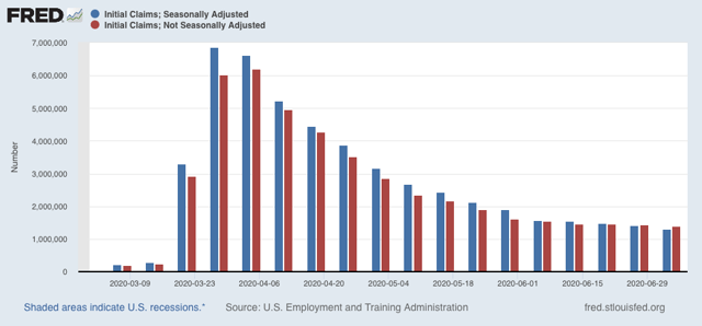
There were 1.400 million new claims, 31,000 less than one week ago. After seasonal adjustment this became 1.314 million, 99,000 less than last week’s number. The good news is, this is the smallest weekly decline since the worst reading in April. The bad news is, it is only 250,000 (or 17%) less than five weeks ago. In other words, the improvement is slight and huge second-order impacts in terms of new layoffs continue to spread.
There has been some slight improvement in the trend of continuing claims, which lag by one week, and which after revisions have declined about 15% since late May. This week on a non-seasonally adjusted continuing claims declined by 629,500 to 16.797 million, almost 6 million below their peak of 22.794 million seven weeks ago. After seasonal adjustment they declined 698,000 to 18.062 million, 6.850 million below their peak of 24.912 million seven weeks ago:
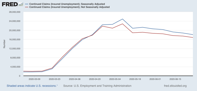
In essence, so far the callbacks to work from various sectors “reopening” have outweighed the new layoffs weekly. For the last few weeks, this had looked like it was stalling, but with revisions and this week’s numbers we have continued progress in being “less awful.”
Now let’s turn to the other employment-focused release from earlier this week, the JOLTS report, which shows both the hiring and discharges sides of the jobs ledger. Note that this lags by one month, so was for May, which the first month of job gains after the pandemic started, it will better show us how much rehiring has been occurring.
During the expansion, I was focused on the leading vs. lagging parts of this report. With the pandemic, this is out the window. What I am interested in is decomposing hiring vs. firing. In that regard, the below bar graph decomposes this year’s numbers into hires (blue), fires (red) and voluntary quits (green):
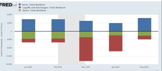
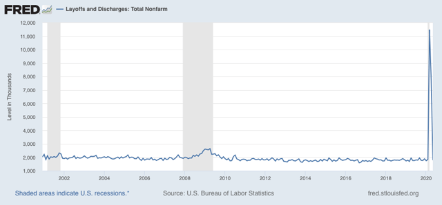
While there have been changes in both hires and quits, both of which declined by roughly 1/3 to 1/2 in the two months of greatest impact, the vast majority of the changes has been in the number of people laid off. As shown in the graph below, these nearly sextupled in March, but by May had returned all the way to their baseline:
Interestingly, the number of hires in May was the highest ever recorded in the JOLTS series. This obviously was due to the surge in “rehiring” to reopen. Below I show both the seasonally adjusted (blue) and non-seasonally adjusted (red) numbers:
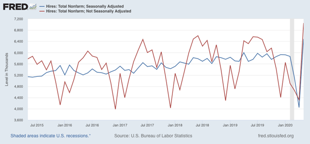
There was a much larger number of new hires in May than ordinarily would be the case, and so this distorted somewhat the seasonally-adjusted number.
In summary, four full months after the initial shock, the overall damage remains huge, with large continuing new secondary impacts. Since the beginning of May, this has been outweighed by the callbacks to the “reopening” economy. Initial claims indicate that continued through last week.
I am expecting this to reverse, as States that recklessly reopened pay the price with surging infections and hospitalizations. This appears finally to be feeding through into increased deaths. All of which is likely to lead to “re-closing” either by edict, or simply by non-viability with customers simply too afraid to patronize businesses. But it hasn’t happened yet.
Wednesday, July 8, 2020
Coronavirus dashboard for July 8: deaths in the South and West finally suggest increasing trend
- by New Deal democrat
Coronavirus death statistics have been plagued recently by State data dumps, where months of deaths have been released on a single day. In the past 2 weeks, both NJ and NY’s such releases had skewed the numbers. As of today, both are out of the 7 day statistics, so I thought I would update again.
One bit of good news, statistics-wise, is that the COVID tracker now has the ability to include hospitalizations (although FL still isn’t fully releasing its numbers). So here are hospitalizations per capita in the 4 US regions:
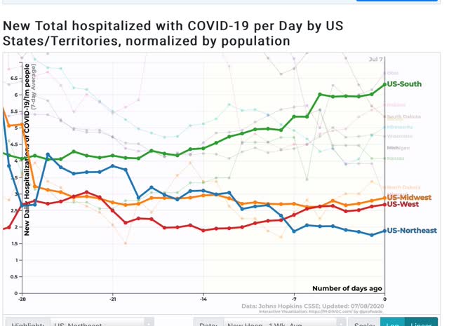
In the past few weeks, hospitalizations have continued to decline in the Northeast, stayed flat in the Midwest, risen slightly in the West starting 14 days ago, and increased by more than 50% in the South starting 19 days ago.
Has the bad news started to translate into deaths in the South and West? Maybe.
Here are deaths per capita in the Northeast and Midwest:
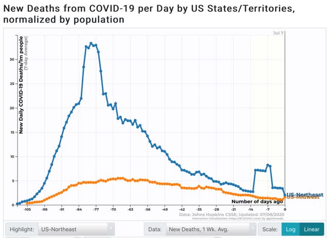
With the NJ and NY data dumps out of the 7 day average, the Northeast average has now decreased to 2.0 per million. This, believe it or not, still makes the Northeast the worst region, due to NJ (4.0 per million), MA (3.3), and RI (2.6). NY has declined to 1.5 per million, and is no longer even in the top 25 per capita. The jump in the Midwest in the past day is due to - sigh - a data dump by Illinois, which will slightly skew the national average for the next week.
Here are deaths per capita in the South and West:
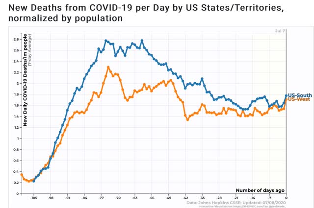
The big question is, are the increases in the past 2 days the start of a trend? If so, then it would appear that deaths per capita in both the South and West bottomed a little over 2 weeks ago.
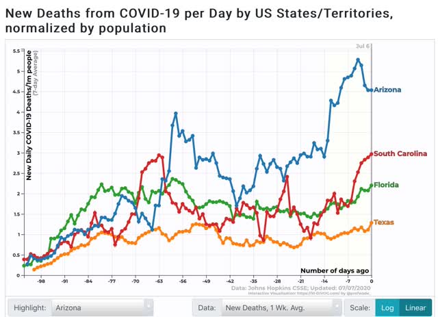
Even so, at 5.5 deaths per million, the worst State, Arizona, still has less than 10% the rate of deaths that NY had (close to 70) at the worst of the outbreak there. God willing, even with all of their reckless mistakes, Florida, Texas, and Arizona hopefully will never get that bad.
Tuesday, July 7, 2020
Coronavirus dashboard for July 7, 2020: deaths as a *very* lagging statistic
- by New Deal democrat
Total diagnosed US coronavirus cases: 2,928,418
7 day average: 50,135
Total US coronavirus deaths: 122,915
7 day average: 480
7 day average: 50,135
Total US coronavirus deaths: 122,915
7 day average: 480
The renewed exponential spread of coronavirus cases is continuing. We will probably be over 3 million cases within 48 hours. Including all of the undiagnosed cases (especially in April and May), probably about 2.5%-3% of the entire US population has been infected by this point.
There is still not enough medical mask production. There is still not a thorough testing program in place. There is still not a significant tracing or isolation protocol in place. There will be none of these until at least January 20, 2021.
The big paradox remains why deaths have continued to decline, albeit very slowly, even while new cases have skyrocketed for at least the last 3 weeks. A detailed look at the top 10 states for new infections per capita, and comparing them with the Northeast megalopolis, is especially telling.
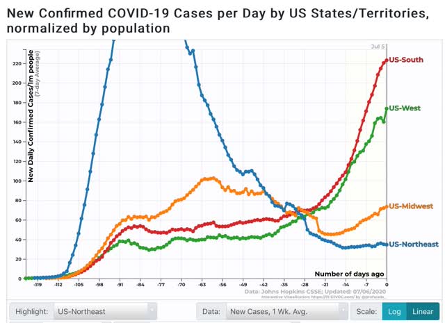
To begin, here are the 4 regions of the US by new cases per capita:
And here are the same 4 regions by deaths per capita:
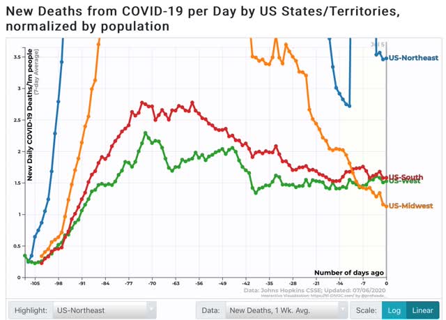
Cases have been exploding in the South and West, increasing significantly in the Midwest, and essentially have been flat in the Northeast. Meanwhile deaths have been flat in the South and West, declining in the Midwest, and are still elevated but declining in the Northeast (the last being complicated by data dumps of past cases from both NY and NJ in the past 10 days).
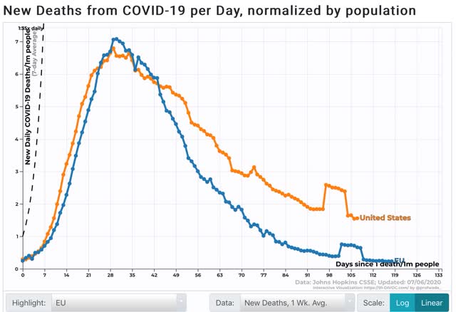
As an aside, comparing the US to the EU as to deaths shows that the US is now where the EU was 2 months ago:
Had most governors had patience for just one more month before reopening, the US would probably be in reasonably good shape.
But to return to my main theme, while reckless reopening in the Confederacy, Arizona, and a few other places together with reckless behavior by the young, leading to a change in disease demographics explains a lot of the continued decline in deaths, it doesn’t explain all of it. The significance here is what has happened - or not happened - in the Northeast.
Here are the top 10 States for new infections:
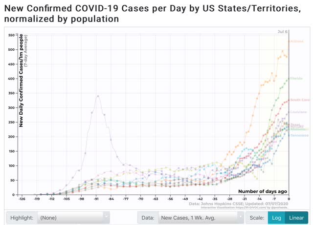
Eight of these are in the Deep South; the other two are Arizona and Nevada. All of them are showing big increases.
Now here are the top 10 Jurisdictions for deaths:
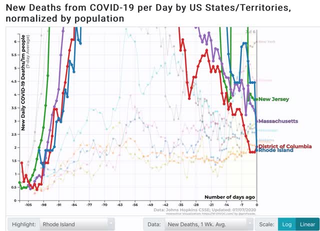
Due to its data dump 6 days ago, NY temporarily leads the way, but more importantly, note that the highlighted 3 States plus DC remain in the top 10 - despite all having had their infectious peaks over 2 months ago!
In other words - and this is what I want to emphasize - it isn’t just taking a long time for big increases in infections to show up in death rates. It’s also taking a long time for big DECREASES in infections to show up in death rates. On a per capita basis, the Northeast is still leading the pack, even with relatively draconian lockdown policies that were in place for a long time.
Meanwhile, while some of the recklessly reopened States are showing increases in deaths:
Others among the top 10 for new infections, including Alabama, Georgia, Mississippi, Tennessee, and (not shown) Louisiana are *not* showing significant increases in infections - and in the case of Georgia an incomprehensible decrease:
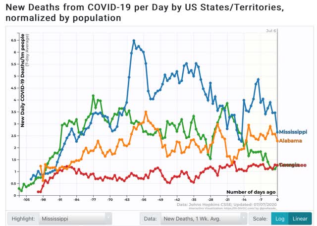
Although it is too noisy to graph, when we expand out to the top 25 for new infections that have increased significantly in the past 3 weeks, 10 of them - Idaho, Arkansas, California, Utah, North Carolina, Delaware, Wisconsin, Ohio, Washington State, Nebraska, and Missouri - are still showing flat or even decreasing deaths.
The lag time for new increases in deaths, plus the lag time for low incidence of deaths in the Northeast where cases peaked over 2 months ago, suggests that more is going on than just younger demographics and better medical treatments. The delay in deaths works both ways.
Monday, July 6, 2020
The 2020 Presidential election forecast from State polling: a Biden tsunami threatens to swamp the GOP Senate
- by New Deal democrat
For the past two weeks I have posted a projection of the Electoral College vote based solely on State rather than national polls (since after all that is how the College operates) that have been reported in the last 30 days.
Here’s how it works:
- States where the race is closer than 3% are shown as toss-ups.
- States where the range is between 3% to 5% are light colors.
- States where the range is between 5% and 10% are medium colors.
- States where the candidate is leading by 10% plus are dark colors.
Here is the updated map as of the 4th of July:
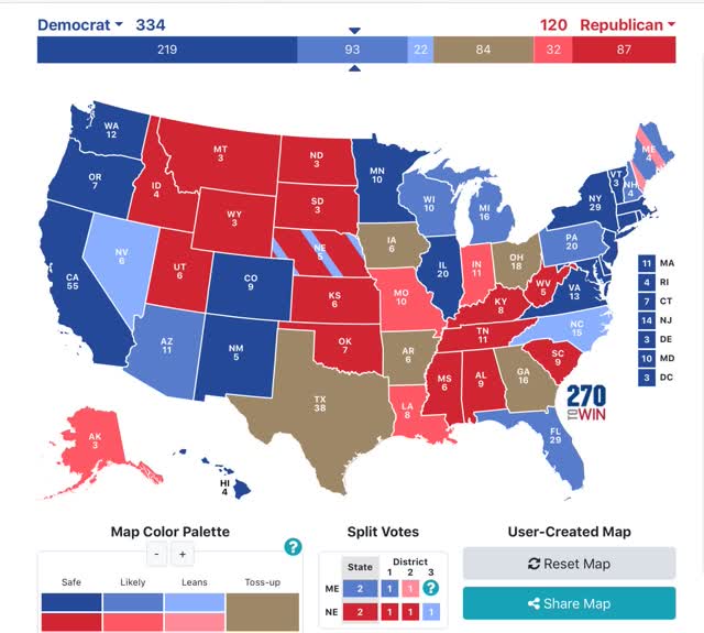
There is one change since last week and it is an important one: by the barest of margins North Carolina has moved from toss-up to lean Biden.
As was the case last week, if Biden were simply win the States in which he leads by 5% or more in the polling, he would win the Electoral College, without even winning a single “toss-up” or “lean Biden” State as shown on the map.
There has been an enormous “reversion to the mean” element about Trump support going all the way back to 2016, so I still expect several of the States of the Confederacy to revert to being pro-Trump.
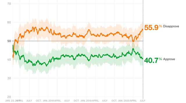
He always polls his worst when he is not just cruel, but cluelessly incompetent at it. Since he seems to want to run on being anti-Black lives matter, pro-Confederate statues, and pro-coronavirus even as the next tsunami wave is hitting, his present situation certainly qualifies. Here is Nate Silver’s most current measure of Trump approval:
Here’s how it works:
- States where the race is closer than 3% are shown as toss-ups.
- States where the range is between 3% to 5% are light colors.
- States where the range is between 5% and 10% are medium colors.
- States where the candidate is leading by 10% plus are dark colors.
Here is the updated map as of the 4th of July:
There is one change since last week and it is an important one: by the barest of margins North Carolina has moved from toss-up to lean Biden.
As was the case last week, if Biden were simply win the States in which he leads by 5% or more in the polling, he would win the Electoral College, without even winning a single “toss-up” or “lean Biden” State as shown on the map.
There has been an enormous “reversion to the mean” element about Trump support going all the way back to 2016, so I still expect several of the States of the Confederacy to revert to being pro-Trump.
He always polls his worst when he is not just cruel, but cluelessly incompetent at it. Since he seems to want to run on being anti-Black lives matter, pro-Confederate statues, and pro-coronavirus even as the next tsunami wave is hitting, his present situation certainly qualifies. Here is Nate Silver’s most current measure of Trump approval:
Beyond the Presidency, the turn against Trump appears to be submerging several GOP Senators who had thought their path to election or re-election was easy:
- The past 3 polls in Iowa all have Jodi Ernst losing.
- Both of the last two polls in Montana show the Democrat Governor Bullock leading in that State’s Senate contest.
- Two of the last five polls in Georgia show Democrats leading in the races for one of the two Senate seats up this year.
- Most shockingly, two of the last three polls in Kansas (which if memory serves correctly hasn’t elected a Democrat to the Senate in close to 100 years) show Democrat Barbara Bollier leading in that State’s contest as well.
If all these Democrats do win, it will be the first time since 1980 that there has been such a shock to Senate incumbents.
Sunday, July 5, 2020
Weekly Indicators for June 29 - July 3 at Seeking Alpha
- by New Deal democrat
My Weekly Indicators post is up at Seeking Alpha.
There is a theory of the “wisdom of the crowd.” It refers to a situation where a mass of people, all taking their best guess as to a true fact, are all individually wrong, but averaged together are correct.
As to the economy, presently the “wisdom of the crowd” may be a ghastly, cold-blooded determination that there can be reasonable growth even with millions of infections and hundreds of thousands of deaths on an ongoing basis. Maybe.
As usual, clicking over and reading will bring you virtually up to the moment on the economy, and reward me a little bit for my efforts.
P.S. This coming week will feature only two noteworthy pieces of data: the May JOLTS survey on Tuesday, and jobless claims on Thursday. So I will probably take a day or two off from posting. But I do want to update my map of the Electoral College based on State polling, and the coronavirus dashboard.
Subscribe to:
Posts (Atom)