Saturday, January 29, 2022

Weekly Indicators for January 24 - 28 at Seeking Alpha


 - by New Deal democrat

My Weekly Indicators post is up at Seeking Alpha.

While most of the chatter this past week was about inflation and the Fed raising interest rates, commodities got hot again, with oil making another 7 year high.

This is both good and bad. It’s good because it shows that the global economy is really running hot. And it’s bad because, well, the global economy is really running hot - and the steps taken to cool it off are not going to be good for ordinary workers.

As usual, clicking over and reading will bring you up to the virtual moment on the state of the economy, and will reward me just a little bit for the effort I put in.

Friday, January 28, 2022

Real personal income and spending both decline in December; no imminent worry but evidence of softening


 - by New Deal democrat

Nominal personal income rose 0.3% in December, while spending declined -0.6%. In real terms after inflation, personal income declined -0.1%, and personal consumption expenditures declined -1.0%. Nevertheless both remain well above their pre-pandemic levels: 


Here is what the same information looks like using May 2021 as a baseline, after all the stimulus money had been expended:


Since then spending is up 0.9%, while income has declined -1.1%.

Comparing real personal consumption expenditures with real retail sales for December (essentially, both sides of the consumption coin) reveals both faltered for the second month in a row:


Because so many people front-loaded their Christmas spending into October, the subsequent decline is not too concerning. On the other hand, the quarterly graph below shows that real personal income declined in each of the last three quarters of 2021. I think this decline (along with COVID) explains most of the decline in the approval for Joe Biden and Congressional Democrats in general:


I have been expecting the economy to soften (although no recession at least through the middle of this year), and this morning’s income and spending data adds to the evidence.

Thursday, January 27, 2022

Real Q4 GDP completes the Boom of 2021, while long leading components warn of weaker 2022 to come


 - by New Deal democrat

Nominal GDP increased 6.9% in the 4th Quarter of 2021. After taking into account inflation, it increased 1.7%:


The last six economic quarters together have been the biggest economic Boom since 1983-84, as shown in the below graph showing YoY real GDP growth, minus the 5.5% of 2021, going all the way back to 1948:


That’s pretty impressive. But it is also the rear view mirror.

To see what lies ahead, there are two components of GDP which are helpful: real residential fixed investment (housing) and proprietors income (a proxy for business profits). Both of these have long and good track records as helping forecast the economy one year in advance. And here, the news is not so good.

Proprietors income (blue in the graph below) declined -0.9%, even before taking into account any inflation adjustment. Note that this generally rises and falls with corporate profits (red), although it is not quite so leading. But since the latter won’t be reported for at least another month, it is a good placeholder:


The news is also bad in housing, as real residential fixed investment declined for the 3rd quarter in a row:


Both nominal and real residential fixed investment as a share of GDP (the actual measurement that is part of the long leading indicators) also declined:


The decline in the housing component is not surprising. Monthly data in housing permits and starts declined by recessionary margins all the way through October of 2021. That business profits may have topped out as well is not a good sign, although this is only the first quarter of decline, and obviously may be a false signal.

Both of these long leading indicators are among the array I track. I plan on posting my forecast for year end 2022 shortly at Seeking Alpha, and will reference it here.

With seasonality over, it is clear that Omicron is responsible for increased layoffs


 - by New Deal democrat

With seasonality behind us, it is apparent that Omicron has resulted in increased layoffs.

New claims declined 30,000 last week to 260,000 - still well above its pandemic low of 188,000 set early in December. The 4 week average of new claims increased 15,000 to 247,000:


Continuing claims for jobless benefits rose for the second week in a row, by 51,000 to 1,575,000, 120,000 above its 50 year low set two weeks ago:


Last week I wrote that “The effects of Omicron are going to continue for at least a few more weeks. The quirks of seasonality should resolve after another week. Until I see more going on, I do not see any reason to overreact to the last two weeks’ big increase in claims.” At this point it seems clear that Omicron has had a significant impact. At the same time, with cases nationwide down 20% from peak as of today, I still suspect Omicron will be behind us by the end of February. So I still do not see a big reason to overreact to this increase in claims, to what is still in the long run an excellent number.
 

Wednesday, January 26, 2022

New home sales surge, while house price measures decelerate; expect deceleration or even downturns in each


 - by New Deal democrat

Since I didn’t post yesterday, let me catch up today with a note on both new home sales and prices.


New home sales (blue in the graph below) for December rose sharply to 811,000 on an annualized basis. This is the higher monthly number since March, and while it is well above the trend since the Great Recession, it is still well below its levels from late 2020:


The red line is inventory. When it comes to new homes, inventory lags not only sales but also prices, so it is not surprising that inventory has increased sharply to a 10 year+ high.

While new home sales are the most leading of all housing metrics, they are very noisy and heavily revised. So in the below graph I compare them with single family permits (red), which have also increased in the last few months, but also are not at 2020 levels:


Because mortgage rates have increased significantly in the past several months, I do not expect this surge in new home buying to last much longer.

Sales lead prices, and for most of 2021 sales were down. So it should not be a surprise that on a YoY basis, price increases are at last abating, shown both monthly (blue) and quarterly (black) in the graph below:


In December, prices were only up 3.4% from one year prior. Since the data is noisy on a monthly basis, the quarterly number, still high at just under 15%, but well below the sharp gains earlier in the year, is more telling.

The deceleration in YoY price gains, which nevertheless are still very high, was also the story yesterday in both the Case Shiller and FHFA house price indexes (light and dark blue in the graph below, /2 for scale). Also shown are the YoY% gains in rent of primary residence and owner’s equivalent rent (how the CPI measures housing inflation)(light and dark red):


My purpose in the above graph is to show that both house price indexes track one another closely, as do both “official” measures of housing inflation. Additionally, as I’ve previously pointed out, house price increases tend to bleed over into the official inflation measures with about a 12 to 18 month lag. Thus on a YoY basis price increases bottomed in 2019, but did not bottom in the official measures of rent until the beginning of 2021. Since the YoY% increase in house prices peaked in mid year 2021, we can expect the “official” CPI housing measure to continue to increase on a YoY basis through roughly late 2022.

This doesn’t necessarily mean that the *total* inflation measure will continue to increase throughout this year. Below I again show the YoY% change in owners’ equivalent rent as above, but also the total inflation index (gold). Most importantly, note that sometimes they track in tandem, but also that generally during the entire house price boom, bubble, and bust from 1995 to 2015 they tended to move in opposite directions:


Why did this happen? Sometimes, as during 1995-2015, home ownership and apartment renting are alternative goods. When more people decide to leave apartments and move into houses, house prices increase while rents flatten. This is generally what happened during the boom and bubble. Then during the bust people were forced to abandon houses and move back into apartments. This is shown in the below graph of homeownership:


Note the huge upward surge until the housing bubble popped, followed by the equally sharp deflation.

Finally, let’s factor in interest rates set by the Fed, shown in black below:


As CPI increases, the Fed typically increases interest rates. By the time the fully effect in owners’ equivalent rent is felt, Fed rate hikes have typically cooled the economy, meaning that the remaining majority of the overall consumer inflation index declines.

Bringing our discussion back to the present, we see that total inflation has been rising sharply since just after the pandemic hit. Owners’ equivalent rent started to rise about 9 months ago. Part of the delay was the big increase in the homeownership rate during that time, driving rents and house prices in opposite directions. The consensus is that the Fed will raise rates several times this year, perhaps starting as early as this spring. If they indeed do so, they will probably continue to embark on hiking rates until the economy slows or even reverses, enough so that price increases - other than rents - decelerate considerably. But while rent measures will continue to accelerate this year, house price increases themselves are likely to continue to decelerate, or even stall in the months ahead.


Monday, January 24, 2022

A historical note on US Treasury interest rates and stock prices


 - by New Deal democrat

Over the weekend I was asked by two people what is going on in the markets. That’s usually a sign that there has been a sudden downside move, and people are getting emotional.


Back 5 and 10 years ago, when I was doing perpetual battle with the DOOOMers, several times I was able to call a market bottom to the day - and once within an hour in real time - by how triumphantly the DOOOMers were trumpeting. Most of them have long since disappeared, but it’s well to keep in mind that while emotional moves in the stock market may be brutal, they are typically very short, and reverse quickly. That’s because there are always some cold-blooded sharks in the water, and at some point they see values as compelling and pile in buying.

As I draft this, the market is down 10%, which is “officially” a “correction.” (Most people define a bear market as requiring a 20% down move). I’m not interested in insta-calling a turning point, or speculating on “why” a particular daily move has taken place. In particular I don’t see any reason why anything having to do with the crypto-currency crazed would have a significant effect on the US’s $20 Trillion economy as a whole. Rather, let’s take a look at a few longer-term relationships that are fact-based and have been reliable.

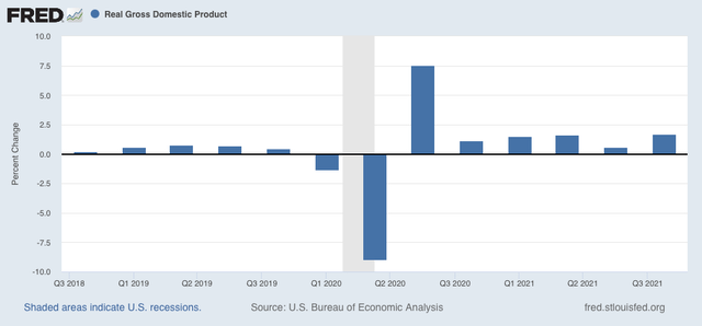
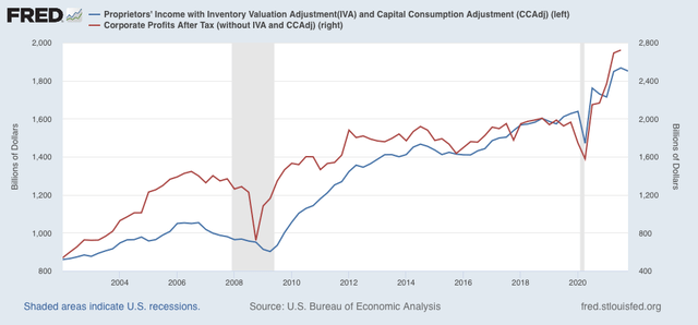
Corporate profits are a long leading indicator, typically turning over 12 months before the economy as a whole. The stock market is a short leading indicator, typically turning 3-8 months before the economy as a whole. Which means corporate profits turn first; the stock market only reacts later. On Thursday the first estimate of Q4 2021 will be reported, and that will include “proprietors’ income,” a proxy for corporate profits, which won’t be reported until the “final” GDP report in two more months. That will give me what I need to make a long term forecast of the US economy through the end of this year. Last week I noted that the short leading indicators forecast the expansion would continue through mid year. 

In the meantime, because it is widely believed that the Fed is going to start raising interest rates in a few months in order to deal with inflation, let’s examine the yield curve in the US Treasury market, also a long leading indicator, and the Fed funds rates themselves, for their relationship to stock prices.

Since the 1960s, an inversion in the US Treasury yield curve, where 2 year interest rates are higher than 10 year interest rates, has preceded every single recession, typically by 12 to 18 months. The first two graphs below show that yield curve in blue, and compare it with the YoY% change in stock prices (red, /20 for scale), for the past 40+ years:


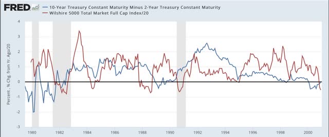
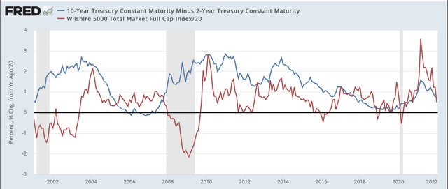
Again, notice that the yield curve has inverted roughly a year or more in advance of every single recession during that period. It even did so briefly in August 2019, although the 2020 recession was an anomaly caused by the near complete stoppage of the economy in the first several months of the pandemic. Further, aside from one month in 1998, it never inverted without a recession following. In other words, it has a near perfect record.

Now look at the red line. Stock prices turned lower YoY during every recession except for the brief 1980 one. But they also turned down a number of times when traders expected an economic slowdown (1984, 1994, 2002, 2016) - but these downturns were very brief. The only more extended YoY decline was the exact 1 year period following the crash of 1987. Also, note that stock prices typically continued higher YoY even after there was a yield curve inversion - each and every time believing “it’s different this time.” Only after an oncoming recession was obvious did stocks turn lower YoY.

Now let’s take a look at the same information zoomed in over the past 2 years:


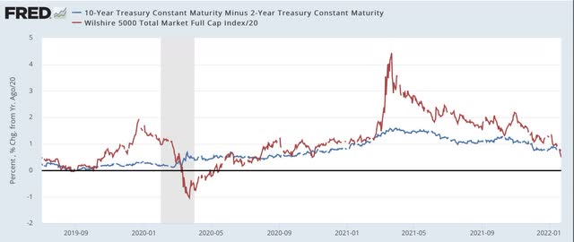
The yield curve is not as positive as it was 1 year ago. But on the other hand, it has certainly not inverted. At roughly +0.8%, it is more or less in the middle of its range for the last 40 years. Quite simply the yield curve is not forecasting any imminent economic downturn.

But what about the Fed raising rates. Below are two graphs showing the same 40 year period, with the same YoY% change in stocks represented; this time being contrasted with the actual Fed funds rate (black, right scale):


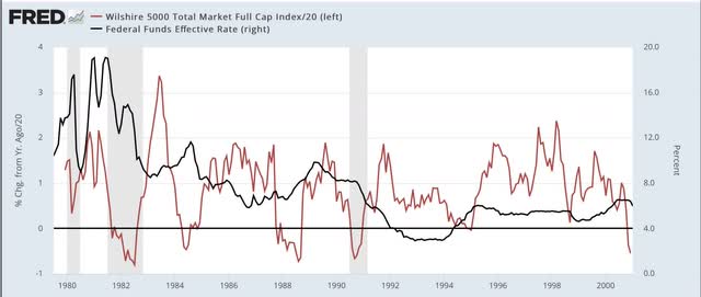
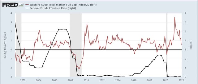
Don’t squint too hard, because the point is that there is no strong relationship between the two. In the 1980s and 1990s, YoY stock prices moved somewhat opposite to Fed funds, i.e., an increase/decrease in the funds rate correlated with a downturn/upturn in the YoY% change in stock prices. Since 2000, in the era of zero or near zero Fed funds rates, there has been very little correlation at all, and indeed during most of the time that the Fed funds rate was increasing in 2005-07 and 2016-19, there were continued YoY gains for stock prices.

The bottom line is, there is nothing fundamental happening that justifies a major revaluation downward in stock prices for any extended period. A brief emotional - and emotionally jarring - move to negative YoY comparisons, with a swift rebound would hardly be surprising. And it would be emotionally jarring, because stock prices increased 25% last year:


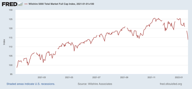
So a YoY decline would mean giving that all back. But it would likely be the kind of move that the late St. Jack Bogle of Vanguard Funds fame would categorize as almost certainly being “V” shaped. Of course, it could always “be different this time.” But that has historically been the wrong conclusion.