Saturday, September 7, 2019
Weekly Indicators for September 2 - 6 at Seeking Alpha
- by New Deal democrat
My Weekly Indicators post is up at Seeking Alpha.
The nowcast and the long term forecast have been pretty stable, but the short term forecast has been volatile recently - and the monthly series (slightly negative) vs. the weekly data (more positive) are not in sync.
This is likely because there is much more monthly data (usually from the government) than weekly data (more often from private sources) about manufacturing.
Friday, September 6, 2019
August jobs report: for once, the underwhelming headline masked very good internals
- by New Deal democrat
HEADLINES:
Other important coincident indicators help us paint a more complete picture of the present:
HEADLINES:
- +130,000 jobs added (+105,000 ex-Census)
- U3 unemployment rate unchanged at 3.7%
- U6 underemployment rate rose 0.2% to 7.2%
Leading employment indicators of a slowdown or recession
I am highlighting these because many leading indicators overall strongly suggest that an employment slowdown is coming. The following more leading numbers in the report tell us about where the economy is likely to be a few months from now. These were positive.
- the average manufacturing workweek rose +0.2 from 40.4 hours to 40.6 hours. This is one of the 10 components of the LEI and is positive (note last month was -0.3 so on net this is still -0.1 hours from two months ago).
- Manufacturing jobs rose by 3,000. YoY manufacturing is up 138,000, a deceleration from last summer’s pace.
- construction jobs rose by 14,000. YoY construction jobs are up 177,000, also a deceleration from last summer. Residential construction jobs, which are even more leading, rose by 7,000.
- temporary jobs rose by 15,400 (note this *may* reflect census hiring).
- the number of people unemployed for 5 weeks or less rose by 6,000 from 2,201,000 to 2,207,000. The post-recession low was four months ago.
Wages and participation rates
Here are the headlines on wages and the broader measures of underemployment:
Here are the headlines on wages and the broader measures of underemployment:
- Not in Labor Force, but Want a Job Now: rose by 107,000 from 5.043 million to 5.150 million
- Part time for economic reasons: rose by 397,000 from 3.984 million to 4.381 million
- Employment/population ratio ages 25-54: rose +0.5% from 79.5% to 80.0%. THIS IS A NEW EXPANSION HIGH.
- Average Hourly Earnings for Production and Nonsupervisory Personnel: rose $.11 from $23.48 to $23.59, up +3.5% YoY. This is still a slight decline from the recent YoY% change peak. (Note: you may be reading different information about wages elsewhere. They are citing average wages for all private workers. I use wages for nonsupervisory personnel, to come closer to the situation for ordinary workers.)
Holding Trump accountable on manufacturing and mining jobs
Trump specifically campaigned on bringing back manufacturing and mining jobs. Is he keeping this promise?
Trump specifically campaigned on bringing back manufacturing and mining jobs. Is he keeping this promise?
- Manufacturing jobs rose an average of +11,500/month in the past year vs. the last seven years of Obama's presidency in which an average of +10,300 manufacturing jobs were added each month.
- Coal mining jobs rose +1200, an average of +117 jobs/month in the past year vs. the last seven years of Obama's presidency in which an average of -300 jobs were lost each month
Other important coincident indicators help us paint a more complete picture of the present:
- Overtime fell -0.1 hours to 3.2 hours.
- Professional and business employment (generally higher-paying jobs) rose by +37,000 and is up +449,000 YoY.
- the index of aggregate hours worked for non-managerial workers rose by +0.3%
- the index of aggregate payrolls for non-managerial workers rose by +0.8%
Other news included:
- the alternate jobs number contained in the more volatile household survey rose by 590,000 jobs. This represents an increase of 2,274,000 jobs YoY vs. 2,074,000 in the establishment survey.
- Government jobs rose by 28,000 (up +3,000 ex-census).
- the overall employment to population ratio for all ages 16 and up rose 0.9% to 60.9% m/m and is up 0.6% YoY.
- The labor force participation rate rose 0.2% to 63.2% m/m and is up 0.5% YoY.
SUMMARY
This report was the mirror image of most others we have seen this year: the establishment report was mediocre, while the household report was excellent.
The deceleration in jobs growth was well in evidence in the headline number. The last three months, ex-census hiring, has only been +147,000. But construction and manufacturing jobs both did increase. Non-supervisory wage gains increased to +3.5% YoY. On the other hand, if census hiring was included in the temporary jobs number, that decreased significantly.(UPDATE: Census hiring was not included therefore the positive number is real, but temporary jobs remain significantly below their December 2018 peak.) It is also concerning that the revisions to prior months continue to be downward. This is something that tends to happen near turning points.
The household survey, on the other hand, was generally very strong. Almost 600,000 new jobs were added in that report, and the YoY gains now exceed the establishment report. The prime age employment to population ratio increased to its highest level since January 2008. It is only because of this big addition to the labor force that the unemployment rate stayed steady (vs. going lower) and the underemployment rate increased. Aggregate hours and payrolls both jumped.
So, despite the underwhelming headline number, this was overall a very good report.
Thursday, September 5, 2019
One marker of initial jobless claims turns (slightly) negative
- by New Deal democrat
I’ve been monitoring initial jobless claims closely for the past several months, to see if there are any signs of stress. This is because the long leading indicators were negative one year ago, and many - but not a majority - of the short leading indicators have recently turned negative as well. So I am on “recession watch.” But no recession is going to begin unless and until layoffs increase.
To reiterate, my two thresholds are:
1. If the four week average on claims is more than 10% above its expansion low.
2. If the YoY% change in the monthly average turns higher.
This week the second measure turned negative. Let’s take a look.
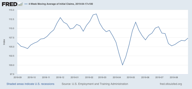
Initial jobless claims last week were 217,000. This is in the lower part of its range of 220,000 +/-12,000 for the past 19 months. As of this week, the four week average is 7.3% above its pre-Easter low:
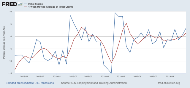
The four week YoY change as well as the YoY change for the month of August as a whole (red) are 450 higher than last year (weekly YoY change is shown in blue):
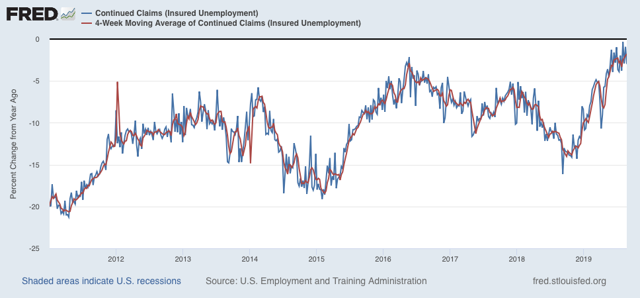
The less leading but also less volatile 4 week average of continuing claims rose slightly and is now only -1.8% below its level of one year ago, which is the weakest comparison in this entire expansion:
Overall, jobless claims remain ever so weakly positive, against some very tough YoY comparisons. There is no imminent economic downturn so long as this remains the case.
Tuesday, September 3, 2019
Two sharply contrasting reports on the economy to start September
- by New Deal democrat
We got two contrasting views of the economy this morning.
First, the good news: residential construction spending increased in July. Below I show it in comparison with single family permits:
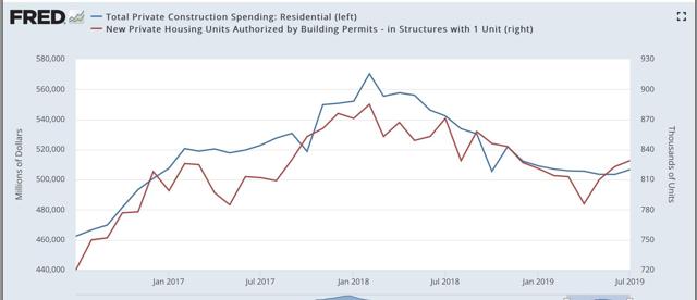
First, the good news: residential construction spending increased in July. Below I show it in comparison with single family permits:
Typically construction follows permits. In the past few years, it has been almost coincident with permits. This is more good news for the important and leading housing sector, indicating that the decline that started in early 2018 has ended. With the continued recent further decline in mortgage rates, I expect further advances, although possibly not strong.
Now, the bad news: the ISM manufacturing index fell below 50 to 49.1. Worse, the leading new orders component fell to 47.2, the worst reading since the Great Recession:
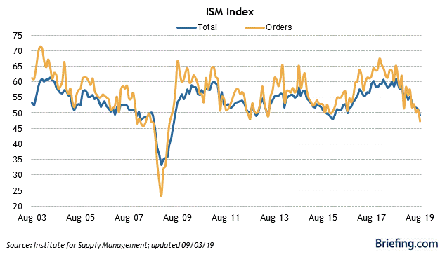
Now, the bad news: the ISM manufacturing index fell below 50 to 49.1. Worse, the leading new orders component fell to 47.2, the worst reading since the Great Recession:
Typically it takes at least two readings below 48 for the ISM manufacturing index to indicate recession. But the new orders index is already at a level which has been consistent over the past 70 years with a recession in the very near future - although it is also consistent, as for example in 1966, with a slowdown only:
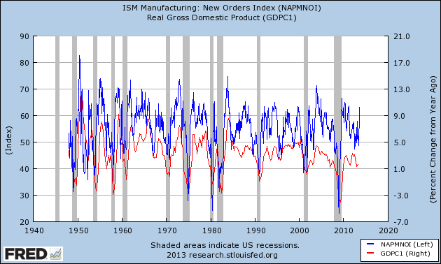
Nevertheless, it does tip the balance of short leading indicators from neutral to slightly negative.
The reports, combined, suggest that in Friday’s jobs report there should be a little improvement in residential construction jobs, but suggest a decline in manufacturing jobs - something that has been loudly telegraphed by the decline in the manufacturing work week in the past year.
Sunday, September 1, 2019
The Passive-Aggressive Investor for the Week of August 26-30
Before starting please note that I am not the reader's investment advisor or lawyer. This information is not meant for a specific individual. Please read and then consult with your adviser. This is not investment advice for any specific person.
Let's start with a simple question: where are we in the economic cycle? We're a lot closer to the end of the latest expansion. I've got a 25% recession probability in the next 6-12 months, based on the yield curve and softness in several business related metrics. While I don't think a recession is a foregone conclusion there is a broad enough swath of data to be concerned. But as for the third quarter, the NY Fed's 3Q19 GDP prediction is 1.8%; the Atlanta Fed is predicting 2%; the blue-chip consensus is between 1.6%-2.4%.
The markets have taken notice. In my latest weekly Technically Speaking summation, I noted that the weekly charts are continuing to roll-over in a bearish formation. I've also noted that the daily charts are trending weaker.
Let's take a deeper look at the charts I follow for this column, starting with US equity indexes:

Click for a larger image
The ETFs that track larger indexes (the SPY, OEF, and QQQ) are still in decent shape. All recently hit highs but have since sold-off due to weaker economic news and trade-related concerns. As the size of the issue decreases, however, the chart becomes technically weaker. Mid-caps (IJH) are in fair shape, small caps (IWM) are technically more precarious and the micro-caps (IWC) are hanging on by a technical thread.

Click for a larger image
Defensive sectors (the XLP, XLU, VNQ) are in solid uptrends. The fourth defensive sector (the XLV) is under a great deal of political and legal weight right now. The other more aggressive sectors range from fair (the XLK and XLY) to very weak (XLE).
Let's now look at the international ETFs:
 Click for a larger image
Latin America (the ILF) has dropped sharply thanks to Argentina's and Brazil's weak performance. Europe (VGK) and Asia (VPL) have both sold-off recently thanks to weaker economic data and concerns over trade-related issues. The broader ETFs (developed and developing markets) are also weaker for the same reasons.
But the dividend paying ETFs are in slightly better shape:

Click for a larger image
The international dividend ETF has sold-off with the markets. But with a high yield (it's currently yielding 6.3%) it's reasonable to assume that it's hit a bottom for now. Preferred shares continue to rally. The broader market dividend ETF has sold-off a bit but is still trading at its 50-day EMA.
Now let's turn to the bond market ETFs, starting with the US:

Click for a larger image
The US bond market is on a tear. Both the treasury and corporate markets are rallying very strongly.

Click for a larger image
We see the same pattern in the international bond markets, although international treasury bonds (left) are stronger than international corporate (right).

Click for a larger image
Junk bond markets are actually doing pretty well, thanks to investors reaching for yield.
Let's add all this up:
 Click for a larger image
Let's look the historical performance of three possible allocations:
portfolio 1: 25% stocks/75% bonds
portfolio 2: 50% stocks/50% bonds
portfolio 3: 75% stocks/25% bonds
Let's first look at the historical return of this portfolio (January 1978-August 1979)
 Click for a larger image
There's not much difference between the standard deviation (risk) of portfolio 1 and 2. But portfolio 3's risk increased a lot for a .55% increase in the compound annual growth rate. In addition, the Sharpe and Sortino ratios decline a bit between portfolio 2 and 3. There's also a large increase in the drop during the worst year between portfolio 2 and 3. The bottom line is that portfolio 2 looks to be a decent mix for the risk, whereas somewhere between portfolio 2 and 3 the investor winds up on the losing end of the risk-reward trade-off.
Finally, let's run a monte carlo simulation of the 50% SPY/TLT allocation model:

Here's the end result of the analysis (emphasis added):
Let's start with a simple question: where are we in the economic cycle? We're a lot closer to the end of the latest expansion. I've got a 25% recession probability in the next 6-12 months, based on the yield curve and softness in several business related metrics. While I don't think a recession is a foregone conclusion there is a broad enough swath of data to be concerned. But as for the third quarter, the NY Fed's 3Q19 GDP prediction is 1.8%; the Atlanta Fed is predicting 2%; the blue-chip consensus is between 1.6%-2.4%.
The markets have taken notice. In my latest weekly Technically Speaking summation, I noted that the weekly charts are continuing to roll-over in a bearish formation. I've also noted that the daily charts are trending weaker.
Let's take a deeper look at the charts I follow for this column, starting with US equity indexes:

Click for a larger image
The ETFs that track larger indexes (the SPY, OEF, and QQQ) are still in decent shape. All recently hit highs but have since sold-off due to weaker economic news and trade-related concerns. As the size of the issue decreases, however, the chart becomes technically weaker. Mid-caps (IJH) are in fair shape, small caps (IWM) are technically more precarious and the micro-caps (IWC) are hanging on by a technical thread.

Click for a larger image
Defensive sectors (the XLP, XLU, VNQ) are in solid uptrends. The fourth defensive sector (the XLV) is under a great deal of political and legal weight right now. The other more aggressive sectors range from fair (the XLK and XLY) to very weak (XLE).
Let's now look at the international ETFs:

Latin America (the ILF) has dropped sharply thanks to Argentina's and Brazil's weak performance. Europe (VGK) and Asia (VPL) have both sold-off recently thanks to weaker economic data and concerns over trade-related issues. The broader ETFs (developed and developing markets) are also weaker for the same reasons.
But the dividend paying ETFs are in slightly better shape:

The international dividend ETF has sold-off with the markets. But with a high yield (it's currently yielding 6.3%) it's reasonable to assume that it's hit a bottom for now. Preferred shares continue to rally. The broader market dividend ETF has sold-off a bit but is still trading at its 50-day EMA.
Now let's turn to the bond market ETFs, starting with the US:

Click for a larger image
The US bond market is on a tear. Both the treasury and corporate markets are rallying very strongly.

Click for a larger image
We see the same pattern in the international bond markets, although international treasury bonds (left) are stronger than international corporate (right).

Click for a larger image
Junk bond markets are actually doing pretty well, thanks to investors reaching for yield.
Let's add all this up:
- The economic back-drop is fair. But while there are clear signs of economic weakness, a recession isn't a foregone conclusion.
- Larger cap indexes are still catching a bid.
- The smaller the underlying equity issue covered by the ETF, the more precarious its technical position.
- Bonds are very strong.
- The possibility of massive capital gains is very small, which means
- We should look for assets that have, at minimum, a certain level of income.
- While I didn't cover them above, a number of Dividend Aristocrats are currently yielding far above the 10-year treasury, making them potential candidates in future issues.
- We should probably shy away from higher risk (higher beta) assets due to the modest possibility of a recession in the next 6-12 months.

Let's look the historical performance of three possible allocations:
portfolio 1: 25% stocks/75% bonds
portfolio 2: 50% stocks/50% bonds
portfolio 3: 75% stocks/25% bonds
Let's first look at the historical return of this portfolio (January 1978-August 1979)
There's not much difference between the standard deviation (risk) of portfolio 1 and 2. But portfolio 3's risk increased a lot for a .55% increase in the compound annual growth rate. In addition, the Sharpe and Sortino ratios decline a bit between portfolio 2 and 3. There's also a large increase in the drop during the worst year between portfolio 2 and 3. The bottom line is that portfolio 2 looks to be a decent mix for the risk, whereas somewhere between portfolio 2 and 3 the investor winds up on the losing end of the risk-reward trade-off.
Finally, let's run a monte carlo simulation of the 50% SPY/TLT allocation model:
Here's the end result of the analysis (emphasis added):
Monte Carlo simulation results for 10000 portfolios with $1,000,000 initial portfolio balance using available historical returns data from Jan 2003 to Dec 2018. The historical return for the selected portfolio for this period was 8.50% mean return (8.30% CAGR) with 8.03% standard deviation of annual returns. The simulated inflation model used historical inflation with 2.08% mean and 1.37% standard deviation based on the Consumer Price Index (CPI-U) data from Jan 2003 to Dec 2018. The generated inflation samples were correlated with simulated asset returns based on historical correlations. The available historical data for the simulation inputs was constrained by iShares 20+ Year Treasury Bond ETF (TLT) [Aug 2002 - Aug 2019].Here are a few observations from the above data:
- With the exception of one scenario, all returns are positive
- By year 3, it's reasonable to assume an annual return of 5%
- By year 10, it's reasonable to assume an annual return between 5% and 7.5%
Subscribe to:
Comments (Atom)