Saturday, July 18, 2020
Weekly Indicators for July 14 - 18 at Seeking Alpha
- by New Deal democrat
My Weekly Indicators post is up at Seeking Alpha.
With the coronavirus beginning to rage out of control again in a majority of US States, improvement in the coincident and short leading indicators has generally halted.
As usual, clicking over and reading will bring you up to the moment, and bring me a penny or two.
Friday, July 17, 2020
Improvement slows in initial claims; expect recent job growth to slow as well
- by New Deal democrat
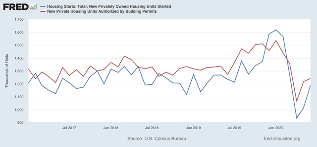
A preliminary note: this morning’s report on housing permits and starts showed improvement across the board in June, although the absolute levels are no better than the low points of 2017 and late 2018-early 2019:
I’ll have more at Seeking Alpha later.
Now let’s turn to yesterday’s report on initial and continuing claims, which have been giving the most up-to-date snapshot of the continuing economic impacts of the coronavirus on employment. This week continued the trend of slight improvement to “less awful,” as shown in the below graph of the week over week % change:
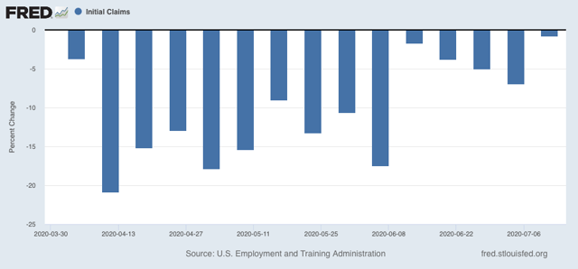
There were 1.300 million new claims, only 10,000, or -0.8%, less than one week ago. This is the smallest weekly decline since the peak in claims in early April.
As for continuing claims for the previous week, they declined to 17.338 million, 422,000 less than one week prior (blue in the graph below, vs. red for initial claims):
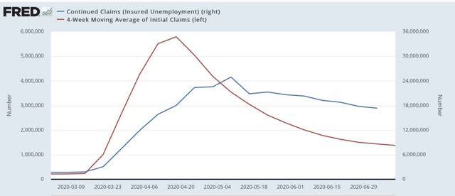
Although there is slight improvement, this is frankly discouraging, as close to 1% of the workforce is still being laid off and filing for unemployment every week, four months after the onset of the crisis. With special pandemic benefits expiring this month, the economy is set to take a further gigantic hit unless an extension is passed by Congress (which means clearing the GOP Senate). In short, the damage is continuing, and it is continuing to spread out, even if at a slower rate.
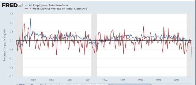
Back in the “regular” pre-coronavirus era, one of the ways of forecasting future employment was by tracking the moving average of initial claims, as the trend in initial claims has a lengthy track record of leading overall jobs. Although the claims data is noisy, even averaging over a month, here is the record in two graphs going back 50 years:
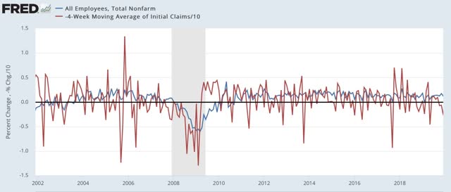
Now here is the past few months:
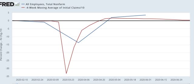
Note that the typical improvement in initial claims during the past 50+ years has almost never been better than +5% (divided by 10 in the graphs). In the past several months, it has been up to 50% (again, divided by 10 in the graphs). But that has now slowed to about 25% (2.5% in the last graph).
We are probably going to get another big positive number in the jobs report for July, for which the survey week is this one. On the other hand, the slowdown in gains in the initial claims numbers means that job gains are likely to slow in the next several jobs reports. And that does not take into account any large-scale re-closing of portions of the economy in many States.
Thursday, July 16, 2020
June retail sales: some actual good news; the entirety of the pandemic decline has been reversed
- by New Deal democrat
Retail sales are the third report for June out of the four main coincident indicators that show whether the economy is in recession or expansion. And they were the third that grew again for the month. In fact, in real, inflation-adjusted terms they were higher than in February, the last month before the coronavirus pandemic hit:
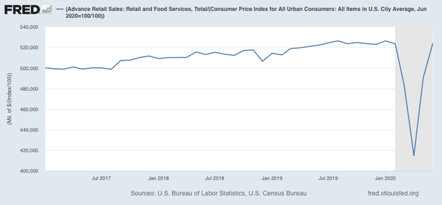
They were also only 0.4% lower than their all-time high set last August.
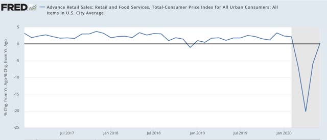
And they were also slightly *higher* YoY (0.4%), as shown in the below graph:
Beyond that, over the long haul, real retail sales have been a good if noisy short term leading indicator for job growth:
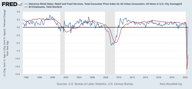
(Note that real retail sales are divided by 2 for scale in the above graph).
Here’s a close-up of the same since Trump took office:
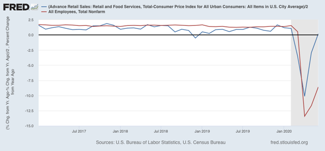
This is a good omen for the July jobs report. In the past two months, jobs have regained about 1/3 of their pandemic losses. It’s at least within the realm of reasonable possibility that most of the pandemic job losses could be made up within the next two months, even if many States at least partially “re-close” - although brick-and-mortar sales jobs might be replaced by more warehouse and deliver order-fulfilling jobs. And I don’t see how restaurant and bar jobs come back intact for many months to come.
Wednesday, July 15, 2020
Industrial production rebounds, but will manufacturing employment continue to do so?
- by New Deal democrat
Industrial production is the King of Coincident Indicators. The NBER almost always identifies month of the end, and frequently the beginning, of recessions based on the top and bottom of this statistic. This morning it was reported to have risen for the second month in a row in June. Let’s take a little deeper look.
First, here’s the graph of both overall (blue) and manufacturing (red) production since Trump was inaugurated in January 2017:
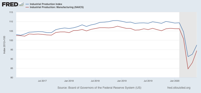
Both rose by a total of 5% or more until December 2018. In that month both peaked, and both have been in declines since then, first shallow, and then collapsing when the coronavirus hit in March. As of this morning’s report, overall production has regained about 1/3 of its loss since December 2018. Manufacturing has regained about 1/2 of its loss.
Manufacturing employment (green in the graphs below) has historically followed manufacturing production with a lag of several months. Here’s the long term YoY look since 1984 (employment x2 for scale):
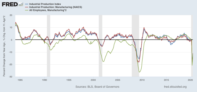
The sudden stop forced on the economy by the pandemic has meant that there has been virtually no lag this year:
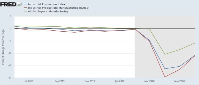
But unless manufacturing quickly returns to its February level, I expect that job losses in manufacturing will be more permanent. I.e., employers will not be so quick to rehire all of their laid-off workers.
Tuesday, July 14, 2020
Coronavirus dashboard for July 14: A few US States are containing the coronavirus
- by New Deal democrat
Headlines for the US:
Total infections: 3,364,704
7 day average: 60,997
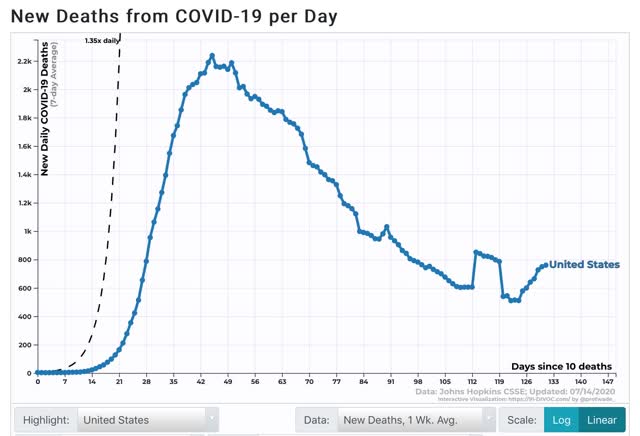
Total deaths: 135,615
7 day average: 780
We all know that, taken as a whole, the US is failing abysmally in controlling the coronavirus. At least 13 States most notably including California are “re-closing” at least in part. In the last week, deaths, which had continued to decline despite the renewed exponential rise in cases in many areas, finally started to rise as well:
But, in view of the announcement yesterday that, for the first time in months, on Sunday New York City did not have even a single death from the coronavirus, I thought I would take a look to see if New York, or any other States, have continued to “crush the curve.” There are a few slivers of good news.
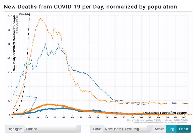
For a benchmark, let’s start by taking a look at Canada and the European Union, in terms of cases (dotted lines) and deaths (solid lines) per week:
Canada has 7.35 cases per million per week; the EU 7.91. Canada has .331 deaths per million; the EU .177.
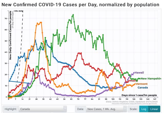
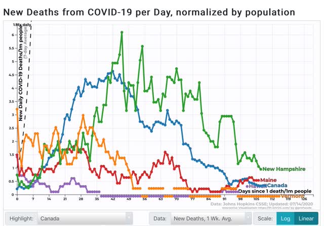
These are markers of true success against the coronavirus. Do any US States even come close? Only 4: Maine, New Hampshire, Vermont, and Hawaii.
Here are the 4 above States compared with Canada (blue) in terms of cases:
And here is the same comparison in terms of deaths:
Over the past 7 days, the numbers of cases and deaths per million respectively are:
ME 14 / .531
NH 16 / .946
VT 11 / 0
HI 22 / .303
Note that Hawaii’s case counts have recently increased. I decided to include them because, as islands, I suspect the State can turn it around quickly.
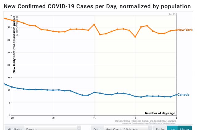
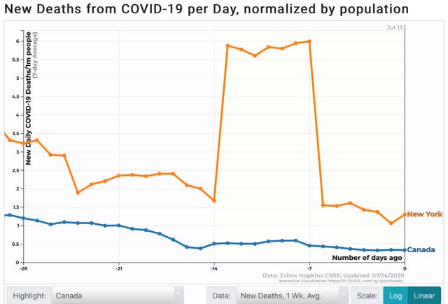
By comparison, here is how NY compares with Canada in terms of cases per million:
And deaths per million:
NYS still has around 4x the number of both new infections and deaths compared with Canada.
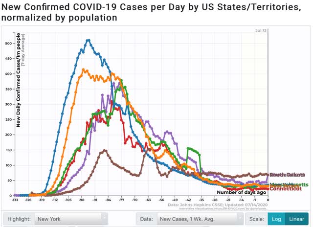
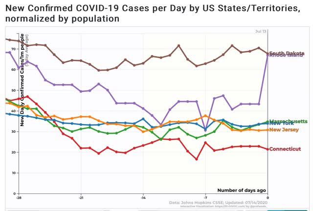
Aside from NY, only 5 other States are swimming against the tide of sharply rising new infections: NJ, CT, RI, MA, and SD. Here is the long term view:
And here is the same data just over the past 4 weeks:
Note RI apparently had a data dump yesterday, accounting for the sharp one day increase.
Bottom line: only the Northeast above the Mason-Dixon Line, and excluding PA, is continuing to have any success containing or crushing the coronavirus. The metro NYC and Boston areas still have work to do to bring their numbers down to that of neighboring Canada.
The rest of the US is on fire.
Sunday, July 12, 2020
The 2020 Presidential election nowcasts and forecast: growing evidence for a likely Biden blowout
- by New Deal democrat
For the past three weeks I have posted a projection of the Electoral College vote based solely on State rather than national polls (since after all that is how the College operates) that have been reported in the last 30 days.
Here’s how it works:
- States where the race is closer than 3% are shown as toss-ups.
- States where the range is between 3% to 5% are light colors.
- States where the range is between 5% and 10% are medium colors.
- States where the candidate is leading by 10% plus are dark colors.
Here is the updated map through July 11:
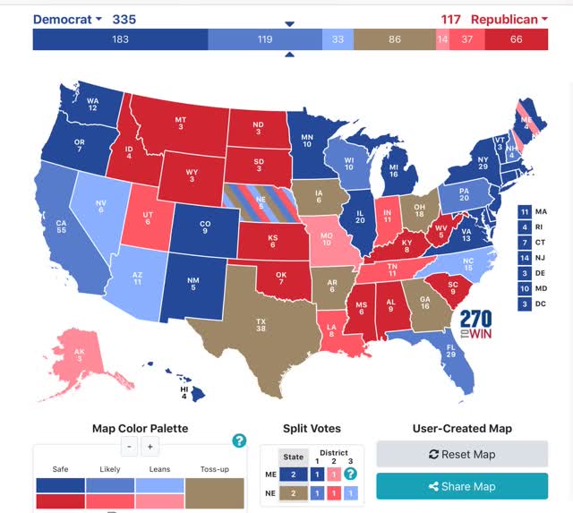
There are no flips, except that I noticed I had overlooked a poll last month of Nebraska that actually showed a slight Biden lead. In Biden States, Arizona weakened and several others strengthened. In Trump States, a number in the Mississippi valley weakened significantly. And this morning another Texas poll showed a Biden lead, although not enough to move that State out of the “toss-up” range.
As has been the case for the past two weeks, if Biden simply wins the States in which he leads by 5% or more in the polling, he would win the Electoral College, without even winning a single “toss-up” or “lean Biden” State as shown on the map.
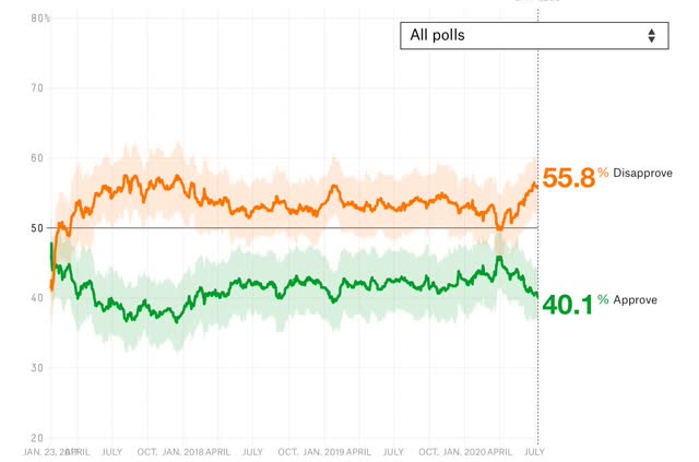
Trump continues to have close to his worst polling in the past 2 1/2 years, as shown in Nate Silver’s most current measure of Trump approval:
Although he is a GOP pollster, I think Rasmussen’s measure of strong approval vs. strong disapproval is also very telling. The theory is that those with strong opinions aren’t going to change, so what remains are those with weak opinions. Here is what that looked like for Trump’s first 1 1/2 years:
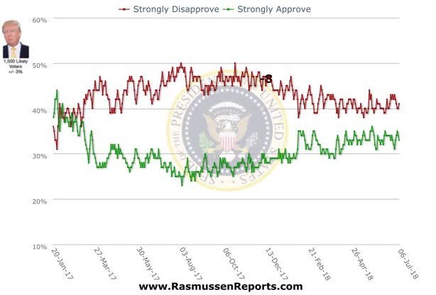
And here is the same metric for the past 2+ years:
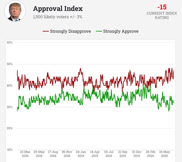
Strong disapprovers are at ~45%, about the worst level in the past two years. Only during the ACA repeal attempts during 2017 did Trump fare significantly worse. It would be extremely difficult for Trump to overcome that disadvantage, especially since late deciders almost always break towards the challenger.
Next, let’s look at some econometric models. First, here is the “Bread and Peace” econometric model, first showing its historical record through 2016 (the creator, Douglas Hobbs, has not made any update for the 2020 election):
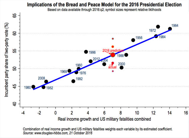
This model measures the change in real disposable personal income per capita, and adds casualties in wars to arrive at its forecast (whether pandemic deaths would be equivalent is completely unknown, but obviously would make a big difference).
Here is what the change in real personal income per capita looks like, first historically through the last recession, and now the past few months:
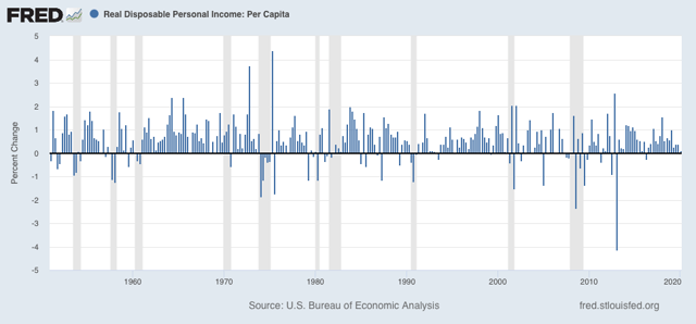
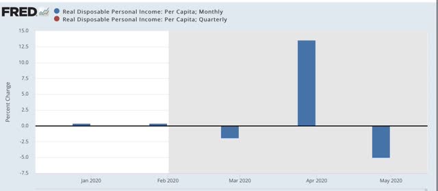
The number, while not negative, was in the danger zone even before March. Since then, the stimulus checks in April greatly helped this metric for one month, but if June is as poor as May, it will be completely undone. If pandemic deaths carry any weight at all close to casualties in war, the model forecasts disaster for Trump.
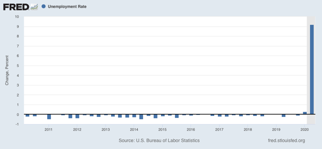
Another model recently put forward by a Fed watcher (sorry, I forgot her name) demonstrated that an increase of 0.4% off its best levels in the unemployment rate in the quarters before an election has historically indicated a loss by the incumbent. Needless to say, this indicator is awful for Trump now:
But all of the above are nowcasts. They change right up until the election with incoming polling and/or economic data.
By contrast, the best *forecast* model I have seen takes Q1 polls, plus the Index of Leading Indicators at the end of the Q1 to predict how the economy will be behaving just before Election Day. So here is an update through May of the LEI:
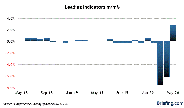
Even May’s big bounce barely made a dent in the March and April declines. Needless to say, this forecasts a Biden blowout and is not affected by the vicissitudes of polling between now and November. In essence, it is already set in stone. All of this, in turn, was driven by the pandemic.
Which leads me to the following: at this point I think I can be blunt. Trump has about 7 weeks to turn around the pandemic. If Labor Day comes and goes and the pandemic is still raging anywhere near as bad as it is now, Trump is going to lose the popular vote, and lose it badly, making an electoral college victory virtually impossible.
And if so, it is very likely that the Democrats win the Senate as well. In the past week, polling has confirmed a big lead in Arizona, a moderate lead in Maine, and slight leads in Iowa and North Carolina. Even the Alaska Senate race isn’t solidly GOP.
Of course, keeping in mind 2016, Democrats should behave as if Biden, and every House, Senate, and State candidate is running 2% behind, and keep the pedal to the metal.
Subscribe to:
Posts (Atom)