Saturday, September 15, 2018
Weekly Indicators for September 10 -14 at Seeking Alpha
- by New Deal democrat
My Weekly Indicators post is up at Seeking Alpha.
An anomalous surge in demand deposits led to one of the 5 biggest weekly jumps in M1 money supply ever as reported by the Federal Reserve this week.
By clicking on the link and reading, you help reward me for my work by putting a penny or two in my pocket.
Friday, September 14, 2018
Subdued inflation helps gains in real average and aggregate wages
- by New Deal democrat
With the consumer price report yesterday morning, let's conclude this weeklong focus on jobs and wages by updating real average and aggregate wages.
Through July 2018, consumer prices are up 2.7% YoY, while wages for non-managerial workers are up 2.8%. Thus real wages have finally grown, ever so slightly, YoY:

In the longer view, real wages have still been flat -- up only 0.5% -- for 2 1/2 years:

But because employment and hours have increased, real *aggregate* wage have continued to grow:

Real aggregate wages -- the total earned by the American working and middle class -- are now up 26.1% from their October 2009 bottom.
Finally, because consumer spending tends to slightly lead employment, let's compare YoY growth in real retail sales, first measured quarterly (red), with that in real aggregate payrolls (blue):

Since we are two months into the next quarter, here's the monthly close-up on the last 10 years (excluding this morning's decline of -0.1% in real retail sales):

Since late last year real retail sales growth has accelerated YoY, and again further this morning, as last August's -0.3% monthly number was replaced by the less negative -0.1% this morning, bringig the YoY% change up to +3.8%. So we should expect the recent string of good employment reports to continue for at least a few more months.
Thursday, September 13, 2018
August JOLTS report: thriving jobs market, and still-thriving Taboo against raising wages
- by New Deal democrat
Tuesday's JOLTS report once again confirmed the very good employment report from one month ago:
- Quits made a new all-time high
- Hires are just below their expansion high of two months ago
- Total separations made a new expansion high
- Layoffs and discharges improved, but not to their expansion low made in March
- Job openings made yet another all-time high
Let's update where the report might tell us we are in the cycle, remaining mindful of the fact that we only have 18 years of data. To do that, I am varying my past presentations to focus instead on hiring, quits, layoffs, and openings as a percentage of the labor force. Here's what they look like since the inception of the series (layoffs and discharges are inverted at the 1.5% level, so that higher readings show fewer layoffs than normal, and lower readings show more:

Note the data is averaged quarterly to cut down on noise.
During the last expansion:
- Hires peaked first, from December 2004 through September 2005
- Quits peaked next, in September 2005
- Layoffs and Discharges peaked next, from October 2005 through September 2006
- Openings peaked last, in Spril 2007
- Layoffs and Discharges troughed first, from January through April 2009
- Hiring troughed next, in March and June 2009
- Openings troughed next, in August 2009
- Quits troughed last, in August 2009 and again in February 2010

While only Quits made a new expansion high, the trend in quits and Openings has been very positive, while that of actual Hirs and Layoffs has been more mutedly so.
Next, here's an update to the simple metric of "hiring leads firing," (actually, "total separations"). Here's the long term relationship since 2000, quarterly:

Here is the monthly update for the past two years measured YoY:

In the 2000s business cycle, hiring and then firing both turned down well in advance of the recession. Both are still advancing, but the YoY% rate of growth is decelerating.
In the 2000s business cycle, hiring and then firing both turned down well in advance of the recession. Both are still advancing, but the YoY% rate of growth is decelerating.
Finally, let's compare job openings with actual hires and quits. As you probably recall, I am not a fan of job openings as "hard data." They can reflect trolling for resumes, and presumably reflect a desire to hire at the wage the employer prefers. In the below graph, the *rate* of each activity is normed to zero at its July 2018 value:
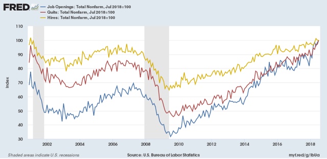
As I noted a month ago when I first presented this graph, while the rate of job openings is at an all time high, the rate of actual hires isn't even at its normal rate during the several best years of the last, relatively anemic, expansion. Meanwhile one month ago quits tied their best level of 2001 (at the end of the tech boom).
In other words, as we saw when we looked at the NFIB data earlier this week, the employer taboo against raising wages is continuing. In response, employees have reacted by quitting at high rates to seek better jobs elsewhere.
So in summary, the July JOLTS report continues to show a thriving employment market, but a market that is not in wage equilibrium, as employers are failing to offer the wages that employees demand to fill openings.
Wednesday, September 12, 2018
Real median household income rose 1.8% in 2017; poeverty rate declined
- by New Deal democrat
The Census Bureau reported this morning that *real* median household earnings rose 1.8% in 2017. Here's their presentation graph:

This is another score by Sentier Research, whose monthly estimates have accurately forecast the Census Bureau's (very tardy) annual reports and showed, on an annualized basis, growth in 2017, but on an averaged basis less than that from 2014 to 2015, or 2015 to 2016:

Remember a couple of caveats:
- "households" includes *all* households, including, e.g., year-round college roommates and, especially, retirees. Retirees' income is typically only about 1/2 of that of workers, so hoardes of retiring Boomers are affecting the median.
- "income" is more inclusive than "wages." For example, stock dividends interest on bonds are forms of income.
That being said, real income from full-time employment actually *declined* in 2017:

The difference between the rise in "all workers'" incomes on the left, and that of full-time employees on the right, is the increase in the number of hours worked by part-time workers, including transitioning to full-time employment. Recall that involuntary part-time employment has been declining sharply over the last 18 months:

The poverty rate did decline, so that is a definite plus:

What I still haven't found, and will update when I do, is real median household income by age cohort (that will take care of the issue of the increasing percentage of retiree households).
Tuesday, September 11, 2018
Decelerating trends in 5 long leading indicators
- by New Deal democrat
I have a new post up at Seeking Alpha, "Five Long Leading Indicators 'On the Cusp'."
The post follows up on my "Weekly Indicators" paradigm with graphs showing what the trends look like for aforesaid five series which have been hovering at the borderlines of being positive to neutral, or neutral to negative, over the past few months.
If you like my work, putting a little jingle in my pocket by clicking the link and reading is a nice thing to do.
The Taboo against raising wages is still thriving among small businesses
- by New Deal democrat
The National Federation of Independent Businesses (NFIB) put out its monthly confidence and hiring reports over the past few days.
The confidence report soared to new high, so the economy is Teh Awesome and happy days are here again! Right?
And look! It's confirmed by the hiring report, which also shows record high plans to hire new workers:

So how have those record hiring plans been working out? Ummm, not so well ....

When it come to, you know, actual hires, small businesses have not added any more workers than they have since 2013. With a big *actual decline* in the month of record desires to hire.
Leading to record numbers of unfilled openings:

Oh.
So what could possibly be behind this market failure, where employers can't seem to be able to find workers to fill those record openings?
Well, do you see anything in the below chart that sticks out like a sore thumb? You know, the only things with a dash or red arrow:

Yeah. *Lowering* compensation plans, and *zero* actual changes to compensation. That will do the trick.
Forget "monopsony" employers. The Taboo against raising wages is very much alive and thriving in small business.
Monday, September 10, 2018
Scenes from the August jobs report
- by New Deal democrat
1. The strong trend of people entering the jobs market and getting jobs remains intact
Here's a nice graph put together by Kevin Drum at Mother Jones showing both a linear and curvilinear trend line (which are nearly identical) (red) with the prime age employment to population ratio (blue):

The trend is intact and quite positive, despite the one month decline.
2. Involuntary part-time employment is near 25 year low levels
The below graph is of involuntary part time employment as a share of the entire labor force, from which I have subtracted 2.7% to norm the rate at zero:

Involuntary part time employment -- the primary addition forming the basis of the broad U6 underemployment rate -- has dropped to levels only seen for two months in the 2000s expansion, and exceeded for 3 years at the end of the 1990s internet boom.
3. But the percent of those who aren't even looking for work but want a job remains slightly elevated and has started to increase
The below graph is of those "not in the labor force who want a job now" as a percent age of the entire labor force, from which I have subtracted 3.15% to norm the recent low from March to zero:

This has never returned to either 1990s or 2000s levels, and has risen in the last 5 months. It might just be noise, or it might not.
4. Goods-producing employment has been soaring . . . BUT
This graph comes from Matt O'Brien at the Washington Post. Goods producing jobs have recently risen at 35 year highs:

This is mainly due to two things: (1) the post-2016 recovery in the Oil Patch; and (2) truck and railcar production. The latter is *extremely* pro-cyclical, as a mere slowdown in growth at the final goods levels means a sharp downturn in the orders for new trucks and railcars to support that growth.
One important note of caution about this trend: in the past, even a two month sequential decline in the rate of growth of goods producing jobs has usually meant a sharp cyclical slowdown at minimum. I counted only 3 occasions in the last 50 years where that was not the case.
And on that note, August growth slowed down from 3.75% YoY to 3.5% YoY. Since I am expecting a sharp slowdown in the economy by about midyear next year, if a second straight month of deceleration were to be reported next month, that would be a significant yellow if not red flag.
Subscribe to:
Posts (Atom)