Saturday, September 23, 2023

Weekly Indicators for September 18 - 22 at Seeking Alpha


 - by New Deal democrat


My Weekly Indicators post is up at Seeking Alpha.

With interest rates at or near multi-decade highs, and the existing home market completely seized up, the background financial condition have trended even worse. Meanwhile the shorter term indicators may be getting reading to peak. But their previous sharp increase has worked its way into most of the coincident data.

As usual, clicking over and reading will bring you right up to the virtual moment, and reward me with a couple of centavos for my efforts.

Friday, September 22, 2023

The Big Picture of the housing market, and its almost complete bifurcation, in 3 easy graphs


 - by New Deal democrat


I want to spend some time commenting on the broader issue of why the public perceives that inflation is still rampant, even though almost all official measures show it rapidly decelerating, and even completely absent on a YoY basis currently by a few measures. A big part of that has to do with housing, and since I’ve discussed several facets of that issue in discussing the data releases this week, I wanted to pull that together into a “Big Picture” summary. I do that in 3 simple graphs below.

Graph #1: Active listing counts of existing homes (red, left scale) vs. new housing under construction (blue, right scale):


The average mortgage on an existing home is something like 3.5%. Huge numbers of people either bought or refinanced when mortgage rates were 3%, and now those people are locked in. For example, a $1000 monthly interest payment at 3% is a $2333 monthly interest payment at 7%. Those people are locked into their existing home for the foreseeable future.

As a result, the existing home market has collapsed. As I showed yesterday, sales are near 25 year lows. The active listing count above, which averaged 1.3 million in the years prior to the pandemic, even with a modest recovery in the past year is still only about 700,000, a -600,000 decline.

Meanwhile the number of new homes under construction has risen from about 1.125 million annualized in the years before the pandemic to about 1.725 annualized, a mirror image +600,000 increase.

In other words, the seizing up of the existing home market has diverted people to the new home market.

Graph #2: median price of existing (red) vs. new (blue) homes:


The NAR only lets FRED publish the last year of their price data, which is not seasonally adjusted, but that is fine for today’s purposes, so the above graph compares it with the not seasonally adjusted price data for new homes.

The lack of inventory of existing homes means that prices got bid up, and remain bid up. Builders responded by building lots of new units, and unlike existing homeowners, they can respond to market conditions by varying their price point, which the above graph shows they have done. The median price for a new home went down -$100,000, or 20%, a few months ago, and is still down about -15% from its peak last year.

Graph #3: Single vs. multi-family units under construction:


The Millennial generation and the first part of Gen Z are well into their home-buying years. But because they have been priced out of large parts of the market, due to both the aforesaid big rise in mortgage rates, but also the post-pandemic increase in prices, they have had to downsize their target from single family homes to the less expensive condos or apartments.

As part of their adjustment described above, apartments and condos are being built hand over fist, and builders are offering price or financing concessions. Single family houses under construction have declined by about 20% from summer 2022, while multi-family units soared to a new all-time record, about 20% higher than their level in summer 2022.

It’s the housing version of shrinkflation, since - although the data isn’t easily available - I think we can take notice of the fact that apartment and condo units are considerably less expensive on average than single family detached houses.

[As an aside, note that a very similar thing happened in the 1970s when the Baby Boom generation was well and truly into their first home-buying years. While the Millennial generation is slightly bigger numerically than the Boomers, since the total US population was only 50% of its current size back in the 1960s, proportionately the Boomers had an even bigger impact on the market.]

That’s the Big Picture of the almost complete bifurcation of the current housing market. The “shrinkflation” I’ve described above is very much a part of why the public continues to believe that inflation remains a big problem. 

Thursday, September 21, 2023

With sales near 25 year lows, the huge divergence between the existing and new home markets continues


 - by New Deal democrat


The drastic bifurcation between the new and existing home markets continues. Existing home sales fell to 4.04 million annualized in August, the lowest level of the entire past 10+ years except for last December and January. In fact, with the additional exception of a number of months during the great home bust during and right after the Great Recession, it’s the lowest level of the past *25* years:


This is a market that is in utter collapse, down about 40% from its peak several years ago.

The reason for the collapse, as I have noted several times in the past few months, is that existing homeowners are essentially locked in place by their 3% original or refinanced mortgages. They’re not selling, and they’re not going anywhere in the foreseeable future. Such houses as are on the market are disproportionately from people who have no mortgages, and so are insensitive to those rates.

With inventory so restricted, prices have held firm. Indeed, the median price was above  $400,000 for the third month in a row (blue line), at $407,100, and is up YoY for the second month in a row (shaded gold area), at +3.9%:


All of this has been driving buyers to the new home market, where builders have been cutting prices and engaging in other incentives, and in particular the less expensive multi-family units, which made continual new records until their very slight decline this month, as I pointed out a couple of days ago.

To show you the contrast, here is a graph of the YoY% change in new home prices (red, left scale) compared with new home sales (blue, right scale):


The median price of a new home is down -8.7% YoY. The number sold remains higher than at any point in the last expansion except for four months in 2019.

So long as the Fed keeps interest rates elevated, I do not see this changing anytime soon.

Initial jobless claims: unresolved seasonality obscures cautionary YoY comparisons


 - by New Deal democrat


For the last few weeks, I have been highlighting that there is likely some unresolved post-pandemic seasonality in the initial claims numbers. That certainly looked like the case this week, as a sharp decline mirrored a similar sharp decline 52 weeks ago.


To wit: initial claims declined -20,000 to 201,000, the lowest number since February. But exactly one year ago, they declined -5,000 to 192,000, part of a -24,000 monthly decline to a 50 year low of 182,000 on September 24th.

The 4 week average this week also declined -7,750 to 217,000, also the lowest since February. And continuing claims, with a one week delay, declined -21,000 to 1.662 million, the lowest since January:


But the YoY% changes make clear the effect of unresolved seasonality. On that basis, weekly claims were higher by 5.2%, the 4 week average by 10.4%, and continuing claims by 28.9%:


The 4 week average being higher by more than 10% YoY is enough to maintain the “yellow caution flag” but not over the 12.5% threshold that, if maintained for 2 months, would warrant a “red flag.”

On a monthly basis, despite the big declines on a weekly basis, so far September is running 11.8% above last year:


.That suggests that the unemployment rate over the next few months is likely to trend towards 3.9%-4.0% (1.118*3.6%, the average unemployment rate in summer and autumn last year). The “Sahm Rule” for recessions would only be triggered by an average unemployment rate of 4.0% or higher this coming winter, which would be 0.5% higher than last winter’s average of 3.5%


Wednesday, September 20, 2023

Using the stock market and unemployment as an easy and timely coincident recession indicator


 - by New Deal democrat

My fellow forecaster Bob Dieli has a measure he calls “DeltaDelta,” basically an average of the YoY% change in the stock market and the unemployment rate (which hopefully he won’t mind me mentioning here). It called to mind that occasionally in the past I have noted that a YoY decline in stock prices is a yellow flag for a potential recession, although there are many false positives. I wondered whether the signal might improve if, rather than averaging the two, for a signal I insisted that each of the measures be negative YoY. So here’s where that led me.


First, here’s what the YoY% change of the average of the two measures - stock market and unemployment rate - goes back to the beginning of the Wilshire 5000 total market index over 40 years ago (S&P only lets FRED publish the last 10 years of that measure, but since on a YoY basis it is virtually identical to the Wilshire 5000, there’s no loss):


This measure occasionally leads and occasionally lags by several months, but overall is a good coincident indicator. There are a few false positives, notably two months in autumn 1988, and one month each in 1992 and early 2019. Interestingly, it was also negative last December and this past March.

Now let’s see what it looks like divided up, and also divided into pre- and post- pandemic lockdown sections:


The false positives all go away, as do the two below 0 readings in the past year. On the other hand, this look misses the 1980 recession. It occurred to me that adjusting stock market returns for inflation might take care of that, and it did:


Interestingly, it also indicates a slightly below 0 readings from this past April.

Finally, because initial jobless claims lead the unemployment rate, I substituted the former for the latter, and here’s what I got:


It doesn’t improve the model, partly because I need to adjust initial claims by 10%, and partly because stock market returns often don’t turn negative YoY until after a recession begins.

Still, I think tracking both stock market returns as well as either the unemployment rate or initial claims YoY does add value. That’s because the former generally provides a measure of the broad producer side of the economy (vs. for example the ISM manufacturing index, which only measures one slice of it), while the former provides a measure for the consumer side. At present what it is telling us is that the consumer is likely weakening, while producers still see clear sailing in the months ahead.

Since the stock market bottomed at the beginning of last October, for the next several months YoY comparisons will be easy:


In my weekly updates, to avoid noise and being whipsawed, I look at the last 3 months to see if the stock market has made a new high or low. At the moment the market is a positive, given the 12 month high it made at the end of July. Unless the market makes a new 3 month low, that rating will continue until at least the end of October.

Tuesday, September 19, 2023

The long awaited downturn in multi-family construction may finally have happened


 - by New Deal democrat


With the relative fading of manufacturing in importance to the US economy, the leading construction sector has assumed even greater importance. And the most important data about construction are the leading, and long leading, data about residential housing construction.


To give a little additional framework, typically the first data to turn are new home sales. But that data series is extremely noisy and heavily revised. The next data to turn are housing permits, and the subset with the least noise and most signal are single family permits. Next are housing starts, which are much noisier than permits, although they represent actual economic activity. Perhaps surprisingly, next in line are housing completions. Bringing up the rear, but representing the actual sum of economic activity in housing, are housing units under construction. 

And as I have pointed out almost every month for the past year, because of pandemic bottlenecks in production of relevant materials, units under construction have lagged by a particularly long time.

That may finally have changed this month.

Let’s start with permits (Note: In each of the graphs below, blue represents the total (on the right scale), gold single family units, and red multi family units). Permits have rebounded since their bottom in January, and made a 10 month high:


Single family permits, which convey the most signal, participated in that increase, rising to their highest level since May 2022. This is good news (but we’ll come back to that below). Meanwhile, while they did rise, multi-unit permits continued to languish near their 3 year low set in June.

Starts, on the other hand, declined sharply in August. Perhaps most significantly, multi-family starts declined to their worst level since August 2020 (not shown):


Because starts are so noisy, take this with a big grain of salt.

But the biggest news was what happened with units under construction. The total declined slightly, as did single family units. But most significantly, for the first time since February 2021, multi-family units under construction also declined, albeit only by 2,000 units annualized:


Why is this so important? Because, as this long term historical graph shows, total housing units under construction, although the most lagging of housing construction statistics, have also had to turn down before recessions begin:


Even moreso, as shown above multi-family units under construction, which typically turn after single family units, have also usually (except for 2008 and the pandemic) turned down before recessions have begun.

So the fact that multi-unit dwellings under construction may finally have made their turn is significant in terms of meeting the conditions for a recession to begin. If this continues, the final thing to look for is if total units under construction decline 10%, which is the average decline before the onset of recession.

In that regard, finally let’s return to permits. As I have written dozens of times in the past decade, mortgage rates lead permits. Here’s the 40 years between the beginning of the modern data and the end of the Great Recession:


With the exception of the housing bubble (where everyone “knew” that “housing only goes UP!” so continued to buy housing even after mortgage rates increased) and the mirror-image bust, permits for housing reliably followed mortgage rates.

Here’s the subsequent 10+ years through the present:


The typical leading / lagging relationship re-asserted itself. And as you can see, with mortgage rates reverting to over 7%, on a YoY% basis they are forecasting permits to turn back down perhaps by 20% or more from already depressed levels YoY as well.

It will take another couple of months’ worth of data to be more confident, but it certainly appears that the turn I have been waiting for in the housing market has finally happened. This is an important reason why, while I have removed the “recession warning” from the end of last year, the “recession watch” remains, pending a return down of several short leading indicators like vehicle sales and the stock market.

Monday, September 18, 2023

The 2 big reasons (one obvious, one subtle) why real median household income declined in 2022


 - by New Deal democrat


Last week, with its usual very big lag, median household income was reported by the Census Bureau for 2022. If, given big wage gains and hiring in 2022, you were expecting a significant increase, well, that didn’t happen. Instead, real median household income declined -2.3% from $76,330 in 2021 to $74,580:


Unsurprisingly, the WSJ was out of the box with an article crowing that it showed the failure of Bidenomics. And maybe more surprisingly, there has been little debunking from the progressive side.

Since I am all about the data, and letting the chips fall where they may, I decided to take my own in depth look. So, why did real median household income fall last year? There were two big reasons, one glaringly obvious, the other surprisingly subtle.

1. There were no COVID stimulus payments in 2022.

In 2020 and 2021, there were 3 rounds of COVID stimulus payments to almost all households. That’s a big reason why in 2020, despite massive job losses, real median household income only declined -2.0%. There were smaller stimulus payments in spring 2021, that helped real median household income hold up, relatively speaking, declining only -0.4%.

The stimulus payments in 2021 were $1400 per household member up to $2800. Even the smaller amount was equivalent to 1.8% of real median household income in 2021.

In 2022, those disappeared. So right off the bat, a decline in real median household income in the range of -1.8% to -3.6% might be expected.

And the Census Bureau confirmed the same, right on page 1 of its report:

“Real median post-tax household income exhibited a substantial decline in 2022 from 2021. This was due in part to the expiration of policies introduced in response to the COVID-19 pandemic, such as Economic Impact Payments and the expanded Child Tax Credit.”

It would be nice to know what real median household income would have been leaving aside the stimulus payments, but unfortunately that information is not contained in the report. But a -2.3% decline after payments of 1.8% or more of income ended is hardly out of the ballpark.

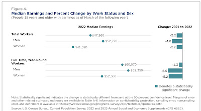
But the Census Bureau’s report does provide important further detail, because they *also* calculated real median household income based on wage and salary payments alone. Here’s what the page 1 summary said about those:

“The real median earnings of all workers (including part-time and full-time workers decreased 2.2% between 2021 and 2022, while median earnings of those who worked full-time, year round decreased 1.3:”


This is more problematic at first, but leads us to the second, surprising big reason that median income declined: 

2. The -6.1% decline in the broad stock market.

A big stock market decline is exactly what we *wouldn’t* expect to be behind a decline in earnings. But it comes in through the back door via a big decline in the vesting of stock options.

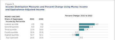
The first clue is that the lower quintiles of households generally did *better* in 2022 than 2021:


Here’s how the Census Bureau defines “income” on page 19 of the report (with some summary headers by me):

“[Wages, salaries, and other employment compensation:]
1. Earnings.

[Govenment transfer payments:]
2. Unemployment compensation.
3. Workers’ compensation.
4. Social Security.
5. Supplemental Security Income.
6. Public assistance.
7. Veterans’ payments.
8. Survivor benefits.
9. Disability benefits.

[Deferred employment compensation:]
10. Pension or retirement income.

[Investment income:]
11. Interest.
12. Dividends.
13. Rents, royalties, and estates and trusts.

[Other transfer payments:]
14. Educational assistance.
15. Alimony.
16. Child support.

[Miscellaneous others:]
17. Financial assistance from outside of the household.
18. Other income.”

First and foremost, note that investment income (but not capital gains) are included in the calculation of household income. While interest payments of *existing* investments generally did not benefit from the increase in rates, so did not raise income, the big decline in the stock market certainly *did* affect some dividend payments, as firms that are not doing well tend to cut or even forego dividends. That is going to take a chunk of income out of the leisure class, which did the worst in 2022.

But that isn’t the whole story, because remember that “earnings” alone declined in 2022. But it turns out that regular wage and salary payment omit a significant chunk of “earnings.” That’s because the vesting of stock options are frequently counted as earnings, as indicated by the IRS:

You have taxable income or deductible loss when you sell the stock you bought by exercising the option. You generally treat this amount as a capital gain or loss. However, if you don't meet special holding period requirements, you'll have to treat income from the sale as ordinary income. Add these amounts, which are treated as wages, to the basis of the stock in determining the gain or loss on the stock's disposition.”

When the stock market goes down, as it did in 2022, fewer stock options meet vesting requirements, which are usually tied to an increase in the company’s stock price. Less vesting means less cashing in, which means less income reported.

How big a deal was that in 2022? While we don’t have national figures, California does keep track of this, and its Department of Revenue noted how important it was last year. Let me give a little background first.

As you probably recall, I keep close track of tax withholding payments, which are based on earnings and, because of Social Security and Medicare caps, are not as distorted as other measures might be by billionaires’ compensations.

And in the last 4 months of 2022, tax withholding payments were virtually unchanged, even in nominal terms (i.e., before the 7.9% CPI increase), from the equivalent months in 2021, as shown in the below graph of the monthly YoY% changes for the past serval years:


Matt Trivisonno helpfully keeps track of the YoY% change of the entire previous 365 days of withholding payments, and as you can see from the below graph, for the entirety of 2022, withholding payments were only about 6.5% higher than 2021, i.e., about a -1.4% decline:


Additionally, the QCEW is a virtual census of all job gains and losses, and wage and salary payments for all employers. It is updated quarterly. For the 4 quarters of 2022, in chronological order the YoY% changes in payments were: +6.7%, +4.3%, +6.7%, and -2.3%. The 4 quarter average was +3.85%, well below the inflation rate.

Now let’s go back to California. Its Department of Revenue periodically updates how well its income tax withholding collections are doing in comparison with previous budget estimates. And in the last quarter of 2022, they fell off a cliff:


The Department of Revenue looked into the sudden falloff, and determined that the most likely reason was a huge shortfall in the vesting of stock options. As they explained:

 Some private sector employers pay employees bonus salary at different times of the year. Some bonuses reflect the overall business climate—notably holiday and year-end bonuses—while other bonuses are based on productivity. Productivity bonuses are often paid more frequently, typically at the end of each month or quarter. So far this fiscal year, income tax withholding during the last few days of each month, when bonuses are typically withheld, is far below 2021 levels. Specifically, the figure below shows that withholding during the final week of each month is 12 percent lower this year, despite withholding from the first three weeks of each month being higher in 2022. This dynamic reflects growing employment overall but a potentially sharp drop-off in month-end bonuses.”

It’s reasonable to suggest that California’s experience was not unique. And if the failure of stock options to vest caused a big shortfall in income tax withholding in the 4th quarter of last year, that would be very much in accord with the QCEW experience, and the poor YoY nationwide income tax withholding results late last year.

And that is in exact accordance with the income distributional chart supplied by the Census Bureau as to median earning income, shown above.

The final persuasive evidence comes from the below graph, in which I show the YoY% changes in average hourly earnings, aggregate nonsupervisory payrolls, nominal median household income, and inflation for the past 10 years:


Note the significant divergence of household income from jobs and payrolls in 2013 and 2014, and the large divergence in 2019. None of those years featured any huge economic upturn or downturn. But they *did* feature changes in tax law. The former featured the ending of the 2% withholding tax holiday, causing an increase in withholding in 2014 vs. 2013. The latter featured the taking effect of the pro-Billionaire tax law of 2018, but which also included a near doubling of the standard tax deduction and a slight decrease in many tax brackets.

In other words, significant changes in earnings income have on multiple occasions are Ibsen from either tax law changes and/or the behavior of financial markets.

One final caveat: nevertheless, the big increase in gas prices in early 2022 certainly did not help. As shown in the below graph of median real hourly wages, after the initial pandemic distortions higher (because mainly lower wage workers got laid off), after service workers were largely hired back, real hourly wages declined through mid-2022 before gradually rising back to trend:


Because aggregate payrolls rose so strongly, this probably was not enough without the additional downturn in the cashing in of stock options to translate into an actual decline in real median household earnings in 2022, but it certainly didn’t help.

Conclusion

The big decline in real median household income in 2022 was hardly a failure of “Bidenomics.” If anything, it reflected the success of Congressional stimulus payments under both the last year of Trump’s presidency, as well as the first year of Biden’s, in keeping the nation from a deeper downturn during the worst of the pandemic.

Further, the stock market decline of 2022 - which was largely responsible for the failure of stock options to vest - was more than anything else about the Fed’s aggressive rate hike policy, which was widely anticipated, and further widely anticipated to cause a recession, not because of any fiscal policies by Congress or the Administration.