Saturday, April 13, 2019
Weekly Indicators for April 8 - 12 at Seeking Alpha
- by New Deal democrat
My Weekly Indicators post is up at Seeking Alpha.
Lower interest rates have to some extent been offset by weaker real money supply. In any event, they haven’t fed through into other, shorter term indicators just yet.
As always, clicking over and reading should bring you up to date on the economy, and reward me a little for my efforts.
Friday, April 12, 2019
The economy in 2019: a look at the “big picture”
- by New Deal democrat
Although I have a bunch of nerdy forecasting models, I view my primary mission as trying to explain what is going on in the economy for ordinary middle and working class American workers and consumers.
I’ve been meaning to do a “30,000 foot perspective” on the economy for awhile, to draw together all the information into a Big Picture narrative. Well, I finally got around to it, and it is up at Seeking Alpha. This is something that should be of particular interest to those who have followed me all the way back from my Daily Kos days.
The most overlooked feature of the economy in the past five years has been the way low gas prices have allowed room for the economy - and real wages - to grow without being strangled by high interest rates.
Thursday, April 11, 2019
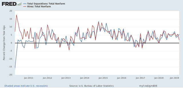
February JOLTS: a mirror of the poor jobs report
- by New Deal democrat
The JOLTS report on labor is noteworthy and helpful because it breaks down the jobs market into a more granular look at hiring, firing, and voluntary quits. Its drawback is that the data only goes back less than 20 years, so from the point of view of looking at the economic cycle, it has to be taken with a large dose of salt.
With that disclaimer out of the way, Tuesday’s JOLTS report for February generally mirrored the poor jobs report (+20,000, revised to +33,000) for that month. With the exception of one new high, the other series are off their best levels, and two continued to decline:
- Quits declined -0.1% from their peak of one month ago.
- Hires declined and are -3% off their October peak.
- Total separations rose slightly but remain about -2% off their peak in last July.
- Job openings declined about -7% from their October all time high, which was virtually tied one month ago. While this is a sharp decline, it has typically happened once or twice a year in this series even during expansions.
- Layoffs and Discharges rose slightly and remain about 9% higher than their September 2016 low, although well below their levels of most of the past 18 months.
Let's update where the report might tell us we are in the cycle.
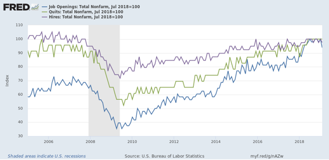
First, below is a graph, averaged quarterly through the fourth quarter, of the *rates* of hiring, quits, layoffs, and openings as a percentage of the labor force since the inception of the series (layoffs and discharges are inverted at the 3% level, so that higher readings show fewer layoffs than normal, and lower readings show more):
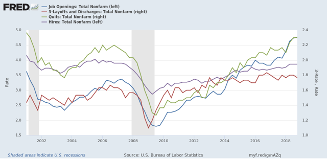
During the 2000s expansion:
- Hires peaked first, from December 2004 through September 2005
- Quits peaked next, in September 2005
- Layoffs and Discharges peaked next, from October 2005 through September 2006
- Openings peaked last, in Spril 2007
Now here's what the four metrics look like on a monthly basis for the last five years:
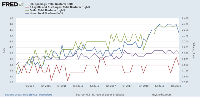
With the exception of layoffs and discharges, only hires and total separations *possibly* show signs of having made a cyclical peak at this point.
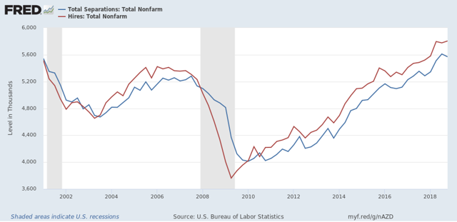
Next, here's an update to the simple metric of "hiring leads firing," (actually, "total separations"). Here's the long term relationship since 2000 through Q4 of 2018:
Here is the monthly update for the past five years:
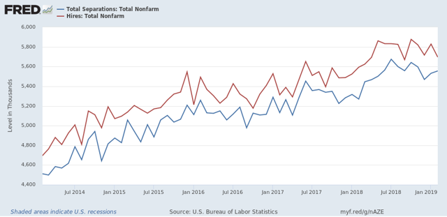
In the 2000s business cycle, hiring and then firing both turned down well in advance of the recession. Hires *may* have made their cyclical peak last July. If so, that would be sin line with what happened during the 2000s expansion, when hires peaked first, but it is obviously too soon to know for sure.
Further, while gains in each have decelerated on a YoY basis, as shown in the graph below, there is no sign of a significant downturn:
Further, while gains in each have decelerated on a YoY basis, as shown in the graph below, there is no sign of a significant downturn:
Finally, let's compare job openings with actual hires and quits. As you probably recall, I am not a fan of job openings as "hard data." They can reflect trolling for resumes, and presumably reflect a desire to hire at the wage the employer prefers. In the below graph, the *rate* of each activity is normed to 100 at its July 2018 value:
Now, here is a close-up of the last two years:
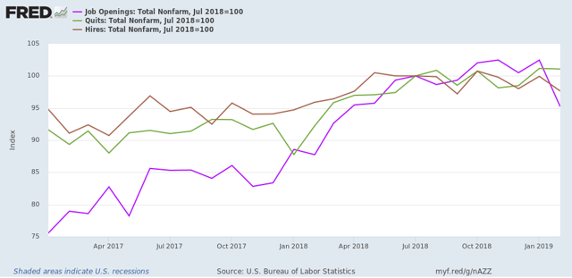
In 2018, my take was that employees have reacted to the employer taboo against raising wages by quitting at high rates to seek better jobs elsewhere. If the dam were finally breaking, we should see the hiring rate increase, and quit rate level off. With the most recent revisions, that is not the case, as quits have continued to increase slightly, while hires have decreased slightly.
In summary, the February JOLTS report reflected some of the same weakness we saw in that month’s jobs report, but there is no evidence of significance of any more profound downturn.
Wednesday, April 10, 2019
Real wages got gassed in March
- by New Deal democrat
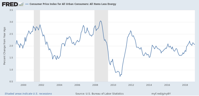
The consumer price index rose +0.4% in March, mainly as a result of a big monthly increase in gas prices. That really shouldn’t have been a surprise, since almost every time gas prices have increased by as much as they did in March — up 9% for the month — consumer prices as a whole have gone up at least +0.4%. I’m showing just the last 10 years in the graph below:
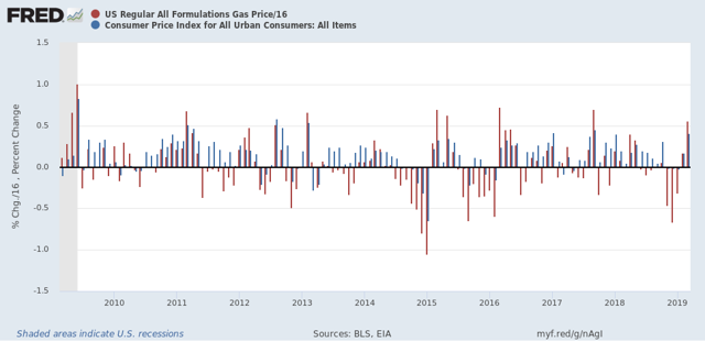
In fact, ex-gas, consumer inflation ex-energy has been remarkably stable between 1.5% and 2.5% YoY ever since gas prices made their long term bottom in early 1999. The only big exceptions were in the year before each of the last two recessions:
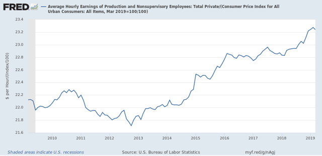
As a result of the 0.4% jump in inflation, real wages for non-supervisory employees, which went up +0.3% last month, actually declined slightly:
On a YoY% basis, real wages also decelerated slightly, down to +1.4%. Here’s the big picture look going back over 50 years:
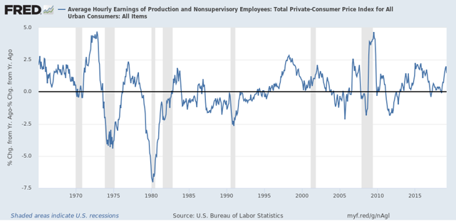
Just one month, so not a big deal. Unless gas prices continue to increase at this rate for several more months, in which case headline inflation will be significantly over 2%, and the Fed may feel compelled at very least not to lower rates. In that regard, it’s worth noting that, as shown in the above graph, the typical late cycle pattern over the past 50 years is for wages to increase more than earlier in the cycle, but for the inflation rate to rise even more.
Tuesday, April 9, 2019
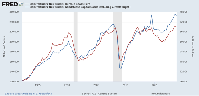
Downturn in manufacturing new orders adds to evidence of slowdown
- by New Deal democrat
I don’t normally pay much attention to the new factory orders report, because it is simply too noisy to be of much use. But as of February’s report, released yesterday and showing a -0.1% decline in “core” new orders, there is enough to at least take notice.
Here are overall new factory orders (blue, left scale) and “core” new orders (red, right scale) for the past 25 years:
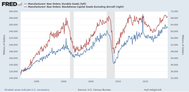
In the first place, while they clearly turned down in advance of the 2001 recession, which was a producer-led recession, that wasn’t the case at all, especially for “core” new orders, in the 2008 recession, which was consumer-led. Further, there is so much monthly noise that monthly readings don’t give you reliable signal until the turn is well underway.
To tease out more signal from noise, here is the same data as above, but on a quarterly basis (note since March data hasn’t been released yet, this ends with Q4 2018):
Much less noisy, but even here a one quarter downturn happens often enough in the middle of expansions that it really doesn’t give us helpful information.
Even two negative quarters in a row, while more helpful, still shows us negative readings in 1998 and 2015-16:
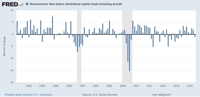
This can tell us that manufacturing is indeed in a downturn, but not enough to reliably forecast a recession.
Finally, here is the YoY% change in core new orders:
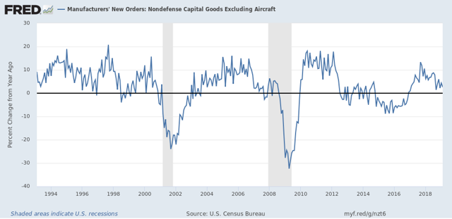
While a YoY decline for several quarters in a row has occurred before both of the last two recessions, that was also true of 1998 and 2015-16.
That neither overall new orders nor core new orders have made a new high in 6 months as of February, and are likely to be down two quarters in a row once we have March’s data, is certainly evidence of a slowdown in manufacturing. Only in conjunction with indicators from other sectors like construction and consumer spending could we draw any conclusions about an economic slowdown vs. something worse.
Monday, April 8, 2019
I told you so: the March employment report showed a slowdown in the leading sectors
- by New Deal democrat
For the past few months, I have been forecasting a jobs slowdown. That has been based in part on the natural progression of a downturn in long leading indicators, then short leading indicators, and finally to coincident indicators of which jobs along with industrial production are the Queen and King, respectively.
Further, I have pointed out that, even when the spread between short and long term bonds simply gets tight, even if there is no outright inversion, employment growth almost always falters. And goods-producing employment - including manufacturing and construction jobs - has *always* faltered in the past 60 years.
Finally, since temporary jobs are a well-known leading indicator for jobs as a whole, I have been expecting them to slow down if not turn down.
March’s jobs report delivered all of this in spades.
But I received a little blowback on this point, suggesting that the declines were trivial or that I was retrospectively cherry-picking to support a Doomish hypothesis. Far from it: this is something I’ve been forecasting for months in specific sectors, and in the last three months, even in the face of big overall employment gains, it has shown up.
So, to set the record straight, before I get to the March graphs, let me recap the literally 15 times I warned of a coming slowdown in manufacturing, construction, and temporary jobs, and in the goods sector generally. If you don’t want to read the “I told you so” part, just scroll right past number 15 to the bolded headline and you’ll get right to the March jobs graphs.
The 15 times I forecast an oncoming slowdown in leading employment sectors
1. Last August: the simple tightening of the yield curve suggests a subsequent jobs slowdown
2. In January, discussing The consumer nowcast and economic forecast
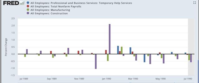
5. I followed that up with a post showing how manufacturing, construction, and temporary jobs have led the overall jobs numbers prior to each of the last three recessions, including the following three graphs .
2000-01
2006-07

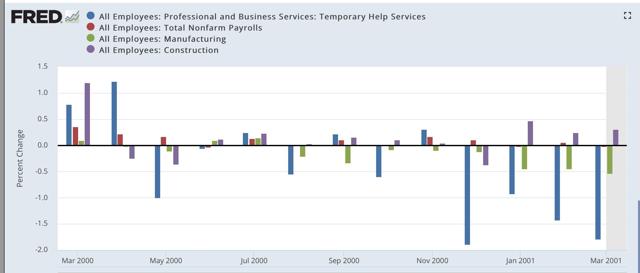
First, here is a m/m graph of manufacturing, construction, and temporary jobs, all of which are leading sectors for jobs as a whole:
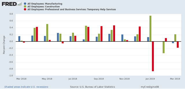
In the past three months, all three have faltered, with decelerating or outright declines in jobs. Note how similar this looks to the trend in the three pre-recession graphs of these sectors I posted under article #5 above.
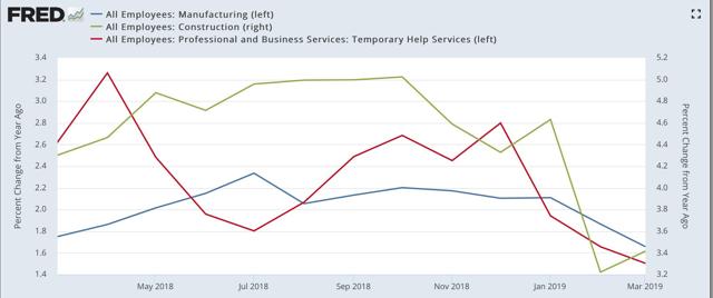
Here is the YoY look at the same three sectors, showing that all three have decelerated substantially:
Further, I have pointed out that, even when the spread between short and long term bonds simply gets tight, even if there is no outright inversion, employment growth almost always falters. And goods-producing employment - including manufacturing and construction jobs - has *always* faltered in the past 60 years.
Finally, since temporary jobs are a well-known leading indicator for jobs as a whole, I have been expecting them to slow down if not turn down.
March’s jobs report delivered all of this in spades.
But I received a little blowback on this point, suggesting that the declines were trivial or that I was retrospectively cherry-picking to support a Doomish hypothesis. Far from it: this is something I’ve been forecasting for months in specific sectors, and in the last three months, even in the face of big overall employment gains, it has shown up.
So, to set the record straight, before I get to the March graphs, let me recap the literally 15 times I warned of a coming slowdown in manufacturing, construction, and temporary jobs, and in the goods sector generally. If you don’t want to read the “I told you so” part, just scroll right past number 15 to the bolded headline and you’ll get right to the March jobs graphs.
The 15 times I forecast an oncoming slowdown in leading employment sectors
1. Last August: the simple tightening of the yield curve suggests a subsequent jobs slowdown
Four times during the 1980s and 1990s the difference in the interest yield between 2 and 10 year treasury bonds got about as low as it is now [Note: i.e., August 2018] (blue in the graphs below). That occurred in 1984, 1986, 1994, and 1998.
Even though on none of those 4 occasions a recession followed, on 3 of 4 of those occasions YoY employment gains ... subsequently declined ...
In other words, even if the Fed stops raising rates now [as of August 2018], and the yield curve does not get tighter or fully invert, my expectation is that monthly employment gains will decline to about half of what they have recently been -- i.e., to about 100,000 a month -- during the next year or so.
Keep an eye on these three areas (new orders, temp hiring, and new jobless claims). If these turn outright negative, that will be a very strong sign that poor public policy is causing what otherwise would just be a slowdown to tip all the way into recession.
Unsurprisingly, building permits lead construction employment. The lead time between the former turning negative YoY vs. the latter has varied between 5 and 23 months, but usually has been between 10 and 14 months. Currently, with the exception of one month, permits have been negative YoY since August.
[C]onstruction employment has usually turned down YoY before a recession....
4. Saying to also watch manufacturing jobs in the January jobs report
The number of manufacturing jobs themselves has also turned down in advance of recessions ever since 1974.
...the absolute number of manufacturing jobs reliably decelerates from peak before a recession begins, and usually declines, even if the YoY change does not turn negative.
At present, while the manufacturing work week has declined in recent months, the absolute number of manufacturing jobs has not followed.
The second conclusion, building on my last post concerning construction jobs, is that with the sole exception of the oil shock of 1974, no recession has ever started without at least one of the two - construction or manufacturing jobs - having moved down first.
5. I followed that up with a post showing how manufacturing, construction, and temporary jobs have led the overall jobs numbers prior to each of the last three recessions, including the following three graphs .
1989-90
2000-01
2006-07
6. After the January jobs report, pointing out some deterioration in the leading jobs sectorsh
7. Pointing out that the poor December retail sales report added to the evidence of an impending jobs slowdown
If the poor December ( retail sales) number isn’t revised away, or reversed by a big gain in the next months’ report, this portends a significant deceleration in jobs growth in the monthly employment reports over about the next 6 months.
8. Discussing how the Downturn in the American Staffing Index portended weaker temporary jobs numbers
All of which makes me think that the deceleration of temp jobs in the monthly report for the last three months, ... hasn’t just been noise, but - while still positive - is demonstrative of real weakness.
The bottom line is that almost all of the other economic data has been validating the “slowdown” forecast I made beginning last summer, and I expect employment to follow — and temporary jobs will probably lead the way.
Tomorrow I am looking for continued gains in both manufacturing and construction, but a cooling in manufacturing vs. continued trend growth to a slight deceleration in construction. In both cases this means gains of less than 30,000, and possibly as low as 5,000. Because the economy is slowing, and this should show up in jobs numbers, if there is a surprise in either or both, it will likely be to the downside.
Finally, I expect YoY overall jobs growth to begin to decelerate from its peak last month:
11. Discussing how the February jobs report did show weakness in the leading sectors
this month’s report actually went beyond taking back January’s report. The YoY change in construction, manufacturing, and total jobs for the last two months combined are all lower than they were in December.
In summation, I suspect this month marked the first month in which the economic slowdown showed up in the jobs report.
12. Again, Discussing the February jobs report
The bottom line is that, even averaging January with February, all of the leading employment indicators show some deterioration, but none of them are at a point where I would expect them to be if a recession were imminent.
13. In March, reiterating my August forecast for a slowdown in employment based on the tight yield curve:
...Even if the Fed starts to lower rates soon, I strongly suspect that January was the YoY peak in employment, and we have started down the road to roughly 100,000/month employment gains - if not worse - later this year.
14. Discussing how continued poor readings in the American Staffing Index forecast a poor number in temporary jobs in the March jobs report
After the 2015-16 shallow industrial recession, the growth in temp jobs picked up decently. But in the last four months, only about 2250 temp jobs per month have been added. I am looking for this decelerating trend to continue, and the decline in the Staffing Index indicates we shouldn’t be surprised if there is an outright loss in temp jobs in the report on Friday.
15. Pointing out that A tight or inverted yield curve has always led to a stall or downturn in goods-productions jobs, in the context of what to watch for in the March jobs report:
Note that in *every* case that the interest rate spread has inverted, or just decreased to nearly zero, within about 18 months YoY growth in goods-producing jobs has declined to less than 0.5%, and usually outright declined. That translates to an annual pace of not more than 7000 goods producing jobs a month. By contrast, in the past several years at least 20,000 goods productions jobs have been addedvirtually every month ...
So if history is a guide, a sharp slowdown in goods producing jobs growth should begin very soon, if not having already begun in February.
To the graphs: the jobs reports in the last three months have borne out my forecast for a deceleration or decline in the leading semployment sectors
First, here is a m/m graph of manufacturing, construction, and temporary jobs, all of which are leading sectors for jobs as a whole:
In the past three months, all three have faltered, with decelerating or outright declines in jobs. Note how similar this looks to the trend in the three pre-recession graphs of these sectors I posted under article #5 above.
Here is the YoY look at the same three sectors, showing that all three have decelerated substantially:
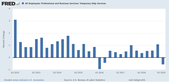
On a six month basis, temporary jobs are up by 500 out of 3 million! Here are the quarterly numbers, showing that Q1 of this year marked the first decline, aside from the downturn of 2015-16, since the end of the Great Recession:
By the way, if you don’t believe me that temporary jobs are a leading sector for jobs overall, then how about University of Oregon Professor Tim Duy, who wrote in connection with Freiday’s report that it contained “A Hint of Weakness;”
On the surface, this is another “Goldilocks” report – strong job growth, low and steady unemployment and nothing in the wage data to support inflation concerns. A hint of weakness, however, is visible in the temporary help numbers:
Next, here are goods-producing jobs (which include but are not limited to manufacturing and construction). Last week I wrote that I expected these to slow down to a rate of +7000/month. In the past two months, there was a loss of -28,000 in February, followed by a gain of +12,000 in March:
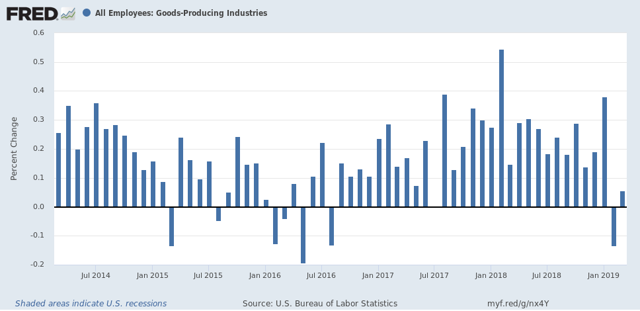
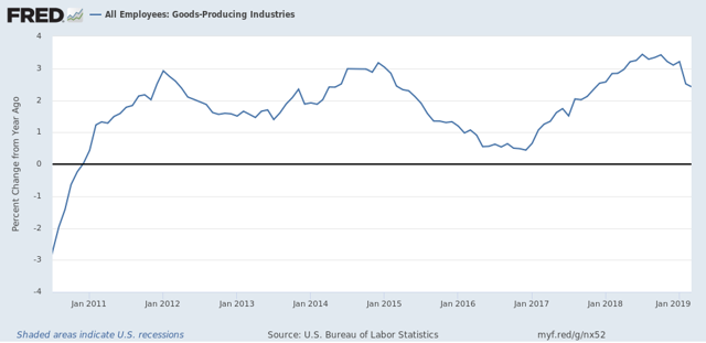
Here is the YoY look:
The last two months average to -8,000 per month.
Next, here is the YoY% change in nonfarm payrolls, showing a deceleration in the past two months:
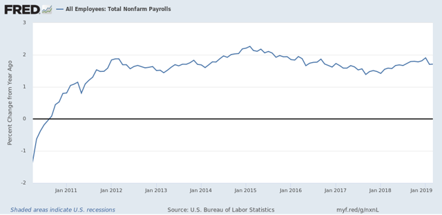
This is as I forecast.
Here is a comparison of YoY changes in nonfarm payrolls as measured b the establishment report vs. jobs as measured by the household report:
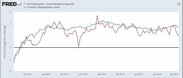
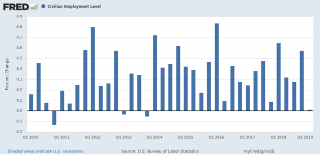
What is noteworthy is that, at turning points, it appears to be the case that the household report gives warning first. in that regard, this past month was one of the worst 4 months in the past 9 years:
Finally, here is a graph of the quarterly changes in employment since the beginning of 2018. Jared Bernstein, who is convalescing from a stroke, typically compares the 3-, 6-. And 12-month average in employment growth to show the trend:
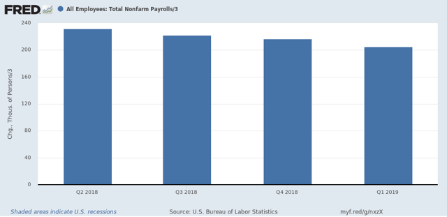
Here are the numbers:
3 month average: 205,000
6 month average: 208,000
Finally, here is a graph of the quarterly changes in employment since the beginning of 2018. Jared Bernstein, who is convalescing from a stroke, typically compares the 3-, 6-. And 12-month average in employment growth to show the trend:
Here are the numbers:
3 month average: 205,000
6 month average: 208,000
12 month average: 219,000
This shows a slow decline in the job growth trend overall.
This shows a slow decline in the job growth trend overall.
In sum, for three months I have been pounding the table to watch the leading sectors of manufacturing, construction, and temporary jobs. The three months since, including Friday’s jobs report, give every appearance of heralding the jobs slowdown I have been forecasting.
Subscribe to:
Posts (Atom)