Thursday, May 5, 2011

How Oil's choke hold on the economy will end

- by New Deal democrat

For the second time in two years, Oil's choke hold on the economy is asserting itself. Acceleration in recovery causes acceleration of demand, and acceleration of Oil prices - which causes the economy to stall. That choke hold won't go on forever, though. There are three forces that will combine to bring it to an end: alternate fuels, conservation, and exploration.

1. Alternate fuels and technology

Perhaps the most promising alternate fuel to oil is natural gas. According to the EIA, natural gas reserves increased 11.3% in 2010. Nautral gas exploration in the northeeastern US, Texas, and North Dakota is proceeding robustly, and we can expect natural gas usage to increase over the next decade.

In addition to natural gas, alternate technology in the form of hybrid vehicles is finally making up a small but significant share of vehicle sales. In 2010, hybrid vehicles made up ~2.5% of all vehicles sold. As gasoline prices have continued to increase, in the first three months of 2011:
Growth in highly fuel-efficient vehicles far outpaced the rest of the market.

In the first quarter of 2011, hybrids increased sales by 33.9 percent, while the overall market grew by 20.2 percent. In March, small cars— such as the Ford Fiesta and Honda Fit—grew at almost twice the rate of the overall market, 30 percent compared to 17 percent.
...
Hybrids and small cars are even bigger in the used car market.
Although this probably only means an increase to 2.7% of all vehicles so far, looking further out into the future, the recently released J.D. Power and Associates 2011 US Green Automotive Study
indicates major growth in consumer interest in green cars—including hybrids, clean diesel, plug-in hybrids and pure electric cars. The market research firm expects as much as 10 percent of sales to come from vehicles with these fuel-efficient technologies by 2016. That would represent a four-fold increase in the sales numbers for green cars
If $4 gasoliine becomes the norm, I suspect that estimate may be substantially to the low side.

2. Conservation

The fact is that the 2008 Oil spike and the "great recession" have left a substantial dent in US Oil consumption, as shown in this graph of weekly usage:


Continuing high gas prices are once again having an impact an auto buying. While April as a whole logged in at 13.1 M vehicles sold on an annualized basis, the Detroit News reported that:

April started strong, but took a dive as gas prices spiked, storms ravaged the Midwest and South, and parts supply shortages in earthquake-stricken Japan squeezed new car and truck inventories, analysts say.
Furthermore, as I noted above, there has been a marked shift not just to hybrid vehicles, but also to smaller, more fuel efficient models.

Over the short term, demand for fuel is inelastic, but over the longer term we can see that people do adopt strategies to conserve energy usage in the face of high prices. As in 2008, high gas prices are causing an increase in the use of mass transit. For example, in the Miami, FL area mass transit usage is up 11% compared with last year. Other areas, such as Philadelphia, have shown similar increases.

3. Exploration

In addition to opening up natural gas exploration, $100 Oil is causing renewed drilling for Oil in areas where it was previously unprofitable. As a result, US Oil production has actually increased in the last two years:


Additionally, deep water drilling in places like offshore Brazil, have led to discoveries such as this one noted in 2009:

Brasileiro SA, Brazil's state-controlled oil company, says its tests show the Guara deepwater offshore field holds between 1.1 billion and 2 billion barrels of oil and initial production may start in 2012 with 50,000 barrels of oil equivalent a day.
This deposit, known as the Guara field, is scheduled
to start pilot production in early 2013 at a rate of 120,000 barrels a day of oil and 5 million cubic meters a day of natural gas,
, according to Petrobras.

As the Wall Street Journal reported in 2009:

When this is added to the Tupi and Lara fields recently found by the Brazilian oil giant Petrobras, the total yield could be close to 12 billion barrels. It has been years since deposits of this size have been found anywhere.
The same article in 2009 reported on another huge find that has since taken on another significance:

BP (BP) last week said it found an oil field deep under the Gulf of Mexico that could yield as much as one billion barrels of oil and gas.
Yes, I think we know about that last "gusher."

In Summary, however, the Oil choke hold on the economy will not last forever. I claim no clairvoyange, but a good guess is that by 2013 or 2014, the combination of alternative fuels and technology, conservation, and exploration will relieve the current situation.

Initial Claims Scaring the Heck Out of Me

From Marketwatch:
The number of people who filed new applications for jobless benefits leaped 43,000 last week to 474,000, the highest level in almost nine months. A Labor official attributed much of the increase to temporary layoffs in the auto sector and in the state of New York, where workers in the educational field such as bus drivers are eligible for compensation during the week of spring break. Economists surveyed by MarketWatch had expected claims to fall to seasonally adjusted 412,000 from the prior week's revised level of 431,000. The average of new claims over the past four weeks, meanwhile, climbed by 22,250 to 431,250, the highest level since November. The four-week average is considered more accurate a gauge of employment trends because it lessens week-to-week volatility in the data. Also, the government said the number of workers who continue to receive state compensation increased by 74,000 to a seasonally adjusted 3.73 million in the week of April 23. Altogether, 8.01 million people received some kind of state or federal benefit in the week of April 16, down 171,547 from the prior week
This is clearly a major move in the wrong direction. More importantly, a jump like this is a signal of a huge slowdown coming. In short -- not good, not good at all.

Wednesday, May 4, 2011

Thursday Oil Market Round-Up

Last week I wrote the following about the oil market:
This week, I'm still left with the feeling that traders are sensitive to the overall price of gas. In addition, consider the fact that the oil market has not advanced due to the ongoing problems in the Middle East. And, we're starting to get word of decreased gasoline demand and a possible slowing economy in Q1.

While my feeling is not scientific, I'm still of the opinion there is not much upside room in the oil market, given gas' current price.
Let's take a look at the chart to see what it tells us:


Prices have hit strong resistance at the 114 price level. First, notice that as prices rallied to that level from the middle of April, they printed some very weak bars. When prices hit the 112 level, they printed several spinning tops and candles with weak bodies. Also of interest is the MACD which printed some very weak readings. While the EMA picture was strong, there was also the fundamental picture; gas is approaching $4/gallon, which is clearly having an impact on consumer behavior.

As such, we see that prices have again retreated from the 114 level, printing some strong downward bars. Let me add that I do not expect prices to crash; there is still very strong upward pressure from simple supply and demand. World oil supplies are tight, demand -- although weakening -- is still strong, the Middle East is still a tinderbox and we're entering the summer driving season in the US. Those facts provide strong support for prices.

In short, I don't see the market moving strongly in either direction. As prices approach the 114 level, I see them hitting resistance, especially as news of gas prices gets publicity. However, there are strong supports for the market as well.

Basically, I think we're in for a fairly tight trading range near term.

Is Manufacturing Out of the Woods?

Last week, I noted that three regional Fed manufacturing surveys had printed lower numbers in their latest reading. As I described it, the breadth of the data was concerning. This week we have two more data points to analyze.

From the ISM:

"The recent trend of rapid growth in the manufacturing sector continued in April as the PMI registered above 60 percent for the fourth consecutive month. The New Orders and Production Indexes continue to drive the PMI, as they have both exceeded 60 percent for five consecutive months. Manufacturing employment appears to have developed significant momentum, as the Employment Index readings for the first four months of 2011 are the highest readings in the last 38 years. Inventory growth also took place in April after two months of destocking; however, the inventory restocking would appear to be necessitated by the strong performance in new orders. While the manufacturing sector is definitely performing above most expectations so far in 2011, manufacturers are experiencing significant cost pressures from commodities and other inputs."


While this data point is lower than the preceding months, the reading is still very good alleviates some of my concern. 17 of the 18 industries reporting were showing growth, with the only laggard being furniture.

Here is what respondents said:


  • "Rapidly rising raw material costs putting extreme pressure on profits." (Food, Beverage & Tobacco Products)
  • "Plastic resin product prices are climbing so fast that [suppliers] are attempting to increase prices on orders already accepted but not [yet] delivered." (Chemical Products)
  • "Customers are rebuilding safety stock levels of inventory, and also trying to buy ahead of material price increases." (Plastics & Rubber Products)
  • "Market continues to get stronger month over month. Recovery is faster than anticipated." (Transportation Equipment)
  • "Pressure from offshore suppliers continues to mount with exchange rate increases and seasonal demand for capacity." (Miscellaneous Manufacturing)
One interesting point is that people and firms appear to be stocking up on supplies in anticipation of further price increases. That tells us that some of the current activity is probably speculative in nature. It also means manufacturers are probably getting squeezed by the increases and are looking to pass on some of those increases in higher prices if possible.

However, the overall report is still very strong and indicates manufacturing appears to be in good shape.

Factory orders also printed a strong number:

U.S. factory orders surged in March, posting a fifth straight monthly increase that showed a healthy manufacturing sector well placed to support economic recovery.

The Commerce Department said on Tuesday new orders for manufactured goods rose 3 percent to a seasonally adjusted $463 billion, well above Wall Street economists' forecasts for a 1.9 percent pickup.

In addition, February orders that had been reported as dropping by 0.1 percent were sharply revised to instead show a 0.7 percent increase.

A cheaper U.S. dollar has helped export industries and there are signs that producers are boosting investment in plants and equipment to benefit from it.

Orders for costly durable goods, items designed to last three years or more, were up 2.9 percent in March, the department said, an upward revision from a 2.5 percent gain it had earlier reported.

Financial markets showed no response to the data.

Orders for nondefense capital goods excluding aircraft -- often taken as an indicator of businesses' future investment plans -- were revised to show a 4.1 percent rise in March instead of a 3.7 percent gain. That followed a 0.9 percent increase in February.

The above reports help to alleviate my concern as they add more evidence to the argument that recent weakness is simply a blip.

David Leonhardt understands classical conditioning

- by New Deal democrat

On Monday I said:

I have argued . . . that [last summer’s slowdown] was a classic case of classic psychological conditioning. Dog hears bell, dog receives shock. The next time the dog hears the bell, it cringes, anticipating a shock. Last spring the Euro crisis recapitulated the early stages of the 2008 financial crisis. LIBOR rates surged. Businesses and consumers froze, fearing a repeat of 2008. (It also didn't help that Americans could see live video, 24/7, of a potentially cataclysmic Oil volcano erupting on the bottom of the Gulf of Mexico). The economy stalled. When the Euro crisis abated (and the well was capped), the economy unfroze.
Via Prof. Brad Delong, today we learn that David Leonhardt of the NY Times says:

Crises do so much damage that they leave businesses and households predisposed to believe the worst and to pull back at the first hint of economic weakness. Households are slow to resume spending. Banks are slow to lend, especially to small businesses. Companies are slow to hire.
Ding! Ding! Ding!

Economics really needs to understand, in dynamic fashion, classical and operant conditioning.

The Great Depression, Part 3

I want to continue with a look at the Great Depression from another angle, which is the percent the annual BEA data in a "contributions to percent change in GDP" format. This allows us to see what areas of the economy contributed to growth during a particular year.


The years 1930-1933 show a clear and devastating economic contraction. GDP dropped by 8.6%, 6.5% and 11.1% in the years 1930-1932 and a milder 1.3% in 1933. Most importantly, notice that literally all sectors of the economy are responsible for this contraction; PCEs and gross private domestic investment all decreased at sharp rates in 1930-1932. However, notice that government spending did little to stave off the decline; while it contributed to overall growth (that is it printed a positive number in the above chart) it did not add much. But while government spending did increase 10.2% in 1930, it only increased 4.2% in 1931 and contracted in both 1932 and 1933 (dropping 3.3% in both years from their previous years levels). As such, the lack of a contribution was the result of an unsustained fiscal stimulus effort.


The years 1934-1937 show a very different economy -- one of very strong growth. For the years 1934-1937, GDP grew 10.9%, 8.9%, 13% and 5.1% respectively -- all very healthy rates of growth. Most importantly, notice the increase was primarily the result of private sector factors with both PCEs and gross private investment adding to growth. Government spending did help, but this was hardly the public sector takeover many claim existed. However, also note that government spending did increase in these years (increasing 12.8%, 2.7% and 16.7% for the years 1934-1936, respectively) helping to add to economic growth (remember the GDP equation of C+I+X+G).


1937 brought a recession to the economy, which led to another contract. Notice that -- once again -- this led to a drop in PCEs and investment. However, by 1938 growth had returned.

Contra an Oil shock recession

- by New Deal democrat

A couple of weeks ago, I made the case that the Oil shock of 2011 had begun. Consumer confidence, on cue, had suddenly decreased. Buyers changed to more fuel efficient autos. Yesterday brought word that April auto sales totalled 13.1 M units annualized, slightly higher than in March but lower than February, meaning that vehicle sales have essentially flatlined for the last 3 months.

At least one more signature of an imminent slowdown was released in the first quarter GDP report: median compensation. Below is a graph of its YoY% growth (blue) compared with YoY% of inflation (green). Notice that every time inflation, mainly fueled by Oil prices, has surged - 2006 to $90, 2009 to $147, and now to $114 - such that YoY inflation overtakes YoY median wage increases, GDP (red) slowed down acutely within several quarters:


This doesn't tell us how long the increase in Oil prices will exceed that of wages, but we can certainly say that the longer it goes on, the more will be the damage.

In my post several weeks ago, however, I also said I did not foresee an actual new recession. There are several data series I track which argue that, even if there will be a slowdown or stall for several quarters, a recession is not likely. Certainly with the release of April's LEI (up .4) there is no indication of any downturn this quarter. Compare this with the LEI's in 2007 and 2008:


Secondly, in order to have a recession you have to have a downturn in economic activity, and that is usually led by housing. In fact, housing permits are one of the 10 LEI above. Well, housing has been on its back for so long, that it would be difficult for it to fall futher. Here is the graph in the change in housing permits month by month since the beginning of 2007:


When housing was in free fall, we got a recession. Housing has been flatlining for two years now. If it doesn't fall, it is nearly impossible for the economy to generate a significant downturn.

A third reason is that people might be better able to withstand $4 gas due to an increased cushion of savings. Here is a graph of total personal savings:


There is no doubt that consumers have more of a stock of $$$ "fuel" to fall back on to get through this Oil shock.

Finally, the real personal savings rate (the savings rate minus the inflation rate) is an excellent leading indicator for GDP in the future. While this has fallen significantly, it is still positive


-- and we have not yet seen the full effects of the very high level of savings for the last couple of years, as that stockpile of "fuel" is gradually expended.

All of these argue that the Oil shock, particularly if it is short-lived, will lead to a short stall rather than an actual renewed recession.


Wednesday Commodities Round-up

Below are six, longer term futures contracts. I have put them up to demonstrate the futures prices are falling or stalling in a number of markets. There are several reasons this is important.

1.) It lowers the possibility of inflationary pressures
2.) I could mean that supply/demand issues are coming back into balance
3.) There may be a bet that the world economies are slowing, thereby lowering futures demand.


Tuesday, May 3, 2011

Employment preview

- by New Deal democrat

With the updating of GDP and April sales data, let's take a look at two leading indicators for employment growth.

First of all, real YoY GDP (minus 2%) tends to lead employment by about a quarter or two. This relationship has held up well both during the "great recession" and also the recovery since then. Unfortunately it suggest that 3-6 months from now we will see very sluggish job growth. As in 5 figures, or possibly even one or two negative months:


Now here is the comparison including March real retail sales (which, you may recall, were negative for the first time since last summer):


This relationship gives room for more optimism, although candidly it is disappointing that the relationship has not fared so well during the recovery (although it is closer if we look at hours worked rather than jobs created).

We really need commodity prices and especailly gasoline to reverse trajectory. If there is another Oil-shock stall, there is going to be another stall in employment, which is the last thing we need.

India Raises Interest Rates 50 BP

From the WSJ:

India's central bank raised its lending rate by 0.50 percentage point Tuesday and announced a new monetary policy framework, escalating its fight against inflation even as it lowered its forecast for this year's economic growth.

The Reserve Bank of India, which usually increases lending rates by 0.25 percentage point at a time, on Tuesday raised a key lending rate by an unexpected 0.50 percentage point to 7.25%, highlighting the urgency of taming price pressures that threaten to dampen the country's economic growth.

.....

With Tuesday's hikes, the RBI has raised the repo rate by 2.50 percentage points and the reverse repo rate by 3.00 percentage points in little over a year.

.....

The RBI's attempts to tame inflation have been insufficient so far. Originally driven by food prices, inflation in recent months has hit manufactured goods as well, raising the specter of a wage-price spiral.

Headline inflation came in at 8.98% in March, nearly a full percentage point higher than the RBI's estimate of 8%.

The RBI expects the economy to expand around 8% in the current fiscal year, lower than the 8.6% the economy is estimated to have grown last fiscal year. The government expects the economy to grow as much as 9.25% this fiscal year.

While Brazil has lower overall inflation, they are in the same position: they have a growing economy that has inflationary pressures building up. As such, they will probably continue to raise rates as well.

This has important implications for the US dollar. As other countries raise their interest rates, their currencies will appreciate in value relative to the dollar, thereby lowering the dollar's value. In addition, most of these countries also have a higher growth rate -- another attraction for currency traders. In short, this news adds downward pressure to the dollar.

The Great Depression, Part 2

I'm going to continue looking at the Great Depression from a different perspective; that of the year to year percentage change in various GDP components. Unfortunately, the BEA's data is only for annual numbers.


The above chart shows the year to year percentage change in GDP. For the years 1929 to 1933 we see a contraction, but then strong growth ensures -- 10.9% in 1934, 8.9% in 1935 and 13% in 1936. 1937 shows a decrease in the rate of growth to 5.1% -- which is still good. 1938 shows a slight contraction followed by a rise of 8.1% in 1939. What this chart demonstrates very clearly is growth did occur in the later half of the decade -- and the growth was of strong rates.


The early years of the Depression saw a strong drop in personal consumption expenditures with annual drops in the 5%-9% range. However, by 19323 the rate of annual decline was slowing and the years 1934-1937 saw good year to year growth.


The above chart shows the year to year percentage change in gross private domestic investment. Notice the collapse from 1929-1933 with terrible annual drops of 33%, 37% and 69%. That represents a near collapse. However, the years 1933-1937 show a strong rebound. Part of that is due to the low readings of 1933. But that only holds up for the first few years of the rebound; for by 1937 total inflation-adjusted domestic investment was at its 1929 level, meaning the rebound was complete.


Finally, notice the year to year percentage change in government spending was on a clear downward trajectory for the years 1930-1934. There were increases from 1934-1936; two of those years showed large increases, but one year showed only a slight increase. Also remember the middle years of the Depression is when GDP started increasing at s

Treasury Tuesdays

Last week I wrote the following about the Treasury market:

I'm treating the current action as a consolidation range and would wait to make a trading move until after prices convincingly choose a direction. For the IEFs, that would be a move above 94-94.5 or a move below 92. For the TLTs, it would be a move above 93.5 or a move below 90.

The long end of the curve is still contained by the 200 day EMA -- a technically important development. In addition, the Treasury market is still in a trading range. Until we see a convincing move in either direction, I would not be trading this market.


As with last week, very little has occurred this week to change my opinion.


The IEFs have hit the 94.5 price area, but retreated. Also note the line chart helps to further clarify where prices are; prices have been meandering and fluctuating around various levels, but there has been no strong move in either direction.


The TLTs are right at the 93.5 level. But notice they have been rebuffed two times now. Also note the declining volume, indicating a lack of excitement or momentum.


Notice how the IEF prices have been fluctuating around the 200 day EMA along with their respective EMAs. All the shorter EMAs are moving higher and the shorter are above the longer. However, the EMAs are still around the 200 day EMA.


After hitting resistance at the 200 day EMA, prices have moved beyond that level only to stall. While the shorter EMAs are moving higher, they are below the 200 day EMA. Also note the lack of volume, taking away from the advance.

Overall this is still an undecided market. The EMAs are jumbled and prices have been floating around the 200 day EMA. What is interesting is that despite the continued calls of rampant inflation, prices have not sold off. In addition, at this point in the stock market rally, Treasury prices would typically start to sell off as traders began to anticipate the Fed's first post recession tightening move. But with the Fed still in a very easy interest rate stance, that will not be happening anytime soon.

Monday, May 2, 2011

The Cure For High Commodity Prices Is High Commodity Prices

From the WSJ:

The months-long rally in commodity prices has sparked fears it could ignite inflation or cripple consumer spending. But a surprising trend is now sweeping the markets for some key materials: Prices are falling.

Goods from cotton to zinc that were highfliers late last year have turned into laggards in recent weeks. Several have logged double-digit-percentage declines in futures markets.

Cotton has pulled back 17% from the all-time record set in early March, and sugar is down 34% from its multidecade high in February. Lead and zinc have tumbled in recent weeks after shooting up in the second half of 2010. Copper has shed 6% this year.

The declines came amid a wild April in which other raw materials continued to climb. U.S. oil prices rose 7% for the month, while gold set fresh records in nominal terms 13 times and silver neared its all-time high.

The wild ride continued early Monday, when spot silver suffered one of its worst drops on record, falling 12% in 11 minutes at its most severe. It opened at $47.863 an ounce, rose to $48.150, then in 20 minutes fell to $42.210 before stabilizing. The selloff also hit spot gold, which fell 2.2% in just over a half-hour to $1,542.61 an ounce from $1,576.52.

Reasons vary for the pullbacks. Prices for some materials have fallen as ample production has eased shortage fears. The appetites for others have faltered after China and other fast-expanding nations moved to tamp down growth.

But the declines could also signal that prices rose too sharply in recent months and became unmoored from fundamental forces of supply and demand, which typically reassert themselves over time.

"A lot of those markets were technically overbought," said Brad Zigler, editor of Hard Assets Investor, an online newsletter. "Commodities are a volatile asset class, and you've got to anticipate that what goes up fast can come down fast."

The Great Depression, Part 1

Nothing seems to get people more interested in arguing about economics than talking about the Great Depression. To some people it was the greatest economic success of the last 100 years, while others argue it was the beginning of the massive welfare state which has destroyed civilization as we know it.

Regardless of your political orientation, there is one common thread to both sides of the discussion about the Great Depression: a remarkable and perhaps understandable focus on the politics of the time rather than the pure economic data. So this week all I'm going to look at is data to explain what happened.


Let's start with GDP, which the above chart shows in real (inflation-adjusted) terms. Notice the "V" shape. The economy contracted from the years 1929-1933 but then expanded from 1933 onward with the exception of a dip in 1938. Also note that by 1939, real GDP was at a decent rate above the 1929 level. This chart tells us there was plenty of actual economic growth during the Great Depression.


One of the common arguments made against the idea of government spending is that an increase in government spending will crowd out private spending. However, the above chart shows that did not happen. While private investment did contract from 1929-1932, we saw a slight uptick in 1933 followed by strong advances in the years 1934-1937. In 1938 there was a drop down but levels started to rise again in 1939. This chart demonstrates that private investment rebounded fairly quickly during the Great Depression.


The above chart shows government spending as a percentage of GDP. Notice that the highest level this reached during the Great Depression was 22.4% in 1932. These levels are commensurate with those that exist today.

The point of the above charts is to illustrate that the entire decade was not one of complete disaster; for the latter half of the decade the economy grew quite well. Next, we'll look at other macro-statistics.

Macroeconomics is a rancid, putrefying pseudoscience

- by New Deal democrat

Berkeley Prof. Brad Delong has sounded another clarion call for the discipline of economics to examine why the dominant neoliberal model so spectacularly failed in the last 5 years:

[W]hat astonishes me even more is the apparent failure of academic economics to take steps to prepare itself for the future. “We need to change our hiring patterns,” I expected to hear economics departments around the world say in the wake of the crisis.

The fact is that we need fewer efficient-markets theorists and more people who work on microstructure, limits to arbitrage, and cognitive biases. We need fewer equilibrium business-cycle theorists and more old-fashioned Keynesians and monetarists....

Yet that is not what economics departments are saying nowadays.
Indeed, unintentioinally a prime example of the failure of macroeconomics to confront the root causes of its disaster was written on Sunday Yale Prof. Robert Shiller in the New York Times. Shiller claimed:

[F]ew argued convincingly during the last decade that the most recent economic crisis was near. ...
... [T]he theory of outlier events doesn’t actually say that they cannot eventually be predicted. Many of them can be, if the right questions are asked and we use new and better data. Hurricanes, for example, were once black-swan events. Now we can forecast their likely formation and path pretty well, enough to significantly reduce the loss of life.
Such predictions are a crucial challenge in economics, too, and they are why data collection ... can be very revealing.
Sigh. It seems that progress is likely to come "one funeral at a time." Only when the powerful astrologers are gone, can actual astronomers stand a chance to formulate the science.

Let's take Shiller's example of hurricanes. Everything he says is true. But now let's add in human behavior. It is almost universally accepted among the scientific community that global warming is real, and the only issue is how much of it is caused by human activity - reams and reams of data say so. One of the consequences of global warming is said to be more frequent and more powerful hurricanes. We can only "avoid" the consequence of more frequent and powerful hurricanes if we can CHANGE the human behavior that makes them more likely. Despite the near-universal agreement among those doing the science, has anybody noticed any success there?

In other words, data collection is just so much more toilet paper unless human beings believe it and act on it. If you don't know how human beings will react to tranquility and change, any attempt to predict or change a bad outcome of human behavior is pseudoscience. You may as well use astrology.

For example, have economists yet explained last summer's sudden economic slowdown, or why it ended? No. True we very, very briefly had $90 Oil, and we had the expiration of the $8000 home buyer's credit, but that is only part of the reason. I have argued instead a non-economic explanation, that it was a classic case of classic psychological conditioning. Dog hears bell, dog receives shock. The next time the dog hears the bell, it cringes, anticipating a shock. Last spring the Euro crisis recapitulated the early stages of the 2008 financial crisis. LIBOR rates surged. Businesses and consumers froze, fearing a repeat of 2008. (It also didn't help that Americans could see live video, 24/7, of a potentially cataclysmic Oil volcano erupting on the bottom of the Gulf of Mexico). The economy stalled. When the Euro crisis abated (and the well was capped), the economy unfroze.

Prof. Hamilton has incorporated the concept of human behavior change into his theory of Oil price shocks. According to Hamilton, once Oil hits 6% of consumer spending, AND if the price is a "shock" - i.e., we haven't just seen this price already, it is a new, higher price than the recent past - then consumers alter their behavior, ultimately cutting back spending more than twice as much as the Oil price increases directly change their costs.

Let's return to Shiller's starting point: that "[F]ew argued convincingly during the last decade that the most recent economic crisis was near."

That isn't a coincidence. It is precisely because so few argued convincingly, that the crisis happened! Suppose in 2004 the 100 most prominent economists had all descended on Washington, and written in every mainstream publication that low interest rates, almost total non-enforcement of financial fraud laws, and burgeoning leveraged side-bets on housing were going to lead to a debt crisis. If they were to succeed in changing behavior (even just the enforcement of existing regulatory authority), the crisis simply would not happen. If they were met with universal complacency, the crisis would still occur.

Put more simply: we avoided Great Depression 2.0 in 2009 because we remember the history of the Great Depression. But we peered into the abyss because we forgot the 1920's and repeated in more modern form almost all that decade's vices. We do have lots of data from the 1920's - but nobody in power believed it was relevant any more.

Macroeconomists don't simply need to collect more data. Nor do they need to change graduate school education. What is needed instead is a root-and-branch rewriting of undergraduate Economics 101.

First, patently ridiculous assumptions about human behavior must never be taught. Economics 101 assumes that humans act to maximize the ethereal "utility," that their tastes are unchanging, and are never satiated. Meanwhile in the next building Psychology 101 - based on actual evidence - teaches that humans like variety, their drives are satiable, and they are veritable learning, copy-catting, adaptive (and maladaptive) dynamos.

Second, static equations imported from 19th century physics won't do. That humans are learning, copy-catting, and behavior-changing dynamos whose tastes change and whose drives can be satiated means that dynamic, not static, systems must be modeled. For example, via heterodox Prof. Steve Keen, Geophysicist Dr. Geoff Davies has used dynamic equations from his field to create a dynamic model of a credit bubble and bust.

The need for more data is only a start. When economists base their models on actual human behavior, based on actual data about that behavior including how it changes, and feed that data into a dynamic system, then they might stand a chance of actually foreseeing more potential crises and at least averting some of them. Of course, such a system might show that once a living generation passes, its lessons become unlearned - just as US elites forgot, denigrated, and ignored the data from the 1920's.

But until macroeconomics really and truly questions its basic assumptions and methodologies, it will remain a rancid, putrefying pseudoscience in a state of self-denial.

Equity Week in Review and Preview of the Upcoming Week/Month

Last week, the market moved higher, which I did not think would happen. As I have stated for the last few weeks (see here, here and here), my underlying concern is the macro environment which is turning neutral (see NDDs Friday high frequency indicators report for more information) which I believe would have prevented the move higher. Obviously, the market did not agree.

So -- the question going forward for this week is the current rally a technical development -- that is, is the market merely acting on technical data -- or, is there a strong fundamental reason for the market to move higher? Currently, we don't have any confirming underlying data for the rally which is my primary criteria to believe the advance is for real. But this week, we get a slew of data which will either provide the requisite confirmation -- or not. The most important for me is Friday's employment report. The last few reports have been encouraging, but we have seen an unwelcome increase in initial unemployment claims over 400,000 for the last few weeks which could indicate the employment situation is weakening (see this link for a good discussion on the topic). We also get both ISMs - with the manufacturing ISM being of particular importance considering the recent drop in three regional manufacturing indexes.

A third possible explanation of the market is that of leading indicator; the market is saying the first quarter is an anomaly and growth will return in the second quarter. As such, traders are getting in on the rally at the earliest possible moment. That is always a possibility; that we are seeing a hiccup in growth and things will get better soon. I'm not completely sold on that idea as of yet, although it is a reasonable explanation. I'd be more comfortable with that analysis if prices at the pump were cheaper and initial claims weren't increasing.

At minimum, I'd wait until the unemployment report before moving into the market. But even then, I'm not thrilled by this advance. Overall, gas prices are high, 1st quarter GDP was low, other commodities' upward moves have stalled, and the bond market is also moving higher. And if we are seeing an advance rally that indicates the economy is experiencing a "hiccup" rather than a stall, there will be other buying opportunities.

That being said, let's look at the technical side of the market, which is clearly bullish:


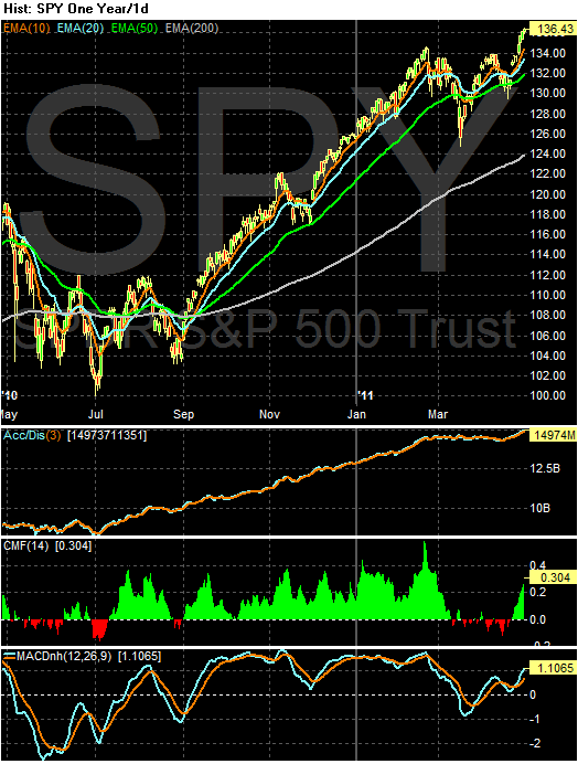
First, prices have moved to new highs, which is always indicative of a bull market. In addition, this move higher is confirmed by the rising A/D and CMF and MACD -- which has a fair amount of room to run at this point. Also note the bullish orientation of the EMAs -- all are moving higher, the shorter are above the longer and prices are using the EMAs for technical support. Technically, it does not get much more bullish.


The QQQQs have the same analysis, save for the fact prices have not moved through new highs in a meaningful way yet.

Technically, the above charts are fine and indicate a further advance. But, as I've said before, I don't think the fundamental situation warrants it.

Friday, April 29, 2011

Weekly Indicators: Oil Price Tornado destroying growth Edition

- by New Deal democrat

The big news this week was first quarter GDP limping in at 1.8%. It is interesting that this GDP advance was almost exactly that of second quarter 2010 when gas prices were similar. With gas prices even higher in the last month, second quarter GDP is not likely to be pretty either. Durable goods orders, however, rose strongly, up 2.5%. While the regional manufacturing surveys have weakened month over month, they are basically going from white hot to red hot.

That manufacturing continues to look excellent is a great positive, because the high-frequency weekly indicators are almost all in retreat:

Oil was trading at $113.76 a barrel by Friday, the fifth full week it has been above $100. It remains at a level above 4% of GDP. Gas at the pump increased $.04 more to $3.88 a gallon - with the exception of 11 weeks in 2008, an all time high. Gas prices have gone up over $1 a gallon just in the last 5 months. Gasoline usage at 9148 M gallons was 1.5% lower than last year's 9290. This YoY comparison has been negative for the last seven weeks in a row, averaging -1.5% for the last five weeks. If this level of decline continues for another month, that will be equivalent to the decline near the end of 2007.

The BLS reported that Initial jobless claims last week were 429,000. The four week average has gone back over 400,000, This series has not made a new low in eight weeks, has been back over 400,000 for three weeks, and recorded the highest number in over 3 months. Not good at all.

Railfax was up only 1.4% YoY. Baseline traffic is below last year's levels. Cyclical traffic is at a low ebb for YoY advance. Waste materials sank even lower below last year's levels and shipments of motor vehicles fell. Only intermodal traffic is holding up reasonably well. Also not good.

The American Staffing Association Index remained at 92 for the fourth week in a row, after stalling at he 90-91 level for 7 weeks. If this series does not pick up significantly in the next four weeks, it will mirror its flatness in 2008. Also not good.

As expected, the Mortgage Bankers' Association reported a decrease of 13.6% in seasonally adjusted mortgage applications last week, reversing the prior week's increase of 10.0%, due to new higher FHA premiums. Refinancing decreased 0.6%, and remains near its June-July 2010 lows. The purchase series has been generally flat for close to one full year - compared with its previous relentless decline, a good thing.

The ICSC reported that same store sales for the week of April 23 rose 3.2% YoY, and increased 0.4% week over week. Shoppertrak reported a 16.1% YoY increase for the week ending April 23. It also reported a WoW increase of 12.2%. This was the week before Easter, so calendar affects continued to strongly affect these results.

Adjusting +1.07% due to the 2011 tax compromise, the Daily Treasury Statement showed that for the first 19 days in April 2011, $129.4 B was collected vs. $123.4 B a year ago, for an increase of $6.0 B YoY. For the last 20 days, $135.3 B was collected vs. $125.1 B a year ago, for an increase of $10.2 B, or 8.3%. Use this series with extra caution because the adjustment for the withholding tax compromise is only a best guess, and may be significantly incorrect.

Weekly BAA commercial bond rates decreased .09% to 5.98%. This compares with a .10% decrease in the yields of 10 year treasuries to 3.41%. There remains no sign of corporate distress here, and no sign yet of a deflationary bust.

M1 was up 0.2% w/w, up 0.5% M/M, and up 11.3% YoY, so Real M1 is up 8.6%. M2 was up 0.1% w/w, up 0.6% M/M and up 3.9% YoY, so Real M2 is up 1.2%. Although Real M1 is still strongly in the "green zone" where it has been since before the end of the "great recession," Real M2 has faded even more below its 2.5% "green zone." (In all recessions since the Great Depression, real M1 has been negative and real M2 has been below +2.5%). Not so good.

The weekly indicators are lining up on the side of a stalling economy.

My condolences to all to who sustained loss due to this week's massive outbreak of tornadoes. Have a good weekend.

Contractionary fiscal policy is contractionary.

1.) Here is the GDP equation: Consumer Spending (C) + Investment (I) + Plus Net Exports (X) + Government Spending (G) = GDP.

2.) Government spending subtracted 1.09% from the final GDP total (see table 2).

3.) Contractionary fiscal policy is contractionary.

Are We At a Market Top?

Two contrasting views:

The bearish argument has the following 10 signs:
S&P (SPY) profit margins are at or near historic highs. Given rising input costs, especially from energy and commodities; these will start to come down and reduce expected earnings. Witness the statements from Kimberley Clark (KMB), Wal-Mart (WMT), McDonalds (MCD), Xerox (XRX),…etc all warning of higher costs over last several weeks

The continued rise of gas prices. Gas is at or approaching $4 a gallon in most states. This is eerily like the summer of 2008 and will have negative impacts on consumer sentiment, spending, Obama’s poll numbers, and high priced retailers. See UA’s ten percent plunge yesterday on rising inventory levels.

Continued and escalating tension in the Middle East. Libya, Syria, Egypt, Bahrain, Yemen, Oman, Tunisia, etc….all have seen dramatic unrest. This will continue to impact oil prices and has the potential to be a Black Swan if it spreads to a major oil producing state like Saudi Arabia.

IPO Activity is at a four year high, which is generally a good contrarian sign for the market

Seasonality as we are entering historically the worst time for the market. Sell in May and Go Away seems like an appropriate rallying cry this year.

Europe. Austerity measures are negatively impacting growth. Greece and Ireland have received bailouts, but will probably need to restructure their debt eventually. Portugal is waiting its turn and Spain is on the clock. Voters predictably are choosing parties that might reject supporting any further assistance; see Finland. This cauldron has the potential to blow up any day.

China is taking more and more measures to curb inflation and property speculation. This will eventually have negative impacts to worldwide growth.
Merger Monday is back as we have seen a large increase in M&A activity this year.
Another good contrarian sign.

The end of fiscal stimulus and state budget challenges will severely curtail job and economic growth as state and local governments enact plans to balance budgets through layoffs and other spending cutbacks.

Given the approaching end of QE2 as well as the upcoming federal budget battles, the political acrimony that will be unleashed is not likely to be good for overall health of the market environment
And the Bullish Side:

Let’s look at the SPY chart. It speaks for itself – i.e., bullish.


Price broke out strongly above previous resistance at $134. RSI crossed up strongly through the neutral line last week and is headed for a date with overbought territory soon. Similarly, MACD has a bullish crossover and is pointing up. Price is well above all of its daily moving averages such that some mean reversion will be in order soon – but not necessarily much of a pullback, as the moving averages play catch-up. Volume on these strong days, however, is still disappointing.
And more from the bullish side:

As long as we stay above the 850 level, the Russell remains in primary uptrend/bullish mode with no remaining overhead levels of resistance to monitor.

.....

Like the Russell 2000, the NASDAQ at new recovery highs breaks a “line in the sand” to the bullish camp, forcing some bears/short-sellers to buy-back positions to cover (a potential short-squeeze).

I know there are a lot of bearish commentaries out there, but price tells a different story, and it continues to do so as long as the indexes remain at new recovery (or lifetime) highs.

Unless we fall back under 850 in the Russell or 2,800 in the NASDAQ soon, then the market continues to be dominated by the primary uptrend and the buyers/bulls.


Also consider this from Marketbeat:
But for my money, the thing I’m watching is the bond market. The yield on the 10-year has been moving pretty steadily lower since it crested at a bit more than 3.70% back in February. And despite all the inflationista frothing, fiscal debt debates, Bill Gross dismissals and S&P outlook warnings, investors have kept buying Uncle Sam’s IOUs.

....

It doesn’t get as much attention as the stock market, but in the investment world the bond market is often thought to be the dog wagging the tail that is the stock market. If so, you might want to take a bit of profit off the table.


As I reaffirmed on Wednesday, I'm very suspicious of the market's current move higher, but for fundamental reasons. As several commenters above noted, you can argue the technicals are strong. However, I believe in a blended approach which coordinates fundamental and technical analysis and right now the fundamental analysis is concerning. I should also note -- I could be missing a move higher. But I'd rather be safe given the current environment.

Friday Dollar Analysis

Last week, I wrote the following about the dollar:

Given the above charts, and the fact nothing has fundamentally changed in the big picture for the dollar, my assessment of the dollar market for the coming week is the exact same as it was for last week: more moves lower with rebounds into the EMAs providing upside resistance.


Taking a look at the chart, nothing has changed. Prices are below the EMAs, all the EMAs are moving lower and the shorter EMAs are below the longer EMAs.

This week, we learned that US growth for the first quarter was 1.8%, which means the Fed will be under pressure to not raise rates. In addition, we have the following Fed statement:

The Committee will maintain the target range for the federal funds rate at 0 to 1/4 percent and continues to anticipate that economic conditions, including low rates of resource utilization, subdued inflation trends, and stable inflation expectations, are likely to warrant exceptionally low levels for the federal funds rate for an extended period.

The Committee will continue to monitor the economic outlook and financial developments and will employ its policy tools as necessary to support the economic recovery and to help ensure that inflation, over time, is at levels consistent with its mandate.

The EU has already raised rates, as has China and a host of other countries. Only the US remains in 0% interest rate land, which will add further downward pressure to the dollar.


Thursday, April 28, 2011

Hayek v. Keynes -- the Rap Battle

Why this didn't go viral in the Econ community, I have no idea. But this is brilliant -- just brilliant.

Enjoy

Durable Goods Up

On March 18, I wrote the following:

Durable goods orders are a very volatile series. However, their current lack of movement is beginning to concern me regarding the big picture.


In light of that, we got some good news yesterday:

A key gauge of U.S. manufacturing rose in March and new orders in February were stronger than initially thought, indicating a vibrant factory sector even as the economy slowed in the first quarter.

New orders for manufactured goods meant to last at least three years increased 2.5 percent after an upwardly revised 0.7 percent rise in February, the Commerce Department said on Wednesday.

The rise in March durable goods orders beat economists' expectations for a 2 percent advance, while orders in February had been previously reported to have dropped 0.6 percent,

Though the report -- which showed upward revisions to key categories in February -- did not change views that the economy slowed sharply in the first three months of this year, it confirmed that manufacturing continued to power the recovery.

Here is an updated chart of the data:


While still below pre-recession levels, the chart does look better.

With the recent drops in three Fed region manufacturing indexes (Philadelphia, Dallas and Richmond) -- and manufacturing being a key driver of the current expansion -- these data series are disproportionately important. The durable goods chart is starting to look a little better. However, I'm going to reserve judgement for the next few months as we get more information about the manufacturing sector.

A Closer Look At Monetary Velocity

Let's finish looking at money supply by looking at velocity and GDP


From 1959 until 1984, there is a strong relationship between M1s YOY percentage change and GDPs YOY percentage change. This relationship breaks down briefly in 1974. In the above chart notice how the two lines mirror each other's movement.


The M1/GDP YOY percentage change relationship breaks down in the 1990s but returns to a certain extent in the 2000s. In the 2000s there is a very general arcing pattern to M1s chart as with GDP -- but this is a general relationship.


For about 15 of the 25 years in the above chart, M2's YOY percentage change in velocity mirrors GDP YOY percentage change. However, notice the relationship breaks down in the 1970s -- in fact, the relationship is almost inverted during this period.


From 1985 until 2010, the correlation between M2s YOY percentage change in velocity and the YOY percentage change in GDP is fairly high. From 1990-1995 the relationship is very strong. However, the relationship breaks down during the latter half of the expansion. There is a loose relationship between the two numbers during the 2000s expansion while there is a very close relationship during the last expansion.


With the exception of the mid-1970s, MZM and GDP's YOY percentage change in velocity show a strong correlation.


From 1985 until 2000 MZM's yearly percentage change becomes very volatile relative to the GDP change. During this period there appears to be little relationship between velocity and GDP. However, the MZM/GDP correlation returns over the last 10 years.

Of all the statistics, monetary velocity appears to have the strongest correlation with GDP growth. This makes strong intuitive sense. If people are spending money more rapidly there will be more activity; whereas if people are spending money less rapidly there is less activity.

Wednesday, April 27, 2011

Thursday Oil Market Analysis

Last week I wrote the following about the oil market:

Over the last few weeks, with the exception of today, the price action has been weak. There were two strong down bars, three weaker moves higher, another strong downward bar and then a weak up bar. Today's action is the only strong bar over the last 8 trading sessions.

The overall feeling I can't shake is that with gas at $3.84/gallon on average, traders are incredibly sensitive to the effect of higher oil prices on the expansion. This is probably what led Goldman to issue its sell recommendation on commodities last week. In short, I keep thinking we already have a top built into the market caused by economic fundamentals. On that order, consider this chart from the St. Louis FRED:


Click for a larger image

Notice that over the last week, we've had one day of solid gains followed by three days of weaker price action. Additionally, prices have been contained by the 113/114 price level -- this despite the Middle East still being in pretty heavy turmoil. Also note the declining MACD and weak position of the overall MACD line, which shows a remarkable lack of momentum.


Note the remarkable lack of conviction in the overall market on the 5-minute chart. There are very few sharp rallies and prices seem to get stalled in the 113/114 area.

This week, I'm still left with the feeling that traders are sensitive to the overall price of gas. In addition, consider the fact that the oil market has not advanced due to the ongoing problems in the Middle East. And, we're starting to get word of decreased gasoline demand and a possible slowing economy in Q1.

While my feeling is not scientific, I'm still of the opinion there is not much upside room in the oil market, given gas' current price.

Richmond Fed Manufacturing Index Drops

From the Richmond Fed:

Manufacturing activity in the central Atlantic region expanded in April for the seventh straight month but at a more temperate pace than a month ago, according to the Richmond Fed's latest survey. All broad indicators — including shipments, new orders and employment — continued to grow but at a rate below March's pace. Other indicators were mixed. Fifth District contacts reported that capacity utilization continued to grow more slowly, while backlogs turned slightly negative. Vendor delivery times edged higher and raw materials inventories grew at a somewhat higher rate.


This is the third regional manufacturing survey to show a drop in its latest reading. While this is only one month of data, the breadth of the data (the number of regions showing a drop) is concerning. I'm assuming that some of this is the result of the supply chain problems caused by Japan, but I'm also thinking we're starting to see the effects of China's continued effort to slow its economy through a combination of higher interest rates and reserve requirements, along with other rate increases from Asian and South American countries.

Manufacturing has been a driver of the current expansion, making these readings that much more concerning.

A Quick Note on the Markets


Yesterday we saw rallies in all the major indexes. However, I wrote the following on Monday:
Any move above technically important levels should be viewed with extreme caution unless accompanied by a fundamentally altering event such as a great unemployment report, a clear policy change from Washington that creates more fiscal stimulus, or a good GDP report that surprises the markets.
While the press mentioned the consumer sentiment reading as a driver of the rally, this number is still low by historical standards:


In short, I don't see the release as a market mover. As such, I don't see the rally as sustainable.

Let me add -- I could be wrong here. But I don't think we currently have a good backdrop for a meaningful rally.

A Closer Look at MZM

Investopedia defines MZM thusly:

A measure of the liquid money supply within an economy. MZM represents all money in M2 less the time deposits, plus all money market funds.

MZM has become one of the preferred measures of money supply because it better represents money readily available within the economy for spending and consumption. This measurement derives its name from its mixture of all the liquid and zero maturity money found within the three "M's."
So this concept lies between M1 and M2.


The above chart is the total of MZM on a logarithmic scale. When the overall trend is up, there have been some noticeable sideways moves: the mid-1980s, the late 1980s , the mid-1990s and right after the last recession.


The above chart places total MZM and GDP on a 200 scale. Notice that -- like the other monetary aggregates, both have a general uptrend. However, MZM's overall pace of growth has been accelerating faster than GDP since the end of the last expansion.


Coming out of the early 1980s recession we see a big spike in MZM's YOY percentage change which correlates with a concurrent rise in GDP. However, MZM rose during the middle of the expansion with no rise in GDP. But, the MZM/GDP correlation returned coming out of the early 1990s recession, although the pace of MZM's YOY growth was far lower than that of the early 1980s recession.


The above chart shows MZM's and GDPs YOY percentage change for the years 1993 through 2010. In 1995 we see a dip and then rise in MZM which corresponds to the similar movement in GDP, but MZM's move is far more prounced. During the second half of the expansion MZM rises with no concurrent move in GDP.

As with the other monetary aggregates, I find it interesting that the YOY relationships are so weak; I would have expected a more solid relationship. However, the one to one relationships are still solid, which makes sense. In a $14 trillion economy, there has to be a sufficient amount of money to actually engage in transactions.

Wednesday Commodity Round-Up

Silver has been getting a ton of attention lately, largely because traders and investors are seeing it as an alternative to gold. So, let's break the SLV ETF's chart down to see what they say.


The underlying technicals are extremely bullish. The A/D line is showing a ton of money moving into the market, which is confirmed by the CMF. In addition, the MACD is also showing extremely strong momentum. The EMAs are currently in the most bullish orientation possible, with the shorter above the longer and all moving higher. Also of importance is the candles are using the EMAs for technical support -- yet another bullish development on the chart.


The six month chart shows the recent bullish action in more detail. Also note the volume spike over the last week or so, indicating we may be witnessing a buy climax.


The above chart is a four year, weekly chart which I included to show two things. First, notice the volume increase over the period adding credence to the argument we're seeing a buying climax. In addition, prices are parabolic, which simply can't last.

I think the last chart says it all; prices are in a position which can't last under any conditions. I think this rally is pretty close to correcting.

Tuesday, April 26, 2011

The Depression as An Era of Innovation

From the NYTimes:

Q. What were the key innovations of the 1930s?

Mr. Field: What’s notable about the Depression years is the very broad range of advance. One can’t point to a single or even a few innovations that somehow defined the era. Nonetheless, notable new products included the DC-3, a plane introduced in 1936 that revolutionized commercial aviation; television, developed with venture capital funding during the 1930s and rolled out at the 1939-40 World’s Fair; and nylon stockings, introduced in May 1940, with 63 million pair sold the first year.

A number of products available in the 1920s moved from low-penetration boutique goods to mass-produced commodities. Case in point: mechanical refrigerators. Less than 3 percent of U.S. households had them in 1929, and they were expensive and unreliable, requiring extensive after-market service. In 1941, 44 percent of households had mechanical refrigeration, including 56 percent of urban households.

Automobiles saw major refinements in the 1930s. Heaters, radios, low-pressure balloon tires, and four-wheel hydraulic brakes all became standard. The decade saw the development of options we often consider standard today — power steering, automatic transmission, front-wheel drive, and V-8 engines. Aside from product innovation, significant process innovation occurred across the industrial sector.

And in contrast to the 1920s, advance was not limited almost entirely to manufacturing. Highway design in the 1930s excited engineers as much as did the information “superhighway” in the 1990s. The U.S. route system, built almost entirely during the Depression, represented a huge improvement over what had preceded it, with big benefits for transportation and distribution.

Organizational innovation also played a role. In railroads, treaties now allowed unlimited freight interchange. Rolling stock — railroad cars — from one road could move onto tracks owned by another, and while there, discharge and pick up cargo, and even be repaired in a “foreign” yard. The agreements and uniform tariff schedules that permitted this were critical in enabling U.S. railroads to carry more freight and almost as many passengers in 1941 as they did in 1929, using many fewer employees, cars, and locomotives.

I wrote about some of the basic numbers of the Depression here.


Dallas Manufacturing Index Drops

From the Dallas Fed:

Texas factory activity continued to expand in April, according to business executives responding to the Texas Manufacturing Outlook Survey. The production index, a key measure of state manufacturing conditions, moved down from 24 to 8, suggesting slower growth in output.

Other measures of current manufacturing activity remained positive but retreated from their March levels. The capacity utilization and shipments indexes declined to readings of 10 and 8, respectively. The new orders index was positive for the sixth consecutive month, although it decreased from 14 to 4 in April. Downward movement in the indexes for current activity was largely due to a rise in the share of manufacturers reporting decreases in these indicators.

Respondents noted continued improvement in the broader economy as indexes reflecting general business conditions had positive readings for the seventh month in a row. The general business activity index was largely unchanged in April, coming in at a reading of 11. The company outlook index declined from 16 to 10, with a quarter of respondents saying their outlooks were improved from the prior month compared with 15 percent saying their outlooks had worsened.

Labor market indicators showed mixed movements in April. The employment index edged up from 12 to 13, its highest reading this year. Nineteen percent of manufacturers reported hiring new workers compared with 6 percent reporting layoffs. Hours worked were essentially flat in April after increasing for five consecutive months.

This is the second regional Fed manufacturing index to slow sharply (the first was Philly's). While this is only one month of data, this is the second index to slow in a short period of time.