It's that time of the week again. NDD will be here tomorrow and I'll be back on Monday. Until then ...
Friday, March 1, 2013
ISM manufacturing report negatives recession
- by New Deal democrat
One of the things that mystified me when I was disputing a certain well-known forecasting firm's recession call in the last year was that their own long leading indicators appeared to suggest that the economy was going to strengthen. Sure enough, although stagnating or even slightly contracting over much of last year, for the last two months the ISM manufacturing index has registered unabashed expansion.
But first, a quick refresher. Back in June when the report first came in under 50 I said:
[D]oes a contracting ISM report mean recession now, or later in the year? The answer to the first question is almost certainly not, and as to the second, the answer is more likely not, although the odds based on past data approach 50/50.And after last month's report I noted that:
Since the record started in 1948, the report has declined from over to under 50 a total of 32 times. Of those times, 11 were associated with the onset of recession and 3 more occurred during a recession after a brief period above 50. That means the ISM manufacturing index has slipped under 50 a total of 18 times when no recession followed, meaning that a one month contraction in the index was associated with no recession a little more than 50% of the time.
[L]eft to itself, it looks like the economy wants to keep growing. Today's ISM manufacturing report of 53.4 is very potent evidence of that. The index has been reported since 1948. Since that time, only once - for the first six months or so of the 1973-74 recession - has the index ever recorded a reading above 53 during a recession.Today's report is even stronger at 54.2. The below graph subtracts 54.2 from the index reading better to show its historical pattern, first from 1948 through 1977:
And here it is from 1978 to the present:
The sole exception, as I noted last month, was 1973-74
when a strongly growing US economy ran into the brick wall of the Arab oil embargo. So if a recession is starting, you can blame it squarely on ridiculous contractionary austerity coming from Washington, DC.With the budget sequester starting today, we are living through a period that demonstrates the fallacy of relying upon economic actors to be rational. As I have pointed out numerous times in the past, the myth of rational actors conclusively shows that World War 1 never happened. Unfortunately for the world, Kaiser Wilhelm didn't get the memo.
Taiwan's GDP Rebounds in the Fourth Quarter
Last week Taiwan issued its preliminary estimate of fourth quarter GDP:
DGBAS's preliminary estimate showed that Taiwan's seasonally adjusted real gross domestic product (GDP) increased by 7.30% at annualized rate in 2012Q4, and the yearly growth rate of unadjusted GDP was 3.72%. For the whole 2012, economic growth rate was 1.26%. Meanwhile, the GDP is expected to grow 3.59% in 2013.
Let's look at some of the data.
Overall, Taiwan's growth rate declined on a year over year basis through second quarter of 2012, but started to rebound in the 3Q12.
Over that same period, we see a large drop in the year over year percentage change in industry. Services declined as well, but still remained positive. Industry rebounded in the 3Q12 and came on strong the 4Q12.
From 3Q11-2Q12 we also see a large drop the in year over year percentage change in gross investment and exports. The drop in exports coincides with the height of the EU's mess, while the drop in investment was caused by a dual contraction in public and government investment. Throughout, private consumption and government spending have been resilient.
DGBAS's preliminary estimate showed that Taiwan's seasonally adjusted real gross domestic product (GDP) increased by 7.30% at annualized rate in 2012Q4, and the yearly growth rate of unadjusted GDP was 3.72%. For the whole 2012, economic growth rate was 1.26%. Meanwhile, the GDP is expected to grow 3.59% in 2013.
Let's look at some of the data.
Overall, Taiwan's growth rate declined on a year over year basis through second quarter of 2012, but started to rebound in the 3Q12.
Over that same period, we see a large drop in the year over year percentage change in industry. Services declined as well, but still remained positive. Industry rebounded in the 3Q12 and came on strong the 4Q12.
From 3Q11-2Q12 we also see a large drop the in year over year percentage change in gross investment and exports. The drop in exports coincides with the height of the EU's mess, while the drop in investment was caused by a dual contraction in public and government investment. Throughout, private consumption and government spending have been resilient.
No, Mr. Draghi, Europe is Not Healing
Here's the latest unemployment chart from Eurostat:
You'll notice a month to month increase of .1%, indicating that unemployment is getting worse, not better. As unemployment is a coincident economic indicator, this is pretty good evidence that the EU's overall condition is worsening.
But the news actually gets worse from there:
The euro area1 (EA17) seasonally-adjusted2 unemployment rate3 was 11.9% in January 2013, up from 11.8% in December 20124. The EU271 unemployment rate was 10.8%, up from 10.7% in the previous month4. In both zones, rates have risen markedly compared with January 2012, when they were 10.8% and 10.1% respectively. These figures are published by Eurostat, the statistical office of the European Union.
.....
Compared with a year ago, the unemployment rate increased in nineteen Member States, fell in seven and remained stable in Denmark. The largest decreases were observed in Estonia (11.1% to 9.9% between December 2011 and December 2012), Latvia (15.5% to 14.4% between the fourth quarters of 2011 and 2012), Romania (7.4% to 6.6%) and the United Kingdom (8.3% to 7.7% between November 2011 and November 2012). The highest increases were registered in Greece (20.8% to 27.0% between November 2011 and November 2012), Cyprus (9.9% to 14.7%), Portugal (14 7% to 17.6%) and Spain (23.6% to 26.2%).
So -- compared with a year ago, unemployment has increased 1%. And on a year over year basis most countries -- as in 70% -- saw an increase while only 25% (7 countries total) saw a decrease. That's an unmitigated economic policy disaster.
And then there are the latest round of Markit manufacturing surveys. Here's the short version:
Germany is doing well.
France is deteriorating sharply with a reading of 42.9
Italy's rate of deterioration is accelerating; their latest reading is 45.8
Spain's rate of deterioration is improving, but they still have a reading of 46.8.
I understand that Central bankers jobs have an inherent PR component. And, a central bank head who was alarmist in his public statements would do more harm then good. However, the continued talk of a 2H13 turnaround is looking more and more like a pipe dream and the EU slogs its way through continued economic contraction.
You'll notice a month to month increase of .1%, indicating that unemployment is getting worse, not better. As unemployment is a coincident economic indicator, this is pretty good evidence that the EU's overall condition is worsening.
But the news actually gets worse from there:
The euro area1 (EA17) seasonally-adjusted2 unemployment rate3 was 11.9% in January 2013, up from 11.8% in December 20124. The EU271 unemployment rate was 10.8%, up from 10.7% in the previous month4. In both zones, rates have risen markedly compared with January 2012, when they were 10.8% and 10.1% respectively. These figures are published by Eurostat, the statistical office of the European Union.
.....
Compared with a year ago, the unemployment rate increased in nineteen Member States, fell in seven and remained stable in Denmark. The largest decreases were observed in Estonia (11.1% to 9.9% between December 2011 and December 2012), Latvia (15.5% to 14.4% between the fourth quarters of 2011 and 2012), Romania (7.4% to 6.6%) and the United Kingdom (8.3% to 7.7% between November 2011 and November 2012). The highest increases were registered in Greece (20.8% to 27.0% between November 2011 and November 2012), Cyprus (9.9% to 14.7%), Portugal (14 7% to 17.6%) and Spain (23.6% to 26.2%).
So -- compared with a year ago, unemployment has increased 1%. And on a year over year basis most countries -- as in 70% -- saw an increase while only 25% (7 countries total) saw a decrease. That's an unmitigated economic policy disaster.
And then there are the latest round of Markit manufacturing surveys. Here's the short version:
Germany is doing well.
France is deteriorating sharply with a reading of 42.9
Italy's rate of deterioration is accelerating; their latest reading is 45.8
Spain's rate of deterioration is improving, but they still have a reading of 46.8.
I understand that Central bankers jobs have an inherent PR component. And, a central bank head who was alarmist in his public statements would do more harm then good. However, the continued talk of a 2H13 turnaround is looking more and more like a pipe dream and the EU slogs its way through continued economic contraction.
Morning Market Analysis
Short summary: The US market is selling off, but in a disciplined way. While the treasury market has rallied through resistance, it is now consolidating gains below the 200 day EMA. After a weak GDP print, the Indian ETF moved below the 200 day EMA. And gold is approaching support on the weekly chart.
The SPYs are now in a downward sloping run. After hitting a high in mid-February, prices have traded down to the top Fib fan and then rebounded to just above the 10 day EMA. The MACD and CMF all indicate a further move lower is most probably. The best news in this chart is that the sell-off is not sharp, but instead is contained.
After strongly breaking through resistance on Monday, the long end of the treasury curve hit the 200 day EMA and stalled. However, prices now have the rising 10 and 20 day EMAs to use for technical support. The real question is whether prices will move through the 200 day EMA. A move through that level would signal a strong change in the overall tenor of the market.
Yesterday we leaned that Indian GDP fell more than expected, which made the Indian ETF one of the biggest losers yesterday. Most importantly, the technicals of this chart continue to weaken. Prices are below all the EMAs and are now below the 200 day EMA. Momentum is decreasing and money is flowing from the market. At this point, I'd look for an entry point and then short.
The weekly gold chart is now at the lower boundary of its year long trading range. Also note the weakening technical position: declining MACD and CMF and prices below the shorter EMAs. A break of 150 would send a clear shorting signal, with a price target of the 200 week EMA.
The SPYs are now in a downward sloping run. After hitting a high in mid-February, prices have traded down to the top Fib fan and then rebounded to just above the 10 day EMA. The MACD and CMF all indicate a further move lower is most probably. The best news in this chart is that the sell-off is not sharp, but instead is contained.
After strongly breaking through resistance on Monday, the long end of the treasury curve hit the 200 day EMA and stalled. However, prices now have the rising 10 and 20 day EMAs to use for technical support. The real question is whether prices will move through the 200 day EMA. A move through that level would signal a strong change in the overall tenor of the market.
Yesterday we leaned that Indian GDP fell more than expected, which made the Indian ETF one of the biggest losers yesterday. Most importantly, the technicals of this chart continue to weaken. Prices are below all the EMAs and are now below the 200 day EMA. Momentum is decreasing and money is flowing from the market. At this point, I'd look for an entry point and then short.
The weekly gold chart is now at the lower boundary of its year long trading range. Also note the weakening technical position: declining MACD and CMF and prices below the shorter EMAs. A break of 150 would send a clear shorting signal, with a price target of the 200 week EMA.
Thursday, February 28, 2013
Spanish GDP Report Downright Ugly
Spain is the EUs third largest economy, which has been in a recession for the last year. The latest GDP report indicates that trend isn't ending anytime soon. First, consider this chart of GDP>
The red line shows the quarter to quarter growth rate, which has been negative for the last six quarters. Additionally, the latest drop is the largest, indicating the trend isn't getting any better.
Above are the quarterly year on year growth rates for all major GDP components. Notice they are all negative for the last year.
Simply put, there is nothing positive in the above charts. The Spanish economy -- the third largest in the EU -- is still in terrible shape and is showing no signs of recovery.
The red line shows the quarter to quarter growth rate, which has been negative for the last six quarters. Additionally, the latest drop is the largest, indicating the trend isn't getting any better.
Above are the quarterly year on year growth rates for all major GDP components. Notice they are all negative for the last year.
Simply put, there is nothing positive in the above charts. The Spanish economy -- the third largest in the EU -- is still in terrible shape and is showing no signs of recovery.
Singapore GDP Recap
Singapore's growth rebounded in the 4th quarter:
The Singapore economy grew by 1.5 per cent on a year-on-year basis in the fourth quarter of 2012, an improvement from the flat growth recorded in the preceding quarter. On a quarter-on-quarter seasonally-adjusted annualised basis, the economy grew by 3.3 per cent, a reversal from the 4.6 per cent contraction in the third quarter.
Here's a chart of the data:
The third quarter slowdown was primarily the result of a big drop in manufacturing -- a drop of 16.6% which followed a 1% drop in the 2Q. This in turn can be attributed to the EU slowdown occurring at the same time. But also notice the slowdown in the service sector in the 2Q12 and 3Q12 mostly attributable to "other service industries" indicating the slowdown was broad-based.
Considering the macro-level annual data, we get the following:
For the whole of 2012, Singapore’s GDP growth slowed to 1.3 per cent, from 5.2 per cent in 2011, mainly due to weakness in the externally-oriented sectors. Weighed down by the contraction in the electronics cluster, manufacturing sector growth slowed sharply from 7.8 per cent in the previous year to 0.1 per cent. By contrast, the construction sector growth accelerated from 6.3 per cent to 8.2 per cent in 2012, due to the expansion in both public and private building activities.
The services producing industries grew by 1.2 per cent in 2012, anchored by a pick-up in growth in business services sector to 3.9 per cent, on the back of strong performance in the real estate segment. On the other hand, the wholesale & retail trade sector declined by 0.7 per cent, while growth in the finance & insurance sector and other services industries moderated to 0.5 per cent and 0.1 per cent respectively.
The Singapore economy grew by 1.5 per cent on a year-on-year basis in the fourth quarter of 2012, an improvement from the flat growth recorded in the preceding quarter. On a quarter-on-quarter seasonally-adjusted annualised basis, the economy grew by 3.3 per cent, a reversal from the 4.6 per cent contraction in the third quarter.
Here's a chart of the data:
The third quarter slowdown was primarily the result of a big drop in manufacturing -- a drop of 16.6% which followed a 1% drop in the 2Q. This in turn can be attributed to the EU slowdown occurring at the same time. But also notice the slowdown in the service sector in the 2Q12 and 3Q12 mostly attributable to "other service industries" indicating the slowdown was broad-based.
Considering the macro-level annual data, we get the following:
For the whole of 2012, Singapore’s GDP growth slowed to 1.3 per cent, from 5.2 per cent in 2011, mainly due to weakness in the externally-oriented sectors. Weighed down by the contraction in the electronics cluster, manufacturing sector growth slowed sharply from 7.8 per cent in the previous year to 0.1 per cent. By contrast, the construction sector growth accelerated from 6.3 per cent to 8.2 per cent in 2012, due to the expansion in both public and private building activities.
The services producing industries grew by 1.2 per cent in 2012, anchored by a pick-up in growth in business services sector to 3.9 per cent, on the back of strong performance in the real estate segment. On the other hand, the wholesale & retail trade sector declined by 0.7 per cent, while growth in the finance & insurance sector and other services industries moderated to 0.5 per cent and 0.1 per cent respectively.
More bad news for recessionistas
- by New Deal democrat
Those people who've been claiming that a recession started "now" in September 2011, then probably in 1Q 2012, then by midyear 2012, and then in July 2012, got two more pieces of bad news this morning.
First, the first revision to 4Q 2012 GDP puts it - just barely - in positive territory. While the recessionistas touted that frequently recessions started in a quarter of positive GDP (which is true), in every single such recession the next quarter has always turned negative. No recession has started out with two quarters of positive GDP in a row.
Next, initial jobless claims came in at 344,000, confirming the new lower range of claims post-Sandy. No recession has ever started with initial claims making new lows.
It's probably uncharitable to add that only once in the last 100 years has the stock market made new highs 8 months into a recession.
With the sequester going into effect tomorrow, it's impossible to say if the blow to GDP, on top of the payroll tax increase, will do enough damage to actually push the economy into contraction. All we know is, left to its own devices, the economy as of the most recent monthly data is still growing.
Morning Market Analysis
The South Korean ETF started selling off at the beginning of 2013, hit the 200 day EMA and rose to the 61.8% Fib level recently. Also note that the lows of mid-November and mid-February form the bottom of a symmetrical triangle. Given China's overall strength, this ETF should continue in some type of consolidation for the next month or so.
The Mexican market has sold off to the 61.8% Fib level, with a declining MACD and negative CMF. Prices are also below the 10, 20 and 50 day EMAs. Note there is plenty of resistance below current levels for price support. Additionally, this has been a well-performing economy for the last few years, so any sell-off should be controlled and gradual.
The Japanese ETF has not sold off or broken trend. Instead, it has consolidated in a triangle pattern. Also note the EMAs are still rising. However, a declining MACD and CMF indicate the ETF may be ready to break trend.
Like the Mexican ETF, the emerging Europe market ETF has declined since the beginning of February. Prices are below all the shorter EMAs, with a declining and CMF. Prices will most likely use the 200 day EMA for support within the next few days.
The daily chart (bottom chart) of the long-term corporate bond market has broken through resistance with a rising MACD and CMF. However, the weekly chart (bottom chart) shows that prices are essentially moving along a slowly rising trend line.
Wednesday, February 27, 2013
Yes, Sequestration Will Hurt
From Bernanke's Testimony:
However, a substantial portion of the recent progress in lowering the deficit has been concentrated in near-term budget changes, which, taken together, could create a significant headwind for the economic recovery. The CBO estimates that deficit-reduction policies in current law will slow the pace of real GDP growth by about 1-1/2 percentage points this year, relative to what it would have been otherwise. A significant portion of this effect is related to the automatic spending sequestration that is scheduled to begin on March 1, which, according to the CBO's estimates, will contribute about 0.6 percentage point to the fiscal drag on economic growth this year. Given the still-moderate underlying pace of economic growth, this additional near-term burden on the recovery is significant. Moreover, besides having adverse effects on jobs and incomes, a slower recovery would lead to less actual deficit reduction in the short run for any given set of fiscal actions.
Nothing new to readers of this blog, but always good to hear someone in Washington actually making some factual sense.
However, a substantial portion of the recent progress in lowering the deficit has been concentrated in near-term budget changes, which, taken together, could create a significant headwind for the economic recovery. The CBO estimates that deficit-reduction policies in current law will slow the pace of real GDP growth by about 1-1/2 percentage points this year, relative to what it would have been otherwise. A significant portion of this effect is related to the automatic spending sequestration that is scheduled to begin on March 1, which, according to the CBO's estimates, will contribute about 0.6 percentage point to the fiscal drag on economic growth this year. Given the still-moderate underlying pace of economic growth, this additional near-term burden on the recovery is significant. Moreover, besides having adverse effects on jobs and incomes, a slower recovery would lead to less actual deficit reduction in the short run for any given set of fiscal actions.
Nothing new to readers of this blog, but always good to hear someone in Washington actually making some factual sense.
No, Europe is Not Healing
From the latest Markit retail Survey:
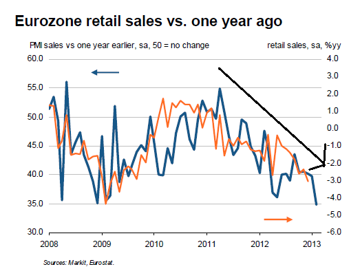
Markit’s Eurozone retail PMI® data for February signalled a record year-on-year fall in retail sales revenues in the single currency area. Sales were also down sharply compared with January, as signalled by a PMI reading of 44.5, down from 45.9.
Commenting on the data, Trevor Balchin, senior economist at Markit and author of the Eurozone Retail PMI, said: “February’s retail PMI provided more bad news for the Eurozone economy, falling to 44.5 and extending the current run of sub-50.0 readings to a survey record-equalling 16 months. Moreover, unlike the trend in manufacturing and services, where the worst phase of the current downturn may have passed, the retail sector remains some way from stabilisation.”
Let's look at some of the charts of the report:
The overall level for the retail PMI has been in a downward trajectory for the last two years. Over the last year, we see a consolidation of the number as low (contractionary) levels.
Year on year retail sales are tanking hard.
No, Virginia, Europe is not healing.
Markit’s Eurozone retail PMI® data for February signalled a record year-on-year fall in retail sales revenues in the single currency area. Sales were also down sharply compared with January, as signalled by a PMI reading of 44.5, down from 45.9.
Commenting on the data, Trevor Balchin, senior economist at Markit and author of the Eurozone Retail PMI, said: “February’s retail PMI provided more bad news for the Eurozone economy, falling to 44.5 and extending the current run of sub-50.0 readings to a survey record-equalling 16 months. Moreover, unlike the trend in manufacturing and services, where the worst phase of the current downturn may have passed, the retail sector remains some way from stabilisation.”
Let's look at some of the charts of the report:
The overall level for the retail PMI has been in a downward trajectory for the last two years. Over the last year, we see a consolidation of the number as low (contractionary) levels.
Year on year retail sales are tanking hard.
No, Virginia, Europe is not healing.
Morning Market Analysis
The Chinese market is still in the middle of a small sell-off. Prices peaked slightly about 2440 but have been dropping for the last week. They've moved through the 10 and 20 day EMAs and are currently resting on an important Fib level. The MACD indicates a move lower is most likely, probably to the 50 or 200 day EMA .
The weekly copper chart is still consolidating in a symmetrical triangle pattern. Prices are currently right below the 200 day EMA.
The homebuilding sector had been rallying since the first of the year. But the ETF topped out at the 29.5 level and has since fallen to early November levels. Prices are now contained by all the shorter EMAs. Also note the weak MACD and CMF readings along with the higher volume on this weeks sell-off. Overall the technicals indicate the most likely move is lower.
The British point continues to move lower. After moving through the 157 price level, price have continued to drop. From the chart highs of 161, prices have fallen a little under 7%.
However, the real technical damage to the pound is on the weekly chart, where we see prices have finally broken through the support provided by the 152-152 area -- a support line that had held for the last few years.
Tuesday, February 26, 2013
Some Very Ugly Charts on US Employment
From the latest Fed Minutes:
Private nonfarm employment expanded in December at about the same rate as in the fourth quarter as a whole, while government employment decreased. The unemployment rate was 7.8 percent in December, below its average in the third quarter, while the labor force participation rate was the same as its third-quarter average. The rate of long-duration unemployment and the share of workers employed part time for economic reasons edged down in December, but both measures were still elevated. The rate of private-sector hiring, along with indicators of job openings and firms' hiring plans, was generally muted but remained consistent with continued moderate increases in employment in the coming months.
Let's take these data points one at a time, and expand on the data where needed.
The top chart shows that while we've seen consistent job growth, we're still 3 million jobs below the total establishment job peak in 2008. The reason for this gap is the slow pace of growth, leading to the second chart showing the monthly gain in establishment job totals. While there has been two years of growth, it's been weak growth with most months coming in below the 200,000 level.
Before talking about the participation rate, let's properly define the term. According to the BLS glossary:
The labor force includes all persons classified as employed or unemployed in accordance with the definitions contained in this glossary, while the labor force participation rate is "The labor force as a percent of the civilian noninstitutional population."
However, these numbers are also influenced by the underlying components of the population. For example, we are currently at the front end of the massive baby boomer retirement wave, where 10,000 people per day are retiring. While the drop in the LPR is not completely attributable to that demographic trend, the research on the issue seems to be coalesing around the fact that about half of the drop is the result of retirements.
That being said, here is are two views of the LPR:
The top chart shows the total data, where a clear expansion of the labor force is seen from the years from 1965 until 2000. There are a number of reasons for this but the two biggest reasons are the baby boomers entering the workforce and women entering the work force. The second chart shows the decline in the LPR from 2008 until now. Overall, we see a drop of about 2.5%, of which about half is a result of the baby boomers retiring while the other half is the result of the great recession.
The above chart is perhaps the most troubling. It shows the total number of people unemployed for 27 weeks or longer. What it really shows is that if a person does not have a job after being unemployed 27 weeks, they stand a very poor chance of getting employed.
The above chart shows the total number of employees who are part time for economic reasons. Like the long-term unemployed, this number is incredibly high by historical standards. It also indicates that in the current environment, once you achieve this status it's very difficult to get out of this group.
For those paying attention, the charts above will show nothing new: job growth has been weak. The long-term unemployed have been that way for a long time and probably won't find a job anytime soon. And while about half of the decline in the LPR can be attributed to the boomers retiring, the other half is the result of people leaving the labor force because they can't find a job.
Private nonfarm employment expanded in December at about the same rate as in the fourth quarter as a whole, while government employment decreased. The unemployment rate was 7.8 percent in December, below its average in the third quarter, while the labor force participation rate was the same as its third-quarter average. The rate of long-duration unemployment and the share of workers employed part time for economic reasons edged down in December, but both measures were still elevated. The rate of private-sector hiring, along with indicators of job openings and firms' hiring plans, was generally muted but remained consistent with continued moderate increases in employment in the coming months.
Let's take these data points one at a time, and expand on the data where needed.
The top chart shows that while we've seen consistent job growth, we're still 3 million jobs below the total establishment job peak in 2008. The reason for this gap is the slow pace of growth, leading to the second chart showing the monthly gain in establishment job totals. While there has been two years of growth, it's been weak growth with most months coming in below the 200,000 level.
Before talking about the participation rate, let's properly define the term. According to the BLS glossary:
The labor force includes all persons classified as employed or unemployed in accordance with the definitions contained in this glossary, while the labor force participation rate is "The labor force as a percent of the civilian noninstitutional population."
However, these numbers are also influenced by the underlying components of the population. For example, we are currently at the front end of the massive baby boomer retirement wave, where 10,000 people per day are retiring. While the drop in the LPR is not completely attributable to that demographic trend, the research on the issue seems to be coalesing around the fact that about half of the drop is the result of retirements.
That being said, here is are two views of the LPR:
The top chart shows the total data, where a clear expansion of the labor force is seen from the years from 1965 until 2000. There are a number of reasons for this but the two biggest reasons are the baby boomers entering the workforce and women entering the work force. The second chart shows the decline in the LPR from 2008 until now. Overall, we see a drop of about 2.5%, of which about half is a result of the baby boomers retiring while the other half is the result of the great recession.
The above chart is perhaps the most troubling. It shows the total number of people unemployed for 27 weeks or longer. What it really shows is that if a person does not have a job after being unemployed 27 weeks, they stand a very poor chance of getting employed.
The above chart shows the total number of employees who are part time for economic reasons. Like the long-term unemployed, this number is incredibly high by historical standards. It also indicates that in the current environment, once you achieve this status it's very difficult to get out of this group.
For those paying attention, the charts above will show nothing new: job growth has been weak. The long-term unemployed have been that way for a long time and probably won't find a job anytime soon. And while about half of the decline in the LPR can be attributed to the boomers retiring, the other half is the result of people leaving the labor force because they can't find a job.
A Quick Note on the Markets
From the Financial Times:
“This definitely throws a spanner into the works,” said Lyn Graham-Taylor, fixed-income strategist at Rabobank, given that the ability to activate the OMT should it ever be needed would be difficult if not impossible for Italy without agreement in both houses.
And therein lies the rub. Late last summer, the head of the European Central Bank gave a speech wherein he stated he would do whatever it takes to save the euro. Here are his exact words:
When people talk about the fragility of the euro and the increasing fragility of the euro, and perhaps the crisis of the euro, very often non-euro area member states or leaders, underestimate the amount of political capital that is being invested in the euro.
And so we view this, and I do not think we are unbiased observers, we think the euro is irreversible. And it’s not an empty word now, because I preceded saying exactly what actions have been made, are being made to make it irreversible.
That speech is the primary cause of the latest overall global rally, as traders took the remarks to mean the ECB would do anything to save the region. As a result, we've had a good run in the equity markets. US treasuries have been selling off for the last few months, and the euro has been rising.
But the Italian election situation completely throws all of these developments out the window, as we will now return to news stories about problems in the EU and their seeming inability to solve their problems. So long as these problems persist, expect instability to reign in the markets.
That means that for the time being, we're risk off: stocks are under pressure, treasuries catch a safety bid.
Some
economists and investors questioned whether political deadlock in Italy
would undermine the broader recovery in markets triggered by the
European Central Bank offer last September to buy short-dated government
debt of ailing eurozone countries under its outright monetary
transactions (OMT) programme.
“This definitely throws a spanner into the works,” said Lyn Graham-Taylor, fixed-income strategist at Rabobank, given that the ability to activate the OMT should it ever be needed would be difficult if not impossible for Italy without agreement in both houses.
And therein lies the rub. Late last summer, the head of the European Central Bank gave a speech wherein he stated he would do whatever it takes to save the euro. Here are his exact words:
When people talk about the fragility of the euro and the increasing fragility of the euro, and perhaps the crisis of the euro, very often non-euro area member states or leaders, underestimate the amount of political capital that is being invested in the euro.
And so we view this, and I do not think we are unbiased observers, we think the euro is irreversible. And it’s not an empty word now, because I preceded saying exactly what actions have been made, are being made to make it irreversible.
That speech is the primary cause of the latest overall global rally, as traders took the remarks to mean the ECB would do anything to save the region. As a result, we've had a good run in the equity markets. US treasuries have been selling off for the last few months, and the euro has been rising.
But the Italian election situation completely throws all of these developments out the window, as we will now return to news stories about problems in the EU and their seeming inability to solve their problems. So long as these problems persist, expect instability to reign in the markets.
That means that for the time being, we're risk off: stocks are under pressure, treasuries catch a safety bid.
Morning Market Analysis
Thanks to the poor result of the Italian elections, uncertainty has returned to the markets. The US markets spent the day selling off. Treasuries caught a safety bid while the Italian and Spanish ETFs sold off sharply.
Yesterdays' sell-off was technically devastating. Prices gapped at the open and then continued to fall. They trend to rally late on the AM but hit resistance right after lunch. After making a second fall, they traded sideways until about an hour below the close when the dropped hard, printing two very long bars.
I've included a daily chart of the SPYs with Fib levels for reference. Note that yesterday prices sold off to the top Fib fan.
Yesterday, the long-end of the treasury market caught a bid in a big way, printing some very strong bars. Prices moved through all the EMAs, stopping just below the 200 day EMA.
Both the Italian (top chart) and Spanish (bottom chart) ETFs tanked yesterday as a result of the Italian election results -- or lack thereof. The results indicated that the EU may be headed towards another period of political uncertainty, increasing the stress in the region.
Yesterdays' sell-off was technically devastating. Prices gapped at the open and then continued to fall. They trend to rally late on the AM but hit resistance right after lunch. After making a second fall, they traded sideways until about an hour below the close when the dropped hard, printing two very long bars.
I've included a daily chart of the SPYs with Fib levels for reference. Note that yesterday prices sold off to the top Fib fan.
Yesterday, the long-end of the treasury market caught a bid in a big way, printing some very strong bars. Prices moved through all the EMAs, stopping just below the 200 day EMA.
Both the Italian (top chart) and Spanish (bottom chart) ETFs tanked yesterday as a result of the Italian election results -- or lack thereof. The results indicated that the EU may be headed towards another period of political uncertainty, increasing the stress in the region.
Monday, February 25, 2013
Australia As Global Bright Spot
Last week, the Australian market was one of the best performing of the international ETFs I follow. Let's first take a look at the charts.
Despite the somewhat weakening picture on the daily chart, the weekly chart is still rallying and has nothing but bullish indicators -- a rising set of EMAs and a strong underlying momentum in conjunction with a strong CMF.
However, the real strength is seen on the monthly chart. Prices are now rising above their previous highs established in late 2007. The one drawback to this bullish interpretation is the weak volume reading over the last 6 or so months, indicating declining participation in the rally.
The reason for this strength is the underlying economy. Here is a general summation from the latest minutes of the RBA:
Members recalled that the national accounts, which had been released the day after the December Board meeting, showed that the Australian economy grew by 3.1 per cent over the year to the September quarter, which was around trend pace. Growth in the September quarter at 0.5 per cent was a bit slower than trend, with public demand declining – consistent with the fiscal consolidation that was occurring – while growth in consumption slowed somewhat following very strong growth earlier in the year. In contrast, mining investment rose strongly in the quarter and was still expected to peak sometime over the next few quarters, with information generally suggesting that the outlook for mining investment had not substantially changed despite the recent increase in iron ore prices.
More timely information pointed to growth in economic activity having picked up in the December quarter, with a significant contribution coming from exports. Against that, members noted that surveys of business conditions remained below average for most industries. While conditions remained soft in the construction industry, there were some signs that the housing market had firmed, partly due to the series of interest rate reductions over 2012. Notwithstanding month-to-month volatility, building approvals had increased since the middle of 2012, particularly in states other than Victoria, and prices and rental yields in the established housing market had also picked up.
were briefed that resource exports were estimated to have increased strongly in the December quarter, including coal exports following the end of a significant industrial dispute. The recent heavy rainfall in Queensland was likely to have a noticeable impact on the transport of coal to ports, but at the time of the meeting it appeared that the effect on exports would be much less pronounced than was the case in 2011. The heavy rainfall and flooding had also affected some agricultural areas.
Household consumption in the September quarter had slowed from the rapid pace seen in the first half of 2012. Information available at the time of the meeting, including from liaison, suggested that growth in the December quarter may have picked up a little, although conditions varied for different types of retailers. Over the same period, sales of motor vehicles had risen strongly. Measures of consumer confidence were at, or even a little above, long-run average levels.
Household income growth had slowed, in line with the weaker labour market. The unemployment rate had drifted up gradually over 2012, to be 5.4 per cent in December. Members noted that, over the same period, the labour force participation rate had declined a little and average hours worked were a little lower. Total employment had grown moderately in the second half of 2012, despite some decline in employment in mining and business services. Job vacancies and other forward-looking indicators had continued to soften, but remained consistent with modest employment growth in the months ahead.
CPI inflation was 0.5 per cent in the December quarter, on a seasonally adjusted basis, following 1.2 per cent in the previous quarter, which had been boosted by the introduction of the carbon price and means testing of private health insurance rebates. The various measures suggested that underlying inflation was about ½ per cent in the December quarter. This followed a slightly higher-than-expected outcome three months earlier. Year-ended underlying inflation had remained around 2¼ per cent since the middle of 2012. Consistent with earlier expectations, the effect of the introduction of the carbon price on these measures appeared to be modest.
The daily EWA shows that the overall uptrend is still intact. The trend started in mid-November and continued through the first of the year. Prices briefly broke trend in early February, but instead of falling they consolidated sideways. But starting in mid-February they again started moving higher. The underlying technicals are generally bullish. The MACD has given a buy signal (even though it's trading sideways) and the the EMAs are rising. However, the CMF is weakening a bit.
However, the real strength is seen on the monthly chart. Prices are now rising above their previous highs established in late 2007. The one drawback to this bullish interpretation is the weak volume reading over the last 6 or so months, indicating declining participation in the rally.
The reason for this strength is the underlying economy. Here is a general summation from the latest minutes of the RBA:
Members recalled that the national accounts, which had been released the day after the December Board meeting, showed that the Australian economy grew by 3.1 per cent over the year to the September quarter, which was around trend pace. Growth in the September quarter at 0.5 per cent was a bit slower than trend, with public demand declining – consistent with the fiscal consolidation that was occurring – while growth in consumption slowed somewhat following very strong growth earlier in the year. In contrast, mining investment rose strongly in the quarter and was still expected to peak sometime over the next few quarters, with information generally suggesting that the outlook for mining investment had not substantially changed despite the recent increase in iron ore prices.
More timely information pointed to growth in economic activity having picked up in the December quarter, with a significant contribution coming from exports. Against that, members noted that surveys of business conditions remained below average for most industries. While conditions remained soft in the construction industry, there were some signs that the housing market had firmed, partly due to the series of interest rate reductions over 2012. Notwithstanding month-to-month volatility, building approvals had increased since the middle of 2012, particularly in states other than Victoria, and prices and rental yields in the established housing market had also picked up.
were briefed that resource exports were estimated to have increased strongly in the December quarter, including coal exports following the end of a significant industrial dispute. The recent heavy rainfall in Queensland was likely to have a noticeable impact on the transport of coal to ports, but at the time of the meeting it appeared that the effect on exports would be much less pronounced than was the case in 2011. The heavy rainfall and flooding had also affected some agricultural areas.
Household consumption in the September quarter had slowed from the rapid pace seen in the first half of 2012. Information available at the time of the meeting, including from liaison, suggested that growth in the December quarter may have picked up a little, although conditions varied for different types of retailers. Over the same period, sales of motor vehicles had risen strongly. Measures of consumer confidence were at, or even a little above, long-run average levels.
Household income growth had slowed, in line with the weaker labour market. The unemployment rate had drifted up gradually over 2012, to be 5.4 per cent in December. Members noted that, over the same period, the labour force participation rate had declined a little and average hours worked were a little lower. Total employment had grown moderately in the second half of 2012, despite some decline in employment in mining and business services. Job vacancies and other forward-looking indicators had continued to soften, but remained consistent with modest employment growth in the months ahead.
CPI inflation was 0.5 per cent in the December quarter, on a seasonally adjusted basis, following 1.2 per cent in the previous quarter, which had been boosted by the introduction of the carbon price and means testing of private health insurance rebates. The various measures suggested that underlying inflation was about ½ per cent in the December quarter. This followed a slightly higher-than-expected outcome three months earlier. Year-ended underlying inflation had remained around 2¼ per cent since the middle of 2012. Consistent with earlier expectations, the effect of the introduction of the carbon price on these measures appeared to be modest.
A Closer Look at the LEIs
NDD is a strong advocate of the KISS method of economic analysis -- a method which I agree with. The reality is there are a series of indicators which typically lead economic growth. There are also those which rise and fall more or less with economic activity and those that lag.
Last week, the Conference Board release the LEIs for the US. So, let's take a look at the numbers.
Click for a larger image.
Let's look at the positive contributions to the index which are outlined in green in the top graph. First, initial claims dropped, indicating a healing in the employment statistics. In addition, we see positive contributions from the manufacturing numbers. Remember that industrial production is a coincident indicator; for that number to rise the sector needs new orders. Hence, their inclusion as a leading number.
Building permits increased -- telling us the housing sector continues to heal (albeit from a very low level). And stock prices increase. Finally, the yield spread increased, telling us the risk on trade increased in significance.
Let's look at the accompanying comments to gain more insight:
Says Ataman Ozyildirim, economist at The Conference Board: “The U.S. LEI rose again in January, pointing to a slow but continued expansion in economic activity in the near term. Despite continued weakness in manufacturers’ new orders and consumer expectations, improvements in housing permits and financial components helped boost the LEI in January. Meanwhile, the CEI also advanced in January, despite the slight decline in industrial production. Both the LEI and CEI have experienced widespread gains among their components over the past six months.”
Says Ken Goldstein, economist at The Conference Board: “The indicators point to an underlying economy that remains relatively sound but sluggish. Credit use has picked up, driven in part by relatively strong demand for auto loans. The biggest positive factor is housing. The housing market is now at twice the level reached during its recessionary lows, and will likely continue to improve through the spring, delivering some growth momentum to the labor market and the overall economy. The biggest risk, however, is the adverse impact of cuts in federal spending.”
First, the expansion is expected to be "slow but continued." This is in line with most economists. Remember that we have a backdrop of a high unemployment which will diminish aggregate demand, lowering growth.
Both economists noted the strength in the housing market, which started to rebound about a year ago. While it is still rising from low levels, the numbers and indicators are still rising.
Also note the new orders for manufacturers played a big role in the numbers.
Finally, the biggest problem is the negative impact of cuts in federal spending.
Last week, the Conference Board release the LEIs for the US. So, let's take a look at the numbers.
Click for a larger image.
Let's look at the positive contributions to the index which are outlined in green in the top graph. First, initial claims dropped, indicating a healing in the employment statistics. In addition, we see positive contributions from the manufacturing numbers. Remember that industrial production is a coincident indicator; for that number to rise the sector needs new orders. Hence, their inclusion as a leading number.
Building permits increased -- telling us the housing sector continues to heal (albeit from a very low level). And stock prices increase. Finally, the yield spread increased, telling us the risk on trade increased in significance.
Let's look at the accompanying comments to gain more insight:
Says Ataman Ozyildirim, economist at The Conference Board: “The U.S. LEI rose again in January, pointing to a slow but continued expansion in economic activity in the near term. Despite continued weakness in manufacturers’ new orders and consumer expectations, improvements in housing permits and financial components helped boost the LEI in January. Meanwhile, the CEI also advanced in January, despite the slight decline in industrial production. Both the LEI and CEI have experienced widespread gains among their components over the past six months.”
Says Ken Goldstein, economist at The Conference Board: “The indicators point to an underlying economy that remains relatively sound but sluggish. Credit use has picked up, driven in part by relatively strong demand for auto loans. The biggest positive factor is housing. The housing market is now at twice the level reached during its recessionary lows, and will likely continue to improve through the spring, delivering some growth momentum to the labor market and the overall economy. The biggest risk, however, is the adverse impact of cuts in federal spending.”
First, the expansion is expected to be "slow but continued." This is in line with most economists. Remember that we have a backdrop of a high unemployment which will diminish aggregate demand, lowering growth.
Both economists noted the strength in the housing market, which started to rebound about a year ago. While it is still rising from low levels, the numbers and indicators are still rising.
Also note the new orders for manufacturers played a big role in the numbers.
Finally, the biggest problem is the negative impact of cuts in federal spending.
Morning Market Analysis
Quick overview: the markets finally broke trend last week. The initial reason for the sell-off was the Fed minutes, which indicated some Fed governors were having second thoughts about QE. Interestingly enough, the dollar rather than treasuries caught the safety bid.
The daily chart (top chart) shows the general trend. On Wednesday, prices broke the upward trend line that started at the beginning of the year. Also note the volume spike over the last few trading days, the weakening MACD and declining CMF. Prices have moved back through the 10 and 20 day EMAs, but now the previous trend line will provide resistance. On the 60 minute chart (lower chart) we see the action in more detail. More importantly, prices on Friday rebounded to two important Fib levels.
What's interesting is that we're not seeing a huge response rally in Treasuries. The 10 year ETF (top chart) did break the downward trend that started at the beginning of December, but notice that overall prices are still trading in the 105.75-106.50 range with little volume increase on the move higher. The same can be seen in the TLT (bottom chart), where prices are trading between the 116 and 117 level with little upward movement. The last few days of price action on both charts have printed very small candles, indicating a lack of momentum.
The real safety asset has been the US dollar, which broke through resistance on Wednesday by printing a big bar on strong volume. This was follwed by two more days of higher prices, although printing weaker bars. Prices are currently standing at the levels established in mid-November which may provide some resistance.
The daily chart (top chart) shows the general trend. On Wednesday, prices broke the upward trend line that started at the beginning of the year. Also note the volume spike over the last few trading days, the weakening MACD and declining CMF. Prices have moved back through the 10 and 20 day EMAs, but now the previous trend line will provide resistance. On the 60 minute chart (lower chart) we see the action in more detail. More importantly, prices on Friday rebounded to two important Fib levels.
What's interesting is that we're not seeing a huge response rally in Treasuries. The 10 year ETF (top chart) did break the downward trend that started at the beginning of December, but notice that overall prices are still trading in the 105.75-106.50 range with little volume increase on the move higher. The same can be seen in the TLT (bottom chart), where prices are trading between the 116 and 117 level with little upward movement. The last few days of price action on both charts have printed very small candles, indicating a lack of momentum.
The real safety asset has been the US dollar, which broke through resistance on Wednesday by printing a big bar on strong volume. This was follwed by two more days of higher prices, although printing weaker bars. Prices are currently standing at the levels established in mid-November which may provide some resistance.
Sunday, February 24, 2013
A thought for Sunday: the intent of the Framers of the Fifteenth Amendment
- by New Deal democrat
It looks like the five alleged "strict constructionists" of the Supreme Court want to gut the Voting Rights Act of 1965. If they do so, it will be in direct derogation of the intent of the Framers of that Amendment.
The Framers of the Fifteenth Amendment were not the slaveholders who formed so much of the Constitutional Convention of 1789. Rather they were the Radical Republican Reconstructionists of the post-Civil War Congress.
The Congressional debates on the 15th Amendment are not online, but once upon a time long, long ago I read the entirety -- and I mean every single word -- of the Congressional debates that led to the 14th Amendment that gave us Due Process and Equal Protection of the law. I can tell you two things about those "framers": (1) they were as left wing as you could get in terms of civil rights in the US, and would have been very much at home in the 1960's Congress which gave rise to the Voting Rights Act; and (2) mindful of Dred Scott decision, they did not trust the Supreme Court with their handiwork, but engraved into the Amendments themselves their own legal authority to act.
In the case of the 14th Amendment, the Congressional proponents had two separate arguments: there were those who believed that Negro slaves were in fact the equal of whites, and therefore deserved full equality; and there were those who believed that the Negro slaves were not equal to whites, but it so damaged the moral fabric of civilization to treat them unequally that they nevertheless must be given equal rights.
Those Radical Republican Reconstructionists did something else that was entirely new: they granted to Congress itself the right to legislate in support of the goals of the Amendments. This is an explicit grant of jurisdiction to the US Congress. While the Supreme Court might have the right to determine what the Amendments require, Congress did not intend to allow the Court to refuse authority to go further. If legislation served the purposes of the Amendment, Congress gave itself the authority to so act, even if the action was not required by the Amendment. In the wake of Dred Scott, the distrust of the moral authority of the Supreme Court is manifest.
And then the Congress refused to re-admit the former Confederate States back into the Union until they ratified these Amendments.
It is a shame that the Congressional debates that gave rise to the Fifteenth Amendment are not online, because if they were, there is no doubt that that Congress would stand foursquare behind the 1960s Congress that passed the Voting Rights Act.
Now the reactionaries on the Supreme Court appear ready to spit in the face of both the Reconstructionist Congress and the Civil Rights Act Congress. If they do so, let it be clear that they may have the raw power to mandate their prejudices, but in no way can they honestly claim to be upholding the intent of the Framers of that Constitutional Amendment.
Weekly Indicators: muddling through under the palm trees edition
- by New Deal democrat
[Note: Apologies for the last posting. I am on vacation in an Undisclosed Location, but faithful to my nerd-dom, put together this week's compilation, which was assembled near a beach in the company of several pina coladas and tropical martinique.]
Monthly data released last week included producer and consumer prices, both up 0.1%, and housing permits, which made another post-recession high, while starts declined. existing home sales rose slightly. The volatile Philadelphia Fed index contracted to a six month low. The Leading Indicators for January increased 0.2' indicating that expansion should continue for the next few months.
Let's start again this look at the high frequency weekly indicators by checking what is happening with tax withholding:
Employment metrics
Daily Treasury Statement tax withholding
- 128.3 B unadjusted was withheld this year in the first 14 days of February compared with $116.5 B a year ago, a --% increase
- $145.3 (adjusted for 2013 payroll tax withholding changes) vs. $151.4 B, -4.0% YoY for the last 20 days. The unadjusted result was $167.2 B for a 10.4% increase.
- 362,000 up 20'000
- 4 week average 360,750 up 8,250
- unchanged at 89 w/w up 2.7%YoY
For the record again, I am adjusting my YoY tax withholding figures to reflect the increase in personal withholding taxes. While the YoY collections are up substantially, they should be up over 15% to compensate for the tax increase. Since I can think of no reason why employment itself should have fallen off a cliff in January, it is very possible that there is a lag in the payment of withholding taxes with the new increase. If this hypothesis is correct, I would expect tax withholding to be much more reliable within the next week or two. So far, that isn't happening.
Consumer spending
- ICSC +2.7% w/w +1.8% YoY
- Johnson Redbook +3.1%YoY
- Gallup daily consumer spending 14 day average at $82 up $14 YoY !
Housing metrics
Housing prices
- YoY this week. +3.4%
Real estate loans, from the FRB H8 report:
- -0.6% w.w
- +0.7% YoY
- +2.5% from its bottom
Mortgage applications
- -17%% w/w purchase applications
- +17% YoY purchase applications
- -1.6% w/w refinance applications
Interest rates and credit spreads
- 4.86% BAA corporate bonds unchanged
- +0.01% to 2.01% 10 year treasury bonds
- -0.01 change at 2.85% credit spread between corporates and treasuries
Money supply
M1
- +0.5% w/w
- +2.0% m/m
- +10.8% YoY Real M1
M2
- +0.1% w/w
- -0.4% m/m
- +5.4% YoY Real M2
Oil prices and usage
- Oil $93.13 down 2.73w/w
- gas $3.75 up $0.13 w/w
- Usage 4 week average YoY +2.5%
Transport
Railroad transport
- -3300 or -1.2% carloads YoY
- +2700 or +1.6% carloads ex-coal
- +33,000 or +13.6% intermodal units
- +27,000 or +5.3% YoY total loads
- Harpex up 2 at 372
- Baltic Dry Index down 13 to 740
Bank lending rates
- 0.17 TED spread down -0.025 w/w
- 0.2000 LIBOR unchanged w/w
JoC ECRI Commodity prices
- up 0.12 to 129.03 w/w
- +3.22% YoY
It remains the case that the most important issue at the moment is whether the 2% increase in withholding tax rates is having an effect on consumers. The austerity of budget sequestration is now less than a week away. The potential consequences of moving income and spending forward into 2012 from 2013 due to tax increases are also noteworthy. For the last three weeks it looks like we got some - but by no means an overwhelming amount of - evidence that there has been an effect.
By far the most negative data was tax withholdings. Other employment metrics are neutral. M2 money supply has declined since the first of the year. Corporate bond rates have risen and the credit spread has widened, although it is still closer to YoY lows. ICSC consumer spending was weak. Commodity prices fell this weel. Gas prices are higher than last year by $0.16 and at $3.75, the Oil choke collar is beginning to engage.
Continuing positives once again include the housing market, consumer spending as measured by Gallup and this week by the Johnson Redbook survey, and bank lending rates. Gas usage has turned positive. Rail traffic is also positive again.
While again there is some evidence of a consumer and employment slowdown, it is not substantial yet. More interesting is that while the majority of the high frequency data continue to be positive, they are less so than in recent months.
Have a nice weekend.
Subscribe to:
Posts (Atom)