I have to admit that for the last few weeks I have been utterly perplexed by the markets. While I understand that markets are not required to always make sense, I still like to have some understanding about what is actually going on.
The problem has been the huge split between the fundamental and technical backdrop. While the market technicals were bullish (with the exception of breadth indicators) the economic backdrop has not been. I highlighted this divergence here. With the exception of China, all regions of the world are either in recession (EU, UK and Japan), suffering from slow growth (the US) or slowing growth (Russian, India and Brazil). And while the US is in a situation where it could break-out economically thanks to car sales, housing and manufacturing, Washington is doing it's very best to thwart growth with the payroll tax hike and sequester. Simply put, these are not macro fact patterns that support new highs on equity indexes. And while traders keep their eyes glued to the screens during a rally, looking for a viable entry point, at some point the lack of strong fundamentals has to come into play.
And then I read this:
He
also says the source of January inflows [into the equity markets] may simply be the flurry of
bonuses and special dividends paid out in the US ahead of this year’s
tax rises. He describes this as “a flood of demand from income that
would have normally occurred in January, February and March that needs a
home”.
And this:
January is historically a strong month for inflows as investors make their annual contributions to IRAs and year-end bonuses are invested. This year there was a bulge in such funds as more bonuses and dividends were paid out before the "fiscal cliff" tax hikes expected at the start of 2013. Let's have a closer look at the data:
(1) Wages and salaries in personal income popped by 0.6% during December. Odds are this number will be revised upwards given that individual income tax receipts collected by the US Treasury jumped 19.8% y/y (the most since October 2011), with the 12-month average up 1.9% m/m.
(2) Dividends in personal income spiked from $782 billion (saar) during November to $1.1 trillion during December. Data available through December show that reinvested dividends in equity mutual funds rose to a record $77.0 billion last year, with a record $46.6 billion during December alone.
In addition, consider this chart from Dr. Ed's Blog:
At the end of last year, there was a flurry of dividend payments to avert the effects of the fiscal cliff. As the blue line shows, this action literally flooded the market with money that has to go somewhere. So it's currently going into equities.
But at some point, that money will run out. When this happens, the fundamentals will come back in play.
So, we're in the middle of a liquidity fueled rally with too many dollars chasing too few stocks, leading to the increase in share prices.
With that in mind, let's take a look at last week's SPY action:
The daily chart shows that the overall bullish trend is intact. Prices are still moving higher after consolidating last week. All the EMAs are rising and prices are using the EMAs as technical support. But notice the MACD which has given a sell signal.
Looking deeper, we see the 60 minute chart shows that prices spent last week consolidating between 150 and 151.5 with a rising base. The 15 minute chart shows that prices did not rally all day Friday, but instead moved higher at the open and then remained there for the remainder of the trading session. Both charts do have positive momentum and volume indicators.
In addition, consider these breadth indicators:
Both the S&P 500 and NASDAQ indexes have a large percentage of stocks trading over the 200 day EMA -- an overbought sign.
Above is a chart of the last three years price action for both the SPYs and the percent of stocks trading above the 200 day EMA. I've boxed the areas where a peak in the percent above 200 occurs. Notice that in all three we see a slowing rise (2010-2011) or outright peak (beginning of 2012).
And finally, consider this from Marketwatch:
Corporate insiders are now selling their companies’ stock at a rate not seen since late last July.
.....
Consider a ratio calculated by Argus Research of the number of shares
insiders have sold in the open market to the number that they have
bought. Last week, according to the latest issue of Argus’ service, the
Vickers Weekly Insider Report, this sell-to-buy ratio stood at
5.77-to-1. And among insiders at companies listed on the New York Stock
Exchange, this ratio was even more lopsided at 8.2-to-1.
Making
these recent readings even more worrisome, according to Argus Research,
is that they came on markedly stepped-up activity among corporate
insiders. This increases our confidence that the ratio accurately
reflects prevailing sentiment among a broad cross-section of the
insiders.
In fact, Vickers is so alarmed by recent insider trends
that this week it is selling big chunks of its two model portfolios and
putting the proceeds in cash. After the sales, its “Insider Model
Portfolio” will be nearly 30% in cash and its “Risk Model Portfolio”
will be more than 60% in cash.
So, to sum up my points above, the current rally is technical in nature. A bunch of new money flooded the market -- money that had to go somewhere. But at the same time, the economic fundamentals just don't support this move higher. Finally, the underlying breadth indicators are weak and insiders are selling into the rally.
This is not a strong bull market that will continue for a long time, barring a a change in the underlying fundamental.
Monday, February 11, 2013
Saturday, February 9, 2013
Weekly Indicators: a blizzard of conflicting signals edition
- by New Deal democrat
Monthly data released last week were sparse, but included a substantial increase in December factory orders, Productivity in the 4th quarter decreased, and unit labor costs increased. Consumer credit increased, and wholesale inventories decreased.
This week continued to give some indications that tax increases may be affecting the economy. So Let's start this look at the high frequency weekly indicators by checking what is happening with tax withholding:
Employment metrics
Daily Treasury Statement tax withholding
- $137.6 B (adjusted -13.1% for 2013 payroll tax withholding changes) vs. $146.5 B, -6.2% YoY last 20 days. The unadjusted result was $158.1 B for a 7.9% increase.
- 366,000 down 2,000
- 4 week average 350,500 down 1,500
- unchanged at 89 w/w up 2.5% YoY
I am adjusting my YoY tax withholding figures to reflect the increase in personal withholding taxes. While the YoY collections are up substantially, they should be up over 15% to compesnate for the tax increase. Since I can think of no reason why employment itself should have fallen off a cliff in January, it is very possible that there is a lag in the payment of withholding taxes with the new increase. In fact, the rolling 20 day average this week is much better than the average was last week compared YoY. If this hypothesis is correct, I would expect tax withholding to be much more reliable by the end of February.
Consumer spending
- ICSC +2.4%%% w/w +2..6% YoY
- Johnson Redbook +1.5% YoY
- Gallup daily consumer spending 14 day average at $80 up nearly $20 YoY
Housing metrics
Housing prices
- YoY this week. +2.6%
Real estate loans, from the FRB H8 report:
- 0.3% w.w
- +1.3% YoY
- +2.9% from its bottom
Mortgage applications
- +2% w/w purchase applications
- +16% YoY purchase applications
- +4% w/w refinance applications
Interest rates and credit spreads
- +0.13% to 4.85% BAA corporate bonds
- +0.12% to 2.02% 10 year treasury bonds
- +0.01% change at 2.83% credit spread between corporates and treasuries
Money supply
M1
- +0.4% w/w
- +1.1% m/m
- +10.5% YoY Real M1
M2
- +0.1% w/w
- -0.4% m/m
- +5.3% YoY Real M2
Oil prices and usage
- Oil $95.72 down $2.05 w/w
- gas $3.54 up $.18 w/w
- Usage 4 week average YoY +4.7%
Transport
Railroad transport
- -9800 or -3.4% carloads YoY
- +1800 or +0.6%% carloads ex-coal
- +16,600 or +7.2% intermodal units
- +6,800 or +1.3% YoY total loads
- 9 of 20 types of carloads up YoY, a decrease of 1 from last week
- Harpex up 7 at 366
- Baltic Dry Index down 10 to 748
Bank lending rates
- 0.225 TED spread down -0.015 w/w
- 0.2000 LIBOR down -0.006 w/w
JoC ECRI Commodity prices
- up 0.02 to 129.91 w/w
- +2.15% YoY
By far the most negative data was tax withholdings, although these were not so bad as last week. Temporary jobs also stalled, and initial claims are back in their 2012 range. Bond interest rates and spreads are also increasing. Money supply, while positive, is near the lower end of its range.
Continuing positives include the housing market, money supply, consumer spedning, bank lending rates, and commodity prices. Gas prices, while rising, haven't turned constrictive yet. Gas usage has turned positive. Rail traffic is also positive again.
If austerity measures emanating from Washington are enough to tip the economy into contraction, the evidence should accumulate in the next few weeks. While there is some evidence of a consumer and employment slowdown, most of the high frequency data continues to support economic expansion.
Have a nice weekend.
Friday, February 8, 2013
Weekend Weimar, Beagle and Pit Bull
It's that time of the week again. I'll be back on Monday. NDD will be here tomorrow with this weekly numbers. Until then....
Is It Time to Buy Wheat?
On the yearly chart for wheat, we see the big price move starting in mid-June of 2012, which ultimately shows a move higher of about 21%. Prices moved sideways for the summer and fall, but eventually moved lower at the end of last year, hitting support in early January. Prices have been consolidating between the 7.5 and 8.00 a bushel level since.
While fund managers are currently bearish on the crop, consider this key piece of data from the same Bloomberg story:
As of Feb. 5, the U.S. Drought Monitor classified 92 percent of a six-state Great Plains region with soil-moisture levels below 20 percent of normal, including some at zero, with water shortages and crop damage likely.
“The risks to 2013-14 production are still high given the on-going drought conditions in the U.S,” said Erin FitzPatrick, an analyst at Rabobank International in London. “If we do get slightly bearish numbers from the USDA it could continue to push prices lower in the short run, but we think this will open up a buying opportunity.”
Any improvement in consumption may boost demand for U.S. supplies. Wheat on the CBOT is about $1.23 a bushel cheaper than the grain on NYSE Liffe in Paris, compared with a premium of about 71 cents a bushel in July, according to data compiled by Bloomberg.
We're still in a major drought in the area of the country that grows wheat. Until that changes, I'd be going long wheat right now.
While fund managers are currently bearish on the crop, consider this key piece of data from the same Bloomberg story:
As of Feb. 5, the U.S. Drought Monitor classified 92 percent of a six-state Great Plains region with soil-moisture levels below 20 percent of normal, including some at zero, with water shortages and crop damage likely.
“The risks to 2013-14 production are still high given the on-going drought conditions in the U.S,” said Erin FitzPatrick, an analyst at Rabobank International in London. “If we do get slightly bearish numbers from the USDA it could continue to push prices lower in the short run, but we think this will open up a buying opportunity.”
Any improvement in consumption may boost demand for U.S. supplies. Wheat on the CBOT is about $1.23 a bushel cheaper than the grain on NYSE Liffe in Paris, compared with a premium of about 71 cents a bushel in July, according to data compiled by Bloomberg.
We're still in a major drought in the area of the country that grows wheat. Until that changes, I'd be going long wheat right now.
Morning Market Analysis
So far this month (which is basically this week), the SPYs have been consolidating gains. The 60 minute chart (top chart) shows that prices have hit resistance at the 151.5 area with a rising base. Also note the declining MACD for the entire duration of the chart. The daily chart (bottom chart) shows that prices are right at support with an MACD that has given a sell signal.
The daily long-term corporate chart (top chart) shows that prices have fallen below the shorter EMAs and are now using the 200 day EMA for technical support. The shorter EMAs are headed lower with the shorter below the longer and a negative CMF. The weekly chart (bottom chart) shows that the technical damage is becoming more severe. The long bull run is clearly over with prices breaking the trend at the end of last year. Now prices are right at the 200 week EMA with a declining MACD and higher volume. Also note the very weak position of the CMF.
The oil market broke the sharp upward trend this week, falling back to the 10 and 20 day EMA. The 998 price level provided sufficient resistance. The declining MACD indicates that a consolidation period is probably in order.
Thursday, February 7, 2013
Barry on the End of the Secular Bear Market
From the Big Picture Blog
A decade ago, I concluded that we were in the early stages of a secular bear market, and that investors needed to adjust their risk postures accordingly. Back in December 2003, I penned a piece for the Stock Trader’s Almanac, titled Managing the Very, Very Long Term, based on this blog post from November 2003.
Long time readers know this is a major theme to for me. Much of my commentary, presentations and investing posture has been about longer term, secular cycles. Search the Big Picture for the phrase “secular bear market” and 659 results come up (in quotes, 130).
This is a great piece -- one that everybody who is interested in the market should read. So go read the rest of it.
A decade ago, I concluded that we were in the early stages of a secular bear market, and that investors needed to adjust their risk postures accordingly. Back in December 2003, I penned a piece for the Stock Trader’s Almanac, titled Managing the Very, Very Long Term, based on this blog post from November 2003.
Long time readers know this is a major theme to for me. Much of my commentary, presentations and investing posture has been about longer term, secular cycles. Search the Big Picture for the phrase “secular bear market” and 659 results come up (in quotes, 130).
This is a great piece -- one that everybody who is interested in the market should read. So go read the rest of it.
Are Growth Headwinds Abating?
From the latest Australian Central Bank's policy decision:
Global growth is forecast to be a little below average for a time, but the downside risks appear to have abated, for the moment at least. The United States has so far avoided a severe fiscal contraction and financial strains in Europe have lessened considerably over recent months. Growth in China has stabilised at a fairly robust pace. Around Asia generally, growth was dampened by the earlier slowing in China and the weakness in Europe, but again there are signs recently of stabilisation. Some commodity prices have firmed over recent months.
From the latest policy decision from India:
Since the Reserve Bank’s last quarterly Policy Review in October 2012, headwinds holding back the global economy have begun to abate gradually, although sluggish conditions prevail. In the US, activity gathered momentum in the third quarter of 2012 but this is unlikely to have been sustained in the fourth quarter. While a political consensus to avert the ‘fiscal cliff’ has calmed financial markets, how the debt ceiling is managed will be crucial in shaping the market sentiment on the way forward. The euro area economy is threatened by continuing contraction, notwithstanding the liquidity firewall of the European Central Bank (ECB) and the EU’s commitment to act collectively to backstop the union. Overall, however, apprehensions that the sovereign debt crisis will disrupt the global financial system have ebbed.
Global growth is forecast to be a little below average for a time, but the downside risks appear to have abated, for the moment at least. The United States has so far avoided a severe fiscal contraction and financial strains in Europe have lessened considerably over recent months. Growth in China has stabilised at a fairly robust pace. Around Asia generally, growth was dampened by the earlier slowing in China and the weakness in Europe, but again there are signs recently of stabilisation. Some commodity prices have firmed over recent months.
From the latest policy decision from India:
Since the Reserve Bank’s last quarterly Policy Review in October 2012, headwinds holding back the global economy have begun to abate gradually, although sluggish conditions prevail. In the US, activity gathered momentum in the third quarter of 2012 but this is unlikely to have been sustained in the fourth quarter. While a political consensus to avert the ‘fiscal cliff’ has calmed financial markets, how the debt ceiling is managed will be crucial in shaping the market sentiment on the way forward. The euro area economy is threatened by continuing contraction, notwithstanding the liquidity firewall of the European Central Bank (ECB) and the EU’s commitment to act collectively to backstop the union. Overall, however, apprehensions that the sovereign debt crisis will disrupt the global financial system have ebbed.
Morning Market Analysis
Yesterday, I noted the Mexican market is starting to lose momentum as prices move more and more sideways. This trend is continuing throughout Latin America. The Colombian market (top chart) has been trading in a tight trading range for the entire year. While the EMAs have been moving generally higher, the shorter EMAs are starting to lose momentum. Also note the downward trajectory of the MACD. The Argentinean market (bottom chart) has broken the trend started in mid November and is now headed for the 200 day EMA. Like the Colombian market, this market also has a declining MACD.
Recently, the Australian central bank kept their interest rate policy unchanged. This exacerbated the downward trend of the Australian dollar. On the daily chart (top chart) we see that prices have broken trend and are now headed for the 200 day EMA. We also see a degradation of the EMA picture with the shorter EMAs crossing through the longer EMAs as prices pull all lower. However, the real technical damage is on the weekly chart (lower chart) which shows that prices have attempted to breach the 105/106 level again, only to be rebuffed lower. As a result, we see a decrease in the CMF.
The Japanese ETF has been consolidating between the 9.7 and 10 price level for the month of January. Yesterday, prices broke through upside resistance on a decent volume spike. This was accompanied by the MACD printing a buy signal.
The Malaysian market continues its drop, which has been a little over 7% since peaking at the 15.4 level. Prices are now below the 200 day EMA which will eventually pull the other EMAs lower as well. Also note the increase spike in volatility as evidenced by the rising Bollinger Band width.
Wednesday, February 6, 2013
Regarding the Rating Agencies Cases
Over the last few days, it was announced that the DOJ had filed a suit against S&P regarding the AAA valuations they gave to crap securities. Barry over at the Big Picture has a very good summation of why the ratings agencies deserve to burn in hell. I would like to add the following to his great take down of these "credit enablers."
First, it used to be that less sophisticated fund managers would use a rating from a ratings agency as a primary reason for buying a bond. This was especially true in smaller markets where a portfolio manager either wore multiple hats or for whom finance was not his first line of business -- for example, small fraternal societies, smaller, regional banks, etc... In essence, the rating essentially did their job for them. That's is why what happened with S&P is so important.
Second, the agencies are going to lose. How do I know that? Email. A central component of all these cases is an email trail. And I guarantee you that after spending five years sifting through over 20 million pages of information, the DOJ has plenty of doozies. Within the confines of corporate communication, people say all sorts of incredibly stupid things that essentially incriminate themselves or the organization. As an example, read this report on the tax shelter industry that led to a criminal settlement with KPMG of over $600 million. In the KPMG investigation, an email trail was used multiple times to counter a witnesses statements and prove they were lying. I will bet anyone that the same situation exists here.
Third, the reason it takes so long to bring these cases is the size of the issue. Think about how many deals S&P rated over a 5 year period. I don't know for sure, but they were the preeminent player in the field. So, casting the widest net possible we now have literally the entire playing field of deals done in the credit boom. Now start to cull through all that data to the best cases to prosecute. Of all the deals the DOJ looks at, they're going to find the best. Remember, they get to pick their battlefield -- why not pick the ones with the greatest tactical advantage?
Fourth, like Barry I hope all of these agencies are destroyed by this case.
First, it used to be that less sophisticated fund managers would use a rating from a ratings agency as a primary reason for buying a bond. This was especially true in smaller markets where a portfolio manager either wore multiple hats or for whom finance was not his first line of business -- for example, small fraternal societies, smaller, regional banks, etc... In essence, the rating essentially did their job for them. That's is why what happened with S&P is so important.
Second, the agencies are going to lose. How do I know that? Email. A central component of all these cases is an email trail. And I guarantee you that after spending five years sifting through over 20 million pages of information, the DOJ has plenty of doozies. Within the confines of corporate communication, people say all sorts of incredibly stupid things that essentially incriminate themselves or the organization. As an example, read this report on the tax shelter industry that led to a criminal settlement with KPMG of over $600 million. In the KPMG investigation, an email trail was used multiple times to counter a witnesses statements and prove they were lying. I will bet anyone that the same situation exists here.
Third, the reason it takes so long to bring these cases is the size of the issue. Think about how many deals S&P rated over a 5 year period. I don't know for sure, but they were the preeminent player in the field. So, casting the widest net possible we now have literally the entire playing field of deals done in the credit boom. Now start to cull through all that data to the best cases to prosecute. Of all the deals the DOJ looks at, they're going to find the best. Remember, they get to pick their battlefield -- why not pick the ones with the greatest tactical advantage?
Fourth, like Barry I hope all of these agencies are destroyed by this case.
Is the US Economy Moving Into A Higher Growth Phase? Part II; The Negative
Yesterday, I looked at three reasons why the US economy might be moving into a higher growth mode. I did this analysis to essentially argue with a previous conclusion I came to hat argued for slow growth going forward. The three areas of the economy that I highlighted yesterday -- housing, auto sales and manufacturing -- could provide strong growth going forward, possibly kicking GDP growth into a higher gear. However, there are two decidedly negative developments at the national level which are going to hurt growth. Unfortunately, both emanate from Washington.
The Payroll Tax Increase
From CNBC:
As of Jan. 1, the payroll tax that funds Social Security was raised two percentage points to its 2010 level of 6.2 percent. It is also by far the biggest component—$125 billion of the $190 billion—in tax increases approved by Congress to fend off a bigger wave of tax hikes from the "fiscal cliff."
The basic problem with this situation is that consumers on whole have seen paltry wage gains during this expansion. Consider this chart from the St. Louis Fed:
The year over year percentage change in average hourly earnings of production workers have been declining for the duration of this expansion. This decline is to be expected when unemployment is still at 7.9%, leading to no upward wage pressures.
Under standard IS/LM analysis, an increase in taxes leads to a decrease in spending, and hence, national income.
The Sequester:
First, what is the sequester?
It’s a package of automatic spending cuts that’s part of the Budget Control Act (BCA), which was passed in August 2011. The cuts, which are projected to total $1.2 trillion, are scheduled to begin in 2013 and end in 2021, evenly divided over the nine-year period. The cuts are also evenly split between defense spending — with spending on wars exempt — and discretionary domestic spending, which exempts most spending on entitlements like Social Security and Medicaid, as the Bipartisan Policy Center explains. The total cuts for 2013 will be $109 billion, according to the new White House report.
Under the BCA, the cuts were triggered to take effect beginning Jan. 1 if the supercommittee didn’t to agree to a $1.2 trillion deficit-reduction package by Nov. 23, 2011. The group failed to reach a deal, so the sequester was triggered.
As people who read this blog regularly are well aware, a drop government spending leads to a drop in GDP. We saw this last quarter with the impact of a drop in defense spending. We've also seen this hit the UK, which has been engaging in austerity for the last few years having little success.
Under standard IS/LM analysis, a drop in government spending leads to a drop in GDP.
Thanks to the idiots in Washington, it appears that we have macro-level policies that are counter-productive to the economy as a whole. This at a time when the economy wants to move into a higher growth mode.
The Payroll Tax Increase
From CNBC:
As of Jan. 1, the payroll tax that funds Social Security was raised two percentage points to its 2010 level of 6.2 percent. It is also by far the biggest component—$125 billion of the $190 billion—in tax increases approved by Congress to fend off a bigger wave of tax hikes from the "fiscal cliff."
The basic problem with this situation is that consumers on whole have seen paltry wage gains during this expansion. Consider this chart from the St. Louis Fed:
The year over year percentage change in average hourly earnings of production workers have been declining for the duration of this expansion. This decline is to be expected when unemployment is still at 7.9%, leading to no upward wage pressures.
Under standard IS/LM analysis, an increase in taxes leads to a decrease in spending, and hence, national income.
The Sequester:
First, what is the sequester?
It’s a package of automatic spending cuts that’s part of the Budget Control Act (BCA), which was passed in August 2011. The cuts, which are projected to total $1.2 trillion, are scheduled to begin in 2013 and end in 2021, evenly divided over the nine-year period. The cuts are also evenly split between defense spending — with spending on wars exempt — and discretionary domestic spending, which exempts most spending on entitlements like Social Security and Medicaid, as the Bipartisan Policy Center explains. The total cuts for 2013 will be $109 billion, according to the new White House report.
Under the BCA, the cuts were triggered to take effect beginning Jan. 1 if the supercommittee didn’t to agree to a $1.2 trillion deficit-reduction package by Nov. 23, 2011. The group failed to reach a deal, so the sequester was triggered.
As people who read this blog regularly are well aware, a drop government spending leads to a drop in GDP. We saw this last quarter with the impact of a drop in defense spending. We've also seen this hit the UK, which has been engaging in austerity for the last few years having little success.
Under standard IS/LM analysis, a drop in government spending leads to a drop in GDP.
Thanks to the idiots in Washington, it appears that we have macro-level policies that are counter-productive to the economy as a whole. This at a time when the economy wants to move into a higher growth mode.
Morning Market Analysis
Earlier this week, we learned that the Brazilian inflation rate came in hotter than expected. As a result, the Brazilian central bank's policy bind is deepening. The Brazilian market is reflecting this problem. Despite gapping higher at the beginning of the year, the daily chart has been moving sideways for the last month (top chart). The declining MACD shows that momentum is slowing -- which can be a sign of consolidation. Prices overall are trading in a very narrow range (roughly 1.5-2 points). The weekly chart (bottom chart) places the movements in a broader perspective, with prices trapped by the 200 week EMA. However, this chart does have a positive and rising MACD.
The Japanese yen continues to move lower. Since the new Japanese government announced they would engage in more stimulus spending and accept a higher inflation target of 2%, the yen has dropped. Since the yen's absolute high on the six month chart of 127.36 it has dropped almost 18%.
The South Korean market has taken a hit over the last month. After spiking up at the beginning of the year to the 65 level, prices have continued to move lower, dropping about 10% to their current price of 59, right above the 200 day EMA. However, the real technical damage becomes apparent on the weekly chart (bottom chart). After breaking through the top side of a consolidation triangle in the late summer, the market was moving higher. However, now prices have broken that trend line, with the next logical price target the 50 week EMA.
The Mexican market is still moving higher, but notice the trajectory is starting to wane. This is confirmed by the declining MACD.
Tuesday, February 5, 2013
Is the US Economy Moving Into A Higher Growth Phase? Part I; the Positive
I wrote a four part series last week discussing the possibility of a new bull market opening up. While the technical side of the markets favored the bulls, I was deeply concerned that the overall economic environment was too negative to support a strong move higher. Here was my conclusion:
To sum up the national and international position, I just don't see strong enough overall growth in any economy to warrant a strong long position right now. The best reading of the data is that we'll see a stronger second half, with the US housing market providing sufficient domestic stimulus combined with a more settled fiscal situation. This would also allow the EU to continue strengthening or bottoming. The stronger second half argument leads could lead into the fact that the market is a leading indicator of anticipated future activity -- a fair point as far as it goes, but I just don't see the overall underlying strength to support the rally long term.
Then came Friday's move higher, which led me to question my analysis yet again. Over the weekend, I realized that my conclusion was based on a macro reading of other world economies, and not the fact that the US being the largest world economy could achieve a level of growth sufficient to propel it beyond the 2% GDP growth rate we've seen for the last few years. In addition, for the last few years I've been wedded to an analysis that calls for US growth between 0%-2% (an analysis that has been mostly correct).
So, as a thought exercise, let's look at a few data points that support the idea the US is about to move into a period of higher growth.
Housing
If any sector can help to move the economy into a higher gear, it's housing, largely because it provides a tremendous multiplier. When a house is built, it requires a large amount of raw materials converted into useful items (wood, copper, etc..). There is also a decent amount of labor involved. Finally, there is a large amount of durable goods that go into a house (furniture and appliances). All of these factors add up to a decent multiplier for the macro economy as a whole.
For me, the real story of housing is the low inventory levels we're seeing at the macro level, as shown in the following two charts.
The top chart of new homes inventory shows levels at some of their lowest levels in 40 years, while the lower chart if existing homes shows that levels are now at far more normal levels. These inventory levels have led to price increases, as shown in the year over year percentage change in the Case Shiller index:
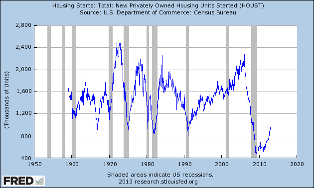
Finally, the low levels of inventory have led to a big increase in new home construction, as shown in the housing starts figures:
Although they are coming off a low level, housing starts have clearly picked up and are rising at a strong clip.
Also note residential construction increased 22.3% last year -- a very strong number.
In short, housing still remains a big reason why the US economy may kick into a higher growth rate.
Auto Sales
Sales of cars and light trucks have been in a strong uptrend since the bottom of the recession.
The top chart shows the figures for the last five years. While we do have some dips in the figure, the overall upward trend is clear. The longer chart (lower chart) puts the action in overall historical context. The drop in activity during the Great Recession was the sharpest we've seen since 1980. But now overall figures are at levels seen with the mid-1990s expansion.
The reason for the importance of auto sales is, like housing, they have a decent multiplier effect on the economy. There are still a fair number of employees in this industry -- especially in the industrial Midwest -- the the process of making a car still requires a large amount of ancillary activity.
Manufacturing
The strongest evidence of a manufacturing resurgence is found in the latest ISM report, issued last week.
The report was issued today by Bradley J. Holcomb, CPSM, CPSD, chair of the Institute for Supply Management™ Manufacturing Business Survey Committee. "The PMI™ registered 53.1 percent, an increase of 2.9 percentage points from December's seasonally adjusted reading of 50.2 percent, indicating expansion in manufacturing for the second consecutive month. The New Orders Index registered 53.3 percent, an increase of 3.6 percent over December's seasonally adjusted reading of 49.7 percent, indicating growth in new orders. Manufacturing is starting out the year on a positive note, with all five of the PMI™'s component indexes — new orders, production, employment, supplier deliveries and inventories — registering above 50 percent in January."
Of the 18 manufacturing industries, 13 are reporting growth in January in the following order: Plastics & Rubber Products; Textile Mills; Furniture & Related Products; Printing & Related Support Activities; Apparel, Leather & Allied Products; Electrical Equipment, Appliances & Components; Miscellaneous Manufacturing; Fabricated Metal Products; Transportation Equipment; Petroleum & Coal Products; Machinery; Primary Metals; and Food, Beverage & Tobacco Products. The four industries reporting contraction in January are: Nonmetallic Mineral Products; Computer & Electronic Products; Wood Products; and Chemical Products.
Simply put, the report above is very bullish. It shows a broad path of growth over a variety of internal ISM figures (overall index, new orders, employment, supplier deliveries and inventories) along with a majority of industries growing.
The US report is confirmed by the latest Markit report:
The final Markit U.S. Manufacturing Purchasing Managers’ Index™ (PMI™)1 signalled a strong expansion of the U.S. manufacturing sector at the start of 2013. Moreover, at 55.8, below the earlier flash estimate of 56.1 but higher than that recorded in December (54.0), the PMI signalled the fastest rate of growth in nine months.
Here is a chart of Markit's overall figures:
When looking for the reasons of the manufacturing increase, consider these points from the latest ISM report:
It is interesting that these reports are not in sync with the regional Fed reports, a situation that I cannot explain.
All three of the above sectors -- housing, autos and manufacturing -- are bedrock components of the economy. If all three are doing fairly well, the worst that can happen is slow growth. There is simply too much of a multiplier effect of the combined total for a recession to occur with the above three expanding.
However, this is before we get to the latest and upcoming fiscal follies from the idiots in Washington. We'll touch on that tomorrow.
To sum up the national and international position, I just don't see strong enough overall growth in any economy to warrant a strong long position right now. The best reading of the data is that we'll see a stronger second half, with the US housing market providing sufficient domestic stimulus combined with a more settled fiscal situation. This would also allow the EU to continue strengthening or bottoming. The stronger second half argument leads could lead into the fact that the market is a leading indicator of anticipated future activity -- a fair point as far as it goes, but I just don't see the overall underlying strength to support the rally long term.
Then came Friday's move higher, which led me to question my analysis yet again. Over the weekend, I realized that my conclusion was based on a macro reading of other world economies, and not the fact that the US being the largest world economy could achieve a level of growth sufficient to propel it beyond the 2% GDP growth rate we've seen for the last few years. In addition, for the last few years I've been wedded to an analysis that calls for US growth between 0%-2% (an analysis that has been mostly correct).
So, as a thought exercise, let's look at a few data points that support the idea the US is about to move into a period of higher growth.
Housing
If any sector can help to move the economy into a higher gear, it's housing, largely because it provides a tremendous multiplier. When a house is built, it requires a large amount of raw materials converted into useful items (wood, copper, etc..). There is also a decent amount of labor involved. Finally, there is a large amount of durable goods that go into a house (furniture and appliances). All of these factors add up to a decent multiplier for the macro economy as a whole.
For me, the real story of housing is the low inventory levels we're seeing at the macro level, as shown in the following two charts.
The top chart of new homes inventory shows levels at some of their lowest levels in 40 years, while the lower chart if existing homes shows that levels are now at far more normal levels. These inventory levels have led to price increases, as shown in the year over year percentage change in the Case Shiller index:
Finally, the low levels of inventory have led to a big increase in new home construction, as shown in the housing starts figures:
Although they are coming off a low level, housing starts have clearly picked up and are rising at a strong clip.
Also note residential construction increased 22.3% last year -- a very strong number.
In short, housing still remains a big reason why the US economy may kick into a higher growth rate.
Auto Sales
Sales of cars and light trucks have been in a strong uptrend since the bottom of the recession.
The top chart shows the figures for the last five years. While we do have some dips in the figure, the overall upward trend is clear. The longer chart (lower chart) puts the action in overall historical context. The drop in activity during the Great Recession was the sharpest we've seen since 1980. But now overall figures are at levels seen with the mid-1990s expansion.
The reason for the importance of auto sales is, like housing, they have a decent multiplier effect on the economy. There are still a fair number of employees in this industry -- especially in the industrial Midwest -- the the process of making a car still requires a large amount of ancillary activity.
Manufacturing
The strongest evidence of a manufacturing resurgence is found in the latest ISM report, issued last week.
The report was issued today by Bradley J. Holcomb, CPSM, CPSD, chair of the Institute for Supply Management™ Manufacturing Business Survey Committee. "The PMI™ registered 53.1 percent, an increase of 2.9 percentage points from December's seasonally adjusted reading of 50.2 percent, indicating expansion in manufacturing for the second consecutive month. The New Orders Index registered 53.3 percent, an increase of 3.6 percent over December's seasonally adjusted reading of 49.7 percent, indicating growth in new orders. Manufacturing is starting out the year on a positive note, with all five of the PMI™'s component indexes — new orders, production, employment, supplier deliveries and inventories — registering above 50 percent in January."
Of the 18 manufacturing industries, 13 are reporting growth in January in the following order: Plastics & Rubber Products; Textile Mills; Furniture & Related Products; Printing & Related Support Activities; Apparel, Leather & Allied Products; Electrical Equipment, Appliances & Components; Miscellaneous Manufacturing; Fabricated Metal Products; Transportation Equipment; Petroleum & Coal Products; Machinery; Primary Metals; and Food, Beverage & Tobacco Products. The four industries reporting contraction in January are: Nonmetallic Mineral Products; Computer & Electronic Products; Wood Products; and Chemical Products.
Simply put, the report above is very bullish. It shows a broad path of growth over a variety of internal ISM figures (overall index, new orders, employment, supplier deliveries and inventories) along with a majority of industries growing.
The US report is confirmed by the latest Markit report:
The final Markit U.S. Manufacturing Purchasing Managers’ Index™ (PMI™)1 signalled a strong expansion of the U.S. manufacturing sector at the start of 2013. Moreover, at 55.8, below the earlier flash estimate of 56.1 but higher than that recorded in December (54.0), the PMI signalled the fastest rate of growth in nine months.
Here is a chart of Markit's overall figures:
When looking for the reasons of the manufacturing increase, consider these points from the latest ISM report:
- "Fiscal cliff, uncertainty in general and EU economic weakness are factors causing our customers to be very tentative with commitments for product purchases in 2013." (Machinery)
- "Midwest drought impact will be felt at least through midyear, impacting protein, sweeteners, eggs, oils, emulsifiers, etc." (Food, Beverage & Tobacco Products)
- "Slowing interest in high-dollar purchases reflects continuing economic uncertainty." (Miscellaneous Manufacturing)
- "Expenditure and investment are expected to remain high in North America in Q1 and Q2, 2013." (Petroleum & Coal Products)
- "Housing sales are trending upward in light of overall market uncertainty, translating to improving optimism in appliance market." (Electrical Equipment, Appliances & Components)
- "Still waiting for reaction to consumer tax increases." (Fabricated Metal Products)
- "Government spending is very low, probably due to the fiscal cliff and the looming debt ceiling." (Transportation Equipment)
- "Business is improving." (Furniture & Related Products)
- "The general theme developing in our industry is that we can move suitable volumes. However, profit margin is elusive." (Wood Products)
- "Overall production volume decreasing. Decrease is led by decline in exports of 10 percent." (Chemical Products)
It is interesting that these reports are not in sync with the regional Fed reports, a situation that I cannot explain.
All three of the above sectors -- housing, autos and manufacturing -- are bedrock components of the economy. If all three are doing fairly well, the worst that can happen is slow growth. There is simply too much of a multiplier effect of the combined total for a recession to occur with the above three expanding.
However, this is before we get to the latest and upcoming fiscal follies from the idiots in Washington. We'll touch on that tomorrow.
Morning Market Analysis; European Sell-Off Edition
The big story yesterday was the equity market sell off in Europe caused by political scandal in Spain (top two charts) and an upcoming election in Italy (bottom two charts). The Spanish market's daily chart (top chart) shows that prices have dropped about 10% over the last few days. PRices have fallen through all the shorter EMAs and the 10 day EMA is about to move through the 20. Also note that technically, prices are already at the 50% Fib level -- a very strong technical shellacking. On the Spanish weekly chart (second from top) prices have already broken the trend established in July of last year.
The Italian market charts (bottom two charts) have similar technical profiles, albeit a bit less several in their implications. The daily chart (second from bottom) has only sold off to the 38.2% Fib level while the weekly chart shill has its long-term trend intact, albeit barely.
The sell-off also hit the French market, shich dropped over 3%, breaking a short, month-long trend. The market is now in retreat, with the next logical target being the 61.2% Fib lever or the top Fib fan level.
Finally, there is the German market, which sold off right to technical support.
Monday, February 4, 2013
The Super Bowl Power Outage and Our Terrible Infrastructure
There was a 30 minute black out during the Super Bowl last night, which seems like an appropriate time to bring up the terrible state of the US' infrastructure.
Here's the report card of the US' infrastructure:
Aviation
D
Bridges
C
Dams
D
Energy
D+
Levees
D-
Rail
C-
Roads
D-
Schools
D
Solid Waste
C+
Transit
D
Wastewater
D-
America's Infrastructure GPA: D
Estimated 5 Year Investment Need: $2.2 Trillion
Would this be a great way to lower unemployment and get the economy moving again? It did work for China, after all.
Estimated 5 Year Investment Need: $2.2 Trillion
Would this be a great way to lower unemployment and get the economy moving again? It did work for China, after all.
Why the "Currency War" Meme Is Useless
I'm not sure who first coined the phrase "currency war." By my recollection, it was first used over the last four years by Brazil, as they started to complain about low US interest rates lowering the dollar's value. This in turn raised the price of commodities, which hurt Brazil which is more dependent on commodity exports for growth. Regardless, this term continues to be used by a variety of sources and people. But while this is a great way to gain traction for your website, it's terrible analysis that is factually incorrect for a number of reasons.
First, the standard policy response to a recession from any central bank is to lower interest rates. This is not with the intent to start a currency war; it occurs to stimulate the local economy. And while this move may lead to a lower currency value, that is also an intended result of lowering rates, as a lower currency value makes the home country's goods more competitive on the world stage.
But more importantly, the US was not the only country to lower interest rates after the Great Recession: in fact, interest rates from all around the world are at record low levels.
For example, the ECB has interest rates at .75%. And yet, we see the following chart for the euro:
Yes, the euro was declining from mid-2011 to mid-2012. However, it was during this time that the entire trading world though the EU was going to implode. Talk of a "Grexit" were rampant. Editorial writers fell over themselves trying to predict the EUs imminent collapse. In other words, the macro-economic and political background against which traders make their bets was uniformly bearish.
But, starting at the end of last summer when the ECB chief said he would do whatever it takes to save the EU union, the euro has been rallying despite it still has a 75 basis point discount rate. The reason for the rally is a general impression that the economic and political environment is healing.
And then there is Japan, who's interest rate has been at record lows since the Clinton While House. Yet, the month chart of the yen for the last five years looks like this:
We see an overall rally that lasts nearly five years. It was only after the new government started to talk about deliberately devaluing the yen, accepting a higher inflation target and passive a stimulus bill that traders started to sell the yen.
And then there is the dollar:
Despite having record low rates since the end of the Great Recession, the dollar rallied from mid-2011 to mid-2012. And while the dollar has dropped since then, it's not at a record low as one would think in the current rate environment.
And then there's the British Pound. Although the Bank of England has kept rates at low levels since the beginning of the expansion, the Pound has been trading in a range for two years:
In times of economic hardship, central banks lower interest rates -- that's central banking 101. If they didn't lower rates because of a fear of starting a currency war, there would be an uproar from traders and economists about their non-movement. In short, the idea that there is a global currency war going on just doesn't play out in the charts.
First, the standard policy response to a recession from any central bank is to lower interest rates. This is not with the intent to start a currency war; it occurs to stimulate the local economy. And while this move may lead to a lower currency value, that is also an intended result of lowering rates, as a lower currency value makes the home country's goods more competitive on the world stage.
But more importantly, the US was not the only country to lower interest rates after the Great Recession: in fact, interest rates from all around the world are at record low levels.
For example, the ECB has interest rates at .75%. And yet, we see the following chart for the euro:
Yes, the euro was declining from mid-2011 to mid-2012. However, it was during this time that the entire trading world though the EU was going to implode. Talk of a "Grexit" were rampant. Editorial writers fell over themselves trying to predict the EUs imminent collapse. In other words, the macro-economic and political background against which traders make their bets was uniformly bearish.
But, starting at the end of last summer when the ECB chief said he would do whatever it takes to save the EU union, the euro has been rallying despite it still has a 75 basis point discount rate. The reason for the rally is a general impression that the economic and political environment is healing.
And then there is Japan, who's interest rate has been at record lows since the Clinton While House. Yet, the month chart of the yen for the last five years looks like this:
We see an overall rally that lasts nearly five years. It was only after the new government started to talk about deliberately devaluing the yen, accepting a higher inflation target and passive a stimulus bill that traders started to sell the yen.
And then there is the dollar:
Despite having record low rates since the end of the Great Recession, the dollar rallied from mid-2011 to mid-2012. And while the dollar has dropped since then, it's not at a record low as one would think in the current rate environment.
And then there's the British Pound. Although the Bank of England has kept rates at low levels since the beginning of the expansion, the Pound has been trading in a range for two years:
In times of economic hardship, central banks lower interest rates -- that's central banking 101. If they didn't lower rates because of a fear of starting a currency war, there would be an uproar from traders and economists about their non-movement. In short, the idea that there is a global currency war going on just doesn't play out in the charts.
Morning Market Analysis
Of the four major averages, only one (the QQQs) are not in the middle of a rally. All have strong EMA positions and all are above their respective 200 day EMA. There are a few warning signs to consider, however. First, notice the large valume spike on the transports (bottom chart). That could be interpreted as a buying frenzy. In addition, all the MACDs are weakening. The IWMs and IYTs (bottom two charts) have flashed sell signals while the SPYs (top chart) is weakening.
However, these negative developments could just as likely be interpreted as the beginning of a consolidation rather than a sell off.
At the same time, we're finally seeing the treasury market begin to sell off. The longer end (bottom two charts) are clearly in a downward trend with prices below the 200 day EMA and the shorter EMAs crossing below the 200 day EMA. Also note that prices have moved through support established in early September. The 7-10 year section of the market (second from top), is right at support with a weakening technical position.
The next few weeks will be critical to seeing of the treasury market is finally going to meaningfully sell-off, thereby providing much needed funds for the equity markets.
Subscribe to:
Posts (Atom)