Thursday, August 26, 2010

Yesterday's Market


After forming a double top (a and b), prices have moved lower, consolidating in two general areas (c and d).


Yesterday prices gapped lower at the open (a) and moved lower. However, their lower points (b) were accompanied by a reverse in momentum (c), signaling a reverse. Prices then rose into the 50 minute EMA (d). They then reversed again (e) and rose for the rest of the day (f), moving through the resistance areas established at the close of the previous days markets (g). Notice how along the way, prices fell into the EMAs (h).

The Russell 2000 hit support at previous levels (b) and rallied strongly yesterday (a). This is probably the result of program trading.


The QQQQs have had three big gaps lower over the last two weeks (a, b and c).


After gapping higher yesterday (a), the IEFs moved lower for the remainder of the trading session (b and c). Prices traded higher into the 10 and 20 minute EMA throughout the day (d).

Yesterday's bounce looks technical. The IWMs hit support where there were probably a ton of computerized buy orders. The Treasury markets fall also looks like like a "let's take some profits off the table" situation.


Gold is still in a rally (a) and has consolidated gains by falling into the 10 and 20 day EMA (b). Also note the EMAs are in a very bullish posture (c) -- the shorter are above the longer and all are rising.


Wheat continues to correct after breaking its drought induced uptrend (a). Prices are currently at important support levels (b). If they fall through the next area of support is at the 50 day EMA (d). Also note that momentum is clearly negative (c).

Wednesday, August 25, 2010

Notes on the Bond Market

From the NY Times:

For a few months at the start of this year, things were looking up for stock market investing. Optimistic about growth, investors were again putting their money into stocks. In March and April, when the stock market rose 8 percent, $8.1 billion flowed into domestic stock mutual funds.

But then came a grim reassessment of America’s economic prospects as unemployment remained stubbornly high and private sector job growth refused to take off.

Investors’ nerves were also frayed by the “flash crash” on May 6, when the Dow Jones industrial index fell 600 points in a matter of minutes. The authorities still do not know why.

Investors pulled $19.1 billion from domestic equity funds in May, the largest outflow since the height of the financial crisis in October 2008.

Over all, investors pulled $151.4 billion out of stock market mutual funds in 2008. But at that time the market was tanking in shocking fashion. The surprise this time around is that Americans are withdrawing money even when share prices are rallying.

The stock market rose 7 percent last month as corporate profits began rebounding, but even that increase was not enough to tempt ordinary investors. Instead, they withdrew $14.67 billion from domestic stock market mutual funds in July, according to the investment institute’s estimates, the third straight month of withdrawals.

A big beneficiary has been bond funds, which offer regular fixed interest payments.

As investors pulled billions out of stocks, they plowed $185.31 billion into bond mutual funds in the first seven months of this year, and total bond fund investments for the year are on track to approach the record set in 2009.

Here is the accompanying graphic:


From last week's Barron's:

But in the Information Age, you can find out anything about anything on—where else?—Google. Google Trends tracks what people are searching as well as how many news stories mention the search term. And, observers Nicholas Colas, chief market strategist at BNY ConvergEx Group, "bubble" seems to have a hold on the imaginations of Google users for the better part of the past 18 months.

Colas notes that it takes a while for a bubble to inflate fully and burst. The peak in Google searches for "housing bubble" was in 2005—years before the top in the market. It takes time, and usually leverage, to get the last, credulous buyers who ignore all the warnings to buy at the top tick.

But as for the terms "bond bubble" and "Treasury bubble," Google hasn't had enough searches to register a trend, Colas finds. That suggests bond investors "seem oblivious to bubble chatter," so he concludes that any backup in yields is apt to be met with more buying.

.....

As ISI Group points out in its Friday missive to clients, yields on government bonds have collapsed around the globe in the past two months. While the 10-year U.S. Treasury yield hit a 16-month low of 2.53%, the German 10-year bund fell to a record low 2.27% while the comparable U.K. gilt dipped below 3%, to 2.98%. And in Japan, the 10-year yield is under 1%, at 0.94%. So it's not just an American phenomenon.

.....

More importantly, Gluskin Sheff's David Rosenberg—who's been spot-on in his call on bonds and the economy slowing to stall speed—also takes issue with the two Jeremies' assertion that the $559 billion influx into bond mutual funds and $233 billion exodus from equity funds from January 2008 to June 2010 signals a bubble. If anything, it shows households' increased acumen, says Rosenberg, given that Treasury bonds returned 13% over that span while stocks lost 21%.


From the WSJ:

A similar bubble is expanding today that may have far more serious consequences for investors. It is in bonds, particularly U.S. Treasury bonds. Investors, disenchanted with the stock market, have been pouring money into bond funds, and Treasury bonds have been among their favorites. The Investment Company Institute reports that from January 2008 through June 2010, outflows from equity funds totaled $232 billion while bond funds have seen a massive $559 billion of inflows.

We believe what is happening today is the flip side of what happened in 2000. Just as investors were too enthusiastic then about the growth prospects in the economy, many investors today are far too pessimistic.

.....

Today the purveyors of pessimism speak of the fierce headwinds against any economic recovery, particularly the slow deleveraging of the household sector. But the leveraging data they use is the face value of the debt, particularly the mortgage debt, while the market has already devalued much of that debt to pennies on the dollar.

This suggests that if the household sector owes what the market believes that debt is worth, then effective debt ratios are much lower. On the other hand, if households do repay most of that debt, then the financial sector will be able to write-up hundreds of billions of dollars in loans and mortgages that were marked down, resulting in extraordinary returns. In either scenario, we believe U.S. economic growth is likely to accelerate.


A few points/observations:

1.) Personally, from an investing perspective I'm a big fan of high quality, dividend paying equities and some fixed income. For example, I like portfolios that have companies like Exxon, MMM, coke, etc... The reason is with a dividend you always have a little bit of cash coming in. This puts a natural floor under the stock and provides an income stream for further investments. I'm hoping this style of investing is catching on; the pure growth play is a huge, double down bet at the investment table.

2.) As both NDD and I have pointed out, we've seen in increase in the personal savings rate over the last year or so. That money has to go somewhere. Savers see bank accounts paying next to nothing, so a bond mutual fund with liberal withdrawal privileges is the next best thing.

3.) In addition to the Treasury market, consider these charts of the mortgage backed bond market, investment grade corporate bond market and the junk bond market:


Money is clearly flowing into a variety of fixed-income funds, not just the Treasury Market.

4.) All of the fixed income markets have an inflection point that starts a rally right around the break-out of the Greek crisis this spring. This tells us that the Greek crisis was probably a catalyst event for the investment public, and a clear signal to put on the breaks and move money into more conservative venues. Since then, the US economy has printed weaker numbers, which has confirmed that asset shift to income yielding investments.


A note about Housing Permits, Starts, Sales, and Prices

- by New Deal democrat

Here's what Calculated Risk said about June existing home sales when they were reported a month ago:
Months of supply increased to 8.9 months in June from 8.3 months in May. A normal market has under 6 months of supply, so this is already high - and probably excludes some substantial shadow inventory. And the months of supply will increase sharply next month when sales collapse.
So July existing home sales were reported yesterday and, surprise surprise, they collapsed. This didn't prevent the usual Circle Jerks of Doom from taking place at the usual locations.

Notice I didn't use the present progressive tense, "collapsing". That's because home sales aren't.

In the first place, you have to distinguish between volume, i.e., the number of housing units being sold, from the prices at which they are being sold. As I pointed out just a couple of days ago, housing prices are nowhere near bottom and probably have at least two more years to fall. Here's a graph from Ned Davis Research via The Big Picture, making that same point:


But sales, i.e., volume, are another story altogether. Here's a graph, showing house permits (blue) and starts (red) since the peak of the housing bubble five years ago:


Note that both these series bottomed out in early 2009 and have not made new lows since.

Here's a close-up of the same two series since then:


Notice that there are two peaks, coinciding with the original, and extended, end dates for the $8000 housing credit. Notice that permits fell immediately in May and have stayed in the same range in the two months since. Starts, as per usual, lagged one month.

Now here is a graph showing purchase mortgage applications from the mortgage bankers association from the same time period as the second permits and starts graph above:


Notice that purchase applications fell off a cliff immediately after the April 30 deadline, and have been in a range since the beginning of July.

This morning, new home sales followed the same pattern. After surging to (all months revised) 414,000 in April, they fell to 281,000 in May, rose to 315,000 in June, and fell back to 276,000 in July (sorry, no graph).

Now here are existing home sales. The graph covers a longer time period, but the two peaks and subsequent swan dives after the expiration dates of the housing credit are obvious:


Home sales declined in June, but the real force of houses that went under contract after the April 30 ending of the $8000 tax credit wasn't felt until July (exactly as CR said). If that isn't good enough for you, then consider Prof. Dean Baker of "Beat the Press", who isn't exactly a raging optimist, who said, "Economists With a Clue Were Not Surprised by the July Plunge in Home Sales" , noting that they came, on schedule, about 6 - 8 weeks after the plunge in mortgage applications.

While I can't swear that August existing home sales won't be worse than July, they probably won't be substantially worse. Furthermore, because sales are seasonal, it is perfectly possible that December - February will be worse than this. What I think is just about certain is that this is the seasonally adjusted bottom taking place right now, perhaps including next month, a bottom that was delayed a year by the housing credit. Which will differentiate 2011, which will likely feature slowly rising sales with still-declining prices, from the 2006-08 period during which both sales and prices were declining.

But anyone who says that home sales are "collapsing" as an ongoing event is either ignorant or is getting their kicks by being the host of the Circle Jerk of Doom, or both.

Yesterday's Market


Notice the large number of failed rally attempts over the last 10 days; prices have just had a hard time getting beyond the 10 and 20 minute EMA.


Yesterday we have another gap lower, making five in the past week and a half.


The EMAs are now turning bearish (a), with the shorter crossing below the longer (especially the 200 day EMA). The A/D line hasn't seen a big exodus of money yet (b), but the CMF is starting to show people leaving (c). In addition, momentum is clearly waning (d).


\Prices are at clear support levels (a).


Notice that prices yesterday hit upside resistance at the 200 minute EMA three times.

Simply put, the market has a clear bearish tilt right now. Don't expect to see rallies maintain momentum beyond the 200 day EMAs.


Further confirming the bearish tone of the stock market is the bond market's rally, which is still in full force. The long-term uptrend is still in place (e) and the EMAs are still very bullish (a). Money is flowing into the market (b and c) and there is clear momentum (d).


After peaking at the end of April (a), lumber prices tumbled (b) and are currently consolidating losses (c).


Copper prices are correcting. They have either formed a flag pattern (b) or a downward sloping pennant pattern (c). Momentum is moving lower (d).

Copper could still be in a simple correction from their recent rally as prices have yet to break below major support. However, with the weakness in the housing market, I have to wonder how strong copper can be going forward.

Tuesday, August 24, 2010

Business Investment, Consumer Spending And Current Economy

From the Washington Post:

Many Democrats say the economy needs more stimulus. Business lobbyists and their Republican allies say it needs less regulation and lower taxes.

But here in the heartland of America, senior executives say neither side's assessment fits.

They blame their profound caution on their view that U.S. consumers are destined to disappoint for many years. As a result, they say, the economy is unlikely to see the kind of almost unbroken prosperity of the quarter-century that preceded the financial crisis.

Across the industrial parks and office towers of the Chicago region, in a more than a dozen interviews, senior executives said they see Americans for years ahead paying down debts incurred during the now-ended credit boom and adjusting spending to match their often-reduced incomes.

"It's a different era," said Daryl Dulaney, chief executive of Siemens Industry, which has 30,000 U.S. employees who make lighting systems for buildings and a wide range of other products. "Our hiring and investment decisions have to be prudent and reflect that."

Executives see little evidence that the economy is slipping back into recession. But they describe a business environment in which sales come in fits and starts and their customers can't predict what they will want to buy in the future.

"In the past, our customers had more long-term vision on what they're going to need," said Bill Larsen, president of Larsen Packaging Products in Glendale Heights, Ill. Now, he said, "they don't know what they're going to need and when they're going to need it."

I think this article/perception really explains a great deal about the current economic situation. First, the latest Senior Loan Survey from the Federal Reserve noted that loan demand is still weak. As the article highlights, businesses see little need to take out loans because they see a weak economy going forward.

NDD hit on a big part of it yesterday -- the paying down of debt and how that is impacting growth going forward. Consider these charts from the St. Louis Federal Reserve:


First, this chart is exponential. Total consumer debt outstanding has increased at a more or less consistent rate until this recession. Now the growth has dropped a bit as households pay down their debt. This drop in debt has occurred in both mortgage and revolving credit (neither of the following charts are logarithmic to better highlight the severity of the contraction in both):


As a result of this decrease, households are under less financial stress:


It's important to note that despite the decrease in consumer debt, the economy is seeing some increase in PCEs.


Total real PCEs are clearly off their lows, although recent revisions have placed them below the peak of the last expansion.


Real spending on services has increased slightly, but is better characterized as having dropped and leveled off. These comprise about 65% of total PCEs.


Real spending on non-durables has increased from its post recession lows, as has


Spending on durable goods.

The money for this spending is coming from increased savings:


In short, the consumer is spending, just not as robustly as before. And his paying down debt is a key part of the slowdown.

No, Really, Austerity Doesn't Work

From the FT:

The eurozone’s growth spurt lost momentum this month, as an expansion in output in Germany and France failed to make up for a near standstill elsewhere in the 16-country region.

A closely followed barometer of business activity on Monday pointed to a slower but still solid expansion in private sector activity, with the region’s prospects hanging largely on Germany and France, its two largest economies.

The purchasing managers’ indices are regarded as an early indicator of business trends, and the latest readings contained some hope of growth continuing at a brisk pace, even if the US economy slows.

But they intensified worries that the region will be marred increasingly by weaker growth in the peripheral eurozone countries such as Spain and Greece, where fears remain over the stability of public finances


I realize that abject stupidity is becoming the currency of political discourse on both sides of the aisle, but really, the whole austerity thing doesn't work.

Here's a chart of the data from the same article:

Yesterday's Market


Click for a bigger chart.

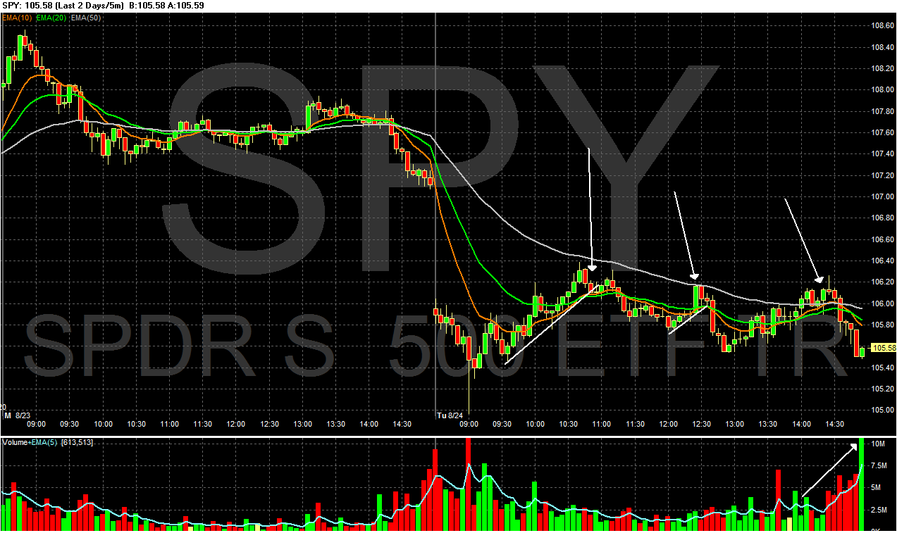
Prices gapped higher at the open (b), but hit resistance 108.5 and reversed, rallying into the 10 minute EMA (d) before hitting support t a low established last week (e and e). Prices twice tried to rally through the EMAs but couldn't get much beyond (f and g), so they sold off at the end of trading (h) on increasing volume.


In the last 8 days, we've had four gaps lower (a, b, d and e) and one gap higher (c). Also note that after the gap higher, prices hit resistance at the 200 day EMA which they could not get beyond.

In other words, the overall tone of the market is bearish right now.


One of the things I find really interesting is how the oil market has been stuck in a range for the last few months. Notice that after breaking through the $80/bbl area (a), prices fell back just as quickly (b), printing some very strong downward sloping bars. Now the EMAs are bearish with the shorter EMAs below the longer EMAs and prices below the EMAs pulling the EMAs lower. Also note the MACD has given a sell signal and momentum is clearly leaving the market.


Corn has risen in sympathy with the wheat market. Prices have moved through key resistance levels (a), but have upside resistance with line (b). Also note the EMAs are rising and there is a fair amount of space between them. There is also plenty of momentum (d), and a bit of upside left.


Soy beans -- which had been rising with wheat -- have broken their uptrend (a) and have printed some strong lower bars (b). While the longer EMAs are still rising, the shorter EMAs (the 10 day EMA) has turned lower, and the MACD has given a signal (d).


Cotton is still in a strong uptrend (a) which has consolidated gains (b) during the rally. Also note the strong EMA picture (c) although the MACD is close to giving a sell signal.

Monday, August 23, 2010

A few additions to the Site

- by New Deal democrat

With Bonddad's permission, I've made a couple of additons to the site.

First of all, on the right side I've added a list of the most recent comments, so it is easier to have and follow a conversation on any recent blog posts.

Second, I've added a few more blogs to the blogroll. I've tried to focus on some that are worthy of your attention, but not so widely followed as others.

Carpe Diem is Prof. Mark Perry's site. There are a plethora of perenially negative economic blogs, but Perry makes Bonddad and me look like suicidal Doom and Gloomers. The commentary is intelligent and is a good counterpoint to other blogs.

Tim Duy is a colleague of Prof. Mark Thoma at the University of Oregon. His economic commentary is always thoughtful.

A Dash of Insight is a trading and investment blog by Jeff Miller, with interesting meta-commentary as well (e.g., on Confirmation Bias).

Matt Trivisonno's blog is likewise about trading and technical analysis, (e.g., the recent upside breakout of the A/D line), but also includes the Daily Treasury update on withholding taxes, and some decidedly populist commentary.

Finally, Russ Winter's blog, a/k/a Winter Watch is back from behind a paywall, and so long as that lasts, he's added to the list. Russ's curmudeonly astringent humor is worth a read all by itself, but his analysis is top-notch, whether you a agree with him or not.

I hope you enjoy these, and hopefully we can add a few more goodies for you.

Regarding Government Numbers

One of the oldest arguments on the internet is the government -- or non-government numbers for that matter -- are deeply flawed and therefore useless in economic analysis. This argument falls short in one very important way: there is no proof.

Purveyors of this theory first point to the website Shadow Stats as evidence. However they are wrong. For example, according to their "methodology" the US inflation rate was over 5% for the entire decade of 2000-2010.


However during this same time the US 10-year Treasury crossed 5% three times:


Either Shadowstats is correct or one of the most liquid and heavily traded markets in the world is correct. Sorry Shadowstats, but you're way off.

Then there is the issue of "survivor bias." This theory states that surveys are biased in favor of firms that survive economic hard times, thereby skewing the numbers positively. Unfortunately, this theory is also wrong as we debunked here a while ago. Here is an example from the Census Bureau regarding retall sales.

"Births are added to the monthly survey in February, May, August, and November of each year. At the same time, deaths are removed from the survey. To minimize the effect of births and deaths on the month-to-month change estimates, we phase-in these changes by incrementally increasing the sampling weights of the births and decreasing the sampling weights of the deaths in a similar fashion. In the first month, we tabulate the births at one-third their sampling weight and tabulate the deaths at two-thirds their sampling weight. In the second month, we tabulate the births at two-thirds their sampling weight and tabulate the deaths at one-third their sampling weight. In the third month, we tabulate the births at their full sampling weight and the deaths are dropped (sampling weight equal zero)."

Then there's the issue that no one has issued any research on this topic. Here's a fun exercise. Go to SSRN -- the Social Science Research Network -- and start searching for papers from economists and statisticians on the failure of government numbers. If the problem were as widespread as some think, then there should be evidence as in an entire body of work indicting the government statistical system. However -- there is no such body of work; it does not exist.

The short version is people who have absolutely no training in statistics think they know more than the people who staff government and professional forecasting agencies -- who also happen to be trained in statistics.

The reason for this entry is to reiterate a central rule of the comments section:

2.) If you are going to challenge the veracity of government statistics you must provide a reference from a paper written by someone with at least a masters in a relevant discipline (statistics, mathematics, economics etc...). There has been a raging debate in the economic blogosphere about government statistics. The classic debate is about the birth/death model used by the Bureau of Labor Statistics. (To find out more, go to the Bureau of Labor Statistics and type in birth death in the search bar in the upper right hand corner). The BLS uses this to overcome sampling errors in their employment statistics. According to some bloggers this is a bogus adjustment which makes the numbers unreliable. However, go to www.ssrn.com -- the social science research network -- and type in birth/death in the search bar. You'll find 34 hits that center around health care systems. But there is nothing about the BLS' birth/death model. In other words, among academics in the economic and financial world, there isn't a debate (at least not yet). So, the people who should be calling bullshit -- and backing it up with data and information -- are not calling bullshit. When they are, I'll be happy to consider the information.

And please -- Shadowstats is crap.

And a second reason is people have a habit of saying, "the government statistics are wrong" when the statistics disagree with their assertions. But when the statistics confirm their assertions, the government numbers are sacrosanct.

Bottom line: these are the numbers economists use. When I see an economist with a Ph.D. say, "these numbers are flawed and I can prove it" then I'll listen. But when a guy on a blog with a political ax to grind says the same thing, well, let's just say credibility is an issue at that point.

So here's the deal. If you're going to argue that economic numbers are wrong on this blog, please prove it. And, no, your word isn't good enough. Find someone who can prove they know what they are talking about (that's what PhDs are for) to back-up your assertion. And make sure the entire paper is about the topic, not just a sentence you can mis-quote and mis-construe. Better yet, find a group of people to back-up your assertion. Until then, Mish and Daily Kos are open for business.

The S l o w - M o t i o n Bust enters a new phase

- by New Deal democrat

Way back in 2006,(see, for example, here) I started to develop a narrative for what I called "the s l o w - m o t i o n bust" -- a 19th century style debt panic that, because of all the Great Depression and post World War 2 structures put in place to prevent exactly that, would unfold in very slow motion, taking years to play out. That's why I've always cautioned that my bullishness on the US economy last year and earlier this year has been tempered by the idea that it is "Springtime during an Ice Age". In other words, it is a cyclical economic expansion that unfolds during a secular downturn that won't be over until the structural issues of debt and the declining middle class in the US are resolved.

For example, here I am on August 4, 2006 laying out a scenario:
It [ ] helps to keep a narrative in my head for how the numbers are likely to develop, and I am beginning to expect the following:

The consumer sector of the economy (the 'bonddad economy') is in recession right now (or will be imminently).
Despite that, the 1906 industrial economy (the 'kudlow economy') will continue to grow.
- The growth in the kudlow economy will continue to outweigh the nevertheless-increasing drag of a recession in the bonddad economy (daisycolorado wins her bet).
- This also means that the fed's attempt to tame inflation will fail.
- Thus, the fed will continue to have to raise rates, against its will, to preserve some value in the dollar and combat rising inflation.
- Inflation will not be brought to heel until the kudlow economy contracts (i.e., goes into recession as well).
- The consumer will be in no shape to rescue the industrial economy's collapse, as the consumer did in 2001-2.
- At some point in the next 2-4 years, we have the worst recession since and maybe including 1981-2.
- We have then reached the midpoint of the 60 year kondtrafieff interest rate cycle, and interest rates and inflation will rise in a secular manner for the next 30 years

It's a narrative, I'm chewing on it, but the more I think about it, the more it makes sense to me.

And here I am in August 2007:
[T]he "credit crunch" is real and deflationary....

But the offset to that deflation is, the global dollar glut....

These two big forces are working at cross-purposes: the deflationary credit crunch is deflationary for domestic prices. The inflationary global dollar glut is inflationary for assets that can be held by foreigners. ...

There may be Very Bad Days for either of these forces. But they are both MegaSized and will takes years to play out. Mortgage resets in particular are less than 1 year into a 5 year death spiral.

This is the end of the disinflationary cycle that began in about 1980. Debt will be punished, savings will slowly be rewarded. It is a catastrophe that will play out in slow motion.
Not perfect of course, but not a bad narrative for what did in fact unfold in the next couple of years. I would say we have been through 3 Episodes of "the s l o w m o t i o n bust". First was the Wile E. Coyote moment of late 2007 - early 2008 during which the economy hung suspended in mid-air, but hadn't dropped yet. Then we got "The Panic of 2008" (btw, that post was published in November 2007 and almost exactly laid out the panic scenario that did take place the next year) including the US's "very bad day" of Black September 2008 as the entire US financial system failed systemically and had to be propped up by massive infusions of taxpayer dollars. The third episode is The Respite, in which the bailout succeeded in stabilizing the economy, consumers slowly regained enough confidence to spend again, global trade and manufacturing resumed, and finally employment bottomed and increased (and in the private sector, is still increasing) again.

It looks like we are embarking on a new phase, that started out with episode 4: "Europe's Very Bad Day." This meltdown from March and April, as bad luck would have it, coincided with the BP Gulf disaster and the ending of the $8000 mortgage credit in the US, and was exacerbated by Congress's insane refusal for months to give revenue-strapped states the aid they needed to get through a second bad year.

Perhaps more important than those transitory effects is the "choke collar" that the price of Oil places on any US recovery. No sooner is there growth than Oil charges back to $80+ a barrel, putting it at or near the 4% of GDP level which in the past has always triggered a slowdown or recession.

Some of the above more transitory problems, such as the Gulf oil catastrophe, have resolved themselves. Others, like new home permits, appear to have bottomed. On the other hand, Greece hasn't suddenly become solvent, and the recent spike in new unemployment claims suggests that states and localities continue to lay off 10,000s of workers.

More question marks are the continuing exposure of TBTF US banks to toxic debt, and whether the Treasury's open-ended commitment to pour endless taxpayer dollars into those institutions will overcome any difficulties. Finally, the renewed downturn in home prices may mean more underwater homeowners going into foreclosure or "walking away."

In the short term, it is well to remember that we have neither the $147 Oil nor the credit crisis that drove the 2008 economic crash. Leading Indicators so far only indicate a slowdown to zero growth, not an outright double-dip recession.
In the longer term, over at least the next two years, the S l o w - M o t i o n Bust will continue to play out until the underlying systemic problems are addressed. That includes:
- house prices falling to their long term multiple of income [ h/t Housing Tracker]


- household debt being paid down to levels at or near where they were before refinancing debt became the norm (i.e., the 1980s)


- and savings rates also reaching levels closer to their long term norm (back to the 1980s as well) [h/t Calculated Risk]


Only when the toxic debt is purged from the system will the s l o w - m o t i o n bust be truly over.

Yesterday's Market


Notice that the level denoted by (a) was still technically important last week, as prices attempted to move through this level, only to be rebuffed.


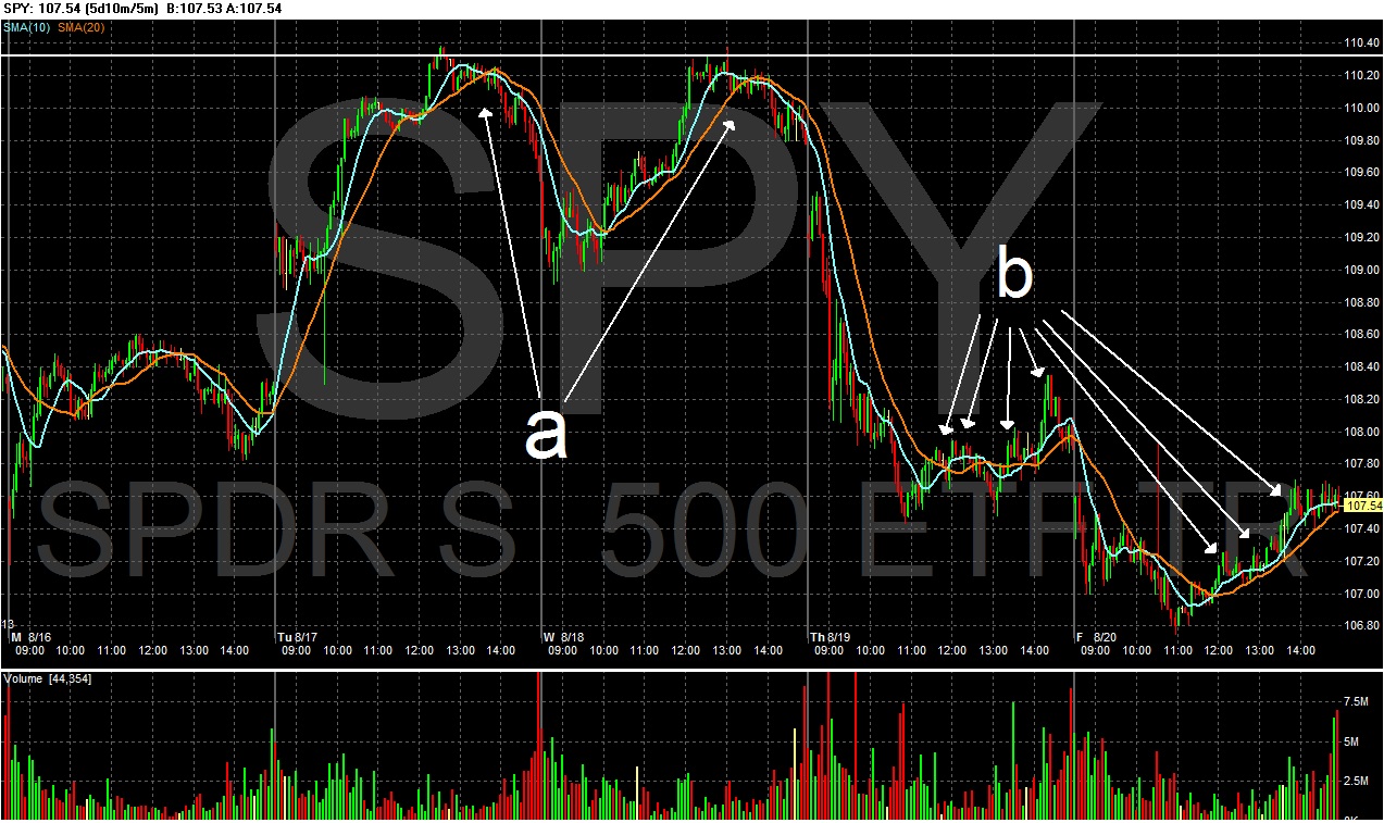
There were two important events last week. First was a double top, which occurred on Tuesday and Wednesday. Secondly, notice that prices had a difficult time maintaining any momentum on any attempt to move higher on Thursday and Friday. Every time prices attempted to move through the EMAs, they got above the level but couldn't continue higher.


With all three daily charts above, notice that all the averages are really floating around the 200 day EMA. In other words, for the last three months, the markets has been trying to figure out whether it's a bull or bear market.


A big reason for the equity market's indecision is the Treasury market continues to rally. Notice the uptrend that started in early April is still in play. In addition, the EMA picture is extremely bullish (a) with all the EMAs rising and the shorter above the longer. The A/D and CMF line indicate new money is coming into the market and the MACD line indicates there is clearly some momentum going forward.

Last week, the cattle market was a big winner. Prices moved through key resistance (a and b). Prices have been in an uptrend for several months (c), consolidating gains against the EMAs (d) along the way. However, the price arc is turning pretty parabolic (e), which indicates a pullback si highly likely.


Gold was also a big winner last week. Notice that prices are in an uptrend (a) and the EMAs are slowly turning more bullish (b). Also note that momentum is increasing as well (c).