From Bloomberg:
Mexico’s economy grew less than
forecast by any of the analysts surveyed by Bloomberg in the
second quarter as industrial production declined on a sluggish
U.S. recovery.
Gross domestic product expanded 1.5 percent from the year
earlier, rebounding from a revised 0.6 percent growth rate in
the previous three months, the National Statistics Institute
said on its website today. The median estimate of 17 economists
surveyed by Bloomberg was for growth of 2.3 percent. The economy
contracted 0.7 percent from the previous quarter.
The central bank cut its growth forecast for this year to
between 2 percent and 3 percent this month from 3 percent to 4
percent on stagnant exports to the U.S. and muted public
spending. Growth will accelerate in both the third and fourth
quarters, rising to 4 percent next year as the U.S. recovery
strengthens and the government passes key economic reforms,
according to the median estimate in a Bloomberg survey.
Industrial production fell 0.6 percent in the second
quarter from the year earlier, the statistics agency also said
today. The construction sector contracted 4 percent over the
same period amid a drop in government spending.
Here's a chart of the data:
And retail sales continue to show hit and miss year over year results:
And total production has stagnated for over a year -- although it is at higher levels than before the contraction:
Let's turn to the Mexican ETF, starting with the weekly chart:
The main feature of the chart is the rally from mid-2012 to the spring of 2013, when the market rallied about 45%. Since then, however, we've seen two waves of selling. The first in the mid-Spring, and the second that started three weeks ago. The logical price target for the second wave of selling is the 200 week EMA.
On the daily chart, the relief rally that took place starting in early July looks incredibly weak; it occurred on weak volume while the MACD was still in negative territory. Once prices got just above the 38.2% Fib level, they ran out of steam and started moving lower.
Wednesday, August 28, 2013
Tuesday, August 27, 2013
August consumer inflation rate probably +0.1%
- by New Deal democrat
As a corollary of the theme to my reporting that the Oil choke collar is an important factor in the economy, for the last few months I have been using the change in the price of a gallon of gas to forecast that month's CPI in advance. My point has been, that all you really need to know about inflation is the price of gasoline. So far each prediction has turned out to be within 0.1% of the actual number.
Yesterday the E.I.A. reported for the final week of August (next Monday will be September), so we can already estimate the inflation rate. My method is to take the change in the price of a gallon of gas and divide by ten, then add 0.1% to 0.2% to account for core inflation, or else divide by 16 to be more conservative, to arrive at the non-seasonally adjusted inflation rate.
In July the price of a gallon of gas was $3.59.1. This month it was $3.57.4. That is a -0.5% decline. Dividing by 10 gives us -0.05%, and adding 0.1% to 0.2% gives us +0.05% to +0.15%. Dividing by 16 gives us a -0.3% decline, and adding 0.1% to 0.2% gives us +0.07% to +1.7%.
The seasonal adjustment for August last year was -0.045%. This gives us a final seasonally adjusted inflation rate that rounds to +0.1% +/-0.1%.
That will replace last August's +0.5% inflation rate, so that the YoY inflation rate will be +1.6%. This inflation rate is subdued enough to suggest that real YoY wages have probably increased slightly in August.
I do not think these graphs are a coincidence
- by New Deal democrat
My intensive examination of real average and median wages and income has caused me to rethink a few other things. First of all, I do not think that the relationship in the graph below, which shows the employment to population ratio (blue) and real average wages (red), is a coincidence:
Notice that the employment to population ratio remained fairly steady from the immediate aftermath of World War 2 until the late 1960's, when women started entering the workforce in large numbers. By the 1990's, that trend had matured. So had Baby Boomers, the olders of whom hit age 55 in the year 2000. Research on this ratio has suggested that the decline from 2000 through 2007 was largely as a result of the beginning of the Boomer retirement tsunami. Since that time, of course, it has been augmentsd by the long term unemployed.
Meanwhile average wages for non-supervisory personnel (the series only began to be reported in the 1960's) peaked in the early 1970's and fell through the mid-1990's, and surprisingly, has increased since.
I am not suggesting that the mass entry of women into the workforce was in any way "wrong." I am merely pointing out that, as a simple matter of supply and demand, the mass entry of new laborers into the workforce should act to depress wages, and it certainly looks like that was the case. When the trend ended, so did the depression in real wages.
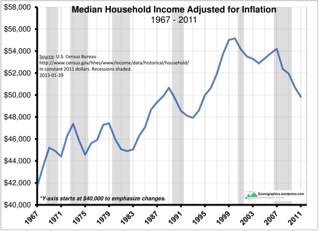
This has also caused me to rethink the graph below, showing that real median household income peaked in 1999:
As we have seen in other posts, real median wages rose slightly between 2000 and 2007, and even rose during the great recession, as the price of gas decreased. But real median household income declined. Just as we have seen that since the great recession, the continuing decline in real median household income is almost entirely a reflection of the decline in the employment to population ratio, the decline between 1999 and 2007 is probably really showing the same thing (recall that the median income of retirees is about half of that of working age households).
If this is true, then we should expect median household incomes to continue to decline for several more decades, as the entire Baby Boom generation retires and a majority of us have passed away.
By the way: those two spikes in the 1970's in the graph of real average wages? Here's a close-up of average wages (blue) and the inflation rate (red):
Back then, we had unions, and unions had power. They succeeded in writing automatic wage increases into contracts. These automatic increases were supposed to ensure that their wages did not erode due to inflation, and typically reflected the recent (higher) inflation rates. So although the spike in inflation receded (red line), the wage increases didn't (blue line), causing the echo-spike in real wages. That all ended with Reagan and Volcker.
Monday, August 26, 2013
Are We Closer to Recession Than We Think?
Over about the last month, a number of economic numbers have been released that are a bit concerning.
First, consider this point from Bloomberg:
Price gains of stocks in the Standard & Poor’s 500 Index (SPX) are outpacing profits by the fastest rate in 14 years as the bull market extends beyond the average length of rallies since Harry S. Truman was president.
The benchmark gauge for U.S. equities has risen 14 percent relative to income over the past 12 months to 16 times earnings, according to data compiled by Bloomberg. Valuations last climbed this fast in the final year of the 1990s technology bubble, just before the index began a 49 percent tumble. The rally that started in March 2009 has now outlasted the average gain since 1946, the data show.
For a contrary view, see this at Calafia Beach Pundit.
And then there was today's durable goods announcement (let's ignore the headline number which includes transportation bookings):
Core durable goods orders, excluding volatile transportation items, fell by a seasonally adjusted 0.6% last month, defying expectations for a 0.5% increase.
Core durable goods orders in June were revised to a 0.15 increase from a previously reported decline of 0.1%.
Orders for core capital goods, a key barometer of private-sector business investment, fell 3.3% in July, confounding expectations for a 0.5% gain and after rising 0.9% in June.
Continuing forward, let's look at a combination of economic numbers that started this line of thought.
While overall GDP growth has been weak this recovery, it's been very weak over the last three quarters. Consider the following three charts:
The year over year rate of change in real GDP has been below 2% for the last three quarters.
The compounded annual rate of change has been below 2.5% for the last three quarters, and
The percent change from the previous quarter has been below .5%.
No matter how you look at growth, it's been weak.
Also note this is occurring at a time when its obvious the sequester is hurting growth and we're hearing mumblings yet again that we'll have a budget showdown in Washington.
The last nine readings of industrial production have shown little forward progress and capacity utilization hasn't growth over the same time frame.
New home sales dropped 13.4% last month. Over at CR, Bill McBride notes (correctly) that this is only one month of data. This is always a good point to remember with economic numbers. However, the sharpness of the drop combined with its timing (during the summer buying season while interest rates are rising) is enough to give me pause.
Above is a table of the leading US indicators and their contribution to the last six months of readings. Notice that 33% of the data points have been negative over the last six months. Also note that ISM new orders printed four straight negative prints, as did average consumer expectations. Building permits printed three.
There is no magic ratio here, but 33% just does not seem like an overly bullish percentage.
Granted, there are some data points on the other side of the argument, with the latest ISM readings (see here and here) high on the list; retail sales are also still in good shape. But the sum total of the above points does give me reason to be a bit concerned right now, especially considering the close proximity of these data releases combined with the three straight quarters of weak GDP numbers.
Also -- consider the points made in NDDs recent post on the long leading indicators.
First, consider this point from Bloomberg:
Price gains of stocks in the Standard & Poor’s 500 Index (SPX) are outpacing profits by the fastest rate in 14 years as the bull market extends beyond the average length of rallies since Harry S. Truman was president.
The benchmark gauge for U.S. equities has risen 14 percent relative to income over the past 12 months to 16 times earnings, according to data compiled by Bloomberg. Valuations last climbed this fast in the final year of the 1990s technology bubble, just before the index began a 49 percent tumble. The rally that started in March 2009 has now outlasted the average gain since 1946, the data show.
For a contrary view, see this at Calafia Beach Pundit.
And then there was today's durable goods announcement (let's ignore the headline number which includes transportation bookings):
Core durable goods orders, excluding volatile transportation items, fell by a seasonally adjusted 0.6% last month, defying expectations for a 0.5% increase.
Core durable goods orders in June were revised to a 0.15 increase from a previously reported decline of 0.1%.
Orders for core capital goods, a key barometer of private-sector business investment, fell 3.3% in July, confounding expectations for a 0.5% gain and after rising 0.9% in June.
Continuing forward, let's look at a combination of economic numbers that started this line of thought.
While overall GDP growth has been weak this recovery, it's been very weak over the last three quarters. Consider the following three charts:
The year over year rate of change in real GDP has been below 2% for the last three quarters.
The compounded annual rate of change has been below 2.5% for the last three quarters, and
The percent change from the previous quarter has been below .5%.
No matter how you look at growth, it's been weak.
Also note this is occurring at a time when its obvious the sequester is hurting growth and we're hearing mumblings yet again that we'll have a budget showdown in Washington.
The last nine readings of industrial production have shown little forward progress and capacity utilization hasn't growth over the same time frame.
New home sales dropped 13.4% last month. Over at CR, Bill McBride notes (correctly) that this is only one month of data. This is always a good point to remember with economic numbers. However, the sharpness of the drop combined with its timing (during the summer buying season while interest rates are rising) is enough to give me pause.
Above is a table of the leading US indicators and their contribution to the last six months of readings. Notice that 33% of the data points have been negative over the last six months. Also note that ISM new orders printed four straight negative prints, as did average consumer expectations. Building permits printed three.
There is no magic ratio here, but 33% just does not seem like an overly bullish percentage.
Granted, there are some data points on the other side of the argument, with the latest ISM readings (see here and here) high on the list; retail sales are also still in good shape. But the sum total of the above points does give me reason to be a bit concerned right now, especially considering the close proximity of these data releases combined with the three straight quarters of weak GDP numbers.
Also -- consider the points made in NDDs recent post on the long leading indicators.
Market/Economic Analysis: US
Let's start by looking at last weeks news.
The Good
Existing home sales increased 6.5% and inventory increased to 5.1 months of supply. This is was good report for two reasons: sales increased, indicating that higher interest rates haven't deterred buyers yet, and inventory increased, which should lead to a decreasing of upward pricing pressures in the housing market.
The Neutral
The Chicago Fed National Activity Index (CFNAI) edged up to –0.15 in July from –0.23 in June. Three of the four broad categories of indicators that make up the index increased slightly from June, but only two of the four categories made positive contributions to the index in July.
I have the indicator in the neutral area because it indicates that the US economy is expanding at below the optimum rate and has for the duration of this expansion.
The Bad
New homes sales decreased 13.4%. In addition, the Census Bureau revised the new home sales figures lower, indicating the housing rebound hasn't been as strong as first thought.
Conclusion: the CFNAI number is simply telling us what we already know: this is a weak expansion and recovery. The real problem comes from the new homes sales numbers. While it is only one month of data, last week's number was a very negative print occurring in the summer when people are more likely to buy a house (this allows them to move into a new school district before the start of the the school year). This is the second week in a row when we've had pretty significant blips in the data. When this is combined with the weak GDP reading over the last three quarters, I think some caution is warranted.
The SPYs continue to correct in an orderly way. They hit a hight of 170.97, then started to drift lower. They moved through support at the 168.18 level and continued to drift lower until prices found support at the lower Fib fan. The MACD has given a sell signal and momentum continues to decrease. Volume flow is weak and volatility is increasing.
Both the belly of the curve (the IEFs) and the long end (TLTs) broke through support last week and moved lower. The IEFs broke through the 100 level, while the TLTs moved through the 105 area. Both have bearish chart attributes: declining shorter EMAs, negative momentum and weak volume flow.
The dollar did little last week, and continues its overall movement between the 21.5 and 23.2 levels.
The Good
Existing home sales increased 6.5% and inventory increased to 5.1 months of supply. This is was good report for two reasons: sales increased, indicating that higher interest rates haven't deterred buyers yet, and inventory increased, which should lead to a decreasing of upward pricing pressures in the housing market.
The Neutral
The Chicago Fed National Activity Index (CFNAI) edged up to –0.15 in July from –0.23 in June. Three of the four broad categories of indicators that make up the index increased slightly from June, but only two of the four categories made positive contributions to the index in July.
I have the indicator in the neutral area because it indicates that the US economy is expanding at below the optimum rate and has for the duration of this expansion.
The Bad
New homes sales decreased 13.4%. In addition, the Census Bureau revised the new home sales figures lower, indicating the housing rebound hasn't been as strong as first thought.
Conclusion: the CFNAI number is simply telling us what we already know: this is a weak expansion and recovery. The real problem comes from the new homes sales numbers. While it is only one month of data, last week's number was a very negative print occurring in the summer when people are more likely to buy a house (this allows them to move into a new school district before the start of the the school year). This is the second week in a row when we've had pretty significant blips in the data. When this is combined with the weak GDP reading over the last three quarters, I think some caution is warranted.
The SPYs continue to correct in an orderly way. They hit a hight of 170.97, then started to drift lower. They moved through support at the 168.18 level and continued to drift lower until prices found support at the lower Fib fan. The MACD has given a sell signal and momentum continues to decrease. Volume flow is weak and volatility is increasing.
Both the belly of the curve (the IEFs) and the long end (TLTs) broke through support last week and moved lower. The IEFs broke through the 100 level, while the TLTs moved through the 105 area. Both have bearish chart attributes: declining shorter EMAs, negative momentum and weak volume flow.
The dollar did little last week, and continues its overall movement between the 21.5 and 23.2 levels.
Saturday, August 24, 2013
Weekly indicators: Steel production debuts, plus, Gallup gets a bad panel edition
- by New Deal democrat
In July monthly data reported this past week, existing home sales rose, while new home sales fell sharply, confirming that higher interest rates are having an impact on that important, leading market. Meanwhile the Index of Leading Indicators rose sharply. A year ago this index was stalled, but it has been more consistently positive in the last 9 months, suggesting that the remainder of this year will continue to show economic expansion.
One blind spot in the high frequency weekly indicators I've been trying to fill in is manufacturing, since it would be helpful to compare it with transport. There are several weekly indexes, but these appear to mainly work backward from rail transport. I finally found one direct measure of at least one sector, so let me spotlight that this week:
Steel production from the American Iron and Steel Institute
+0.9% w/w
-1% YoY
Steel production over the last several years has been, and appears to still be, in a decelerating uptrend. Obviously there is some noise in the weekly numbers. Last week it was off -1.7% YoY, so we can start by watching to see if the uptrend re-asserts itself in the next several weeks.
Employment metrics
Initial jobless claims
- 333,000 up +13,000
- 4 week average 330,500 down -1500
The American Staffing Association Index was unchanged at 96. It is up +3.9% YoY
Tax Withholding
- $119.2 B for the first 16 days of August vs. $111.0 B last year, up +8.2 B or +7.4%
- $147.1 B for the last 20 reporting days vs. $132.4 B last year, up +14.7 B or +11.1%
This week the four week average of initial claims made a new nearly 6 year low, placing it firmly in a normal expansionary mode. Interestingly, it has been at this point in the year for each of the last three years that this same, good, downside breakout has occurred.
Temporary staffing had been flat to negative YoY for a few months, but has now also broken out positively. Tax withholding, which had one of its worst readings in the last 7 months last week, is back within its normal range for most of this year.
Consumer spending
- ICSC -1.9% w/w +2.2% YoY
- Johnson Redbook +3.4% YoY
- Gallup daily consumer spending 14 day average at $87 up $3 YoY
Oil prices and usage
- Oil down -1.04 to $106.42 w/w
- Gas $3.55 down -0.01 w/w
- Usage 4 week average YoY up +2.2%
Interest rates and credit spreads
- 5.44% BAA corporate bonds up +0.10%
- 2.73% 10 year treasury bonds up +0.11%
- 2.71% credit spread between corporates and treasuries down -0.01%
Housing metrics
Mortgage applications from the Mortgage Bankers Association:
- +1% w/w purchase applications
- +5% YoY purchase applications
- -8% w/w refinance applications
Housing prices
- YoY this week +10.3%
Real estate loans, from the FRB H8 report:
- down -20 or -0.6% w/w
- up +0.1% YoY
- +1.1% from its bottom
Money supply
M1
- -1.4% w/w
- +1.4% m/m
- +7.9% YoY Real M1
M2
- -0.2% w/w
- +0.9% m/m
- +5.1% YoY Real M2
Transport
Railroad transport from the AAR
- +1500 carloads up +0.5% YoY
- +800 carloads or +0.5% ex-coal
- +9700 or +3.7% intermodal units
- +10,800 or +2.0% YoY total loads
- Harpex up 3 to 406
- Baltic Dry Index up +63 to 1165
Bank lending rates
- 0.24 TED spread up +0.02 w/w
- 0.184 LIBOR unchanged w/w
JoC ECRI Commodity prices
- down -0.46 to 124.53 w/w
- +3.34 YoY
Before we get to the other issues, let's deal with the collapse in Gallup consumer spending. This isn't the only Gallup indicator which has collapsed over the last week or so. Gallup's unemployment rate survey increased a full percent over the last two weeks. Gallup consumer confidence also fell sharply. But the other measures of both consumer spending and employment reported above have held up nicely, or even improved. So we are left with explalining why there has been a sudden sharp downturn in all of Gallup's consumer metrics, but only in Gallup's consumer metrics. Either (1) there has been a sudden but hidden crash in the economy over the last several weeks, or (2) Gallup got an unrepresentative survey panel, as is going to happen from time to time in such surveys. Until I see evidence backing up the cliff-diving of Gallup's consumer metrics, I'm going with (2).
Otherwise, there were only 3 negatives this week: interest rates, housing loans, and the still elevated price of Oil. Steel production was positive week over week, while negative (but less so, and the overall trend is still up) YoY.
Everything else was either weakly or strongly positive. Tax withholding and commodities were weakly positive. House prices, the ICSC and JR measures of consumer spending, temporary staffing, jobless claims, gas prices and usage, money supply and bank rates, interest rate spreads, and both rail and shipping transportation, were all solidly positive.
Although several of the long leading indicators - interest rates and housing - are problematic, the shorter leading indicators in both the ECRI WLI and the Conference Board's LEI point to nearer term imporovement. Have a nice weekend.
Friday, August 23, 2013
Food CPI Contained
Riffing off the grain post from earlier today, here's a chart of the year over year percentage change in food CPI. Notice that prices are very much contained at this point, coming at under 2%:
More Downward Pressure On Grain Proces Likely
From the Financial Times:
The US drought of 2012, the worst since the Dust Bowl years of the 1930s, is finally releasing its grip on world agricultural markets.
Propitious growing conditions from Brazil to Ukraine and the US have raised hopes of a sharp rebound in world cereals stocks, easing inflation pressures and pushing food security down the policy agenda.
The US drought of 2012, the worst since the Dust Bowl years of the 1930s, is finally releasing its grip on world agricultural markets.
Propitious growing conditions from Brazil to Ukraine and the US have raised hopes of a sharp rebound in world cereals stocks, easing inflation pressures and pushing food security down the policy agenda.
World corn, rice, soyabean and wheat production
will break records this year, the US Department of Agriculture estimated
this week. The International Grains Council
in London expects grain inventories in critical exporters such as
Argentina, Australia, Europe, Russia and the US to rise 40 per cent.
Let's take a look at some of the agricultural ETFs:
The weekly chart of the gains ETF shows that prices spiked in the late spring, rising to 64.92 as a high. But since then, they have been trending downward in a slow, consistent selling channel. Prices have lost about 32% so far. We see weak momentum and volume flow along with a very bearish shorter EMA picture (all are moving lower with the shorter below the longer). Finally, prices are now below the 200 day EMA, indicating a bull market.
While we're here, let's take a look at softs:
The softs market has been in a decline for over two years, falling over 50% during the period.
While we're here, let's take a look at softs:
The softs market has been in a decline for over two years, falling over 50% during the period.
Thursday, August 22, 2013
Dear Kevin Drum, CNN Money, CNBC, ABC News, Huffington Post, and AP: No, household income does not equal "compensation" or "earnings"
- by New Deal democrat
If you were wondering why I spent so much time and effort researching the the "median wage " and "median income" question, Kevin Drum becomes the latest economic observer to conflate the two, reprinting Sentier Research's latest graph of household income with the observation that
median household income today isn't just below the level of 2007, it's below the level of 2000. If you add in health benefits, the picture is brighter, but only modestly: Total household compensationtoday is still below its level in 2000 even when you count healthcare premiums. We are now well into our second decade of flat incomes for the non-rich.[my emphasis]
As I showed last week, household income includes things like interest, and it's decline from both 2007 and indeed 2000 is almost completely accounted for by Baby Boomer retirements and the decline in the labor force itself. Wages are higher than they were in 2000, equal to what they were in 2007, and about 2% to 3% below their level of 2009 due to the effects of $3+ gasoline feeding through into the general economy.
The conflation of these two metrics is obviously endemic. Drum's error was repeated as fact in the blog Prairie Weather. But I intend to continue to point it out.
Update:Doug Short does his usual terrific work on this issue. If you haven't already, you should add him to your reading list. Here's a chart from his latest:
Take a look at what the Boomer cohort is doing to the age 55 through 74 cohorts, and take a look at the median income for those cohorts compared with younger working age cohorts.
UPDATE 2: And the Huffington Post and ABC News also repeated the error. It looks like all of these erroneous comflations began with an AP report that started: "The average American household is earning less than when the Great Recession ended four years ago, according to a report released Wednesday."
Kudos to the New York Times, which avoided the error.
UPDATE 3: This is from the Sentier report itself (pdf):
The decline in real median annual household income for households with an unemployed householder far exceeded that of any other subgroup. Median income for households with an unemployed householder declined by 21.0 percent, from $41,806 to $33,036, during the post-recessionary period. This decline reflects, in part, the continued high number of long-term unemployed. In contrast, the median income for households with a working householder declined by only 4.1 percent, from $71,191 to $68,275.In other words, once you strip out "an unemployed householder" (they don't define how that applies in dual-income households), the decline is very close to that of wages alone. The report does not directly address the issue about Boomer retirements.
UPDATE 4: Add CNN Money to the list of media that completely got the facts wrong. Their story reads:
The nation may be in better economic shape, but that doesn't mean Americans' paychecks are. Median annual household income has fallenEVERY SINGLE COMMENTER at these outlets, from what I have read of them, thinks that that the Sentier report is about wages.
UPDATE 5: CNBC copies and pastes the AP misreporting as well. Shouldn't a network that devotes itself to business know better?
Interest rates in disinflationary vs deflationary environments
- by New Deal democrat
I wanted to follow up on a point I made the other day in my post about "Three ways to look at interest rates." Namely (quoting myself here), I think it is important to keep in mind the difference between inflationary recessions and deflationary recessions. All of the post-WW2 recession through 2000 were inflationary recessions. Inflation increased, the Fed raised short rates to counter it, long rates began to decline as bond investors anticipated weakness, and a recession began. In deflationary recessions, an asset bubble bursts, and/or a debt overhang reaches critical mass, and the inflation rate declines, possibly turning into deflation. Interest rates follow, subject ot the zero lower bound.
The difference in the two types of scenarios is manifest in the different way that interest rates have behaved vis-a-vis stock prices during the disinflationary period of 1982-97 vs. 1998 to the present.
First, let me show you simple graphs comparing the performance of the S&P 500 vs. the 10 year treasury bond. Here's 1982-90:
Here's 1991-98:
And here is 1998 to the present:
It's easy to see in the depictions above that from 1982 through 1997 at least, rising stock prices were paired with declines in bond yields. What is harder to see is that the mirror image of declining yields ands rising stock prices also applies to shorter periods. Conversely, and again it is somewhat harder to see in the depiction above, the period from 1998 on features bond prices declining in much more subdued fashion, and no longer as a mirror image of stock prices, even over most shorter terms.
But fear not, I wanted to show you the above just to give you the raw comparison. The difference in the relationship between stock prices and bond yields becomes much clearer when I measure each by their YoY percentage change. Here's 1982-97:
And here is 1998 to the present:
Now it is much more obvious. During the disinflationary period of 1982-97, the YoY percentage change in stock prices was the mirror image of the YoY percentage change in bond yields. Stocks rose when bond yields fell, and stocks fell when bond prices rose. From 1998 on, however, almost always stock prices and bond yields have moved in the same direction (with the exception of late 2003 through mid-2006).
During the disinflationary period of 1982-97, as interest rates fell, there was continual room for consumers to refinance debt at lower rates. Further, consumers took on more and more debt. When inflation briefly broke back over 6% at the end of the 1980's, the Fed raised rates and inverted the yield curve, and the subsequent recession brought even lower interest rates, and an even lower general rate of inflation in the 1990's. During that period, bond yields fell even with a strong economy.
But that changed beginning in 1998. From that point until the present, bond yields have generally risen with a strengthening economy, and fallen with a weaker economy. As first the tech stock bubble burst, and then the housing bubble burst, there were deflationary moves in asset prices and declining bond yields simultaneously. Several times since then, there have been brief periods of outright deflation. Perhaps a more finely grained assessment is that, since 1998, during periods of a strong economy, bond yields and stock prices behaved as mirror images. But during periods of a weak economy (which has been the vast majority of the time since the turn of the Millenium), the two asset classes have moved in tandem. Since I think it is fair to say that the economy is quite weak, I expect that any decoupling in bond yields and stock prices now to be brief.
Consumers Are Spending More on Durable Goods This Recovery
The chart above from the St. Louis Federal Reserve shows non-durable (in blue) and durable goods (in red) purchases, with 2007 being base 100. While durable goods dropped more sharply during the recession (as would be expected), their purchases have clearly increased at a sharper rate during the recover. Non-durable purchase, in contrast, are rising at a far slower rate.
Let's take the consumer purchasing numbers and compare them to overall consumer industrial production. We see a sharp drop in consumer goods IP during the recession followed by a moderate increase.
The above spending pattern leads to a large increase in the production of durable goods (blue line) than non-durable goods (red line).
Wednesday, August 21, 2013
Indian Situation Continues To Deteriorate
The situation in India continues to deteriorate.
First, yields are spiking:
A surge in Indian sovereign debt costs to a 12-year high this week is threatening Prime Minister Manmohan Singh’s plan to cut the budget deficit and fueling the fastest surge in credit risk since 2008.
Ten-year (GIND10YR) yields rose 72 basis points this month through yesterday to 8.92 percent, the most among 14 regional markets tracked by Bloomberg, touched the highest level since 2001 of 9.48 percent. They plunged 57 basis points today after the Reserve Bank of India said late yesterday it will buy long-dated notes via open-market auctions. Government debt in Indonesia added 68 basis points to 8.39 percent.
In response, the Reserve Bank of India has gone into the market to buy bonds with the intended effect of lowering yields:
Late
on Tuesday night the RBI announced that it would purchase Rs80bn
($1.2bn) of long-dated government bonds, along with other measures to
ease pressures on banks, whose valuations have been badly hit by a
series of measures introduced to protect the rupee over the past month.
The moves partially reversed previous tightening measures and led to accusations from analysts of policy “flip-flops”.
These moves have led to questions about the overall veracity of the RBIs policies:
First, yields are spiking:
A surge in Indian sovereign debt costs to a 12-year high this week is threatening Prime Minister Manmohan Singh’s plan to cut the budget deficit and fueling the fastest surge in credit risk since 2008.
Ten-year (GIND10YR) yields rose 72 basis points this month through yesterday to 8.92 percent, the most among 14 regional markets tracked by Bloomberg, touched the highest level since 2001 of 9.48 percent. They plunged 57 basis points today after the Reserve Bank of India said late yesterday it will buy long-dated notes via open-market auctions. Government debt in Indonesia added 68 basis points to 8.39 percent.
In response, the Reserve Bank of India has gone into the market to buy bonds with the intended effect of lowering yields:
The moves partially reversed previous tightening measures and led to accusations from analysts of policy “flip-flops”.
These moves have led to questions about the overall veracity of the RBIs policies:
However,
the latest move followed a series of other minor interventions,
including steps to tighten controls on domestic capital controls last
week and further open market interventions to support the rupee on
Tuesday, leading to doubts about the RBI’s overall approach.
“Over in India,
flip-flops by policy makers continue,” Rajeev Malik, senior
Asia-Pacific economist at brokerage CLSA, wrote in a note. “The latest
moves by the RBI are aimed at cleaning up the unintended mess in the
bond market from their convoluted and ineffective currency defence. But
they still appear unsure of what [growth, rupee, bonds] they want to
eventually save.”
Nancy Folbre pre-buts Paul Krugman on math and trade
- by New Deal democrat
Prof. Noah Smith writes a searing indictment of most macro economic theory, saying:
But macro was a different story [from physics].To which Prof. krugman replies:
In macro, most of the equations that went into the model seemed to just be assumed. In physics, each equation could be - and presumably had been - tested and verified as holding more-or-less true in the real world. In macro, no one knew if real-world budget constraints really were the things we wrote down. Or the production function. No one knew if this "utility" we assumed people maximized corresponded to what people really maximize in real life. We just assumed a bunch of equations and wrote them down....
In other words, the math was no longer real. It was all made up....
We were told not to worry about this. We were told that although macro needed microfoundations - absolutely required them - it was not necessary for the reality of any of these microfoundations to be independently confirmed by evidence. All that was necessary is that the model "worked" after all the microfoundations were thrown together. We were told this not because of any individual failing on the part of any of our teachers, but because this belief is part of the dominant scientific culture of the macro field. It's the paradigm.
the main way (in my experience) that mathematical models are useful in economics: used properly, they help you think clearly, in a way that unaided words can’t.Via Mark Thoma, Nancy Folbre of U Mass Amherst has in essence a perfect pre-buttal:
Take the centerpiece of my early career, the work on increasing returns and trade. The models I and others used were, in a way, typical of economics: clearly untrue assumptions (symmetric constant elasticity of substitution preferences; symmetric costs across products!), and involved a fair bit of work to arrive at what sounds in retrospect like a fairly obvious point: even similar countries will end up specializing in different products, and because there are increasing returns in many sectors, this will produce gains from specialization and trade. But this point was only obvious in retrospect. People in trade were not saying anything like this until the New Trade Theory models came along and clarified our thinking and language.
... Trade theory emphasizes that those who benefit from free trade should be able to compensate those who suffer, making everyone better off. What trade theory doesn’t explain is why the beneficiaries would offer such compensation unless they are forced to do so. ...And there goes all of Prof. Krugman's eloquent math (which, to his credit, he has realized at least in substance in subsequent writings.). In the meantime, because Krugman and his cohorts' math was persuasive, hundreds of millions of workers around the world have suffered.
When Bonddad wrote last week that neither of us were "trained" economists, that wasn't entirely true. I took a year of graduate level macro at a School the name of which you would instantly recognize before leaving in disgust, for the exact criticisms made by Noah Smith. Nothing that has happened in the last 10 years has caused me to re-evaluate that opinion (although I greatly credit Thoma and DeLong, among others, for recognizing and trying to address the issue).
p.s. U Mass Amherst has really been kicking economist butt recently!
The oil choke collar and wages
. - by New Deal democrat
I remain mystified why virtually the entire Econo-commentariat fails to notice the importance of the Oil choke collar operating in the background of almost all economic events. It is clear to me that the constraint imposed by the vanishing supply of cheap petroleum is an important determinant of how weak the economy has been since even before the great recession.
To refresh your memory, here is a graph of the price of Oil (blue) for the last 50 years, and the price of gasoline (red) since the EIA started keeping statistics in the early 1990's, adjusted by average wages. I use wages as the deflator since the price of Oil itself is a component of the CPI. Both are normed to 1 at the peak in July 2008:
It is fair to categorize what happened between 1999 and 2008 as the second Oil shock, the first being the 1970's. And both had similar economic outcomes. In fact, at one point Prof. James Hamilton estimated that the Oil shock of 2008 was responsible for about half of the GDP loss during the great recession.
Further, note that in a "real" sense, the prices of Oil and gas remain very elevated, far higher than at any time except for the end of the 1970's and in early 2008. If Oil were not such a constrained resource, and gas was priced at $1.60 or even $2.60 a gallon vs. around $3.60 a gallon, as it has been for the last 2 years, there is little doubt that we would be seeing a much stronger recovery.
To make the point, well, more pointedly, the below graph shows the CPI (green) , CPI ex-energy (blue), and median wages from the Employment Cost Index (red):
Normally it takes about 12 months or so for energy prices to feed through into the broader array of prices. Notice that the "ex-energy" measure of CPI makes more subdued peaks and troughs, and does so about 12 months after the measure that includes energy. It's bad enough that the Employment Cost Index decreased from growing at over 3% YoY before the recession to only 1.5%-2% per year since, but notice that when the YoY increase in the price of gas has exceeded the increase in median wages, it has correlated with a virtual stall (or worse) in GDP. Conversely GDP has recovered when the YoY increase in the price of gas has been below the increase in median wages.
In short, the paltry increase in nominal median wages is only half of the story of working class wage stagnation. The other part is the surge in the real price of Oil, its continued highly elevated price, and its effect of being a choke collar constraining the economy.
Developing Market Currencies Dropping Sharply
India is in a very difficult position, as it seems that several major macro-level economic problems are coming to a boil.
First, they have a large current account deficit, which is having an overall negative impact on the rupees value.
Secondly, inflationary pressures -- while lower -- are still cropping up underneath the surface. To stem both of these problems, the central bank would normally raise interest rates. However, overall economic growth has been dropping as well, hemming in the Central Bank.
Brazil is another developing country that has a very difficult economic environment. Growth is slowing
while the inflation rate remains elevated:
All of these problems are starting to come to a head in the respective ETF charts of these currencies:
Both are weekly charts.
The rupee ETF (top chart) has fallen through support at the 19.5 level and is currently trading near three year lows. Momentum is negative, as is the volume flow. Prices are pulling the shorter EMAs lower.
The real ETF has the same technical profile, except with different support levels, with its occurring right about 18 and 17.
First, they have a large current account deficit, which is having an overall negative impact on the rupees value.
Secondly, inflationary pressures -- while lower -- are still cropping up underneath the surface. To stem both of these problems, the central bank would normally raise interest rates. However, overall economic growth has been dropping as well, hemming in the Central Bank.
Brazil is another developing country that has a very difficult economic environment. Growth is slowing
while the inflation rate remains elevated:
All of these problems are starting to come to a head in the respective ETF charts of these currencies:
Both are weekly charts.
The rupee ETF (top chart) has fallen through support at the 19.5 level and is currently trading near three year lows. Momentum is negative, as is the volume flow. Prices are pulling the shorter EMAs lower.
The real ETF has the same technical profile, except with different support levels, with its occurring right about 18 and 17.
Tuesday, August 20, 2013
Oil Is Consolidating Recent Gains
Oil is consolidating in a symmetrical triangle pattern between 104 and 108. If I was to place any bets, I'd wager a move higher. All the short-term trending indicators (shorter EMAs) are moving higher, there's still a positive volume inflow and the MACD is positioned to give a buy signal on a price upswing.
Also note the bullish tenor of the weekly chart: rising EMAs, capital inflow and rising MACD.
Three ways to look at interest rates
- by New Deal democrat
The impact of the Fed's "taper" on longer term bonds has been one of the big events of the last three months. It is well known that bonds tend to serve as a long leading indicator for the economy (think of it as the "price of money"), but there are several different ways to look at bond yields: (1) whether they are rising or falling; (2) their "real" rates, i.e., their relationship to inflation; and (3) the yield curve, which is the relationship between shorter term and longer term bonds. Depending on how you look at bonds, the story is quite different.
First, let's look at what the back-up in long term rates is showing us. The following is the YoY graph of long term rates, showing that they have increased by over 1%:
As I have previously pointed out, since WW2, an increase of 1% in long rates has been necessary, but not sufficient to indicate that a recession is coming within the next 12 months.
A second way to look at interest rates is to gauge then vs. inflation, i.e., what is the "real" price of money? The theory is that the economy slows down when "the price of money" gets more expensive. Let's take a look, using long rates:
It is readily apparent that the actual "price of money" does not predict strength vs. recession. But it is also apparent that prior to recessions, the "price of money" declines. So let's look at the same data, but the YoY change vs. the absolute rate:
"Real' long interest rates have almost always turned negative before a recession, at least in the post-WW2 period. But there are far too many false recessionary signals to make this measure worthwhile, except perhaps as a negative for recession if the measure has been positve for the last 2 years up until the present.
Since short and lomg rates may give different results, the following variation averages short rates, represented by 3 month treasuries, and long rates, represented by 10 year treasuries, comparing that average to inflation:
Once again, the actual "price of money" is less predictive than the directional move. Here's the same information, but plotted as the YoY change:
This is more interesting. Almost always, within 12 months before a recession, the average of long and short "real" rates is negative by at least 1%, although there are a few false positives. Note that by this measure, as opposed to just long term rates, the recession signal is on - but it has also been on twice before since the 2008-09 recession without any new downturn.
Finally, let's look at the yield curve. It has a nearly impeccable recond of corresponding to recessions approximately 12 months later since WW2, having only one false positive in 1966:
I used to swear by the yield curve as a long leading indicator. I approach it with more caution now. In particiluar, while an inverted yield curve is always a bad thing, and an inverted curve in the presence of deflation is what I dubbed the Death Star, since it has occurred twice in the last 90 years (in 1928 and 2006); the yield curve remained positively sloped from the end of 1929 throughout the entire Great Depression, and was normally sloped from early 2007 on, giving no warning at all of the late 2008 calamity.
In any event, if you are following the yield curve, then its steepening is regarded as a good sign of a strengthening economy. If the economy is going to remain in inflation, I agree with you. If it is verging on deflation, in my opinion all bets based on the yield curve are off.
More deeply, I think it is important to keep in mind the difference between inflationary recessions and deflationary recessions. All of the post-WW2 recession through 2000 were inflationary recessions. Inflation increased, the Fed raised short rates to counter it, long rates began to decline as bond investors anticipated weakness, and a recession began. In deflationary recessions, an asset bubble bursts, and/or a debt overhang reaches critical mass, and the inflation rate declines, possibly turning into deflation. Interest rates follow, subject ot the zero lower bound. In inflationary recessions, the decline of inflation to less than the rate of wage increases signals the bottom. In deflationary recessions, it is the decline in the rate of deflation which signals the bottom.
So I do not think the inflationary regime applies. Hence my focus on whether the middle and working class can continue to refinance debt at lower rates, and how wages are behaving relative to prices. In short, I am paying more attention to the first measure than to the yield curve.
The Case Against Larry Summers As Fed Chair
I will admit upfront that I do not get into the personalities of the various Fed presidents; I couldn't tell you who's a dove or hawk, or who has strong verses weak growth projections for the economy. But I can tell you the qualities that I'd like the next Fed chief to have. First, a track record of being right about the economy and business cycle in general is a foregone conclusion -- especially when considering the current recession and slow recovery. Secondly, the last thing that needed is a divisive character; what we do need is someone who has the ability to listen to all sides, develop a consensus and nurture that conclusion. For that reason, Larry Summers is clearly not the right person for the job, while Janet Yellen is.
Let's start with who's been right and who's been wrong about the economy. Larry Summers has a spectacular track record of being on the wrong side of many policy issues. I'll let Barry over at the Big Picture provide the rundown:
Let's compare that to Janet Yellen:
In interviews with more than a dozen people who have worked closely with Yellen, the portrait that emerges is of a careful and deliberate thinker who has been mostly right in her assessments over the tumultuous past six years of crisis, recession and grinding recovery. She has been a strong intellectual force within the Fed, a tough taskmaster for staff and single-minded in her desire to push down joblessness. She has been less inclined to wring her hands over the risks that the Fed’s easy money policies could create new bubbles or stoke inflation.
The fact that she's been right about the current economic situation speaks volumes about skills. Also consider this:
At the University of California-Berkeley, Yellen studied the crucial question of why labor markets don’t work like other types of markets. In particular, she looked at why, in a recession, people go without work rather than take a lower wage — of particular interest in the past few years of high unemployment.
At a time when unemployment is clearly the main problem facing the country and the economy, we have someone who is an expert in that very problem.
And consider her warnings about the housing bubble in 2007:
So when the leaders of the Fed gathered around their big mahogany table overlooking the National Mall on Dec. 11, 2007, Yellen was perhaps the most gloomy.
“The possibilities of a credit crunch developing and of the economy slipping into recession seem all too real,” she said, reading carefully measured words from a sheet of paper. The “shadow banking system,” the complex financial markets that funnels credit to Americans, was freezing up, she said, and the economy was likely to slow significantly.
The above statements show a high level of prescience about the US economy which few economists had.
Let's turn to the issue of "likeability." The floating of the Larry Summers trial balloon was greeted with remarkably stiff Congressional opposition:
The Wall Street Journal reports this morning that roughly a third of Senate Democrats have signed on to a letter urging Barack Obama to appoint Janet Yellen as the next chairman of the Federal Reserve. It’s being widely assumed that Obama’s first choice is Larry Summers, who is opposed by a number of progressive economists for various reasons, among them his previous support for banking deregulation. The letter is not available — nor is a list of signatories, but you can assume it’s compromised of the liberal flank of the Dem caucus — and is being closely guarded by the office of its lead author, populist Senator Sherrod Brown.
The push from Senate Democrats on behalf of Yellen — who is currently the Fed’s board of governors vice chairperson and would be the first female Fed chair — is significant, because the next chair will obviously need a lot of support among Dems. The letter doesn’t actively oppose Summers, but the groundswell of support for Yellen to replace Ben Bernanke is an implicit demand that the White House pass over him and pick her instead.
Before getting out of the gate, Summers is drawing fire. That's just not the way we should be doing business.
And then there is Summer's personality, which is described as combative and undiplomatic -- not exactly the leadership qualities we should be looking for in a Fed Chair.
Compare that with Yellen:
“Janet was very much a person who asks very probing questions, wants to understand kind of what’s below the conclusions,” said John Williams, who was head of research under Yellen and followed her as president of the San Francisco Fed.
I think Yellen's primary drawback is she has less personal experience with the financial sector than is ideal for a Fed President. But this time around, that might actually be a good thing as she doesn't have the super-close relationship with banks.
And finally, consider this point about Summers:
This post is the product of numerous conversations with Summers’s supporters who, to my continuing frustration, typically refuse to be quoted even when they’re just saying nice things about their former colleague. Given the centrality of their testimony to this process, however, it’s important to know what they’re arguing. So here are the key points they make — points I’m passing along, to be clear, without endorsement:
Think about the emboldened statement. His friends are basically saying this: "he's a really good guy. Brilliant economist. Wonderful mind. Just don't quote me on that." There's something fundamentally wrong with that development.
I used to work with a guy who people would universally describe in the following way: he's a genius and he's an asshole. And this guy was both. Financially, he had one of the sharpest minds anyone had ever met. But he was without a doubt, the biggest asshole anyone had met. Larry Summers strikes me the exact same way. Yes, he's brilliant. But he appears to be distinctly lacking in people skills, which is something a manager cannot have.
So we have the following choice:
Janet Yellen was right about the recession and recovery, is a well-respected economist, has the ability to develop consensus and has extensive experience in the Federal Reserve System.
Larry Summers endorsed policies that created this mess, is well-respected but also feared and has all the people skills of Attilla the Hun.
Why is there even a debate?
Let's start with who's been right and who's been wrong about the economy. Larry Summers has a spectacular track record of being on the wrong side of many policy issues. I'll let Barry over at the Big Picture provide the rundown:
• He has consistently argued for privatization and deregulation of the financial sector;To put it more generally, Summers has argued for all the ingredients that led to the financial collapse of 2007. That's just not someone who should be in a position of authority.
• He oversaw the repeal of Glass-Steagall via the passage of the Gramm-Leach-Bliley Act;
• He approved the (previously illegal) merger between Citibank and Travelers;
• He oversaw (and indeed encouraged) concentration in the financial sector, thinking bulked up banks are a virtue. This led to the rise of the TBTF institutions (formerly known as mega-banks).
• He successfully fought Brooksley Born, then chair of the Commodity Futures Trading Commission, to rein in financial derivatives;
• He oversaw passage of the Commodity Futures Modernization Act of 2000, preventing ALL Federal regulation of derivatives; The CFMA also exempted derivatives from state insurance oversight and antigambling laws.
• Thanks to Summers, derivatives still have no minimum reserve requirements, no disclosure obligations, no transparency and no exchange listing / reporting requirements.
Let's compare that to Janet Yellen:
In interviews with more than a dozen people who have worked closely with Yellen, the portrait that emerges is of a careful and deliberate thinker who has been mostly right in her assessments over the tumultuous past six years of crisis, recession and grinding recovery. She has been a strong intellectual force within the Fed, a tough taskmaster for staff and single-minded in her desire to push down joblessness. She has been less inclined to wring her hands over the risks that the Fed’s easy money policies could create new bubbles or stoke inflation.
The fact that she's been right about the current economic situation speaks volumes about skills. Also consider this:
At the University of California-Berkeley, Yellen studied the crucial question of why labor markets don’t work like other types of markets. In particular, she looked at why, in a recession, people go without work rather than take a lower wage — of particular interest in the past few years of high unemployment.
At a time when unemployment is clearly the main problem facing the country and the economy, we have someone who is an expert in that very problem.
And consider her warnings about the housing bubble in 2007:
So when the leaders of the Fed gathered around their big mahogany table overlooking the National Mall on Dec. 11, 2007, Yellen was perhaps the most gloomy.
“The possibilities of a credit crunch developing and of the economy slipping into recession seem all too real,” she said, reading carefully measured words from a sheet of paper. The “shadow banking system,” the complex financial markets that funnels credit to Americans, was freezing up, she said, and the economy was likely to slow significantly.
The above statements show a high level of prescience about the US economy which few economists had.
Let's turn to the issue of "likeability." The floating of the Larry Summers trial balloon was greeted with remarkably stiff Congressional opposition:
The Wall Street Journal reports this morning that roughly a third of Senate Democrats have signed on to a letter urging Barack Obama to appoint Janet Yellen as the next chairman of the Federal Reserve. It’s being widely assumed that Obama’s first choice is Larry Summers, who is opposed by a number of progressive economists for various reasons, among them his previous support for banking deregulation. The letter is not available — nor is a list of signatories, but you can assume it’s compromised of the liberal flank of the Dem caucus — and is being closely guarded by the office of its lead author, populist Senator Sherrod Brown.
The push from Senate Democrats on behalf of Yellen — who is currently the Fed’s board of governors vice chairperson and would be the first female Fed chair — is significant, because the next chair will obviously need a lot of support among Dems. The letter doesn’t actively oppose Summers, but the groundswell of support for Yellen to replace Ben Bernanke is an implicit demand that the White House pass over him and pick her instead.
Before getting out of the gate, Summers is drawing fire. That's just not the way we should be doing business.
And then there is Summer's personality, which is described as combative and undiplomatic -- not exactly the leadership qualities we should be looking for in a Fed Chair.
Compare that with Yellen:
“Janet was very much a person who asks very probing questions, wants to understand kind of what’s below the conclusions,” said John Williams, who was head of research under Yellen and followed her as president of the San Francisco Fed.
I think Yellen's primary drawback is she has less personal experience with the financial sector than is ideal for a Fed President. But this time around, that might actually be a good thing as she doesn't have the super-close relationship with banks.
And finally, consider this point about Summers:
This post is the product of numerous conversations with Summers’s supporters who, to my continuing frustration, typically refuse to be quoted even when they’re just saying nice things about their former colleague. Given the centrality of their testimony to this process, however, it’s important to know what they’re arguing. So here are the key points they make — points I’m passing along, to be clear, without endorsement:
Think about the emboldened statement. His friends are basically saying this: "he's a really good guy. Brilliant economist. Wonderful mind. Just don't quote me on that." There's something fundamentally wrong with that development.
I used to work with a guy who people would universally describe in the following way: he's a genius and he's an asshole. And this guy was both. Financially, he had one of the sharpest minds anyone had ever met. But he was without a doubt, the biggest asshole anyone had met. Larry Summers strikes me the exact same way. Yes, he's brilliant. But he appears to be distinctly lacking in people skills, which is something a manager cannot have.
So we have the following choice:
Janet Yellen was right about the recession and recovery, is a well-respected economist, has the ability to develop consensus and has extensive experience in the Federal Reserve System.
Larry Summers endorsed policies that created this mess, is well-respected but also feared and has all the people skills of Attilla the Hun.
Why is there even a debate?
Subscribe to:
Posts (Atom)