Saturday, June 29, 2019
Weekly Indicators for June 24 - 28 at Seeking Alpha
- by New Deal democrat
My Weekly Indicators post is up at Seeking Alpha.
Not a lot of movement in any individual indicators, but manufacturing in particular moved very close to a downgrade.


Friday, June 28, 2019
The consumer is alright
- by New Deal democrat
One of my big themes this year is that low gas prices can hide a multitude of economic sins. This morning’s data on personal income and spending confirms that the consumer side of the economic ledger is doing OK.
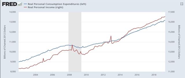
Nominal personal income rose +0.4%, and nominal personal spending rose +0.5%. After adjusting for inflation, the numbers are +0.3% and +0.2%, respectively. As a result, the positive trends for both continue:
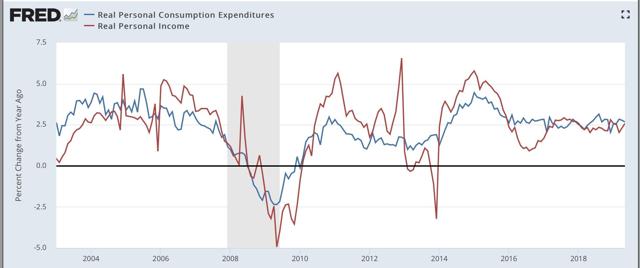
On a YoY basis, we can see that spending slightly leads income (similarly point to the way consumption leads employment, not the other way around), and is also more volatile:
Next, going back 50 years, real retail sales improve further early in expansions, and fade more quickly later in expansions. Here’s the graph for that for the past 20 years:
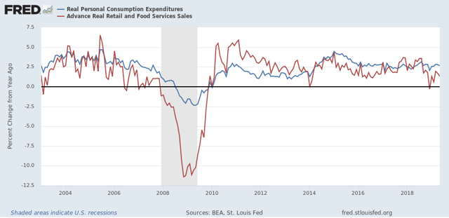
The trend reversed for 12 months after the August and September 2017 hurricanes sparked lots of extra spending, but not the late cycle pattern has re-asserted itself.
What isn’t spent is saved, and the personal savings rate adjusted for inflation generally declines substantially roughly midway through expansions, and then starts to turn up just before or early during recessions as consumers get more cautious:
What isn’t spent is saved, and the personal savings rate adjusted for inflation generally declines substantially roughly midway through expansions, and then starts to turn up just before or early during recessions as consumers get more cautious:
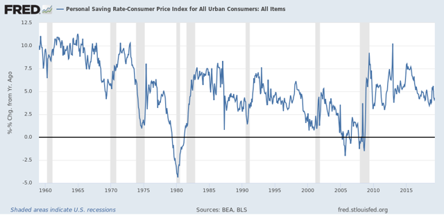
The former has happened. The latter really hasn’t, although it did briefly spike during the “mini-recession” caused by the government shutdown.
Finally, real personal income minus government transfer payments (e.g., food stamps) is one of the metrics the NBER uses to delineate recessions. Here’s what that looks like for the past 20 years:
Finally, real personal income minus government transfer payments (e.g., food stamps) is one of the metrics the NBER uses to delineate recessions. Here’s what that looks like for the past 20 years:
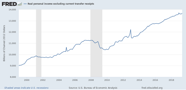
Again, this is still positive, although for the last 9 months there has been a significant deceleration to +1.0% (or +1.3% annualized).
So, to sum up, as to the consumer side of the economic ledger:
1. Lots of evidence of late cycle deceleration, but
2. No sign of rolling over at this point.
With low gas prices and somnolent inflation, 3%+ YoY wage gains are enough for the consumer to be doing alright. If there is a recession waiting in the wings, it will be producer-led similar to the dotcom bust of 2001.
Thursday, June 27, 2019
Initial jobless claims: positive this week, but close to crossing two thresholds for concern
by New Deal democrat
I have started to monitor initial jobless claims to see if there are any signs of stress.
My two thresholds are:
1. If the four week average on claims is more than 10% above its expansion low.
2. If the YoY% change in the monthly average turns higher.
Here’s this week’s update.
The four week average is 9.8% above its recent low:
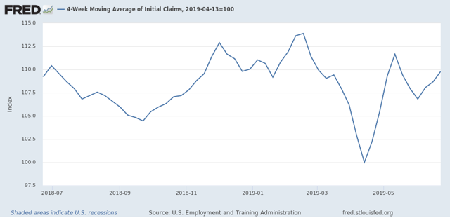
On a weekly basis, YoY the average is +0.3% higher than this week last June.
Last June the monthly average was 222,000. With one week still to go this June, it is 221,250:
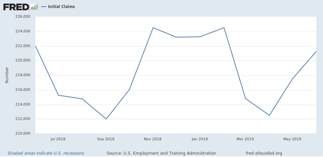
Depending on revisions to this week’s number, if next week comes in at 222,000 or higher, that will cross the first threshold. If it comes in at 224,000 or higher, it will cross the second threshold as well.
Wednesday, June 26, 2019
Manufacturing job losses now look virtually certain
- by New Deal democrat
I’ll have a post going up at Seeking Alpha later, but between a steep decline in the manufacturing work week, lackluster regional Fed manufacturing indexes (still barely positive), a turndown in durable goods orders (in part due to Boeing’s woes), and increasing inventories, it now looks nearly certain that there will be an actual decline in manufacturing jobs over the next twelve months.
To put this in perspective, here are the annual gains (losses in 2010) in manufacturing jobs through the end of 2018:
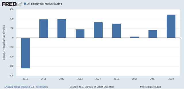
Here is the same data monthly through May from the beginning of Obama’s second term:
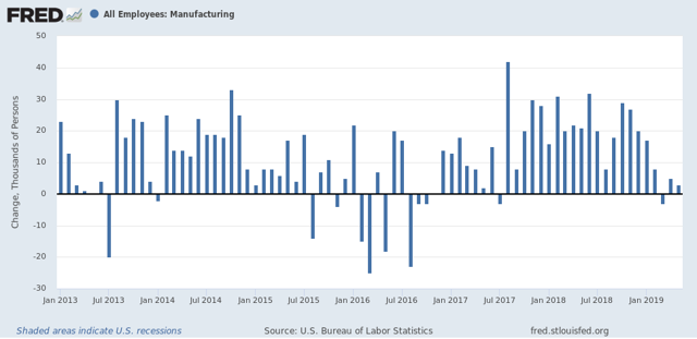
Hillary Clinton ran for President in 2016 in the teeth of a manufacturing recession. That is why the fundamentals-based economic models all forecast a very close election that year.
It increasingly looks like Trump will face a similar dynamic, at least in the first half of next year.
Of course, I’ve been forecasting a steep slowdown with an epicenter of roughly Q4 of this year since the middle of 2018. And — hey, look! — a big name economist or two are beginning to come around:

Sent from my iPad
Tuesday, June 25, 2019
New home sales: is housing developing a price “choke collar”?
- by New Deal democrat
So, new single family home sales for May were reported light this morning:
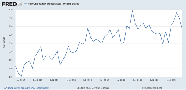
Because this series is very volatile and heavily revised, as always take this with a grain of salt.
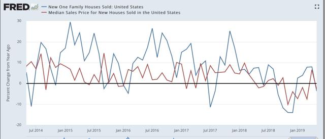
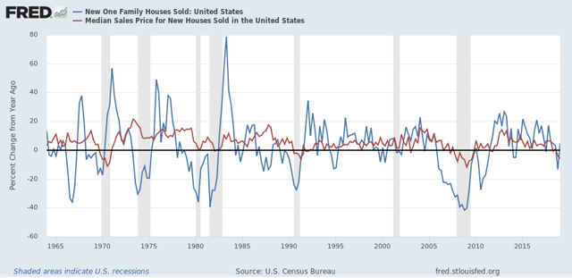
To smooth out some of the volatility, I pay more attention to the three month moving average, which at 670k is slightly below that of that average for the past two reports, and also slightly below the late 2017 peak. Still it is above all of 2018, so it nevertheless adds to the evidence that the bottom for housing is in.
Also, the YoY% change in median price, while reverting to negative this month, is also a significant improvement over the situation over the winter (red in the graph below):
What is interesting here is how quickly price declines, and now price rebounds, have followed sales. Usually there is more of a lag:
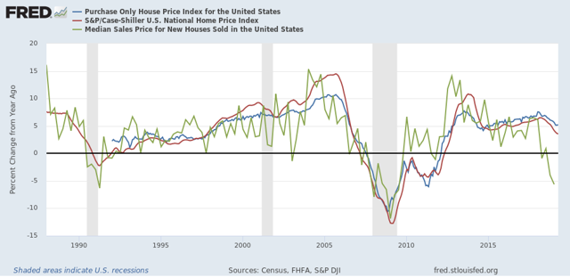
Here’s the quarterly average of YoY% change in median single family home prices (green, through Q1) vs. the monthly FHFA average (blue) and Case-Shiller national index (red):
The FHFA and Case-Shiller price indexes have only decelerated to a point where they roughly match median household income growth. This makes me wonder if prices for new homes will shoot back up again quickly as demand returns. If so, we could wind up in a “choke collar” situation (similar to what we had with gas prices 5 to 10 years ago), where rapid price increases choke off demand, which causes prices to back off, which reignites demand, and so on repeatedly.
This is important, because if the producer side of the economy falters, a choking off of higher new demand for housing would enhance the chances of a recession, and mute the chances of a housing recovery heading that off.
Monday, June 24, 2019
A tale of two timeframes
- by New Deal democrat
No data today, so while we are waiting for new home sales tomorrow, let me step back a little and give you an updated overview of my thinking.
It boils down to: the short term forecast — over the next 4 to 8 months — looks flat at best, and could develop into an actual downturn. The longer term — over one year out — looks more positive.
Let me start with the positive long term forecast first.
Long term interest rates have gone down significantly. Most importantly, mortgage rates have declined from about 5% to 4%. As a result, overall housing permits and starts, new single family home sales (which will be updated tomorrow) and through last Friday’s release of existing home sales have all turned higher:

The last big holdout, single family permits, probably made a bottom in April.
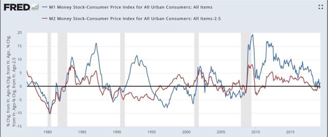
But they aren’t the only long leading indicators to have improved. So has real money supply. Here’s the long term view:
And here’s a close-up of the last few years:
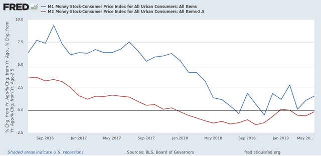
Last year real M2 (minus 2.5%) turned negative, and for several months, so did real M1. Both are now positive again. Note that the closest analogues are 1988 and 2002 - neither of which times coincided with a subsequent recession.
So while the inverted yield curve is a real concern, it isn’t being confirmed by a number of other very valid indicators over the past six months.
So while the inverted yield curve is a real concern, it isn’t being confirmed by a number of other very valid indicators over the past six months.
Now let’s contrast with the short term forecast. The second half of last year, especially Q4, coincided with the greatest number of the long leading indicators turning south. That means we are heading into treacherous waters in the near term.
One “quick and dirty” way to look at the short leading indicators is simply to compare stock prices via the S&P 500 (blue in the graph below) vs. initial jobless claims (red, inverted):
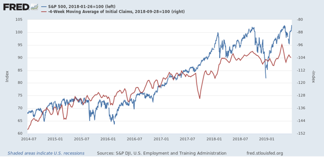
In the above graph, stock prices are normed to 100 as of the January 2018 high. Note they have only improved by a little over 3% as of their most recent highs last week. Meanwhile initial claims only improved over their September 2018 lows (shown as a peak) during the three weeks before Easter this year, probably due to residual seasonality.
In short, short leading indicators have been going basically sideways. And as I’ve noted repeatedly in the last few months, the leading employment sectors of manufacturing, residential construction, and temp jobs have all turned flat or downward since January. Whether there’s a recession or not in the short term probably depends on the intensity of Trump’s trade wars, and how much businesses, and business planning, suffers for them.
So if my writing on the economy seems schizoid, it’s because the dour near term forecast depends on the actions of a narcissist who thrives on chaos, while the longer term is being leavened by other very leading sectors.
Sunday, June 23, 2019
Weekly Indicators for June 17 - 21 at Seeking Alpha
- by New Deal democrat
My Weekly Indicators post is Up at Seeking Alpha.
The Fed moving to a cutting stance helped both stocks and bonds, and improved the long term outlook even more.
Friday, June 21, 2019
Initial jobless claims still weakly positive
- by New Deal democrat
I have started to monitor initial jobless claims to see if there are any signs of stress.
My two thresholds are:
1. If the four week average on claims is more than 10% above its expansion low.
2. If the YoY% change in the monthly average turns higher.
Here’s this week’s update.
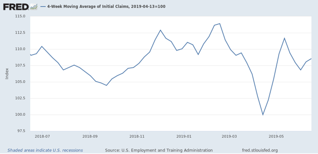
The four week average is 8.6% above its recent low:
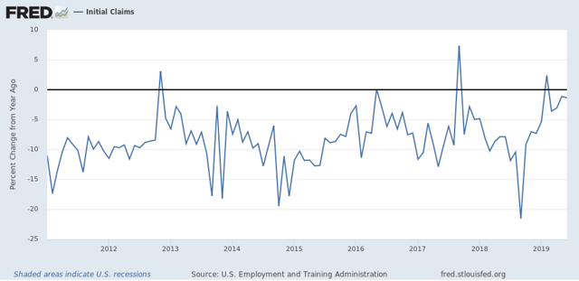
YoY the average is -0.5% lower than this week last June.
Last June the monthly average was 222,000. With two weeks to go this June, it is 219,000:
Like so many other economic indicators at this point, initial jobless claims remain weakly positive.
Thursday, June 20, 2019
Regional Fed indexes confirm that manufacturing is flat
- by New Deal democrat
[A reminder: this week I’m on vacation, so light posting is the rule.]
Earlier this week the Empire State Manufacturing Index went negative. This morning the Philly Index just barely avoided the same, reported at up +0.3 for June:
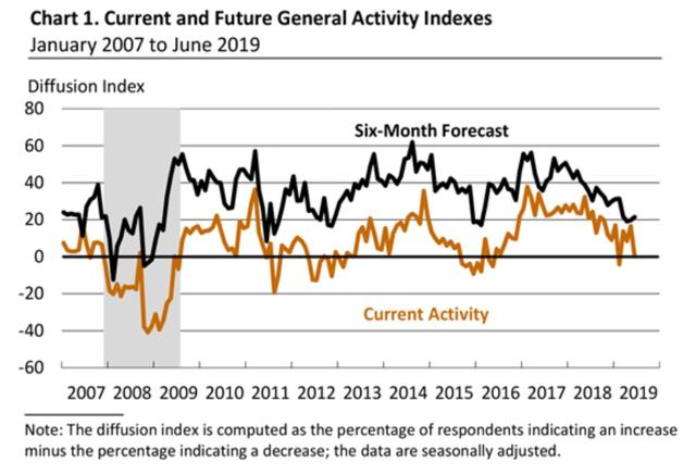
The more leading new orders index declined to +8.3.
This means the average of NY and Philly is a little below -1, while the average of all five regional Fed indexes as of their last reports is +0.8.
Last week I pointed out that the average manufacturing work week had fallen to a point consistent with an oncoming recession, and based on past patterns, I expect layoffs to follow. This week’s two regional indexes show that the leading manufacturing sector, as of the most recent readings, is not in decline, but on the other hand, it is almost exactly flat.
Wednesday, June 19, 2019
Trucking suggests transport slowing, but has not rolled over
- by New Deal democrat
I have been paying particular attention to the monthly report of the American Trucking Association, to compare its performance with rail, which has been sagging since the beginning of this year. A few other people are relying on the Cass Freight Index, but since that includes international shipping and air transport, it does not exclusively measure the US economy.
In April this index rose 7.7%, and was up 7.4% YoY as well. In May it gave almost all of that back:
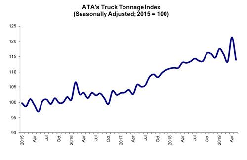
According to the ATA, truck traffic declined 6.1% in May, and is now up only 0.9% YoY.
The trend remains neutral to slightly positive, in contrast to rail, suggesting that overall the economy, at least as measured by transport, has slowed down substantially but not yet rolled over.
Tuesday, June 18, 2019
May housing permits and starts consistent with rising trend off bottom, but suggest layoffs to come
- by New Deal democrat
Although the headlines in the May report for building permits and starts were “meh,” the internals suggest that the bottom has probably already been reached. The downside remains that residential construction employment will decline.
First, let’s look at the headlines for permits (red) and starts (blue). It appears that permits made their bottom 9 months ago, and starts five months ago:
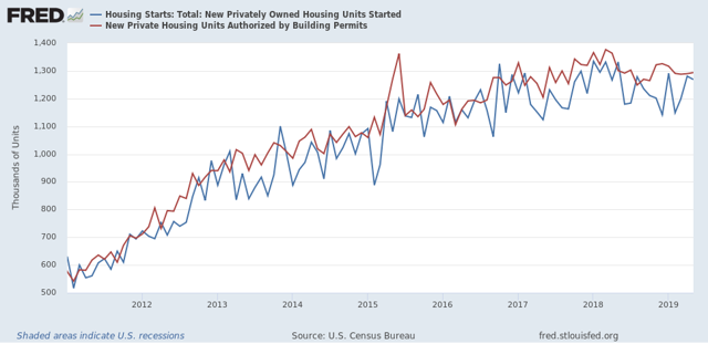
Since starts are much more volatile than permits, I also look at their three month moving average. This is at 1.225 million annualized, a 10 month high.
Single family permits are the least volatile most forward looking measure. These rose off their April low:
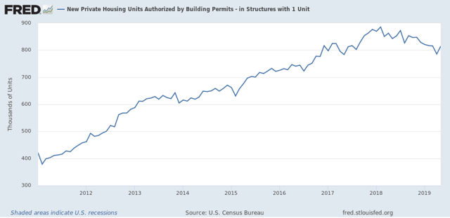
No change of trend obvious yet, but my strong suspicion is that April was the low.
On the negative side, housing under construction (blue in the graph below) went sideways, and housing completions (green) fell by almost 10%:
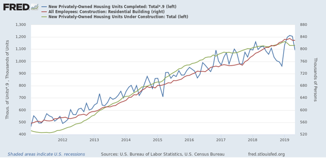
Because residential construction employment (red) tends to turn after construction and contemporaneously or shortly after completions, this morning’s report adds to the evidence that there will probably be layoffs in this leading employment sector.
The big economic question at the moment is whether housing will turn around quickly enough and strongly enough to overcome the negative trends that have become apparent in the first half of this year.
Monday, June 17, 2019
Empire State Manufacturing: OUCH!
- by New Deal democrat
I’m on vacation this week, so fair warning that there is probably going to be light posting!
The only economic news of note today was the Empire State Manufacturing Index. Only one district, only one survey, in a noisy series, but just the same, the overall index fell to -8.6 and the new orders component fell to -12:
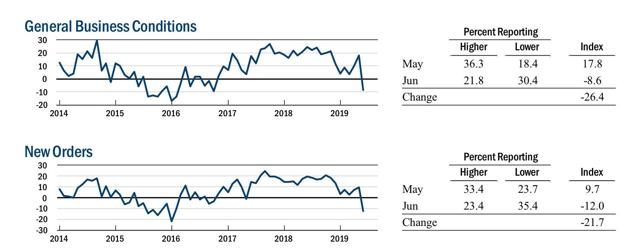
This brings the average of all five regional Fed Indexes down to +1. If the Philly Index simply declines to +5 or less later this week, then the average will turn negative.
Even that would not be a disaster. Note that in 2015-16 when the Empire State Index was this low or lower, the overall economy remained positive. But unless housing turns around quickly, we have a problem.
Saturday, June 15, 2019
Weekly Indicators for June 10 - 14 at Seeking Alpha
- by New Deal democrat
My Weekly Indicators post is up at Seeking Alpha.
The divergence between the near term vs. longer term forecast is increasing, and the risk that the forecast is too optimistic is asymmetrical, because for the economy, Trump’s chaotic tariff behavior cannot improve the situation, but can definitely cause harm.
Friday, June 14, 2019
May real retail sales positive, but industrial production remains in a shallow recession
- by New Deal democrat
Retail sales are one of my favorite indicators, because in real terms they can tell us so much about the present, near term forecast, and longer term forecast for the economy.
This morning retail sales for May were reported up +0.5%, and April was revised upward by a net +0.5% as well. Since consumer inflation increased by +0.4% over that two month period, real retail sales have risen +0.6% in the past two months. For the past two months I have noted that sales were still slightly below their peak last November, and YoY real sales remained in a downshift. This morning’s report helps those comparisons substantially, as YoY real retail sales are now up +1.4%.
Here is what the last five years look like:
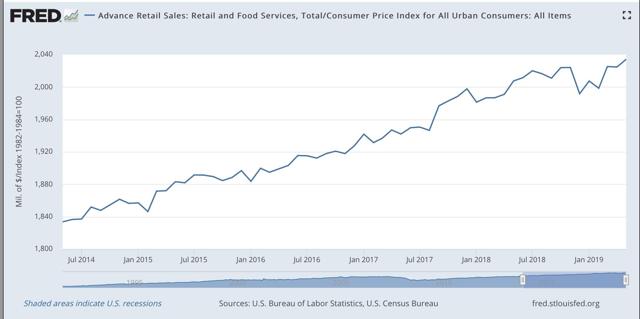
Real retail sales turned flat for about a year before both of the last two recessions. Even with this morning’s positive revisions, since late last year we’ve hit the biggest soft patch since 2013.
Next, although the relationship is noisy, because real retail sales measured YoY tend to lead employment (red in the graph below) by a number of months, here is that relationship for the past 25 years, measured quarterly to cut down on noise:
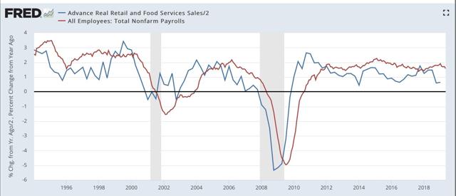
Now here is the monthly close-up of the last five years. You can see that it is much noisier, but helps us pick out the turning points:
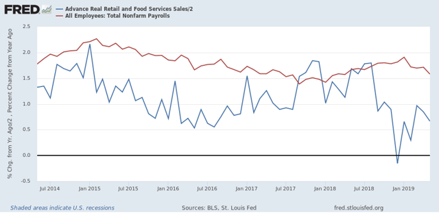
The lead times are somewhat variable, although usually within 6 to 9 months. We have had 9 months of a big downshift in YoY sales. Even with this morning’s improvements, the YoY metric is still low, and so I still expect the slowdown in employment as measured in the monthly jobs report that showed up last Friday to continue.
Finally, real retail sales per capita is a long leading indicator. In particular it has turned down a full year before either of the past two recessions:
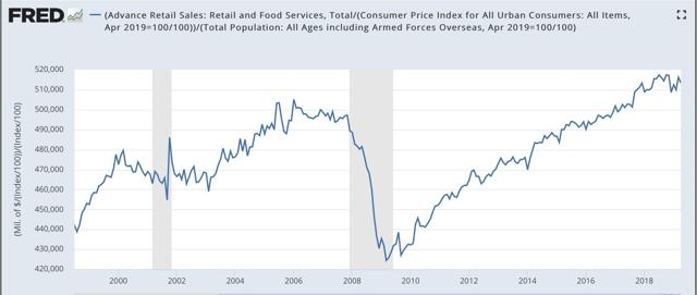
Here is the close-up of the past five years:
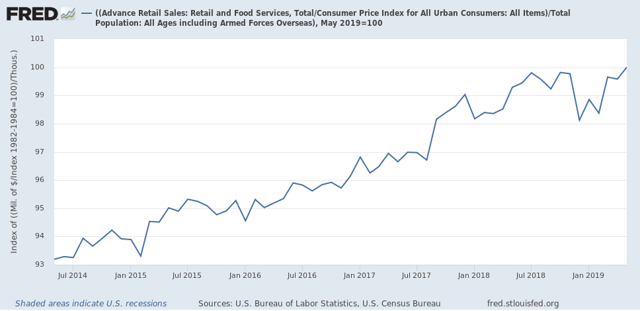 The good news is, as of this morning’s report this measure made a new high, which if not revised away is evidence against a recession this year. Further, in the last 70 years, this measure has always turned negative YoY at least shortly before a recession has begun. Although there have been some false positives, there are no false negatives. But this is still up a little over +0.6% YoY, which is very much consistent with a slowdown.
To sum up, real retail sales Have resumed a weakly positive trend, that nevertheless points to a slowdown in employment gains in the months ahead.
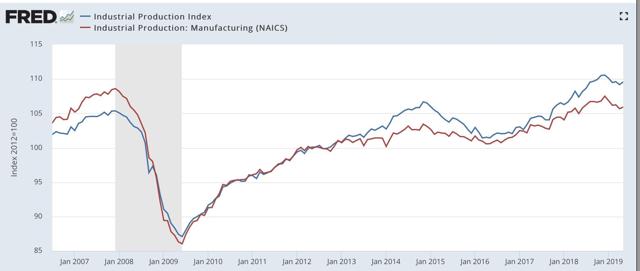
Turning to industrial production, this also improved, up +0.4% in May. The difference is, this merely took back the -0.4% decline in April. Industrial production, both in total and limited to manufacturing, is lower than it was last December:
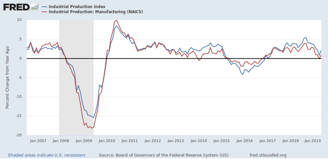
YoY industrial production is only up +2.0%, a mediocre result compared with most of this expansion:
Bottom line: the consumer part of the economy is picking up after the government shoutdown caused “mini-recession”. But the producer side is still *in* a shallow recession now. If the economic slowdown we are in is going to metastasize into a recession, it is probably going to come from the producer side and be due mainly to the effects of chaotic trade and tariff decisions from the Administration.
Turning to industrial production, this also improved, up +0.4% in May. The difference is, this merely took back the -0.4% decline in April. Industrial production, both in total and limited to manufacturing, is lower than it was last December:
YoY industrial production is only up +2.0%, a mediocre result compared with most of this expansion:
Bottom line: the consumer part of the economy is picking up after the government shoutdown caused “mini-recession”. But the producer side is still *in* a shallow recession now. If the economic slowdown we are in is going to metastasize into a recession, it is probably going to come from the producer side and be due mainly to the effects of chaotic trade and tariff decisions from the Administration.
Thursday, June 13, 2019
Initial jobless claims for week ending June 10 - no concern yet
- by New Deal democrat
I have started to monitor initial jobless claims to see if there are any signs of stress.
My two thresholds are:
1. If the four week average on claims is more than 10% above its expansion low.
2. If the YoY% change in the monthly average turns higher.
Here’s this week’s update.
Initial claims last week were 222,000. The four week moving average was 217,750.
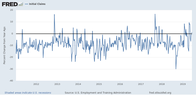
First, the four week average is only 8.1% above its recent low:
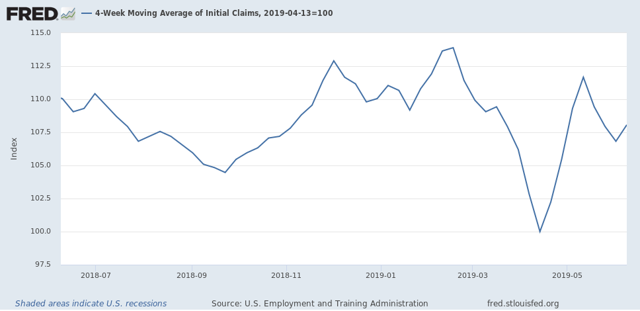
Second, the YoY% change for this week is only lower by -1.8%. For the first two weeks of June, it averages +0.5% higher:
Finally, last week I noted that, since initial claims tend to slightly lead the unemployment rate, I expected a slight increase in the unemployment rate in last week’s jobs report. Instead, it remained at 3.6%. Here’s the updated look at the YoY% change in the four week average (blue) compared with the YoY change in the unemployment rate (red):
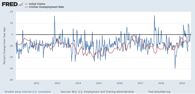
Obviously the relationship does not hold exactly for every month, but I still expect the very small YoY change in initial claims to show up in a very small (as in -0.1%) decline in the monthly unemployment rate shortly.
For now, initial claims are only signaling a little bit of weakness, but nothing to be imminently concerned about.
Wednesday, June 12, 2019
May real wages grow, but real aggregate payrolls on the verge of a red flag warning
- by New Deal democrat
The consumer price index rose +0.1% in May and declined YoY to 1.8%. Again the main reason was gas prices, which declined in during the month. Below is overall CPI (blue) vs. CPI less energy (red) for the past 20 years:
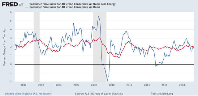
Ex-gas, consumer inflation ex-energy has been remarkably stable between 1.5% and 2.5% YoY ever since gas prices made their long term bottom in early 1999. The only significant exceptions were in the year before each of the last two recessions. In short, there is no inflation pressure on the economy.
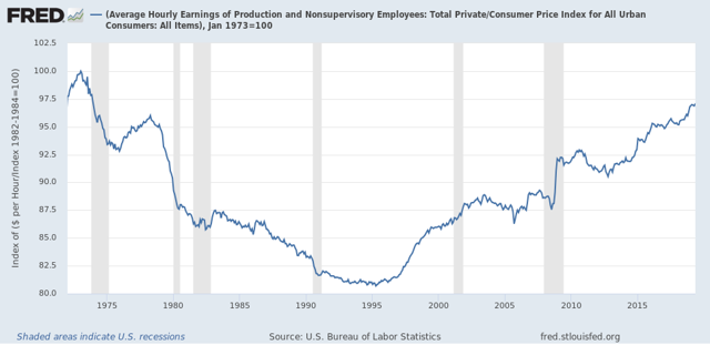
Now let’s turn to wages. Nominally, wages for non-supervisory employees increased +0.3% in May, so after inflation they were up +0.2%, an improvement over the past few months. YoY non-supervisory wages nominally were up +3.2%, which means that real wages for non-supervisory workers are up +1.6%: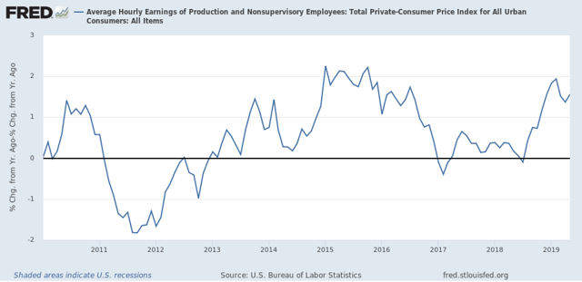
This was a new 40+ year high, but in the longest view, real wages are still -2.9% below their January 1973 peak:
Finally, something important is going on with aggregate real wages. This tells us how much more American workers as a whole in real terms since the bottom just after the Great Recession. These are presently up 28.8% from their post-Great Recession low, but Are -0.1% below their January peak:
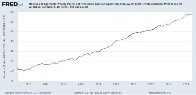
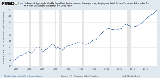
This tells us that, in the aggregate, average Americans have less to spend than they did four month previous, and in that in general this metric has stalled out this year. This is important, because as the below longer term graph shows, real aggregate income has stalled and then started to roll over in the year before almost all recessions in the past 50 years, with the peak usually happening within 6 months of the onset of the recession:
When we take the information in the above graph and chart the YoY% change, we see that real aggregate wage growth has typically decelerated by 1/2 or more from its 12 month peak just at the onset of recessions, although there have been 3 false positives coincident with slowdowns:
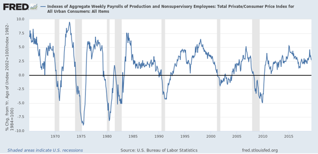
YoY real aggregate payroll growth peaked at 4.6% in January, and is down to 2.6% as of May. Another -0.3% downturn in YoY growth would trigger a red flag recession warning in this signal.
When we take the information in the above graph and chart the YoY% change, we see that real aggregate wage growth has typically decelerated by 1/2 or more from its 12 month peak just at the onset of recessions, although there have been 3 false positives coincident with slowdowns:
YoY real aggregate payroll growth peaked at 4.6% in January, and is down to 2.6% as of May. Another -0.3% downturn in YoY growth would trigger a red flag recession warning in this signal.
Tuesday, June 11, 2019
April JOLTS report: a mixed bag consistent with the strong jobs report one month ago
- by New Deal democrat
The jobs report one month ago was a blowout to the upside, so I expected the JOLTS report for April, reported yesterday with a one month lag, to follow suit. And generally it did.
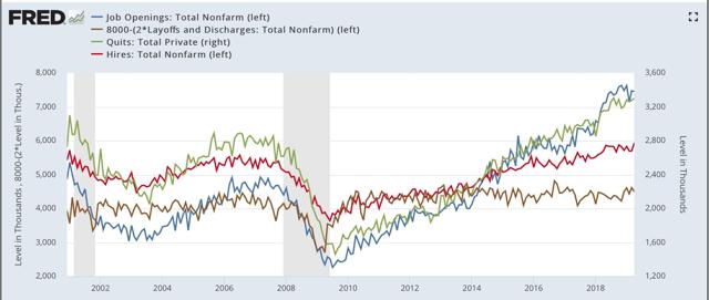
Because this series is only 20 years old, we only have one full business cycle to compare. During the 2000s expansion:
- Hires peaked first, from December 2004 through September 2005
- Quits peaked next, in September 2005
- Layoffs and Discharges peaked next, from October 2005 through September 2006
- Openings peaked last, in April 2007
In yesterday’s report:
- Hires made a new expansion high
- Quits were only 1000 off their expansion high
- Layoffs and discharges backed off from interim lows in January and March
- Openings continued to fade from their expansion high last November:
Here’s the composite graph (with layoffs and discharges inverted, since fewer is better):
And here are the YoY% changes, better to show the underlying trend (minus hires, which I’ll break out separately below:

You can see that openings are weak, and quits actually went negative, while layoffs have improved from a year ago.
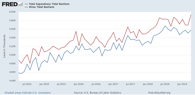
Next, here is the update of the “hiring leads firing (actually, total separations)” metric:
And here is the same data measured as a YoY% change:
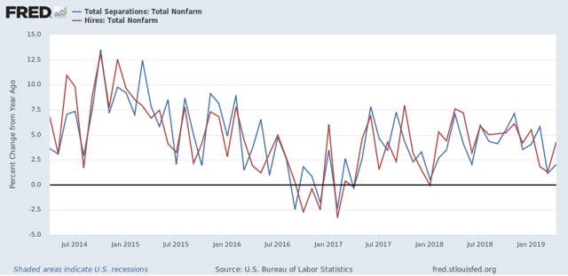
Hires bounced back strongly in April, while total separations continue to show weakness but are not negative.
To sum up, this was a strong report, on par with the strong April jobs report, with hiring and quits consistent with a strong employment picture, while other metrics showed varying degrees of weakness, but no impending doom. The report may also have been affected by residual seasonality due to the very late Easter. If so, there will be payback one month from now.
Subscribe to:
Posts (Atom)