Wednesday, January 11, 2012

Morning Market


The 60 minute IWM chart shows that prices gapped higher yesterday.  This is technically good, but notice (again) the lack of follow through.  Prices gapped and then stopped. 


 The daily chart shows the remarkable lack of strong bars over the last week and a half.  Most bars have very small bodies and small shadows.  There is simply no conviction in the market. 


In fact, the QQQs gapped higher and then moved lower throughout the session.  Notice that prices closed near the low of the day -- not the high.  This is not a sign of strength.


And while the SPYs have technically broken out, I've circled the price clusters the index has formed.  Instead of making a strong move through resistance on heavy volume, prices moved higher and then moved sideways for about a week (the first circled area).  Then prices gapped higher and formed a second price cluster. 


And notice that various sectors of the market are suffering from the same weak conditions. 


Tuesday, January 10, 2012

1951 Summation

Below are links to all the posts on 1951, which are part of the Bonddad Economic History Project

Employment and Income
Exports and Imports
Investment
PCEs, Income and Savings
GDP
Fed policy and inflation


Bonddad Linkfest

  1. Copper climbs most in a week (BB)
  2. Hedge funds bearish on US equities (BB)
  3. US consumer credit increases most since 2001(Reuters)
  4. French business confidence increases (BB)
  5. China's trade surplus the lowest since 2005 (WSJ)
  6. Sluggish Chinese imports hint of lower domestic demand (FT)
  7. China's copper imports hit record (FT)
  8. Italian banks borrow 210 billion euros from the ECB (FT)
  9. Distorted US employment indicators (Dr. Ed Yardeni)
  10. High Yield Spreads on the decline (Bespoke)

1951; Prices and Fed Policy

This is part of the Bonddad Economic History Project


Remember that the early 1950s saw tremendous growth in consumer demand and employment growth (see here and here).  Hence there is s tremendous amount of demand pull inflation in the economy.  In addition, the US is now producing for a massive war effort, which greatly increases the demand of basically every raw material.  As such, inflation increases.  Yet, in 1951 we see a decrease in inflation, which leads to the question, why?

Price controls.  In 1951, Congress passed the General Ceiling Price Regulation of 1951, which froze prices at their highest level reached in late December 1950 and late January 1951. 

Also of extreme importance this year was the Treasury Fed-Accord of 1951, which was:
Agreement between the U.S. Treasury Department and the Federal Reserve Board of Governors that enabled the Fed to pursue an active Monetary Policy, independent of the Treasury and the federal government. Before 1951, the Fed had to assure low cost Treasury financing by purchasing Treasury securities at a set price. Afterward, the Federal Reserve Open Market Committee was able to purchase as much, or as little, of Treasury securities offered for sale by the Treasury Department as it wanted, instead of having to buy whatever the Treasury issued at the prevailing rate. Also known as the Treasury-Fed Accord.
You can read a more complete history at the Richmond Fed.

In short, the Fed no longer had to buy bonds at set prices; as such lenders could no longer count on
the Fed to purchase bonds whenever they (the lenders) needed to extend credit.  As such,

While the Fed did not raise the discount rate, they did increase the reserve requirements for banks, and the margin account requirements for stock purchasers.  They also tightened installment credit terms and real estate lending.  In addition, there was also a voluntary restraint on "non-essential lending, related to war activity.
The charts below, from the Federal Reserve report, show the changes in overall credit for year.

Business loans still grew at a strong rate, largely thanks to loans for essential war activity.  The constraints on consumer lending show clearly on the chart (and below, which show a small .1% increase in consumer lending) as does the constraints on mortgage credit.

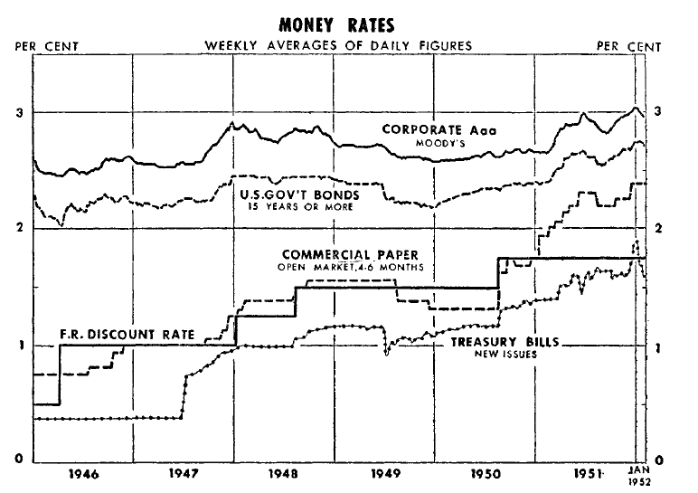
The above chart shows the overall upward drift of interest rates in the government security areas, which was primarily caused by the new arrangement between the Fed and the Treasury department.

Finally, consider the following charts of inflation from the 1952 Economic Report to the President.


2012: Housing, Oil, and the race between Deleveraging and Deflaton

- by New Deal democrat

Part I: The K.I.S.S. method forecast

This is one of those times when I am working on so much different material that nothing gets finished on time, like my year-end review of housing sales and prices, and reflections on the Oil choke collar. The good news is, I have been spending so much time decoding ECRI's black box (with a great deal of success, I might add. It just isn't finished yet) that I can give you a much more detailed forecast for 2012.

Let me begin this year the same way I began last year: why I use the K.I.S.S. method of forecasting. Even though the LEI is the statistic most denigrated by Wall Street forecasters, it has the inconvenient habit of being right more often than the highly-paid punditocracy, especially at turning points.

Since I'm not a highly paid Wall Street pundit, I simply rely upon the LEI for the short term, and the yield curve for the longer term with the caveat of watching out for deflation. The simple fact is, with one exception, if real M1, and real M2 (less 2.5%), are positive, and the yield curve 12 months ago was positive, the economy has always been in expansion. When real money supply is negative, and the yield curve was inverted 12 months ago, the economy has always been in contraction. The exception is that the yield curve does not help to project the economy 12-16 months later if the economy at that later date is in deflation - as it was in 1930-32 and late 2008 through early 2009 - which will feature a negative real money supply.

The simplest forecast, therefore, is that since the LEI were positive all during 2011, and since both M1 and M2 are positive -- in fact, courtesy of the tsunami of cash that washed ashore in August and September due to the Euro crisis, both have been almost off-the-charts YoY positive for the last few months -- and since the yield curve did not invert at any point in the last year, so long as we don't fall into deflation we should have growth all through 2012.

This year, though, simply citing leading indicators is uniquely complicated because of what Doug Short calls The Great Leading Indicator Smackdown. The Conference Board's LEI shows clear sailing ahead. ECRI called for a recession to begin by the end of 2011, and has insisted that at very least one will begin by the end of this half. Here's Doug Short's close-up of the divergence between the two indexes:


The divergence is due in part to differing approaches, and in part to what are elements of the indexes. ECRI makes use of long, short, and weekly leading indicator indexes, while the Conference Board relies upon one mixed medium-term index. While we don't know exactly what is in ECRI's black boxes, we do know what indexes they inherited from their founder, Prof. Geoffrey Moore. Specifically, we know his proposed long leading index consisted of real M2 money supply, the Dow Jones Bond Average, housing permits, and a measure of corporate profits. His proposed WLI included weekly readings of M2, the DJBA, the S&P500, Dun and Bradstreet's business birth/death count, and (probably) the Mortgage Bankers Association's Purchase Mortage Index, and credit spreads. The Conference Board, by contrast, does not make use of the DJBA or corporate profits, but does include the yield curve.

That difference is crucial. In fact at some point between December 2009 and June 2011 one or more of ECRI's 4 legacy long leading indicators were always negative: real M2 (minus 2.5%) was negative the longest, but housing permits also declined by 150,000 between April 2010 and February 2011, corporate profits dipped at the end of 2010, and the DJBA turned down between August 2010 and February 2011. Here's the graph, showing each of the LLI normed to 100 at their maximum reading before turning down in 2010 (note: substituting the nearly identical BAA bonds trend for the DJBA):


That is about equivalent to their collective negative turn in advance of the 2001 just-barely-a-recession, although the relative components were different. The yield curve, by contrast, did invert in 1999 but did not come close in 2011. Nor did real M1, which has also always turned negative before at the inception of a recession. Here's the equivalent graph with each LLI normed to 100 at their pre-2001 recession peak:


Since the long leading indicators are designed to give at least 12 months warning of a recession, that puts us in the greatest window of weakness right about now.

In this respect, the LEI aren't that different: their weakest readings were in April and September, and if you discount the M2 and yield curve readings, were negative in April and again from June through September (h/t EconomPicData):


meaning that they also forecast maximum weakness right about now.

Just as interestingly, though, all of ECRI's long leading indicators have turned up since last spring, with real M2 and the DJBA making new all time highs. Here's the same graph we looked at above -- you can see that all 4 LLI's have rebounded and two have made new highs:


This, plus the positive yield curve, tells me that for the second half of 2012, the indicators are really in agreement -- there will be growth.

So what do the shorter leading indicators say about the first half of 2012? I'll spare you a very noisy graph, but here's the scorecard:

- The positives are that the stock market has been rallying for the last 5 months, durable goods orders are still climbing, and consumer expectations have regained virtually all their losses from the July debt debacle. Initial jobless claims have come down to 3 1/2 year lows.

- The negatives are that the ISM manufacturing indexes have been just barely positive for most of the last 6 months, the vendor delivery subindex has declined substantially, and credit spreads are at their widest since 2009. Also, the gasoline price spike from a year ago has reached the point, based on past history, of maximum impact, and will remain there through April. Commodity prices are falling, and the last two months the CPI has actually registered deflation, raising a caution flag about relying upon the yield curve. Finally, as I will detail more in part 2, you can't go on forever with real wages in decline, as they have been for all of 2011.

One other item: typically recessions do not begin until at least 8 of the 10 LEI's are lower than they were 6 months ago: through November 6 are negative, 4 are positive. That's close, but not quite enough.

Ultimately the question as to whether the trend is slightly positive or slightly negative in the first part of 2012 becomes whether housing will show enough actual strength, and whether the Oil choke collar will weaken sufficiently, to support US growth if manufacturing and exports falter. For reasons I will explore more in part 2, my best judgment is that we will avoid recession, but that at least one quarter of negative GDP, with the likelihood greater in this quarter than the second quarter, can't be ruled out.

Morning Market -- Still Not Sold on the Rally


First, I'm starting to feel like the great complainer regarding the latest developments in the equity markets.  However, consider the above three charts, which are in the 30 minute time frame.

The IWMs opened the year by gapping higher and then fell.  While it has rallied since then, it is still below the highs established on the gap higher.  The IYTs are in the same boat.  The SPYs are the same way, although they have moved a bit closer to their highs.  The QQQs are the only averages who have continued their break-out and advanced to higher levels.  In short, there just isn't any follow-through on the rally, and the length of time from the original pop to now is a big deal.


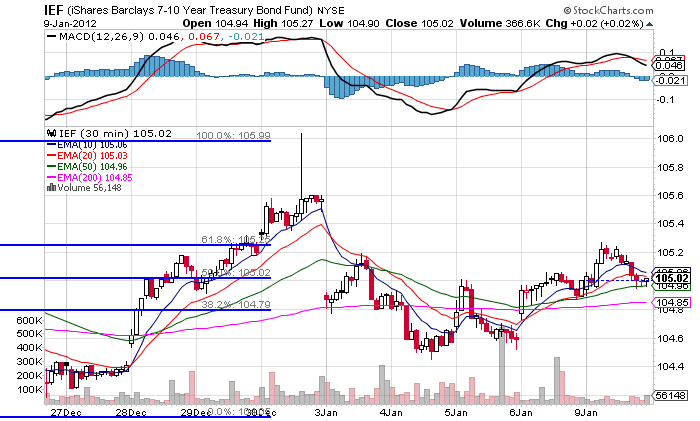
In addition, we see that the IEFs gapped lower, but haven't sold off any more.  If we were seeing a big rush into equities, we'd probably be seeing a bigger sell-off in the treasury market.


After hitting resistance at the 38.2% Fibonacci level and selling off into the EMAs, the grains ETF has a nice move higher yesterday.  Notice the upward momentum implied by the EMAs -- the shorter EMAs are rising and the 50 is also turning positive, although at a smaller angle.  We see overhead resistance at the 38.2% Fib level and the 200 day EMA.

 
Oil is still trapped below resistance established in November.  The volume indicators tell us there has not been a major move out of the security, but we also haven't seen a big rush in yet. 

Monday, January 9, 2012

Bonddad Linkfest

  1. EU debt markets are still under stress (FT)
  2. Italy steps up efforts to get tax evaders (FT)
  3. Brazil overtakes the UK in absolute GDP size (FT)
  4. Germany issues debt with negative yield (FT)
  5. Dollar rises on strong US economic news (FT)
  6. 10-year US yields approach their highest rate in nearly a month (BB)
  7. Speculators increase bullish commodity bets (BB)
  8. Economists and traders diverge on US treasury recommendations (BB)
  9. An examination of Romney's deals at Bain (WSJ)
  10. Recent dollar trading patterns could indicate a change of philosophy(WSJ)

3 important trends from the employment report

- by New Deal democrat

This is an update on several trends I've been tracking, one that helps explain the relatively anemic job gains in the recovery, and two that forecast changes in the unemployment rate.

First, here is an updated graph of aggregate hours (blue) vs. total payrolls (red) measured from their pre-recession top.


You can see that the economy shed almost 10% of all hours worked, while only about 6% of jobs were lost. Since then, aggregate hours have improved at a much higher rate than jobs have been added. If the current trend continues, at some point in the next 6 to 9 months, it is likely that aggregate hours will catch up with jobs. From that point forward I would expect job growth to more closely mirror the growth of hours in the economy.

Second, here is the graph from Thumbcharts showing initial jobless claims for the last 6 month period vs. the same 6 months one year prior, showing that it leads the unemployment rate measured the same way.

;

The thumbcharts graph strongly suggests that the unemployment rate will continue to be well below it was in the last half of 2009 (i.e., under 9%) and probably will decline further from its current level.

The third graph is a comparison of initial jobless claims as a percentage of the population vs. the unemployment rate, again showing how the first leads the second. This is a graph I began running in December 2010 when I was totally surprised by the close and long-lasting fit (although there has been a slight drift upward over the long term in the unemployment rate vs. claims):


Here's what I said in March 2011:
This graph argued [in December 2010] that the unemployment rate was far too high compared with initial claims. Since then the unemployment rate has declined 0.9%!!! As population-adjusted initial claims has consistently led the unemployment rate for almost 50 years, this graph suggests that further declines in the unemployment rate in the coming months are likely. If so, the dramatic drop in the unemployment rate could be the surprise economic story of 2011.
Here's a close-up of the last few years:


Well, maybe it wasn't the economic surprise of the year, but it certainly was lower than just about everyone was forecasting. Please note that the December initial jobless claim rate data isn't included in the graph, and since this leads the unemployment rate, it strongly argues for a further decline in the employment rate in the next few months. An unemployment rate under 8% by election day is certainly not out of the question.

The Current Economic Situation

Last week, we saw the release of the latest Fed minutes.  These provide a really god overview of the current US economic situation.
The unemployment rate dropped to 8.6 percent in November, and private nonfarm employment continued to increase moderately during the past two months. Nevertheless, employment at state and local governments declined further, and both long-duration unemployment and the share of workers employed part time for economic reasons remained elevated. Initial claims for unemployment insurance moved down, on net, since early November but were still at a level consistent with only modest employment gains, and indicators of job openings and businesses' hiring plans were little changed.
(I wrote this before the release of the last employment report, which NDD wrote about here.  This report did show an improving situation).  There are several points made above which are very important.  First, the continued bleeding of government jobs is a very negative issue for the employment situation, and is probably a reason for the continued high showing in the initial unemployment claims over the last year.  The continued high level of long-term unemployed, the high JOLTS survey and the high level of part-time for economic reasons employment tells us that while the bleeding has stopped, we're simply not creating enough jobs to pick-up the slack in the labor market.  I have a supply of graphs on this topic at this link.
Industrial production rose in October, reflecting in part a rebound in motor vehicle production from the effects of supply chain disruptions earlier in the year. Factory output outside of the motor vehicle sector also continued to rise, and the rate of manufacturing capacity utilization moved up. However, motor vehicle assemblies were scheduled to only edge higher, on balance, in the coming months, and broader indicators of manufacturing activity, such as the diffusion indexes of new orders from the national and regional manufacturing surveys, were at levels that suggested only modest increases in production in the near term.
Overall, manufacturing appears to be improving.  After a 6-8 month, mid-year lull, we're starting to see better numbers come from this sector.  However, it's important to remember that Europe is near a recession (if not already in one) and Asia is slowing (although it is still printing growth numbers).  In other words, we're not out of the woods yet.  And even if we see a strong performance from this sector, it's not large enough to pull the economy out of its current 0%-2% growth range into a higher rate of activity.
Revised estimates indicated that households' real disposable income declined in the second and third quarters, and the net wealth of households decreased in the third quarter. Nonetheless, overall real personal consumption expenditures (PCE) rose modestly in October following significant gains in the previous month, as spending for consumer goods continued to increase at a strong pace while outlays for consumer services were roughly flat. In November, nominal retail sales, excluding purchases at motor vehicle and parts outlets, expanded further, and sales of light motor vehicles stepped up. But consumer sentiment was still at a subdued level in early December despite some improvement in recent months
Overall, the consumer has been performing about how I thought he would perform in this "new economy" -- he's been spending, but at a historically lower rate.  However, the Fed noticed the basic problem with consumer spending right now: real DPI is declining, median incomes are stagnant and overall wealth has taken a hit.  This is to be expected when unemployment is 8.6% and has been at high levels for over two years.  However, to maintain current spending levels, consumers have had to start dipping into savings -- a process that can't last forever.
Activity in the housing market continued to be depressed by the substantial inventory of foreclosed and distressed properties and by weak demand that reflected tight credit conditions for mortgage loans and uncertainty about future home prices. Starts and permits for new single-family homes in October stayed around the low levels that prevailed since the middle of last year. Sales of new and existing homes remained slow in recent months, and home prices moved down further.
While new homes sales are still very low by historical standards, inventory levels are now in line with historical norms.  Existing home sales have been stable (at low levels) for the last few years, but inventory levels are still high, so we need more clearing out here.  What I find really interesting is that home prices have more or less stabilized.  Consider this chart of the Case Shiller home price index:


While there has been some bouncing around over the last few years around the 150 price level, there has not been a major crash through that level.
Real business spending on equipment and software seemed to be decelerating. Nominal orders and shipments of nondefense capital goods excluding aircraft edged down in October, and the slowing accumulation of unfilled orders suggested that increases in outlays for business equipment would be muted in subsequent months. Also, survey measures of business conditions and sentiment remained at relatively downbeat levels in November. Real business spending for nonresidential construction moved up in October but was still at a low level, reflecting high vacancy rates and restricted credit conditions for construction loans. Inventories in most industries looked to be reasonably well aligned with sales, although motor vehicle stocks continued to be lean.
There are two ways to look at this data:


 The total, real dollar amount of investment is now at higher levels than the height of the previous expansion.   However,


 The YOY percentage change has been declining (although it's still a good levels).  Finally,


The continuously compounded annual rate of change is still good.


The above chart is the total, real amount of non-residential structure investment from the GDP report.  Notice is hasn't moved in any meaningful way for the last 2 1/2 years.  Like the residential market, we're just not seeing a big move in commercial real estate right now.
In the government sector, real federal defense purchases appeared to have stepped down in October and November from their level in the third quarter. At the state and local level, real purchases seemed to be decreasing at a slower pace in recent months than earlier in the year.
This is a huge problem -- the contraction in government spending.  Consider the following chart (which I've shown before):


Austerity is in fact subtracting from overall economic growth.  For anyone that knows anything about GDP and how its calculated (which eliminates anyone in Washington and most political pundits) this should be no surprise. 


The U.S. international trade deficit narrowed in October, as imports decreased more than exports. Declines in imports of petroleum products (reflecting lower prices and lesser volumes), non-oil industrial supplies, and automotive products more than offset increases in capital goods, consumer goods, and food. Reductions in exports of industrial supplies and consumer goods, led by a few particularly volatile components, outweighed the gains in capital goods.


Let's look at three graphs for the above data.


The US is still a net importer.  However, the level of the overall rate is actually better than it was at the height of the last expansion. 


Given that we are still a net importer, consider the above chart -- the US' net exports.  Exports are doing very well right now.


The above 5-year chart, with data displayed on a quarterly basis, shows how well exports are doing in the current economy.  Total, real exports surpassed their last peak over a year ago.  In short, exports are a success story in the current environment.


Inflation continued to decrease relative to earlier in the year. Indeed, the PCE price index edged down in October. Consumer prices for energy decreased, and survey data indicated that gasoline prices declined further in November. Increases in consumer food prices in October were substantially slower than the average pace in the preceding months of this year. Consumer prices excluding food and energy also continued to rise at a more modest pace in October than earlier in the year. Near-term inflation expectations from the Thomson Reuters/University of Michigan Surveys of Consumers declined in early December, and longer-term inflation expectations remained stable.


The above chart shows the percentage YOY percentage change in total and core CPI.  This is where I disagree to a point with the FED.  First, I'm not an alarmist who thinks we are facing a bought of hyper-inflation that will kill the economy and turn us into a Weimar republic.  However,  because I watch the futures markets on a regular (read daily) basis, I've seen both oil and agricultural commodities spike massively over the last few years.  While I don't see hyper-inflation, I do see commodity price spike possibilities in both the oil and agricultural markets this year, which could have a deleterious effect on an already low consumer sentiment.
Measures of labor compensation indicated that nominal wage gains continued to be subdued. Compensation per hour in the nonfarm business sector increased moderately over the year ending in the third quarter, while the 12-month change in average hourly earnings for all employees remained low in October and November. Unit labor costs edged up over the past four quarters.
I also highlighted this in the employment link above.  The decline in DPI has led consumers to dip into savings.  While a lowered DPI is to be expected when unemployment is high, at some point a lowered DPI and household wealth situation combined with a declining savings rate will lead to depressed consumer spending.
Foreign economic growth, especially in the euro area, appeared to weaken in recent months. Real gross domestic product (GDP) in the euro area barely edged up in the third quarter. Moreover, industrial production in the region fell sharply in September, and indicators of manufacturing activity in October and November pointed to lower output. Measures of business and consumer confidence in the euro area continued to decline in recent months. In other advanced foreign economies, real GDP in Japan rebounded in the third quarter from the effects of the earthquake in March, and real GDP recovered in Canada as oil production picked up after several months of shutdowns; however, available indicators of manufacturing activity in both of these economies pointed to declines during the fourth quarter. Among emerging market economies, real GDP in Brazil was flat in the third quarter, while exports from China slowed in recent months, although Chinese domestic demand appeared to remain strong.
The EU area is the big wild card in the room.  The latest data indicate that if they're not already in a recession, than they soon will be.  That could have a very negative impact in the US.  Asia is slowing, but all signs are that it is in better shape than the EU.

In conclusion,we're pretty much where we've been for the last year.  The consumer is spending, but not at fast enough rates to kick the economy into higher growth.  Businesses continue to invest and exports are growing.  However, austerity is really hurting as is the housing market.


Morning Market -- Still Not Sold on the Rally (Although I'm Closer)

From this week's Barrons'
Investors blew off the uncertainty of 2011 and plowed into the new year of 2012 with gusto, sending stock prices up almost 2% in the first week of trading. Volumes, though, remained light in a holiday shortened week.

Although stocks dropped Friday, traders said they were heartened by the market's ability to hold on to the big gains made early in the week, particularly after a volatile 2011, in which such early-week gains often disappeared by Friday.

The Dow Jones Industrial Average rose 142.6, or 1.2%, on the week, to close at 12359.92, while the Standard & Poor's 500 index rose 1.6%, to 1277.81. The Nasdaq Composite gained 2.7%, to end at 2674.22. The biggest rises were seen Tuesday, the first day of trading in 2012.

"The fact that, coming out of the gate, we have been able to hold on to Tuesday's big gain is constructive," notes Michael Marrale, head of U.S. sales trading for RBC Capital Markets. Now that the calendar page has turned, hedge funds, many of which sat out much of 2011, might be induced to return to buying stocks, particularly if there is another 1% to 2% gain relatively soon, he says. Fears of missing out on a rally will increase, and they won't want to start the year already 2% to 4% in the hole, he adds.
Here's why I'm not entirely in agreement -- although I do think the "ice is cracking" in the equity markets.


Above is a 30 minute chart of the SPY.  Riddle me this: where's the follow-through?  Yes prices gapped higher, but then they just stayed there.  Taking solace in the lack of a decline -- especially in light of last week's positive economic news -- doesn't make me any happier.


And the fact that the IWMs haven't made a convincing move above their resistance level is also a problem.  This market should be moving strongly higher on the signs the US economy is starting the year with a bang; instead we're seeing an average trapped by highs established early last November.

That does not mean all the news is bad, however.


Both the utility and consumer staple sectors of the market -- which had been strong performers the previous week -- sold off.  And,


Both the financial sector and the consumer discretionary sectors made good advances last week. 

But


A big problem I still have is with the treasury market, which is obviously catching a bid from the EU situation.  However, if investors were really sold on the idea of a strongly advancing stock market, I'd expect to see a much stronger sell-off in the treasury market.

Europe is still the big wild card in the deck.  So long as there is a fear the EU will break up -- or that there will be a big problem from that area -- I don't see how stocks can have a strong rally that lasts more than a few weeks at best.  


Saturday, January 7, 2012

Weekly Indicators: 2012 starts out strong edition

- by New Deal democrat

Happy New Year! In 2012 I am making some additions and improvements to this weekly recap of high frequency indicators designed to capture an up to the moment snapshot of the economy. First of all, many of the data series have seasonality and so must be tracked YoY. But one problem reporting simple YoY data is that it will lag turning points. To capture those turning points better, I am reporting new 4 month high or low YoY comparisons where applicable. Secondly, because of the concern that global weakness may itself cause a US recession, I am adding several indicators of global strength or weakness: two credit stress indexes, and two shipping indexes. Finally, I hope shortly to introduce a Shadow Weekly Leading Index, designed to replicate that ECRI series as much as possible from public data.

Before turning to the high frequency weekly indicators, let's as usual briefly check out the monthly reports. All of the monthly data reported this week was positive, although a few came in lighter than expectations. Construction spending, ISM manufacturing, ISM services, factory orders, vehicle sales, and most importantly of all, payrolls, all were positive month over month. Further, all of the leading indicator components of the ISM, factory order, and payroll numbers, also showed improvement. These numbers show an ongoing solid, if not stellar, recovery.

There are still a couple of weeks left where holiday seasonality can strongly influence the high frequency weekly indicators.

Weekly employment-related data continued positive:

The BLS reported that Initial jobless claims fell by 9,000 to 372,000. The four week average declined by 1750 to 373,250. This is the lowest level since mid-2008. Seasonality will remain significant for a couple of more weeks, so caution is still warranted in reading too much into these extremely good numbers.

The American Staffing Association Index fell by 7 to 86 last week. This is entirely due to seasonality, and in fact, the index is back above year ago levels, after stagnating in mid-2011.

Adjusting +1.07% due to the 2011 tax compromise, the Daily Treasury Statement showed that withholding for the full month of December was $164.0 B vs. $169.9 B a year ago. Since there were two more reporting days for December 2010 vs. 2011, however, this is not a concern. For the last 20 reporting days, $150.3 B was collected vs. $142.4 B a year ago, a gain of +5.5%.

Housing data was mixed:

The Mortgage Bankers' Association reported that seasonally adjusted purchase mortgage applications decreased -9.7% from two weeks ago. While they did not report a YoY figure, it is nevertheless clear that YoY purchase applications were down, continuing a decline that began about a month ago. The overall trend remains flat since over 18 months ago. Refinancing also fell -1.9% from two weeks ago.

For the sixth week in a row, YoY weekly median asking house prices from 54 metropolitan areas at Housing Tracker were positive, up +2.1% YoY. This is the best reading in close to 5 years. An absolute majority of metro areas -- 29 -- had YoY price increases. Since the issue in 2012 will be whether the sales price trend catches up with asking prices, or whether asking prices will "catch down" with YoY Case-Shiller data, my downside metric is changing from -10% YoY to -5% YoY. While I believe asking prices are leading sales prices, if I am wrong sellers should start to capitulate and the number of areas with -5% or greater declines should increase. Nine metropolitan areas had YoY decreases in excess of -5%. In the meantime, Chicago remained the only area with a 10% YoY price decrease.

Sales and transportation continued strong:

Retail same store sales continued to perform well. The ICSC reported that same store sales for the week ending December 31 increased strong +5.3% YoY, and were also up 1.2% week over week. Shoppertrak, did not report, however, Johnson Redbook also reported a strong 4.9% YoY gain.

The American Association of Railroads reported that total carloads increased 4.7% YoY, up about 19,100 carloads YoY to 426,900. Intermodal traffic (a proxy for imports and exports) was up 14,400 carloads, or 8.6% YoY. The remaining baseline plus cyclical traffic increased 4,600 carloads or 1.9% YoY. Total rail traffic has staged an impressive rebound in the last 4 months. This made a YoY high one week ago.

Money supply and credit spreads were tepid:

Money supply has been flat or down since its Euro crisis induced tsunami of late summer. M1 increased +1.5% last week, but only +0.5% month over month. It is still up 17.3% YoY, so Real M1 remains up 13.9%. This is about 8% under its peak YoY gain at the end of summer. M2 was flat week over week, but also up +0.5% month over month. It remains up 9.6% YoY, so Real M2 was up 6.2%. This is about 4% less than its YoY reading at the crest of the tsunami.

Weekly BAA commercial bond rates declined .03% to 5.21%. Yields on 10 year treasury bonds fell .01% 1.94%. Spreads in the last couple of months have generally widened slightly, representing increasing weakness. This spread had a 52 week maximum difference in August and tied that within the last month.

With the positive news, the Oil choke collar tightened again:

Oil closed at $101.81 a barrel on Thursday. This is above the recession-trigger level calculated by analyst Steve Kopits. Gas at the pump rose $.04 a gallon to $3.30. Measured this way, we are just about at the 2008 recession trigger level. Gasoline usage, at 8556 M gallons vs. 8853 M a year ago, was off -3.4%. The 4 week moving average is off -4.9%. Since March the YoY comparisons have been almost uniformly negative, and substantially so since July.

Now let's turn to new high frequency indicators designed to track the global slowdown/recession:

The TED spread is at 0.5723 down from 0.5800 week over week. This index is slightly above its 2010 peak, and has been increasing since summer. The one month LIBOR is at 0.295, even with one week ago. While it too has been increasing since summer, it remains below its 2010 peak.

The Baltic Dry Index at 1426 continues to decline from its October 52 week high of 2173. The Harpex Shipping Index has been declining for a full year, and at 389 is at a 52 week low. Please note that these two indexes are influenced by supply as well as demand, and have generally been in a secular decline due to oversupply of ships for over half a decade. The Harpex index concentrates on container ships, and has been leading at recent tops and lagging at troughs. The BDI concentrates on bulk shipments such as coal and grain, and has been more lagging at the top but has turned up first at the 2009 trough.

While global worries generally continue to increase, in the US with the sole exception of mortgage applications there is no hint of any present or imminent downturn in any of the data as we begin 2012.

Have a good weekend.