Friday, September 1, 2023

August jobs report: deceleration shows up in spades


 - by New Deal democrat


My focus remains on whether jobs growth continues to decelerate, particularly manufacturing and residential construction jobs, but also total construction and goods production jobs as a whole; as well as watching for the increase in jobless claims to translate into a higher unemployment rate (a leading relationship that it has had for over 50 years).

And, with help from some significant downward revisions, further deceleration did indeed turn up in spades during August.

Here’s my in depth synopsis.


HEADLINES:
  • 187,000 jobs added. This would be the lowest since January 2021, except for revisions to the prior two months, making June the lowest at 105,000 followed by July at 157,000.
  • Private sector jobs increased 179,000. Government jobs increased by 8,000
  • June was revised lower by -80,000 and July by -30,000, for a total of -110,000. The three month moving average decreased to 175,000, the lowest since the pandemic lockdowns except for January 2021.
  • The alternate, and more volatile measure in the household report rose by 222,000 jobs. The YoY% gain in this report is +1.8%.
  • The U3 unemployment rate rose -0.3% to 3.8%, the highest since February 2022 . The civilian labor force, the denominator in the figure, rose sharply (by 736,000), and the numerator, the number of unemployed, also rose sharply (by -514,000).
  • U6 underemployment rate rose 0.4% back to 7.1%, the highest since May 2022. 
  • Further out on the spectrum, those who are not in the labor force but want a job now rose 133,000 to 5.370 million, vs. its post-pandemic low of 4.925 million set this past March.

Leading employment indicators of a slowdown or recession

These are leading sectors for the economy overall, and help us gauge how much the post-pandemic employment boom is shading towards a downturn.  These were mixed:
  • the average manufacturing workweek, one of the 10 components of the Index of Leading Indicators, was unchanged at 40.1, equal to its lows earlier this year and down -0.6 hours from its February 2022 peak of 40.7 hours.
  • Manufacturing jobs rose by 16,000.
  • Within that sector, motor vehicle manufacturing jobs declined -100. 
  • Construction jobs increased by 22,000.
  • Residential construction jobs, which are even more leading, rose by 2,400. It nevertheless continues to appear likely that January was the peak for this sector.
  • Goods jobs as a whole rose 36,000. These should decline before any recession occurs. They remain up 1.6% YoY, which remains a very good pace compared with most of the last 40 years.
  • Temporary jobs, which have generally been declining late last year, declined further, by -19,000, and are down 242,000 since their peak in March 2022.
  • the number of people unemployed for 5 weeks or less rose 217,000 to 2,221,000.

Wages of non-managerial workers
  • Average Hourly Earnings for Production and Nonsupervisory Personnel increased $.06, or +0.2%, to $29.00, a YoY gain of +4.5%, and the lowest since June 2021.

Aggregate hours and wages: 
  • the index of aggregate hours worked for non-managerial workers increased 0.3%, and is up 1.2% YoY, a slight uptick from last month’s 1.1%, which was the lowest since March 2021.
  •  the index of aggregate payrolls for non-managerial workers rose 0.6%, and increased 5.8% YoY, 0.2% slightly lower than last month, and the lowest since March 2021. Nevertheless this is significantly above the inflation rate, meaning average working class families have more buying power.

Other significant data:
  • Leisure and hospitality jobs, which were the most hard-hit during the pandemic, rose 40,000, -290,000, or -1.7% below their pre-pandemic peak.
  • Within the leisure and hospitality sector, food and drink establishments rose 14,900, but remain -32,400, or -0.3% below their pre-pandemic peak.
  • Professional and business employment rose 19,000. These tend to be well-paying jobs, But this series has been decelerating, and is currently up 1.4% YoY, its lowest YoY gain since March 2021.
  • The employment population ratio was unchanged at 60.4%, vs. 61.1% in February 2020.
  • The Labor Force Participation Rate rose 0.2% to 62.8%, vs. 63.4% in February 2020.


SUMMARY

This was a weak report on both is Establshment and Household sections. I should emphasize that revisions to prior data significantly affected some of the numbers, but detailed discussion of those is a topic for another day.

Perhaps most significantly, the weakness that has been forecast for the last 5 months in the initial jobless claims data finally showed up in the unemployment and underemployment rates, both at their highest levels since the early part of last year. I should add that the level is *not* recessionary, as to fulfill the Sahm Rule it would have to be at least 4.0% for several months. 

But the headline jobs number as well as the revisions were weak and weaker - although I hasten to add that a three month average gain of 175,000 jobs is perfectly decent on an absolute scale. 

On the other hand, there were some definite bright spots, including the continued solid gains in aggregate pay for nonsupervisory workers even after inflation is taken into account, as well as gains in manufacturing and construction jobs. Last month I wrote that it looked like it would take about 9 months at the current pace of deceleration before goods producing jobs rolled over. This month there were outsized gains, but that estimate still looks good. This is significant because employment broadly in goods production typically turns down before a recession begins.

So, in sum: significant further weakness, but not at all recessionary, and on an absolute scale quite decent.

Thursday, August 31, 2023

Real personal spending (driven by vehicles?) spikes, income stalls, saving tanks, and inflation edges back up


 - by New Deal democrat


As I have repeated for the past several months, in the current economy the personal spending and income report is just as important as the jobs report. That’s because, despite the downturn in manufacturing production and many parts of the housing market, consumer spending especially on services has continued to power the economy forward.


Today’s report contained more good news on spending, but not such good news on income, saving, sales, or inflation.

Nominally personal income rose 0.2%, and personal spending rose a strong 0.8% (that was already telegraphed by the strong July retail sales report). But since the deflator increased 0.2% as well, real income was flat, while real spending rose 0.6%. This is shown In the below graph in which both real personal income (red) and spending (blue) are normed to 100 as of the onset of the pandemic:


Real income is up 3.8% since just before the pandemic, while real spending has zoomed 9.3%.

One of the 4 important coincident measures for the NBER, real personal income less government transfer receipts, also rose 0.2% to another new high:


Although I won’t bother with a graph, this is a 1.4% increase YoY.

On the spending side, here’s how goods vs. services spending compare. I show this because real spending on goods has in the past declined months in advance of recessions, while real spending on services has frequently powered right through:


Real spending on goods rose 0.9% for the month, while real spending on services rose 0.4%. The former is up a whopping 18.3% compared with just before the pandemic, while service spending is up 5.3% since then. On a YoY basis, real spending on goods has been rising and is now up 3.3% while real spending on services is up 2.9%:


Although I won’t show the long term graph, a 2.8% YoY increase in real spending on services remains historically very strong. 

Real spending on goods can be decomposed further into durable (blue) vs. non-durable (red) goods, showing that the bigger increase continues to be in durable goods:


My suspicion has been that the loosening of supply chain disruptions in motor vehicle production, and increased sales in the same, is what has been reflected in the big increase in durable goods consumer spending; and that suspicion once again seems vindicated.

With no increase in real income, but a big increase in real spending, the personal saving rate - income that isn’t spent - declined a very sharp -0.8% for the month to 3.5%, although it is still higher than its 2.7% level at its low water mark last June. The below graph subtracts 3.5% for a long term comparison:


With the exception of several months last year, and the 2005-07 lows, the personal saving rate is at its lowest level ever. This is leaving consumers quite vulnerable.

That’s important because consumers tend to get cautious and save more in the advance of a recession. That occurred in the last year, but it has completely reversed in the past two months. I am doubtful this will be sustained, but we’ll see.

Additionally, the personal consumption deflator gets used in the calculation of real manufacturing and trade sales, which is another important coincident indicator monitored by the NBER. These were unchanged in June, and are still -0.7% below their recent January 2023 peak, as well as their higher January 2022 peak:


Finally, the deceleration in the personal consumption deflator, which started with the peak in gas and commodity prices generally in June 2022, may have ended. YoY this deflator increased to 3.3% in July from 3.0% in June. The “core” deflator also increased from 4.1% to 4.2%:


Last month I summed up by writing that “If that tailwind [of YoY decelerating prices] is ending - and I suspect it is - what happens next?” This month provided more confirmation of that suspicion. I suspect the Fed will not be happy with these increases. If they respond by further raising rates, then without the tailwind of declining commodity prices the “soft landing” could come to a rather abrupt end, depending on how quickly the clogged housing and vehicle markets roll over.

YoY initial claims restart the yellow caution flag, suggest unemployment will rise towards 4.0%


 - by New Deal democrat


I’ll post on personal income and spending a little later.


But first, initial jobless claims declined -4,000 to 228,000 last week. The more important 4 week average increased 250 to 237,500. With a one week delay, continuing claims increased 28,000 to 1.725 million:


For forecasting purposes, the YoY% change is more important. There, initial claims are up 10.6%, while the 4 week average is up 13.0%. Continuing claims are up 28.4% YoY:


Note that YoY comparisons in the coming couple of months will be very challenging, as they will be against the lowest of all the post-pandemic numbers.

Finally, here is the monthly average of claims (blue, left scale) which is up 13.0% YoY, vs. the YoY change in the unemployment rate (red, right scale). Remember that the former has a long history of leading the latter with a lag of a few months:


In summer and autumn of last year the unemployment rate averaged 3.6%. Initial claims suggest that unemployment will rise towards 4.0% in the coming months. This is not quite enough to trigger the Sahm Rule, which requires an average YoY increase of 0.5%, but on the other hand that initial claims are up more than 12.5% YoY crosses the threshold restarting the yellow caution flag. A full two months of such numbers are required for a recession warning.

Wednesday, August 30, 2023

July JOLTS report: is the game of reverse musical chairs in employment ending?


 - by New Deal democrat


For the past 18 months, I’ve likened the job market to a game of reverse musical chairs, where there are more chairs put out by potential employers than there are job applicants willing to fill them. Also for many months, I have noted the gradual deceleration in that game. July’s JOLTS report not only continued that trend we’ve seen for the past 15 months of a jobs market slowly returning towards a convergence of the number of players and chairs, but in terms of actual hires and quits, the convergence has happened.

Below are job openings (blue), hires (red), and quits (gold), all normed to 1 as of the average of their last 3 months before the pandemic hit:


In July actual hires were -3.4% below that average. Quits were only 0.6% above that average. In other words, in terms of hires and quits, the number of each in July was almost identical to the number in the period of December 2019 through February 2020.

Only job openings remained significantly higher, to wit, 26.8% higher than their 3 month average just before the pandemic hit. But since their post pandemic high in 2021 was 72.7% higher, almost 2/3rd’s of the surge in openings has abated. And since I have always been a little skeptical of the veracity of the official openings numbers (e.g., how many are permanent, or simply fishing for applicants) the situation may have attenuated more than that.
The number of layoffs and discharges (blue below) also remains significantly tighter than before the pandemic, at -18.2% below their level for the 3 month pre-pandemic average (vs. -30.2% lower at their post-pandemic trough in June 2021). Since there is a tendency for the trend in layoffs and discharges to slightly lead new unemployment claims (red, right scale), those are shown relative to their pre-pandemic 3 month average as well:


Finally, I came across a blurb on Seeking Alpha that stated that the quits rate (blue in the graph below) was a good leading indicator for the pace of wage gains (red, right scale). I checked it out, and it did check out:


This makes sense, since I’ve described the YoY% change in wages as a long-lagging indicator, that only bottoms after the unemployment rate turns down after recessions, and indeed only when the U-6 underemployment rate declines to the 8%-9% area. And indeed it is suggesting that nonsupervisory wage gains will decelerate to about 3.8%-4% in the coming six months.

 one of these statistics move in a straight line, so it would be a mistake to project this report’s relatively big moves forward. But the trend clearly remains in place. While the same is true for the unemployment rate and number of jobs gained each month in that report, I expect this same continued deceleration trend to continue in the August report this Friday. 

Tuesday, August 29, 2023

Frozen homeowners mean record low inventory, meaning existing home prices have stopped declining


 - by New Deal democrat


Before discussing this morning’s reports on existing home prices, let’s start with a look at new listings and total active listings of housing inventory, which are very instructive:


This information is not seasonally adjusted, and obviously follows a seasonal pattern. The important thing to notice is that since late last year, new listings have collapsed to levels even lower than conquerable months just before and during the onset of the pandemic. Basically, mortgage rate increases have frozen existing homeowners in place.

And with the extreme shortage of inventory, prices have not corrected (vs. new house prices, which have declined over 15% from their peak).

In June, the FHFA (red) reported that existing house prices increased 0.3%, the 10th seasonally adjusted increase in a row:


YoY prices are 3.1% higher as measured by that index. The Case Shiller index (blue) is not seasonally adjusted, but YoY prices are down less than -0.1%:


As I have frequently pointed out, house prices typically have led Owners’ Equivalent Rent in the CPI (black above) by 12 or more months. Here is the close-up of the last 4 years:


As I forecast many months ago, OER was going to start decelerating, perhaps sharply, on a YoY basis, following house prices. It took OER somewhat longer (about 24 months vs. 18 months for house prices) to go from pandemic trough to post-pandemic peak, so now the question is, will there be a similar delay? If so, then OER is not going to decline below 3% until about autumn of next year. Keeping in mind that inflation ex-shelter is only about 1% YoY even now, will the Fed insist that OER do so before lowering interest rates?

Monday, August 28, 2023

Fed rate hikes in the face of declining commodity prices: an analysis of 4 precedents


 - by New Deal democrat

We live in interest-ing commodity times. Over the weekend, my latest piece at Seeking Alpha highlighted the strong contrary pulls of higher interest rates and lower commodity prices. While not unique, as we’ll see below, the disconnect is the most severe in 100 years.


So let’s start with a comparison of the YoY change in interest rates (blue) vs. the YoY% change in commodity prices (red) for the past 65 years:


Typically interest rates and commodity prices move more or less in tandem, as the Fed chases increased inflation with higher rates on the way up, and lowers rates as demand destruction causes commodity prices to decline. But in addition to the present, there have been several exceptions, where the Fed increased interest rates even as commodity prices declined: 1959, 1981, 2006, and to some extent 2015. Probably unsurprisingly, the first three instances were just before recessions, two of them among the most severe during that period. In 2015, the Fed did not raise rates, but was unable to lower them due to already being at the zero lower bound; and also, no recession occurred.

Let’s now look at some real world correlates during those 4 instances.

Below are two sets of graphs for each period. The first compares YoY real retail sales (blue), YoY real personal spending on goods (light blue green), and YoY industrial production. The second breaks out YoY real personal spending on services (black).

Here is the period including 1960 through 1982:


Aside from the usual note that real retail sales leads industrial production, all three series decline sharply to and ultimately below “0” YoY as or shortly after the 1960 and 1982 recessions began. Real spending on services, as is so often the case, never turned negative during the recessions, but did decelerate sharply just as they began.

Here is 2001-2019:


In 2006, only real retail sales turned negative YoY. Both industrial production and real spending on goods held up until several months into the Great Recession. By contrast, in 2015, only production declined. Consumer spending measured both ways continued to sail along. Spending on services, which had declined into 2014, actually *increased* sharply during 2015.

Now here is the post-pandemic situation:


Much like the 3 recessionary periods between 1960 and 2007, both measures of consumer spending on goods have declined, although after a decline last year, this year consumer spending on goods measured both ways has been improving. Meanwhile, real spending on services has held steady at roughly +2.5% YoY, which if you compare with the previous graph, is still stronger than at almost any time between 2000 and 2020.

It is the large YoY% gain in spending on services which is most reminiscent of 2015’s “no recession” vs. the three prior periods of increased interest rates in the face of declining commodity prices. As in those three periods, it was when real spending on services sharply decelerated that the recessions actually began.

 Finally, below I show the YoY change in the interest rates charged for auto loans (dotted lines) vs. mortgage rates (gold) since 1985:


As you can see, these are the sharpest increases in nearly 40 years. Despite the fact that multi-family housing construction and vehicle sales currently seem to be levitating, I have to think these increased rates will soon enough have a big effect. The question then becomes whether consumers simply continue to spend on services, or whether those too are ultimately affected. We’ll get an update on that for July on Thursday.

Saturday, August 26, 2023

Weekly Indicators for August 21 - 25 at Seeking Alpha


 - by New Deal democrat


While I was away on vacation, the high frequency data continued to pour in. And so my Weekly Indicators post for the week is up at Seeking Alpha.

There continue to be some very negative signs associated with interest rates, including important things like both purchase and refinancing mortgage applications, both of which are at or near 30 year lows. Not a good sign for housing, I would say!

Meanwhile consumer spending is showing at least one sign of a renewed increase, and producing is getting “less bad.”

As usual, clicking over and reading will bring you up to the virtual moment as to the shape of the economy, and reward me a little bit for my efforts.

Thursday, August 24, 2023

Initial claims improve weekly, continue to suggest slow weaking


 - by New Deal democrat

[Reminder: I’m still traveling, so with no economic news, don’t expect a post tomorrow.]

Initial jobless claims declined to 230,000 last week. The more important 4 week average increased to 236,750. Continuing claims, with a one week lag, declined slightly to 1.702 million:


The YoY% change in the 4 week average, more important for forecasting purposes, increased to 11%, and measured monthly so far for August is up 10%::


This indicates some continued weakening in the jobs market, and at 10% on a monthly basis, renews a yellow caution flag. But to signal an oncoming recession requires 2 months in a row of a 12.5% YoY or higher increase in claims. While the current situation continues to suggest that the unemployment rate will increase perhaps 02% or even 0.3% in the coming months, there is no recession signal in this metric currently.

Wednesday, August 23, 2023

Unlike homeowners, home builders can alter their product and (much more flexibly) their price point


 - by News Deal democrat

Yesterday I noted that home builders, unlike existing homeowners trying to sell their existing house, have flexibility in the size and amenities of the house they will build, as well as the price they are willing to set, based on commodity costs and profit margins.


Today’s new home sales report for July confirmed that, as sales rose to 714,000 annualized, the highest level since February 2022 on a seasonally adjusted basis. As I have frequently pointed out, new home sales are the most leading of any housing metric, but they do have the drawback of being very noisy and heavily revised. Below I compare them (blue) with single family permits (red, right scale) which are much less noisy:


I suspect that level will not survive the increase in mortgage rates to over 7.25% in the past week, the highest rate inn over 20 years.

The report does not seasonally adjust prices, so the best way to look is YoY. Below I compare those (gold) with the YoY% change in sales (red):


The median price of new homes has declined -8.7% over the past 12 months, vs. existing homes, which as we saw yesterday, are actually *higher* YoY.

This dynamic cannot last beyond the short term. I suspect it will change as soon as commodity prices for home building materials (chiefly lumber) have unequivocally stopped declining, and homeowners feel a profit squeeze.


Tuesday, August 22, 2023

Existing homeowners are still trapped by their 3% mortgages


 - by New Deal democrat

Higher interest rates have created a bifurcation in the housing market. While builders can build smaller models and lower prices, existing homeowners can’t do the former and generally won’t to the latter.


As a result, homebuilders have been able to take advantage of the declining in commodity prices (like for lumber) to maintain volume at lower prices. Meanwhile existing home sellers have been unable or unwilling to sell their homes mortgaged at 3% in order to buy a home which will be mortgaged at 6% or 7%.

That pattern continued in July, as existing home sales declined to a 5 month low of 4.07 million on an annualized basis (the past 2 years of data are shown below):


Meanwhile the median price ofr an existing home is still up 1.6% YoY.

For all intents and purposes, many homeowners are trapped in their existing homes by the all-time low mortgage rates they were able to lock in early in the pandemic.

Tomorrow we will see if the more economically important new home sales continue their recent rebound, or whether the increase in mortgage rates back above 7%, and perhaps the waning of commodity deflation does some further damage.

S

Sunday, August 20, 2023

Weekly Indicators for August 14 - 18 at Seeking Alpha


 - by New Deal democrat


[First of all, a reminder: I am on vacation for the next week, so don’t expect daily posts, especially if no significant economic data is released.]

My Weekly Indicators post is up at Seeking Alpha.

While collapsing commodity prices have buoyed the shorter term leading indicators, the renewed increase in interest rates has made the long leading indicators even more negative.

As usual, clicking over and reading will bring you right up to date, and reward me a little bit for my efforts.

Friday, August 18, 2023

The importance of 10 (and 20) year new highs in interest rates


 - by New Deal democrat

As you may have already read elsewhere, interest rates on the 10 year US Treasury just made a new 10+ year high. Perhaps more importantly, 30 year mortgage rates made a new 20+ year high:


Both rates are slightly above their previous highs from last October:


Almost always in the past, interest rates peaked *before* the Fed finished hiking interest rates. Which suggests that the Fed is likely to make at least one more rate hike. Typically, these rates have also peaked *before* a recession ever hit. In fact, their failure to make new highs for 4 months has typically been the first long-term event enabling a recovery after that recession. So the new highs in interest rates “re-set the clock” in terms of how far off in the distance a post-recession recovery might take place.

Secondly, as I wrote Monday, the “Big Story” of why it actually *is* different this time is the 10% decline in commodity prices occurring while the economy is still expanding. This has enabled, for example, home builders to lower the price of their new homes to offset the effects of Fed rate hikes.

So far this decline in commodity prices has been more important than interest rate increases. But once these declines are done, they’re done. In contrast, Fed rate hikes will affect future activity 1 and 2 years later. A contract for a new house that isn’t signed today will affect housing under construction a year from now, and the purchase of furnishings and landscaping items 2 years from now.

I expect housing’s recent recovery to reverse, probably to a level roughly equivalent to its lows 6 and 9 months ago. Will producers of consumer goods be able to lower their prices (even further in the case of home builders) to compensate for the increase in interest rates? We’ll soon see.

Thursday, August 17, 2023

Initial claims travelin’ man edition: still below cautionary levels


 - by New Deal democrat

Initial claims were 250,000 last week. The 4 week average increased to 234,250. Continuing claims with a one week delay were 1.716 million.


Most importantly, YoY the4 week moving average is up 9.5%:


This is well below the 12.5% YoY increase necessary to trigger a new caution.

Industrial production improves, with help from vehicle production: travelin’ man edition


 - by New Deal democrat

Industrial production increased 1.0% in July. Its manufacturing component increased 0.5%. Total production is still down -0.6% from its peak last autumn, while manufacturing is down -01.%:


These are not recessionary numbers. 

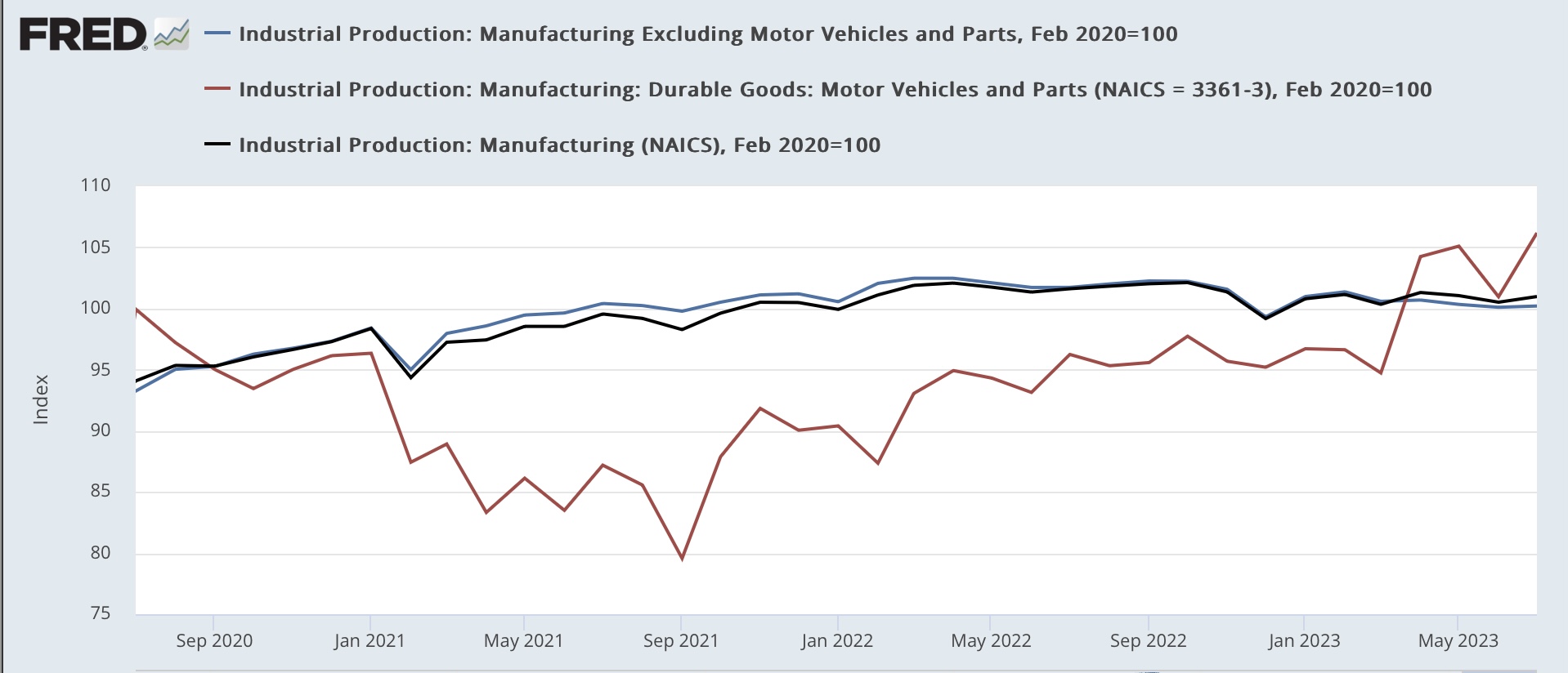
It’s worth emphasizing that the unspooling of pandemic related bottlenecks is significantly affecting these numbers. Below I show total manufacturing (black), manufacturing except for motor vehicles (blue), and vehicle manufacturing (red), all normed to 100 as of just before the pandemic:


Production of motor vehicles and parts is up about 10% this year. Were it not for that, manufacturing production would be down further.

Also, here is production of wood products, which has been tracking housing construction, and like construction has also had a little bit of a rebound this year:


This by the way shows an important difference between this metric and the ISM manufacturing index and Fed new orders indexes. The former is weighted by contribution, whereas the latter are diffusion indexes. The two types of indexes are telling us that while the bulk of manufacturing is down significantly, the ramping up of vehicle production is counterbalancing that.

Wednesday, August 16, 2023

In housing construction, the last domino still refuses to fall: Travelin’ Man edition


 - by New Deal democrat

[First, a blogging note: I will be traveling for the next week and a half. I’ll keep posting the data, but the posts are likely to be brief, and may be a day late. On days when there is no data, I will probably not post at all.]


When it comes to housing construction, I’ve been waiting for the last domino to fall. Once again in July, it didn’t.

Total housing starts rose 3.9%, but are -19% below their peak. Permits rose 0.1%, but are 22% below their peak. Units under construction, which is the “real” economic activity, rose 0.4% and is slightly, as in -2.7%, off its peak:


Single family permits are the most leading and least noisy data point. They were essentially flat, and both starts and permits are off about -25% from their respective peaks. Single family units under construction declined all of 5,000, and are -18.4% below their peak:


With the huge increase in the prices of houses after the pandemic, action shifted to multi-family units. Permits and starts for these were virtually unchanged last month. While permits are down -33% and starts are down -25% from their respective peaks, multi-family units under construction made yet another new all-time high:


The pace of construction for these multi-family units has barely slowed down at all:


Historically you have needed about a -10% decline in housing under construction before a recession actually began. Once again in July, the final domino - multi-family units under construction - did not fall. I suspect no recession will begun until it does.


Tuesday, August 15, 2023

July retail sales: gas and vehicle sales continue to dominate the trend


 - by New Deal democrat

As always, real retail sales tell us a great deal about what is happening in the consumer economy. July continued the recent trend since gas prices started declining over a year ago.


Nominally retail sales increased 0.7%. Since consumer prices increased 0.2%, real retail sales increased 0.5%. Here they are compared with real personal expenditures on goods since just before the pandemic:


Unsurprisingly, in the past year real retail sales have followed the trajectory of gas prices, declining in the second half of 2022 before increasing again in 2023.

Excluding gas sales, real retail sales have been almost relentlessly flat for the past 2 years:


Also, because there is potent evidence that motor vehicle sales have improved sharply since supply chain bottlenecks started to unspool last year, below I show total retail sales (blue) compared with retail sales for motor vehicles and parts (red), and retail sales excluding motor vehicles (black). Also shown are the number of cars and light truck sold (gold):


Clearly the improved sales of cars and light trucks are helping buoy retail sales.

To put it simply: the improvement in retail sales this year is coming from vehicle and gas sales, while consumers appear to be cutting back slightly on other purchases of goods.

Finally, because real retail sales /2 (blue below) are a short leading indicator for employment, here is the updated YoY graph comparing them as well as YoY real personal consumption of goods /2 (red) and YoY payrolls (black):


This relationship continues to forecast continued deceleration in jobs numbers in the months ahead, although not an outright decline at this point. In other words, basically more of the same.

Monday, August 14, 2023

This is the Big Story: a 100+ year near-record decline in commodity prices is enabling continued record wage growth and employment


 - by New Deal democrat

No important economic data today, so let me elaborate on the matter of “immaculate disinflation,” i.e., the decline in inflation without a decline in growth. I’m going to argue that, to the extent there is causation, it is the reverse of what is generally assumed, to wit: that there is decent growth without any meaningful hit to employment, which somehow is occurring while inflation is declining.


To the contrary, it is precisely *because* inflation is declining under the present set of circumstances that we are continuing to get good growth in employment and overall consumption.

Let me start by running a long term version of a graph I have highlighted many times over the years, average hourly wages YoY (red) vs. CPI (blue) and also CPI ex-fictitious shelter (blue green):


Going back 60 years, whenever wage growth exceeds inflation (the red line is higher than the blue or blue green lines), you are either in an economic expansion, or the end stages of a recession setting the stage for the next expansion. Consumers have an increasing amount of money to spend, and they are spending it.

Note the converse isn’t always true. Particularly from about 1970 to 1995, there were times when average wages weren’t keeping up with inflation but we were nevertheless in expansion. This is because that was the era of women entering the workforce by the millions. This operated to tamp down average wages. BUT, median household income grew. If that statistic were updated monthly or even quarterly, that’s what we would want to use. Unfortunately, it is only updated annually, so it’s realistically not available.

But do note that approaching recessions (with the exception of the pandemic), average wages either dip below inflation, or at least the gap is almost entirely closed. 

Currently average hourly wages are growing at a rate of 4.8% YoY, while headline inflation is up 3.2% and CPI ex-fictitious shelter is up only 1.0%. Consumers have more money to spend, and they are spending it.

But to look for why consumer inflation has become so tame, let’s look at commodity prices for producers.

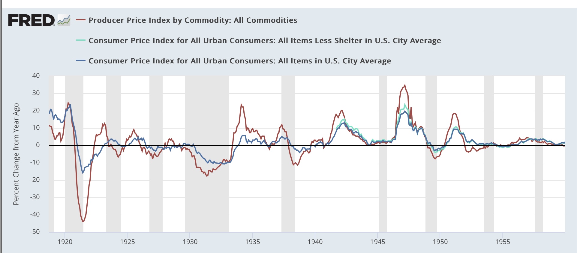
Here are two graphs of commodity prices (red) vs. headline consumer inflation and inflation ex-shelter going back 110 years:


At the far right of the second graph, you can see that producer prices were down close to -10% YoY one month ago. If you go back over the entire 110 year period, declines that steep only happened once in the past 70 years (at the end of the Great Recession). Before that, declines of -10% or more only happened late in or at the end of the recessions of 1920, 1938, and over -5% near or at the end of two recessions in the 1920s, and the 1950 recession. Recently declines nearly that steep happened at the end of the 2001 recession, during the 2015 “shallow industrial recession,” and the pandemic lockdowns.

It’s no coincidence that those steep declines are at or near the end of those recessions. Those big declines in costs to producers enabled them to cut sales prices to consumers (note that consumer inflation is also declining at those times), which made it earlier for consumers to buy those goods. And a new expansion began!

In fact, the disparity between producer commodity costs now and consumer inflation (shown in the graph below) is close to its most extreme in that entire 110 year period, as consumer prices YoY are running more than 10% above producer commodity prices). Only at the end of the Great Recession and the end of WW1 was the disparity so huge):


This huge decline in producer prices in the past year has enabled them to hire more workers at substantially higher wages and yet still pocket increased $$$, especially if they have market power and are able to maintain their recent price hikes.

As shown in the graphs above, typically sharp declines in producer prices occur because of demand destruction during recessions. But this time around, prices have declined because of the unspooling of pandemic-caused restrictions and bottlenecks. Because commodity prices are set globally, there may also be an element of a slowdown in Chinese manufacturing to the story as well, but for purposes of any impact on the domestic US economy, this is irrelevant.

This is the Big Story. This is why there hasn’t been any recession - at least not yet -despite huge Fed rate hikes. This is why I am temporarily paying much more attention to producer prices than I normally do. It’s also why I am looking for signs of that downdraft (hello, $3.80 gas prices again) ending.