- by New Deal democrat
We live in interest-ing commodity times. Over the weekend, my latest piece at Seeking Alpha highlighted the strong contrary pulls of higher interest rates and lower commodity prices. While not unique, as we’ll see below, the disconnect is the most severe in 100 years.
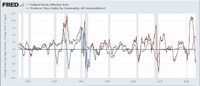
So let’s start with a comparison of the YoY change in interest rates (blue) vs. the YoY% change in commodity prices (red) for the past 65 years:
Typically interest rates and commodity prices move more or less in tandem, as the Fed chases increased inflation with higher rates on the way up, and lowers rates as demand destruction causes commodity prices to decline. But in addition to the present, there have been several exceptions, where the Fed increased interest rates even as commodity prices declined: 1959, 1981, 2006, and to some extent 2015. Probably unsurprisingly, the first three instances were just before recessions, two of them among the most severe during that period. In 2015, the Fed did not raise rates, but was unable to lower them due to already being at the zero lower bound; and also, no recession occurred.
Let’s now look at some real world correlates during those 4 instances.
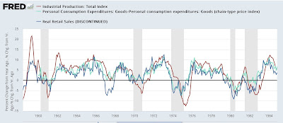
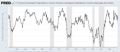
Below are two sets of graphs for each period. The first compares YoY real retail sales (blue), YoY real personal spending on goods (light blue green), and YoY industrial production. The second breaks out YoY real personal spending on services (black).
Here is the period including 1960 through 1982:
Aside from the usual note that real retail sales leads industrial production, all three series decline sharply to and ultimately below “0” YoY as or shortly after the 1960 and 1982 recessions began. Real spending on services, as is so often the case, never turned negative during the recessions, but did decelerate sharply just as they began.
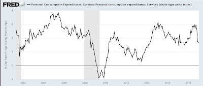
Here is 2001-2019:
In 2006, only real retail sales turned negative YoY. Both industrial production and real spending on goods held up until several months into the Great Recession. By contrast, in 2015, only production declined. Consumer spending measured both ways continued to sail along. Spending on services, which had declined into 2014, actually *increased* sharply during 2015.
Now here is the post-pandemic situation:
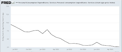
Much like the 3 recessionary periods between 1960 and 2007, both measures of consumer spending on goods have declined, although after a decline last year, this year consumer spending on goods measured both ways has been improving. Meanwhile, real spending on services has held steady at roughly +2.5% YoY, which if you compare with the previous graph, is still stronger than at almost any time between 2000 and 2020.
It is the large YoY% gain in spending on services which is most reminiscent of 2015’s “no recession” vs. the three prior periods of increased interest rates in the face of declining commodity prices. As in those three periods, it was when real spending on services sharply decelerated that the recessions actually began.
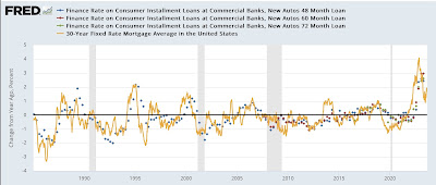
Finally, below I show the YoY change in the interest rates charged for auto loans (dotted lines) vs. mortgage rates (gold) since 1985:
As you can see, these are the sharpest increases in nearly 40 years. Despite the fact that multi-family housing construction and vehicle sales currently seem to be levitating, I have to think these increased rates will soon enough have a big effect. The question then becomes whether consumers simply continue to spend on services, or whether those too are ultimately affected. We’ll get an update on that for July on Thursday.
