Friday, December 18, 2020

Housing permits and starts for November: yet more evidence of an economy primed for takeoff in 2021


 - by New Deal democrat

If there was bad news yesterday in the further increase of initial jobless claims, there was also good news in the 10+ year highs in new housing permits.


Here’s the graph of permits (blue), single family permits (red, right scale), and housing starts (green):


Not only total permits, but also the much less noisy single family permits, made 13 year highs. While the much noisier starts didn’t, the only months in the past 13 years that were better were last December through this February.

Because housing construction involves spending on all sorts of trades in the following year, and spending on landscaping, appliances, and other furnishings thereafter, new home building is an excellent long leading indicator.

Bottom line: yet more evidence that once the pandemic is brought under control, the economy is primed for a very vigorous takeoff.

Thursday, December 17, 2020

Jobless claims negative trend reversal likely; expect a poor December jobs number


 - by New Deal democrat

This week new jobless claims rose further from their recent pandemic lows, while continuing claims, seasonally adjusted, made a new pandemic low. Nevertheless I strongly suspect the downward trend has broken.

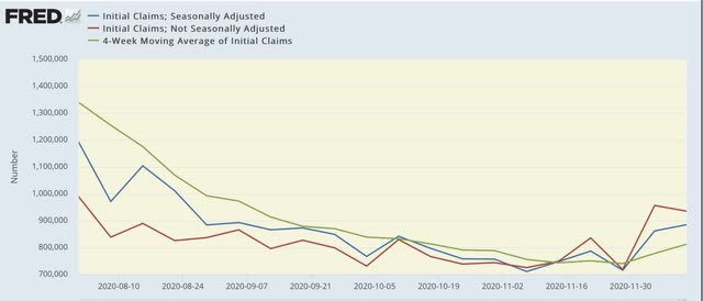
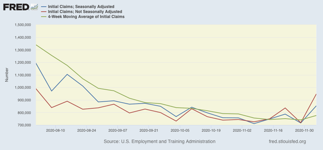
On a unadjusted basis, new jobless claims declined by 21,335 to 935,138. Seasonally adjusted claims, on the other hand, rose by 23,000 to 885,000. The 4 week moving average also rose by 34,250 to 812,500, the highest reading in a over a month. Here is the close up since the end of July (for comparison, remember that these numbers were in the range of 5 to 7 million at their worst in early April):


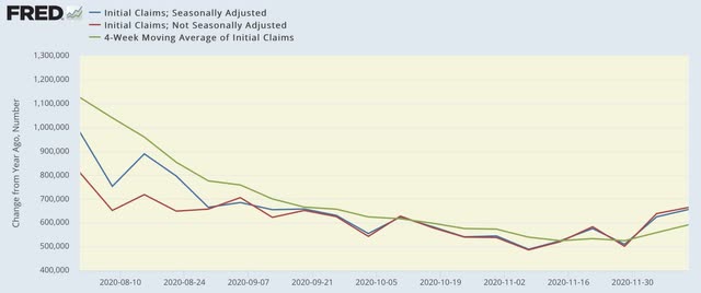
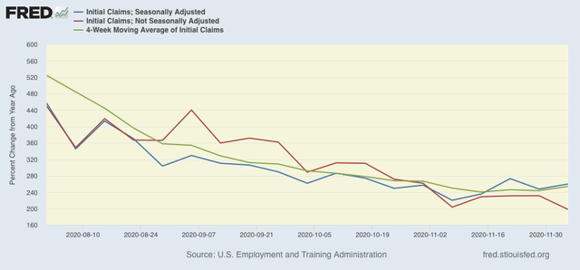
Because of the huge distortions caused by the pandemic in seasonally adjusted numbers, and because we are at a time of year when seasonality causes the most distortions in any event, let’s also take a look at the YoY changes in all of the above metrics:


There is now a 5 week trend of increasing YoY comparisons of the weekly data, and the 4 week average also looks like it has started a trend higher YoY. Thus it is very likely that the renewed explosion of the pandemic has indeed caused new jobless claims to break into an upward trend due to the rampaging pandemic. Nevertheless, as I wrote last week, I won’t feel certain unless and until seasonally adjusted new claims rise over 900,000 and the 4 week average over 850,000, which would take both out of the range they have been in over the past 4 months. We’re not quite there yet.

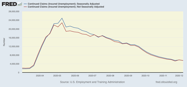
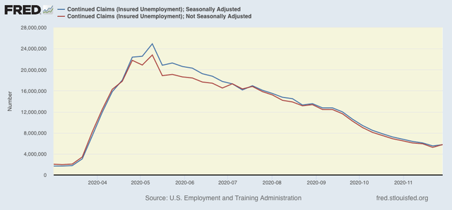
The “good” news was that continuing claims, which historically lag initial claims typically by a few weeks to several months, fell by 312,257 to 5,492,701 on an unadjusted bases, and also declined by 273,000 to 5,508,000 after seasonal adjustment, a new pandemic low:


Because these lag initial claims, I strongly suspect we will see an upward reversal in the next few weeks.

Additionally, although I won’t bother with a graph, both initial and continued claims remain at or above their worst levels from the Great Recession.

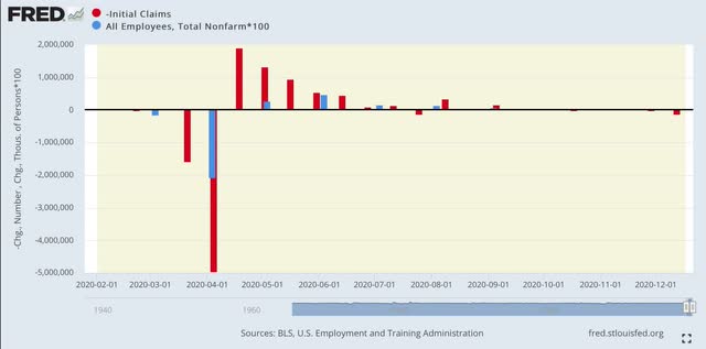
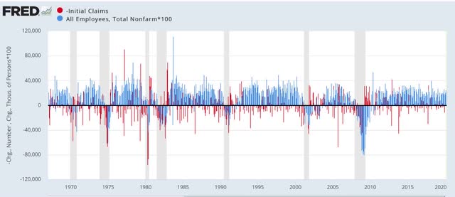
Finally, the increase in new jobless claims has averaged 72,000 in the past 4 weeks. Here’s what that looks like vs. monthly job gains or losses this year (note that the 2 week change in jobless claims is inverted so that an increase shows as a downward bar:


I mention this because such a dramatic increase in jobless claims over a month has never occurred outside of a recession, and has always coincided with a *loss* of jobs in the monthly report:


Because we are in uncharted territory all I really feel comfortable saying is that I suspect that the December jobs report is going to be the weakest since May.  A negative number is very possible, and if there is a positive number, it looks likely to be well under 200,000.  

Additionally, I also suspect the unemployment claims situation is going to continue to worsen as long as the pandemic does. I have no idea how much worse it will get.

Wednesday, December 16, 2020

November retail sales poor m/m, but trend still good


 - by New Deal democrat

Retail sales for November clocked in at -1.1% without adjusting for inflation. After inflation, the number was -1.3% m/m.

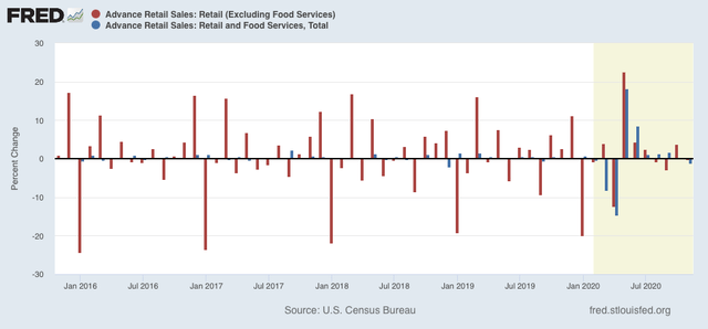
While the seasonally adjusted headline was certainly bad, this year tracking the unadjusted numbers is also important due to the havoc COVID is playing with consumption and employment. So the below graph shows the m/m changes over the past 5 years of both the adjusted (blue) and unadjusted (red) numbers:


As you can see, comparing this way shows that the November downturn is, relatively speaking, just a blip. Over the past 10 years November sales, unadjusted, had typically improved over 3% m/m as the Christmas season ramped up. This year sales declined -0.2%. So at very least we need to see if December changes the holiday dynamic this year.

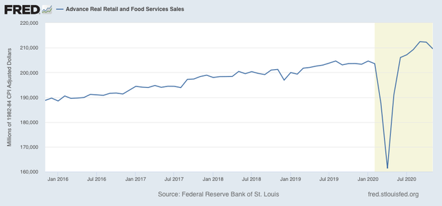
On an absolute basis, real retail sales are still up 2.9% since February:


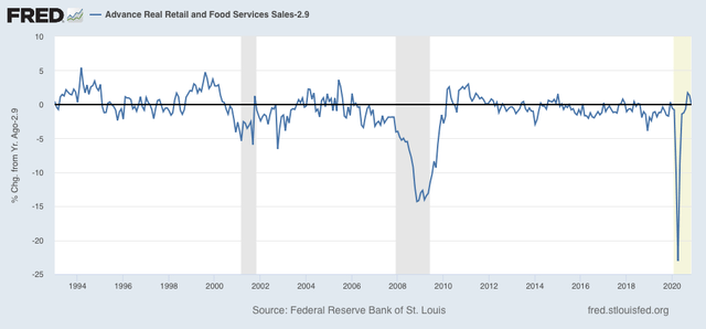
They are also up 2.9% YoY. The below graph subtracts 2.9% from the YoY value to show how the present compares with the historical data:


In short, whether measured since just before the pandemic hit, or YoY, sales still look pretty good.

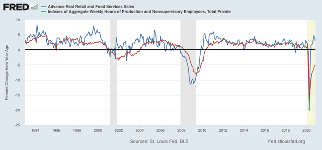
Finally, as I have pointed out many times, consumption leads employment. It’s even a better match for aggregate hours worked in the economy, as shown in the long term graph below:


So I continue to expect employment to continue to rise - with a lag, and quite possibly a pause during this winter as the pandemic continues to rage - to match the level of sales, probably as more and more people are vaccinated and warmer weather returns.

Indeed, tucked away in the Census Bureau’s report is this important note:

“[Sales in] Nonstore retailers were up 29.2 percent (±1.6 percent) from November 2019, while food services and drinking places were down 17.2 percent (±3.7 percent) from last year.”

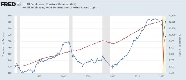
When we compare employment in the two above sectors, this is what we see (note the huge difference in the left vs. right scales):


As of November, nonstore retailers have regained almost all their employees since the pandemic started,  but food and beverage retailers are still down over 2 million jobs! It is this sector that will probably catch back up once the pandemic is brought under control.

Tuesday, December 15, 2020

Industrial production continues to progress, at a slower rate, in November


 - by New Deal democrat

I call industrial production the “King of Coincident Indicators” because it is the metric that is usually the decisive one for the NBER in determining when recessions and expansions begin and end.


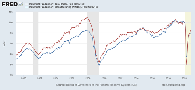
November’s report continues the trend of a strong rebound in production, as overall production increased 0.4% from October, and manufacturing 0.8%. Total production has recovered about 70% from its April low compared with February just before the pandemic struck, and manufacturing has recovered over 80% from that point:


Even so, both are currently off their peaks by about the same percentage as the worst of the 2001 recession, and the 2016 “shallow industrial recession.”

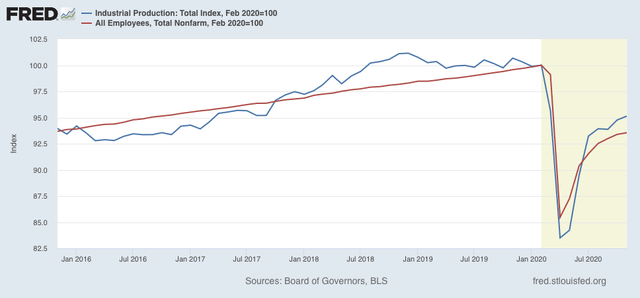
The next graph compares overall production (blue) with nonfarm payrolls (red), both normed to 100 as of February:


Jobs were hit harder in March and April, but have recovered more, as they are only about 3.5% lower than their February peak. On the other hand, it’s quite clear in the graph above that the recovery in both production and employment has slowed considerable in the past 3 months, even if both continued to make progress through November.

Note finally that, exactly because these are *coincident* indicators, they tell us where we are now, but do not forecast the next few months. In other words, as always it would be a mistake to assume or project that the present trend is going to continue.

Monday, December 14, 2020

The US economy is primed for takeoff in 2021


 - by New Deal democrat

The fist vaccine against COVID-19 began to be distributed today. At last there is light at the end of the tunnel.

The pandemic has been dictating the state of the economy ever since it hit. But for the last several months and longer, the “high frequency” data I follow each week has painted a picture of an economy that “wanted” to accelerate.

But because the weekly data can be very volatile, a look at the more reliable, long-established leading indicators that are provided monthly or quarterly is worthwhile.

I have prepared a post doing exactly that, first with the long leading indicators that help us know the direction of the economy about 1 year out. This post is up at Seeking Alpha.

As usual, clicking over and reading should be informative for you, and a little bit $ rewarding for me.

Sunday, December 13, 2020

The GOP has crossed the Rubicon


 - by New Deal democrat

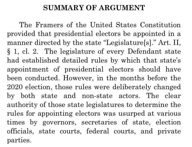
In the Roman Republic, military leaders automatically lost their legal authority to command at the Rubicon River in northern Italy. When Julius Caesar crossed the Rubicon with his legions, it was an act of war against the Republic. With the filing of their  Amicus brief in the Supreme Court this past week, the GOP as represented by their Congressional delegation similarly finally broke with the idea of American democracy itself. 


For the first several weeks after Trump’s railing against the election results, the GOP simply took the position that he was entitled to pursue legal remedies if he believed he was wrong. The mask was ripped off, and that pretense abandoned, when in their brief, the GOP took the core position  not just that there were allegations of errors which were entitled to be explored, but rather ***asserted as a fact*** that millions of votes in 4 swing States were invalid and should not be counted. Not because dead people voted, or people not properly registered had voted, but rather simply on the flimsiest of assertions that actions by Courts and Executive officials carrying out their respective States’ election laws rendered all of the votes cast in good faith reliance upon the law by millions of voters in those States null and void.

Here’s the “Summary of Argument” from the GOP Brief:


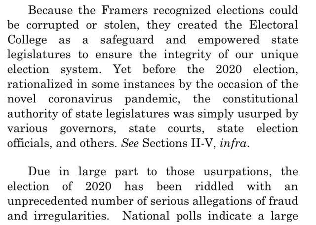
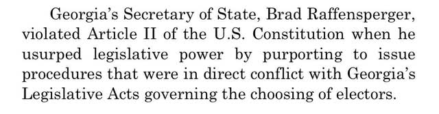
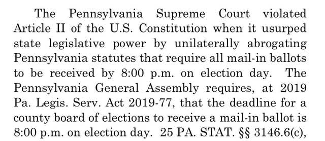
And here is a sample of their assertions against the 4 swing States.

Georgia


Pennsylvania:


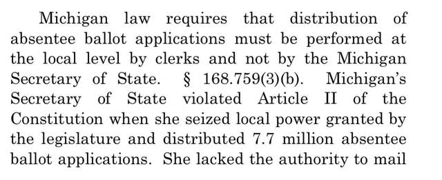
Michigan


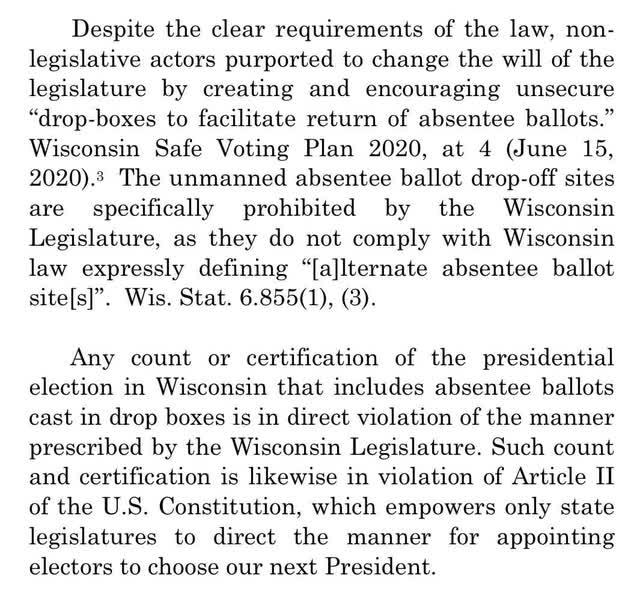
Wisconsin


Not a single one of these assertions indicates that any of the votes so cast were not by US citizens who were properly registered to vote, and were acting in good faith relying upon their State’s guidance.

While the Electoral College will cast their votes on Monday, it is crystal clear that on January 6, when the new Congress convenes to confirm the election, GOP Senators and Representatives will en masse object to the counting of these 4 States’ Electoral votes, and perhaps the Electoral votes by other swing States as well. Meaning that if there were a GOP majority in the House, they would refuse to confirm Biden’s election and instead declare Trump the winner.

In short, we have reached the point where the GOP as an institution has declared that if it has the power to do so, it will overturn a Presidential election vote for the Democratic candidate. They have crossed the Rubicon, and no longer support democracy in America.

Saturday, December 12, 2020

Weekly Indicators for December 7 - 11 at Seeking Alpha


 - by New Deal democrat

My Weekly Indicators post is up at Seeking Alpha. Here’s the link:

https://seekingalpha.com/article/4394374-weekly-high-frequency-indicators-weakness-spreads-still-no-fundamental-change-in-outlook

With the big increase in jobless claims, as well as a deteriorating situation for restaurant dining, weakness has spread further among the indicators - but the forecast, both long and short term, remains very positive.

As usual, clicking over and reading should bring you up to the virtual moment, and I appreciate the jingle jangle of a penny or two extra in my pocket.

Friday, December 11, 2020

November inflation tame again, with economy weak, but real wage gains strong


 - by New Deal democrat

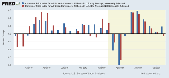
Consumer prices rose 0.2% in November on a seasonally adjusted basis, but declined -0.1% unadjusted:


As shown in the above graph, a November decline in prices is typical. This year’s decline was less than either of the past two years.

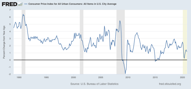
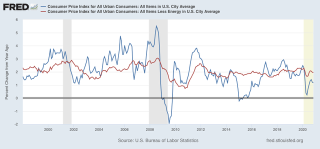
On a YoY basis, consumer prices were only up 1.2%:


For the past 40 years, recessions had typically happened when CPI less energy costs (red) had risen to close to or over 3%/year. As of this month that number is under 2% (last 23 years shown in graph):


But while the relative lack of inflation is good news in isolation, such declines in the rate of YoY inflation growth have typically happened during recessions, I.e., they are also a sign of economic weakness.

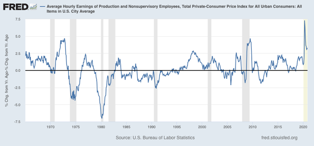
On the bright side, because wages are “stickier” than prices, typically as recessions beat down prices (or at least price increases), in real terms wages rise, either during or just after a recession. That has been the case for the coronavirus recession as well, as real wages growth for the past year has been over 3%:


It is the “real” buying power of wages among those still securely employed during a recession that is one of the engines that usually restarts growth. With the exception of the late 1990s tech boom, and during the latter part of the Great Recession when gas prices completely collapsed, the current reading is the best in nearly 50 years.

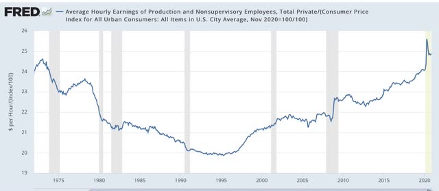
Also as a result, as I’ve noted for the past several months, real hourly wages for non-supervisory workers have finally exceeded their previous 1973 peak, although part of that has been the asymmetric loss of jobs among some of the lower paid occupations:


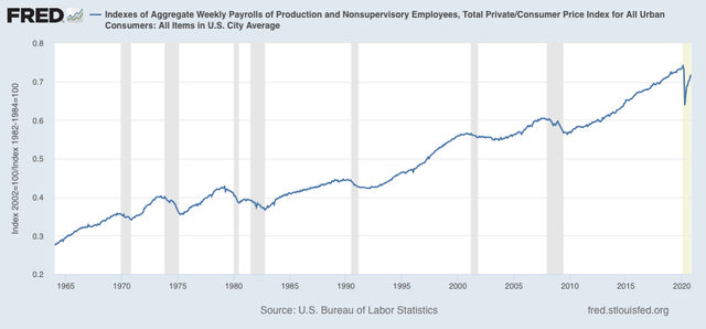
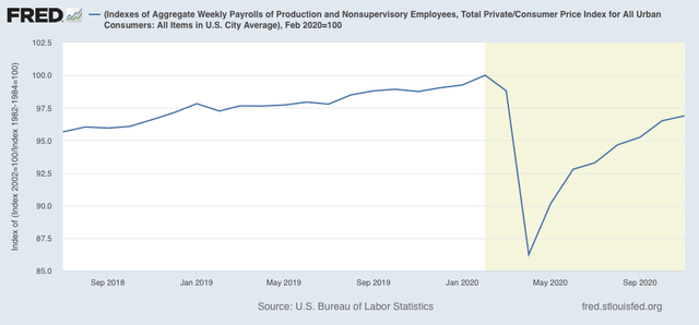
Finally, one of the most telling metrics of the overall health of the middle/working class is that of real aggregate wages. An increase in this metric has *always* mean that the economy is expanding and not in a recession:


After declining -13.8% from February through April, they have now recovered to -3.1% below their peak, approximately at the same level as they were at the end of 2018:


If the rate of gains over the past 5 months were to continue - a *very* open question - aggregate real wages would exceed their February level about 4 months from now, I.e., next March.

Of course, this like almost all other economic data, remains at the mercy of the course of the pandemic, which is completely out of control in most of the US, and which has manifested itself in the weakest jobs gain in half a year, and an increase in new unemployment claims. It is also very much subject to the public policy that has been stalled in Washington for the past half a year, and is going to continue to be stalled until at least January 20.

Thursday, December 10, 2020

Jobless claims rise: a break in the trend?


 - by New Deal democrat

This week’s new and continuing jobless claims all rose off of last week’s pandemic lows, but while I suspect the downward trend has broken, I don’t think we can say so  decisively yet.

On a unadjusted basis, new jobless claims rose by 228,982 to 947,504. Seasonally adjusted claims rose by 137,000 to 853,000. These were the worst readings in 4 and 2 1/2 months, respectively. The 4 week moving average also rose by 35,500 to 776,000, the highest reading in a little over a month. Here is the close up since the end of July (for comparison, remember that these numbers were in the range of 5 to 7 million at their worst in early April): 


Before proclaiming DOOOM, let me point out that the YoY changes have barely budged higher in the adjusted claims, and *unadjusted* claims had their best week yet since the start of the pandemic:


This is because initial claims almost always jump by about 40% in the week just after Thanksgiving. This year they “only” jumped about 32%. So while it is quite likely that the renewed explosion of the pandemic has indeed caused new jobless claims to start to trend higher since 4 weeks ago, I don’t think we can say so confidently unless and until seasonally adjusted new claims rise over 900,000 and the 4 week average over 850,000, which would take both out of the range they have been in over the past 4 months.

Continuing claims, which historically lag initial claims typically by a few weeks to several months, rose by 533,336 to 5,780,895 on an unadjusted bases, and rose by 230,000 to 5,757,000 after seasonal adjustment, the first increase since August 29:


Both initial and continued claims remain at or above their worst levels from the Great Recession.

Although last week marked pandemic lows for most of the jobless claims data, we have failed to make any meaningful new lows in a month. Last week I wrote that “my guess is [that nonfarm payrolls gains] will be the weakest reading of the past 6 months. I still suspect the near term trajectory in new jobless claims is going to be poorer.”

Both of these things happened. I suspect the unemployment claims situation is going to continue to worsen as long as the pandemic does. I have no idea how much worse it will get.

Wednesday, December 9, 2020

JOLTS report for October: similar to previous 2 recoveries, but decline in actual hiring may be a warning


 - by New Deal democrat

This morning’s JOLTS report for October showed a jobs market recovery that, for one month at least, paused. Openings and quits were up (good), but layoffs and discharges were also up (bad) while hires were down (bad).

While the JOLTS data is a deep dive into the dynamics of the labor market, since it only dates from 2001, there are only 2 previous recoveries with which to compare the present. Nevertheless it is worthwhile to make the comparison.

In the two past recoveries:
  • first, layoffs declined
  • second, hiring rose
  • third, job openings rose and voluntary quits increased, close to simultaneously

Let’s examine each of those in turn. In each case, I break out 2001-19 in a first graph and then this year in a second.

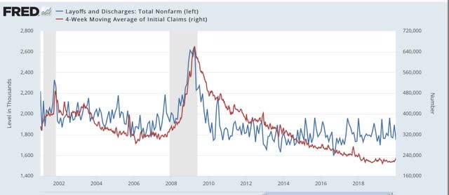
What appears below is that, although there has been some variation, the past several months have recapitulated the pattern from the last two early recoveries: the first two data series to turn - layoffs and hires - have indeed turned, while the last two - job openings and voluntary quits - have appeared to bottom but have had a much less dramatic rise.

This first graph compares layoffs and discharges (blue) with the 4 week average of initial jobless claims (red):


You can see that, by the end of the recessions, layoffs were already declining, and continued to decline steeply over the next 3-8 months before reaching a “normal” expansion level. The turning point coincides exactly with the much less volatile, but more slowly declining, level of initial jobless claims.

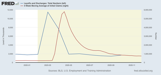
The same has been the case this year, as layoffs and discharges already declined to their “normal” level in May, while initial jobless claims peaked one to two months later, and have been declining (slowly) ever since. Whether the slight rise in the JOLTS series manifests in initial jobless claims in December will have to be seen: 


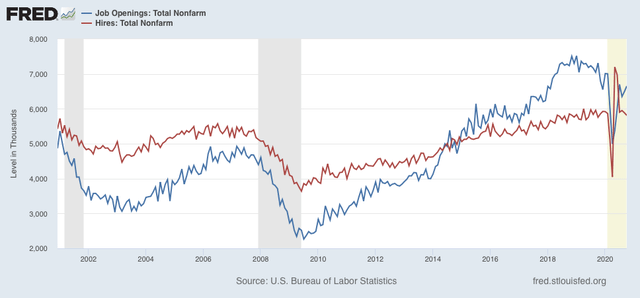
Next, here is the historical relationship between hires (red) and job openings (blue):


In the past two recoveries, actual hires started to increase one to two months before job openings.

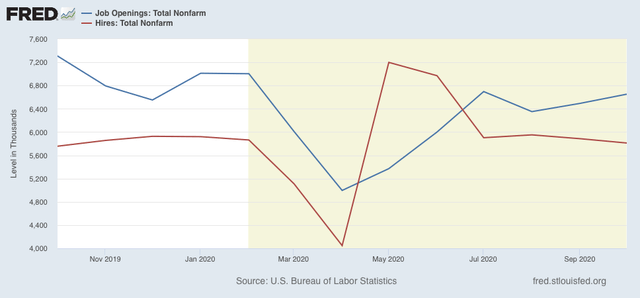
This year, both made troughs in April, but hires rebounded sharply in May and June compared with job openings. Since then both have essentially leveled off, but with hires in October having their worst month (ex-Mar and Apr) since 12 months ago:


Again, we will have to wait and see if this just one off month, or whether hires continue to decline and openings follow.

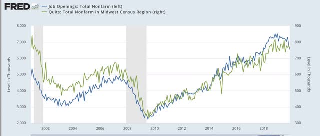
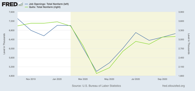
Next, here are quits (green) vs. job openings (blue): 


In the past two recoveries, actual hiring started to rise slightly before quits made a bottom. After that, both rose more or less together (suggesting it is openings that leads to the increase in voluntary quits).

This year, both made a trough in April. Since then, it appears that openings have continued to slightly lead quits:


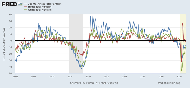
Finally, because seasonal adjustments might not be giving us a true picture because of the enormous moves during this pandemic year, here are job openings (blue), hires (red), and voluntary quits (green), measured YoY without seasonal adjustments for the entirety of the series up through the present:


We can see that, even taking out the seasonal adjustments, hires rebounded first following the 2001 and 2008-09 recessions. Quits and openings moved generally in tandem with a slight lag. The same pattern appears this year.

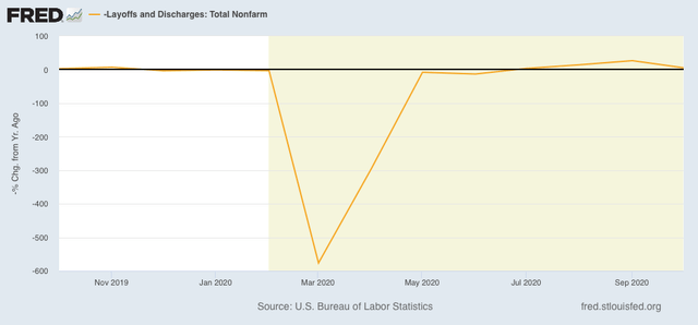
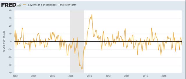
I have broken out layoffs and discharges separately below, because the their level in April and May of this year would obliterate all other variations (note: inverted so that fewer layoffs shows as positive):


This metric returned to normal almost immediately after both of the past two recessions, and did so again by July of this year, and while its gain decelerated in October, it is still slightly positive measured YoY:


To sum up:
1. The JOLTS report shows a pattern consistent with the past 2 recoveries, with layoffs having returned to normal levels, then hiring having increased, and finally quits and openings increasing as well; but
2. The slight increase in layoffs in October, and slight decrease in hiring might just be noise, but with the pandemic once again largely out of control, they might be the harbinger of something darker, as hiring peaked earliest in both of the past two expansions.

Tuesday, December 8, 2020

Coronavirus dashboard for December 8: a very gloomy winter ahead; but treatment outcomes are clearly improving


 - by New Deal democrat

US total infections: 14,949,299*

US average last 7 days: 201,154

US total deaths: 283,703

US average last 7 days: 2,237

*I suspect that the real number is about 21 million, or about 6% of the total US population
Source: COVID Tracking Project

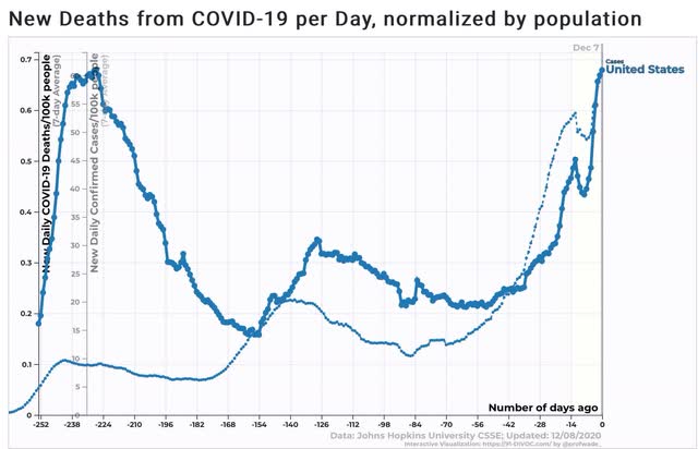
Let’s start with the really bad news. The average daily rate of new infections in the US in the past week is the highest it has ever been, at 61 per 100,000 population, or roughly 1 in every 2,000 people in the US every single day. Average daily deaths also hit a new high at 0.7 per 100,000, or 1 in every 70,000 people daily:


Because deaths lag confirmed infections by roughly 2 weeks, and infections now are almost 50% higher than they were 2 weeks ago, that means we should expect the death rate to climb to over 1 per 100,000 (or over 3,000 people) daily before Christmas.

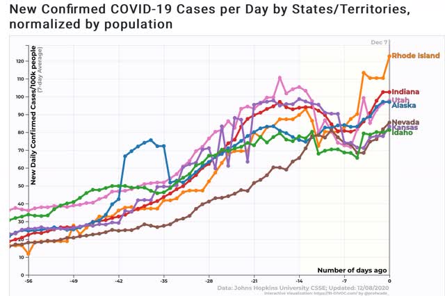
In the past two months, 25 States have seen their rates of infection increase by 40 per 100,000 (or an *increase* of 1 in every 2,500 people) per day. The 7 worst States, with infection rates of 80 per 100,000 people per day or worse, are shown in the graph below:


In addition to those, AZ, AR, AL, CA, CT, DE, Fl, GA, KY, LA, MA, MS, NH, NJ, NY, PA, TN, and WV have all seen increases of 40 per 100,000 or more.

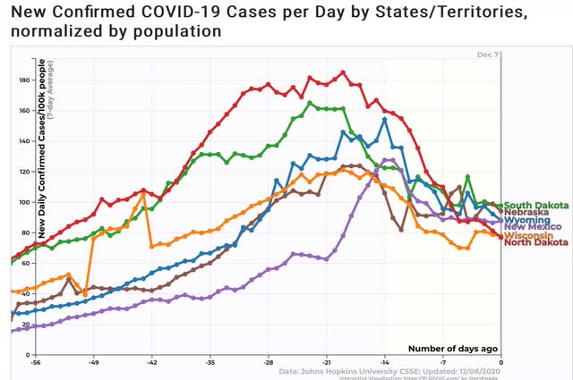
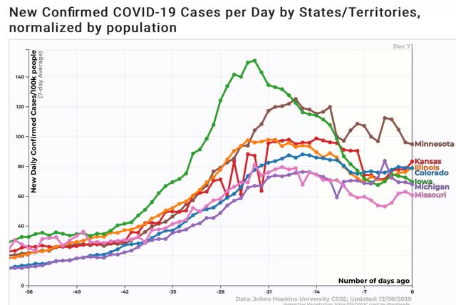
In the closest there is to “good” news, it’s pretty clear that there is still a “pain threshold” where panic sets in, people change their behavior, and the infection rate goes down. Below are the graphs of the 13 States - most dramatically including North Dakota - where the past several weeks have seen significant downturns in infections:


In North Dakota and Iowa, the rate of new infections has declined by 50%.

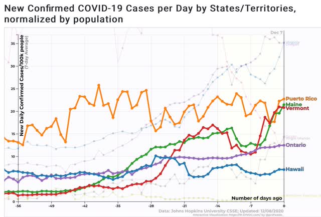
There are also still 3 States - Hawaii, Maine, and Vermont - plus Puerto Rico, where the pandemic is still reasonably under control. I also show the Canadian province of Ontario for comparison:


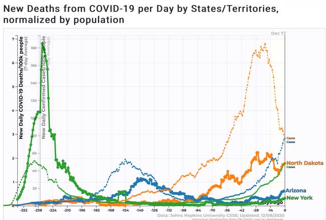
Finally, treatment outcomes appear to be continuing to improve. The below graph shows the rates of both infections (dimmed) and deaths (bold) for the early disaster of NY, the summer poster child for out-of-control spread AZ, and the recent calamity of ND:


In NY, deaths peaked at .078 of confirmed infections, or 1 in every 128; in AZ at .022, or 1 in every 454; and in ND (to date) at .013, or 1 in every 770.

This is going to be an extremely difficult month or two, in which the disease is only restrained by the panic threshold. Between vaccine availability, and a coherent Federal response after January 20, the threat should hopefully at least be receding by early spring.

Monday, December 7, 2020

Four measures of labor market losses in the pandemic


 - by New Deal democrat

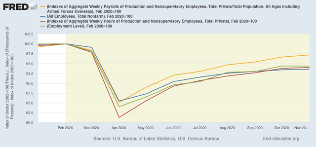
Below is a graph of 4 ways of measuring the downturn in the labor market due to the pandemic:

1. Payrolls (blue) - this is the headline jobs number from the establishment survey
2. Civilian employment (green) - this is the equivalent number from the household survey.
3. Aggregate hours worked (red) - tracks hours rather than jobs.
4. Aggregate payrolls (gold) - tracks total payrolls rather than jobs.


First of all, note that the two jobs measures from the two component surveys track similarly. They are currently down -5.7% and -6.5% respectively from their February peaks.

Further, as you can see, hours fell more than any other measure (down 18.7% vs. 14.5% to 16% in the other measures). This is typical in a recession, as hours get cut more than jobs.

But the most inclusive number is aggregate payrolls (which I’ve divided by population rather than inflation, since they track very closely, but November inflation hasn’t been reported yet). Payrolls are only off -2.8% from their February peak.

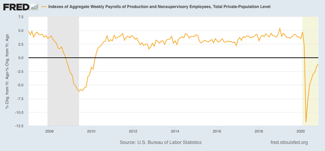
This is a much quicker recovery than we saw in the wake of the Great Recession, as shown in the YoY% change, below:


Total payrolls have almost entirely made up their pandemic loss already, whereas it took 3 years for that to occur after the Great Recession.

If there is not a double-dip downturn, and the vaccine is deployed promptly, we might get a V-shaped employment recovery. Which would be nice for a change.

Sunday, December 6, 2020

The libertarian vs. populist trade-off in the 2020 election and beyond


 - by New Deal democrat

A few weekends ago I wrote that  “the Democratic ‘brand’ is ‘socially liberal, economically moderate,’ while the US electorate as a whole is socially moderate and economically progressive” citing a scatterplot graph of the 2016 electorate; and that:

The path forward is to embrace, and pass, some simple economic fixes ... that materially improve - and are *seen* to materially improve - average Americans’ lives, while allowing for some flexibility on issues that people perceive as ones of morality (and hence are hard to compromise about) in such a way that nobody’s ox gets gored too much.
This past week that scatterplot diagram was updated and improved for the 2020 electorate. Here it is:
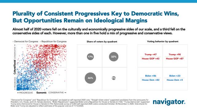

Biden got about 93% of the economically and culturally progressive vote. (Democratic congressional candidates got 91%.) 

While Biden and Democratic congressional candidates did relatively well with the “libertarian” vote (socially liberal but economically conservative), they did poorly with the “populist” vote (economically progressive but socially conservative).
The problem for Democrats is that the “populist” vote is more than 3x as large as the “libertarian” vote. If Democrats were to trade their vote shares between those two groups (I.e., if conservatively Biden were to get 23% more of the populist vote, and lose the libertarian vote by 47%), here’s how the math would work out:

Of *total* votes, Biden would give up 3.1% from the libertarians and 4.7% of the populists, for a total of -7.8%, in exchange for 1.9% from the libertarians and 10.5% from the populists, for a total of +12.4%. 

In short, Biden’s net vote gain would be 4.6%. Using similar math, Democratic Congressional candidates’ shares would improve by 2.9%, 10.3% of the total vote vs. 7.4% presently.

It doesn’t take a genius to figure out that doing this trade would be tremendously advantageous to Democrats.

The upside is that Democrats could enact a thoroughly progressive economic agenda. But it’s certainly fair to ask, what the downside would be.

Start with the idea that “social issues” in most cases really are seen as “moral issues” by most people, and that’s why it is so difficult to find a compromise on them.

For example, 38 States allow 17 year olds to get married; of those 27 allow 16 year olds to be married. In 9 of those States a person over 21 years old can marry a person age 17 or even 16.

Suppose one of those married couples - say a man aged 24 and a teenage girl age 16 - moved into your State. Into your neighborhood.

Under the “full faith and credit” clause of the US Constitution, your State would have to recognize that marriage. It is a very open question to say the least whether your State’s laws criminalizing sex between those two persons could be enforced.

How does that “social issue” look to you?

Suppose you are the proverbial baker, who is a proprietor of your own business. If that couple wanted you to bake a cake for their first anniversary, do you think you should be able to lawfully refuse?

How does that “social issue” look to you?

The point I am trying to make in the above hypothetical situation is that the situation looks very different when it is *your* moral code that is being infringed upon.

To take another issue of recent contention, if I recall correctly even a majority of Democrats were against the forced removal of Confederate statues from all locations.

So, what would a “socially moderate” platform look like? It would probably entail two parts:

1. Allowing different States to make different moral choices within reason, even when it means some people who choose to live in some morally conservative States don’t have all the freedom you think they should have.
2. Allowing freedom of conscience for solo proprietors and family owned small businesses that do not take advantage of the corporate form to deny service to some customers to whom they have a moral aversion (but *not* on the basis of race).

The bottom line is, not forcing one portion of society’s version of morality down the craw of another portion of society, allowing breathing space, but ensuring that reasonable accommodations are made. As I said in my first post several weeks ago, ensuring that “nobody’s ox gets gored too much.”