- by New Deal democrat
Below is a graph of 4 ways of measuring the downturn in the labor market due to the pandemic:
1. Payrolls (blue) - this is the headline jobs number from the establishment survey
2. Civilian employment (green) - this is the equivalent number from the household survey.
3. Aggregate hours worked (red) - tracks hours rather than jobs.
4. Aggregate payrolls (gold) - tracks total payrolls rather than jobs.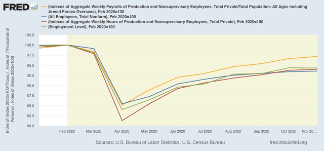
First of all, note that the two jobs measures from the two component surveys track similarly. They are currently down -5.7% and -6.5% respectively from their February peaks.
Further, as you can see, hours fell more than any other measure (down 18.7% vs. 14.5% to 16% in the other measures). This is typical in a recession, as hours get cut more than jobs.
But the most inclusive number is aggregate payrolls (which I’ve divided by population rather than inflation, since they track very closely, but November inflation hasn’t been reported yet). Payrolls are only off -2.8% from their February peak.
This is a much quicker recovery than we saw in the wake of the Great Recession, as shown in the YoY% change, below: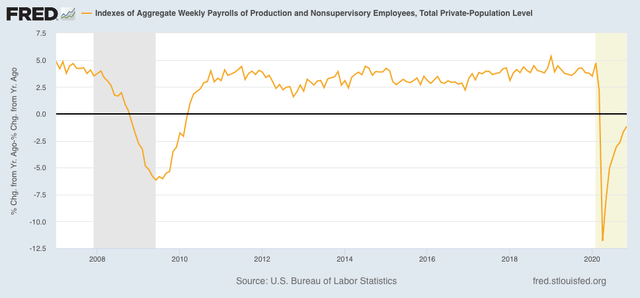
Total payrolls have almost entirely made up their pandemic loss already, whereas it took 3 years for that to occur after the Great Recession.
If there is not a double-dip downturn, and the vaccine is deployed promptly, we might get a V-shaped employment recovery. Which would be nice for a change.