Friday, March 10, 2023

February jobs report: the decelerating trend resumes


 - by New Deal democrat


As I’ve written several times this week, my focus on this report was on whether manufacturing and residential construction jobs turned negative or not, whether temporary jobs continued on their downward trajectory, and whether the deceleration apparent in job growth would reappear after the blockbuster January report.

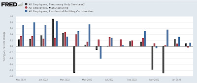
Deceleration absolutely reasserted itself:


and manufacturing jobs appear to have rolled over, while construction and temporary jobs held up:


Although here too the decelerating trend is apparent. 

Here’s my in depth synopsis.

HEADLINES:
  • 311,000 jobs added. Private sector jobs increased 265,000. Government jobs increased by 46,000. The three month moving average of growth declined slightly to 351,000, still 67,000 higher than the average in December.
  • The alternate, and more volatile measure in the household report rose by 177,000 jobs. The above household number factors into the unemployment and underemployment rates below.
  • U3 unemployment rate increased +0.2% to 3.6%.
  • U6 underemployment rate also rose 0.2% to 6.8%.
  • December was revised downward by -21,000, and January was also revised downward by -13,000, for a net decrease of -34,000 jobs compared with previous reports. 

Leading employment indicators of a slowdown or recession

These are leading sectors for the economy overall, and will help us gauge whether the strong rebound from the pandemic will continue.  These were mixed, although as indicated above even the positive indicators still weakened:
  • the average manufacturing workweek, one of the 10 components of the Index of Leading Indicators, declined -0.2 hours to 40.7, down -0.9 hours from February peak last year of 41.6 hours.
  • Manufacturing jobs declined by -4,000.
  • Construction jobs increased 24,000.
  • Residential construction jobs, which are even more leading, increased by only 1,200.
  • Temporary jobs, which had been declining late last year, rose for the second month in a row, by 6,800.
  • the number of people unemployed for 5 weeks or less rose 343,000 to 2,289,000.

Wages of non-managerial workers
  • Average Hourly Earnings for Production and Nonsupervisory Personnel increased $.013, or +0.5%, to $28.42, a YoY gain of 5.3%, an increase from its previous deceleration to 5.1% in January.

Aggregate hours and wages: 
  • the index of aggregate hours worked for non-managerial workers declined -0.4%.
  •  the index of aggregate payrolls for non-managerial workers was unchanged, and resumed its deceleration to 7.4% YoY, the lowest since early 2021, although still more than 1% higher YoY than inflation as of the last reading.

Other significant data:
  • Leisure and hospitality jobs, which were the most hard-hit during the pandemic, rose 105,000, and have improved to -2.4% below their pre-pandemic peak.
  • Within the leisure and hospitality sector, food and drink establishments added 69,900 jobs, and are now only -0.9% below their pre-pandemic peak. 
  • Professional and business employment rose 45,000. This series has also been decelerating consistently, and is now up 2.7% YoY, the lowest increase since mid-2021.
  • The Labor Force Participation Rate increased 0.1% to 62.5%, vs. 63.4% in February 2020.
  • The number of job holders who were part time for economic reasons rose 17,000.
  • Those not in the labor force at all, but who want a job now, declined -211,000 to 5.103 million, compared with 4.996 million in February 2020.


SUMMARY

In absolute terms, this report was yet another solid positive report in terms of job growth. In relative terms, however, the deceleration which was apparent for most of last year resumed. 

Positive signs included growth in temporary and construction jobs, the nearly total recovery in food and drinking places jobs, resumed stronger wage growth, an increase in labor force participation, and a decline in those who aren’t in the labor force but want a job now.

Negatives included a resumption in the decline of the manufacturing work week, a decline in manufacturing jobs (plus downward revisions for the prior two months), increases ini both the un- and under-employment rates as well as short term unemployment, and an outright decline in the number of hours worked.

Deceleration was apparent in residential construction jobs, professional and business jobs, and aggregate non-supervisory payrolls.

In sum, we have further deceleration but no indication of any imminent downturn in the number of actual jobs available in the economy.

Thursday, March 9, 2023

Jobless claims, like JOLTS, consistent with softening within a strong labor market


 - by New Deal democrat


Initial jobless claims increased 21,000 last week to 211,000, still a very low number even if it is the highest since the beginning of January. The 4 week average increased 4,000 to 197,000, also still an excellent level. Continuing claims, with a one week delay, increased 69,000 to 1.718 million, tied for the highest since January 2022:


Just like the JOLTS report yesterday, continuing claims tell us that the labor market, while still objectively very strong, has softened compared with last year.

The YoY% changes also indicate relative softness, with continuing claims up 3.2%, initial claims up 6.6%, but the most important 4 week average only up 0.1%:


For initial claims to warrant even a cautionary yellow flag for recession, the 4 week average would have to be up 10% YoY. Needless to say, we’re nowhere near that marker.

Finally, initial claims are a leading indicator for the unemployment rate, typically with a lag of several months. Here is what the last 16 months look like:


In general, the unemployment rate in tomorrow’s jobs report should be within 0.1% of unchanged, and is a little more likely to increase than to decrease, given the lag compared with November and December’s increase in jobless claims.

I expect tomorrow’s report to revert to the general trend of deceleration that we’ve seen over the past year, since unlike January in February seasonally the data “expects” some hiring vs. massive layoffs as in January. I’ll be especially focusing on whether there is weakness in the leading temp help, manufacturing, and residential construction sectors. We’ll see then.

Wednesday, March 8, 2023

January JOLTS report consistent with a softening, but still very strong, labor market


 - by New Deal democrat


This morning’s JOLTS report for January, unlike the recent payrolls report, generally showed further softening in the labor market.


While hires (red in the graph below, normed to a value of 100 as of February 2020) increased 121,000, quits (gold) declined 207,000, and openings (blue) declined 410,000:


The downward trend in quits is most noticeable. Since employees voluntarily quit more, the more confident they are about new job prospects, this is a clear sign of *relative* weakening. The increase in hires is more a flattening of the trend, which had been decelerating. The trend in openings does appear to be softer, although given the increase in the last few months before January, that is more questionable.

For comparison purposes, here is the same graph covering the period since the inception of the series through 2019:


Note that all three appeared to be weakening just before the 3 recessions since 2000; but openings have continued to increase on a secular basis. That businesses may have been maintaining job postings even when they were not actively looking, but just to troll for resumes; and further that that behavior has probably been spreading throughout industry; is one reason why I do not place as much value in this series as I do in others. Still, the overall trend is useful evidence of the status of the jobs market.

Finally, layoffs and discharges increased sharply, by 241,000, in January, to their highest level since October 2020:


Here is their record before the pandemic:


Note that the current level of layoffs and discharges would be very good for any period since 2000 up until the pandemic hit.

To summarize: the January JOLTS report is most consistent with a continued very strong labor market, but one which is softening in comparison with even stronger levels during 2021-22.

A weakening of this report, particularly as to job openings, is one of the main indicators I have been looking at for evidence that broader employment metrics are beginning to capitulate. I don’t think this report puts us there in any meaningful sense. Still, in Friday’s employment report I will be focusing most intently on whether employment in three leading sectors - temporary jobs, manufacturing, and residential construction - has either continued negative (as to the first sector) or turned negative (as to the last two).

Tuesday, March 7, 2023

Coronavirus dashboard: the first year of COVID endemicity


 - by New Deal democrat


As I indicated back in January, I don’t plan on any regular COVID dashboard updates unless something noteworthy has occurred. Since we are now 1 year into endemicity, this is a good time to look back and see what that means.


The huge initial Omicron spike started in late November 2021 and ended early in March 2022. Since March 1 of 2022, here is the range of confirmed cases daily:


Confirmed cases have varied between a low of 27,400 last April 3 to a high of 140,000 on July 17. The winter Holiday wave only reached a peak of 76,800. As of yesterday, cases were 37,000. 

But with the advent of home testing over a year ago, fewer and fewer people are having the “official” tests to confirm their cases. To get a more accurate reading, Biobot’s waste particles analysis is the better metric (dotted line = 2,000 copes per mL):


At the peak of the Omicron wave, Biobot measured 4,553 particles per milliliter. By contrast, the lowest number was 40 per milliliter on May 26, 2021, at the point where we thought the initial round of vaccinations might conquer the virus.

Since March 1, 2022, particles have varied from a low of 110 particles on March 9, 2022 to a peak of 1,160 on December 28, with a close secondary peak of 1,140 on July 20. The most recent reading last week on March 1 was 460, even lower than last October’s 536. This suggests that the “real” number of daily cases has varied from about a low of 75,000 to a high of 600,000 during the Holidays.

That cases have been as high as they are is probably a combination of the nearly total abandonment of mitigation measures, plus the fact that each new variant has been indicated as inherently more immune-evasive than the last. Thus BA-1 was superseded by the even more transmissible BA-2, then the ever more transmissible BA-2.12.1, BA-5, and finally XBB.1.5, which according to the CDC is so dominant that as of last week it accounted for over 90% of all cases:


Regionally XBB varies from a “low” of 75%+ in the Pacific Northwest to over 98% of all cases in the Northeast and Mid-Atlantic. In fact, XBB.1.5 has so thoroughly transmitted through the vulnerable portion of the population of the Northeast that that Census Region now has a lower particle count than at any point since last March (dotted line = 2,000 particles per mL; Northeast is gold, West green, South pink, and Midwest violet):


Advances in treatment, the percent of the population that has been vaccinated, and increased resistance from prior infections has meant that hospitalizations, which reached a peak of over 160,000 during the Omicron wave, have varied between just below 10,300 last April 5 to a peak of 47,500 this January 3, with a secondary peak of 46,400 last July 25. Currently hospitalizations are at a new 11 month low of 22,800, just below last October’s 22,900:


Which brings us, finally, to deaths, which during last March were still declining from their Omicron peak of 2600 per day in January 2022. Since then they have varied from a low of 234 at the end of November to a high of 642 in January:


Currently deaths average 371 for the past week.

Deaths during each of the first two years of the pandemic totaled about 500,000. Since April 1 of last year, total deaths have increased by 139,000, for an annual rate of 150,000. While this is the equivalent of a very bad flu season, that masks the fact that vulnerability to dying from COVID is very much a factor of immunization status and age.

Here is the death rate by vaccination status for all age groups in total since the start of the pandemic:


In general the unvaccinated are more than 10x as likely to die from COVID as are the unvaccinated.

But age is also a huge determinant. Here are the death rates by various age groups, broken down into vaccinated vs. unvaccinated.

Age 80+:


Age 65-79:


Age 50-64:


Age 30-49:


Age 18-29:


As you can see, regardless of vaccination status, risk rises steeply with age. A fully vaccinated senior is almost as likely to die of COVID as is an unvaccinated person age 50-64.

To summarize: in the first year of endemicity, case rates have averaged 1 person in 1000 each day, varying between a low of 1 in 4000 to a high of 1 in 500. Hospitalizations have ranged between roughly 10,000 to 50,000 per day (well below the crisis point of roughly 150,000 per day). Deaths have ranged between roughly 250 to 600 per day (vs. 1000 to 2600 during the first 2 years of the pandemic), heavily skewed towards the unvaccinated and the aged. 

Finally, if we break down seniors between roughly 7 million unvaccinated and 57 million vaccinated, with about 75,000 of the former dying in the past 12 months and 30,000 of the latter, we get a death rate of 1 in 1000 for the unvaccinated and 1 in 20,000 for the vaccinated. Over the next 10 years, if that were to continue, unvaccinated seniors have a 1 in 100 likelihood of dying from COVID, while the unvaccinated have a 1 in 2000 likelihood for dying from the disease over that period.

Monday, March 6, 2023

The Fed still seems determined to bring about a recession


 - by New Deal democrat


As I wrote on Saturday, several coincident indicators have stabilized in the past several months (for example, Redbook consumer sales, which has been at roughly 5% YoY for 8 weeks; and payroll tax withholding, which was only up 1.2% YoY for the last 4 months of 2022, but is up 4.7% YoY for the first 9 weeks of this year). This has led to increased speculation that the US will avoid an economic downturn, and maybe even avoid a slowdown altogether.


But unless the Fed changes its perspective, I find it difficult to see that happening.

First of all, Fed Chairman Jerome Powell as well as other Board members have expressed concern about the continued elevated level of inflation in their favorite metric, the “sticky” price index for core PCE’s. Here’s the long term historical view of that in comparison with the Fed funds rate:


And here is the close up since the end of the pandemic recession:


For most of the past 60+ years, the Fed funds rate was higher than core PCE inflation. While that wasn’t the case for most of the last 15 years, it is certainly the case that the 5%+ difference during 2021 was the most by which PCE core inflation exceeded the Fed funds rate. Given the historical comparisons, the Fed probably feels that they should hike at least another 0.50% so that the Fed funds rate at very least is equal to the inflation rate.

And as I’ve noted a number of times before, this is the steepest rate at which the Fed has hiked interest rates since 1982:


Only in 1974, 1980, and 1981 did the Fed hike rates more rapidly. Since it takes time for the effects of Fed rate hikes to spread through the economic system (for example, as I have recently pointed out, housing under construction is less than 1% below its all time record set in October), the downward pressure put on the economy from those rate hikes is far from abating.

Further, some members of the Fed have been transparent that they want to see sharp deceleration in wage growth, which as of January was down from its 2021 peak of 7.0%, but still at 5.1% YoY, an extremely strong rate of gains compared with the last 40+ years:


In order to do that, they are going to have to bring the game of “reverse musical chairs” to an end.  By this game I mean the cycle by which the lowest paying employers at any given time find themselves being unable to fill positions, leading to competition to escalate wages on offer, so as not to be the unlucky loser. So long as the cycle continues, there are always employer “losers,” and so ongoing pressure to continue to raise wages.

And that means bringing down the number of job openings compared with actual hires:


the latest number of which we will find out in Wednesday’s JOLTS report for January.

Another way of looking at the same thing is that the trend line of sales vs. employment, as to which the former has completely outperformed the latter since the rounds of pandemic stimulus:


must be brought back into equilibrium. Unless there is going to be a renewed surge in employment gains (*extremely* unlikely), that means bringing down real sales. And in the past, brining down real consumption has *always* meant recession:


Under these circumstance, I just can’t see how we can avoid a real downturn in consumption and employment.


Saturday, March 4, 2023

Weekly Indicators for February 27 - March 3 at Seeking Alpha


 - by New Deal democrat


My Weekly Indicators post is up at Seeking Alpha.

A number of indicators which had been declining have stabilized since the beginning of the year, leading to increased speculation about a “soft” landing or even a “no landing” at all. The bulk of the long and short leading indicators beg to differ.

As usual, clicking over and reading will fill you in on all the details of both the forecasts and the nowcast, and reward me a little bit for putting the information all together in an organized format for you.

Friday, March 3, 2023

Real final sales and inventories as portents of recession


 - by New Deal democrat


As I have mentioned previously from time to time, I read people who have interesting things to say even if their worldview is very different from mine. One such person is Mike Shedlock, a/k/a Mish. He’s an aggressive libertarian and has a long track record as a Doomer, but he frequently parses some thought-provoking economic data. It makes me think, even if I ultimately disagree, and that’s a good thing.


As you might imagine, for the past year he’s been talking about an ongoing recession. Not so noteworthy. But about a week ago he parsed Q4 GDP and pointed out that, when you take out inventories, real final sales and in particular real final sales to domestic purchasers looked extremely close to recessionary levels.

So I took a look, and here’s what I found.

First of all, here are real final sales (red) and real final sales to domestic purchasers (blue) for the last 8 quarters, both normed to 0 as of their Q4 2022 readings for ease of comparison:


Not exactly scintillating, but not negative either.

Now let’s look at the historical record, going all the way back to their start in 1947. Below I split up the series into 3 equivalent time periods, omitting 2020 (so that they’re not just squiggles) and, as with the graph above, normed both series to 0 as of their Q4 2022 readings:


There are lots of false positives (i.e., recession signals) if we rely on just one of the two series being as low Q/Q as they were in Q4 2022. But if we sort out when *both* were at readings that low, we get a much more interesting signal.

In *every* recession (of the 12 since the end of WW2), there was at least one quarter where both readings were as low or lower as they were in Q4 2022. Further, frequently they both turned negative 1-3 quarters before a recession began. If we take those out, there are only 5 false positives, and 3 of those are in the late 1940s and 1950s. In the past 60 years, there have been only 2 false positives, in 1966 and 1987, which were deep slowdowns that didn’t quite turn into recessions. 

So the deep slowdown in real final sales and real final sales to domestic purchasers in Q4 is telling us that the economy was by no means out of the woods.

One important difference over the years is how quickly producers responded to changes in demand by increasing or liquidating inventory. Before 1992, there was a consistent and demonstrable lag:


In other words, suppliers continued to build up inventory for a quarter or more after sales turned down. To eliminate this build-up, they cut production and also the workers on the production line.

Since 1992, with the “just in time” inventory model, frequently with overseas suppliers, inventory liquidation has happened more quickly and with a far less severe impact on sales:


Given the problems with the “just in time” model exposed by the pandemic, producers may be reverting to a more conservative “just in case” model, which will require steeper inventory reductions again. 

Before the first estimate of Q1 2023 GDP at the end of April, we’ll get January and February business sales and inventories, which will give us some information as to what is happening with inventories, and whether the Q4 weakness in real final sales was indeed a portent of recession.

Thursday, March 2, 2023

Jobless claims: the situation remains, ‘all system go’


 - by New Deal democrat


Initial jobless claims declined -2,000 last week to 190,000, while the 4 week moving average increased 1,750 to 193,000. Continuing claims, with a one week delay, increased 5,000 to 1,655,000. All of these remain excellent numbers:


To repeat my meme over the past year, virtually nobody is getting laid off. It’s almost impossible to have an economic downturn with that kind of evidence.

To wit, on a YoY basis, while the past one week and continuing claims are both slightly higher, the crucially important 4 week average remains lower:


Unless and until the 4 week average goes higher YoY by at least 10%, this series is not even worthy of a yellow flag. For now when it comes to employment, it remains ‘all systems go.’

Wednesday, March 1, 2023

February manufacturing and January construction continue negative, while auto sales improve


 - by New Deal democrat


We started out yet another month of data with bad news in two leading sectors.


The ISM manufacturing index has been showing contraction since November, and its more leading new orders subindex since September. And did so again in February, with the total index increasing slightly to 47.7, and the new orders index rebounding from a horrible 42.5 to 47.0. But because both of these numbers are below 50, they still show contraction:


In the past, the ISM has said that numbers below 48 have been most consistent with recession. 

Meanwhile, construction spending for January also declined by -0.1%, and the more leading private residential construction spending declined by -0.6%:


Even after factoring in the prices for construction materials, which declined -0.1% in January, “real” residential construction spending declined -0.5%:


Finally, in a bit of relatively good news, it appears that the crunch in motor vehicle production may have eased somewhat, as in January 15.7 million autos and light trucks were sold on an annualized basis, the highest number since June of 2021 (the below graph norms that to 0 to better show comparisons):


A more typical expansionary reading before the pandemic would have been between 17.0-18.0 million units annualized, so this is still a shortfall, but is much closer to a normal range than we have seen in the past year.

When February payrolls are reported a week from this Friday, the leading sectors of manufacturing and construction jobs, neither of which has turned down as of now, will be of special importance.

Tuesday, February 28, 2023

Housing prices continue to come down - like a feather


 - by New Deal democrat


As I’ve repeated many times in the past 10 years, in housing prices follow sales with a lag. Housing permits and starts both peaked early in 2022, and house prices followed during the summer.


This morning the FHFA and Case Shiller house price indexes for December showed continued declines both on a monthly and YoY basis, continuing to presage a similar decline in CPI for shelter by the end of this year.

Here is what both look like normed to 100 as of their June peaks:


The FHFA index is down -0.9% since then, and the Case Shiller national index down -2.7%.

Notice that between June 2020 and June 2022, both indexed increased by an average of over 1% a month, but have declined at a much smaller rate. In other words, in the aftermath of the pandemic house prices shot up like a rocket, but to date are only drifting down like a feather.

The YoY comparisons, on the other hand, are getting much better. At their peaks during spring 2022, both measures of house prices were up about 20% YoY. As of December, the FHFA is down to +6.6% YoY, and the Case Shiller index +7.6% YoY:


If this rate continues, YoY prices will turn down later this spring.

As I have been emphasizing for over a year, house prices lead the CPI measure of Owners’ Equivalent Rent by 12 or more months. Here is the last 20 year history of the YoY% change in the FHFA Index (red, /2.5 for scale) vs. Owners’ Equivalent Rent YoY (blue):


The good news is that the CPI measure for housing continues to be on track to decline to about 3%-3.5% YoY by about the end of 2023, close to if not within what ought to be the Fed’s comfort range. 

Unfortunately we probably have a few months to go before the official measure of CPI for shelter peaks, likely at 8.0% or higher.

Finally, let’s take a look at households’ ability to make the down payment (leaving mortgage rates aside for this purpose). As shown in the below graph which norms house prices by the average weekly paycheck for nonsupervisory workers, house prices are still  only -3.0% below their all time high, set last May:


So even if prices moderate further as this year goes on, which is likely, housing is still going to be very expensive relative to historical norms.

Monday, February 27, 2023

Durable goods orders: more deceleration, still no recession


 - by New Deal democrat


I normally don’t pay too much attention to durable goods orders. That’s because they are very noisy. They don’t always turn down in advance of a recession (see 2007-08), although they may at least stall, and there are a number of false positives as well (see 2016) as shown in the graph below showing up until the pandemic:


But in 2022 they were one of the last short leading indicators to be positive. As late as November of last year I still rated them as a “positive.”

That has changed somewhat in the past several months. With the exception of December, durable goods orders have made no progress at all since last June, and while “core” durable goods orders excluding aircraft (Boeing) and defense increased in January, it remains below the level of last August, and has generally been flat since then as well:


A YoY view shows that both measures of durable goods are decelerating, but neither are have deteriorated as much as before the last 3 recessions:


But if they continue at their current rate of deceleration, core capital goods will be negative YoY by about mid year.

This has been a dominant theme in the data - especially some short leading and coincident indicators - for the past number of months: continuing deceleration, but not turning negative yet. 

Saturday, February 25, 2023

Weekly Indicators for February 20 - 24 at Seeking Alpha


 - by New Deal democrat


My Weekly Indicators post is up at Seeking Alpha.


While several of the important coincident indicators continue to hover just above neutrality, importantly neither long term Treasury yields nor corporate bond yields nor mortgage rates have made a new high in the past 4 months, and historically that has been significant.


As usual, clicking over and reading will bring you up to the virtual moment as to the nowcast and the forecast for the economy, but reward me a little bit for putting it all together for you.

Friday, February 24, 2023

New home sales: a bright spot in the housing indicators


 - by New Deal democrat


New home sales are very noisy, and are heavily revised, which is why I pay more attention to single family housing permits. But they do have one important value: they are frequently the first housing indicator to turn at both tops and bottoms.

And it increasingly looks like new home sales have already made their bottom for this cycle. In January they rose a 45,000 annualized rate to 670,000. This is their second strong monthly advance in a row, and 127,000 above their low in July (blue in the graph below). This is largely a function of the lower mortgage rates we have seen in the past several months, shown in red, inverted, below:


Since mortgage rates have increased in the past few weeks, we’ll find out in the next month or two whether this positive trend in sales can be sustained.

Meanwhile, for the first time since before the pandemic the median price of a new home declined YoY, by -0.7% (gold in the graph below). Since prices are not seasonally adjusted this is the only valid way to look at them. For comparison purposes I also show sales (blue) YoY as well:


Prices follow sales with a lag. YoY sales peaked in 2020, with a secondary peak early in 2022. Prices YoY peaked in 2021 and the increases have been decelerating ever since, before finally turning negative last month.

The last time I looked at new home sales, several months ago, I noted that new home sales were “suggesting the [economic] downturn may not be that long (Fed willing, of course).” That continues to be true.

Strong upward revisions push real personal income to new highs, put 2 important coincident indicators firmly in expansion territory


 - by New Deal democrat


Almost all of the news in this morning’s release for personal income and spending for January was positive.


Nominally, personal income rose +0.6% and personal spending rose 1.8%. The deflator also rose +0.6%, making real personal income close to unchanged, and real spending (after rounding) up 1.1%. 

But that wasn’t the biggest news. There were major upward revisions to real personal income in the past 6 months. The below graphs show the former values (blue) vs. the current revisions (red):


What had looked like moderate growth in real personal income suddenly looks very strong (once again: a big decline in gas prices can work wonders for inflation-adjusted data!).

This affects one of the coincident indicators used by the NBER to calculate if a recession has begun, real personal income less transfer receipts:


Again, what looked like tepid growth or even a YoY stall now looks strong.

There were only minor revisions for the last several months to personal consumption expenditures, making December -0.2% lower than previously reported. Still, the big growth in January took real personal spending to its highest level ever. As I’ve previously noted, personal spending is like the opposite side of the transaction from real retail sales. Here’s what the monthly changes in each look like for the past 18 months:


Both had an extra dose of seasonality, as big declines in November and December were offset by big increases in January.

The good news also applied to real manufacturing and trade sales for December, which was updated this morning as well, jumping 1.5% for the month to an all time high except for March 2021 and January 2022:


This is also one of the coincident indicators tracked by the NBER, which means that both of them are at the moment firmly in expansion territory.

The only negative in this morning’s report was that the personal saving rate increased 0.2% to 4.7%:


While that’s good for individual households, due to the paradox of saving it is bad for the economy. When in the aggregate consumers save more, they spend less, which is a negative for the economy as a whole. As the above graph shows, typically as expansions go on, consumers save less. Then, as financial conditions like interest rates worsen, they tighten their belts and save more. That’s what we are seeing now.