Thursday, March 18, 2021

Disappointing weekly increase in new jobless claims, but monthly trend improves; expect a 200,000+ number of new jobs in next Employment Report


 - by New Deal democrat

New jobless claims are likely to the most important weekly economic data for the next 3 to 6 months. They are going to tell us whether my suspicion is correct that, as a critical mass of those vaccinated is reached, there will be a veritable surge in renewed commercial and social activities and attendant consumer spending, leading in turn to a strong rebound in monthly employment gains.

More specifically, now that further COVID relief has also been passed by Congress, last week I set a few objective targets: I am looking for new claims to be under 500,000 by Memorial Day, and below 400,000 by Labor Day. 

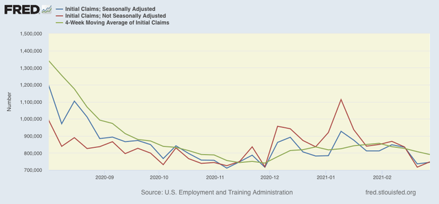
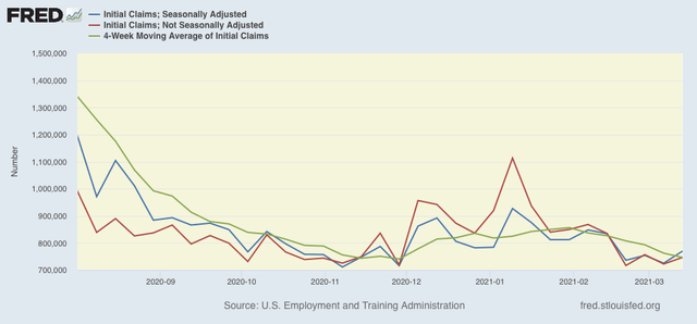
This morning’s data didn’t help. On a unadjusted basis, new jobless claims rose by 424,318 to 746,796. Seasonally adjusted claims rose by 45,000 to 770,000, the highest level in 4 weeks. The 4 week moving average, however, declined by 16,000 to 746,250.  

Here is the close up since the end of July (these numbers were in the range of 5 to 7 million at their worst in early April): 

While both adjusted and unadjusted claims remain above their worst levels at the depths of the Great Recession, the outbreak-related wintertime surge has abated.

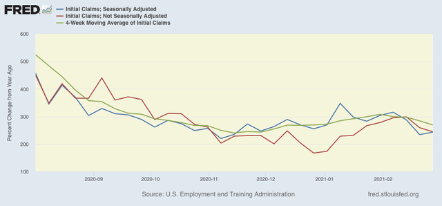
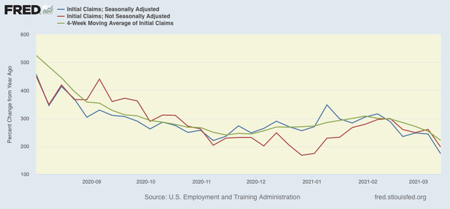
Because of the huge weekly swings caused by the scale of the pandemic, a few months ago I began posting the YoY% change in the numbers as well, since they are much less affected by scale, so there is less noise in the numbers, and the trend can be seen more clearly:

This is at levels last seen in November and December, and confirms that the recent increase in new claims has reversed. In fact, all 3 metrics are at pandemic lows of increases of 175%-225%. An important caveat is that YoY numbers are starting to be compared with the horrific initial pandemic losses of last March and April, so I will probably discontinue this metric in the next several weeks.

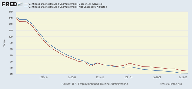
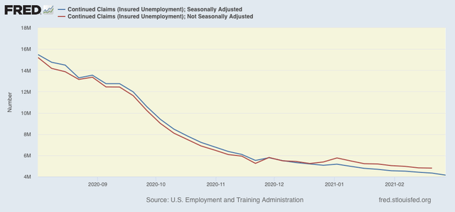
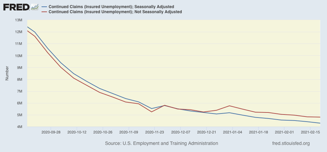
Meanwhile continuing claims, which historically lag initial claims typically by a few weeks to several months, made new pandemic lows yet again this week. Seasonally adjusted continuing claims declined by 18,000 to 4,124,000, while the unadjusted number declined by 95,541 to 4,486,389:


Nevertheless seasonally adjusted continued claims remain at levels last seen at the end of 2010.

Bottom line: although this week’s number of new jobless claims was disappointing, I remain bullish that the ever-increasing pool of fully vaccinated adults - 40,000,000 as of yesterday, or 15.5% of the adult population - together with a seasonal shift from indoor to outdoor activities, is going to result in new pandemic lows well below the existing low of 711,000.

Further, the monthly change in the 4 week average of initial claims ending last week is the best we have seen since November, when 264,000 jobs were added to the economy. As a result, I am looking for a similar number in the March jobs report which will be released at the beginning of April.

Wednesday, March 17, 2021

February declines in housing permits and starts: another likely effect of the Big Texas Freeze


 - by New Deal democrat

Housing is an important long leading indicator. What we see now in mortgage applications, new home sales, permits and starts is informative of what the economy will be like 12+ months from now in 2022.


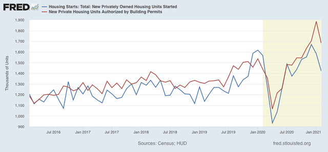
The headline numbers for both permits and starts for February, released this morning, were both poor, off -10.8% and -10.3%, respectively. The temptation is to say, “higher interest rates, We’re DOOOMED!!!” Not so fast. In context, the declines were well within normal month to month variation, and at least some of the declines looks like more fallout from the Big Texas Freeze that we saw yesterday in industrial production and retail sales.

Here is the headline graph covering the last 5 years for both starts (blue) and permits (red):


Two things are of interest here: (1) note that starts fell much more than permits, similar to what happened in the last two winters; and (2) while typically permits lead starts by a month or two, this decline in starts began *before* permits. Neither of these facts are conclusive, of course, but they do suggest an external reason for the pattern - e.g., an outsized winter “event” in February.

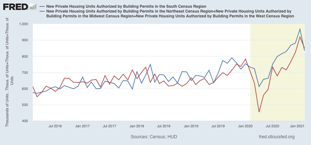
I’ve also separated out the South Census Region that includes Texas from both permits and starts in the other three Census Regions (Northeast, Midwest, West) combined in the below two graphs. First, here’s permits:


Note that while both declined, the Southern region had the bigger one.

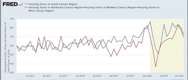
Now, here’s starts:


Again, note the outsized declines in the other three regions including both northern ones in the last two winters, that hasn’t occurred this year. Put another way, the decline in the South, including Texas, was a *relatively* outsized one.

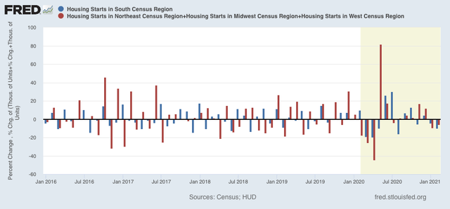
Finally, here is the above regional data for starts shown as a month over month % change:


As I wrote above, February’s declines are hardly noteworthy as monthly declines from the perspective of monthly changes in the past five years. And the February decline in starts in the South this year is bigger than that of the other three regions combined, unlike the last several winters.

I don’t want to oversell this, because the above information is hardly conclusive. But all of this information suggests that, while interest rates most likely did affect at least permits in February, the bigger reason for the relatively big declines in permits and starts was the closure of government offices and inability to undertake new construction in Texas and other nearby areas affected by the Big Freeze.

Tuesday, March 16, 2021

Big (weather related) declines in February production and sales


 - by New Deal democrat


This morning we got the most important single metrics for both the consumer and producer side of the economy for February, respectively, retail sales and industrial production. Both were big misses, one explicitly and the other likely due to the big freeze in Texas and neighboring States.

Let’s turn to production first.

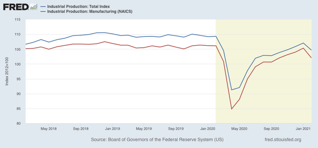
Total industrial production declined by -2.2% in February, while manufacturing production declined -3.1%. Both of these were the first declines of any significance since last April:


Before the DOOOMERS go screaming, “Double-dip!” however, here is the what the Fed itself had to say about this report:

The severe winter weather in the south central region of the country in mid-February accounted for the bulk of the declines in output for the month. Most notably, some petroleum refineries, petrochemical facilities, and plastic resin plants suffered damage from the deep freeze and were offline for the rest of the month. Excluding the effects of the winter weather would have resulted in an index for manufacturing that fell about 1/2 percent and in an index for mining that rose about 1/2 percent.

Because manufacturing is the biggest component of the report, even without the Big Texas Freeze the total index probably would have declined, but by something less than -0.5%. Since in January the total index rose a revised 1.1%, the combined January-February number would still be positive, and the highest since the onset of the pandemic last March.

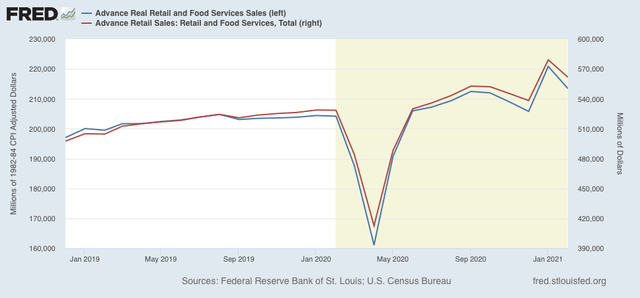
A similar dynamic was present in the retail sales report, although the Census Bureau explicitly does not take weather into account. Nominal retail sales declined -3.0%. After adjusting by the CPI, real retail sales declined -3.4%. Here’s what the last 2.5 years including February look like:


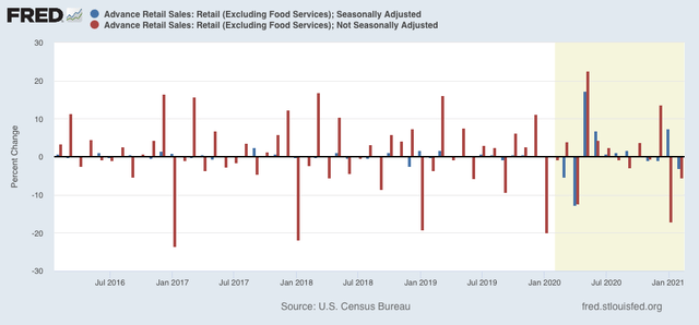
Of course winter occurs every year, but if and when a particularly bad stretch happens might be in December one year, January another, and February still another. So the below graph shows the unadjusted as well as the seasonally adjusted percentage change each month for the same time period. Note that January and February each year, combined, show the steepest month over month decline:


If you look at the unadjusted numbers, it’s pretty clear that January this year had the least decline of the last 5 years, while February’s was the worst. So the below lists the combined January + February declines for the previous 5 years and compares them with this year:

2016: -21.8%
2017: -24.3%
2018: -23.6%
2019: -22.1%
2020: -20.6%
2021: -21.6%

Of the 5 previous years, only 2020 was better than this year. On a seasonally adjusted basis, the combined January-February period this year still showed a gain of 3.7% from December, which would be the highest total since the pandemic started.

In conclusion, don’t sweat these two declines. Ex-the Big Texas Freeze, both production and sales probably did decline, but only slightly, and real retail sales for the two month period combined absolutely rose. 

Monday, March 15, 2021

Coronavirus dashboard for March 15: good news, and cause for concern


 - by New Deal democrat

A year ago today I wrote about the accuracy of Jim Bianco’s forecast of exponential spread of COVID-19. At that time there were exactly 2952 cases, but increasing at 30% each day, and I wrote, “I have not seen any government action significant enough to stop this exponential projection being correct.” 

As of yesterday, there have been 29,438,775 *confirmed* cases - 9% of the total US population. There have certainly been many more cases which have never been confirmed by testing, primarily but not always because they were mild or asymptomatic.


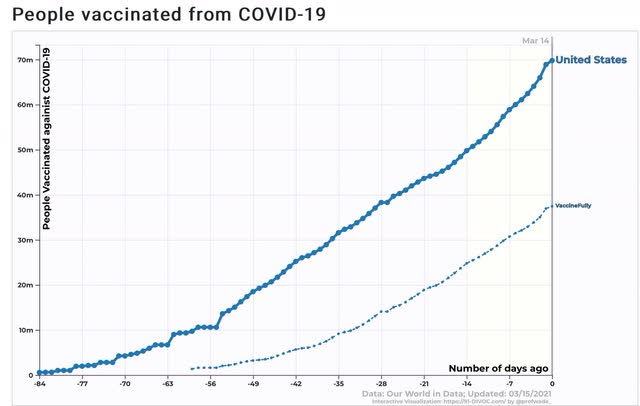
The good news is that vaccinations in the US are making better and better progress. In the past week, about 2.5 million doses were administered each day. At this rate the entire adult population could be vaccinated by the end of June.   

Here’s the total number of people who have received at least one dose (just shy of 70 million), and those who are fully vaccinated (about 37.5 million):


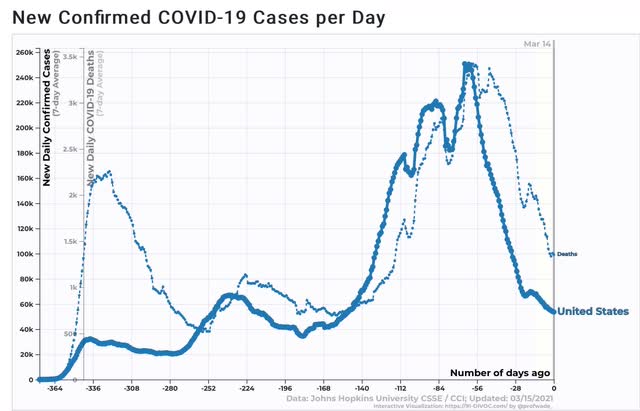
At least partly as a result, both new cases and deaths have declined by over 75% and 60%, respectively, since their wintertime peaks:


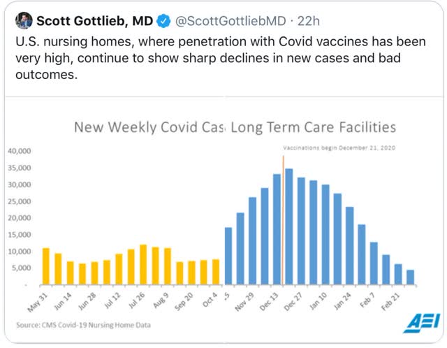
And new cases in long term care facilities have declined by about 90% to the lowest level in at least 10 months:


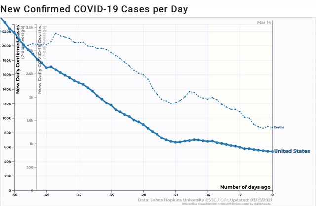
But the bad news, as Dr. Fauci has repeatedly pointed out in recent days, is that the declined are plateauing, as shown in this close-up of the past 8 weeks:


Incredibly reckless behavior by the usual government suspects, particularly the governors of Texas and Florida, is almost certainly contributing to this plateau.

This is particularly of concern because there is at least some evidence that one of the new variants of COVID may not be inhibited by either of the two primary vaccines:


Declaring premature victory, as the governors in those two States have done, is a recipe for emergence of a mutation which evades the effectiveness of the vaccines. If this becomes a real issue, I hope Biden will not hesitate to quarantine those two States and any others (e.g., Mississippi) which are similarly reckless.

Saturday, March 13, 2021

Weekly Indicators for March 8 - 12 at Seeking Alpha


 - by New Deal democrat

My Weekly Indicators post is up at Seeking Alpha.

Although rising long term interest rates are likely to have consequences in 2022, 2021 is shaping up to be a blowout year for economic (and hopefully employment) growth, driven by dual huge monetary and fiscal stimuli.

As usual, clicking over and reading should bring you up to the figurative moment, and reward me just a little bit for my efforts.

Friday, March 12, 2021

January JOLTS report: during the wintertime pandemic surge, hiring hit a brick wall


 - by New Deal democrat

Yesterday morning’s JOLTS report for January was confirmatory of the weak jobs report for that month, showing a largely paused recovery. Further, for the second month in a row, hires were down sharply. Let’s examine this in accord with the data from the prior two recoveries covered by this report, which has only a 20 year history.

In the two past recoveries: 
  • first, layoffs declined
  • second, hiring rose
  • third, job openings rose and voluntary quits increased, close to simultaneously

What we will see below is that the big decline in hiring in December and January is a big outlier compared with the prior two recoveries. The remaining data is largely in accord with the
 pattern from the last two early recoveries: the first two data series to turn - layoffs and hires - did indeed turn, while the last two - job openings and voluntary quits -  bottomed more gradually and have since risen less dramatically.

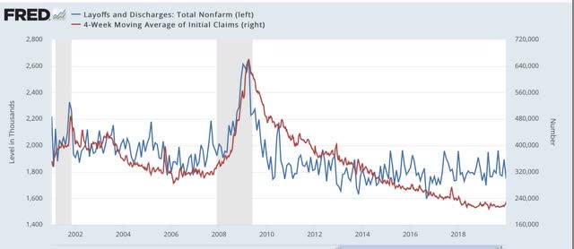
This first graph compares layoffs and discharges (blue) with the 4 week average of initial jobless claims (red) prior to this recession, for reasons of scale since March and April would be “off the charts”:


You can see that, by the end of the recessions, layoffs were already declining, and continued to decline steeply over the next 3-8 months before reaching a “normal” expansion level. The turning point coincides exactly with the much less volatile, but more slowly declining, level of initial jobless claims.

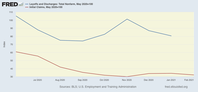
After the initial lockdown period, layoffs and discharges had already declined to their “normal” level in May, while initial jobless claims peaked one to two months later, and continued to decline (slowly) into autumn. In November, layoffs and discharges increased, then decreased in December and January, and initial claims followed suit with a one month delay: 


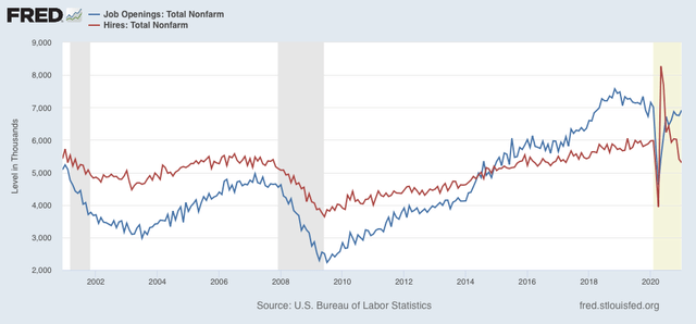
Next, here is the entire historical relationship between hires (red) and job openings (blue) through January 2021:


In the past two recoveries, actual hires started to increase one to two months before job openings.

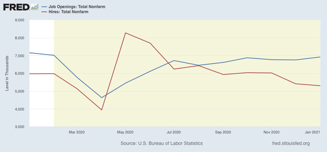
This time around, the relationship is different. While job openings have been generally in a slow uptrend since last June, hires have reversed, stagnating and then declining sharply since last May:


Basically, there was an initial quick rebound from the lockdown periods, and then actual hiring hit a brick wall.

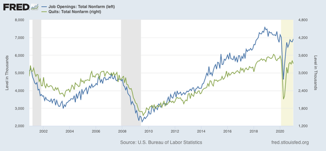
Next, here are quits (green) vs. job openings (blue): 


In the past two recoveries, openings rose first, followed by quits, suggesting it is openings that leads to the increase in voluntary quits. That has been the case in 2020 and into 2021 as well.

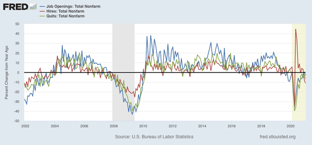
Because of the enormous moves during this pandemic year, seasonal adjustments might not be leaving us with a true picture, so here are job openings (blue), hires (red), and voluntary quits (green), measured YoY instead, for the entirety of the series up through the present:


We can see that hires rebounded first following the 2001 and 2008-09 recessions. Quits and openings moved generally in tandem with a slight lag. The same pattern generally appeared in 2020, with quits perhaps slightly lagging, until the anomalous decline in hiring in the last two months of data. Note also that job openings, as revised, were actually *higher* YoY in December.

In general, the January JOLTS report showed:

1.  A pattern generally consistent with the past 2 recoveries, with layoffs having returned to normal levels, then hiring having increased, and finally quits and openings increasing as well; BUT

2. The late autumn and early winter surge in the out of control pandemic resulted in  increasing layoffs and separations, and a sharp downturn in hiring.

Last month I concluded by saying “I am expecting a positive reversal, but not until at minimum the JOLTS report covering this month [i.e., February],  which will be released in April.” Since February’s jobs report was considerably better than either December or January’s, I continue to expect this to be the case. Further, if I am correct and there will be a sharp increase in hiring in the spring as vaccinations continue to increase and the pandemic abates, the positive reversal is likely to be quite sharp.

Thursday, March 11, 2021

New jobless claims continue to decline, just above pandemic low


 - by New Deal democrat

New jobless claims are likely to the most important weekly economic data for the next 3 to 6 months. They are going to tell us whether my suspicion that, as a critical mass of those vaccinated is reached, there will be a veritable surge in renewed commercial and social activities and attendant consumer spending, leading in turn to a strong rebound in monthly employment gains considerably greater than the roughly 250,000 we saw in February, is correct.

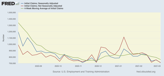
This week, the *relatively* good news continued. On a unadjusted basis, new jobless claims declined by 47,170 to 709,548. Seasonally adjusted claims declined by 42,000 to 712,000, only 1,000 above November’s pandemic low. The 4 week moving average declined by 34,000 to 759,000. 

Here is the close up since the end of July (these numbers were in the range of 5 to 7 million at their worst in early April): 

While both adjusted and unadjusted claims remain above their worst levels at the depths of the Great Recession, it is safe to say that the outbreak-related wintertime surge has abated.

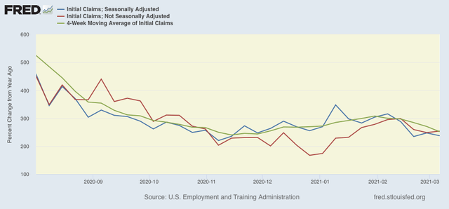
Because of the huge swings caused by the scale of the pandemic - typically claims only vary by 20,000 or less from week to week, but since the start of the pandemic, swings of 50,000 or 100,000 per week have happened as often as not, recently I began posting the YoY% change in the numbers as well, since they will be much less affected by scale. As a result, there is less noise in the numbers, and the trend can be seen more clearly:

This is at levels last seen in November and December, and confirms that the recent increase in new claims has reversed.

Meanwhile continuing claims, which historically lag initial claims typically by a few weeks to several months, made new pandemic lows yet again this week. Seasonally adjusted continuing claims declined by 193,000 to 4,144,000, while the unadjusted number declined by 263,642 to 4,584,706:


Nevertheless seasonally adjusted continued claims remain at levels last seen in late 2010.

For the last several weeks, new jobless claims have validated my belief that with spring beginning in the warmer parts of the country, and consequent increased outdoor activities, together with an ever-increasing pool of vaccinated people, the worst of the job losses would be behind us. 

Now that further COVID relief has also been passed by Congress, I expect to see a continuing strong increase in consumer spending, which in turn will drive fewer layoffs and larger monthly gains in employment. Let me set a few objective targets: I am looking for new claims to be under 500,000 by Memorial Day, and below 400,000 by Labor Day. 

Here’s hoping I’m right.

Wednesday, March 10, 2021

February consumer inflation begins to heat up a little


 - by New Deal democrat

Seasonally adjusted consumer prices rose 0.4% in February. As a result, over the past several months there has been a significant uptick in YoY inflation to 1.7% from 1.1% in November. 

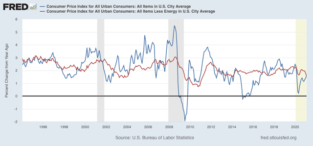
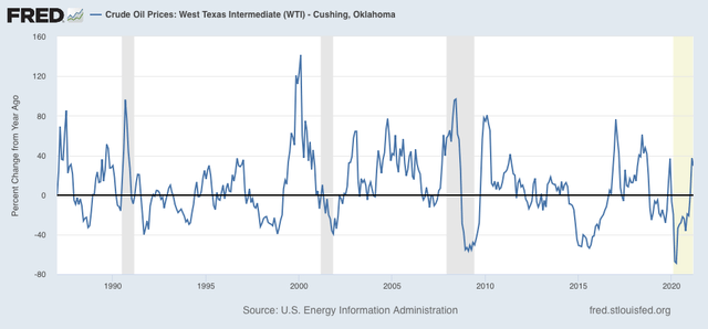
Aside from the pandemic, for the past 40 years, recessions had happened when CPI less energy costs (red) had risen to close to or over 3%/year, usually driven by increases in the price of oil by more than 40% YoY:


Despite recent increases in the price of oil, now up 30% YoY as shown in the graph below, as of this month CPI less energy is only 1.6%, showing no real price pressure at all: 

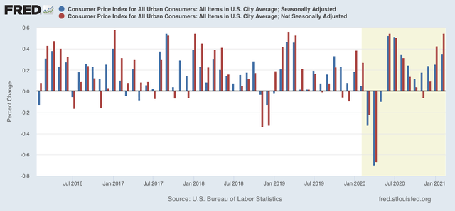
Because pandemic affects are probably influencing seasonality, below I show both the  m/m adjusted and non-seasonally adjusted change in CPI:


Here are the non-seasonally adjusted m/m% increases in prices in February for the past 5 years:

2016 +.1%
2017 +.3%
2018 +.5%
2019 +.4%
2020 +.3%

This February the non-seasonally adjusted m/m% increase was +.6%, the highest since 2005. An increase in inflation, as vaccinations take hold, the pandemic ebbs, and ever increasing numbers of people resume close to normal lives - meaning increased demand for things like travel and entertainment activities - is very likely, but unless there is a much more meaningful increase in the cost of energy, I do not see any significant cause for concern.

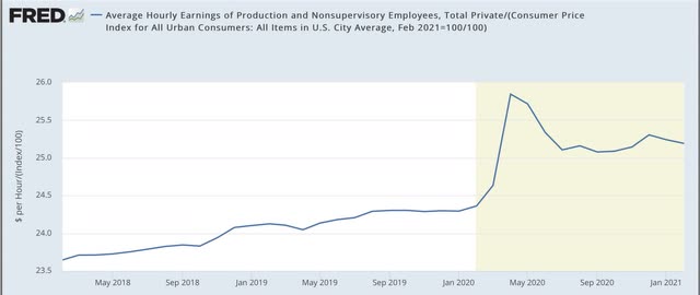
Now let’s take a look at how inflation has affected real wages. Because wages are “stickier” than prices, typically as recessions beat down prices (or at least price increases), in real terms wages rise, either during or just after a recession. That has been the case for the coronavirus recession as well. It is the “real” buying power of wages among those still securely employed during a recession that is one of the engines that usually restarts growth. 

Real wages declined -0.2% in February, and are -2.5% off their all-time high last April. Since last June they have been in a narrow range of -2% to -3% off that peak. Much of the volatility over the past year, of course, has been as a result of the skew in layoffs, which have disproportionately affected those in low-wage leisure and entertainment industries:

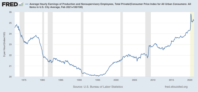
Here is the longer-term view, showing that current real wages remain above their previous 1973 peak:


A further decline in real wages as these workers are called back to employment is quite likely. That would be in accord with history, as real wages are a long lagging metric, that tend to increase long after an economic recovery has begun, and un- and under-employment fall to rates where employers must compete for relatively scarce workers.

Tuesday, March 9, 2021

Pandemic job losses: when should we begin a see a real improvement back towards “full employment”?


 - by New Deal democrat

Let’s take a deeper look at where employment stands as we begin to see the end of the pandemic in sight.


As I and many others noted last Friday, although with the exception of one month there have been job gains every month starting last May, at the pace of the last few months it would take 2 years or more just to get back to the level of employment just before the pandemic struck.

But breaking down those losses between aggregate hours and aggregate payrolls is illuminating. Here’s a look at the YoY% change in jobs, hours, and payrolls for the last 3 recessions and recoveries:
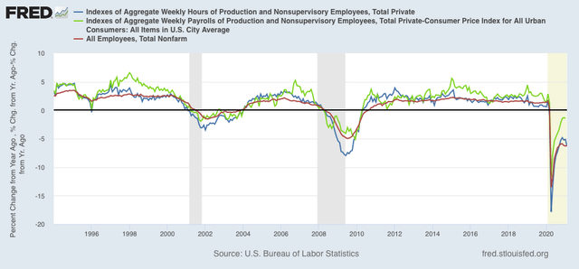

What we can see is that in both 2001 and 2008, hours were cut more than payrolls or jobs. In other words, many more employers reacted to the recessions by cutting employees’ hours rather than laying them off. That hasn’t been the case in the coronavirus pandemic. Both jobs and hours were cut by close to the same amount - I.e., employers laid off employees rather than have them work part time. What was cut far less deeply were payrolls. What this shows is that the brunt of layoffs were borne by lower wage industries. Relatively speaking, higher wage sectors were able to have their employees work from home, and avoided layoffs.

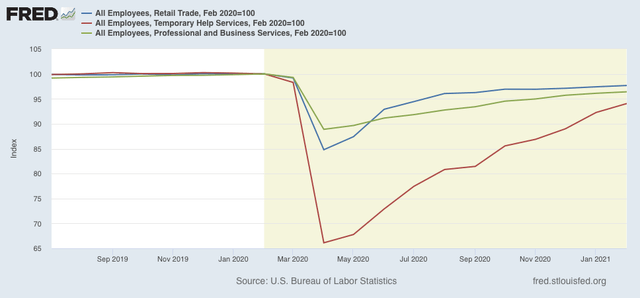
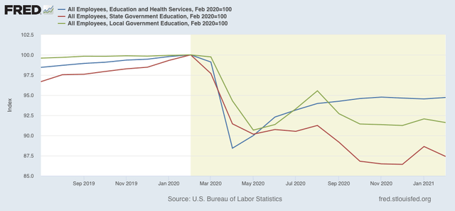
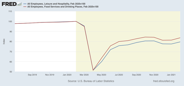
Now let’s slice up the jobs market by sectors to see where the deepest cuts have been. In all of the following graphs, I have normalized employment just prior to the pandemic (as of February 2020) to 100. Thus the graphs show the percentage of jobs lost.

Broadly speaking, employment can be broken down into goods producing and service providing sectors. The latter is by now about 6x the size of the former, which has been deeply cut by offshoring and mechanization. Here’s what that looks like for the pandemic:
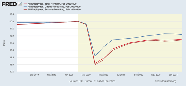

Goods producing jobs are down by “only” 4.6% as of last month, while service jobs are down 6.5%.

The two biggest portions of goods-producing jobs are manufacturing and construction, shown below along with the very leading sector of residential construction:
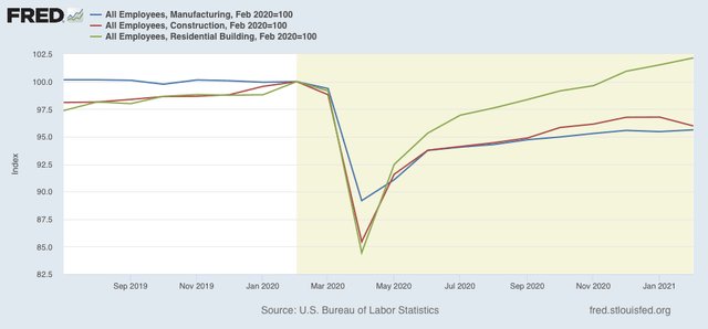

The housing boom brought about by super-low mortgage rates has enabled jobs in that sector to grow, while both construction as a whole and manufacturing are both down by roughly 4%, with losses of roughly 300,000 and 450,000 from the pre-pandemic peak, respectively.

Turning to the services sector, retail trade has not been that badly hit, off 350,000 jobs or -2.3%. Temporary help, another very leading indicator for employment (employers generally hire temps first before extending full time offers), is off -6%, but this is a lower number at 175,000 jobs. The big decline is in professional and business services as a whole, off 770,000 jobs or -3.6%:

The educational sector has been a much bigger loser, off 1.3 million jobs in total, a decline of -5.3%. Local education is down -8.4%, for a loss of 700,000 jobs, and state education off -12.6%, or 350,000 jobs:

Finally, leisure and hospitality has been the hardest hit part of the economy, with a loss of about 3.5 million jobs, or over 20% of the entire employment in that sector. The food and drinking component is down -16.3%, or just over 2 million:

Putting the data together, we see that the lion’s share of the continuing losses in employment are:
- leisure and hospitality, including food and drinking -3.5 million
- education, -1.3 million
- professional and business services, -770,000
- manufacturing, -450,000
- retail trade, -350,000
- construction, -300,000

Leisure and hospitality, being an indoor activity focused on adults, and the food and drink components requiring being unmasked, is probably going to be the last sector to recover. 

Since children are mainly a concern for spreading the disease to adults, once older adults are largely immunized, the worry fades. In other words, it seems very likely that normal, or close to normal, instruction will be a able to begin in September.

The remaining big areas of losses should all start to improve in tandem with the percentage of the adult population that is immunized, so I would expect to see good improvement throughout the spring and summer. In other words, we might see substantially better jobs reports than we have seen in the past few months going forward from now through summer, and another jump with the beginning of the next school year. It would not be a surprise, though, to see a continuing slump in leisure and hospitality right through the end of the year, or until there is herd immunity (which means a large share of GOP ignoramuses getting vaccinated)
Monday, March 8, 2021

Coronavirus dashboard for March 8: update on the effect of vaccinations


 - by New Deal democrat

My first post on the coronavirus was almost exactly one year ago, on March 10, 2020, “This is what exponential growth looks like,” warning that exponential spread was exactly what had started to happen in the US.


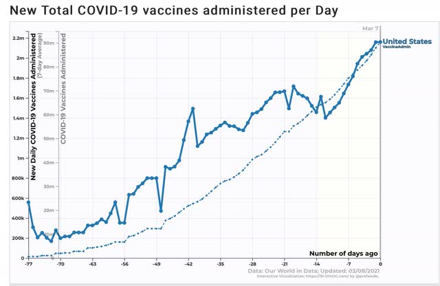
 We are now finally averaging the administration of over 2 million doses of vaccine per day, and according to the CDC almost 60 million people constituting nearly 20% of the US population have already received at least their first dose:


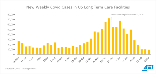
Nursing home cases have declined by about 55,000 per week since vaccines started to be administrated, although it is noteworthy that there has been a plateau in the past 3 weeks:


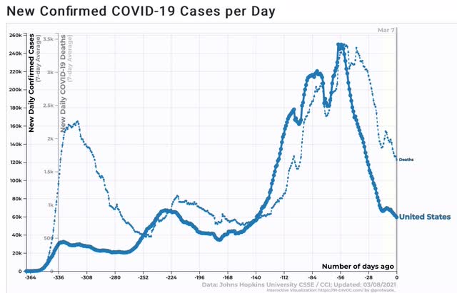
Meanwhile, the good news is that nationwide new cases are now averaging less than 60,000 daily, and deaths about 1,700, a 75% and 50% decline from recent peaks, respectively:


The bad news is that these levels are still near their summertime peaks, which was regarded as awful at the time.

I am hopeful that over the next 30 to 60 days we will see vaccinations begin to win the war against new infections and deaths, as in less than 20,000 new infections and under 1000 new deaths daily.

Saturday, March 6, 2021

Weekly Indicators for March 2 - 6 at Seeking Alpha


 - by New Deal democrat

My Weekly Indicators post is up at Seeking Alpha.

Two important data considerations this week: (1) for the first time, some YoY comparison - e.g., restaurant reservations - are compared with data after the onset of the pandemic. The distortions will intensify next week and last at least through the end of April; and (2) long term interest rates, in particular for Treasury bonds, have considerably affected the long leading forecast.
As usual, clicking over and reading brings you up to the virtual moment, and rewards me just a little bit for the effort I put in to generating the forecasts and nowcast.

Friday, March 5, 2021

February jobs report: strong growth with a few blemishes


 - by New Deal democrat

HEADLINES:
  • +397,000 million jobs added: 465,000 private sector minus - 86,000 government. The alternate, and more volatile measure in the household report indicated a gain of 208,000 jobs, which factors into the unemployment and underemployment rates below.
  • U3 unemployment rate declined 0.1% at 6.2%, compared with the January 2020 low of 3.5%.
  • U6 underemployment rate was unchanged at 11.1%, compared with the January 2020 low of 6.9%.
  • Those on temporary layoff decreased 517,000 to 2,229,000.
  • Permanent job losers decreased 6,000 to 3,497,000.
  • December was revised downward by 79,000, while January was revised upward by 87,000, for a net gain of 38,000 jobs compared with previous reports.
Leading employment indicators of a slowdown or recession

I am still highlighting these because of their leading nature for the economy overall.  These were mixed but more positive than negative: 
  • the average manufacturing workweek decreased to 40.2 hours. This is one of the 10 components of the LEI.
  • Manufacturing jobs increased by 21,000. YoY manufacturing has still lost -561,000, or 4.4% of the total. About 60% of the total loss of 10.6% has been regained.
  • Construction jobs decreased by 61,000 (probably reflecting poor weather, even for winter, in places like Texas in February) . YoY -175,000 construction jobs have been lost, 4.0% of the total. About 75% of the worst loss of 15.2% loss has been regained.
  • Residential construction jobs, which are even more leading, *rose* by 5,300. YoY there have been actual job gains, and employment in this sector is at another new 10 year+ high.
  • temporary jobs increased by 52,700. YoY, there have still been 175,100 jobs lost, or 6% of all temporary help jobs.
  • the number of people unemployed for 5 weeks or less declined by -93,000 to 2.185 million, compared with last April’s total of 14.283 million.
  • Professional and business employment rose by 63,000, which is still 771,000, or about 3.6% below its peak one year ago.

Wages of non-managerial workers
  • Average Hourly Earnings for Production and Nonsupervisory Personnel: rose $0.04 to $25.19, which is a 5.1% YoY gain. This is at a level not seen in the past 10 years outside of the first months of this pandemic and also January. Relative gains in this measure reflect that job losses during the pandemic have occurred primarily among lower wage earners.

Aggregate hours and wages:
  • the index of aggregate hours worked for non-managerial workers declined by -0.8%, with a YoY loss of -6.3%.
  •  the index of aggregate payrolls for non-managerial workers declined by -0.7%, with a YoY loss of -0.8%. Still, about 90% of the loss from last February to April has been made back up.

Other significant data:
  • Full time jobs gained 301,000 in the household report.
  • Part time jobs declined 456,000 in the household report.
  • The number of job holders who were part time for economic reasons increased by 134,000 to 6.088 million, with a YoY increase of 1,690,000, or 39.5%.

SUMMARY

This was generally a positive report, with resumed good growth in the headline employment number and another decline in the unemployment rate. Most internals were positive, including the manufacturing, residential construction, and temporary employment sectors, with a decline in both temporary and permanent layoffs, and an increase in full time jobs. 

The negatives were the surprise decline in the manufacturing workweek, and anomalous declines in both aggregate hours and payrolls. Involuntary part time employment also rose slightly. I am discounting the decline in construction jobs for weather-related reasons.

We are still about 9.5 Million jobs behind where we were one year ago just before the pandemic hit. Even if we were to continue adding jobs at this month’s rate, it would take 2 full years just to get back to that level. The good news, I think, is that with vaccinations picking up speed, the economy is set to really surge by summertime, and hopefully there will be even stronger jobs growth as that happens.

Thursday, March 4, 2021

Initial jobless claims make further progress towards November lows


 - by New Deal democrat

Last week I “pre-debunked” the idea that a lack of reporting in Texas skewed the big decline in claims, concluding that “being very generous, the ‘real’ seasonally adjusted number of initial claims at worst probably would have been only about 30,000 higher - I.e., 760,000 - but for Texas issues.” 

That observation was validated this week, as last week’s 730,000 number was only revised higher by 6,000 to 736,000. And the *relatively* good news continued.

This week, on a unadjusted basis, new jobless claims increased by 31,519 to 748,078. Seasonally adjusted claims increased by 9,000 to 745,000. The 4 week moving average declined by 17,250 to 790,750. 

Here is the close up since the end of July (these numbers were in the range of 5 to 7 million at their worst in early April): 

The recent increase in claims appears to have subsided. Nevertheless both adjusted and unadjusted claims remain above their worst levels at the depths of the Great Recession.

Because of the huge swings caused by the scale of the pandemic - typically claims only vary by 20,000 or less from week to week, but since the start of the pandemic, swings of 50,000 or 100,000 per week have happened as often as not, recently I began posting the YoY% change in the numbers as well, since they will be much less affected by scale. As a result, there is less noise in the numbers, and the trend can be seen more clearly:

This confirms the observation that the recent elevation in new claims is reversing. 

Meanwhile continuing claims, which historically lag initial claims typically by a few weeks to several months, made new pandemic lows yet again this week. Seasonally adjusted continuing claims declined by 124,000 to 4,295,000, while the unadjusted number declined by 22,355 to 4,806,269:


But continued claims remain at levels last seen in autumn 2009, only a few months after the Great Recession.

As spring begins in the warmer parts of the country, we can expect increased outdoor activity and a relative recovery in employment servicing those activities. Together with an ever-increasing pool of vaccinated people, this should put the worst of the job losses behind us. If further COVID relief is passed by Congress in the next week, which seems likely, the added income should carry us through the summer, with continuing strength in consumer spending, which in turn will drive increasing employment.

Wednesday, March 3, 2021

Coronavirus dashboard for March 3: as good news on vaccinations accumulates, the Dakotas already appear to be shambling towards herd immunity


 - by New Deal democrat

There is more and more good news on the vaccination front. In addition to the fact that the single-dose Johnson and Johnson vaccine has been approved, President Biden has made use of the Defense Production Act to enlist competitor Merck in additional production of the J&J vaccine. Biden also announced that there would be enough vaccine produced to supply doses for every American adult by the end of May.


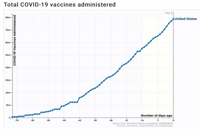
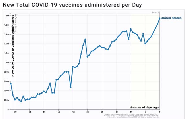
Further, the pace of vaccination has picked up to new highs since the setbacks due to recent weather, with the 7 day average just short of 2 million per pay at 1.946 million as of yesterday:


And just shy of 80 million doses have been administered - 78.6 million as of yesterday:


By about Memorial Day weekend, the principal obstacle to herd immunity is going to be anti-vaxxers and other vaccine-hesitant people, primarily stupid GOPers. I wonder if by that time employers will make being vaccinated a condition of returning to work facilities.

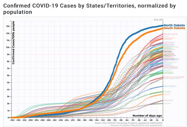
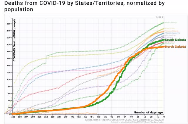
In the meantime, one other recent development has jumped out from the graphs: it looks increasingly like both North and South Dakota have shambled towards herd immunity already. That’s because both States’ levels of total infections look close to perfect representations of an “S”-shaped type of exponential curve called a logistical curve. This occurs when a population approaches a saturation point.

Here’s the graphic evidence in a nutshell:


Both North and South Dakota have the highest rate of *confirmed* infections at roughly 13% of their entire populations.

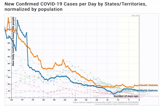
Further, South Dakota is close to, and North Dakota is already among, the lowest 10 States for the level of new confirmed infections:


Since neither one of these two jurisdictions is exactly known for their aggressive anti-COVID restrictions, we are either seeing a recent onset of panic among the populace after their late autumn outbreaks, or else we are seeing a virus that is facing an ever-thinning number of susceptible individuals.

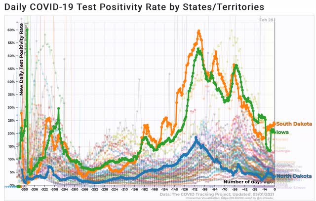
Most notably, during the autumn outbreaks At least South Dakota had close to a 60% positivity rate among people who were tested, that went on for several weeks - where 3% is the rate at which it is thought that testing is probably picking up close to all actual infections:


In other words, during the weeks that roughly 10% of their entire populations are *confirmed* to have contracted the disease, it’s entirely likely that some multiple of that percentage were in fact infected, but either weren’t able, or just didn’t bother, to get tested. If during those weeks for every one confirmed positive there were 4 actual but unconfirmed infections, then by Christmas an outright majority of the population of both North and South Dakota had actually contracted the disease.

I want to emphasize that I’m not claiming that either State has actually arrived at herd immunity yet. For that to be the case I would expect the rate of current infections to be closer to 1 in 100,000 daily than 10 in 100,000 - and I would expect to see continuing declines, which really hasn’t been the case in the past several weeks. And I am *certainly* not claiming that the result is the case of good government! Far from it, both North and South Dakota have among the highest confirmed death rates from COVID at roughly 1 death for every 500 persons, putting them in the top 10 States:


I would love to see what a comparative graph of excess deaths above normal looks like for those 10 States, because I suspect that a significant part of the Dakotas’ death toll was never reported.

Here’s hoping that the vaccines get us to herd immunity before the reckless actions of Trumpist GOP governors like Abbott of Texas manage to hatch a resistant strain of the disease.

Tuesday, March 2, 2021

Household debt and the pandemic


 - by New Deal democrat 

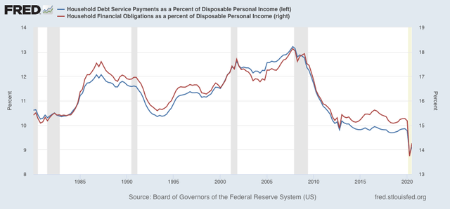
This is something I used to pay a lot more attention to back around the time of the Great Recession. How stretched were American households in paying their monthly bills? The Federal Reserve publishes a quarterly update tracking this issue.

Two of the metrics in that quarterly update are debt service payments and financial obligations, respectively, as percents of household disposable income. The last update was in December, for Q3 2020. The Q4 figure should be released later this month.

And the story is how strong of an impact the pandemic stimulus has made on household balance sheets. Here’s the graph, that pretty much speaks for itself:


Both measures were by far at all-time lows in Q2, and increased slightly in Q3.

One important criticism is that these aren’t median measures. They tell us how the average, not median, household is doing, so they are subject to being skewed by high upper incomes. But the stimulus payments were not matched to income - e..g, every household got a $1200 check back in April, regardless of underlying income. And pandemic unemployment assistance also tended to be skewed towards moderate and lower incomes (i.e., there was a ceiling in the amount of relief).

This is another important data point on how successful (obviously not universal!) the Congressional stimulus has been in alleviating the potentially devastating impact of the pandemic on households and the economy.

Monday, March 1, 2021

Two leading sectors of the economy - manufacturing and housing - turn even hotter


 - by New Deal democrat

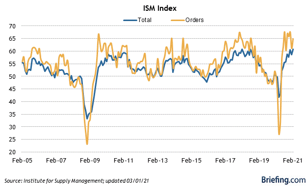
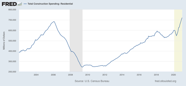
Last month I wrote that both the manufacturing and housing sectors were “on fire.” If anything, this month they turned white hot, with both construction spending and ISM manufacturing data at levels not seen in years.


The overall ISM manufacturing reading rose from 58.7 to 60.8, tying the highest reading since the Great Recession, and indeed since 2004. The even more leading new orders subindex also rose from 61.1 to 64.8, not quite as high as readings earlier in autumn 2020:


Turning to construction, in January spending for residential construction surged even further, up 2.5% for the month. This was the highest nominal reading ever:

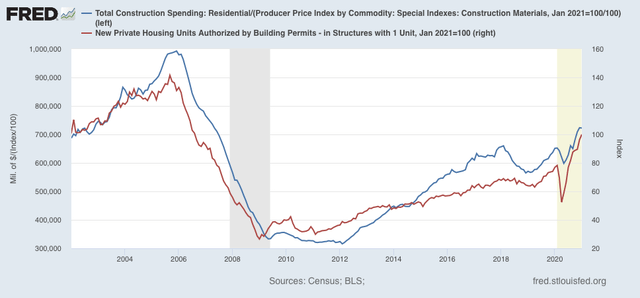
Taking into account inflation - deflating by the PPI for construction materials, which rose 2.7% for the month, in the graph below - residential construction spending (blue) declined -0.2%. Because permits have to be taken out before construction can begin, typically these lead construction spending (although in fairness that really hasn’t been true in the past 2 years). Below I show the less volatile single family permits (right scale):


This year, 2021, is likely going to be absolutely gangbusters for residential construction spending, which means lots more money flowing through the economy as a whole.

Simply put, this morning’s two reports together show that manufacturing and housing, the two most important leading sectors of the real economy, are if anything even hotter than before, and are likely to power very strong GDP gains as vaccinations (hopefully) case the pandemic strictures to give way.