Yesterday, I took a top down approach and focused on the broad averages and the respective market breadth. Today, I wanted to look at the five largest sectors to get an idea for what these charts say. According to S&P, the five largest areas of the market are technology (18.3%), financials (15.8%), health care (12.2%), consumer discretionary (11.7%) and energy (11.2%). Together, these five sectors total almost 70% of the S&P 500. Let's start with the largest percentage constituent down to the lowest.
The technology ETF is in bullish territory, trading about the 200 day EMA. But prices are entangled with the shorter EMAs, largely because there has been no upward momentum since the first of the year. The MACD has given a sell signal and the CMF is declining. There is little in the chart to encourage bulls that the market is moving higher.
The daily chart of the financials ETF (top chart) shows that prices are in a clear uptrend. After breaking through resistance at the beginning of the year, they have continued to move higher, using the 10 day EMA for technical support. Although the MACD is moving sideways, the CMF indicates money is flowing into the market. The weekly chart (bottom chart), is far more bullish. Prices have broken through upside resistance of a consolidation triangle that has been forming for a year and a half. Prices are using the 10 week EMA for technical support and momentum is rising.
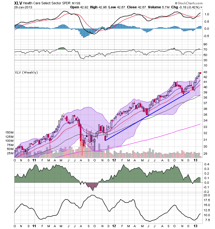
The health chart sectors daily chart (top chart) broke through resistance at the beginning of the year and has been consistently moving higher, using the 10 day EMA for technical support. Also note the rising MACD and CMF. However, the weekly chart (bottom chart) is far more impressive, showing that the market has been rallying for over year. The MACD has given a buy signal (with room to run) but the CMF is declining.
The consumer discretionary daily chart (top chart) has much in common with the other sectors. Essentially we see an early year break out with a continued rally for January. The weekly chart (bottom chart) shows a sector that has been in an upward trend for about a year, with with a slight change in trajectory in May of last year. However, this chart looks bullish, with all the EMAs rising, prices using the 10 week EMA for technical support and a buy signal from the MACD.
The daily chart of the energy ETF (top chart) show that prices have been rallying since mid-November. The MACD is moving higher and the CMF is in a very strong position. The weekly chart (lower chart) shows that prices are right at technical resistance and that they are forming a consolidating triangle.
In summation, only one sector (technology) is in bad shape. Health care's and consumer discretionary's weekly chart shows an incredibly strong sector. Financials weekly chart has broken through resistance and the energy's ETF is right on the cusp. All the daily charts save the technology sector show sectors that have moved through resistance and are rallying.
Bottom line: the sectors look really good.
Tuesday, January 29, 2013
Monday, January 28, 2013
UK Continues to Prove That Austerity Doesn't Work
The UK began implementing it's austerity program in 2010, under the theory that rampant budget deficits were destroying public confidence in the UK economy. Therefore, the reasoning goes, if the UK cleaned up their fiscal act, the economy would return to full employment.
Here is a pie graph of UK spending for the years 2010-2012 which comes from the publicly available budget documents at the HM Treasury's website.
Total spending has fluctuated between 683 billion pounds in 2012 and 710 billion pounds in 2011 -- a situation which is consistent with the US experience over the same time.
Over the same period, we see the following GDP figures:
In the fourth quarter of 2010, we see a contraction. In fact, since 4Q10, there have only been three quarters of positive economic growth. As the Financial Times Reported:
The economy, which has essentially stagnated for 2½ years, pulled out of a shallow double-dip recession in the third quarter of 2012, but contracted again between the third and the fourth quarter by more than the expected 0.1 per cent. The economy was the same size in the fourth quarter as it was a year earlier.
“It remains too early to tell if the economy will triple-dip [which would require the economy to shrink again in the first quarter of this year], but today’s numbers have greatly increased the risk of a new recession and a downgrading of the UK’s triple A credit rating,” said Chris Williamson, an economist at Markit, a data company. “As such, the data pile ever more pressure on the chancellor to seek ways to revive the economy in the March Budget.”
As a result of this slow growth, the IMF is advising the UK to halt austerity measures:
The IMF chief economist has told the BBC that Chancellor George Osborne should consider slowing down austerity measures in his March budget.
"We think this would be a good time to take stock," said Olivier Blanchard, speaking to Radio 4's Today programme.
He also said the global economy was "not out of the woods yet".
In October, Mr Blanchard claimed in an IMF report that austerity had hurt wealthy countries such as the UK far more than most analysts had expected.
His comments come the day after the IMF cut its 2013 forecast for UK economic growth to 1% from the 1.1% predicted in October, and will put pressure on the chancellor as he prepares to deliver a speech at the World Economic Forum in Davos later on Thursday.
The IMF is making this recommendation, largely because they have now determined that the multiple associated with government spending is in fact far larger than they originally calculated.
In “Growth Forecast Errors and Fiscal Multipliers,” Messrs. Blanchard and Leigh calculate IMF and European economists underestimated the euro-for-euro effect of cutting government budgets. While economists expected that cutting a euro from the budget would cost around 50 cents in lost growth, the actual impact was more like 1.50 per euro.
Put another way, for every dollar cut ($1) the economy loses about $1.5 of growth. This is entirely in line with the general thinking mentioned in my old (and very torn) Paul Samuelson Econ text from college.
Here is a pie graph of UK spending for the years 2010-2012 which comes from the publicly available budget documents at the HM Treasury's website.
Total spending has fluctuated between 683 billion pounds in 2012 and 710 billion pounds in 2011 -- a situation which is consistent with the US experience over the same time.
Over the same period, we see the following GDP figures:
In the fourth quarter of 2010, we see a contraction. In fact, since 4Q10, there have only been three quarters of positive economic growth. As the Financial Times Reported:
The economy, which has essentially stagnated for 2½ years, pulled out of a shallow double-dip recession in the third quarter of 2012, but contracted again between the third and the fourth quarter by more than the expected 0.1 per cent. The economy was the same size in the fourth quarter as it was a year earlier.
“It remains too early to tell if the economy will triple-dip [which would require the economy to shrink again in the first quarter of this year], but today’s numbers have greatly increased the risk of a new recession and a downgrading of the UK’s triple A credit rating,” said Chris Williamson, an economist at Markit, a data company. “As such, the data pile ever more pressure on the chancellor to seek ways to revive the economy in the March Budget.”
As a result of this slow growth, the IMF is advising the UK to halt austerity measures:
The IMF chief economist has told the BBC that Chancellor George Osborne should consider slowing down austerity measures in his March budget.
"We think this would be a good time to take stock," said Olivier Blanchard, speaking to Radio 4's Today programme.
He also said the global economy was "not out of the woods yet".
In October, Mr Blanchard claimed in an IMF report that austerity had hurt wealthy countries such as the UK far more than most analysts had expected.
His comments come the day after the IMF cut its 2013 forecast for UK economic growth to 1% from the 1.1% predicted in October, and will put pressure on the chancellor as he prepares to deliver a speech at the World Economic Forum in Davos later on Thursday.
The IMF is making this recommendation, largely because they have now determined that the multiple associated with government spending is in fact far larger than they originally calculated.
In “Growth Forecast Errors and Fiscal Multipliers,” Messrs. Blanchard and Leigh calculate IMF and European economists underestimated the euro-for-euro effect of cutting government budgets. While economists expected that cutting a euro from the budget would cost around 50 cents in lost growth, the actual impact was more like 1.50 per euro.
Put another way, for every dollar cut ($1) the economy loses about $1.5 of growth. This is entirely in line with the general thinking mentioned in my old (and very torn) Paul Samuelson Econ text from college.
Morning Market Analysis; Time To Become A Bull? Part 1: the Equity Markets
At the beginning of this year, I wrote the following about the market:
1.) The equity market is at a key technical area. It has rallied to this point from its 2009 low on three rallies, each of decreasing strength. Prices have stalled at the 140 level for the last four months. This is occurring against a weakening momentum picture.
2.) Instead of moving into equities, investors have plowed money into bonds -- both treasury and corporate. This has led to a lowering of the yield curve across the spectrum.
3.) The fundamental background is weak. Although it's expanding, the economy is very sensitive to shocks. Additionally, we now have a debt ceiling negotiation to deal with, which will be contentious, ugly and probably won't solve any problems.
4.) Internationally, we see a great deal of weakness as well. The only bright spot is a recent rally in the Chinese market.
In short, there is little to think the equity markets can rally strongly at this point, save for a "China will save us all" rally.
However, the SPYs have rallied since the beginning of the year.
The 60 minutes chart (top chart), shows that prices gapped higher at the beginning of the year in response to the fiscal cliff compromise. Prices have continued to move higher as corporate earnings have come in. The daily chart (bottom chart) shows that prices have broken through resistance around the 146 level, and have continued to move higher, using the 10 day EMA as technical support. This has been accompanied by a rise in the MACD and CMF.
This move higher has been confirmed by two other averages:
Both the transports (top chart) and Russell 2000 (bottom chart) have followed the SPYs higher.
In contrast, we have the QQQs, which have been moving sideways since the beginning of the year.
The lack of upward movement from the QQQs is not fatal to the idea of the broader markets rallying. However, it does raise a red flag regarding the strength of the overall rally, as one of the largest segments of the economy (technology) is not participating. Let's look in a bit more detail at the market internals:
The NYSE breadth has been increasing for the better part of the last few years (top chart). However, the NASDAQ breadth was in in overall rate of decline from 2012. While it has rallied since November, it has rallied to a point of resistance that is carried over from 2012.
However, we see a different picture from the high low chart. Both the NYSE (top chart) and NASDAQ high low charts show a clear uptrend.
On the more negative side, we have the NASDAQ and S&P 500 charts of stocks that are over the 200 week EMA. Notice that both are at high (read overbought) levels).
In addition, we have this chart from Bespoke:
Given the above information, it appears that the bullish argument is starting to make some sense. However, the QQQ situation (lack of movement, weak advance decline line), the number of stocks over the 200 day EMA and the chart above from Bespoke add enough negative information to give me pause. And, there is this front page cover indicator from Barry that is also a bit halting (see also this from Sober Look). Before we make a final call, let's look at three other areas: a sector performance breakdown of the SPYs, a look at the bond markets and an overview of the US economy's projected performance for the upcoming year. I'll cover those on Tuesday, Wednesday and Thursday, respectively.
1.) The equity market is at a key technical area. It has rallied to this point from its 2009 low on three rallies, each of decreasing strength. Prices have stalled at the 140 level for the last four months. This is occurring against a weakening momentum picture.
2.) Instead of moving into equities, investors have plowed money into bonds -- both treasury and corporate. This has led to a lowering of the yield curve across the spectrum.
3.) The fundamental background is weak. Although it's expanding, the economy is very sensitive to shocks. Additionally, we now have a debt ceiling negotiation to deal with, which will be contentious, ugly and probably won't solve any problems.
4.) Internationally, we see a great deal of weakness as well. The only bright spot is a recent rally in the Chinese market.
In short, there is little to think the equity markets can rally strongly at this point, save for a "China will save us all" rally.
However, the SPYs have rallied since the beginning of the year.
The 60 minutes chart (top chart), shows that prices gapped higher at the beginning of the year in response to the fiscal cliff compromise. Prices have continued to move higher as corporate earnings have come in. The daily chart (bottom chart) shows that prices have broken through resistance around the 146 level, and have continued to move higher, using the 10 day EMA as technical support. This has been accompanied by a rise in the MACD and CMF.
This move higher has been confirmed by two other averages:
Both the transports (top chart) and Russell 2000 (bottom chart) have followed the SPYs higher.
In contrast, we have the QQQs, which have been moving sideways since the beginning of the year.
The lack of upward movement from the QQQs is not fatal to the idea of the broader markets rallying. However, it does raise a red flag regarding the strength of the overall rally, as one of the largest segments of the economy (technology) is not participating. Let's look in a bit more detail at the market internals:
The NYSE breadth has been increasing for the better part of the last few years (top chart). However, the NASDAQ breadth was in in overall rate of decline from 2012. While it has rallied since November, it has rallied to a point of resistance that is carried over from 2012.
However, we see a different picture from the high low chart. Both the NYSE (top chart) and NASDAQ high low charts show a clear uptrend.
On the more negative side, we have the NASDAQ and S&P 500 charts of stocks that are over the 200 week EMA. Notice that both are at high (read overbought) levels).
In addition, we have this chart from Bespoke:
Given the above information, it appears that the bullish argument is starting to make some sense. However, the QQQ situation (lack of movement, weak advance decline line), the number of stocks over the 200 day EMA and the chart above from Bespoke add enough negative information to give me pause. And, there is this front page cover indicator from Barry that is also a bit halting (see also this from Sober Look). Before we make a final call, let's look at three other areas: a sector performance breakdown of the SPYs, a look at the bond markets and an overview of the US economy's projected performance for the upcoming year. I'll cover those on Tuesday, Wednesday and Thursday, respectively.
Saturday, January 26, 2013
Weekly Indicators: positive at mid-winter edition
- by New Deal democrat
December monthly data reported this past week featured the index of Leading Indicators, up 0.5. This was anticipated as initial claims rebounded from their Hurricane Sandy-induced increase in November. On a 6 month basis, these are now significantly positive. On the other hand, both new and existing home sales declined from November.
Let's start this look at the high frequency weekly indicators by checking out how the increase in tax withholding may be affecting consumer spending.
Consumer spending
- ICSC -1.5% w/w +3.2% YoY
- Johnson Redbook +1.8% YoY
- Gallup daily consumer spending 14 day average $75 up $10 YoY
Housing metrics
Housing prices
- YoY this week. +2.8%
Real estate loans, from the FRB H8 report:
- 0.0% w.w
- +2.4% YoY
- +2.6% from its bottom
Mortgage applications
- +9% w/w purchase applications
- +26% YoY purchase applications
- +8% w/w refinance applications
Interest rates and credit spreads
- -0.01% to 4.69% BAA corporate bonds
- -0.03% to 1.87% 10 year treasury bonds
- +.02% to 2.82% credit spread between corporates and treasuries
Money supply
M1
- +1.4% w/w
- +0.7% m/m
- +9.4% YoY Real M1
M2
- -0.2% w/w
- +0.9% m/m
- +6.2% YoY Real M2
Oil prices and usage
- Oil $95.88 up $0.32 w/w
- gas $3.32 up $.02 w/w
- Usage 4 week average YoY +4.1%
Employment metrics
Initial jobless claims
- 330,000 down 5,000
- 4 week average 351,750 down 7500
- up 2 from 87 to 89 w/w up 3.7% YoY
- $162.0 B (adjusted for 2013 tax changes) vs. $161.2 B +0.5% YoY last 20 days
- $139.0 B (unadjusted) vs. $135.1 B up $3.9 B 1st 16 days of January monthly YoY
Transport
Railroad transport
- -10,200 or -3.5% carloads YoY
- +5700 or +3.5% carloads ex-coal
- +29,700 or +13.5% intermodal units
- +19,500 or +3.9% YoY total loads
- 9 of 20 types of carloads up YoY, a decrease of 4 from last week
- Harpex up 3 to 359
- Baltic Dry Index down 39 to 798
Bank lending rates
- 0.230 TED spread down -0.002 w/w
- 0.2037 LIBOR down .001 w/w
JoC ECRI Commodity prices
- up 1.40 to 129.53 w/w
- +2.06 YoY
Almost everything else was slightly to very positive. Consumer spending remains quite positive, despite the increased tax withholding in their paychecks, although ever slightly less so than in the past month. Initial jobless claims were once again very positive. Bank lending rates and interest rate spreads also stayed very positive. Gas prices remain accomodative. House prices, loans, and especially mortgage applications are all positive, suggesting that the positive housing trend reflected in starts and permits will continue. Railroad and shipping data were up slightly.
The most important issue at the moment is when or whether the 2% increase in withholding tax rates will have an effect on consumers, although there's no significant evidence that it has shown up yet. Once again, this week the high frequency indicators show continued economic expansion.
Have a nice weekend.
Friday, January 25, 2013
Predicting the next recession: a reply to Calculated Risk
- by New Deal democrat
Last weekend, Bill McBride a/k/a Calculated Risk wrote about "Predicting the Next Recession". As it happened, I had just finished writing a post that appeared Tuesday, "A note about the next recession"" which was markedly more pessimistic than Bill's view.
In this note, I want to explain where I disagree with Bill and the reasons why. The bullet point explanation is (1) I simply don't think we can reliably see that far ahead, so we shouldn't assume an optimistic outlook; (2) the odds of any expansion lasting 8 years as a general statement aren't good, and this one has been pretty weak for households; and (3) to the extent we can see murkily more than a year or so ahead, several adverse conditions are reasonably likely to occur.
I should begin by saying that CR and I have been generally on the same page for most of the last 5 years. The only other time I recall a specific disagreement was about the NBER dating the end of the last recession, and what would be required (CR thought new peaks in all the coincident metrics would be required to avoid a "double-dip." Citing past data, including from the Great Depression, I disagreed. In the end, the NBER did what I expected it to).
CR and I also see eye-to-eye about 2013, although I am more concerned about the impact of the 2% increase in tax withholding. Here's the summary conclusion for my 2013 forecast:
[T]he resurgeance of the housing market, and the continuing accomodation in interest rates and moentary policy, look like they will come to the rescue again later in the year, provided Washington can avoid burdening the consumer with further austerity measures taking effect this year.And here is CR:
I expect a pickup in growth over the next few years (2013 will be sluggish with all the austerity.In general, both of us agree that if Washington can avoid further weighing down the economy with immediate austerity measures, 2013 should see overall growth.
Where our views diverge is 18 months to 4 years out. Bill is optimistic, because he sees housing continuing to improve:
So right now I expect further growth for the next few years (all the austerity in 2013 concerns me, especially over the next couple of quarters as people adjust to higher payroll taxes, but I think we will avoid contraction). I think the most likely cause of the next recession will be Fed tightening to combat inflation sometime in the future - and residential investment (housing starts, new home sales) will probably turn down well in advance of the recession. In other words, I expect the next recession to be a more normal economic downturn - and I don't expect a recession for a few years.I think it is more likely that a new recession will begin before Obama's second term ends, and will start out from an already depressed state, much like 1938:
in my opinion the odds are not very good that this recovery, which is already going on 4 years old, is going to last 3 more years or longer. It's close to the weakest recovery on record in terms of restoring us to the prior peaks of employment and personal income and wealth. The cold, hard, fact is that at some point in the next few months, or in a year or two, or in any event almost certainly at some point in Obama's second term, we are going to have the next recession.CR and I agree that most pundits miss turning points, either because they are incentivized to do so (bullish Wall Street forecasters, Pied Pipers of Doom on the internet), or because they tend to simply project existing trends into the future. The use of long and short leading indicators to instruct our opinions helps avoid that pitfall. But that also means that we should not project that long leading indicators will continue their current trend -- i.e., they don't predict themselves.
Yet a lynchpin of CR's analysis appears to be a tacit assumption that housing booms and busts tend to be long cycle events, and that long term interest rates will not increase. He refers us to a prior piece where he said growth will be due to:
a combination of growth in the key housing sector, a significant amount of household deleveraging behind us, the end of the drag from state and local government layoffs, ... some loosening of household credit, and the Fed staying accommodative....My differences with CR's argument are two. First of all, since housing itself is a long leading sector, I have very little idea what housing starts and permits will show 3, 6, 12, or 24 months from now. They may be up or down. Thus our ability to use them to forecast the economy out past about 12 to 18 months almost completely fades away.
Secondly, to the extent we can see beyond 12 to 18 months, the Fed remaining accomodative is not enough. Either real household income most increase, or the ability or willingness to refinance existing debt or take on new debt must increase - i.e., inerest rates cannot simply remain stable, they must actually decrease. This leads me to discuss two data series that actually do seem to lead housing: long term interest rates and the real personal savings rate.
Let's first look at long term interest rates. Here is the 10 year treasury bond vs. 30 year conventional mortgage rate since 1983:
Note that they almost always move in tandem.
Now here is a comparison over the last 40 years of the YoY change in mortgage rates (inverted so a higher mortgage rates means the line is lower)(blue) vs. housing permits (red):
Note that the blue line leads the red line by a short time, i.e., the YoY change in mortgage rates is almost always reflected by a move in the same direction by housing permits some months later.
The use of a YoY measure automatically cuts down on the leading relationship. When we measure the actual mortgage rates (blue, inverted) and compare them with permits (red), we see that the leading period tends to be several years:
At the moment, mortgage rates are slightly out of phase with long term treasuries, which have not made a new bottom for 6 months. One or the other should move back in tandem shortly.
Most important of all for this analysis, since 1983, a recession has always been preceded by a 3 year period when long term interest rates have not established a new low:
At some point, interest rates really can't move much lower. And since interest rates tend to move in very long, ~60 year cycles, and we've had a down cycle for just over 30 years, a secular, long-term shift towards increasing interest rates is very likely. In summary, (1) mortgage rates tend to lead housing permits and starts, and (2) it is more likely that over the next 3 years mortgage rates will rise, or at very least not decline significantly further from here.
Now let's look at the second data series which has a tendency to lead housing permits and starts, albeit noisily: the real personal savings rate. In my 2013 forecast, I noted that the signal from the real personal savings rate (the savings rate minus inflation), which generally measures household optimism or pessimism about spending, was more ambiguous than other long leading indicators, and actually was consistent with a slight contraction early this year. Let's go further, and let me show you a comparison of the real personal savings rate (red) with housing permits (blue) for the last 50 years. First, here' s the period from 1963 to 1983:
and here is 1983 to the present:
Note that the real personal savings rate tends to peak well ahead of housing permits (1965 vs. 1969, 1971 vs, 1973, 1975 vs. 1978, 1993 vs. 1998, 2002 vs. 2005, the two exceptions being 1980 and 1984 vs. 1982). The same pattern is true, and usually closer in time, for troughs (1969 vs. 1970, 1974 vs. 1975, early in 1980 vs. later 1980, early in 1991 vs. later in 1991, and 2006 vs. 2011, the exception being 2001 vs. 2000).
The real personal savings rate made a post recession peak in 2009, and at least an interim trough at the end of 2011. This tells us that the increase in housing permits might not last that much longer, although whether it is this year or a year or two from now is impossible to know. With wage increases only averaging 1.5% a year, it seems that households are likely to become more stingy, rather than more carefree, about spending, and thus more likely that the real personal savings rate will increase rather than decrease from here.
Now let me make a few concluding comments. CR's analysis has several important points in its favor. First of all, with 30 year mortgage rates just having made new lows, and 10 year treasuries having made new lows 6 months ago, that suggests expansion could go on another 2 1/2 to 3 years. If households do not retrench their spending, and the real personal savings rate either decreases or at least does not increase, that too will allow further expansion. finally, if real household incomes actually increase over the next few years, this would allow the expansion to continue. Note that YoY wages just had a sharp increase in the last month:
In the past several expansions, there were positive sharp reversals in 1986 and 2004. I would like that to be the case now, but unfortunately I suspect it is simply noise.
I remain more pessimistic about the longer term. To reiterate, beyond about 12 to 18 months out, we really can only surmise the most murky outlines of the economy. That being said, unlike CR, I am not at all confident that housing permits will continue to increase over the next several years. A move to near 3% or even higher in long term interest rates for a sufficient period of months - or even a mild increase for a sustained enough period of time - would be enough to halt the advance of the housing market; as will any sustained move by households to increase their savings rate. Since I view one or both of these as reasonably likely events, that would cause a top to form in housing permits, and then the long leading indicators will start to forecast deterioration in sufficient time to bring on a recession at some point in Obama's second term -- and, I repeat, a recession that will probably start with depressed levels of unemployment, household income, and wage growth.
The Non-Issue Of the Spending Explosion Of The Last 4 Years
I'm traveling so I haven't had the time to do a market wrap. However, I did want to highlight this point, which has been made by several others. The following graph is from the Monthly Budget Review issued by the CBO:
Total federal outlays increased between 2007 and 2009. The reason? We had a recession and the federal government increased spending to prevent mass starvation. However, notice that for the three years since 2009, spending has been stable. Total outlays were $3,518 trillion in 2009 and is $3,538 trillion in 2012. Also note that the deficits percentage of GDP decrease from 10.1% in 2009 to 7% in 2012. No, this is not great, but it does show there has been an improvement.
Let's look at what we've spent that money on:
Defense outlays have been stable, as have medicare and Medicaid payments. We do see an increase in Social Security benefits, but that is to be expected considering the baby boomers are starting to retire.
Also consider this graph from the same report (which I've preveiously shown using data from the St. Louis FRED system):
The big issue of this graph is that taxes as a percent of GDP are low. (Also note that this is not leading to robust growth as predicted by Art Laffer and his band of idiots.)
Total federal outlays increased between 2007 and 2009. The reason? We had a recession and the federal government increased spending to prevent mass starvation. However, notice that for the three years since 2009, spending has been stable. Total outlays were $3,518 trillion in 2009 and is $3,538 trillion in 2012. Also note that the deficits percentage of GDP decrease from 10.1% in 2009 to 7% in 2012. No, this is not great, but it does show there has been an improvement.
Let's look at what we've spent that money on:
Defense outlays have been stable, as have medicare and Medicaid payments. We do see an increase in Social Security benefits, but that is to be expected considering the baby boomers are starting to retire.
Also consider this graph from the same report (which I've preveiously shown using data from the St. Louis FRED system):
The big issue of this graph is that taxes as a percent of GDP are low. (Also note that this is not leading to robust growth as predicted by Art Laffer and his band of idiots.)
Thursday, January 24, 2013
Coffee At Key Long-Term Support
Above is a 25 year chart of coffee, with each bar representing a month. Last week, coffee prices rebounded off of key long-term (as in five year) technical support. A bounce like that is to be expected after a long and sharp sell-off like the one experienced last fall.
Morning Market Analysis
The daily oil chart (top chart) shows that oil is still in the middle of a rally that started in mid-December. Prices have advanced through the 200 day EMA and has also pulled the 10 and 20 day EMA through that line. The MACD continues rallying and the CMF shows a strong move into the market. The next line of resistance is in the 97-98 price level. Most importantly, the weekly chart (lower chart) shows that prices have moved through the upper line of resistance in the consolidation triangle that started forming early next year. The big key to this chart is the MACD which, while negative, have given a buy signal.
It looks as though oil is getting ready to rally right as the summer driving season starts.
The daily euro chart (top chart) shows that the euro is near a six month high. It's been rallying since the beginning of August and is currently above the 200 day EMA. However, the MACD shows that momentum is dwindling, probably because prices are nearing resistance on the weekly chart (now chart). The euro started rallying mid-summer 2012 and is now in an area established by price movement in early 2012, when prices stayed in the 130-132.5 area for a few months. The MACD on the weekly chart shows a clear upward trend in momentum, which may pull the daily chart higher.
The technology sector is usually the area of the market the pulls stocks higher. However, thanks to Apple, this is not the case. This sector bottomed in mid-November and has been moving higher since. Currenly, prices are right at the 61.8% Gib level from the sell-off. They have advanced above the 200 day EMA with a good, bullish reading from the CMF. The only drawback is the MACD, which shows a weak momentum reading.
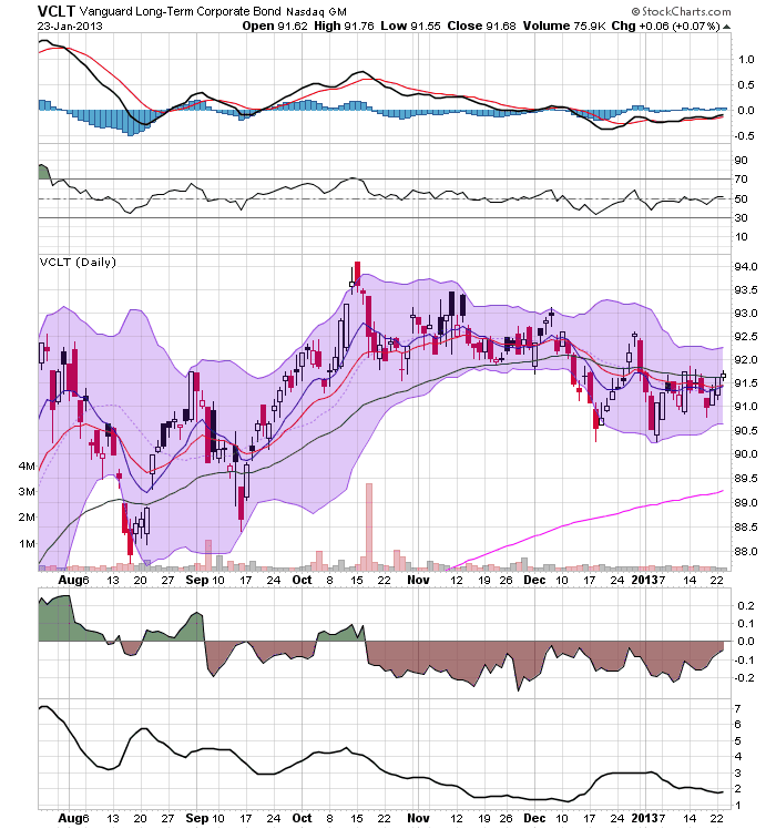
The corporate bond market is still in a generally strong position. The short end (top chart) and the intermediate sector (middle chart) have both broken trend, but are simply moving sideways now. The only weakness we're seeing is in the long end of the market (bottom chart) which is currently drifting lower, headed towards the 200 day EMA.
Let's Shoot Ourselves In the Foot; Investment Edition
The following two graphs are from Mike Konzcal over at the Next New Deal (see links here and here) and they highlight a terrifying trend in the US:
First, notice that the amount of money spent on public education has been declining since the recession. Second,
We are also seeing a large decline in the number of teachers who are actually teaching.
So, we're seeing a sharp decrease in educational spending at the national level, while the teachers who have been fired are not being replaced by the private market. That means we'll be seeing things like increased class size -- a terrible idea for educating children -- increased stress on teachers and in general a very bad situation overall.
I can speak to this from the experience of my state, Texas. We have a biennial legislative session that lasts a few months. In the last session, the state cut $5.4 billion from the education budget. While the educational system was very vocal about this this, it passed through the legislature because it's extremely conservative. In the latest budget proposals, we're seeing a projected surplus but there has been no talk about making up the deficit in financing even though the population of the state has increased since then. The following summation is from the El Paso Times:
Texas lawmakers -- primarily Republicans -- two years ago passed a $173.5 billion budget that cut spending and services and did not fully fund inflation or population growth. The budget sliced $5.4 billion from public education and put off nearly $5 billion in Medicaid costs. Only one member of El Paso's delegation in Austin, then-Republican state Rep. Dee Margo, voted for the budget two years ago.
The proposed 2014-15 House budget uses about $187.7 billion in state and federal funds, which is $2.2 billion less than the current budget. The Senate version is about $186.8 billion, or $3.1 billion less than the current budget.
But while the proposed budgets would use $2.2 billion to pay for the projected enrollment growth of 85,000 students in the state in 2014-15, neither would include money for the enrollment growth that was not fully funded in the last budget cycle. The proposed budgets also do not restore the $5.4 billion in budget cuts to public education that the Legislature approved last session.
We're seeing the same problem at the national level with infrastructure spending. As I've noted ad nauseum, the US' infrastructure is in terrible shape and needs a massive amount of investment to bring it up to speed. Yet, we continue to implement stop gap measures that only put a band-aid over the problem.
The basic problem is that investment in education and infrastructure is neither politically sexy nor are the benefits immediately apparent. However, by not making these investments now, we are shooting ourselves in the foot regarding long-term economic growth.
First, notice that the amount of money spent on public education has been declining since the recession. Second,
We are also seeing a large decline in the number of teachers who are actually teaching.
So, we're seeing a sharp decrease in educational spending at the national level, while the teachers who have been fired are not being replaced by the private market. That means we'll be seeing things like increased class size -- a terrible idea for educating children -- increased stress on teachers and in general a very bad situation overall.
I can speak to this from the experience of my state, Texas. We have a biennial legislative session that lasts a few months. In the last session, the state cut $5.4 billion from the education budget. While the educational system was very vocal about this this, it passed through the legislature because it's extremely conservative. In the latest budget proposals, we're seeing a projected surplus but there has been no talk about making up the deficit in financing even though the population of the state has increased since then. The following summation is from the El Paso Times:
Texas lawmakers -- primarily Republicans -- two years ago passed a $173.5 billion budget that cut spending and services and did not fully fund inflation or population growth. The budget sliced $5.4 billion from public education and put off nearly $5 billion in Medicaid costs. Only one member of El Paso's delegation in Austin, then-Republican state Rep. Dee Margo, voted for the budget two years ago.
The proposed 2014-15 House budget uses about $187.7 billion in state and federal funds, which is $2.2 billion less than the current budget. The Senate version is about $186.8 billion, or $3.1 billion less than the current budget.
But while the proposed budgets would use $2.2 billion to pay for the projected enrollment growth of 85,000 students in the state in 2014-15, neither would include money for the enrollment growth that was not fully funded in the last budget cycle. The proposed budgets also do not restore the $5.4 billion in budget cuts to public education that the Legislature approved last session.
We're seeing the same problem at the national level with infrastructure spending. As I've noted ad nauseum, the US' infrastructure is in terrible shape and needs a massive amount of investment to bring it up to speed. Yet, we continue to implement stop gap measures that only put a band-aid over the problem.
The basic problem is that investment in education and infrastructure is neither politically sexy nor are the benefits immediately apparent. However, by not making these investments now, we are shooting ourselves in the foot regarding long-term economic growth.
Wednesday, January 23, 2013
Where's the Inflation?
Last week, the BLS released both the PPI and CPI. Both showed tame numbers. However, that leads to a question: despite all the money printing by the Federal Reserve, there is literally no inflation in either the producer or consumer numbers. Let's take a look at the data.
Above is a five year chart of the the year over year percentage change in producer prices. Notice that coming out of the recession we see large increases (which is actually pretty standard). However, over the last 8 months, we see minuscule increases, as better shown in the following chart:
For four of the last twelve months we see a decrease in PPI. And for the last 9 months the increases are tiny by historical comparison.
The two charts above show the most volatile components of the PPI. Energy prices (top chart) have been contained for the last twelve months, actually printing solid decreases for most of the readings. The real inflation at the producer level is in food prices (bottom chart) which are showing a decent increase. However, these are not bleeding through to the composite readings.
Turning to CPI, we see the following graphs:
The top chart shows the last 10 years' year over year data. Notice that for most of the last 12 months, the readings have been right below the 2% level. The red line shows that this is a very low reading when compared to the last expansion. The lower chart shows the data in a 5 year time frame. From 2011-2012 we see increases rising to nearly 4%, but that number has clearly decreased since then. Over the last 10-12 months, we see very tame readings for this number.
Finally, we see a graph that shows the relationship between the year over year increase in PPI and CPI for the entire duration of the great moderation (1980-2007). We can break this chart into two periods. The first occurs between 1981 and the late 1990s. During this time, PPI (the red line) was very tame and spent a fair amount of time printing negative numbers. The second period (late 1990s-now) shows PPI numbers that are far more volatile. However, during both of these periods, CPI (the blue line) was remarkably tame.
This chart shows that PPI's volatility so far has not led to a massive spike in CPI. The reason is producers appear to be absorbing the cost increase. Considering the current state of very weak demand, it's doubtful we'll see producers attempt to pass on any increase they see in prices.
Above is a five year chart of the the year over year percentage change in producer prices. Notice that coming out of the recession we see large increases (which is actually pretty standard). However, over the last 8 months, we see minuscule increases, as better shown in the following chart:
For four of the last twelve months we see a decrease in PPI. And for the last 9 months the increases are tiny by historical comparison.
The two charts above show the most volatile components of the PPI. Energy prices (top chart) have been contained for the last twelve months, actually printing solid decreases for most of the readings. The real inflation at the producer level is in food prices (bottom chart) which are showing a decent increase. However, these are not bleeding through to the composite readings.
Turning to CPI, we see the following graphs:
The top chart shows the last 10 years' year over year data. Notice that for most of the last 12 months, the readings have been right below the 2% level. The red line shows that this is a very low reading when compared to the last expansion. The lower chart shows the data in a 5 year time frame. From 2011-2012 we see increases rising to nearly 4%, but that number has clearly decreased since then. Over the last 10-12 months, we see very tame readings for this number.
Finally, we see a graph that shows the relationship between the year over year increase in PPI and CPI for the entire duration of the great moderation (1980-2007). We can break this chart into two periods. The first occurs between 1981 and the late 1990s. During this time, PPI (the red line) was very tame and spent a fair amount of time printing negative numbers. The second period (late 1990s-now) shows PPI numbers that are far more volatile. However, during both of these periods, CPI (the blue line) was remarkably tame.
This chart shows that PPI's volatility so far has not led to a massive spike in CPI. The reason is producers appear to be absorbing the cost increase. Considering the current state of very weak demand, it's doubtful we'll see producers attempt to pass on any increase they see in prices.
Subscribe to:
Posts (Atom)