US Bond Market
US Equity
International
Sunday, December 27, 2015
Saturday, December 26, 2015
Weekly Indicators for December 21 - 25 at XE.com
- by New Deal democrat
My Weekly Indicator post is up at XE.com. This week was virtually identical to last week. The US consumer once again appears to have come through with increased Christmas spending.


Thursday, December 24, 2015
Oil, the US$, and corporate profits
- by New Deal democrat
Previously this week I have written that the effect of US$ strength has been the biggest economic story of 2015, and that for the last 15 years, the US$ has closely tracked the price of gas. Because of the increasing importance of international trade to the US economy, the US$ deserves some weighting as a short leading indicator. Let me conclude with two notes.
First, this is the first time that a big decline in the price of gas has coincided with a surge in the value of the US$. Let's compare with the two prior occasions.
In 1986, the price of oil precipitously fell by nearly 50% (red), but that was accompanied by a weakening US$ (blue):

These two tailwinds helped propel the economy to a second round of growth in the late 1980s.
In 2006, there was a smaller (and less lasting!) decline in gas, that again coincided with a weakening US$:

Now here is the last 6 years:

That the price of gas has fallen so much is a real boon to consumers. In fact both USC Prof. James Hamilton and oil analyst Steve Kopits have shown that whenever crude oil expenditures exceed 4% or more of US GDP, as recession has followed:

That a slow move to 4% would be self-correcting was the origin of my theory about the "Oil choke collar." But the US produces more oil than it used to, so industrial production in the Oil Patch has suffered. Still, the collapse in gas prices would still be a significant net positive if the US$ hadn't eaten into exports so much.
That a slow move to 4% would be self-correcting was the origin of my theory about the "Oil choke collar." But the US produces more oil than it used to, so industrial production in the Oil Patch has suffered. Still, the collapse in gas prices would still be a significant net positive if the US$ hadn't eaten into exports so much.
Here's a look at the US$ (blue) and exports (iinverted, red):

While it almost has to be that a hit to exports will take a toll on US domestic corporate profits, the relationship isn't very strong, as shown in the graphs below:


So there is no reason to think that US corporate profits will automatically continue to suffer so long as the US$ remains strong. And in another month, the YoY comparisons of the US$ may look much more tame:

Wednesday, December 23, 2015
Real disposable personal income growth: not too shabby
- by New Deal democrat
This morning's release of personal income and outlays for November pretty much puts the last nail in the coffin for those Doomers who have been claiming we would go into recession in 2015. Beyond that, "real personal disposable income per capita" is a good enough measure of general middle class well-being that it is the economic metric in Prof. Douglas HIbbs' "Bread and Peace" model of Presidential election outcomes. Let's take a long-term look.
First, here is real disposable personal income per capita from 1959 - present, in log scale best to show the actual trend:

You can see the big increase was in the 1960-73 boom. The trend moderated from 1974-2006, and appears much flatter since. Unsurprisingly, this shows that it has been harder and harder for Americans of each successive generation to make progress.
Now let's take a look at the same metric measured YoY. As of November 2015, the YoY% gain in real disposable personal income per capita was 2.72%, so the graph subtracts that so that equivalent YoY gains show at the "0" line [Note that the big reversal in 2012-13 was due to the temporary 2% decrease in Social Security withholding]:

While the present gains aren't fantastic, they aren't too shabby either. Outside of the 1960-73 era, the only times that there were sustained significantly better YoY gains were several boom years in the 1980s and late 1990s. I hasten to add that the gains in the last year have primarily been due to the big declines in gas prices, rather than a surge in nominal income.
P.S.: If current trends continue, Hibb's model forecasts a win for the Democratic Party nominee in next year's Presidential election.
Tuesday, December 22, 2015
Gas prices and the US$ as short leading indicators
- by New Deal democrat
Yesterday I wrote a post for XE.com pointing out that the more international trade increased as a share of the overall US economy, the more important the trade-weighted US$ has become. Specifically, industrial production peaked 5 months after the US$ began to appreciate strongly in July 2014. By March 2015 things like steel production and transportation had rolled over, and they rolled over further with a further pulse of US$ strengthening several months ago.
While rapid strengthening of the US$ has not always led to recession, it has correlated on a number of occasions, and particularly so where the US$ has appreciated by more than 5% annually, as shown in the graph below:
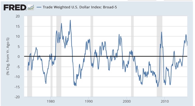
That makes me think that the US$ ought to have a place in the index of *short* leading indicators, with a weighting on the order of +/-0.1% in the LEI for every +/-1% change in the trade weighted value of the dollar. Here is the LEI for the last two years:

and here is the monthly change in the value of the US$, inverted, for the last 5 years:

The US$ would not meaningfully have changed the value of the strong LEI values during the first half of 2014, but would have subtracted -.1 or -.2 in the last half of 2014 into 2015, and again during the 3rd quarter of 2015. This would correlate well with the relative weakness of the economy in the early part of 2015, and strongly suggests rough patch this winter into next spring.
Another important correlation is that, for the last 25 years, the inverse of the value of the US$ (blue) has increasingly tightly correlated with gas prices (red):

In a sense, this just restates the truism that commodity prices are short leading indicators. But it highlights the difference in the manner in which those prices (and in particular gas prices) are transmitted into the US domestic economy. There is less domestic manufacturing, so less of a direct transmission. Rather, weak commodity prices correlate with a strengthening US$, which in turn transmits weakness via those sectors most exposed to the global economy.
Finally, let's look at gas prices themselves over the last 15 years:

Unless you think that gas prices are going to fall below their 2008 bottom and give up all of their secular increase since 1999, we are much closer to the bottom than the top in gas prices, which strongly suggests that - all else being equal - we should be much closer to the top rather than the bottom in the value of the US$. Of course the Fed is tightening so all else may not be equal, but if the US$ is near its peak, then its drag on the LEI is also mainly done. In other words, the YoY comparison in things like steel production, trucking, and rail should become much less negative, and perhaps turn positive, by spring sometime, unless Fed tightening causes the US$ to continue to strengthen.
Monday, December 21, 2015
The strong US$ has been the big economic story of 2015
- by New Deal democrat
This post is up at XE.com .
It's that time of year when we begin to look back, and look forward. I plan on posting more on the US$, grading my 2015 outlook from a year ago, a final look at my "5 graphs for 2015," and a first look at 5 graphs for 2016.
Sunday, December 20, 2015
Saturday, December 19, 2015
Weekly Indicators for December 14 - 18 at XE.com
- by New Deal democrat
My Weekly Indicator post is up at XE.com.
The resiliency of the US consumer continues in the face of the global economic hurricane to be amazing.
Thursday, December 17, 2015
November housing report: almost all great news
- by New Deal democrat
The November housing report overall was excellent, but there is still one nagging open question.
Let's do the good news first. Except for the June spike, this was the best report since early in the Great Recession:

This, along with November's post-recession record vehicle sales, is the simple but devastating rebuttal to those who claim we are already in a recession. We're not.
Even better, single family house permits did set a post-recession record:

This is pure good news.
Multi-family housing spiked in November as well:

Record rents should be creating demand for more multi-unit housing, and the flatness in this metric for the last 4 months has been puzzling.
Now for the nagging concern: like most analysts, I have been putting down the spike in June exclusively to expiration of a housing program in New York. It turns out that only half of the spike can be attributed to New York, as shown in the below graph of total permits (red) vs. pemits ex- NY (blue) [NOTE: graph only goes through October]:

So the decline in permits from July through October can't just be laid at New York's feet. And the state-by-state breakdown in permits won't be reported until next week.
In the meantime, we do have the regional breakdown through November, and here is what permits for all regions ex- the Northeast looks like:

So while I can't signal "all clear" on this most leading part of the US economy until housing permits ex-NY set a new high, we did set a decisive new high in all other regions in November. Most likely, next week we'll find that is true for everywhere except New York, and then I can declare this month's report unvarnished great news.
In the meantime, we do have the regional breakdown through November, and here is what permits for all regions ex- the Northeast looks like:
So while I can't signal "all clear" on this most leading part of the US economy until housing permits ex-NY set a new high, we did set a decisive new high in all other regions in November. Most likely, next week we'll find that is true for everywhere except New York, and then I can declare this month's report unvarnished great news.
Industrial production: the commodity collapse gets an assist frommother nature
- by New Deal democrat
I wanted to follow up on yesterday's industrial production numbers.
First of all, here is the series broken down into manufacturing (blue), mining (red), and utilities (green):

As you can see, manufacturing, while unchanged for the month, continued at its highest point since 2007. The downturn in mining (oil and metals) continues, while the unseasonably mild November weather in much of the nation caused utility production to cliff-dive.
Because 2001 was a business-led recession, where the consumer held up, let's take a look at the same 3 series through that time:

Manufacturing turned down a year before that recession.
Now let's see how overall industrial production fared at the time of the 2001 recession:

Let's compare that with the present downturn, including yesterday's number:

Our current shallow industrial recession is a little more than half of the depth of the downturn that became the 2001 recession, and at the moment the current downturn is much more concentrated in commodities, with an assist last month from global warming.
While the current shallow industrial recession is the biggest threat to the economy since 2009, it isn't yet at a point that makes me think that the economy as a whole is near a recession. For that, I would expect to see a significant decline in manufacturing, and declines in consumer purchases of houses and cars. right now, that's not happening.
Wednesday, December 16, 2015
Good news on housing, mixed on industrial production
- by New Deal democrat
I'm on the road right now, so this will be a brief note without graphs. I'll update later.
Housing can be summarized as follows:
- permits for single family homes made another post-recession record
- permits overall had their best motnh except for June
- the only fly in the ointment is that housing excluding New York (NY being responsible for most of the surge in May and June) is still short of those months, and flat since
- starts, which are more volatile, and slightly less leading, also had a strong month but have been flat for most of this year.
Industrial production, on par with the last few months, wasn't nearly as bad as the headline suggests:
- manufacturing was unchanged at a post-recession record
- mining continued to decline
- utilities went off a cliff (thank you, global warming!)
More later.
Tuesday, December 15, 2015
What November real retail sales tell us
- by New Deal democrat
I have a new post up at XE.com looking at this metric 4 different ways, including as a harbinger for employment, as a marker for early vs. late cycle expansioin, and as a long leading indicator of recession.
Monday, December 14, 2015
High yield junk bonds are imploding: We're DOOOOMED!!!
- by New Deal democrat
The market for junk bonds is imploding. Prices for CCC-rated corporate bonds are down 21% from their peak:

We're DOOOOMED!
Oh, wait. I'm sorry, that was 1998 Asian currency crisis. It was another 2 years and 9 months after that implosion before a US recession occurred:

This is the current graph of CCC-rated corporate bonds:

They are down 17% from their peak, less than the 1998 carnage.
There were some important differences between 2008 and 1998. In 2008:
- the derivates were centered on the lifeblood of the US economy: housing
- an oil price spike of 100% in 2 years had just occurred
- the underlying economy was already in contraction
In contrast, in 1998:
- the issue was centered on a particular corner of the market: foreign currencies
- oil was in the process of making a secular bottom
- the underlying economy was in expansion
While a bond implosion is never to be lightly dismissed, I think it is pretty obvious that our current situation, where the carnage is centered on the Oil patch and other commodities, and the service economy remains in a decent expansion, is more like 1998.
The bottom line is that, while low grade corporate bonds almost always blow out on the cusp of of early stages of a recession, the converse is not true. You can have a junk bond blowout without triggering or indicating a recession.
I suspect it won't be over until a dead whale - maybe a good-sized energy producer or utility - washes up on the beach, prompting Fed and/or Treasury action, just as the bankruptcy of Long Term Capital Management did in 1998. But so long as the consumer keeps buying more houses and cars, and generally spending as measured by real retail sales, I don't see any imminent general problem.
Sunday, December 13, 2015
Forecasting the 2016 election economy: the "Bread and Peace" model
- by New Deal democrat
This is the latest installment in my series, "Forecasting the 2016 election economy," a real-time experiment to see if I can forecast the outcome of the November 2016 Presidential election by making use of economic indicators up to a year in advance.
We have already seen that a number of economic indicators have a good track record of correlating with the election result, provided we know their values in the first 3 quarters of the election year. We have also seen that at least one long leading indicator, housing permits, has some validity in forecasting the election day status of changes in the unemployment rate, one of the best such economic indicators. We have seen that 80% of the time, just knowing whether or not the economy is in recession in Q3 of the election year has accurately forecast the popular vote winner in the election, going back over 150 years! Finally, we have seen that the long leading indicators through Q3 of 2015 suggest that it is more likely than not that this economic expansion will continue through Q3 of next year, and thus favor the election of the Democratic Party nominee.
There is one other well-known model, from economist Douglas Hibbs, called the "Bread and Peace" model. This model makes use of "real disposable personal income per capita" measured over the entirety of the last Presidential term, with weights for each period prior to the last measurement decreased by 20% (i.e., the last period before the election gets a weighting of 1, the period before that a weighting of 0.8, the period before that a weighting of 0.64, and so on). From this is subtracted the number of casualties in any wars of choice, with 1% being subtracted for each 100,000 casualties during the Presidential term. The result of this subtraction gives the percentage of the vote that can be expected to go to the incumbent party.
Here is a graph showing how the "Bread and Peace" model has performed since 1952, with its last projection before the 2012 election:
 As you can see, the model stumbled somewhat badly in 2012, forecasting that Obama would win only 47% of the vote, when in fact he received about 53%, as shown in this "post mortem" graph below:
We have already seen that a number of economic indicators have a good track record of correlating with the election result, provided we know their values in the first 3 quarters of the election year. We have also seen that at least one long leading indicator, housing permits, has some validity in forecasting the election day status of changes in the unemployment rate, one of the best such economic indicators. We have seen that 80% of the time, just knowing whether or not the economy is in recession in Q3 of the election year has accurately forecast the popular vote winner in the election, going back over 150 years! Finally, we have seen that the long leading indicators through Q3 of 2015 suggest that it is more likely than not that this economic expansion will continue through Q3 of next year, and thus favor the election of the Democratic Party nominee.
There is one other well-known model, from economist Douglas Hibbs, called the "Bread and Peace" model. This model makes use of "real disposable personal income per capita" measured over the entirety of the last Presidential term, with weights for each period prior to the last measurement decreased by 20% (i.e., the last period before the election gets a weighting of 1, the period before that a weighting of 0.8, the period before that a weighting of 0.64, and so on). From this is subtracted the number of casualties in any wars of choice, with 1% being subtracted for each 100,000 casualties during the Presidential term. The result of this subtraction gives the percentage of the vote that can be expected to go to the incumbent party.
Here is a graph showing how the "Bread and Peace" model has performed since 1952, with its last projection before the 2012 election:

This is because "real disposable personal income" was one of the poorest-performing consumer measures of Obama's first term, growing by only 3% through August, before increaseing another 1.7% in September and October, to be up 4.7% on election day, with much of that increase coming in just the last few months before the election:
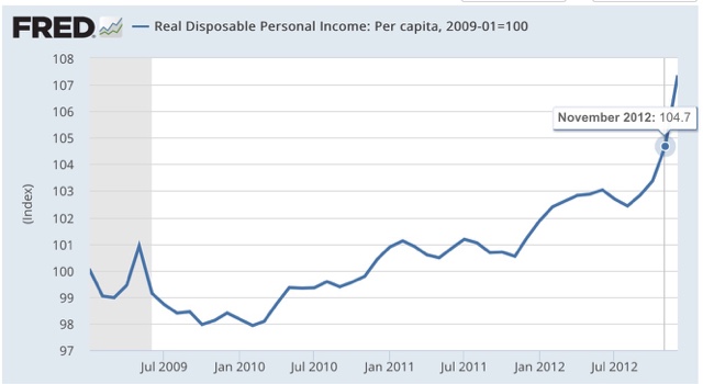
This highlights an unusal feature of the model. the last 3 months before the election count for fully half the wight of the entire result. Each successive preceding quarter counts for about half of th subsequent one. thus if real disposable personal income per capita grew linearly by 10% in the first 3 1/2 year s of a presidency, but did not grow in the lsat 3 momonths before the election, the model projects only +5% for this metric.
Since real per capita disposable income almost always grows outside of recessions and their immediate vicinity, this is n accord with our previous discussioin: a flat - or declining measure right before the election usually means a recession - which is exactly what the simple model indicating that a 3rd quarter recession in election year predicts the popular vote winner 80% of the time.
So what does the model suggest now? Let's take a look at 3 Presidential elections for which the model predicted similar results, and did not have a war (such as in 1968) to detract from the numbers.
First, here is 1988:

Next, here is 1996:

Finally, here is 2004:

In all 3 cases, "real disposable personal income per capita" rose fairly linearly throughout the preceding 4 years, with results on election day of +9.5%, +6.1%, and +7.1%, respectively.
Now here is the 2 years and 10 months of Obama's 2nd term:

Currently "real dispoable personal income is up + 6.4%.
We don't know what it's values will be for the next year. What we can say is that, *IF* real disposable personal income per capita continues to grow at the average rate it has since the beginning of 2013, it will be approximately +8.6% on election day, and the "Bread and Peace" model will favor a Democratic victory with the nominee receiving somewhere on the order of 53%-54% of the vote.
First, here is 1988:
Next, here is 1996:
Finally, here is 2004:
In all 3 cases, "real disposable personal income per capita" rose fairly linearly throughout the preceding 4 years, with results on election day of +9.5%, +6.1%, and +7.1%, respectively.
Now here is the 2 years and 10 months of Obama's 2nd term:
Currently "real dispoable personal income is up + 6.4%.
We don't know what it's values will be for the next year. What we can say is that, *IF* real disposable personal income per capita continues to grow at the average rate it has since the beginning of 2013, it will be approximately +8.6% on election day, and the "Bread and Peace" model will favor a Democratic victory with the nominee receiving somewhere on the order of 53%-54% of the vote.
Of course, this isn't a real forecast, since we won't know the final equation until election day next year. So we need to see if our leading indicators can help us out. And it also suggests that we should not rely on one single metric, but rather an index of metrics, to improve outocmes. As it happens, a British team has done just that with the Index of leading Indicators. Those will be the subjects of my next posts..
Saturday, December 12, 2015
Weekly Indicators for December 7 - 11 at XE.com
- by New Deal democrat
My Weekly Indicator post is up at XE.com .
Due to the reversal of Thanksgiving Day seasonality, we improved from absolutely horrible to merely bad this week.
Friday, December 11, 2015
New progressive blog aggregator
- by New Deal democrat
By way of exploring a big increase in the number of reads of this here blog (YAY!!!), I stumbled upon a new progressive blog aggregator, ProgBlog .
The most recent headlines and ledes from probably over 100 progressively-oriented blogs are included in chronological order. This is a good way to scan for stories of interest in just a minute or two. It won't substitute for your daily reading of economic blogs, as I think this blog and Calculated Risk are the only two mainly economic blogs included, but well worth adding to your favorites and checking once or twice a day.
Good news and bad news on retail sales
- by New Deal democrat
This morning's retail sales report can be summarized as follows:
- +.2% headline
- +.4% ex-auto
- +.3% ex-gasolinle
which is something of a reversal of recent months, where auto sales have done the heavy lifting.
Let me get the good news out of the way first. Once the CPI comes out next week, we will probably find out that November set a record. This is because gas prices account for most of the month to month variability in the CPI. There is an underlying core inflation rate of between +0.1% and +9,2% each month, so if we take that, as well as the volatility of gas prices, into account, we almost always can identify the direction, and ususally the fluctuation +/-0.2%, of the overall CPI number.
Here's what the last year looks like, including the change in November gas prices:

November CPI is likely to be no higher than unchanged, and could easily decline by -.4%.
Let's apply that to real retail sales (red in the graph below) compared with nominal retail sales, both normed to 100 as of October:

If consumer prices are up by no more than +.1%, we will tie the previous record -- and we are likely to surpass it.
The bad news is that, even so, the above graph suggests that real retail sales are flattening. This is not uncommon in the 18 months before a recession. Just another sign that we appear to be later in the cycle.
Thursday, December 10, 2015
Single family housing is outperforming multi-unit housing. And that tells us . . .
- by New Deal democrat
The first thing it tells us, is that I can write a click-bait headline sending you over to my newest post up at XE.com to find out the answer.
Gas prices finally break below last winter's low
- by New Deal democrat
Last winter gas prices bottomed at $2.02. For the last 2 weeks, gas prices flirted with, but never broke through, that low.
Until yesterday. Average US gas prices are now sitting right at the $2.00 mark:

I don't know how much further they may fall. The bottom could be anytime between now and early February. Since in the last 10 years, the seasonal top and bottom in gas prices has tended to be about $1 apart, in summer I thought the bottom might be at about $1.82. Here's what I wrote about the summertime peak only being $0.80 above last winter's low back in July:
This tells us that the medium term trend in gas prices, taking out seasonality, is still down. That suggests that gas prices are going to fall below $2/gallon this winter.We'll probably continue below the $2 mark in the next few days, but I doubt we'll make it all the way down to my original forecast low.
But this does show a continued deflationary background to the economy, and a continued slight boost to most consumers' wallets.
Subscribe to:
Posts (Atom)