Wednesday, July 16, 2025

Producer prices, consumer prices, and tariffs


 - by New Deal democrat


Much of the commentary on yesterday’s CPI report suggested that the tariff impacts were apparent. My own analysis was more cautious. That’s simply because we don’t know for sure which items were affected by tariffs, and at this point referring to, e.g., appliances that showed relatively large monthly increases in prices is speculative - not wrong, mind you, simply speculative. The closest to rigorous analysis I read was that goods inflation was more than services inflation, which would make sense because few “services” can be imported.

That issue continued into this morning’s report on June producer prices.

Headline PPI was reported this morning to have been unchanged for June, while that for raw commodities increased 0.6%. Still, as shown by the below, the YoY trend in each is hardly that of accelerating inflation. Final demand PPI was up 2.4% YoY, continuing its cooling trend, while that for commodities was up 1.7%, in line with its trend for the past 12 months:


When we divide final demand into goods and services, the picture becomes a little more complex, in line with the analysis of yesterday’s CPI. Producer prices for services rounded to unchanged, while producer prices for final demand goods increased 0.6%.  Still on a YoY basis, the trend for services continues to decline, up only 2.7%, the lowest since March of last year, while that for goods was up 1.7%, in line with its recent trend:


One piece of data is incontrovertible, however.

Every day the Department of the Treasury updates its website with a “Treasury Statemeent” of moneys incoming and outgoing from the federal government. And one specific line is for “Customs and Certain Excise Taxes.” 

That particular line as of several days ago indicated that about $125 Billion had been received in such taxes this fiscal year, about $50 Billion more than had been received one year ago at this time.

That $50 Billion was paid by importers, who either ate the cost or passed it on to consumers, or some combination of the two. If we simply figure a 50/50 split between the two possible parties bearing the brunt of the tariffs, that averages out to about a $200 increase per household so far this year. That’s money that could have been saved, or spent on other items. Instead it was spent on the increased cost of items bought.

So even if the data from yesterday’s CPI report was ambiguous, the simple necessary fact is that there have already been increased costs at the producer and/or consumer levels from tariffs. We just don’t know exactly where within those reports they exist.

Tuesday, July 15, 2025

June CPI: an apparent point of transition


 - by New Deal democrat


We are at somewhat of an inflection point as to consumer inflation. On the one hand, the post-pandemic inflationary effects continue to fade. But on the other, we are waiting for the effects of Tariff-palooza! 

In June the waning post-pandemic effects continued to dominate, as the only items still rising at a rate in excess of 4% were Owners’ Equivalent Rent, gas and electric utility services, and motor vehicle insurance and repairs, joined by hospital services, meat and tobacco.

Here’s the more detailed look. 

Headline CPI in June rose 0.3%, core CPI rose 0.1%, and ex-shelter CPI was unchanged. On a YoY basis, CPI rose 2.4%, core CPI rose 2.8%, and CPI ex-shelter CPI rose 0.3%. Here is the month over month look at all three:


On a YoY basis, headline CPI was up 2.7%, core CPI up 2.9%, and CPI ex-shelter was up 2.0%:


This graph does suggest that CPI is at an inflection point. While the YoY trend in core inflation appears to be a continuation of slight deceleration (although both it and headline CPI YoY were 0.3% hotter than last month), CPI less shelter shows a slightly increasing trend over the past 9 months - even as it remains under 2.5% as it has for over 2 years. The net effect is that YoY headline inflation appears to have wobbled in the 2.4%-2.8% range over the past year. In other words, overall the post-pandemic disinflationary effects appear to be fading.

Within shelter, actual rent rose 0.2% for the month, and is up 3.8% YoY, while the fictitious Owners’ Equivalent Rent rose 0.3% for the month, and is up 4.2% for the year. Although both YoY metrics declined slightly this month, both rounded to 0.0%. Here’s what both of them look like in comparison with the FHFA house price index:


I do expect the shelter components of CPI to continue to slowly decelerate, following the continued somnolent readings in the FHFA index.

There were only three other significant drivers of inflation last month: transportation services, utility services, and hospital services.


As a reminder, transportation services (mainly maintenance and repair as well as insurance) are even more lagging than OER, since they react to the increased cost of vehicles and parts (note: FRED does not separately break out insurance):


Transportation services as a whole appear close to their pre-pandemic range, while maintenance and repair costs remain slightly elevated.

While the former problems of new car prices have risen only 0.2% in the past 12 months, and used car prices 2.8% (so I won’t even both with the graph), motor vehicle repair prices are still up 5.2% YoY, and motor vehicle insurance is up 6.1%. Even here, both continued to moderate, as on a monthly basis the former were only up 0.2%, and the latter up 0.1%

Hospital services rose 0.7% for the month and are up 4.2% YoY:


This series is somewhat noisy, but the current reading is within the “normal” range for the past 10 years (the 2023-24 YoY increase was due to one big month’s increase in 2023). Whether the jump this month is a harbinger of a future breakout or just noise is completely unknown.

Finally, the only other current problem child is gas and electric utility services, up 0.9% for the month and up 7.5% YoY:


This does appear to be a genuine breakout from its post-pandemic range. Although I won’t bother with the graph, both electricity and gas utility services are participating in the breakout.

Cleaning up a few other odds and ends: energy prices (mainly gasoline) did increase 0.8% for the month, but remained down -0.8% YoY. Tobacco products increased 0.5% for the month, and were up 6.3% YoY, but these have a very small weighting in the index. Perhaps of more interest, meat and poultry prices declined -0.3% for the month, but remain up 5.8% YoY, although down from their 7.8% YoY peak in March:


To summarize, the takeaway for June is that the slow post-pandemic disinflation, led by shelter and motor vehicle prices, appears to be abating, while several other areas - albeit small - of concern have appeared. On the bright side, there do not appear to be any definite signs of negative impacts from tariff-related price increases yet.

Monday, July 14, 2025

Financial and commodity markets since Election Day


 - by New Deal democrat


The post-jobs report data drought finally ends tomorrow. Today, let me take the opportunity to update some important trends that have been affected or caused by the T—-p Administration’s “policies.” 


All graphs below showing absolute values have been normed to a value of 100 as of Election Day last November.

First and most notably, since Inauguration Day the US$ has declined more than 10%. Below I show the absolute value of the nominal US$ index (blue, right scale) together with the YoY% changes, going back 60 years (red, left scale):


Here is a graph of the H1 decline in the US$ over that same period:


The decline in the absolute value US$ does not look particularly bad vs. several post-recession declines in the past, and on a YoY% basis it is only down 5%. But as the immediately above graph shows, the 10% H1 decline is among the sharpest in the past 60 years. With the exception of the Reagan Administration’s deliberate devaluation strategy, a YoY decline of over 10% would only be normal in a very weak economy where it is part of pump-priming. Needless to say, if we reach such a YoY decline even before going into a recession, that would be a bad thing.

Commodity prices as measured by the PPI are up 2.3% since the election (blue), but since commodity markets are global, how much, eg., lumber can be bought is affected by the US$’s value vs. other currencies as well, and so adjusted, commodity prices have risen 5.5% (red):


In short, it is more expensive to import most commodities now than it was before the election.

As can be found in the Daily Treasury Statement, tariff income has risen to $28.0 Billion during the month of June:


That’s $336 Billion on an annualized basis, and since it is paid by importers and either eaten by them or wholly or partly passed on to consumers, it is a deadweight loss to the economy, particularly in view of the Billionaire Bust-out Budget Bill just enacted. 

In the past, GOP budget bills have made sure to include some crumbs for medium and lower income earners, in the form of at least a modest tax reduction. Not this time. This time, especially coupled with the impact of the tariffs, a large majority of American households will actually lose income:


This is, needless to say, not a good thing in an economy which is 70% fueled by consumption.

In view of all of the above, the yield on long-dated US Treasury’s has hovered at about 4.4% for the 10 year, but gradually risen to almost 5% for the 30 year bond:


As you can see, both of these are close to 20 year highs. Of course, there is no way to know for sure whether the trend will continue, but it certainly appears as if the bond market is anticipating more inflation, and in the case of foreign holders, a requirement for higher yields to hold US$ denominated assets.

Finally, we come to the contrarian indicator - the US stock market, which made yet another new all-time high last Thursday in the face of T—-p’s latest tariff announcements (blue, right scale):


The market is up over 5% since Election Day. 

But as you can see especially from the YoY% change shown by the red line, the pace of increase has slowed considerably.

Usually it is worthless to try to divine “why” the stock market has made a particular move. But in the case of the rally since April, it is almost certainly an indication of the “TACO trade,” which is to say that market participants are not taking T—-p’s tariff pronouncements seriously, and fully expect him to back off.

Paradoxically, this creates positive feedback for T—-p, which in turn makes it more likely that he will carry through on his tariff threats. Which in turn will likely surprise the market and lead to a sell-off. Which is likely to activate TACO again. Rinse, lather, and repeat.

Although lower taxes are normally good for corporate profits, since as indicated above most American households will sustain a net loss from the combination of the tax bill and increased prices due to tariffs, it is hard to see that being the case this time.

Of course, time will tell. But so far the trends from T—-p have been a declining US$, an increase in commodity prices and inflation expectations, and a (small so far) deadweight loss to the consumer economy. Personally, my bet is that the bond market is right, and the stock market is wrong.

Saturday, July 12, 2025

Weekly Indicators for July 7 - 11 at Seeking Alpha


 - by New Deal democrat


My “Weekly Indicators” post is up at Seeking Alpha.

Despite the warning signs in some of the recent monthly data that I’ve highlighted in the past several weeks, the high frequency data this past week indicated smooth sailing, at least for now.

Some of that is likely due to the 4th of July being one week ago, so some consumer data in particular rebounded. But at least one indicator - the S&P 500 making another new all-time high on Thursday - I suspect is due to absolute complacency; namely, the TACO trade. Wall Street must believe that T—-p is going to chicken out again w/r/t his new tariff announcements.

In any event, clicking over and reading will as usual bring you up to the virtual moment as to the state of the economy, and reward me a little bit for collecting and organizing it for you.

Friday, July 11, 2025

Putting markers down: what will it take for my forecast to activate a “recession watch”?


 - by New Deal democrat


Our data drought won’t end until next Tuesday. In the meantime, let me follow up on a theme from my analysis of the economic data from last week. To wit: there are several metrics that I have already stated are worth a “recession watch;” namely, housing units under construction (down almost 20% from peak), and the 3 month economically weighted ISM new orders subindexes (just into contraction territory at 49.3). Additionally, real aggregate nonsupervisory payrolls look like they may be rolling over. But there are many other measures that are not signaling a recession in the immediate near term (e.g, employment in the goods producing sector).


As I noted several weeks ago, in the past 50+ years, in addition to COVID, almost always there has been a domestic political or geopolitical shock that has precipitated US recessions. There are two excellent candidates — the regressive tax bill just passed by Congress, and Tariff-palooza! - for such shocks. That’s the “fundamentals” view.  

But, what data will it take for me to actually go on “recession watch?” And the answer is, at least some of the following continuing or turning negative.

To begin with, several long leading indicators. Last month I updated my look at the non-financial long leading indicators — corporate profits, housing, and real per capita consumption, summing up that “the housing sector is giving recessionary readings. Corporate profits adjusted for inventories are weakening, but are still positive YoY. But real sales are not just positive, but they have been improving.”

Let me update each of the three since then.

First, the last shoes in the housing sector to drop after units under construction but before a recession are housing units for sale in the new home sales report, and employees in residential construction. Here is the long term view of each:


And here is the post-pandemic close-up:


The two measures have tended to peak very close in time to one another. In the last few months there have been signs that both are doing so now. New homes for sale did make a new high - just barely - last month, and the rate of increase has gradually slowed over the last nine months. Meanwhile, employment in residential construction actually declined slightly last month, and has grown less than 0.1% in the past three months. 

New home sales will be reported for June in two weeks. I would expect to see a decline before a recession. 

While corporate profits for Q2 won’t be reported until the end of August, the proxy of proprietors’ income will be reported at the end of this month. Although this rose in Q1 (not shown) I would expect it to decline before a recession. In the meantime, here is the latest actual (through Q1) and forecast (beginning Q2) S&P 500 earnings from Earnings Insight as of last week:


Usually forecast earnings just before actual reports are too pessimistic, so I expect the Q2 number to improve once actual earnings are in. Companies don’t normally cut staff if profits and sales are increasing, but if there is a 2nd consecutive decline, the likelihood of more layoffs increases. 

Another important measure is “real final sales to private domestic purchasers” from the GDP report, which as noted above will be reported at the end of this month. There increased 0.47% in Q1. Here’s how that compares historically pre-pandemic, subtracting 0.47% so that it appears right at the 0 line:


In the past, increases such as we got in Q1 either occurred in times of weak growth - or just before or during a recession. 

Here is the post-pandemic view:


If real sales in the GDP report in two weeks are as weak or weaker than in Q1, that would strongly suggest we are on the eve of a recession.

Now let’s look at real consumption as measured by both real retail sales and real spending on goods pre-pandemic, including the latest personal spending report from two weeks ago:


Even without taking into account population growth, real retail sales have tended to flatten or decline months before a recession begins. Here is the post-pandemic update:


Both of these did quite well in 2024, but there are signs that both have been peaking this year. Should both reports continue to go sideways or even decline further, that would suggest that consumers are pulling in their horns.

Finally, I would expect an increase in layoffs. There are signs from continuing jobless claims, as well as the anemic recent nonfarm payrolls growth, that hiring is weakening. Additionally, the comprehensive QCEW census (not shown) has indicated that there was only 0.8% job growth in 2024 rather than the 1.3% officially shown in the un-benchmarked jobs reports. But as I noted yesterday, initial claims are only slightly higher YoY. 

Here are several measures of layoffs including not just initial claims, but also layoffs and discharges from the JOLTS report, and the number of short term unemployed, and total unemployed from the jobs report. Here is a historical pre-pandemic look:


The most reliable measure, as above, is initial claims. Additionally, the number of unemployed has generally risen to at least 5% higher YoY several months before a recession has begun. The other two are much more noisy, although they too generally increase.

Here is the post-pandemic record:


As discussed a number of times last year, the increase in several of these numbers likely had to do with the surge of immigrants looking for first time work. This has most likely ended. But I would expect the four week average of initial claims to increase to 10% higher YoY at least in order to justify a recession watch.

In addition a to looking for a downturn in goods producing employment and aggregate real payrolls in the employment report, if all of these either continue weak, or turn weaker, I could conceivably go on “recession watch” for the economy as early as the end of this month.

Thursday, July 10, 2025

Jobless claims continue to suggest weakness but no downturn


 - by New Deal democrat


We finally have some new data this week - the usual, jobless claims.


Initial claims declined -5,000 for the week, while the four week moving average declined 5,750. With the usual one week delay, continuing claims, on the other hand, rose 10,000 to a new 4.5+ year high of 1.965 million:


I can’t help but note that although the above numbers are seasonally adjusted, it is clear there is some residual unresolved post-pandemic seasonality nonetheless, as ever since the beginning of 2023 we have seen low numbers at the beginning of the year, rising through midyear, and then falling back down through the Holiday season.

On the YoY% change more useful for forecasting, initial claims were up 2.3%, the four week moving average up 1.3%, and continuing claims up 5.9%:


This continues to forecast weakness, but no recession. Interestingly, while there has been no substantial increase in new layoffs, those who are out of work are finding a more difficult time finding new jobs, as is shown by the increase in continuing claims in the last 8 weeks. Also, it is possible the recent lower figure for YoY% increases in new jobless claims might suggest a break in the trend of 5% higher +/-5% we’ve seen since last autumn, but I suspect it is more likely just noise.

Finally, here is an updated look at what this suggests for the unemployment rate going forward:


While most recently the unemployment rate was unchanged from 12 months previous, jobless claims suggest that this comparison should trend higher by about 0.2% or 0.3% in the next few months. A year ago the big increase in the unemployment rate was likely due to the torrent of new immigrants looking for work. Needless to say, this year that is very much not likely to be true any longer.

Wednesday, July 9, 2025

Why goods-producing employment is not flashing a danger signal for an economic downturn


 - by New Deal democrat


During this week’s drought of new economic data, let’s continue taking a look at some important information from last Friday’s employment report.


In every report, I break down my analysis first and foremost by looking at the leading indicators contained within the data. This is almost entirely confined to the goods-producing sector, and in particular manufacturing and construction. That’s because the goods sector is more volatile than the services sector. The former almost always turns down before the onset of a recession, while the latter in many cases sails right through.

Specifically, let me show you the last 40+ years of the absolute levels of employment in the goods-producing sector (blue) vs. services (red), broken up into three periods.

First, here is 1983-2000:


Here is 2000-2019:


And here is the post-pandemic period:


In each recession (except for COVID) since 1982, employment in the goods producing sector has turned down up to a year or more before the actual onset of the contraction, while at most the addition of jobs in the service producing sector slowed down. At present, as you can see from the last graph, while growth in the goods-producing sector has all but halted, it has not yet turned down.

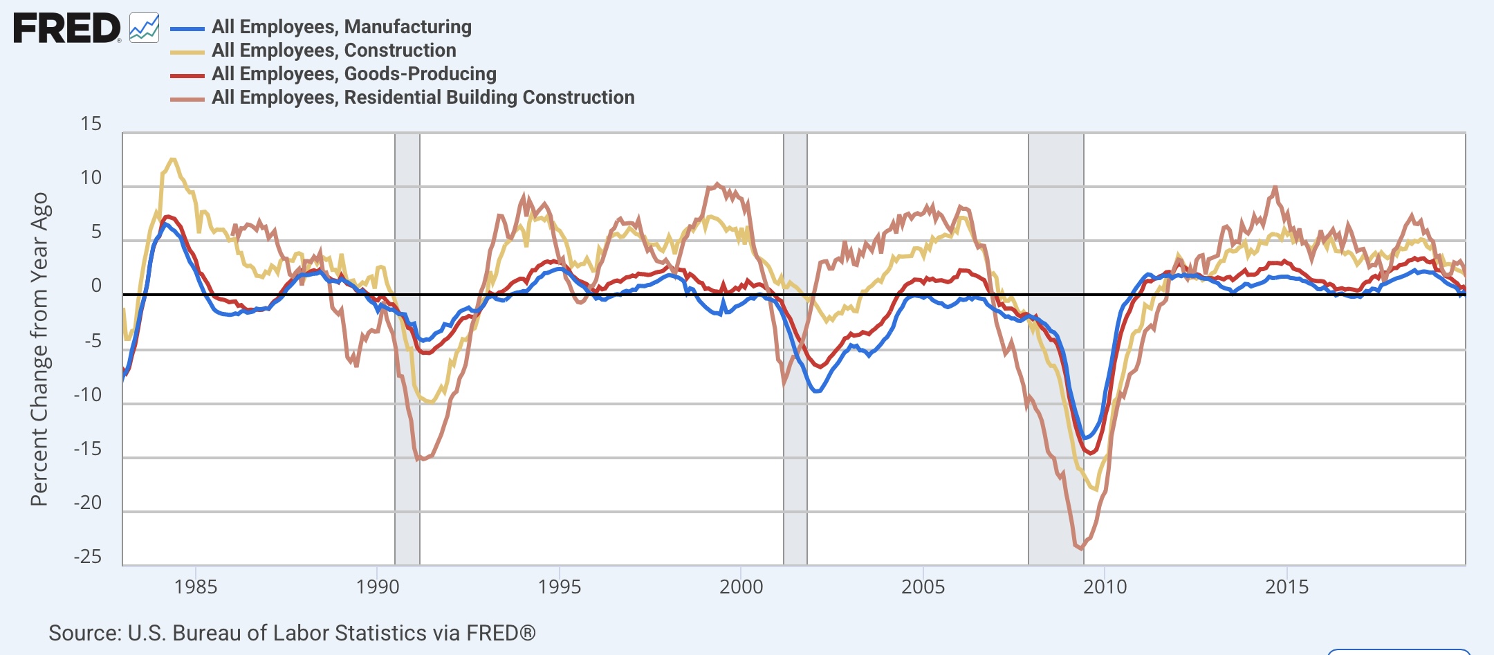
Now let me break down employment within the goods-producing sector into manufacturing, construction, and the more leading residential construction sub-sectors, in addition to the entire goods-producing sector (red), first in absolute terms with all normed to 100 as of February 2023, which is when manufacturing employment peaked:


Recall that since the admission of China to regular trading status in 1999, a downturn in manufacturing has not been enough to drag the economy into a recession. You can see that construction employment, and in particular residential construction employment, which has risen almost 5% since then, has been responsible for the resilience in the overall sector.

Now let’s look at the same data YoY:


While the overall sector is up only 0.1%, manufacturing employment is down -0.7%, but construction employment is up 1.5%, and residential construction employment up 1.7%.

Now let’s take a look at the historical pre-pandemic YoY data. In the below graph, I have added/subtracted from each subsector’s YoY%age the June 2025 reading, so that each crosses the zero line when they correspond to the present:


Note that with the exception of the construction sector as a whole in 2001, all of the subsectors were lower YoY than their current readings at all times before each recession except for COVID. This tells us that there would have to be a further decline in manufacturing employment, and an actual significant turndown in residential construction employment (in 2001 overall construction employment stalled but did not decline) to create the conditions we have had just before all of the last three non-COVID recessions during the past 40 years.

This also hopefully helps explain why several important metrics, like the economically weighted ISM indexes are flashing a “recession watch,” I have not hoisted that flag for my overall forecast.


Tuesday, July 8, 2025

Two important danger signals in the June employment report


 - by New Deal democrat


This is Ben Casellman, Chief Economic Correspondent for The NY Times’s take on last Friday’s employment report:


I beg to differ. As I wrote Friday, underneath the headlines, this was a barely positive report - with some significant negatives. Let me point out a couple of the big ones today.

The headline was 147,000 jobs added, about average for the past year:


So it’s all good, right? 

Not so fast.

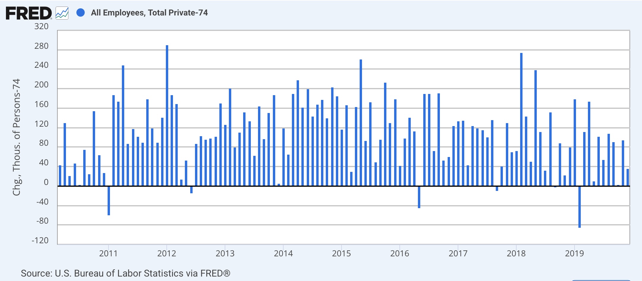
That 147,000 breaks down to 74,000 private jobs + 63,000 education (and 10,000 other). In the past six years, only 3 other times have public sector jobs (including education and all other government jobs) been such a large component of the total gain:


And the simple reason is that education employment is highly seasonal, with layoffs in May through July, and rehiring in August through October, as shown in the below graph where the non-seasonally adjusted numbers are in light blue, the seasonally adjusted ones in dark blue - and even then, I’ve had to divide the NSA numbers by 2 just to avoid the SA numbers being reduced to squiggles:


In June, “only” 271,000 education jobs were lost, which translated to a 63,000 SA gain. As one of Casselman’s correspondents pointed out, that may have to do with the fact that June started on a Sunday, so the reference week for the payrolls report was particularly early, and many school districts may not have ended their school year yet. In any event, regardless of the reason, that 63,000 gain is almost certainly going to be “paid back” next month.

So how bad really is a 74,000 private sector gain?

In the entire decade-long expansion before COVID, there were only 5 times that private sector jobs had fewer than 74,000 gains:


And there have only been 6 such times since the pandemic:


Now let’s zoom out a little bit. In the first 6 months of this year, 644,000 new private sector jobs have been created, plus 138,000 government jobs. Here’s how that compares with the entire 40 year history before COVID:


And here is how it compares post-pandemic:


In the entire 45 year period, *not once* has there been such anemic private sector growth in one half of the year except for during, just after, and the half year just before recessions.

Further, as shown above, private sector job growth tends to be slightly leading. That’s basically simple arithmetic, because total employment is a classic coincident indicator, while government employment lags. That’s because government entities generally have to balance their budgets, and for the first 3 to 12 months of a recession, they base hiring on the prior year’s tax receipts. Since during a recession, those receipts go down, governments have to make cuts that last up to several years after the recession is over.

Here’s the historical view of just public sector employment (the same as in the above) in two graphs:


And here is the post-pandemic view:


In each case government job losses continued for up to two years after the end of the recessions, and sometimes continued to increase during the early parts of the recession themselves. In other words, the early losses were concentrated in the private sector.

Put another way, when private sector employment gains wane, that is a warning signal. And private sector gains have waned so far this year.

I think that’s a little more than squint-worthy.

Before I finish, let me update another important graph. Below is nominal aggregate nonsupervisory payroll growth (red) compared with CPI (orange), together with real aggregate nonsupervisory payrolls (blue) through May (since we don’t have June’s CPI number yet), all normed to 100 as of March:


Nominally, aggregate nonsupervisory payrolls have only risen 0.3% since March, while consumer prices have risen that same percentage just through May. In other words, real aggregate payrolls look like they have been peaking this spring. And as I have pointed out many times in the past, a peak in real aggregate nonsupervisory payrolls has been an excellent metric for forecasting a downturn in real consumer spending, and with it, a recession.

So, far from being healthy or “resilient,” as Casselman contends, the June employment report had a number of important danger signals, only the most important of which I have detailed here.

Monday, July 7, 2025

Economically weighted ISM manufacturing + services indexes continue to warrant “recession watch”


 - by New Deal democrat


Last month the new orders components of the economically weighted ISM manufacturing and services indexes warranted the hoisting of a yellow flag “Recession Watch.” 

This month that continued.

To recap, because manufacturing is much less important to the economy than in the decades before the Millennium, the economically weighted average of the ISM services index (75%) as well as manufacturing (25%), especially over a three month period, has been much more accurate since 2000.

Last week the ISM manufacturing index for June came in at 49.0, and its three month average was 48.7. The new orders subindex came in at 46.4, and its three month average was 47.1. 

On Thursday the non-manufacturing index was reported at 54.2, and the new orders index at 51.3. The three month average for the headline index was 52.6, and for new orders 50.0.

Here is the manufacturing and services numbers for the past three years:


The economically weighted average for the month of June alone is 52.9, which is well into expansionary range. The average for the past three months is 51.6, which is still expansionary, but weakly so.

The new orders components of both indexes, however, are weaker:


The economically weighted average for June is 50.1, just barely into expansion. The three month average, however, is 49.3, up from 49.0 one month ago, but still contractionary. 


Note that while we came close last summer, at no point did either of the three month economically weighted averages tip into contraction, because the services component was only negative for one month.

In summary, the three month economically weighted average of new orders for the economy as a whole contracted for the second month in a row in June. Thus the “recession watch” caution remains in place. 

To reiterate my caveat from last month, treat the terms “watch” and “warning” the way you would for weather. A “watch” means that conditions are right, and the economy is at significantly heightened risk of a recession starting in the next few months. A “warning” would mean that a recession is likely, and almost imminently.

Last month I concluded this piece with the statement: “In the meantime, watch to see if the remaining short leading indicators to fall into place, most notably new jobless claims, consumer retail spending, employment in the goods-producing sectors, at very least a stalling in aggregate real payroll growth.” While some of those, notably new jobless claims and employment in goods-producing sectors, were positive last month; others - real retail spending, real spending on goods - did turn down, and aggregate real payrolls very likely have done so also, although we won’t know that for another week.