Tuesday, June 29, 2021

House prices continue to surge, with affordability near its worst since the Great Recession


 - by New Deal democrat

The FHFA and Case Shiller house price indexes for May and April, respectively, were released this morning. Because housing affordability is very much an issue, let’s take a look.


YoY the FHFA index is up 15.7%, and the Case Shiller national index is up 13.9%:
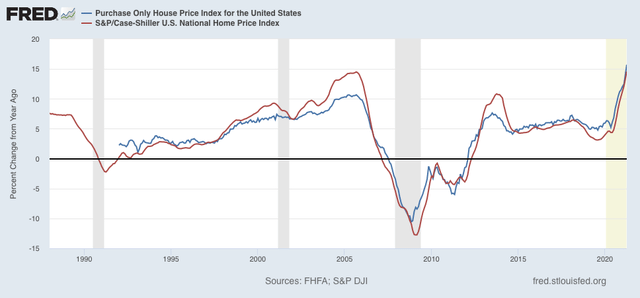

Not shown, but recall that last week the median price for new single family homes was reported up 18.1% YoY for May, and for existing homes up 23.6% YoY. This is on par with their most drastic increases during the housing bubble.

A quick estimate of how (un-)affordable housing is can be seen by dividing house prices by average hourly wages, i.e., how many hours of income does it cost to buy a typical house. Here’s a long term view of what all 4 indexes looked like normed to 1 as of May 2020:
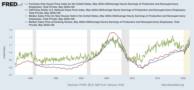

Note that existing home prices are only available to FRED from the NAR for the past 12 months. But it is quite clear that “real” wage-adjusted house prices are close to their most extreme measures during the bubble.

Another type of estimate, for the typical monthly mortgage payment, can be obtained by multiplying the indexes by the prevailing 30 year mortgage rate (important note: this does not produce the actual monthly mortgage payment, but is a reasonably close estimate):
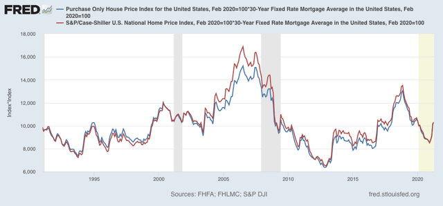

Here the news is much less alarming, as the typical monthly mortgage payment, while higher than a year ago, is nowhere near as high as it was during the housing bubble.

As a result, at 155.8, the NAR’s “housing affordability index” is close to its lowest (I.e., least affordable) reading since 2009, although it is higher than at any point during the housing bubble, when it was always below 150 and at its worst was just above 100:
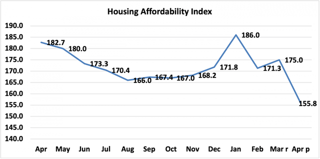

An important difference vs. the housing bubble is that there were many speculators in the market, buying simply on the expectation that prices would continue to rise, i.e., “everyone knows house prices only go up!” This time around there is no evidence of such speculation, although obviously there is some panic buying for fear of being “forever priced out.”

We have already seen a downturn in sales. I do not believe this level of prices can be maintained for long.

Monday, June 28, 2021

Coronavirus dashboard for June 28: comparisons with one year ago as “delta” spreads


 - by New Deal democrat

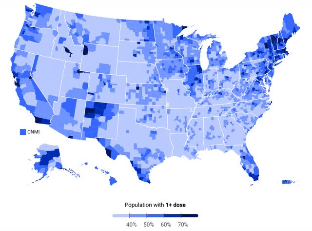
Let’s begin this installment with a look at vaccinations by county from a different source that a reader pointed me to last week, COVIDactnow


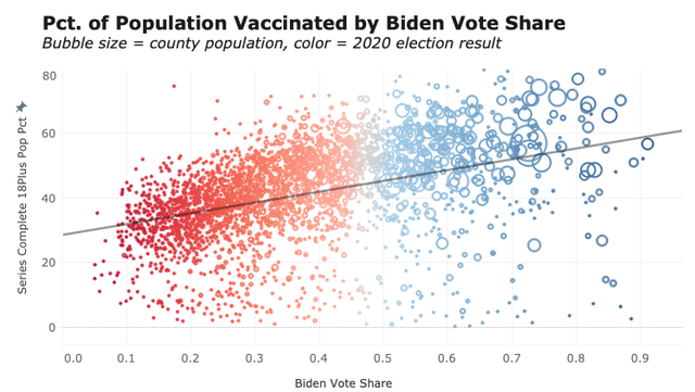
The urban/rural and Red State/Blue State divides are pretty obvious. Conor Kelly (whose work I was highlighting one year ago) also has a more detailed breakdown:


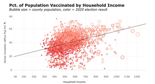
He notes that income level also correlates with vaccination rates even without taking partisanship into account:


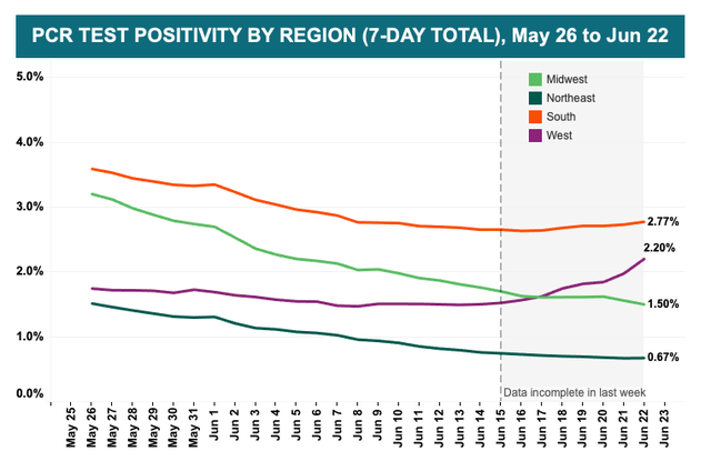
Kelly also notes that test positivity rates have also crept higher in the South and West regions where vaccinations have been lagging:


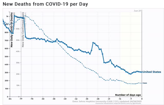
And indeed, when we look at the national level, both deaths and new cases have all but stopped declining:


Cases were declining at a rate of 1500/day up until several weeks ago. Now they have been declining a 1500/*week*, and may have bottomed 5 days ago.

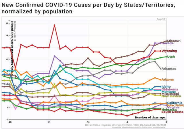
There are 16 States where cases are either flat or higher compared with where they were 2 weeks ago:


I expect this list to grow over the next week, since there are a number of States with numbers higher than they were 10 or 11 days ago. Note that several of the States have high vaccination rates - CA, NJ, VA, and NM - and in the case of the first 3 there may not be any significant increase, and all are at low levels, but are included for consistency.

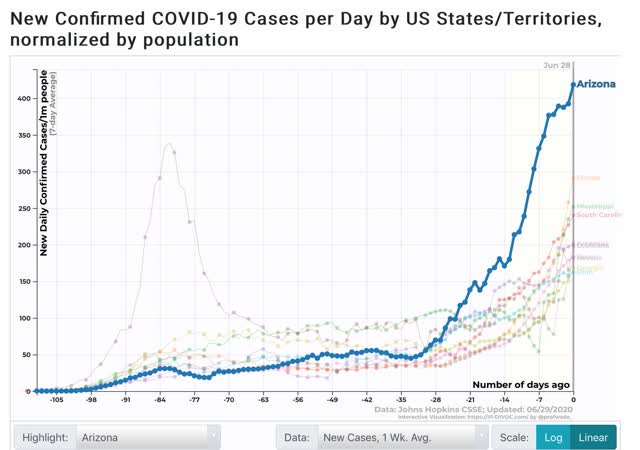
For comparison purposes, here is what the top 10 States for new cases looked like one year ago:


Note that the per capita rate was measured per 1,000,000 one year ago vs. per 100,000 now, so divide by 10 for the rate as measured in the current graph. In other words, by the current measure, the top 10 States had between 15 and 40 cases per 100,000, vs. 5 to 13 cases per 100,000 now.

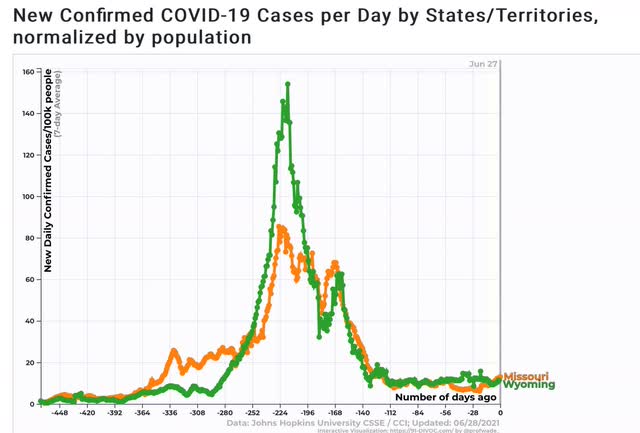
But several States, most importantly MO and WY, have just as high case rates as they had one year ago:


In the case of Missouri, their number of new cases per capita has doubled in the past 4 weeks, from 6.5 to 13.

Missouri is particularly instructive, because the State has terminated pandemic employment benefits to force people back to work under the misimpression that the pandemic is “over.” I predict a poor result.

My best guess at this point - and this is all anyone really has - is that the “delta” variant will only cause a small increase in most highly vaccinated States, except for several, notably California, with huge populations at high density (so easier for the variant to spread among those remaining unvaccinated). But the variant will likely cause a very large spike, although not as bad as last winter’s, among the least vaccinated States. I expect that Missouri will lead the way here, and we will have a very clear picture in about 4 to 6 weeks, unfortunately and needlessly at the cost of much misery and death.

Saturday, June 26, 2021

Weekly Indicators for June 21- 25 at Seeking Alpha


 - by New Deal democrat

My Weekly Indicators post is up at Seeking Alpha.

All of the important metrics for the economy remain positive.

But, in addition to supply chain issues, we have to start worrying about COVID again, because the delta variant has now taken hold in up to 8 States with rising new cases. All of those States have fewer vaccinations per capita than the national average, and most of them much below the average. By the end of July, I anticipate that it will be clear there is a new “wave” of cases in the relatively unvaccinated States. Aside from the human cost, it is unclear how much this will retard recovery in the economy as a whole.

As usual, clicking over and reading will bring you up to date, and bring me a little bit of change.

Friday, June 25, 2021

Real personal income and spending both decline in May - but that’s OK, as it was mainly expiration of stimulus; NBER likely to declare end of recession soon


 - by New Deal democrat

The last of the 4 monthly coincident markers for whether the economy is in recession vs. expansion was reported this morning for May. Let’s take a look.


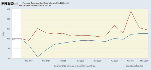
Personal income declined -2.0% in nominal terms, which on top of April’s decline of -13.1%, has taken back most, not by no means all, of March’s big 20.7% gain. The Census Bureau specifically noted in its press release that “the decrease in personal income for May reflected declines in pandemic-related assistance programs.”

Personal spending was unchanged in nominal terms. But both are still ahead, by 8.8% and 5.3%, respectively, of where they were in February 2020 just before the pandemic hit:


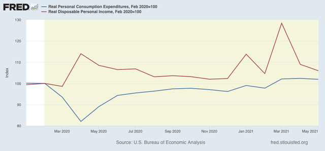
The price deflator, i.e., the inflation measure used in this release, was -0.4% (meaning in essence a 0.4% increase in prices). The below graph takes that into account and shows both real personal consumption expenditures (spending) and real disposable personal income:


Again,both real income and spending are above their pre-recession levels by 6.0% and 1.9%. 

Simply put, in this crisis decisive action by the government to put cash in consumers’ hands has worked.

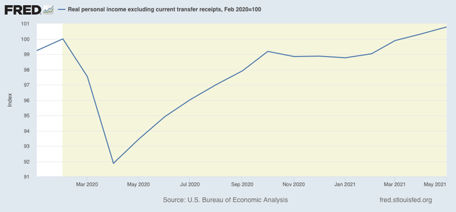
 The “official” recession vs. expansion metric is real personal income less transfer receipts (things like unemployment insurance), shown below:


This was already above its pre-recession level in April, and with its 0.4% gain in May, is now 0.8% ahead of February 2020. 

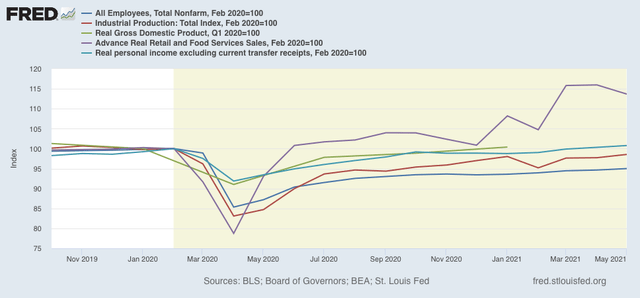
Finally, here are employment, industrial production, real gdp, real retail sales, and real personal income less transfer receipts together:


The last two are already above their pre-recession levels. Real GDP for Q2 is also expected to exceed its pre-recession level when it is reported next month. While industrial production is down by -1.4% from February 2020, its manufacturing component is only down -0.3%. Only employment remains severely down.

Thus, while “happy days are [certainly not] here again” as to employment, unless there is a nasty negative surprise next month, I expect the NBER to shortly declare that the pandemic recession has ended, most likely with the trough date in April 2020.

Thursday, June 24, 2021

New jobless claims stall, adding to the evidence that stalling vaccinations and case counts are having an economic effect


- by New Deal democrat

New jobless claims have been the most important weekly economic datapoint this year, as they have correlated strongly with vaccination progress. Unfortunately, that progress has largely stalled in the past month, and now new jobless claims appear to have stalled as well.

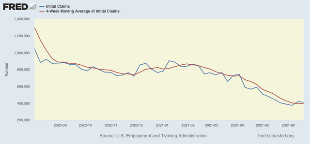
This week new jobless claims declined 7,000 to 411,000, 37,000 higher than the pandemic low of 374,000 set two weeks ago. The 4 week average of claims also rose by 1,500 above last week’s pandemic low to 397,750.


At the peak of the pandemic lockdowns, new claims were running 6 million to 7 million per week. Here is the trend since the beginning of last August:


From late February into May, claims had trended down an average of roughly 100,000 per month. This had slowed to roughly 50,000 per month, indicating that the “opening” of the economy is getting nearer to an endpoint. As indicated above, since 5 weeks ago, the trend is now sideways. This also implies a sharp slowing down of net job creation from the last 3 months’ levels.

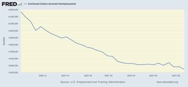
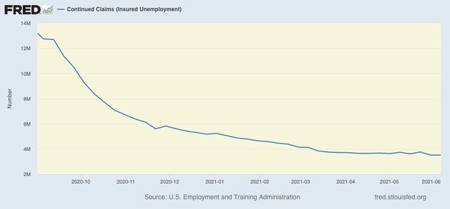
The story is different for continuing claims, which are reported with a one week lag, and lag the trend of initial claims typically by a few weeks to several months. These set a new pandemic low, falling 144,000 to 3,390,000.  At the same time, over the past 3 months these have only declined about 10% from roughly 3,750,000:


At least some of this decline *may* be due to many States’ termination of all extended jobless benefits due to the pandemic.

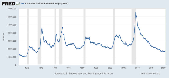
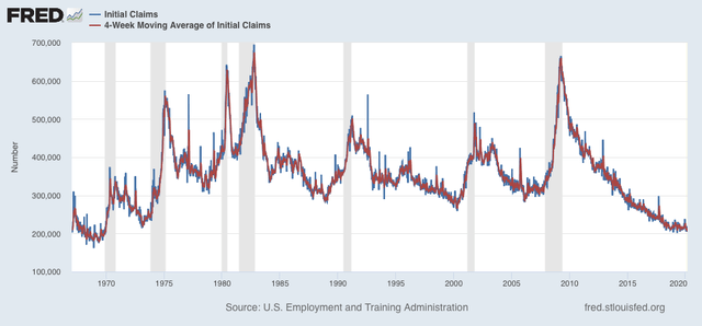
A long term perspective shows that these are equivalent to the worst levels of most previous recessions, or early in the expansions, versus at 2,000,000 or below later in strong expansions:


As I wrote two weeks ago and reiterated last week, “I think we are going to see two tracks going forward from here, as near-normalcy does return to the more vaccinated parts of the country, while attempts to return to normalcy fail in the laggard regions.”

Last week I further wrote, “Over the next 6 to 8 weeks, these States [in the South and the mountain West with low vaccination rates] are ripe for a serious outbreak of the highly infectious new ‘delta’ variant of the disease,” which in turn is going to lead to many people “re-cocooning” themselves in those areas, and thus decreasing economic activity there. This will result in there being 2 separate economic tracks in regions of the US depending on vaccinations and new outbreaks.

[As an aside, when Seeking Alpha cross-posted my note last week, a bunch of RW nutjobs completely lost their minds, a reminder of how much politicized irrational insanity is out there. As a result, I have terminated that arrangement.]

This week’s jobless claims data supports that argument. My final objective  for claims to average 325,000 or below, which would signify a return to normal expansion levels in the past 30 years, increasingly appears to be a ways off.

Wednesday, June 23, 2021

New home sales edition: the remedy for high prices is . . . high prices


 - by New Deal democrat

New home sales confirmed this morning what we learned from existing home sales yesterday, and from housing permits and starts earlier in the month: in terms of new construction and sales, the housing market has peaked.


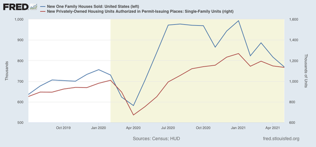
To the numbers.... New single family home sales declined -48,000 on a seasonally adjusted basis to 769,000 annually, the lowest level in 11 months (blue in the graph below):


New home sales have declined by nearly 1/4 (-22.6% to be more precise) off their January peak. They thus confirm the decline shown in the much less noisy single family permits series (red).

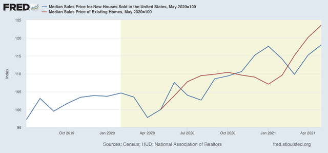
Median sales prices, however, continue to boom, up 18.1% YoY (blue) vs. 23.6% for existing homes (red):


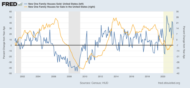
Comparing sales with inventory (gold in the graph below), we can see that sales peak and bottom first (shown YoY in the graph below, but the same is true of the absolute values):


Inventory of new homes for sale bottomed last August and is now up 7.1% YoY.

As I said yesterday, the remedy for high prices is . . . high prices. I expect sales to continue to decline until the price situation is addressed.  

Coronavirus dashboard for June 23: And so, it (the delta wave) begins


 - by New Deal democrat

[Note: New home sales will be reported later this morning, and I will post on that report afterward.]


There is now more evidence that the “delta” variant of COVID is taking hold in the unvaccinated regions of the country, and case counts are increasing accordingly.

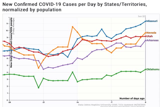
Below are the 5 States that have all seen unequivocal increases in new cases over the past 2 to 4 weeks:


*All* of these except for Nevada are among the lowest 1/3rd of States for vaccinations. Arkansas, at 33% fully vaccinated, is the 3rd worst. Oklahoma and Utah, at 37%, are tied for 8th worst, and Missouri, at 38%, is tied for 12th worst. Only Nevada, at 41%, is closer to the middle of the pack.

As an aside, the 2 worst States for vaccinations, Mississippi at 29% and Alabama at 32%, almost certainly are in worse shape than their “official” new case counts. Although I won’t post graphs, both are among the 10 worst States for the rate of testing, and both are among the 10 highest States for the rate of positive test results (along with 4 of the 5 States above experiencing new outbreaks). Their rate of positivity hasn’t started significantly increasing - yet.

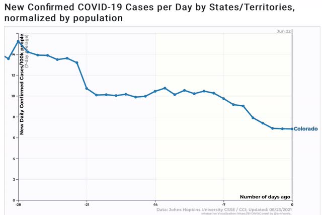
Because I am not a DOOOMsayer, I want to contrast this with the case of Colorado, which has a good  full vaccination rate at 50%, is nearly surrounded by States doing poorly, and yet has case counts that have continued to decline, albeit from high levels:


Colorado will make a very good bellwether for whether high levels of vaccinations will slow or stop the delta spread. 

Tuesday, June 22, 2021

The remedy for high house prices is . . . high house prices


 - by New Deal democrat

I normally don’t pay much attention to existing home sales, since they tell us much less about future economic activity than new home sales, but since there is nothing else on the calendar today, let’s take a brief look.


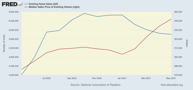
Existing home sales declined again, by 0.9%, in May, to a 10 month low (blue in the graph below). Prices, however, continued to soar (red):


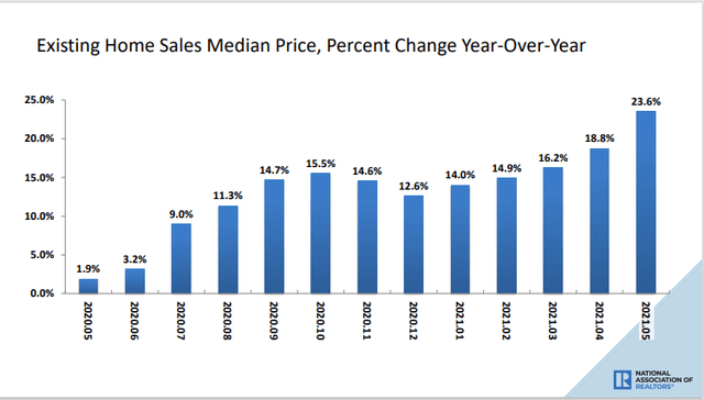
Prices are now up 23.6% YoY!:


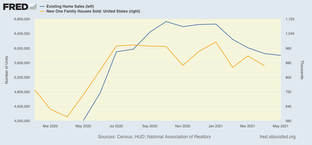
Existing home sales have clearly joined the decline already evident in new home sales (gold) and also housing permits and starts (not shown):


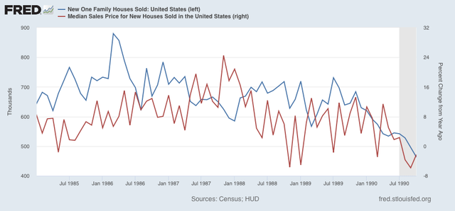
As always, sales lead prices. If sales continue to trend much lower, expect prices to reverse course soon. In this regard, just for reference, here is my template of the late 1980’s for the kind of sales and price decline I am expecting as a first estimate:


After sales peaked, with a delay the YoY increase in prices declined by more than half, and indeed prices only increased on average about 1% a year (less than the rate of inflation) in the last several years before the recession.

Monday, June 21, 2021

Coronavirus dashboard for June 21: watching the States with flat or increasing rates of new cases


 - by New Deal democrat

For the past week I have been sounding the alarm about the economic impact of the “delta” variant of COVID. We are probably already beginning to see its impact on the case count in several States, with many more primed to join the pack, so that is what I want to focus on today.


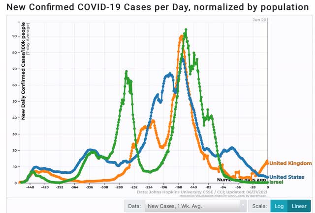
To begin with, let’s compare the 3 countries that have had the most aggressive vaccination programs: the US, UK, and Israel:


Israel has defeated the virus. It’s case count is down to virtually zero. Vaccinations work! But thanks to the “delta” variant, the UK has seen more than a tripling of new cases over the past month. That is where the future likely lies for at least the unvaccinated portions of the US.  One difference between the two is that the UK emphasized maximizing the population with one dose, so when the variant hit, relatively few were fully vaccinated.

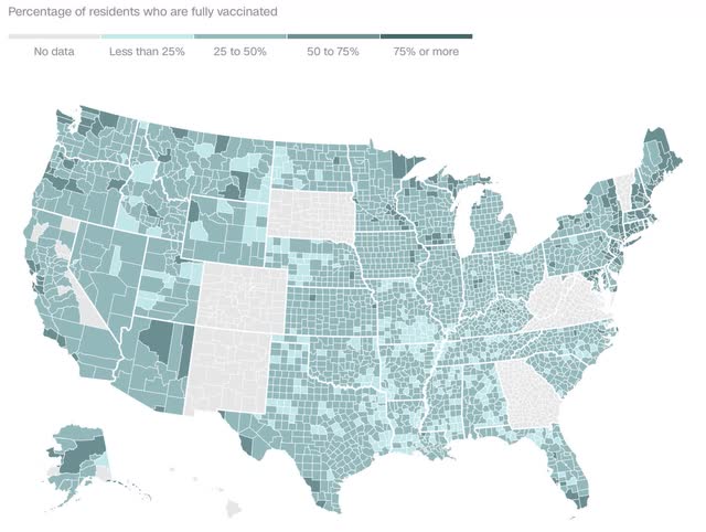
Here is what the county-by-county breakdown of vaccinations in the US looks like (note that several States do not fully report, so are greyed out):


Among other places, note the many counties along the lower Mississippi River and in the panhandle of Florida in which less than 25% of the population is fully vaccinated. And it appears that it is along this route: specifically southern Missouri, northern Arkansas, and eastern Oklahoma and Kansas where the “delta” variant may be making its earliest impact. 

In particular, as noted in This report by a local television station: “The [Missouri] state dashboard says new cases are up by about 20.3% over the past seven days. The positivity rate has jumped 1.2 percentage points in that same time, while tests are down 4.6%.” According to other reports,  
“ A swath of southern Missouri is seeing a big rise in coronavirus cases and hospitalizations  at just the wrong time - as tourists eager to get out after being cooped up for a year make their way to popular destinations such as Branson and Lake of the Ozarks.
....
  most southern Missouri counties are well short of 40%. Branson sits in Taney and Stone counties, where the vaccination rates as of Wednesday were 27.4% and 28.4% respectively. Miller County, at Lake of the Ozarks, had a vaccination rate of 22.9%.

“We think that with the Delta variant here, those that aren’t vaccinated are just sitting ducks," said Steve Edwards, CEO of CoxHealth, which operates several hospitals in the region.


To gauge where the variant may be beginning to show, below are the 17 States where there has been no decline in new cases over the past 2 weeks, divided between those which may have declared premature victory, those where the virus is just as rampant as last summer, and those in between.

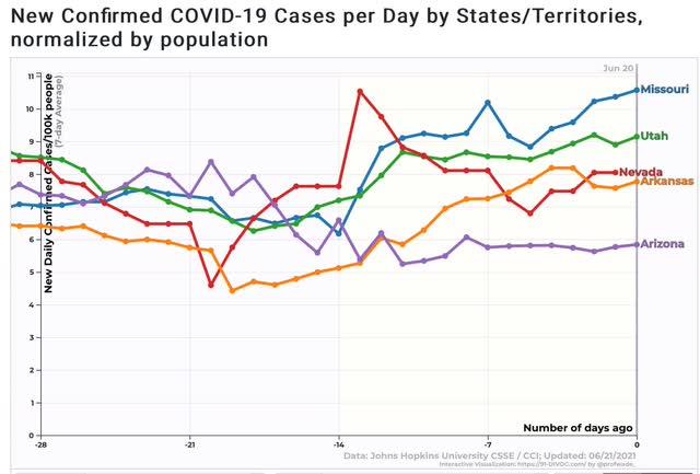
There are five States - MO, AR, AZ, NV, and UT - where the virus is just as widespread as last summer:


Note that in 3 of them - MO, AR, and UT - the number of new cases has actually risen. 

Next, here are the 7 States that may have declared premature victory:


In all of these States, new cases are averaging less than 3.5 per 100,000 daily. At all previous times during the pandemic, that would be excellent. At less than 1 per 100,000, Vermont is outstanding! - but, to be consistent, that rate has not declined in the past 2 weeks.

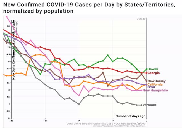
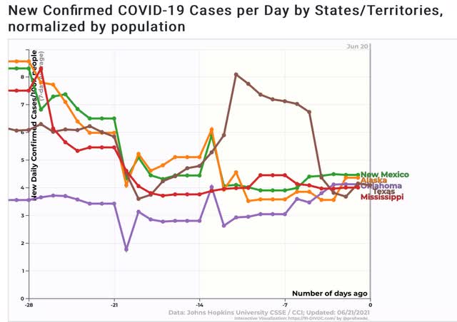
Finally, here are the 5 States that are in between, all averaging between 4 and 5 cases per 100,000 population daily:


Note that in Oklahoma, and possibly New Mexico as well, cases are increasing.
In particular, three of the States that show increasing new cases - OK, MO, and AR - are contiguous, and all show low vaccination rates.

All of these States bear watching, the ones with higher rates to see how bad the next wave gets, and the ones at the low end to see if their higher rates of vaccinations stem the tide, or whether they too see significant upturns. 

Saturday, June 19, 2021

Weekly Indicators for June 14 - 18 at Seeking Alpha


 - by New Deal democrat

My Weekly Indicators post is up at Seeking Alpha.

There was a little more deterioration in the long leading indicators, but they are still positive.

Meanwhile, the new more infectious “delta” variant of COVID raises the real possibility that the relatively unvaccianated sections of the country could go backward, with increased cases and deaths, and people resuming caution about social activities; which also means lower economic activity.

As usual, clicking over and reading will bring you up to the virtual moment, and bring me a few bucks with which to pay my bar tab.

Friday, June 18, 2021

Coronavirus dashboard for June 17: big progress since 1 year ago; big “Delta” challenge still ahead


 - by New Deal democrat

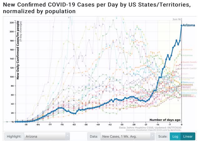
One year ago today, in my Coronavirus Dashboard for June 17, here was my graph of cases:


Which I described as:

As shown in the graph above, [after Arizona at 214 per million population] the remaining “top 10” are all States in the Confederacy, High Plains, and Mountain West. In order, (showing rates of new infections per million as of June 15 in parentheses) they are: Alabama (156), Arkansas (150), South Carolina (125), Louisiana (127), North Carolina (117), Utah (102), Mississippi (98), Florida (83), and Iowa (83).
One year later, the scale of the current pandemic is an order or more of magnitude lower. But the regions with the worst outbreaks remain the same (sadly, ingrained behavior patterns are incredibly resistant to change).


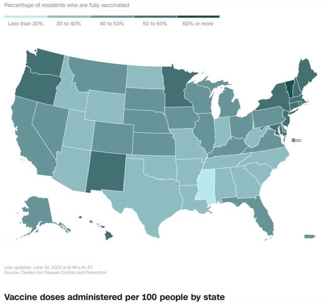
Let’s begin the current situation with CNN’s graph of vaccination rates in the 50 States plus DC and PR:


The regional disparities are completely obvious. While in the US as a whole, 96 doses have been administered per 100 population, the range varies from Vermont at close to 140 doses to Mississippi at about 62 doses. Basically in Mississippi plus all of the other States less than 40% fully vaccinated remain at risk for a renewed outbreak of the virus at any time.

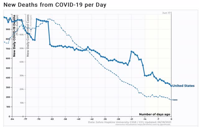
Here is the US situation as to the 7 day average of both new cases and deaths:


Progress on new cases has slowed considerably, while deaths, which lag by about 4 weeks, are still declining. Deaths will probably follow cases to a near halt in the decline at about 300 deaths per day.
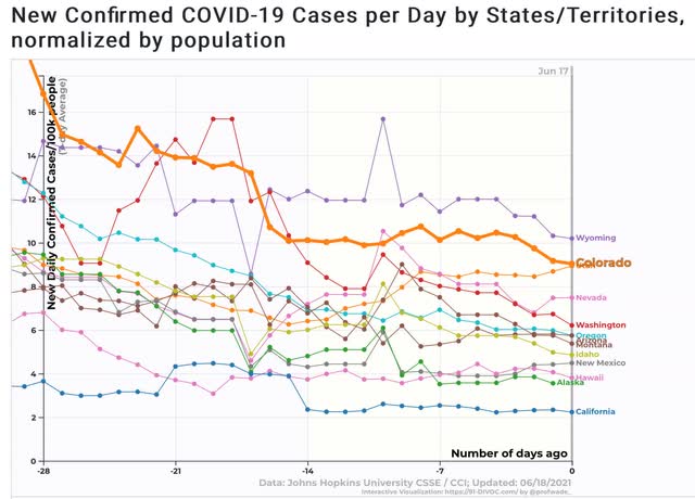
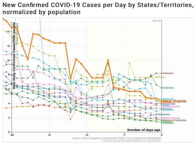
Because of the regional differences, below are new cases for each of the four US regions.

Northeast:


Midwest:


South (including DE, MD, DC, and VA):


And West:


Let’s break the above down by ranges of new cases [NOTE: since 1 year ago 91-DIVOC was measuring per 1 million, and now they measure by 100,000, current rates must be multiplied by 10 to compare with the graph from 1 year ago]:

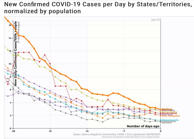
Under 2 per 100,000: VT, SD, CT, MA, MD, WI, NE, VA, DC, PR, NH, SC

2 to 4 per 100,000: NY, IL, CA, MI, MN, RI, TN, PA, OH, IA, NJ, ME, DE, ND, GA, AK, NC, TX, HI, KS, MS

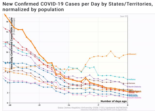
4 to 6 per 100,000: OK, AL, NM, WV, KY, IN, ID, MT, AZ, OR

6 to 8 per 100,000: LA, WA, NV, FL

8 to 10 per 100,000: AR, UT, CO, MO

Over 10 per 100,000: WY

While new cases do not closely track the vaccination rate, the correlation remains obvious, as the best States are all of the Northeast (under 3 cases per 100,000) plus the Mid-Atlantic (DE, MD, DC, and VA), upper Midwest, and California. The worst States are in the Deep South and West, plus Missouri. But there are surprises, like SD and SC doing very well, while WA and CO are doing relatively poorly.

As the “Delta” variant becomes more widespread in the next 4 to 8 weeks, it will be a real challenge for the relatively unvaccinated States. At the same time, all but 12 of the States are currently below even the lowest level of new infections one year ago, and Wyoming’s now is only about 1/2 of Arizona’s last summer at this time - although it would have been in the top 10. 

Thursday, June 17, 2021

The decline in new jobless claims stalls, as the “delta” variant is ready to strike the unvaccinated States


 - by New Deal democrat

New jobless claims continue to be the most important weekly economic datapoint, as increasing numbers of vaccinated people and outdoor activities have led to an abatement of the pandemic, with both new infections and deaths at their lowest point since the onset of the pandemic in March 2020. I’ll have more to say on the intersection of the pandemic with claims in the conclusion.

My final objective is for claims to average 325,000 or below, which would signify a return to normal expansion levels in the past 30 years.

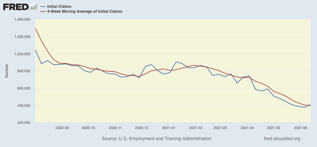
Turning to this week’s report, new jobless claims rose 37,000 to 412,000, the first increase in weekly claims in nearly 2 months. The 4 week average of claims declined by 8,000 to 395,000, a new pandemic low. (Note that I have discontinued comparisons of non-seasonally adjusted claims, as the period of lockdown distortions YoY has passed.)


At the peak of the pandemic lockdowns, new claims were running 6 million to 7 million per week. Here is the trend since the beginning of last August:


From late February into May, claims had trended down an average of roughly 100,000 per month. In the past few weeks, this has slowed to a rate of decline of roughly 50,000 per month, indicating that the “opening” of the economy is getting nearer to an endpoint. This also implies a slowing down of net job creation from the last 3 months’ levels. At their current level, claims are consistent with early mid-expansion levels in the past:


Continuing claims, which are reported with a one week lag, and lag the trend of initial claims typically by a few weeks to several months, rose 1,000 from last week’s revised pandemic low of 3,517,000. Still, over the past 2 months these have only declined about 7% from roughly 3,750,000:


The long term perspective again shows that these are equivalent to the worst levels of most previous recessions, or early in the expansions, versus at 2,000,000 or below later in strong expansions:


I want to conclude with some remarks on how the new “delta” variant of COVID, together with the premature “victory” declaration in many States with low vaccination rates, who have also terminated enhanced unemployment benefits, may change the picture for the worse from here.

I wrote last week that “I think we are going to see two tracks going forward from here, as near-normalcy does return to the more vaccinated parts of the country, while attempts to return to normalcy fail in the laggard regions.”

Across the Deep South and most of the interior West, plus West Virginia, Indiana, and Missouri, less than 40% of the population is fully vaccinated. Most likely less than 50% of the population has received even one dose. Over the next 6 to 8 weeks, these States are ripe for a serious outbreak of the highly infectious new “delta” variant of the disease. Many people in those States are probably going to retreat to their prior, cautious behaviors to protect themselves - and that means decreased economic activity and increased layoffs in those States. The cutoff in pandemic benefits will further curtail spending in those States, which will also lead to increased layoffs.

In short, I am even more convinced that the US is headed towards 2 separate tracks: one of growing vaccinated regions, and one of stagnating or renewed contraction in the unvaccinated regions.

Wednesday, June 16, 2021

May housing permits and starts continue down from recent peak


 - by New Deal democrat

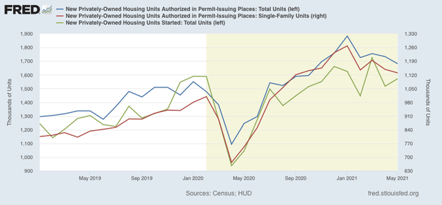
In May housing permits (blue in the graph below), including the least volatile single family permits (red, right scale), continued to decline from their January peak. Meanwhile the more volatile and slightly lagging housing starts (green) increased, but remained below their March peak:


The level of construction activity as high as or higher than its pre-pandemic peak is continuing. On the other hand, with a 10% decline in permits, and 9% in starts, the minimum decline to be consistent with a possible upcoming recession has nearly been met (while a 20% decline is more typical). For now I interpret this to mean a sign of a slowing down of economic growth next year.

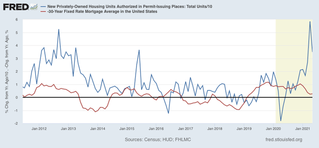
Finally, here is the YoY change in mortgage rates (red), inverted so that up = economic positive, and down = economic negative, compared with total permits (blue)/10 for scale:


As I have said many times before, mortgage rates lead permits and starts. The artifact of comparisons with the pandemic lockdown months will end next month, at which time I expect permits to be much more in line with their historical relationship with interest rates than they have been in the past few months.

Tuesday, June 15, 2021

Industrial production on the verge of exceeding pre-pandemic level


 - by New Deal democrat

Industrial production is the King of Coincident Indicators. It is the single datum that most frequently coincides with the NBER determination of the beginning and end of recessions.


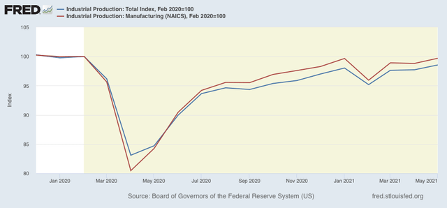
In May, total production increased +0.8%. Manufacturing production increased +0.9%. Both current readings are the highest since the onset of the pandemic:


Total production is only 1.4% below its February 2020 level, and manufacturing production is a mere 0.3% below that level.

If there is another positive report next month, exceeding the February 2020 level, and Q2 GDP is as positive as has been forecast, then the NBER may well decide that the pandemic recession has officially ended (with the most likely trough date being set at April of last year).

May retail sales decline, but 10%+ gain in retail sales since the onset of the pandemic remains intact


 - by New Deal democrat

[Note: I’ll comment on industrial production in a separate post later]

I feel like I could simply repost my retail sales piece from one month ago, because the story is the same: at first glance, May’s retail sales report, like April’s, looks like a big miss, as sales declined -1.3% nominally, and after adjusting for inflation, declined -2.0%.

But the important point is that the big jump in March didn’t get taken back.  As I wrote then: “if the big March gain in sales isn’t taken back in the next month or two, then there’s likely to be a similarly large jump in employment by the end of summer.” Further, I have fully expected the big jump in sales and income fueled by stimulus payments to peter out. In fact, some significant declines for a few months might actually be a *good* thing. Let’s take a look, and I’ll explain why.

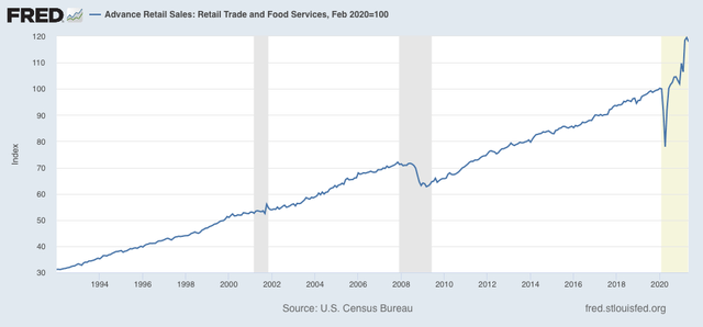
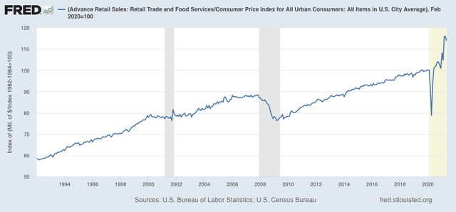
Here are nominal retail sales since the modern series started in 1994:


It’s impossible to miss that there is a huge break to the trend - to the upside - due to the stimulus payments last year, and especially, this year. Retail sales are 18% higher than they were in February 2020. That kind of abrupt, huge increase is going to lead to shortages, which in turn are going to lead to rationing by price - i.e., inflation. A decrease to closer to the long term trend is still going to be better than the situation before February 2020, and won’t give rise to so much inflationary pressure.

The big jump still exists even after we figure in consumer inflation, up 12% since February 2020:


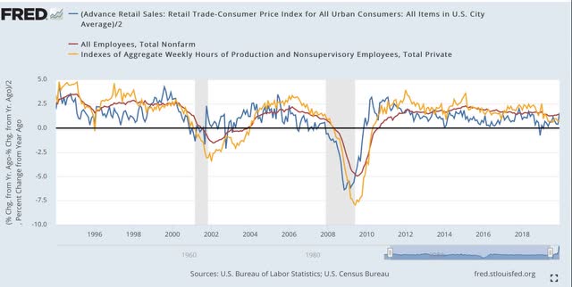
Now, let’s turn to employment, because as I have pointed out many times, real retail sales (blue) tend to lead employment (red) and aggregate hours (gold) by about 3-4 months. Here’s the long term YoY look from 1993 through the end of 2019:


The long lags after the 2001 and 2008 recessions reflected the “China shock” as manufacturing jobs in particular were re-sourced to China in large wages after both recessions.

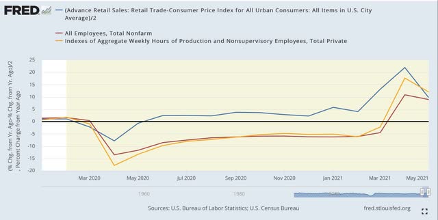
Next, here is the monthly update since the beginning of 2020 (note the huge difference in scale!):


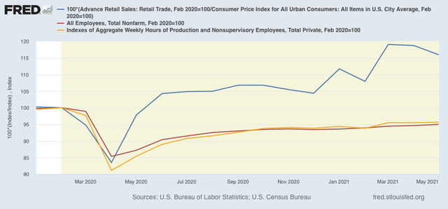
But that there is likely to be a continuing big YoY jump in jobs in the next several months is hardly surprising, given the 22 million loss in jobs in April 2020. So the below graph compares the absolute data, normed to 100 as of February 2020:


The most important takeaways are that, with the stimulus gains “sticking” so far, the large monthly jumps in employment are likely to continue. At the same time, there are legitimate inflationary pressures, as (1) there has been a quick, continuing 10%+ jump in demand; and (2) demand for new employees as indicated by the JOLTS reports of record job openings have remained unfulfilled for a variety of reasons (including lack of child care during in-home schooling) that is requiring big jumps in wages to attract applicants.

Monday, June 14, 2021

Travelin’ man


 - by New Deal democrat

No economic news today, and I’m traveling. 

Regular economic nerdiness will resume tomorrow.

Saturday, June 12, 2021

Weekly Indicators for June 7 - 11 at Seeking Alpha


 - by New Deal democrat


My Weekly Indicators post is up at Seeking Alpha.


Despite the spike in consumer prices in May, long term interest rates like in mortgages declined, largely taking back the increase that occurred earlier this year.


As usual, clicking over and reading will bring you up to the moment, and bring me a penny or two for my efforts.