Tuesday, July 30, 2019

June 2019 personal income and spending


 - by New Deal democrat

The wage-earner/consumer remains in decent shape, and a lack of inflation (continued low gas prices!) continues to be able to hide a multitude of sins. That’s the message from this morning’s June report for personal income and spending.

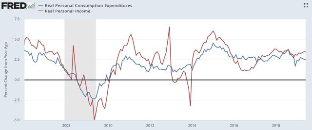
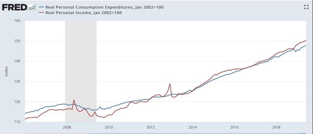
Nominally, income rose +0.4%, while spending rose +0.3%. Since inflation as measured by the PCE price index only increased 0.1%, that means both real income and real spending rose +0.3 and +0.2%, respectively:


Here’s the same data YoY:


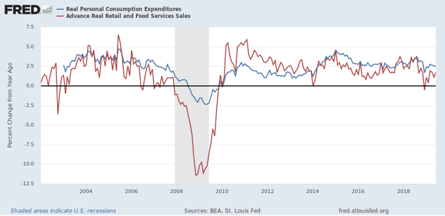
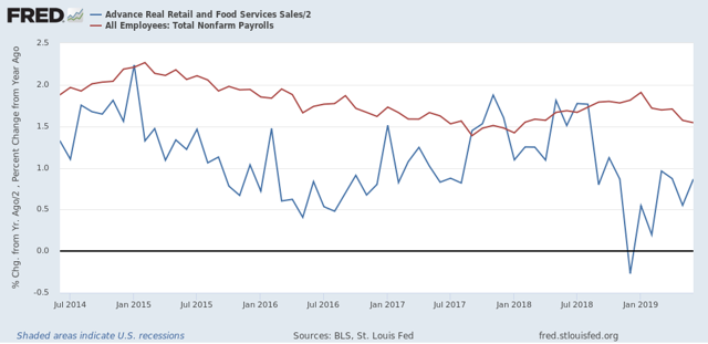
As I’ve written about many times over the past ten years, earlier in the cycle retail sales tend to grow more than the broader measure of personal spending; later in the cycle retail sales decelerate first. Here’s what that looks like updated through June:


This continues to look like a later-cycle consumer who is in pretty decent shape for the moment. And probably will be until either inflation picks up, or international trade weakness bleeds into a broad producer-led slowdown.

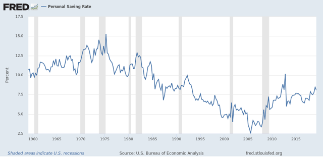
One final note. Something interesting is happening with the savings rate (i.e., the percentage of their income that people don’t spend) — it has been gradually rising, by a total of 2%, over the past several years. Why is that interesting? Because, here is the long term picture:


An increase in personal saving over the course of an economic expansion is something that hasn’t happened in almost 50 years! I’m not sure what exact dynamic is in play, so I won’t commment further. But it is very interesting, and I’m mulling it over.

Monday, July 29, 2019

Trump’s trade wars can still lead to a producer led recession


 - by New Deal democrat

I wrote a piece last week for Seeking Alpha explaining that, while the consumer side of the economy is doing reasonably well, a recession could still com in via the producer side.

https://seekingalpha.com/article/4278010-producer-led-recession-remains-viable

As usual, clicking over and reading should be educational for you, and puts a penny or two in my pocket.

Thus, the idea that no recession can happen absent a 20% YoY slide in new home sales is not correct. In fact, the 2001 recession happened with only a 10% decline from the very top to bottom in sales (and less than that YoY) that ended about 6 months before the recession even began. The decline in new home sales from top to bottom in 2018 was similar.

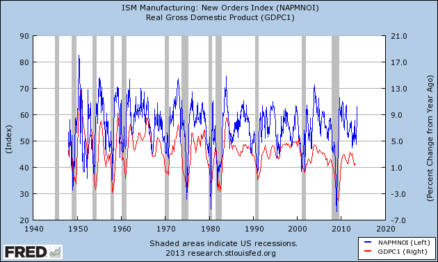
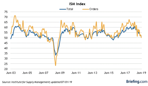
One item that didn’t make it into that post was to note that the ISM manufacturing index, especially the new orders subindex, should give early warning of any producer downturn.


ISM won’t let FRED publish their data anymore, so here’s a graph I created back in 2012 or so showing the relationship going all the way back to 1948. Note that the new orders subindex can decline to about 45 and still be a false positive. In 2000-01, it declined to 40 before the recession actually began:


As of last month it stood at exactly 50.0, as shown in the more updated graph of the new orders subindex from Briefing.com:

The July ISM index will be released on Thursday. The average of the regional Fed indexes is a hair above 0, with the final region - Texas - due to report later this morning. I’ll update the average once they report. 
UPDATE: New orders in the Texas manufacturing survey increased slightly. This is enough to keep the average of the five regions just slightly positive.

Saturday, July 27, 2019

Weekly Indicators for July 22 - 26 at Seeking Alpha


 - by New Deal democrat

My Weekly Indicators post is up at Seeking Alpha.

The short leading indicators have been particularly noisy recently, and they changed again in the past week.

As usual, clicking over and reading not only should be educational for you, but helps reward me with a penny or two for my efforts.

Friday, July 26, 2019

Both long leading components of Q2 GDP declined UPDATED with revisions and further comments


 - by New Deal democrat

The headline number for the first estimate of real GDP in Q2 2019 was 2.1%, as I’m sure you’ve read elsewhere.

As is usual, I’m not so interested in what is, after all, what the view in the rear view mirror is, as what the leading components can tell us about what lays ahead.

In that regard, both leading components of GDP declined.

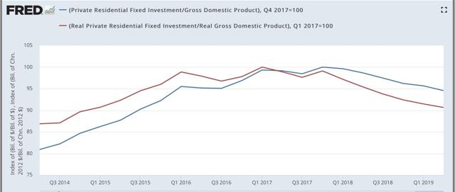
- Real private fixed residential investment declined at a -1.5% rate annualized. This is the 6th quarter in a row of a decline in that number. In the past half century, declines this long have typically been seen either right before or right after a recession has started - although the magnitude of the decline has been smaller.

UPDATE: Here is private fixed residential investment measured both nominally and in real terms as a share of GDP:

Nominally this is down about 5% from peak; in real terms about 10%. This is far short of what is typically the case typically going into recessions, but it *is* on par with the producer-led  2000-01 period.

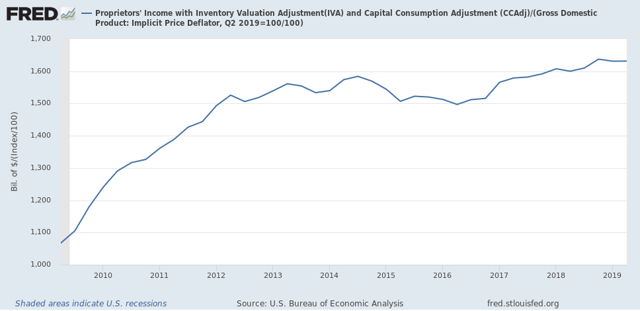
- Proprietors income (a proxy for the more reliable corporate profits, which won’t be released until next month) rose 0.6% nominally. Since the GDP deflator rose 2.2%, this means that “real” proprietors income declined. UPDATE: the 2.2% figure was annualized. Thus the “real” number was essentially flat, but is below its recent peak of Q4 2018:


I will update later once graphs are available. For now, the important takeaway is that one long leading indicators in the GDP release declined, and the second was flat but below peak level,  *consistent with* (but not necessarily implying) a recession either being imminent, or possibly not occurring until next year.

Thursday, July 25, 2019

Initial claims ending July 20: still positive


 - by New Deal democrat
I have started to monitor initial jobless claims to see if there are any signs of stress.

My two thresholds are:

1. If the four week average on claims is more than 10% above its expansion low.
2. If the YoY% change in the monthly average turns higher.

Here’s this week’s update.


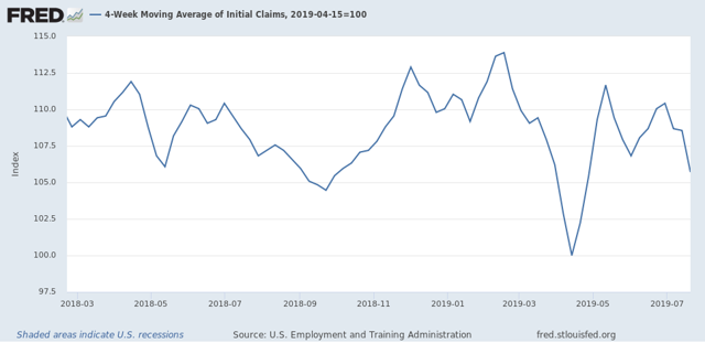
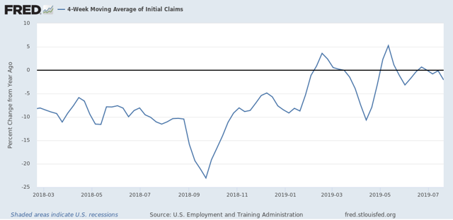
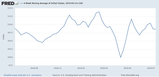
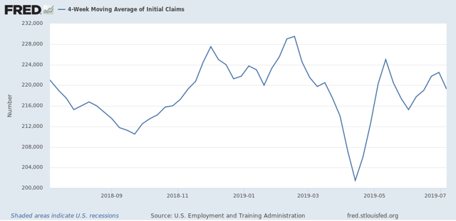
Initial jobless claims last week were 206,000. This is close to the bottom range for the past 18 months. As of this week, the four week average is 5.0% above its recent low: 


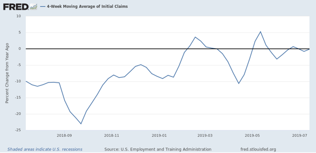
and at 213,000, is 4,500, or -2.1%, lower than this week last year: 


This remains positive.

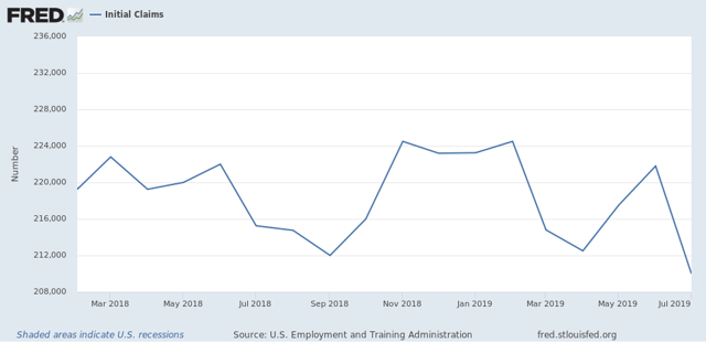
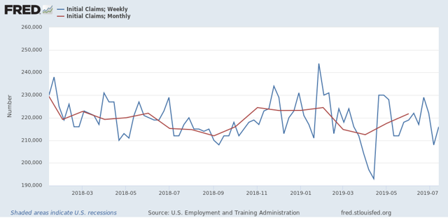
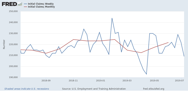
Last July, initial claims averaged 215,250. Through the first three weeks, it is 210,000 this year, which is also positive: 


Claims in the final week would have to be about 230,000 or higher for the entire month of July to be negative (higher) YoY.

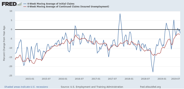
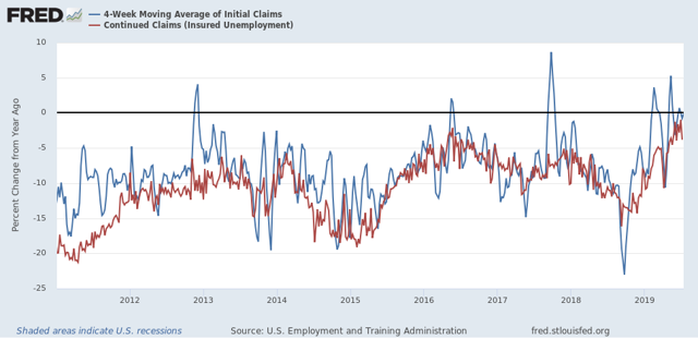
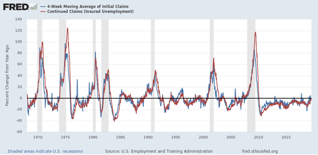
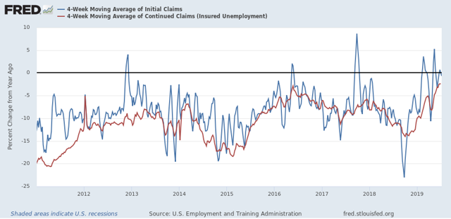
Finally, let’s compare the YoY% change in initial claims (blue) with continuing claims (red):


Comparisons have been  getting closer to crossing the threshold from lower to higher,  but for the past two weeks have trended a little mobster.  This. week the  comparison was -2.9% YoY.  A longer term view continues to show that - so far - this is most consistent with the 1984, 1994, and 1996 slowdowns, and not a recession:

Wednesday, July 24, 2019

Housing has bottomed


 - by New Deal democrat

With the release of new home sales this morning, and existing home sales yesterday, it is increasingly apparent that housing has bottomed - just as I said a number of months ago that it would sometime this spring.

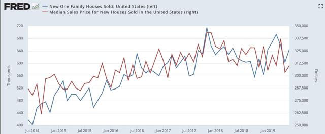
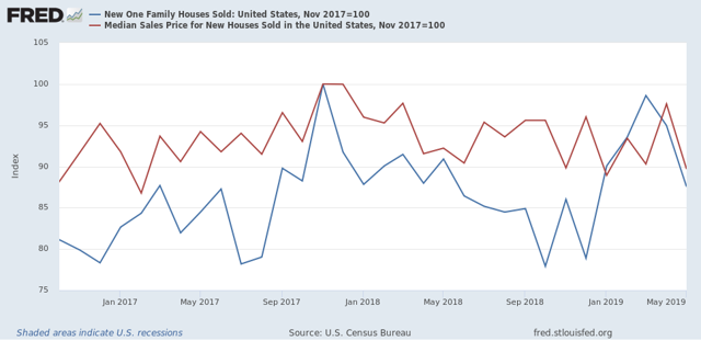
To the graphs! New home sales (blue in the graph below) bottomed last October, at 557,000 units annualized. As of June, they were at 646,000:   


This isn’t as good as earlier this spring, but is better than every other reading in the past 12 months. Meanwhile prices, which typically lag sales, bounced back from May’s 12 month low, but it is not clear at all if the trend is reversing yet.

Here’s the same data presented YoY, so that it is easier to see the trend:


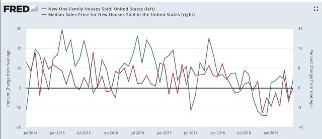
Both sales and prices have bounced back to positive (sales) or unchanged (prices) YoY from their worst comparisons last autumn.

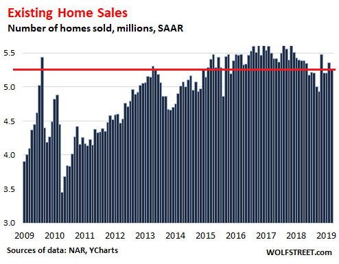
Meanwhile existing home sales declined m/m, but have clearly rebounded off their lows five months ago:


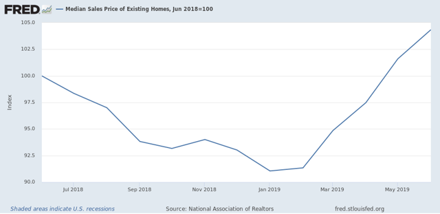
And prices of existing homes, which aren’t seasonally adjusted, rose 4.3% YoY:


At this point the only home sales metric which has not come back from lows is total housing permits, which made a new low in June, due to a big downturn in the very volatile multi-unit permits. Single family permits, which are a less volatile and more reliable metric, are above their low from two months ago. [See my discussion last week.]

In short, lower mortgage rates have put a bottom beneath the housing market.

Tuesday, July 23, 2019

My forecast for the rest of 2019 is . . . .


 - by New Deal democrat

. . . up at Seeking Alpha!

I’ll be doing my long term forecast through mid year 2020 once Q2 GDP comes out on Friday. It’ll probably get posted sometime next week.

P.S. Sorry for the lack of posting yesterday. I submitted the above to SA on Sunday, but they didn’t get around to putting it up until late yesterday afternoon.  If I have the energy, I’ll put up an extra post maybe this afternoon.

Sunday, July 21, 2019

How today’s Democratic ‘Squad’ is a direct ideological descendant of the original 1850s Republicans


 - by New Deal democrat

Nothing is ever really “new.” Today’s ‘Squad’ of young Democrats is the direct ideological descendant of the original 1850s Congressional Republicans. That is one of the important lessons of Joanne Freeman’s “The Fields of Blood,” about the increasing threats of, and actual incidents of, violence in the US Congress between the 1830s and the Civil War. 

Just as today, there were differing economic and social divides in America. Economically there was a struggle for power between the merchant class and farmers. Socially the increasingly contentious issue was that of slavery. At least beginning with Andrew Jackson’s 1828 Presidential election victory, the Democratic Party was the voice of farmers. The ex-Federalists and the nascent Whig party became that of commerce.

But there were northern and southern branches of each party, defined in how they stood on slavery. The story of the 1830s through 1850s is how that moral issue moved to the forefront, splitting both parties, and ultimately giving rise to the Republicans. This is very much the same paradigm as the “great sort” that took place between the Democratic Party and the GOP between 1980 and 2016 (if not 2008).

Not only is that, but reminiscent of polls over the past 10 years, in the 1830s and 1840s  northerners, especially northern Whigs, wanted to settle disputes civilly, while especially southern Democrats were willing to threaten, and even use, physical force to get their way.

Most importantly, dueling was accepted in the south as a way to defend one’s “honor,” while in the north it was looked upon as unseemly. Southerners used this to their advantage, knowing that northerners would back down in the face of a challenge to a duel. This first came to a head when, in 1838, Maine Representative Jonathan Gilley accepted the challenge of Kentucky Representative Williams Graves. Neither really wanted to duel, and both were poorly served by their seconds, who at crucial moments failed to resolve the situation, but the bottom line is that Graves shot and killed Gilley. Sectional debate on the floor of Congress had finally gone all the way to causing a death. 

And just as in our present era, one side was especially willing to break norms in order to get their way on their biggest issues. One analog to Mitch McConnell now was James K. Polk, who promised in 1844 that he would lower tariffs that hurt farmers, acquire California and the Oregon territory, and allow Texas into the Union. Of course, a  big reason for the acquisition of southwestern lands was to allow the expansion of slavery to new states, which is why both the venerable John Quincy Adams and a young Abraham Lincoln opposed the Mexican War. A second norm-breaker was Stephen Douglas, who blew up the Missouri Compromise even before the Dred Scot case, advocating that territories themselves should choose whether they would allow slavery or not, which ultimately succeeded in the Kansas-Nebraska Act. 

Finally the north had had enough, and elected Representatives and Senators who vowed not to be cowed. Here is Freeman’s discussion of the arrival of the first Republicans elected to Congress in 1855:

As inchoate as this new party was, the arrival of an explicitly Northern opposition had an enormous impact on Congress. Not only did the number of fights spike precipitously after 1855, but their dynamics fundamentally changed. Republicans promoted themselves as a new kind of Northerner who was willing to fight back, and they were true to their word. They fought to wrest control of Congress and the Union from the Slave Power.

As an example, Freeman cites the contest for Speaker in 1859. Southerners threatened violence if a Northerner won the post. Pennsylvania Republican Thaddeus Stevens

said that he didn’t blame Southerners for their threats, ‘for they have tried it fifty times, and fifty times they have found weak and recreant tremblers in the North who have been affected by it.’ When Stevens’ quip brought [Georgian] Martin Crawford to his feet uttering threats, Stevens added, ‘That is right. That is the way that they frightened us before.’ At this, Crawford headed toward Stevens .... Within seconds, Republicans and Southern Democrats were rushing down the aisles, several of them reaching for guns.

In addition to the famous caning by Sen. Preston Brooks of Sen. Charles Sumner, there were more than a dozen fights in the Thirty-Sixth Congress. In one incident, Southern Democrat Roger Pryor challenged Republican John Potter to a duel. He was surprised when Potter not only accepted but chose Bowie knives as weapons. Pryor backed down, citing the “vulgarity” of the weapon, and northerners rejoiced.

As Freeman notes, Republicans “did so with an approving Northern public looking on.” Meanwhile, shocked Democrats reacted with apoplexy to the Republican challenge, caricaturing them as lunatics and radicals.

A political faction entrenched in power for a generation or more being challenged by new generation of implacable opposition sounds exactly like the reaction of the GOP to the ‘Squad’ today. 

Just as then, I believe that the new unwavering and determined opposition will ultimately carry the day, although it may be done “one funeral at a time.”  But also just as then, I wonder how big a Constitutional rupture may occur along the way.
Saturday, July 20, 2019

Weekly Indicators for July 15 - 19 at Seeking Alpha


 - by New Deal democrat

My Weekly Indicators post is up at Seeking Alpha.

There were a number a changes among the short leading indicators this week at the margins, in a somewhat surprising direction. Since I’ll be posting my semi-annual updates of my short and long term forecasts over the next week or two, there is a lot for me to think about!

Anyway, as usual, clicking over and reading should be educational for you, and also rewards me a little bit for the effort I put into this enterprise.

Friday, July 19, 2019

My updated look at housing sales and construction


 - by New Deal democrat

My midyear 2019 update on housing construction and sales is up at Seeking Alpha.

Among other things, I go through nine metrics and show the order in which they typically turn, with very significant lags between the first and last indicators. As a result, housing is telling us very different things about the economy over the next 6 - 9 months vs. the next 12 - 18 months.

Judging by the comments there, people still want to see the prices as leading sales, even though almost always sales turn up or down first before prices do.

As an aside of that, Wolf Richter has a very good piece up about the downturn in foreign purchases of US housing. Well-heeled foreigners, and in particular Chinese buyers, have been very important marginal drivers of the high end real estate market, especially in California, New York, and Florida.

That foreign buying has fallen off a cliff in the last year or so probably explains a lot of the reason why the median price of new homes has fallen so quickly and dramatically along with the 2018 downturn in new home sales, as shown below:


Thursday, July 18, 2019

Initial claims still weakly positive, most consistent with slowdown


 - by New Deal democrat
I have started to monitor initial jobless claims to see if there are any signs of stress.

My two thresholds are:

1. If the four week average on claims is more than 10% above its expansion low.
2. If the YoY% change in the monthly average turns higher.

Here’s this week’s update.

Initial jobless claims last week were 216,000. This is average for the past 18 months. As of this week, the four week average is 8.6% above its recent low: 


and at 218,750, is only 250, or -0.1%, lower than this week last year: 


This remains positive.

Last July, initial claims averaged 215,250 (red). Through the first two weeks, it is 212,000 this year (blue), which is also positive:


So this too remains positive.

Finally, let’s compare the YoY% change in initial claims (blue) with continuing claims (red):


Comparisons have been  getting closer to crossing the threshold from lower to higher,  but this week moved lower to -3.8% YoY.  A longer term view shows that - so far - this is most consistent with the 1984, 1994, and 1996 slowdowns, and not a recession:

Wednesday, July 17, 2019

June residential construction report a decidedly mixed bag


 - by New Deal democrat

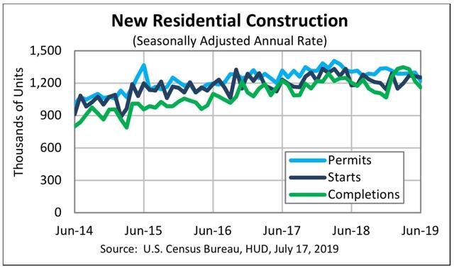
The Census Bureau’s report on residential construction for June was a decidedly mixed bag. Here’s their graph of permits, starts, and completions:


On the positive side, even though starts declined slightly in June, the three month average, which is the best way of looking at this measure due to its noisy m/m readings, improved to the best number in 13 months. Starts are real economic activity, and bode well for 2020.  Single family permits (not shown above) - the least noisy of all the leading housing indicators - also improved to 813,000, suggesting that April’s reading of 786,000 may have been their low.

On the negative side, total permits declined to 1.22 million annualized, which is the lowest reading in over 2 years, and is -13.2% below their March 2018 peak of 1.406 million. This is a bigger decline than that which preceded the 2001 recession. In other words, it is consistent with what might be seen in advance of a producer-led recession.

Additionally, total completions (green in the graph above) fell to a five month low. Since residential construction employment generally turns shortly after completions turn, this renewed decline in the past several months means that we can expect to see declines in this leading employment sector as well in the next several months.

As I said at the beginning, a very mixed bag. I’ll have a more detailed post up at Seeking Alpha probably tomorrow.

Tuesday, July 16, 2019

June consumption was strong, while production was weak


 - by New Deal democrat

This morning’s retail sales and industrial production releases for June are consistent with my take that the consumer sector of the economy is doing OK, while the production sector remains in trouble.

Let’s start with retail sales. 

Retail sales are one of my favorite indicators, because in real terms they can tell us so much about the present, near term forecast, and longer term forecast for the economy.
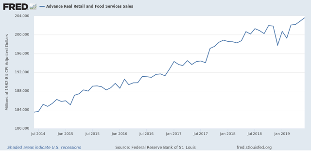
This morning retail sales for June were reported up +0.4%, while May was revised downward by -0.1%. Since consumer inflation increased by less than 0.1% last month, through the magic of rounding, real retail sales also rose +0.4%. The strength of the past two months means that YoY real retail sales are now up +1.7%.
Here is what the last five years look like:


Next, although the relationship is noisy, because real retail sales measured YoY tend to lead employment (red in the graph below) by a number of months, here is that relationship for the past 25 years, measured quarterly to cut down on noise:


Now here is the monthly close-up of the last five years. You can see that it is much noisier, but helps us pick out the turning points:


I still expect some softness in the employment reports in the next few months, but the renewed strength in real retail sales means that it may pass.

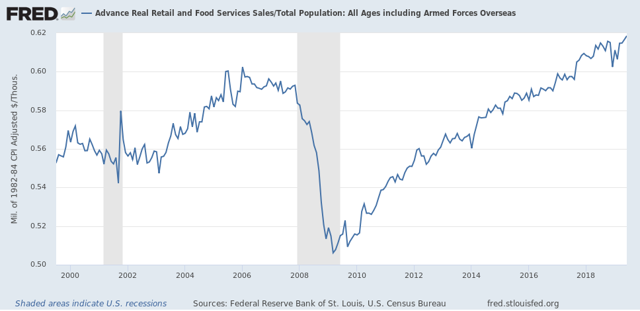
Finally, real retail sales per capita is a long leading indicator. In particular it has turned down a full year before either of the past two recessions:


As these made yet another new high in June, that is an argument against any actual downturn in the economy for the rest of this year.

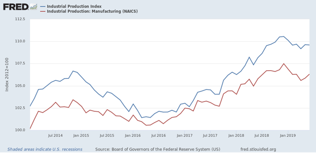
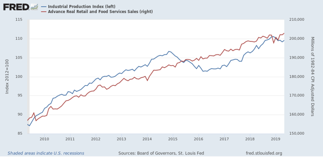
But if the consumer side of the economy looks pretty good, the production side continued to lag in June, as industrial production as a whole was unchanged. Manufacturing production did increase +0.4%:


On the one hand, both may have bottomed in April, following the “mini-recession” brought on by the January government shutdown and some trade war fallout. On the other, both remain significantly below their expansion peaks set six months ago.

If an actual downturn is going to begin in the production sector, it will show up first in the new orders portions of the regional Fed indexes, the average of which has remained above zero so far.

Monday, July 15, 2019

The consumer vs. the producer economy


 - by New Deal democrat

Prof. Edward Leamer wrote over a decade ago that, in a consumer led recession, first housing turns, then vehicle sales, then other consumer goods.

What do home and vehicle sales tell us now about the economy, vs. corporate profits? This post is up at Seeking Alpha.

As usual, clicking over and reading puts a penny or two in my pocket.

Sunday, July 14, 2019

WARNING: another “debt ceiling debacle” is looming, and could cause nearly immediate recession


 - by New Deal democrat

It’s time to start to get seriously worried about another “debt ceiling debacle.” In 2011, the GOP refused to authorize a “clean” debt ceiling hike. The hike in the debt ceiling, for those who may not know, is necessary for the US government to pay debts that *it has already incurred.*

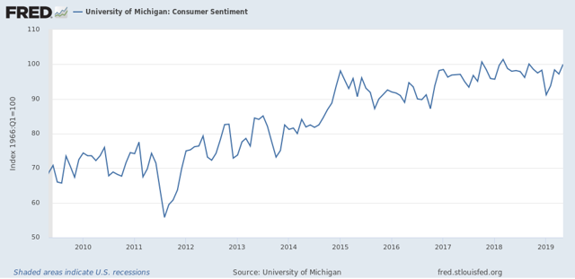
In 2011, as a result of the impasse, US creditworthiness was downgraded from AAA to AA. Consumer confidence plummeted:


Note the next largest spike downward occurred during the government shutdown at the beginning of this year.  
  
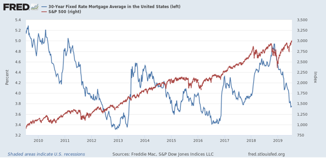
In both cases - the debt ceiling debacle and the government shutdown - Long bond rates (mortgages, shown in blue below) plunged in a “flight to safety,” and stock prices (red) also plunged about 15%:


We know, of course, that the stock market is not the “real” economy. In 2011, consumers nevertheless continued to spend (red in the graph below) and industry continued to expand (blue), but during the government shutdown at the beginning of this year, both went sideways or declined:


As I write this, it is almost certain that the economy is already in a slowdown. It is dicey enough that, although I see slowdown as the most likely scenario, I already am on “Recession Watch” for a possible downturn centered on Q4 of this year. Another knock like the “mini-recession” we had from December through February as the result of the government shutdown is the last thing we need.

But we may be about to get it. Congress is scheduled to go on recess after August 2, and not return until after Labor Day in September. According to various news organizations,

Treasury Secretary Steven Mnuchin put his request on paper for Congress to act on the debt ceiling before the August recess, writing to congressional leaders Friday that there’s a chance Treasury could run out of cash in early September.


Pelosi and Republican leaders are looking to strike a multi-year deal to lift the nation’s $22 trillion debt limit and nix Congress’ stiff spending caps, which threaten billions of dollars of cuts at year’s end.
“I am personally convinced that we should act on the caps and the debt ceiling,” Pelosi told reporters on Thursday evening, adding that it should be done “prior to recess.”

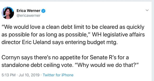
But here is a giant sticking point:


Meanwhile, Mitch McConnell, who may be evil but is nevertheless by far the shrewdest operator in Washington, is keeping his cards close to his vest:

[telling] a weekly leadership press conference that lawmakers wouldn’t let the United States default on its debt, but he didn’t offer a clear pathway to approving a debt ceiling increase.
“Time is running out, and if we’re going to avoid having either short- or long-term CR or either a short- or long-term debt ceiling increase, it’s time that we got serious on a bipartisan basis to try to work this out [...]” McConnell said. A CR, or continuing resolution, would fund the government at current spending levels.
Asked if Congress had to raise the debt ceiling before the August recess, McConnell sidestepped the question, saying lawmakers are in close contact with Mnuchin about the timeline but that he doesn’t “think there’s any chance that we’ll allow the country to default.”

Way back in 2011 I railed against Obama enabling the GOP’s debt brinksmanship, arguing that it only set a precedent for further blackmail. And here we are. 

But as cagey as McConnell may be, as we saw with the government shutdown, Trump is not only willing to hold hostages, but to execute some in order to try to get his way and please his base. All it will take is a few segments on Fox TV for him to once again blow up any deal McConnell brokers.

 There are three workweeks left until Congress’s summer recess. If for any reason we actually go over the brink this time, there is an excellent chance that the slowdown almost immediately tips into recession.

Saturday, July 13, 2019

Weekly Indicators for July 8 - 12 at Seeking Alpha


 - by New Deal democrat

My Weekly Indicators post is up at Seeking Alpha.

Now that the Fed has all but assured a dovish stance going forward, the longer term forecast has become even more positive.

Friday, July 12, 2019

Real average and aggregate wages improved in June


- by New Deal democrat

Now that we have the June inflation reading, let’s finish out our week focusing on the labor market.

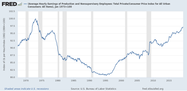
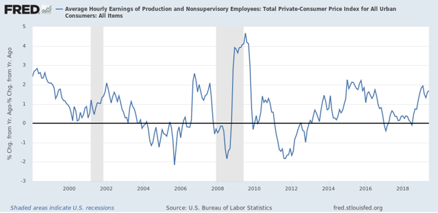
First of all, nominal average hourly wages in June increased +0.2%, while consumer prices increased +0.1%, meaning real average hourly wages for non-managerial personnel increased +0.1%. Together with upward revisions to prior months, this brings real wages up to 97.2% of their all time high in January 1973:


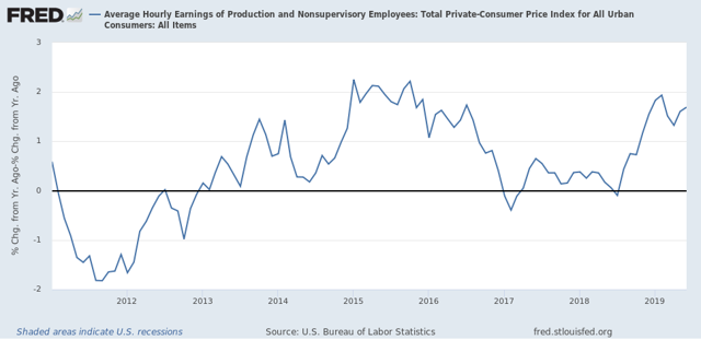
On a YoY basis, real average wages were up +1.6%:


On that score, this morning’s readings include this take by Prof. James Hamilton at Econbrowser indicating that the Phillips curve (the trade-off between inflation and employment) is still alive, together with this guest post by David Branchflower at Talking Points Memo on Jerome Powell’s acknowledgement that the Fed (and many others) failed to appreciate that we were not at full employment in 2016 as they began to raise rates, and stating that the evidence
shows that, now, wage growth is driven not by unemployment but by underemployment, which has still not returned to pre-recession levels. That explains the weak wage growth we see today, and why the U.S. is not yet at full employment.

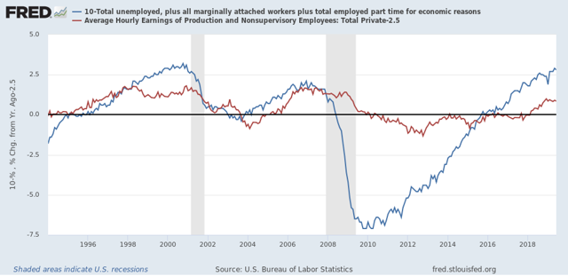
This has been my point of view as well, and it gives me the opportunity to run a graph I haven’t updated in quite awhile - average hourly wages of non-managerial workers (minus 2.5% for easier observation] vs. the U6 underemployment rate [subtracted from 10% so that lower rates show as positives]. This shows that, following recent recessions, underemployment has had to fall below 10% before wage growth stops decelerating:


Last month I raised a concern that real aggregate wages had decelerated sharply this year, writing that “[w]hen we take the information in the above graph and chart the YoY% change, we see that real aggregate wage growth has typically decelerated by 1/2 or more from its 12 month peak just at the onset of recessions, although there have been 3 false positives coincident with slowdowns.” Well, with June’s revisions that concern has disappeared for now:


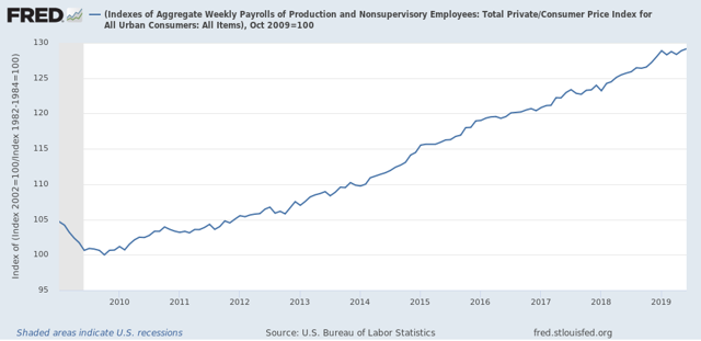
Finally, with the improvement in June, real aggregate wages - the total amount of real pay taken home by the middle and working classes - are up 29.2% from their October 2009 low:


For total wage growth, this expansion is solidly in third place, but behind the 1960s and 1990s, among all post-World War 2 expansions; while the *pace* of wage growth has been the slowest except for the 2000s expansion.

Thursday, July 11, 2019

Initial claims positive to start July, but trend in continuing claims the weakest in 9 years

 - by New Deal democrat
I have started to monitor initial jobless claims to see if there are any signs of stress.

My two thresholds are:

1. If the four week average on claims is more than 10% above its expansion low.
2. If the YoY% change in the monthly average turns higher.

Here’s this week’s update.

Initial jobless claims last week were 209,000. This is in the lower part of its range for the past 18 months. As of this week, the four week average is 9.2% above its recent low, and at 219,250, is 1,500 lower than this week last year: 


This remains positive.

Last July, initial claims averaged 215,250. Obviously, 209.000 (blue in the graph below) is below that average, which is also positive - but is only the first of the four weeks that will go into that average (red):


So this too remains positive.

Finally, let’s compare the YoY% change in initial claims (blue) with continuing claims (red):


We see that the comparisons are getting closer to crossing the threshold from lower to higher, and that the YoY change in continuing claims in particular is the weakest it has been during this entire expansion - but they haven’t crossed the threshold yet.

Wednesday, July 10, 2019

Using long term unemployment claims as confirmation for initial claims


 - by New Deal democrat

In the last few months, I’ve been paying extra attention to the weekly reports of initial jobless claims. Today I want to compare them to long-term claims (15 weeks or over) for unemployment benefits.

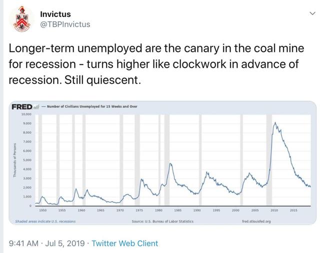
Way back about a decade ago, one of the occasional co-bloggers here was Invictus, who personally knew and subsequently was scooped up by Barry Ritholtz. Well, he still writes, and his Twitter feed is worth checking out. 

So anyway, last week he tweeted this:


It had been a long time since I checked this series, so I wanted to double-check the claim that it always turned up before a recession. The answer is, usually that has been true, but it made its expansion low in the exact month that a recession started three times (1948, 1953, and 1981), and made its low one month after a recession had already started once (1960).

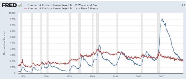
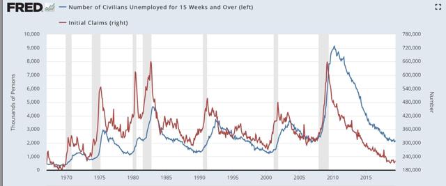
Also, my recollection was that short term unemployment turned up first (0 to 5 weeks), then intermediate term (5 to 14 weeks), before longer term 15+ weeks turned up. That is still correct, but the drawback is that short term claims are much noisier and unreliable compared with long term claims:


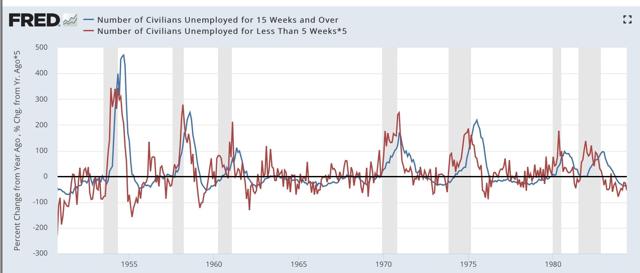
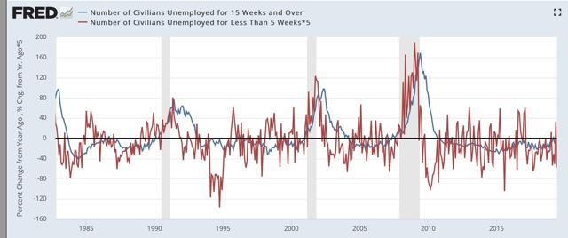
Here is the YoY% change perspective (divided into two time periods), which better shows that short term unemployment leads long term unemployment — but is too noisy to be of much use:


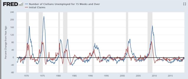
But of course, we don’t have to rely on the monthly unemployment numbers when we have weekly initial claims. As the graph below shows, these *also* lead long term claims, but are much less noisy than the monthly short term unemployment number (note I have averaged initial claims monthly to cut down further on noise in the below two graphs):


The leading/lagging relationship is easy to see when we graph the YoY% change in the two series:


One of the two ways I measure signal in initial claims is if they turn higher YoY on a monthly basis, but there are some false positives. It turns out, when we add long term claims as a confirmatory signal, we only get two false positives, in 1985 and 1996, for only one month each. That’s five accurate signals to two false ones. If we insist on two months in a row, there are no false positives — although as set forth above, there are two false negatives since 1960 in the sense that you don’t get the signal until the month the recession starts or one month later.

Still, using long term unemployment claims as a confirmatory signal looks very useful in terms of adding to the reliability of the forecast.  And speaking of initial claims, their monthly average between July and September was between 212,000 and 215,250 - so the likelihood that they will send a negative signal in the next several months looks high.

Tuesday, July 9, 2019

May JOLTS report is weak, consistent with last month’s weak jobs report


 - by New Deal democrat

The jobs report one month ago was poor, so as expected the JOLTS report for May, released this morning, followed suit.

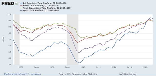
To review, because this series is only 20 years old, we only have one full business cycle to compare. During the 2000s expansion:

  • Hires peaked first, from December 2004 through September 2005
  • Quits peaked next, in September 2005
  • Layoffs and Discharges peaked next, from October 2005 through September 2006
  • Openings peaked last, in April 2007 
as shown in the below graph (normed to 100 as of May 2018):


As shown above, in today’s report, all of the above series, as well as job openings, declined month over month. Additionally, the only series that were higher compared with one year ago were job openings (+2.8% but significantly off its November 2018 high) and quits (+2.5%)


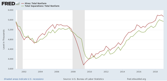
Next, here is the history of the “hiring leads firing” (actually, total separations) metric, measured quarterly to cut down on noise):


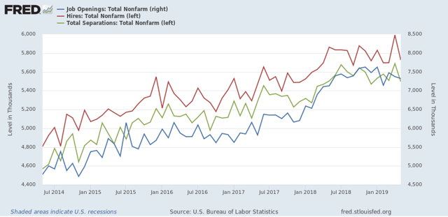
And here is the monthly measure for the last five years (plus job openings in blue):


As you can see, both hires and fires have essentially gone sideways for the last twelve months. It is possible both are at a turning point, but it is impossible to know.

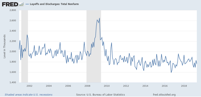
Only layoffs and discharges have shown an improving trend over the last year, and ticked lower in May, although they are off their best readings:


To sum up, job openings have declined about -4% from their peak six months ago. Hires, quits, and total separations have been rangebound, with the only improvement in layoffs and discharges. 

While the absolute levels are solid, this month’s report, just like last month’s jobs report, does not show an improving jobs market. But since the June jobs report was strong, we can expect the JOLTS report next month to be stronger as well.

Monday, July 8, 2019

Scenes from the June employment report


 - by New Deal democrat

As I (and everyone else) wrote on Friday, the establishment portion of the June jobs report was very good.

On closer examination, though, the leading components of the report continued to show some weakness.

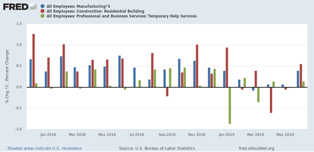
To begin with, for months I’ve been following manufacturing, residential construction, and temporary employment as the leading sectors. As the below graph of the past 18 months shows, all were positive in June:

But if you compare each bar (blue, red, green), you see that two of the three sectors nevertheless came in considerably lower for June with the average in that sector from 2018 (17k vs. 21K, 4.6k vs. 4.3k, 4.3k vs. 6k, respectively).

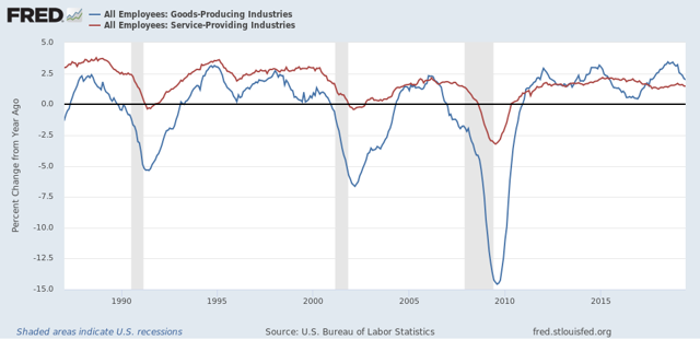
More broadly, jobs in goods producting industries turn down in advance of recessions much more sharply than those in service producing sectors:


There has been a significant turn-down in goods producing jobs in the past six months, although it is consistent with a slowdown only at this point.

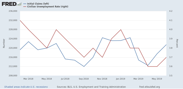
Finally, I’ve been watching initial jobless claims as a leader for the unemployment rate. Here’s what that update looks like through June (note jobless claims are averaged monthly):


Initial jobless claims have trended essentially sideways, averaging between 212,000 and 225,000 over the past 17 months. Meanwhile the unemployment rate has trended slightly downward. If initial claims continue to trend sideways, I expect the unemployment rate to stagnate as well. Note also that initial claims will have very difficult YoY comparisons for the next four months. If they trend higher YoY, that is a cautionary signal consistent with a possible recession shortly thereafter.