Monday, November 9, 2015

Forecasting the 2016 election economy: in which I respond to Nate Silver


 -by New Deal democrat

As you all know, I have been writing a series about "Forecasting the 2016 election economy." In general, good economic conditions at election time usually mean the return of the incumbent party to the White House, while a recession is almost always fatal.

My goal in this experiment is to be able to make a reasonable forecast of those conditions, hopefully no later than the publication of December and 4th quarter data in January.

Based on 160 years of NBER data, and 50 years of data on the "long leading indicators,"a week ago I made a preliminary forecast that Q3 2016 GDP will be positive, a boon to the Democratic nominee.
        
Several days later, in what reads like a direct reply, Nate Silver poured cold water over the entire enterprise, writing that "We know almost nothing about the election day economy."
  
While I have the utmost respect for Nate's statistical skills, I believe in this case his argument is misdirected.  In particular, I believe he has failed to distinguish between the fabled unreliability of the general economic punditry and the more rigorous and objectively verifiable record of indexes of leading indicators. 

The gist of Nate's argument, as I read it, is that while the state of the economy is very important to election outcomes (I agree), non-economic events can have important political consequences (I agree with that as well.  If the economy were the sole determinant of presidential outcomes, Humphrey in 1968 and Gore in 2000 would have won in landslides).  Beyond that, he says, economic forecasting has almost no value one year out, the forecast of an economic pundit having a margin of error of +/-4.6%!  Specifically with regard to 2007, while (he says, I disagree as spelled out below) there were a few warning signs, the punditry and even the Fed was remarkably complacent, seeing only a 1/3 chance of a recession in 2008!  Nate also cites his book, The Signal and the Noise, which devotes a 23 page chapter to issues with economic forecasting, mainly developing in great detail the horrible record of pundits in general.

But, dear reader, notice that in his article this week, and in the links in that article, Nate nowhere discusses the record of indexes of leading indicators in general, or long leading indicators in particular.

Indeed, in the 23 page chapter about economic forecasting in his book, Nate devotes only 3 pages to the issue of leading indicators, one of which is devoted to skewering ECRI's blown 2011 recession call (a call I also skewered as well at the time).  In fact, the Index of Leading Indicators, developed over decades by the BEA under Prof. Geoffrey Moore, and since refined by the Conference Board, gets exactly one paragraph.  He writes on p. 187 that it "has typically declined a couple of months in advance of recession," but has also had "many false alarms." He then cites to a single study which claimed that the real-time unrevised data was much less helpful.  That's it.  That's the entire discussion.

I have dutifully searched for a single reference by Nate to Prof. Moore, or a single reference to "long leading indicators."  As far as I have been able to find, he has never devoted a single pixel to either. 

Here are the problems I see with Nate's argument insofar as it simply waves  off the utility of leading indicators: 

1. To begin with, that economic pundits are notoriously poor forecasters is not evidence that the Long Leading Indicators are in any way deficient.

2. He called ECRI "charlatans" because they won't disclose the inputs to the WLI.  In fact we know exactly what those are, and exactly their weights.  I worked with Jeff Miller, Georg Vrba, and Recession Alert on the issue. We found that 10-15 years ago the components were published publicly each week in Business Week. Then RecessionAlert tested the weightings, and ran a two month trial to make sure the series matched in real time. It did. Nate can run a statistical check, because we made the components and weightings public.

3. In any event, the Index of Leading Indicators, and ECRI's WLI, are designed to forecast 6 to 8 months out, not one year

4. The only indicators designed to see 1 year or more out are the long leading indicators. Professor Moore published them in 1989, although he didn't disclose the weightings. ECRI used to publish the graph, without giving away the components or weightings, until 2011.

5. Right now, as I understand them, all of the long leading indicators but one are positive.

Now let's dsicuss each of these in order:
1. that economic pundits are notoriously poor forecasters is not evidence that the Long Leading Indicators are in any way deficient.

Silver's primary claim is that surveys of economic pundits show that their opinions are frequently very wide of the mark.  That's true.  That's because most pundits are trend followers.  While the original source article unfortunately is a dead link, Prof. Mark Thoma's extensive discussion of it is very much alive, and still timely even though it is now 10 years old:
Forecasters Rely on Today to Predict Tomorrow, Caroline Baum, Bloomberg: ...The sentiment shift, based on high-frequency data, is even harder to understand in light of the economy's steady performance. ... Weak numbers yield a weak outlook. Strong numbers mean good times ahead. Where's the forecasting?
The Index of Leading Economic Indicators, which isn't a bunch of randomly selected components, is signaling slower, not faster, growth ahead. [Note this was written in 2005. The LEI were, ahem, correct!] The 10 components of the LEI were all chosen because of a demonstrated ability to predict future economic activity. ...   As long as the weekly and monthly numbers come in strong, economists will be guided by mostly contemporaneous indicators released with a lag. How come no one follows the leaders?
Prof. Thoma continued:
The paper by Stock and Watson linked above and the work that followed in the next 15 years or so look at these issues in considerable detail and answer the questions raised in the column.  For those interested, the question of the optimality of the LEI and other indicators for use in economic forecasting has been examined extensively with Stock and Watson leading voices in this area.  A very, very quick search of "Stock Watson Forecasting GDP" in Google Scholar turns up the following papers on this topic (some of the abstracts are below for quick reference).  One more note. The comments about forecasters being swayed by high frequency data is why repeated warnings have been issued on this very topic.
So Nate Silver's discussion of how wrong pundits are in my opinion has absolutely zero relevance to a discussion of actual leading indicators, particularly where the issue is whether GDP 4 quarters hence will be positive or negative, not the actual percentage of its growth.

2.  He called ECRI "charlatans" because they won't disclose the inputs to the WLI.  

I feel for ECRI.  They are a proprieatry service (somewhere i heard they charge $64,000 to customers) and so aren't about to give away their secrets.  But as to the Weekly Leading INdex (WLI) we know exactly what those are, and exactly their weights.  I worked with Jeff Miller, Georg Vrba, Recession Alert and others on the issue. We found that 10-15 years ago the components were published publicly each week in Business Week.  Here's are the components of the WLI:

  1. Initial Jobless Claims
  2. Business Failures
  3. Real Estate Loans
  4. Journal of Commerce-ECRI Industrial Materials Price Index
  5. S&P 500 Stock Price Index
  6. Corporate Bond Yield Aaa
  7. Risk Spread Between U.S. Treasury and Corporate Bonds
Then   Recession Alert tested the weightings and ran a two month trial to make sure the series matched in real time. It did. 

Nate can run a statistical check, because we made the components and weightings public. Doug Short shows how to calculate  the WLI growth rate weekly  which I am helpfully quoting below:  
   
"Note: How to Calculate the Growth series from the Weekly Leading Index
ECRI's weekly Excel spreadsheet includes the WLI and the Growth series, but the latter is a series of values without the underlying calculations. After a collaborative effort by Franz Lischka, Georg Vrba, Dwaine van Vuuren and Kishor Bhatia to model the calculation, Georg discovered the actual formula in a 1999 article published by Anirvan Banerji, the Chief Research Officer at ECRI: " The three Ps: simple tools for monitoring economic cycles - pronounced, pervasive and persistent economic indicators."
Here is the formula:"MA1" = 4 week moving average of the WLI "MA2" = moving average of MA1 over the preceding 52 weeks "n"= 52/26.5 "m"= 100 WLIg = [m*(MA1/MA2)^n] - m"

3. In any event, the Index of Leading Indicators, and ECRI's WLI, are designed to forecast 6 to 8 months out, not one year

As noted in the article by Professor Thoma discussed above:
the LEI [ ] "has  an average eight to nine months lead time at peaks and troughs -- shorter at troughs 
Similarly, ECRI's Lakshman Achuthan told Bloomberg TV that the WLI leads economic reality by 6-9 months.

So why should we expect the LEI, or ECRI"s WLI, to forecast the economy one year ahead?

Further, Prof. Geoffrey Moore himself, the originator of the WLI, wrote in  "Leading Indicators for the 1990's"  where he laid out in considerable detail his lifelong research into both Long and Short leading indicators, wrote that the high-frequency Weekly Leading Index is a slightly less reliable adjunct to the LLI and Short Leading Index, but had the advantage of being updated in a more timely and frequent fashion.  For refernce, here is my post from 2011 discussing Prof. Moore's work, including the differences between the Long Leading Indicators, the Short Leading Indicators, and the Weekly Leading Indicators.


4. The only indicators designed to see 1 year or more out are the long leading indicators. Professor Moore published them in 1989, although he didn't disclose the weightings. ECRI used to publish the graph, without giving away the components or weightings, until 2011.

In the same 2011 article I link to above, I listed Professor Moore's 4 Long Leading Indicators:
:
Real M2
Dow Jones Bond Average
Housing Permits
The relationship between price and unit labor costs in manufacturing

These typically turn negative more than 12 months before the onset of a recession, and on average 14 months before.

ECRI has not published a graph of these indicators since 2011.  Here is their history up until then:


One advantage of the LLI is that most of the components will never be revised: the yield curve, M1, M2, and bond yields for October 2015 should read the same 50 years from now as they do today.  Housing permits do get revised in the subsequent month, but to my knowledge little if at all thereafter.  Of Professor Moore's original 4 LLI components, only corporate profits are subject to significant and ongoing revision.

And, contrary to the claim made in Nate's book about 2007, 3  of the 4 components of the LLI had turned down by the end of 2006 (all 4 if one uses real M1 in lieu of real M2), giving a clear early warning of weakness, whic was confirmed by short leading indicators like the increase in jobless claims, decrease in car sales, and peaking of the stock market during 2007 before the onset of the Great Recession.

5. Right now all of the long leading indicators but one are positive.

The Long Leading Indicators are certainly not perfect.  In particular, none of them gave much warning of the 1981-82 "double dip" recession, which was engineered by Volcker's  aggressive tightening at the Fed.  They aren't designed to be infallible, but rather  "necessary but not sufficient."  Prof. Moore's approach was to use the LLI as an "early warning" which then needed to be confirmed by the Short Leading Indicators (things like the stock market indexes and initial jobless claims).  They also have one problem common to all indicators: they become less reliable the moment they significantly affect human behavior.  Fortunately, I am a small blogger out in the Oort cloud of the econoblogosphere, so I am not worried about that.

But, as I wrote earlier, there are others including "Recession Alert," who have been engaged in similar work, and whose forecasts are marked to market at least monthly if not weekly.  While their system in proprietary, I know that their own version of the LLI is similar to Prof. Moore's and incorporates almost all of the long leading indicators I cited in making my preliminary 2016 forecast. Dwaine Van Vuuren of Recession Alert has given me permission to post his most recent graphs, first of his LLI:


and here are his recession probablitiies one year out:


Like me, barring aggressive contractionary Fed action, his model sees almost no chance of a recession before the end of Q3 2016.

 IN conclusion, while no model can be perfect, I believe using the indexes of leading indicators to forecast the 2016 election economy is a worthwhile enterprize.

In "The Signal and the Noise," Nate wrote:
The temptation that some economists succumb to is to put all this data into a blender and claim that the resulting gruel is haute cuisine. 
thus  trashing the entire career of Prof. Moore and others who worked for the Bureau of Economic Statistics and developed the LEI.  Respectfully, they deserved more than a one paragraph note with two citations in Nate's  book, and an airy brush-off last week. 

Specifically, if Nate can show that the LLI are too unreliable 1 year out, more power to him.  the decades of research by Stock and Watson mentioned by Prof. Thoma one decade ago might make a good start.  I believe it is fair to say that his article this past week did not do that. 

So I challenge him to apply his top-notch statistical methods to the LLI, and test whether they performed significantly better than chance in determining, one year out, whether GDP for a particular quarter would turn negative. 

==========

UPDATE:  In addition to Recession Alert, another similar - and totally transparent - system, Georg Vrba's Business Cycle Index, also forecasts no recession within the next 12 months:


Another statistician who helped decode ECRI's WLI, Franz Lischka, wrote of the 2016 election last week:

What will determine who will finally win? As Hillary should know best, “It’s the economy, stupid!”, the famous phrase from her husband’s 1992 campaign.To be more exactly, the single best predictor is the change in the unemployment rate over the election year. (From the December data, which is released at the start of the year to the October data, which is published right before the election.)There seems to be a very strong pattern here: If the unemployment rate rises, stays flat or just inches lower by the smallest possible margin of -0.1% (all marked in red), the candidate from the opposition wins (also marked in red). If the unemployment falls at least -0.2%, the candidate of the incumbent party wins.


....
And at least for now the economy is in Clinton’s favor. Initial claims, which are the best predictor of the future direction of the unemployment rate, are still on the way down.

I understand that Bob Dieli's most recent long term forecast is also for no recession. If I receive his permission to include his report, I will do so.

Saturday, November 7, 2015

Weekly Indicators for November 2 - 6 at XE.com


 - by New Deal democrat

My Weekly Indicators piece is up at XE.com .

Several trends in the US economy have all intensified within the last month.

Friday, November 6, 2015

Houses, cars, and now jobs too say US growth intact


 - by New Deal democrat

I have a new post up at XE.com .  Strong jobs reports like this morning's are inconsistent with any near-term downturn in the US economy.

October Jobs report: blowout raises odds of December Fed action


- by New Deal democrat

HEADLINES:

  • 271,000 jobs added to the economy
  • U3 unemployment rate down -0.1% to 5.0% 
With the expansion firmly established, the focus has shifted to wages and the chronic heightened unemployment.  Here's the headlines on those:

Wages and participation rates
  • Not in Labor Force, but Want a Job Now: up 97,000 from 5.935 million to 6.052 million
  • Part time for economic reasons: down  -269,000 from 6.036 million to 5.767 million
  • Employment/population ratio ages 25-54: unchanged at 77.2% 
  • Average Weekly Earnings for Production and Nonsupervisory Personnel: up $.09 from $21.09 to $21.18,  up +2.2%YoY. (Note: you may be reading different information about wages elsewhere. They are citing average wages for all private workers. I use wages for nonsupervisory personnel, to come closer to the situation for ordinary workers.)
August was revised upward by 17,000.  September was revised downward by -5,000, for a net change of +12,000.

The more leading numbers in the report tell us about where the economy is likely to be a few months from now. These were mainly positive.

  • the average manufacturing workweek rose +0.1 hours from 41.6 hours to 41.7 hours.  This is one of the 10 components of the LEI and so will affect it positively.
  •  
  • construction jobs increased.by 31,000.  YoY construction jobs are up 233,,000.  
  •  
  • manufacturing jobs were unchanged, and are up 80,000 YoY.
  • Professional and business employment (generally higher-paying jobs) increased by 78,000 and are up 664,000 YoY.

  • temporary jobs - a leading indicator for jobs overall increased by 24,500.

  • the number of people unemployed for 5 weeks or less - a better leading indicator than initial jobless claims - fell by -37,000 from 2,363,000 to 2.326,000.  The post-recession low was set 2 months ago at 2,095,000.

Other important coincident indicators help us paint a more complete picture of the present:

  • Overtime rose 0.2 hours from 3.1 hours to 3.3 hours.

  • the index of aggregate hours worked in the economy rose by 0.3% from  103.8 to 104.1. 
  •  
  • The broad U-6 unemployment rate, that includes discouraged workers fell  by  0.2% from 10.0% to 9.8%. 
  •  the index of aggregate payrolls rose by 0.6% from 124.3  to 125.2.
Other news included:      
  • the alternate jobs number contained in the more volatile household survey increased by  320,000 jobs.  This represents an in crease of 1,860,000  jobs YoY vs. 2,814,000 in the establishment survey.  

  • G overnment jobs rose by 3,000.  
  • the overall employment  to population ratio for all ages 16 and above rose 0.1%  from 59.2% to 59.3%, and has risen by 0.1%  YoY. The labor force participation rate was unchanged at   62.4% and is down -0.4% YoY (remember, this incl udes droves of retiring Boomers). 

SUMMARY


This was obviously a very strong reoprt, which if duplicated next month strongly implies the Fed will raise rates.  There were only a few negatives, including stalled labor force participation, the relatively poor household increase YoY,  and the increase inthose who are out of the labor force but want a job.

Everything else - the unemployment rate, YoY wage growth, the decline in those working part-time for economic reasons, and even manufacturing hours, was positive to strongly positive.

I am particularly heartened by signs that wage growth may finally be improving, in keeping with the thesis that it would do so once the U-6 rate fell under 10%.  With nonexistent inflation, it would be nice if the Fed would give labor a break.

Monday, November 2, 2015

Forecasting the 2016 election economy, first forecast: the long leading indicators


 - by New Deal democrat

Last week I showed that, going back 160 years, roughly 3/4 of all US Presidential election results correlated positively with whether or not at the time of the election campaign, the US was in a recession or not. More than 2/3 of the time, it accurately predicted the Electoral College winner, and 80% of the time, it accurately showed the winner of the populat vote.  In fact, if we simply go by the metric of whether or not the US was in recession during the 3rd Quarter of the election year, then 84% of the time the winner of the popular vote was from the incumbent party if the economy was expanding, and from the opposition party if the economy was in recession.


We now have enough information to make a good forecast as to whether or not the US economy will be in recession in Q3 2016.  That means we can make a reasonable forecast as to which party's candidate will win the popular vote.

Prof. Geoffrey Moore, who for decades published the Index of Leading Indicators, and founded the Economic Cycle Research Institute (ECRI) in 1993, wrote  Leading Economic Indicators: New Approaches and Forecasting Records describing and explaining what he called "long leading indicators," that is, economic metrics that reliably turn a year or more before the onset of a recession.  He identified 4:

- corporate bond yields
- housing permits and starts
- real money supply
- corporate profits

A variation of the above is Paul Kasriel's "foolproof recession indicator," which combines real money supply with the yield curve, i.e., the difference in the interest rate between short and long term treasury bonds. This turns negative a year or more before the next recession about half of the time.

Another long leading indicator has been described by UCLA Prof. Edward E. Leamer who has written that "Housing IS the Business Cycle."  In that article he identified real residential investments as a share of GDP as an indicator that typically turns at least 5 quarters before the onset of a recession.

Finally, Doug Short has identified real retail sales per capita as another important metric.  This metric tops out at least a year before the onset of a recession about half of the time.

That gives us a total of 7 long leading indicators.  All of these economic series have a long term history of turning a year or more before a recession.  Let's look at them in turn:

CORPORATE BOND YIELDS

With the sole exception of the 1981 "double-dip," corporate bond yields have always made their most recent low over 1 year before the onset of the next recession.  Corporate bonds most recently made a confirmed low 3 years ago. BAA-rated corporate bonds equalled that low, but AAA-rated bonds did not:


This is a negative, but the good news is that frequently a recession has not occurred until 4 years or more after these lows.

HOUSING PERMITS AND STARTS

With the exception of the 1981 "double dip" and the 1970 recession, these have always peaked at least one year before the next recession.  Both housing permits for single family structures and housing starts made new highs in the #rd quarter.  Here is the long-term view:  


And here is the last 3 years:


I am not making use of housing permits for mult-unit structures because these were distorted by the expiration of a NYC housing program at the end of June.  This caused a rush to get permits for multi-unit structures before then, pulling the number forward and depressing subsequent months.  This program did not affect single structure permits, nor did it affect housing starts. 

This is a positive.

REAL MONEY SUPPLY

Real money supply, whether measured by M1 or M2, continues to be positive:


In addition to the 1981 "double dip," on only 2 other occasions have these failed to turn neegative at least 1 year before a recession.  No recession has ever started without at least one of these two turning negative.

CORPORATE PROFITS

Ideally we would like corporate profits and wages to grow at about the same rate.  Unfortunately since 2000, corporate profit growth has soared while wages have stagnated.  But worse than soaring coporate profits are declining corporate profits: when profits decline businesses stop hiring and if that isn't enough they start laying people off.

Corporate profits have peaked at least one year before thennext recession 8 of the last 11 times, one of the misses being the 1981 "double-dip." The best metric for corporate profits for the 3rd Quarter won't be reported until the end of November..


  But a good proxy, Proprietors' Income, which is almost as reliable, was reported last week:


Proprietors' Income, deflated, made a new high in the 3rd Quarter.  This is a positive.

THE YIELD CURVE

Since 1960, the yield curve inverted more than one year before the next recession about half the time. Below is a graph of the yield on a 10 year US Treasury minus the yield on a 3 month Treasury:


No recession in the last 50 years has started without an inversion in the yield curve (i.e., 3 month Treasuries yielding more interested than 10 year Treasuries).  This statement was not true for the period from 1932-1954, so I do not regard this metric as being that helpful, and Paul Kasriel himself has ntoed that the FED's Zero Interest Rate Policy moots this indicator.  Nevertheless, it is positive now.

REAL PRIVATE RESIDENTIAL FXEDINVESTMENT

Basically this is spending on private housing as a percentage of GDP. Aside from the 1981 "double-dip," and 1948, it has always peaked at least one year before the next recession: .  


Last Thursday it was reported for the 3rd Quarter and made a new post-recession high:


This is a positive.

REAL RETAIL SALES PER CAPITA

This basically tells us how much spending is being done for each consumer.  Consumers tend to cut back well before the economy as a whole rolls over.  It has peaked 1 year or more before the next recession about half of the time. .  


Here is what it looks like for the last 20+ years:


This made a new post-recession high in the last month.  This is a positive.

AND THE WINNER IS ...

Six of the seven long leading indicators had their most positive readings of this economic expansion in the 3rd Quarter just ended.  This gives us a good indication that the economy will not be in recession by the 3rd Quarter of next year. 

Note that none of the indicators are perfect. None of them forecast the 1981 "double-dip," which was engineered by the Volcker Fed.  If the Fed similarly decided to raise rates aggressively in the next 6 - 9 months, or if there were an Oil price spike caused by a Middle eastern War, a recession could happen anyway.

This is a very preliminary forecast, but nevertheless based on the 160-year correlation between economic expansions and Presidential election results, if there is no exogenous economic shock, the most likely winner of the 2016 Presidential election will be the Democratic nominee.

Saturday, October 31, 2015

Weekly Indicators for October 26 - 30 at XE.com


 - by New Deal democrat

My Weekly Indicators post is up at XE.com .

Nothing scary this Halloween. Just weakness, but steady as she goes.

Friday, October 30, 2015

Ed Morrissey Shows His Amateurish Economic Abilities ... Again

     I haven't picked on ol' Ed in awhile.  Frankly, it seemed that he passed on the economic writing to the far more competent Steve Eggleston.  But after yesterday's GDP print of 1.5%, I had a feeling Ed would chime in with his, "the economy really sucks" line of thought.  Thankfully, he didn't disappoint.  So, let's explain why his analysis is incredibly amateurish.

     He starts by correctly noting that PCEs were very strong,  coming in over 3%.  It would have been a bit better if he'd actually looked at the report's detail, however.  Had he done so, he would have found that durable good spending was up a very strong 6.7% while non-durable spending increased 3.5% (see table 1 from the accompanying Excel information; it's on the right hand side of the BEA release).  Why is this important?  Because durable goods require financing, meaning consumers don't make these purchases unless they think they'll be able to make payments for a few years.  This is why the strong level of new car sales (that's a durable good, Ed) is so important; recessions don't happen when the consumer is buying bigger goods.  And this is the second quarter in a row this reading has been strong; 2Q DGs M/Ms were up 4.3%.  In short, this data alone tells us that the release probably isn't the harbinger of doom.

     But then Ed shows is analytical failings.  And I mean his amazingly amateurish "abilities."  He notes that Reuters mentioned the large inventory drag.  But then Ed drops the ball when he notes, "That might be the case, but the big decline in business investment was in structures rather than inventory."

     Actually, Ed, if you had looked at the accompanying Excel sheet, ESPECIALLY TABLE 2, you would have seen that an inventory correction subtracted 1.44% from GDP growth.  See especially cell T48 of Table 2, Ed.  In fact, Ed, according to the same table, total fixed investment added .47% to total growth.

     In contrast to Ed's perma-bear routine, people who know how to read tables and data and who also watch more than the one data point, yesterday's report wasn't nearly as fatal as Ed makes out.  As my co-blogger noted:

The big issue this year has been the effect of the 20% increase in the broad trade weighted dollar. Yesterday's report indicates that
(1) the consumer has not been harmed, and continues to power the US economy forward;
(2) the bleeding in the import/export sector has been staunched; and
(3) affected industries are making progress working through their accumulated inventories.


     This isn't to say there aren't reasons for concern.  As I've noted in my weekly equity columns for a number of months, corporate earnings may have peaked for this cycle.  And the shallow industrial recession caused by a combination of the strong dollar, oil sector contraction and weak international environment continues.  But ol' Ed doesn't mention any of these.  Instead, he continues in the same pattern he has since 2008: he waits for news he can spin negatively and then does so.

     In short, Ed is a partisan hack, who's analysis is poor and whose understanding of the topic is weak.

     He really needs to stop writing about econ; he's that bad.


Q3 2015 GDP report: pretty d*#$!d good for +1.6%


 - by New Deal democrat

I have a new post up at XE.com , explaining why yesterday's GDP report is probably the best +1.6% you could ever see.

Thursday, October 29, 2015

The decline in prime age labor force participation: the smoking gun (part 2 of 2); comparing June Cleaver and Roseanne Conner


 - by New Deal democrat

I recently wrote about the compelling evidence that the biggest reason for the decline in the prime working age labor participation rate was the "child care cost crunch," i.e., the increase in the number of second-earner spouses who decided to stay at home and raise their children, occasioned by the particularly significant decline in wages among lower quintile jobs, together with the soaring costs of outside day care.

In my post yesterday, I showed that the biggest reason why the percentage of both mothers and fathers of minor children who have dropped out of the labor force has increased, is in order to care for their children -- not discouragement, not disability, not education, and not any other reason.


But that is not the end of the story, even though over 80% of men and women eventually become parents of minor children.  In particular, there are other studies which put the spotlight on an increase in disability claims.  In particular, the Atlanta Fed went to the trouble of decomposing the monthly data as to why people aren't in the labor force over the last 16 years.  The graphs are interactive, and illuminating.
To cut to the chase, the Atlanta Fed found that the single biggest reason for the increase in labor force non-participation was disability claims:

A similar graph was compiled in a separate report:

So that's it, the real reason for the increase isn't the "child care cost crunch" but disability, right?  Well, yes and no.  To see why, let's go into the Atlanta Fed's interactive database a little more closely.
At age 50 and above, there has been an outsized increase in the percentage of labor force participants who say they are disabled.  That is the lion's hsare of the increase in disability claims: 

Part of this is simply the overall aging of the labor force during that time. Older people are more likely to be disabled.

But the big news is the mirror image big decline in people aged 50 and over saying they are homemakers between 1998 and 2014:
 
Aside from this huge anomaly that begins at age 50, what we are left with is a sustained increase in people in their 30s and 40s who are staying home to take care of thier children.

What can explain this shift from homemakers to disabled former workers over age 50?  Was there a group,who formerly, say before the 1970s, were largely homemakers, who entered the labor force as young people, say in the 1970s and 1980s, and who are older now and, because they were  working, can go on SS disability?

Of course! The aging of women who entered the labor force is the answer.  First of all, here's the familiar graph showing the big secular increase of women in the workforce between 1965 and 1995:

Consider the two cases of June Cleaver, 1950s homemaker, and Roseanne Conner, 1980s blue collar mother. When June Cleaver got older and more infirm, presumably she have told the Census Bureau that she was still a homemaker. Contrarily, when  Roseanne Conner became older and more infirm, she would probably tell the Census Bureau that she was disabled, not that she had chosen to be a homemaker. 
In short, homemakers don't go on disability.  The big surge in those identifying as disabled in their 50s after 1999 probably reflects the fact that they are the group of women who when they were 18-25, entered the workforce between 1965 and 1995.
-----
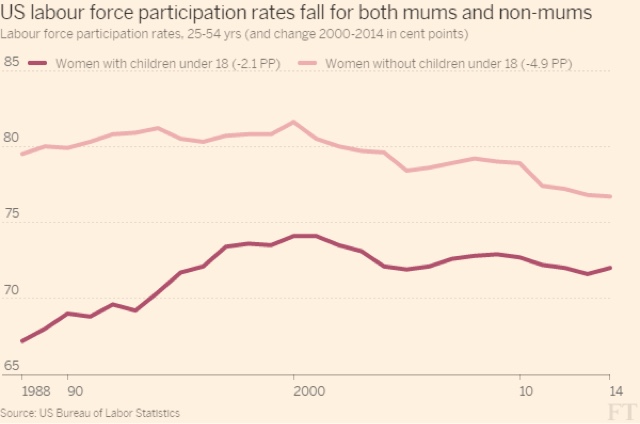
Another source of pushback against the idea that the decline of wages for second earners compared with the price of daycare for children came from the Financial Times. 

As an initial matter, the FT's article clearly shows that the most striking feature of the change in the US labor force since 2000 in comparison with every single other country, has been the big decline in women in the labor force:


There is no such equivalent defference for men.
 But  the FT then pointed out that among the prime working age demographic, the percentage of women who were not in the labor force actually declined *more* for women who were not mothers of minor children. ere's their graph:

Here the problem is at the other end of the age spectrum.  Look at the below graphic of the age at which women have typically have their first child over the last 30 years:

For most of the last decade, an absolute majority of 25 year old women had not yet had their first child -- and that age is still increasing!
And now let's go back to the Altnata Fed's interactive graphs, and show what has happened among younger adults who say they are not working because they are pursuing an education:

This  shows a big increase in people in their 20s who are not in the labor force because they are continuing their educational studies.  That's the explanation for the statistic cited by the Financial Times. The relatively big increase in childless women age 25 -54 who are not in the labor force (note: only about 18% of women ultimately fall into this category) is because of the big increase in this population at the youngest end of the range, and we know why that group is not in the labor force.
-------
In conclusion, put together this information with that published by the Pew Foundation, and we have a pretty complete picture of why there has been a decline in the prime age labor force since 1999:
1. There has been a spike in the relative number of disability claims among older workers, with a concomitant downward spike in the relative number of homemakers among older workers, as the demographics of women in the workforce has aged.
2. Parents of both sexes of minor children have been leaving the labor force in order to care for their minor children,  driven by declining real wages for those jobs held by the second earner, and exacerbated by the surging costs of child day care.
3. A smaller part of the increase is explained by young adults seeking a competitive advantage in the workplace by staying in college longer to obtain deboth undergraduate and graduate degrees. 
The mystery has been solved.

Wednesday, October 28, 2015

The decline in prime age labor participation: the smoking gun (Part 1of 2)


- by New Deal democrat

 I recently wrote about the compelling evidence that the biggest reason for the decline in the prime working age labor participation rate was the increase in the number of second-earner spouses who decided to stay at home and raise their children, occasioned by the particularly significant decline in wages among lower quintile jobs, together with the soaring costs of outside day care.

Since that time (and I'd like to think in part because of my argument), the issue of the "child care cost crunch" has become much more visible, with the candidates in the recent Democratic Presidential debate weighing in, in support of more assistance for working mothers.
   
For example, Fortune magazine repored that:
the Economic Policy Institute (EPI), a worker advocacy group, finds that caretaking costs have become so exorbitant that in most parts of the U.S., families spend more on childcare than they do on rent (included in that number: babysitting, nannies, and out-of-home day care centers.
I think [the cost of childcare] plays a role in a woman’s decision to go to work,” says Gould. “It is taking a toll on labor force participation and therefore on the economy.”
Measuring child care costs against a variety of benchmarks—including the cost of college tuition, the HHS’s 10 percent affordability threshold, and median family incomes—demonstrates that high quality child care is out of reach for working families.
And the Pew Research Foundations updated its study of the impact of child care on the careers of mothers in the labor force:
[W]hile 42% of mothers with some work experience reported in 2013 that they had reduced their work hours in order to care for a child or other family member at some point in their career, only 28% of fathers said the same. Similarly, 39% of mothers said they had taken a significant amount of time off from work in order to care for a family member (compared with 24% of men). And mothers were about three times as likely as men to report that at some point they quit a job so that they could care for a family member (27% of women vs. 10% of men).
It’s important to note that when we asked people whether they regretted taking these steps, the resounding answer was “No.”

To briefly recapitulate my posts from August, against a backdrop of surging costs for child care, and declining real wages for the lower quintile jobs occupied by second earners, the number of stay-at home dads has increased from 1.1 million to 2.0 million between 2000 and 2012, and  the increase in the percentage of stay-at-home dads who are caring for their children is the primary reason:  


Further, the percentage of mothers who are staying at home has also increased, going from 23% in 1999 to 29% of all mothers of minor children in 2012, as shown in the graph below:


In 1999, approximately 10% of stay at home mothers said they were home due to disability, and approximately 82% said they were home to take care of their home and family.

The Pew study found that as of 2012 the vast majority --  85% -- of stay at home married mothers say the reason for not working is to take care of their children.  Including both married and single mothers, the  number of stay-at-home moms is about 10 times the number of stay at home dads.

What we didn't have was  the *reason* those mothers have dropped out of the labor force since 1999.  That was the missing " smoking gun."  Until now.

Thanks to Gretchen Livingston of the Pew Foundation, who provided me with additional information, I was able to generate the following chart detailing the relative increases in mothers who dropped out of the labor force due to discouragement, child care, disability, and other reasons including education and retirement:


1999
 2012
Change
Can't find
job
0.2
1.7
 +1.5%
Child care
18.9
21.4
 +2.5%
Disability
2.3
3.2
 +0.9%
All Other*
1.6
2.5
 +0.9%
TOTAL
23
28.9 (29)
 +5.9

*includes education, retirement, and other

This is the smoking gun.  As you can see, the number of mothers who dropped out of the labor force in order to raise their minor children outstripped  all other reasons including those who wanted a job, consituting nearly half of the total.  Note by the way that the number of those who are out of the labor force but want a job now has declined by about 1 million since 2012, so the likelihood is that as of 2015, the effect of rising day care costs and declining real lower quintile wages is even stronger.

Since According to the Census Bureau, by age 40, 81% of all women have borne at least 1 child, the number of mothers utterly dwarfs the number of prime age women who are not mothers (and, ahem, by necessity of reproductive biology, it is similarly true of men).  Together, the numbers of women and men who are staying at home to raise their children, solve the mystery of the decline in the labor force participation rate among the prime working age population. 

In Part 2, I will address issues raised by an Atlanta Fed study of the microdata, and in prticular, disability.  I will also address some pushback against the "child care cost crunch" meme by the Financial Times.